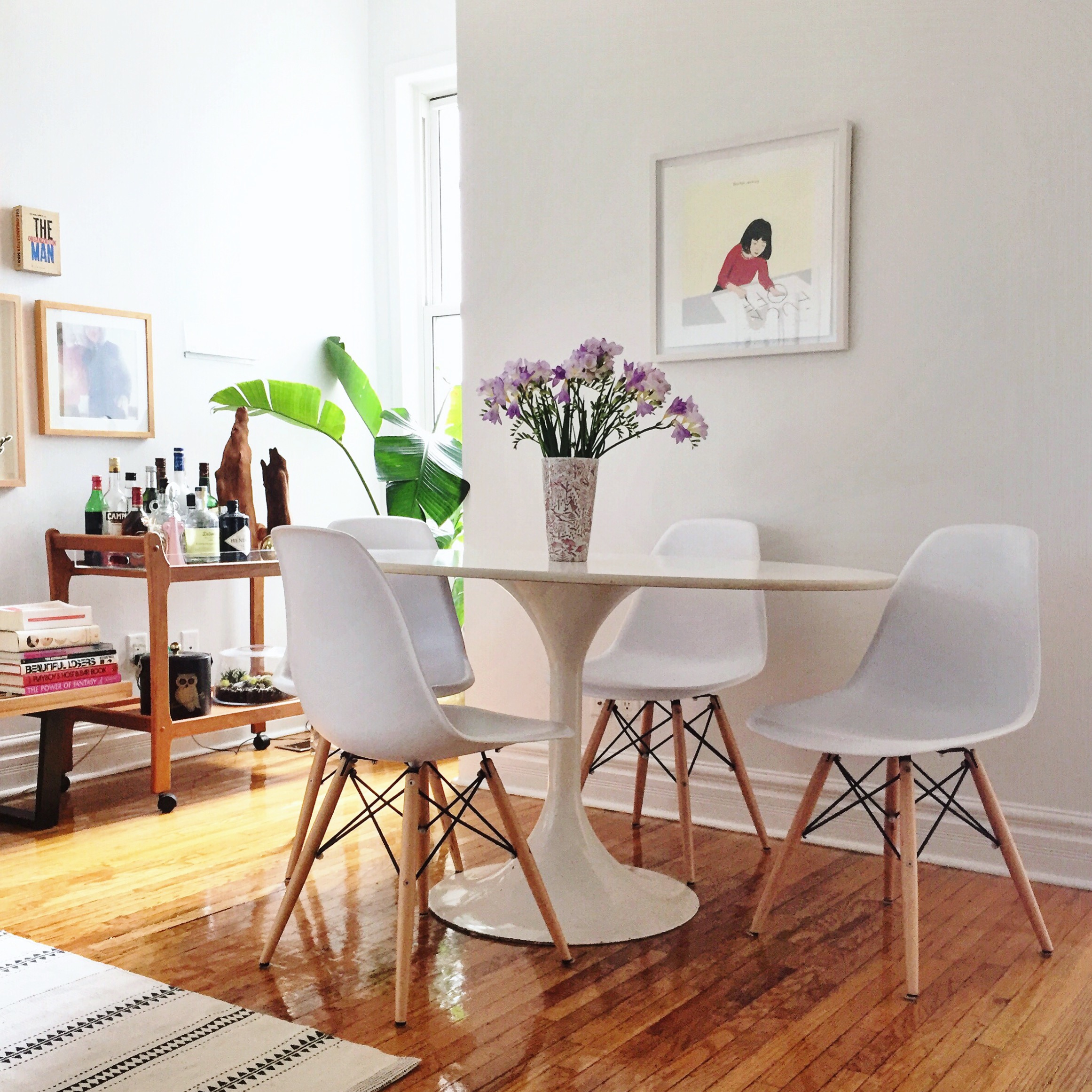
Reader Design: Lauren's New Build Nest

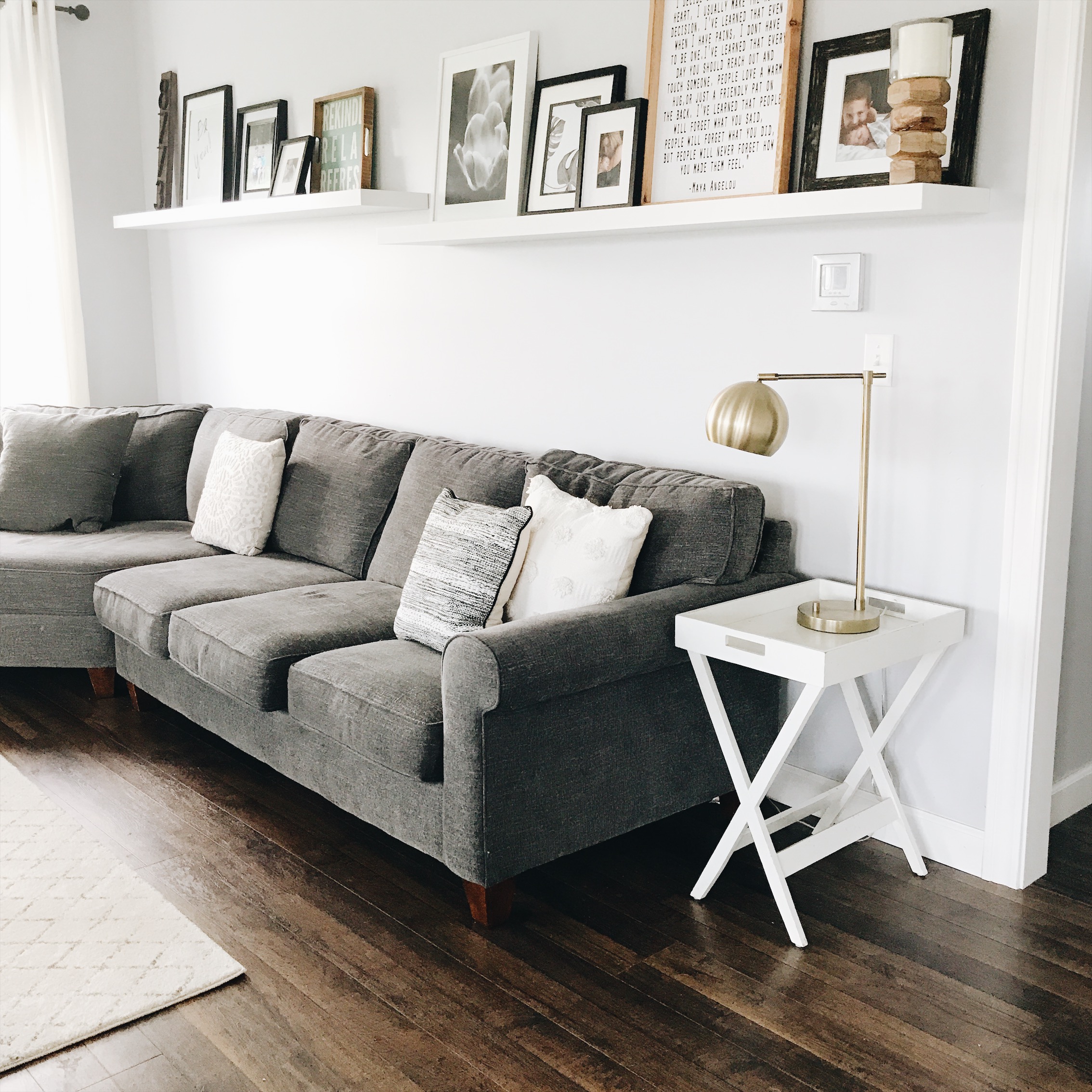
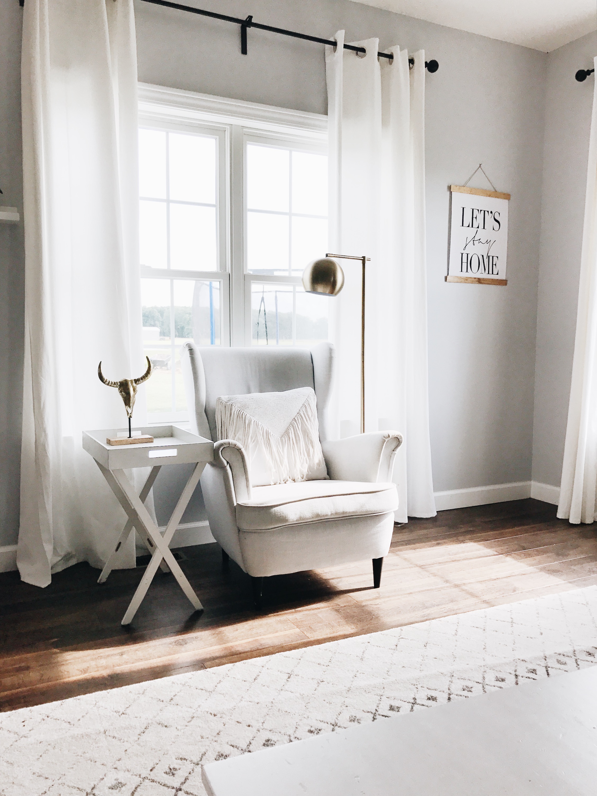
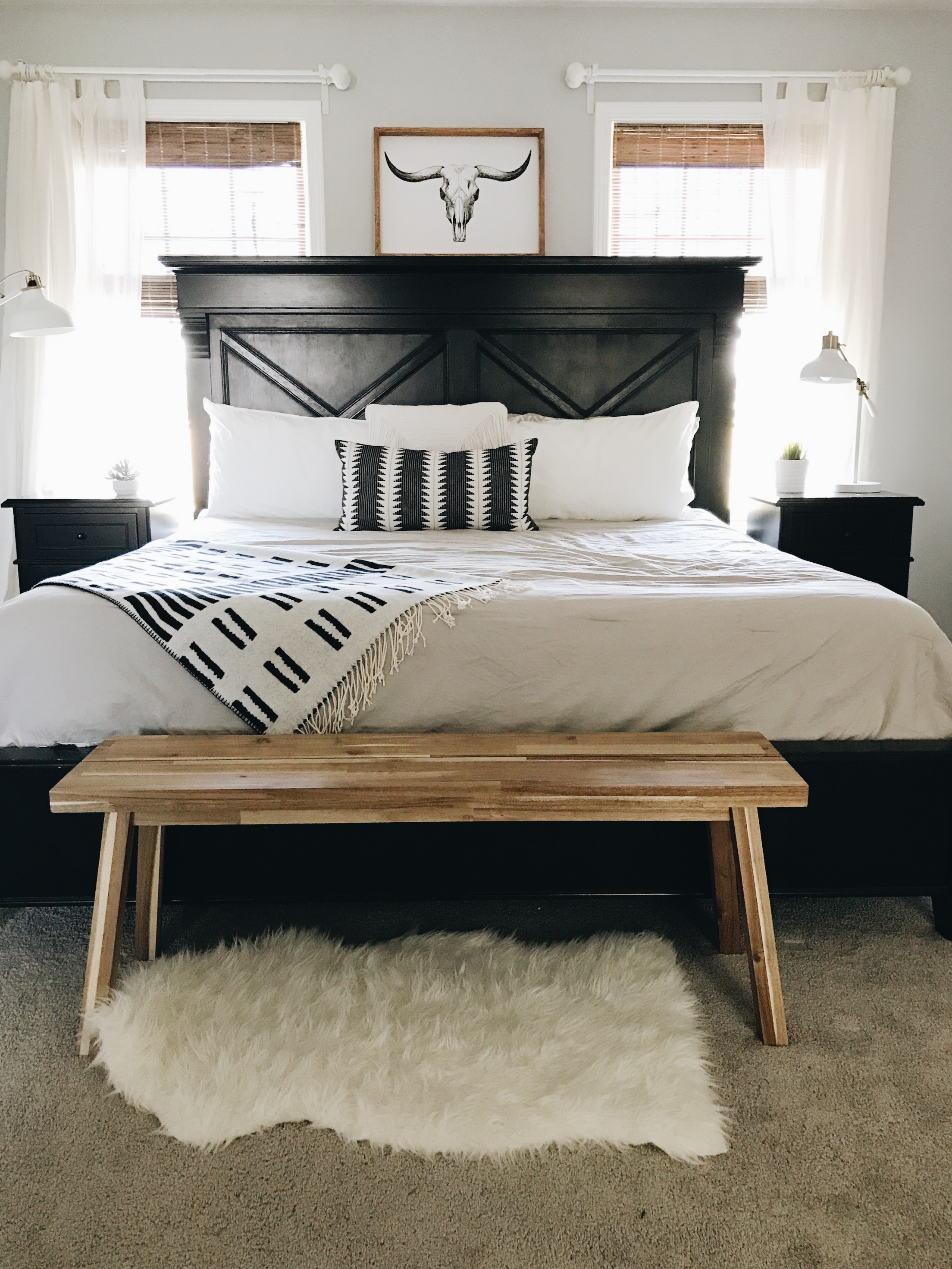
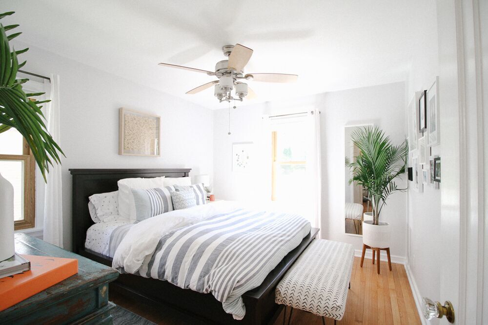
Lauren's home may only be 18 months old, but it's filled with a sense of warmth and character that can only be attributed to Lauren's eye for design. The home was built on Napoleon, Indiana soil that grew corn and beans for harvest, and those same down-to-earth roots can be felt throughout this home. 

From Lauren:

I love to create and recently found this passion for interior design through creating our spaces here in this new home. My husband and I both grew up here in Indiana, so even though there are many different style running throughout our home, we try to keep the bones of our home as the farmhouse we intended it to be, making this house our home!

This home is where Lauren and her husband are raising their three boys, so this home is playing the most important role there is. The oldest just moved into his own room - there are exciting things happening in this household!

Her favorite piece is in the dining room: the geometric Ikea statement rug. Lauren has moved it around her home a few times before finding the perfect spot! 


Lauren describes her style as 'farmhouse eclectic,' with a heavy emphasis on wood, black, and white. It's modern, with bohemian elements, 

I always try to create calm and peaceful spaces in our home. It’s important to me to have spaces for everyone and give my boys places they can thrive in.

She doesn't get caught up in fads, like shiplap (despite her love and admiration of Joanna Gaines), and feels confident sticking to what she knows. As you should, Lauren... as you should. 

That said, if you put something with stripes in front of her - ANYTHING with stripes - she'll probably bring it home. Vases, textiles, rugs... you name it. It's one pattern Lauren can't get enough of, but thank goodness that stripes are totally timeless. 

(Take a look at that dining room rug again. Stripes, of course)

This is a gorgeous family home that's ready and able to grow an awesome family inside it's walls. Lauren, hats off to a job well done. Thank you for showing us around!

Follow Lauren along on Instagram @laurenraes for more!

See you next week,

Reader Design: Kiel's 'Scandifornian' Home

I am so excited to share today's feature with you all! I know you're all probably curious as to what Scandifornian (a term Kiel himself coined) means - but fear not, you will quickly understand once you see what this home is all about. 

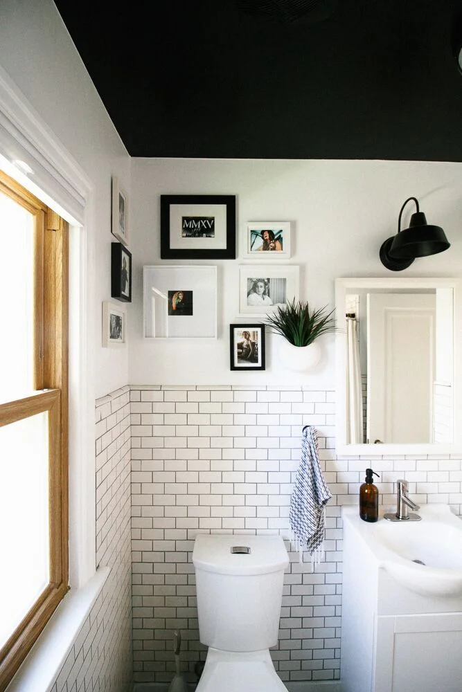
Their Milwaukee, WI home was built in 1951 and was slathered in orange and brown paint when they found it. Kiel, an architect, and his husband, an apparel designer, were clearly the perfect buyers for this fixer-upper and quickly got to work making it their own. 

We love the neutral, minimal qualities of Scandinavian/Nordic style, which also delicately balance modern, traditional, and rustic sensibilities, but we also go after the light, airy, organic qualities we loved from our Californian lifestyle. We have shoved all of those into a Cape Cod in Middle America and feel that it’s a recipe that lends to a very happy life for us.

Both having backgrounds in design, Kiel and Andrew each had strong opinions on the direction they wanted to follow for their home. Andrew gravitated toward color and pattern, while Kiel preferred neutrals. They used a familiar favorite for designers and amateurs alike, Pinterest, to curate their inspiration. Surprisingly, they quickly realized they were pinning the same images and landed on their aesthetic: "bright white spaces with minimal-leaning appointments."

They stuck to their guns, even when others questioned their decisions, and used social media inspiration to pull off the look. 

Our all-white rule is often not understood by Wisconsin locals, who rightfully question how we could possibly want to spend the Winter months, when the ground is covered in snow four months out of the year, trapped inside a white box. But we counter by reminding that those same four months are also very grey and dark, and that our white rooms maximize what light there is and bring to us a great amount of peace and serenity.

The couple took their time picking finishes, large-scale items, and accents alike, realizing and appreciating the importance of each choice. 

The mobile lighting fixture in the dining room was the first thing we bought for the house, and we feel it set the tone for us to add some streamlined accents in this very traditional house.

One of the most difficult decisions was that of the tiles. Kiel was drawn to the look of graphic painted concrete tiles and even placed a huge order. But they eventually realized that it was time bound trend, and their money would be better invested elsewhere. They instead to decided to focus on creating a home that would make them happy for years to come. 

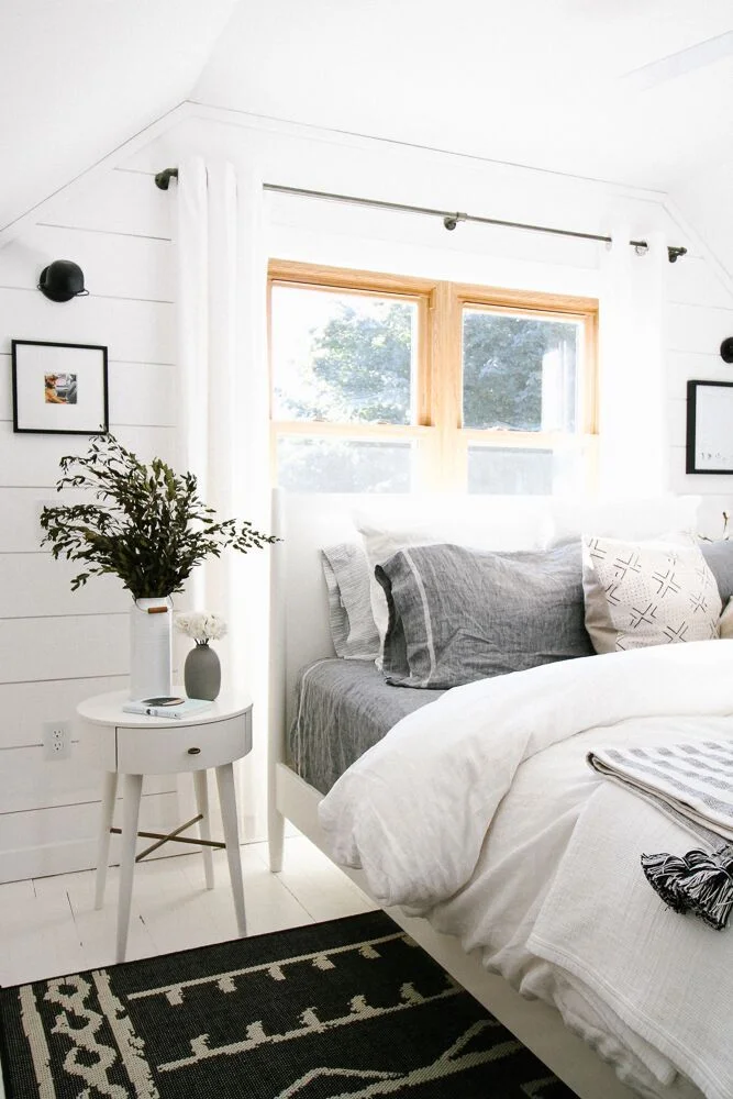
My personal favorite space in their home is the master bedroom. The shiplap detail and white painted floor created a space that is immediately restorative and serene. As Kiel says, "It's an incredible room to wake up to in the morning!" ...I'll bet! 

This entire home is just full of memorable and beautiful design moments. Kiel, hats off for a job well done, and congratulations on owning your first home! Thank you for inviting us in. 

Follow Kiel along on Instagram @kielaaron for more!

Until next time, 

Reader Design: Elaine's Vintage Digs

Mutts, we are officially back after a few weeks away for some much-needed summer relaxation. It just doesn't feel like summer without a few days to unwind near the water or in the mountains - pick your poison. I'm currently in the mountains of Virginia with family for the weekend - and the red eye from the Seattle is to thank for today's #stylemuttspaces delay.

Now, on to the good stuff. We're back to Canada to tour Elaine's vintage home. 

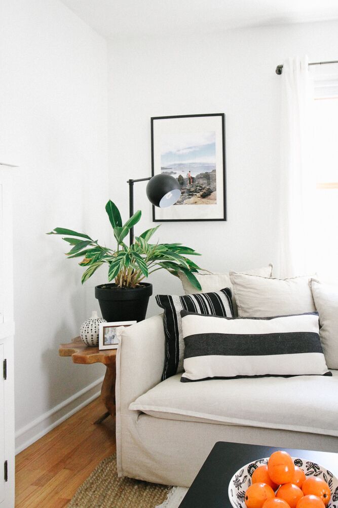
Her home is chalk-full of eclectic finds, great texture, cool tones paired with typical warm mid-century elements, and lots of personality. 
From Elaine:

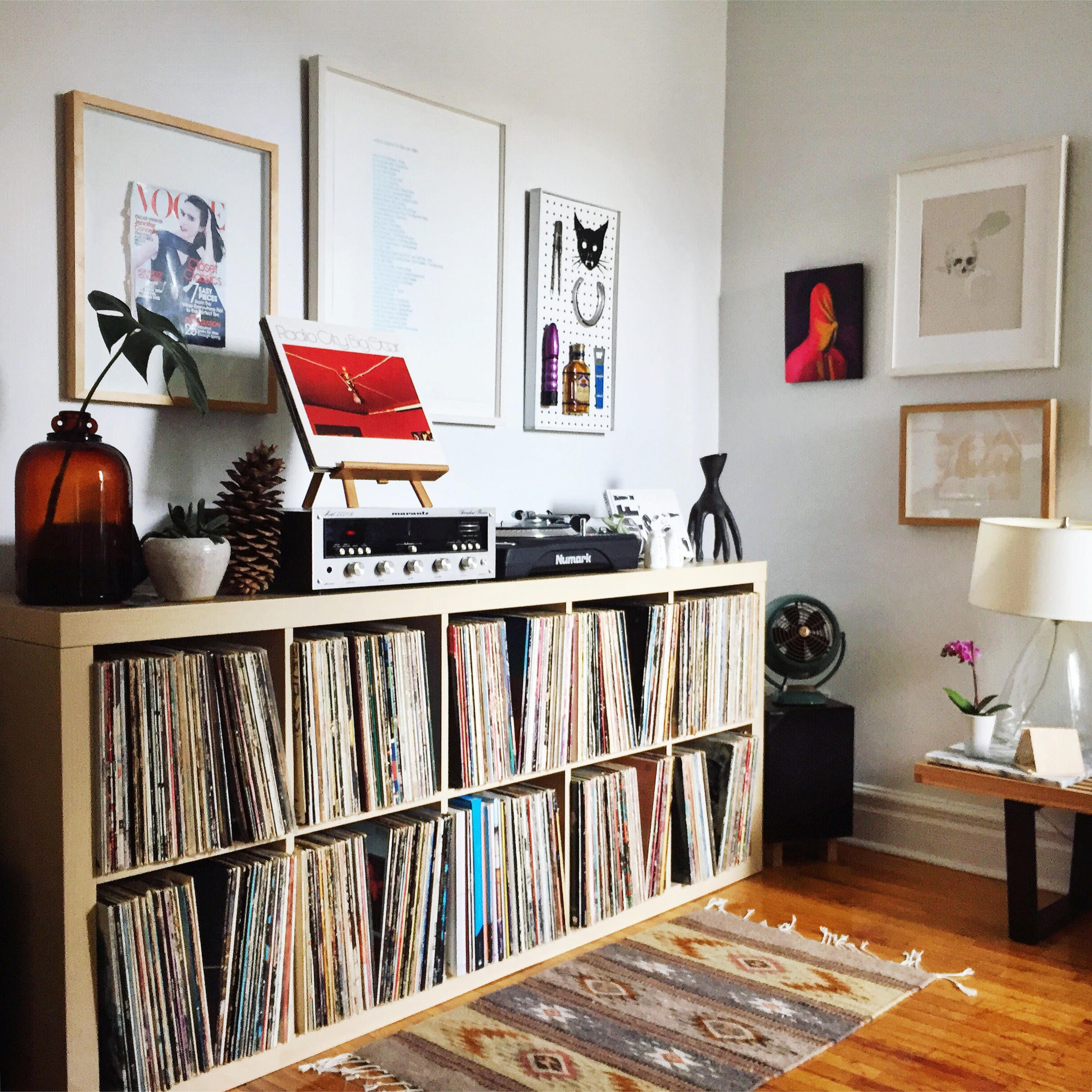
I like to throw in a dash of dirty ‘70s décor into my spaces (think vintage fibre art, rattan, brass and lots of crazy plant lady action). I also get a kick out of juxtaposing harder, more minimal pieces with organic, handmade elements. Nothing sexier than mixing materials — keeps things from looking too matchy-matchy.

Right away, we get to see the best vintage find of all - the Don Freedman wall hanging that totally makes the living room, which fellow Torontonian Jo @jmwearing hooked her up with. 

Freedman designed a whack of super fun and deliciously kooky fibre art for Interlude in the 70’s. The colours couldn’t go more perfectly with what we have going on in the living room and that wall was crying out for a little sum sum!

Despite its urban location, the decor channels an aesthetic that used to be typically found in the southwest - but now is taking locations far & wide by storm. 

Sometimes I like to pretend I’m staying at an Airbnb situated somewhere in Joshua Tree and not living in a rental in downtown Toronto. A girl can dream, no?

The whole home has the vibe of an artist's studio - relaxing, interesting, with plenty of conversation-starting pieces. It's the kind of place that absolutely inspires with quality pieces that have been carefully curated and melded together. What I love about Elaine is that she naturally leans toward one-of-a-kind items, so you won't find many big box purchases! 

And finally, Elaine leaves us with a big heaping for gratitude for this crazy design community of which we're all a part: 

I’ve just been awestruck about the amount of creativity, inspiration, and goodwill I’ve encountered from the online home décor and design community. At first I felt like a total goof hashtagging posts on Instagram—but then I realized that’s how you find your “people.”

Hashtags are how we came to find each other, so we certainly those same feelings. Thank you all for following along, and thank you to Elaine for showing  us around her gorgeous home. Follow along on Instagram at @lana_gto for more.