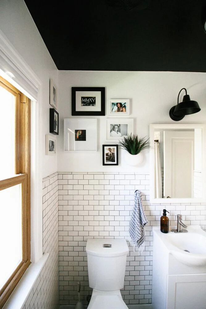
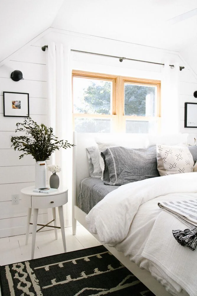
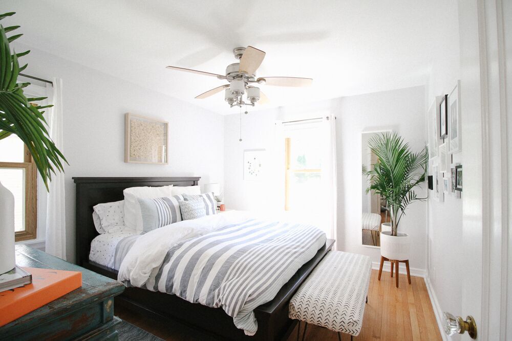
We at StyleMutt love supporting others in our design community, so today, we have quite the treat! We're touring the home of Elizabeth Bear, a designer based in Colorado.
Elizabeth started her business with the encouragement of her friends; as they watched what she did with her own home, they encouraged her to bring her services to others. It's a story that many of us know well but few have the courage to act on.
From Elizabeth:
“When I moved to Colorado, we purchased our home and spent a lot of time renovating it. Once again, friends took notice and asked me to help them design their spaces. When I discovered Instagram, I began using it as a platform to showcase my style. Little did I know, my Insta community would grow to over 10,000 people in less than a year. Now I combine my passion for interior styling/designing with my newfound love: working with brands. There are no rules to designing a dream home it’s just a matter of figuring out the best path to get there.”
What started as a barrette and accessory business in 2003, after Elizabeth left the corporate world, soon became a full-time job. It grew to artwork, pillows, pillowcases, and placemats, all handmade by Elizabeth. Her business took off from there, with her style evolving as life led her through twists and turns of its own.
“I got married a few years after college and our home had things given to us from our families all of which were more traditional, sprinkled in with things we purchased that were more contemporary. After my husband passed away unexpectedly four years later, I sold my house and everything in it that didn’t speak to my soul. I only kept my favorite things. I renovated a three-story townhouse taking it from dated and old to modern and bright and it only contained the things I love. It truly felt like me.
Two years later, my path crossed with my college sweetheart, who was living in Colorado, and we got married. When I moved there everything that came across country with me was my current design style. It’s interesting because this style is what I was drawn to when I was a teenager. Somewhere in the midst of adulthood this style got lost. When I moved into the townhouse I sold everything, but my most favorite pieces. Claiming my new home resurfaced my love of modern, orderly, clean lines, light, bright, white, welcoming, peaceful, less is more.”
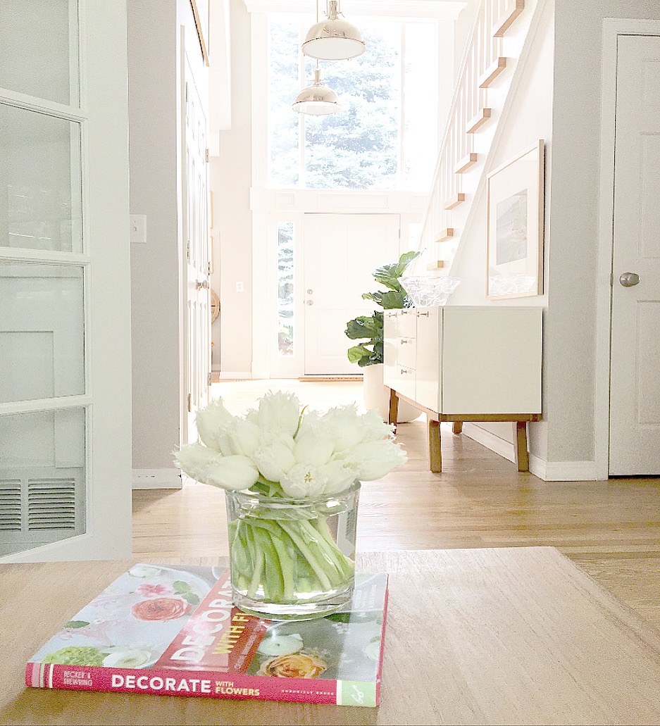
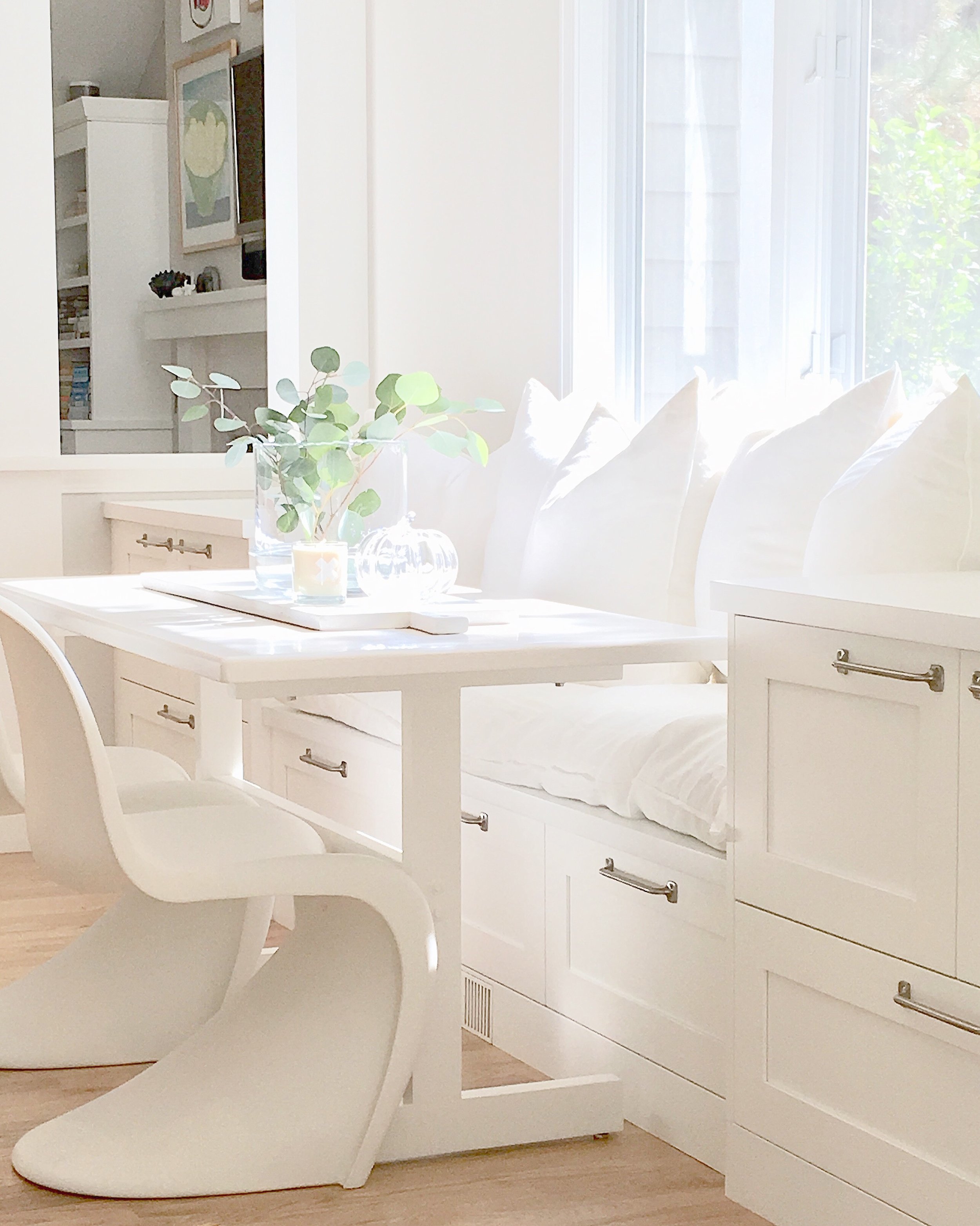
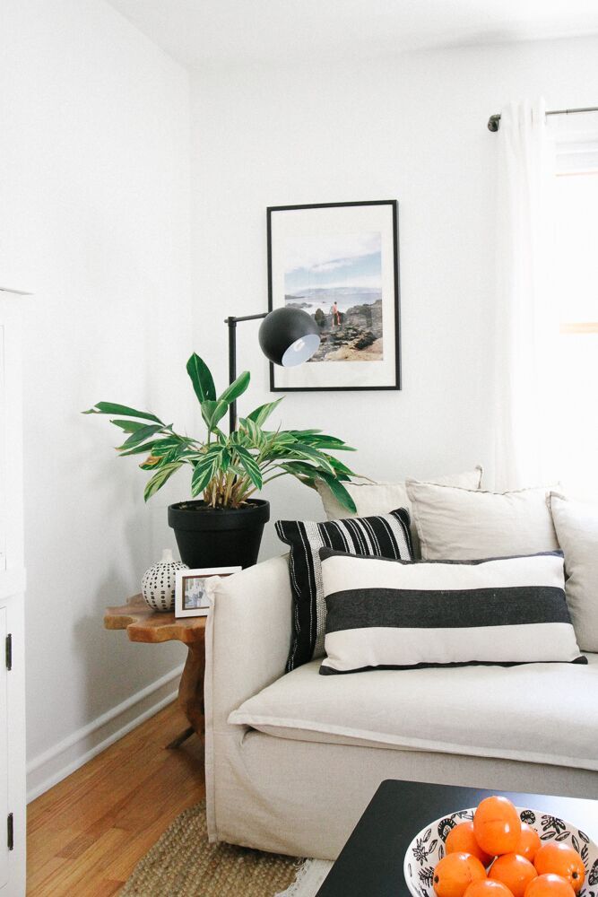
Her home is a reflection of everything life has brought her, and it's a stunningly beautiful reflection indeed. She's created a home that is natural, intentional, intuitive, and warm. It's a 'Goldilocks' home - not too much, not too little, but just right. There are clean lines mixed with nostalgic pieces, and everything is functional.
In the dining room, the freestanding white hutch steals the show.
“We had it custom built by our kitchen company to match the custom cabinets flanking the fireplace, in our kitchen and the built-ins in my husband’s office. Because we have an open floor plan, it was soothing for me to have all of these built in cabinets be cohesive. This hutch adds visual beauty in the room as well as wonderful extra storage space for my collection of pottery, which can be seen through the glass doors.”
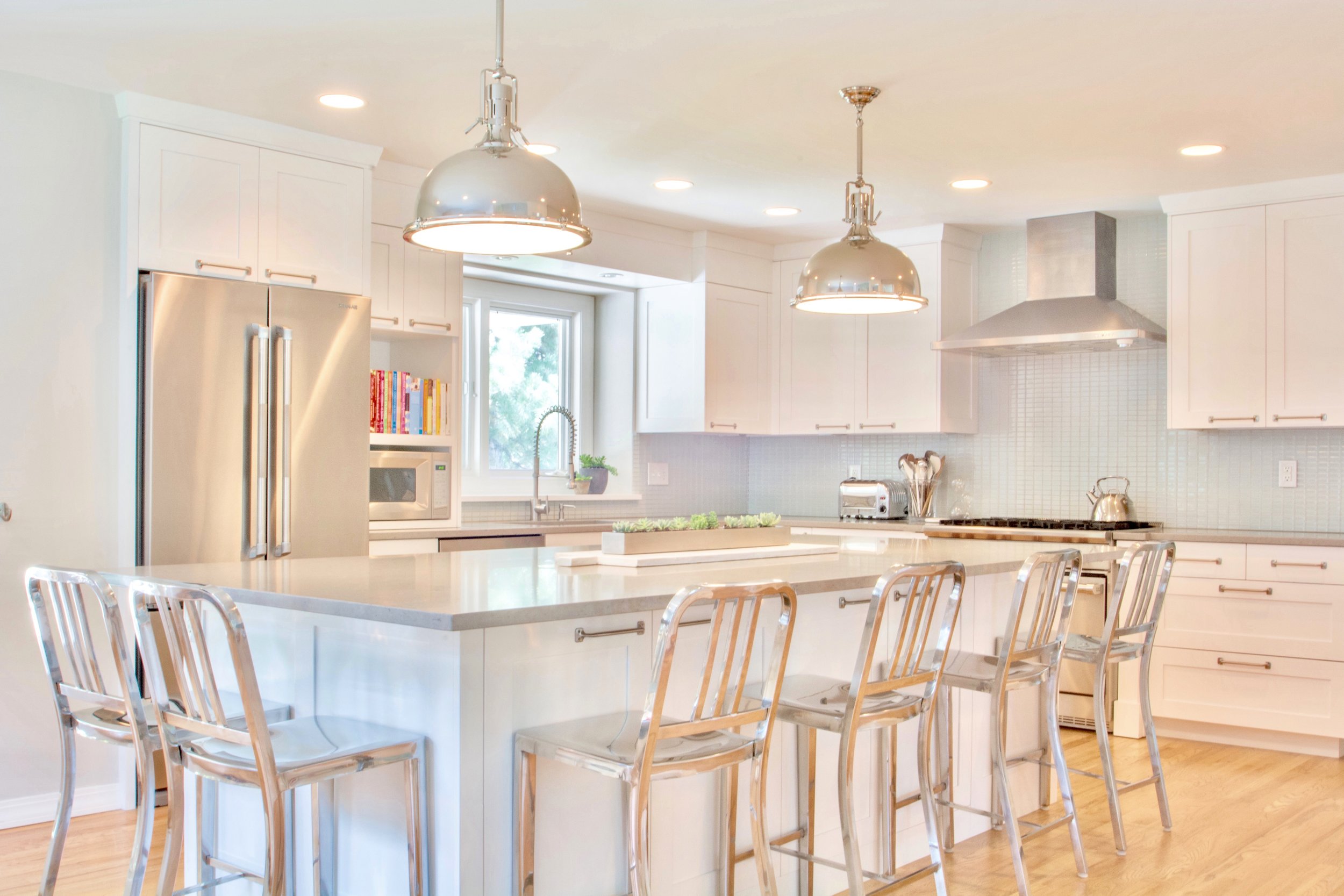
It opens right into Elizabeth's biggest splurge and the heart of the home - the kitchen.
“In my kitchen my favorite thing is our large island which seats six people and is the heart of the home when we have a party (large or tiny) and actually when it’s just us. My husband and I love cooking together so this provides plenty of space to do it on - giving us ample room to make a mess and have fun!”
It's a home that's made for memories. And Elizabeth, we are so honored to share it with you! Thank you for showing us around - and congratulations on the home you've made and the business you've built.
Find more about Elizabeth on her site and on Instagram @elizabethbeardesigns.
