Hey there! It’s been a bit since I’ve written a post on a finished project! In this time of produced stories and reels, I’ve missed writing and sharing work this way. This project is on the larger side (I worked on 9 individual rooms in this home), and with this quantity of spaces I prefer showcasing the project as a whole this way!
This home is tucked into an old Alexandria neighborhood, just a few miles from the Pentagon. It’s rich with history and has been added onto from its original walls. The clients were a young family ready to put down some roots, and I had an absolute blast working with them! Very cool style, very open to unique ideas and ready to implement the designs for each space with fury. They moved quickly on the ordering process and this home was complete in record time! Let’s take a look at the home these clients purchased:
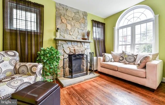
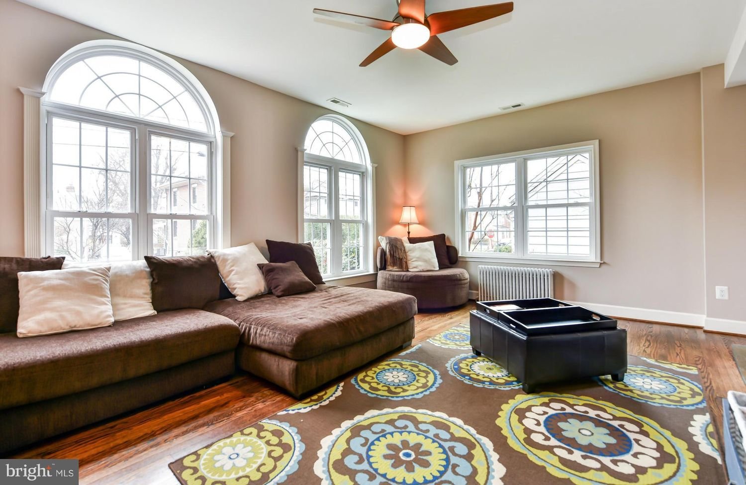
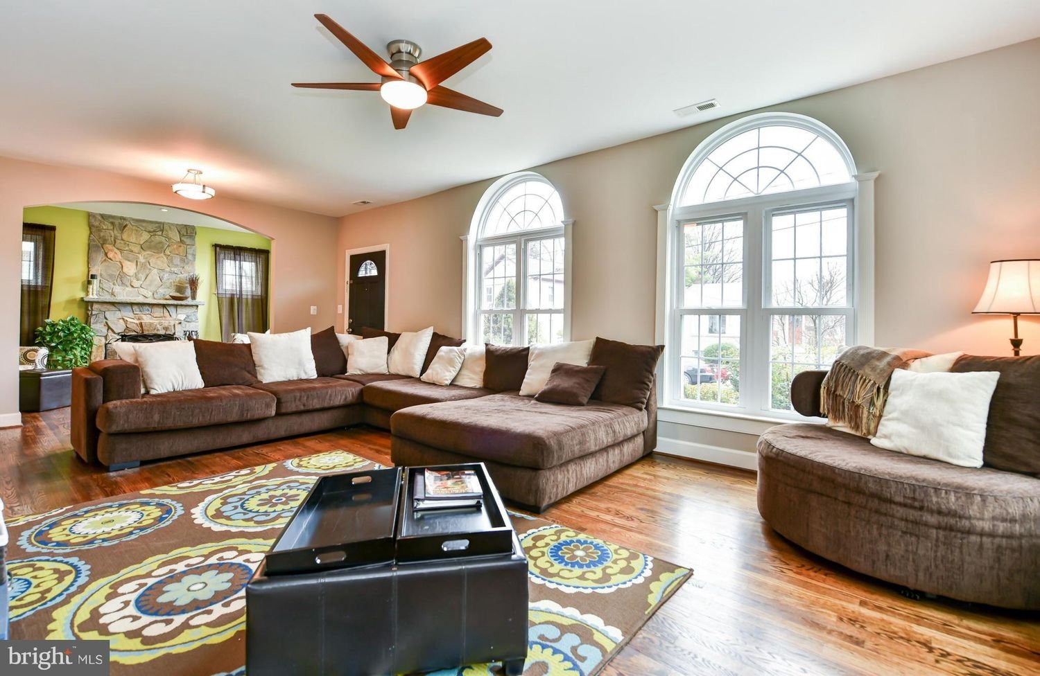
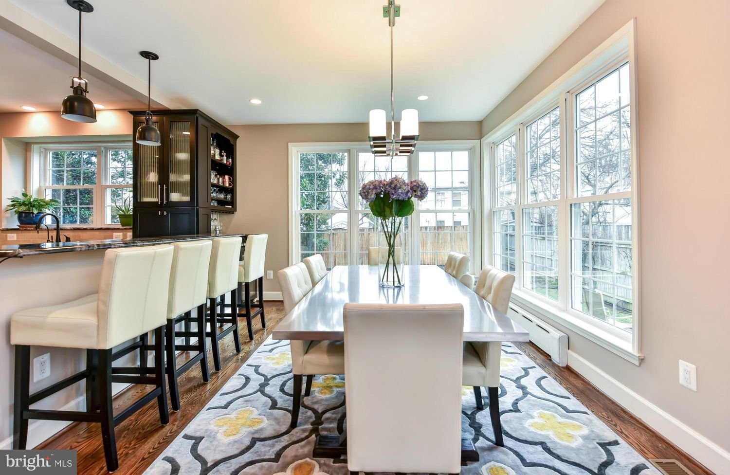
Gorgeous light absolutely floods this home from all sides! That was my first impression. My second was that the current wall colors were not benefiting this home, or really honoring the character of the home itself. With older homes like this, I never want to take away from their history with design elements, but rather enhance the history. We stuck to pretty traditional tones throughout this home, even where we went with slightly more modern furnishings, as you’ll see ahead.
Den
From green to green! I chose a much more earthy green for this space and decided to pair with black velvet armchairs. The clients chose to keep their sputnik style floor lamp and intend to limewash the stone soon. But this space feels so much calmer now and has become a favorite place to read for the client.
Gotta love off-centered architecture!
Living Room
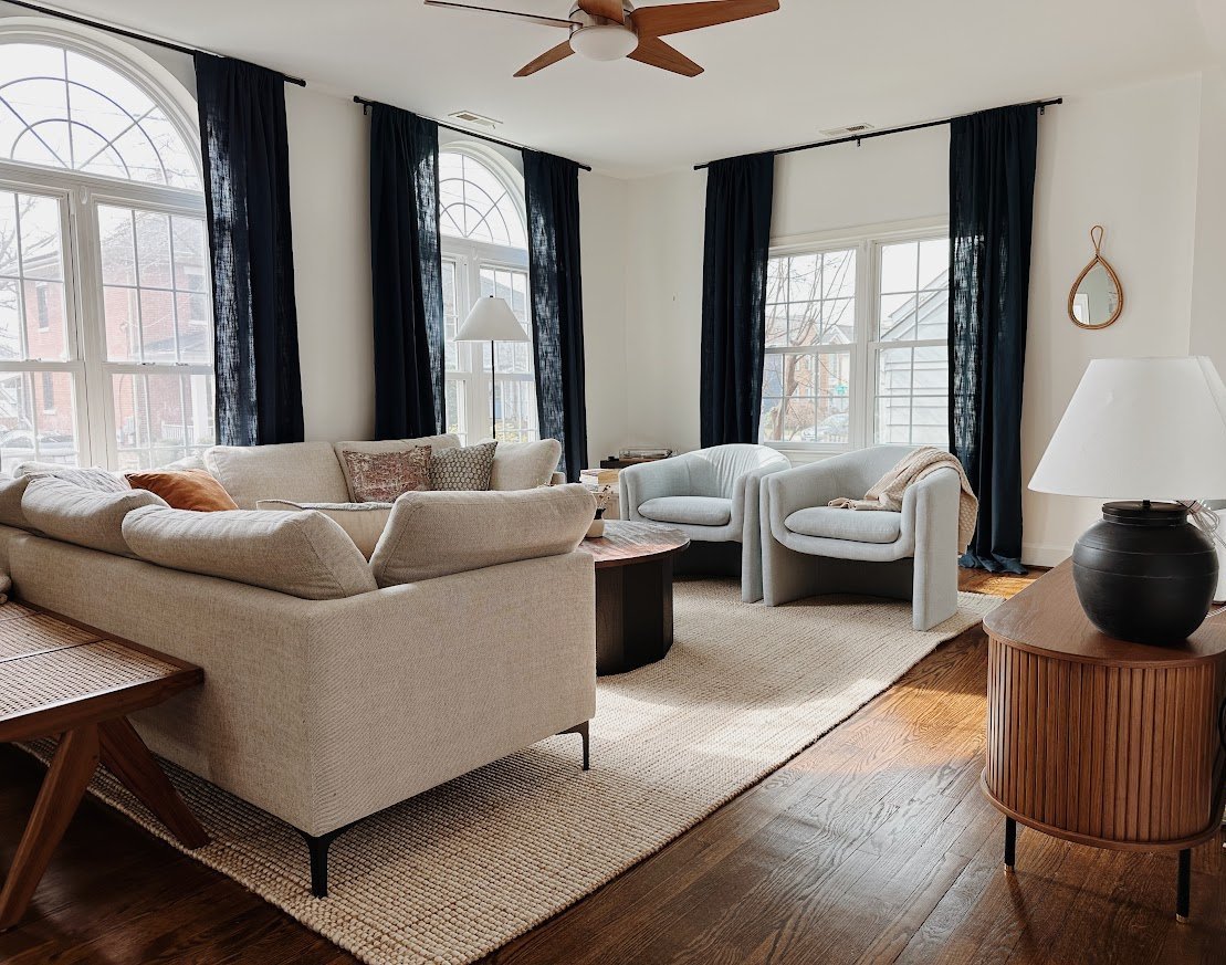
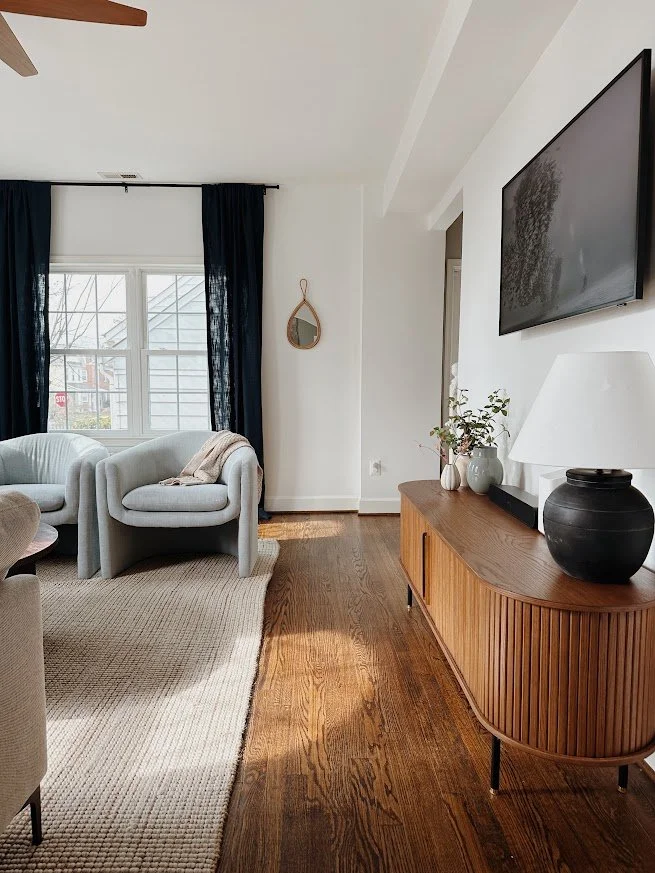
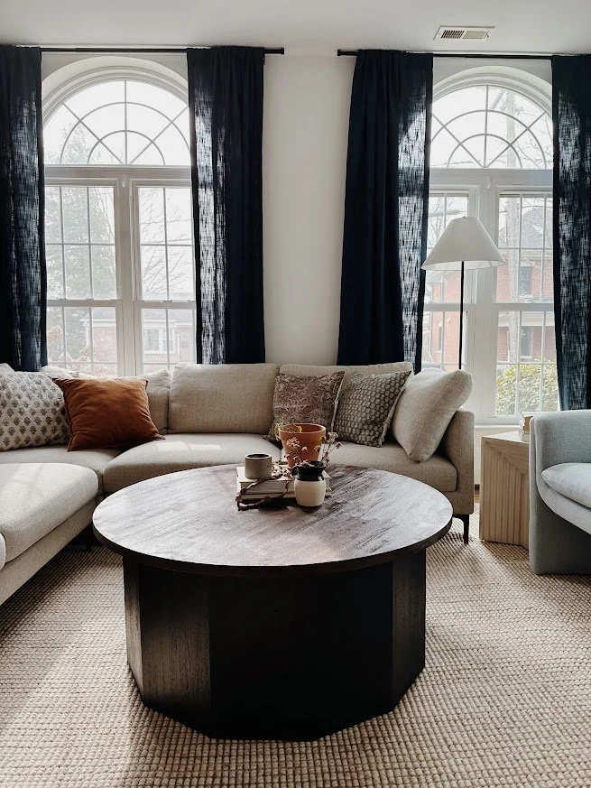
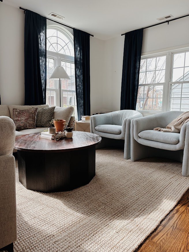
One of the trickier elements in this room was how to treat the arched windows. I wanted to showcase them well and ultimately decided to hang the curtains as high as possible, despite the arch. I think the arches are even more dramatic now! I maintained a simple palette in this space, and focused on interesting pieces that would still provide function and comfort. The fan is among the items I had sourced an alternative for, butthat will have to wait for room in the budget, understandably.
I adore the balance of drama and comfort we brought to this space. It’s just the most beautiful blend of both! I think dramatic can be mistaken for fancy, but this space is heavily used for lounging - just as it was intended. The architectural elements and sculptural pieces make it stand apart from what one might expect of a family room, and I love that about it. It’s a little unexpected but still does the job.
Dining Room
The dining area was previously filled with disproportionately large and contemporary furnishings. It made me forget how old this home actually is! Grounded with a vintage rug and furnished with modern twists of traditional pieces, this beautiful sun kissed room feels current with a nod to the homes history. The light fixture will be the last item to swap, and I’ve selected a simple linen drum pendant to tie a bow on this space.
Half-Bathroom
Just some easy cosmetic changes in here! This little room got a floor to ceiling makeover with fresh paint (same color s the den!), vanity faucet, mirror, towel ring, art and rug! Though simple and straight forward, these little changes do add up to a huge improvement!
Master Bedroom
While the living room is a balance of dramatic and casual, this space is a perfect blend of rich and neutral. The deep copper brown velvet bedspread just catches the sunlight in all the right ways and reflects off the surrounding elements beautifully.
I love mixing materials in a room, and here I used hot rolled steel nightstands paired with a fully upholstered bed and a wooden bench. I love to curate a room from complimentary pieces rather than pick a whole room from a website or magazine! I think this adds character to a space and better reflects the individuality of each client and home.
Nursery
Not a whole lot to do but just take in the striking colors here! I think the challenge with nurseries is always wondering whether to create a space for right now, or a room for a child to grow. This feels like a lovely balance of sweet baby cuteness and a space that can easily evolve as little one grows.
That’s a wrap! Thank you so much for coming by and checking out this latest. I am so grateful to get to do this work and to share the finished product here with you!


