Reader Design: Sara's Approachable Rental

It's December 1. Where has 2017 gone?! 

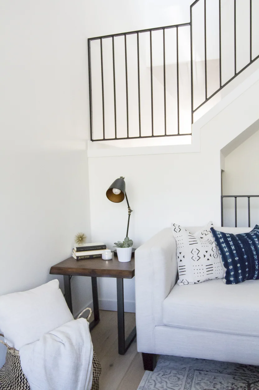
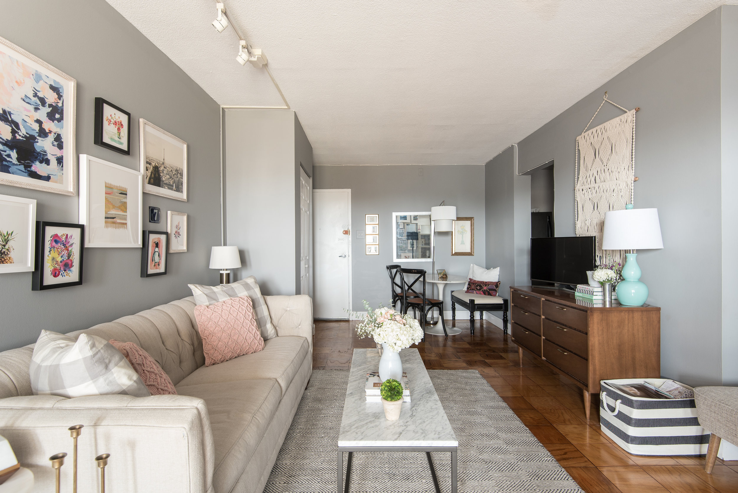
While I sit here and reminisce, let's take a trip to DC, where I lived at the start of this year. We're off to explore Sara's rental in our nation's capitol. Sara's one-bedroom spot is a step-up spatially from the studio she once had - the same spot that inspired her to start sharing her design tips in the first place.

nov 10-012.jpg
nov 10-025 (1).jpg
nov 10-031.jpg
I started my blog because I didn’t find enough resources for studio apartment decorating and living when I first moved into my own studio apartment in DC a 4 years ago. I’ve since upgraded to a one bedroom, but after living in studios and apartments under 800 square feet, I really enjoy the process of designing a space on a budget and that’s entirely renter-friendly. It will probably be awhile before I own a place, so the challenges of making a rental your own are really fun. If your home or apartment is a rental and a place where you spend a lot of time, it should make you happy and reflect your style. Whether it’s new paint, changing out the hardware, adding art or anything else- I believe every home can be beautiful- rental or not!

Sara has pulled together the perfect home base escape, with mid-century, Parisian, and Cali cool vibes throughout. 

nov 10-027.jpg
171110_SSB_3537.jpg
I strive for my home to be inviting, stylish, yet approachable. I want people to admire the space, but also feel comfortable to sit anywhere and put their feet up. I don’t believe any space should be too ‘stuffy’ or so ‘perfect’ that guests are afraid to touch anything. I also have a dog (who is allowed on the furniture) so everything must be pet-friendly, too!
nov 10-049-Edit.jpg
171110_SSB_3518-2.jpg
nov 10-060.jpg

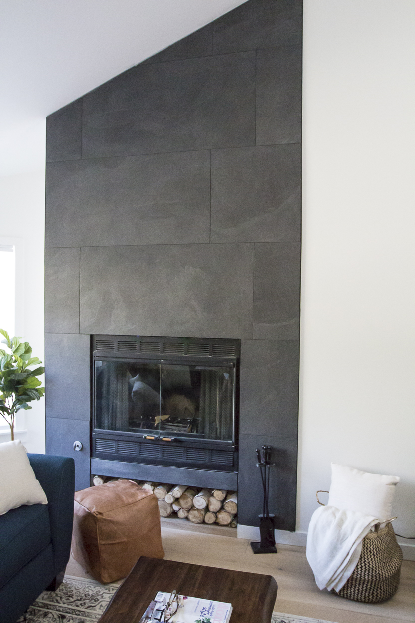
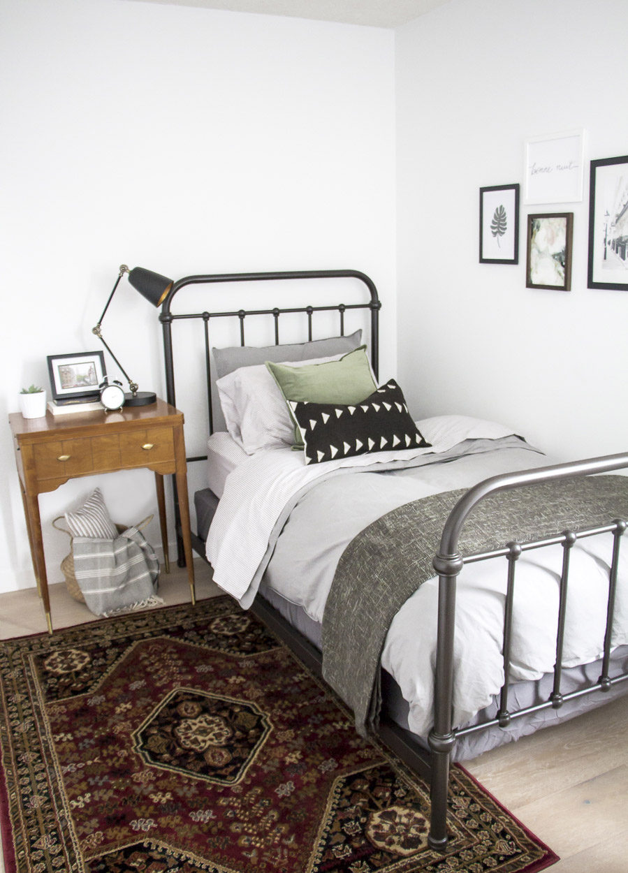
In her home, Sara keeps things simple and calm with neutral tones and subtle pops of visual interest, using color, patterns, and texture. 

The images all over pinterest and instagram constantly give me the urge to paint every inch white and go very scandanavian and remove all color from my place. However... I don’t think I would realistically like that long-term. My apartment is fairly neutral but I do like a pop of color here and there. My bedroom is all white and muted pink accent of the rug and metallic elements keep the space calm and neutral and it’s really relaxing to come home to each night.
171110_SSB_3506.jpg

Since the room is rental, Sara still keeps her design budget-conscious and smart.

I’m always willing to splurge on bigger staple pieces that I know I’ll use for 5-10 years or more. My bed frame and my sofa were both on the higher end of the price scale but I know they are quality investment pieces that I’ll use for years to come. I try to save on accessories and other elements in the apartment- scouring thrift stores and craigslist for great vintage finds.

Sara, thank you for showing us around your home! And thank you, Laura, for the stunning eye candy.

Follow Sara along on Instagram @studiostyleblog for more! Follow the talented @laurametzlerphoto for photos like these and more!
McKenna Sig.jpg

Reader Design: Diane's Intuitive Home

It's clear when you peek into Diane's home that she really went with her gut. Diane shares her PNW home with her boyfriend, and its laid back vibe and simplicity make it the perfect place to unwind. No item necessarily comes from the same family - some are boho, some traditional, and some minimalist - but every piece works together to create "home."

2.jpg
1.jpg
4-1.jpg
I’m a firm believer that if a product speaks to you, it will work with your aesthetic because it will be among other items you love and are drawn to. Letting my intuition steer my decisions helps create a space that evokes who I am without adhering too much to trends.

This often requires patience. Diane is rightfully focused on carefully and intentionally creating a home not just for herself but also for the other very important person who lives there. After all, a home is meant to be representative of all who live in it. 

Take the living room for instance.

The print is a film photo my boyfriend took during a vacation to Europe - the space above our couch was bare until a few weeks ago because we were waiting for the perfect piece, and I’m glad we prevailed. It was meant to be.
4.jpg
7.jpg
2-1.jpg

Another example in the value of patience? Diane's perfectly on-trend dining chairs. 

They have been my best Goodwill score to date; I got all four for $20, and they just needed a little polish on the chrome. The wood has a perfect weather to it and the cane is still in tact.
6.jpg

At the end of the day, Diane is focused on one thing. 

It’s as simple as coming home to a space you enjoy and want to spend time in. I feel much more at peace when I’m surrounded by beautiful things I love. You have to appreciate the journey knowing the effort you’ve put into curating your home, even though I always feel it’s a work in progress (as I’m sure many others do as well! We are ever-evolving as human beings).

Diane, you keep doing you! For more, follow Diane along on Instagram @dklawrence.

Enjoy your Thanksgivings next week, mutts, and we'll see you back with more Reader Designs in December.

McKenna Sig.jpg

Reader Design: Kristina's Evolving Home

Kristina's Edmonton, Alberta home is a perfect balance of trendy and lived-in. Her style is recognizable enough to welcome you in, to feel familiar, but there are still plenty of surprises to keep things interesting. 

 
IMG_3796.jpg
 
IMG_3806.jpg
IMG_3808.jpg
My home style is honestly ever evolving. But at the moment, I’m in love with mid-century modern, with some Scandinavian decor to pay tribute to my roots! My family is mainly from Sweden and Norway, so I tend to gravitate to the style I grew up seeing around me.

Harkening back to her heritage, Kristina has figured out what works for her aesthetically but also is comfortable and homey for her family. It's a far cry from when she first started out and fell prey to something I'm sure all of us know well: opting for mimicery and copycatting to create something "on trend" without much regard to our personal styles. Perhaps those style were not yet part of us, or maybe the hype of Pinterest was too hard to resist. 

As Kristina shares: 

When I started decorating my first home, I got pulled into that shabby chic trend since it was all over Pinterest! And I really struggled with it because it truthfully wasn’t me! Over the years, I started to figure out what trends I could get behind (hello white walls!!) and which ones I could let go. I still love being influenced by the trends of course, but I’m getting better at fine tuning my own style.
IMG_3665.jpg

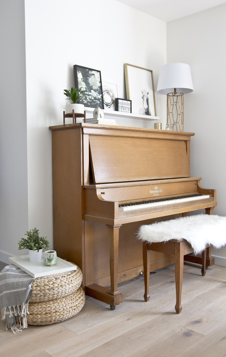
In the living room, Kristina's favorite piece has become even more special since the birth of her son. 

My favourite piece in the living room would have to be my Nana’s piano. It has been in the family for many, many years and took quite the journey across provinces to get here. Even though I don’t know how to play, its presence in our home brings me so much joy, especially when I see Jack sitting on someone’s lap, plunking away at the keys.
IMG_1944.jpg
IMG_1968.jpg
IMG_1300.jpg
In our bedroom, I absolutely love our DIY dresser, which I did on a whim with my husband. Little did I know that simple makeover would be such a hit with so many people. It’s my little success story that I’m really proud of (especially since I’m not the biggest DIYer).
IMG_2060.jpg
IMG_2079.jpg
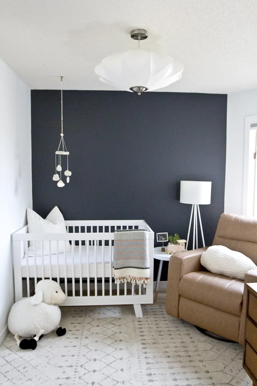
In Jack’s room, I love our vintage dresser that I spotted on a trip through BC. It was exactly what I was hoping to find - mid century, wood, clean lines - and is the perfect piece to have as he grows and changes.
IMG_3729.jpg
IMG_3762.jpg

Every space in this home feels perfect for a young family - it's cohesive, calm, and perfectly curated. Kristina, thank you for showing us around; I can't wait to see what's next! 

Follow Kristina along on Instagram @inspiredbylynne for more! 

McKenna Sig.jpg