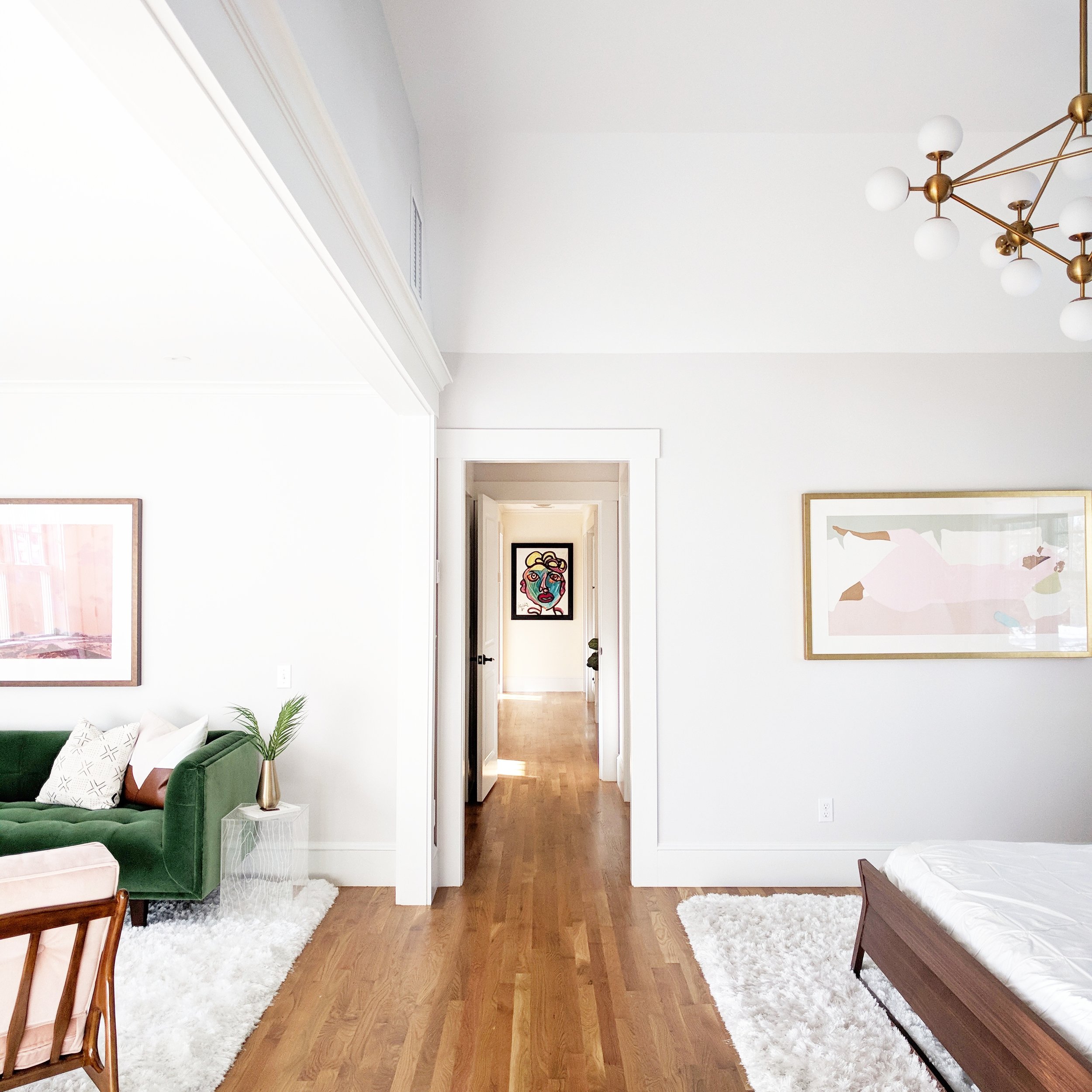
Reader Design: Oksana's Charming Home

A home is nothing if not a place of love, and love is clear in Oksana's home in Chattanooga, Tennessee. The family home, which Oksana shares with her husband and their baby girl, is full of European charm in the middle of the South.

Oksana fell in love with interior design in July of 2015, when she and her husband bought a 1930 bungalow that was previously abandoned for 20 years. Since then, the couple has worked to bring the house back to life, tackling DIY projects like nobody's business and documenting the fun renovation adventures on their blog, Foxy Oxie

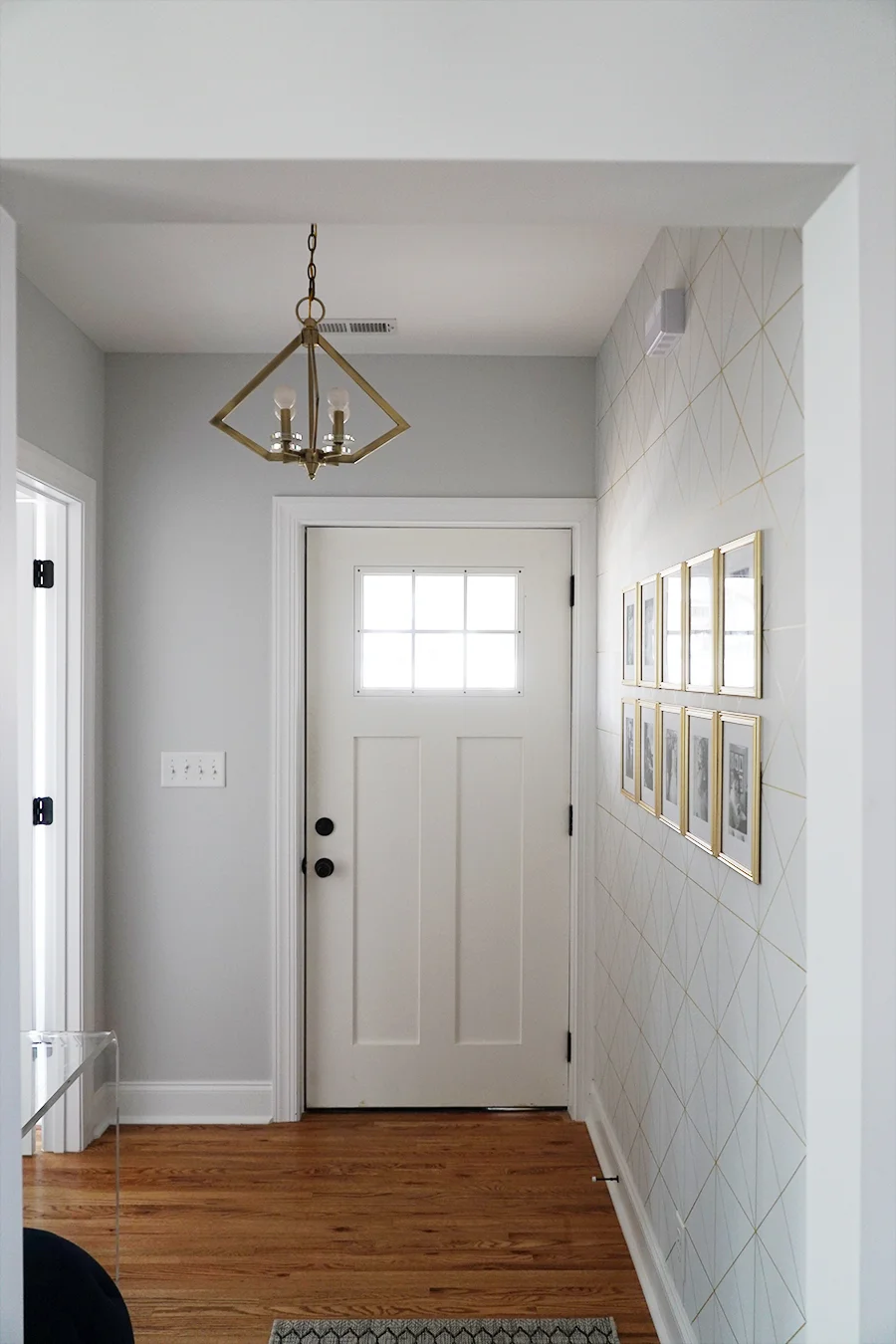
FOXY OXIE - Entryway 2.jpg
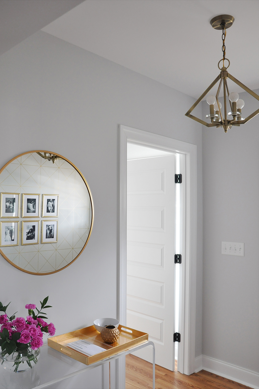
FOXY OXIE - Entryway 3.jpg

From Oksana:

I wouldn’t say I have a particular style, but I am drawn to an aesthetic of clean lines and geometric elements juxtaposed against more traditional silhouettes. The key, for me, is balance. I want our home to feel sophisticated but also real and honest and truly reflective of our everyday life, especially now that we have a young daughter and another little one on the way. I find that playing up opposing styles – feminine and masculine, soft and edgy, modern and traditional – is a great way to showcase personality in design.

I am a compulsive redecorator by nature, and my style is ever-evolving. But I always, always gravitate towards a neutral color palette with lots of texture. Every now and then I’ll add in a pop of color – the latest being a moody teal – but it never lasts.

More important to me than a specific style, however, is the overall feel of our home – and that’s something that is based on individual design intuition and varies greatly from person to person.
FOXY OXIE - Kitchen 1.JPG
FOXY OXIE - Dining Room 1.JPG
You’ll find a lot of European design influence in our home – from our Italian cantilever dining chairs to the French-inspired dining table to our Chesterfield-style sofa.
FOXY OXIE - Living Room 4.JPG
FOXY OXIE - Living Room 2.jpg
FOXY OXIE - Living Room 5.JPG
FOXY OXIE - Living Room 6.jpg
I know first-hand the transformation nature of a well-designed room. Our surroundings have the power to instantly lift our spirits, increase productivity and improve our quality of life. Beyond the aesthetics, I strive to make our home feel relaxed – and a big part of that is maintaining a clutter-free environment. You have to give rooms breathing space. For example, I am one of those rare individuals whose countertops are (almost) always empty. Decluttering sprees are a regular occurrence in our home. And as much as I love arranging pretty vignettes, I am not a fan of displaying decorative tchotchkes for the sake of filling a space.
FOXY OXIE - Master Bedroom 1.jpg
FOXY OXIE - Master Bedroom 2.jpg

Instead of knick-knacks, Oksana gravitates toward more permanent fixtures.

I am very particular about our light fixtures and am always willing to splurge for just the right one. Lighting is truly the jewelry of a room, and just like a well-designed piece of jewelry can instantly elevate a rather simple outfit, light fixtures have the same effect on a room.
 
FOXY OXIE - Nursery 1.jpg
 

Every room is full of love, yet simple; graphic and bold, but timeless. Perhaps it's the combination of Oksana's career as a graphic designer and her family life as a wife and mother that brings balance to bear. Regardless of the reason, it sure has created a beautiful home!

Oksana, thank you for the tour today! 

Follow Oksana and her family along on Instagram at @foxyoxie.

McKenna Sig.jpg

Reader Design: Gemma's Artsy Home

Today, we're off to visit Gemma's bright and fresh home; this Boston place boasts a ton of quirky prints, color and texture, tons of natural light, and some seriously amazing art. Ready for the tour? 

IMG_20180130_144210-01-01.jpeg
IMG_20180105_132407-01-01.jpeg
IMG_20180130_135701-01.jpeg

Even the entry way smacks you with style right away! From the design extraordinaire herself:

I have a hard time defining or labeling my own design style in my home; it’s more of a feeling. I definitely have certain shapes that I prefer; for example, I always pick furniture with clean simple lines, and art tends to be the same way. I prefer minimal designs, and I don’t like anything ornate which is probably why I’m attracted to mid century furniture pieces. By sticking with fairly simple shapes, it gives me a lot of room to decorate with other aspects like color, wallpaper, art, and lighting.
IMG_20171106_111700-01-01.jpeg
IMG_20171111_131552-01-01.jpeg

Each room uses that basic formula - simple, clean furniture + geometric shapes + interesting accents - and just knocks it out of the park. The use of natural elements like wood also helps each space feel incredibly balanced. 

One of my major design goals is to have the house be interesting and inviting but not cluttered. Some areas have really bold wallpapers, but I try to keep all the other elements very simple so as not to overwhelm the room.
IMG_20171231_084904-01-01.jpeg
 
IMG_20180226_112916-01.jpeg
 
IMG_20180208_132224-01.jpeg

Even the mudroom gives a major statement!

My mudroom is a good example of an over the top wall covering, balanced by very little else in the space - necessities only. But that said, the house is comfortable. We have 3 little boys and they play all over and do what little kids do, so storage is a must. Every cabinet in our family room is packed with games, toys, legos, and stuffed animals so that they can easily access stuff they want to play with, but also put it away again.
IMG_20180219_141924-01-01.jpeg
IMG_20180319_115636-01-01.jpeg
IMG_20180101_131234-01.jpeg

One of the key ways Gemma adds interest is art.

My favorite design elements in our house are our pieces of art. Looking at beautiful artwork gives me such genuine pleasure and an emotional connection. We’ve collected our art from all over the place from varying sources, and the pieces are all very different. Many are one of a kind items we’ve found in vintage stores, others are from estate sales, and others are from galleries. Art is the one place we are willing to splurge.
 
IMG_20171114_091903_688.jpg
 

In the bathroom, the star of the show (other than that tub...wow!) is the iconic Slim Aarons Palm Springs photograph (he's a personal favorite of mine). 

Two other ways to add detail? 

Lighting is another great way to express yourself; it can be a forgotten element yet can bring so much interest into a room. And a personal favorite of mine, books - I read a ton and I love holding and having books. My next project in fact involves some serious shelving to house all of our books that are currently homeless!
IMG_20170828_161315-01.jpeg

This house has to be one of the most original ones I've seen in a while. What a place to raise and spend time with your family!

Gemma, thank you so much for the tour.  Follow Gemma along on Instagram @gemmavanderswaagh for more! 

McKenna Sig.jpg

Reader Design: Angela's Authentic Space

Yesterday was International Women's Day, and today, we're all about praising authenticity, love, and strength in this powerful StyleMutt community. Angela, who is hosting us in her home today, is a perfect example of all three of those things. This home for six plus her dog is a clear labor of love.

Image.jpeg

From Angela:

I’m not sure if I really have a specific style. I just buy what I like. But it could probably be described as a little midcentury modern, a little boho, and a little Scandinavian. I aim for all of the rooms to flow together and feel cohesive.
Image-1.jpeg
Image-18.jpeg
Image-6.jpeg
My goal for this house is for it to feel comfortable and to be a haven for us to relax and unwind. We are very informal, and the majority of items in our house are thrift or clearance finds. I never want our kids or guests to feel like they can’t touch something.

Our living room is our main hangout place..we have fires in the winter. The kids play piano and my husband plays guitar, and most nights we are having a dance party to our favorite songs on our Alexa.

The dresser in our living room is one of my favorite pieces. I found it on the Facebook Market place for $25! We keep games, audio books, art supplies, and of course play-doh in the drawers.
Image-7.jpeg
Image-9.jpeg
Image-8.jpeg

Function is absolutely key for this family, and Angela has made small changes to improve life from day-to-day. An example?

Another goal of mine is for our house to be completely functional and realistic for our family. We turned our front entry coat closet into an office nook this last summer. We now each keep our coats and shoes in our own bedroom closets. It’s a lot less clutter, and this space is much more functional now.
Image-14.jpeg
Image-15.jpeg

Angela's use of neutrals and plants makes the home a place her entire family can look forward to spending time in. It's clear this family loves to be together, because they've created a space that reflects their personalities and their values. 

Image-11.jpeg
Image-12.jpeg
 
Image-16.jpeg
 
Image-13.jpeg
Image-17.jpeg

Angela, thanks for hosting us today - and congratulations on your stunning home! Follow Angela along on Instagram at @restoring_home to see more. See you next week!

McKenna Sig.jpg