Reader Design: Lisa's Scandinavian Style

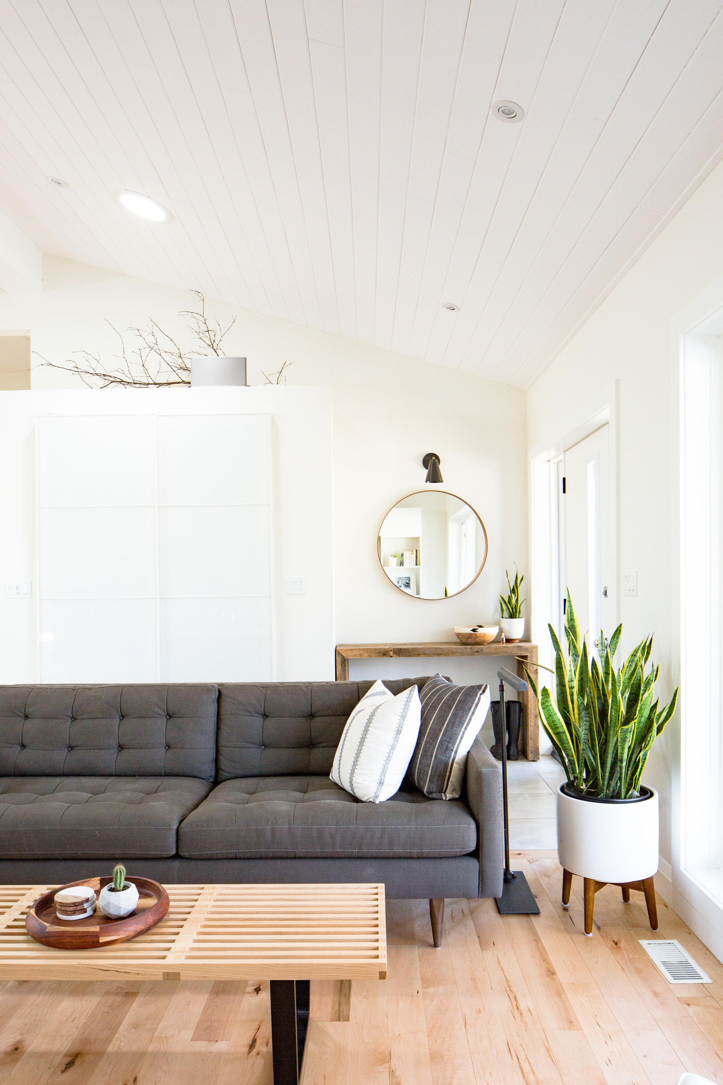
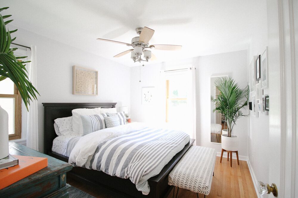
Let's take a field trip to Canada and Lisa's neutral, simple, and modern home. It's the kind of place where you can relax but also feel like you're in an upscale hotel - possibly one situated in an urban Scandinavian city. 

Growing up I spent a lot of time in Denmark visiting family, and I was definitely influenced by their modern, simplistic and practical style. I remember being surprised by the bright, open spaces and simple decor. It contrasted so much with our own 80’s home that seemed dark and congested in comparison. I haven’t been back in ages, and now that I have a better understanding of modern design I think I would be in heaven.
 
AH6A1447-2.jpg
 
IMG_4594.jpg
IMG_4754.jpg
AH6A1469-2.jpg

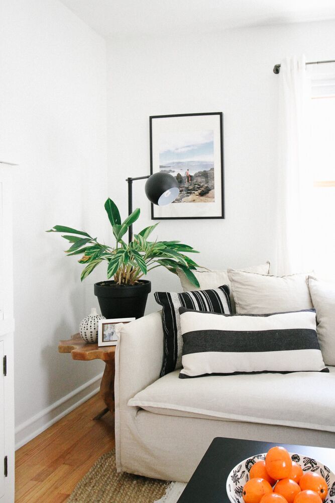
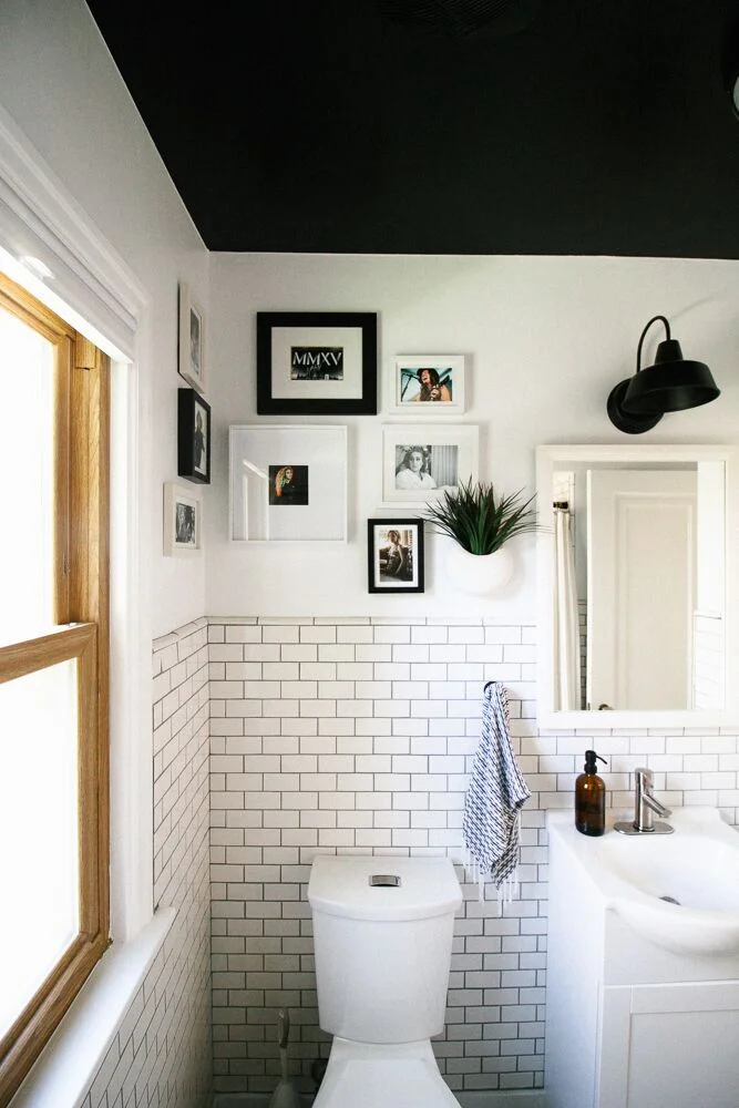
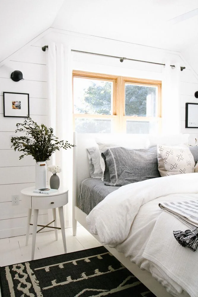
Sometimes Scandinavian or minimal style can read as cold, but Lisa still finds a way to make it warm and inviting for her family. 

More than anything I want my home to be a comfortable and inviting place for my family. I don’t think we get that feeling when a space is visually cluttered. On the other hand, too few things can make a place seem sterile, so I try to create balance by adding warm, natural elements like wood, leather, plants and textiles. I also prefer a neutral colour palate which creates a sense of calm. I recently purchased a couple of rugs for my home and they both have a rich colour to them, but work well with the surrounding neutrals. Textiles and artwork are two categories where I will make an exception to the no-colour rule.
AH6A1626-HDR-2.jpg
IMG_0760-2.jpg
AH6A1436-2.jpg
I try to avoid anything too trendy, preferring instead to invest in pieces that have been around for decades and have staying power. Also, for me, design has to be practical first, then stylish, not the other way around. I once purchased some gorgeous bedside sconces from a well known company, but when I turned them on they cast such a harsh light in the room. I was sad to return them, but there was no question about it.
IMG_4221.jpg

Morale of the story? Focus on timelessness, balance, and authenticity in the design. You will not get it right on the first try, but that's why stores have return policies, right? And eventually, you'll strike the perfect match with pieces like last, like this 85-year old Iranian bedroom rug from @rugandweave.

Great work, Lisa! You'll clearly created a home that works for your family - and that's quite the accomplishment! Thanks for the tour. 

Follow Lisa along on Instagram @lisafogt for more great design!

See you next week,
McKenna Sig.jpg

Reader Design: Madison's Bold Southwestern Style

When school brought Madison from Arizona to Boston, he took a bit of home with him. The result is a stunning space that is bold, bright, and imaginative and clearly derives its spirit from the Southwest. 

Let's take a look!

Wetter,Madison_StyleMutt_Hallway.JPG
 
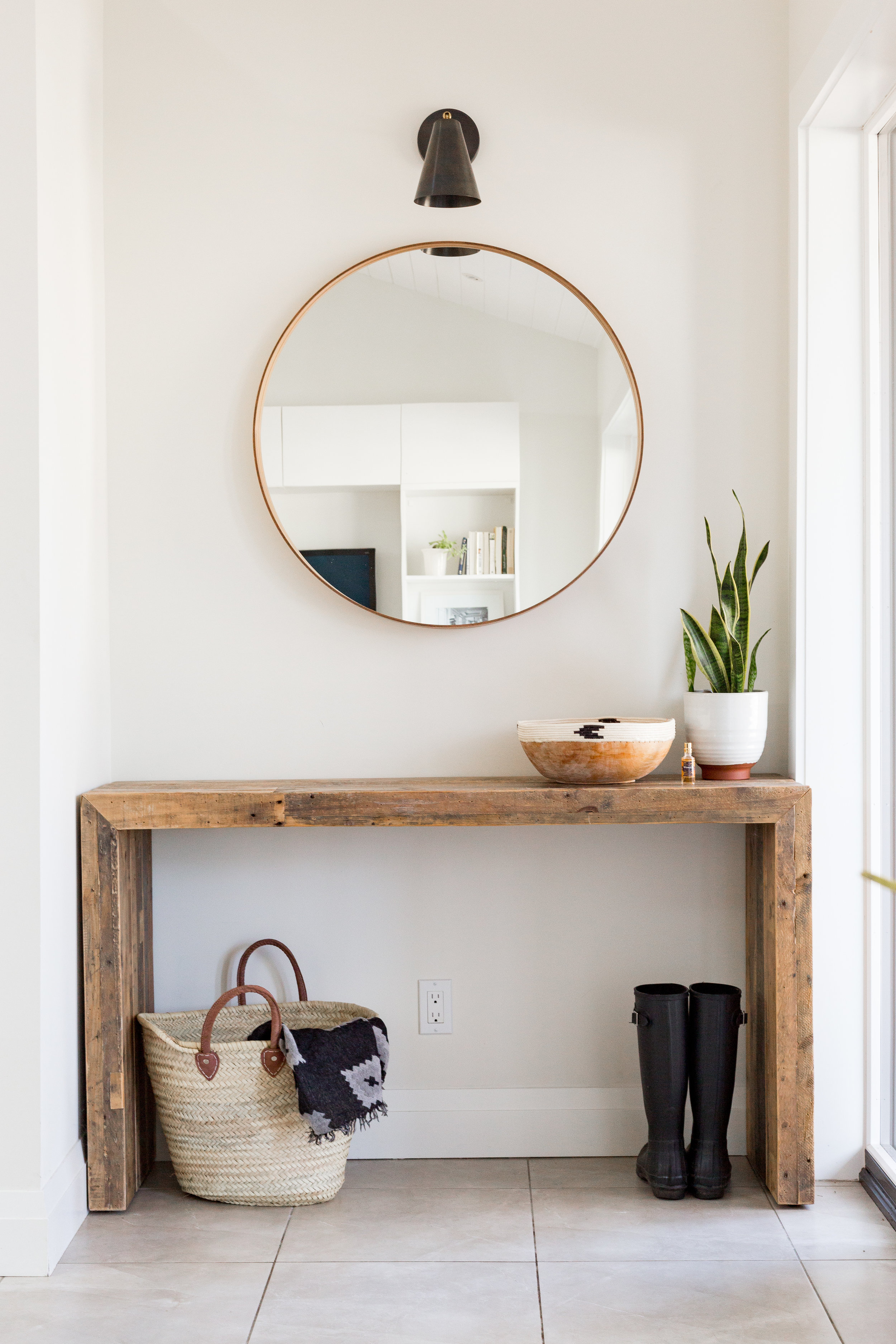
Wetter,Madison_StyleMutt_Entryway.JPG
 

Though he tried to resist, the influences of his childhood both followed Madison all the way across the country and followed him through life stages and into adulthood as he put down New England roots and purchased a home with his husband. 

From Madison:

I grew up near Cave Creek, Arizona and a lot of those Southwestern touches have crept into our home. It’s funny because growing up I used to detest homes that were totally blown out in Bonanza. Now I can hardly resist when I go home. I have to stop into some of the local shops and pick up a Zapotec table runner or a piece of Talavera pottery.
Wetter,Madison_StyleMutt_Dining.JPG
We also travel a lot and love to bring home decor items back with us. Because of that we get a little eclectic and global chic thrown into the mix as well. If I had to sum [our home] up in one line I would say it’s Global Southwestern Mid-Century Modern Chic (that’s a mouthful!). Ultimately, we buy the things that speak to us and that give us that visceral response and we find a way to make them work. There’s no other way!
Wetter,Madison_StyleMutt_Living.JPG

Going with your gut is always the best thing to do, right? Everyone in this new world of authenticity - particularly on social media - preaches staying true to yourself.

But what if you're wrestling with what exactly that means? After all, Madison ended up emulating the very styles he thought he hated while living in Arizona. He even in initially struggled with color - not color choices, but how much of it to use in the first place.  

One thing that I wrestled with is color. A lot of people tell you not to go crazy with color because it will impact the resale of your home or that you will get too tired of it. We sort of just went with it and everyone seems to really love it, including ourselves. It’s not like we redid our entire kitchen with red cabinets - paint is so cheap and easy to fix or change or correct.

Obviously, color won out in this home. And thank goodness it did! At the end of the day, Madison and Sky wanted their home to be "energetic, interesting and fun" and "be a place that is comfortable and inviting." For them,  color did the trick. 

Wetter,Madison_Office.JPG

Moving to the bedrooms, the home starts to take on a quieter vibe. 

In our bedroom, we wanted to be a place of tranquility. The room was inspired by a painting my grandmother did in the 70’s with a Native American man in the sky surrounded by Kachina dolls above the Grand Canyon. That picture has always brought me a lot of peace, and I think that’s a good vibe for your bedroom.
Wetter,Madison_StyleMutt_MasterBed.JPG
 
Wetter,Madison_StyleMutt_MasterBed2.JPG
 

The guest bedroom, like its master peer, also has a fun theme. Instead of a family heirloom painting, that theme is..... drumroll please.... 

LLAMAS!

This is our llama/alpaca room - you will find touches of llamas in almost every corner. I love all of them, but my favorite thing is probably the picture of the alpaca on the yellow nightstand. Sky’s mom surprised me one year, and we want to one of the largest alpaca farms in New England. I snapped this picture of one of them and just can’t get over how much personality shows through the image.
Wetter,Madison_StyleMutt_GuestBed.JPG
2017-10-25_16-08-07.jpg

If there's one thing for certain about this home, it's that it has a whole lot of personality. Madison, your home is so, so, so fun, bold, and beautiful. Thank you for inviting us in! 

Follow Madison along on Instagram @mvwetter for more! 

McKenna Sig.jpg

Reader Design: Kiel's 'Scandifornian' Home

I am so excited to share today's feature with you all! I know you're all probably curious as to what Scandifornian (a term Kiel himself coined) means - but fear not, you will quickly understand once you see what this home is all about. 

Their Milwaukee, WI home was built in 1951 and was slathered in orange and brown paint when they found it. Kiel, an architect, and his husband, an apparel designer, were clearly the perfect buyers for this fixer-upper and quickly got to work making it their own. 

We love the neutral, minimal qualities of Scandinavian/Nordic style, which also delicately balance modern, traditional, and rustic sensibilities, but we also go after the light, airy, organic qualities we loved from our Californian lifestyle. We have shoved all of those into a Cape Cod in Middle America and feel that it’s a recipe that lends to a very happy life for us.

Both having backgrounds in design, Kiel and Andrew each had strong opinions on the direction they wanted to follow for their home. Andrew gravitated toward color and pattern, while Kiel preferred neutrals. They used a familiar favorite for designers and amateurs alike, Pinterest, to curate their inspiration. Surprisingly, they quickly realized they were pinning the same images and landed on their aesthetic: "bright white spaces with minimal-leaning appointments."

They stuck to their guns, even when others questioned their decisions, and used social media inspiration to pull off the look. 

Our all-white rule is often not understood by Wisconsin locals, who rightfully question how we could possibly want to spend the Winter months, when the ground is covered in snow four months out of the year, trapped inside a white box. But we counter by reminding that those same four months are also very grey and dark, and that our white rooms maximize what light there is and bring to us a great amount of peace and serenity.

The couple took their time picking finishes, large-scale items, and accents alike, realizing and appreciating the importance of each choice. 

The mobile lighting fixture in the dining room was the first thing we bought for the house, and we feel it set the tone for us to add some streamlined accents in this very traditional house.

One of the most difficult decisions was that of the tiles. Kiel was drawn to the look of graphic painted concrete tiles and even placed a huge order. But they eventually realized that it was time bound trend, and their money would be better invested elsewhere. They instead to decided to focus on creating a home that would make them happy for years to come. 

My personal favorite space in their home is the master bedroom. The shiplap detail and white painted floor created a space that is immediately restorative and serene. As Kiel says, "It's an incredible room to wake up to in the morning!" ...I'll bet! 

This entire home is just full of memorable and beautiful design moments. Kiel, hats off for a job well done, and congratulations on owning your first home! Thank you for inviting us in. 

Follow Kiel along on Instagram @kielaaron for more!

Until next time,