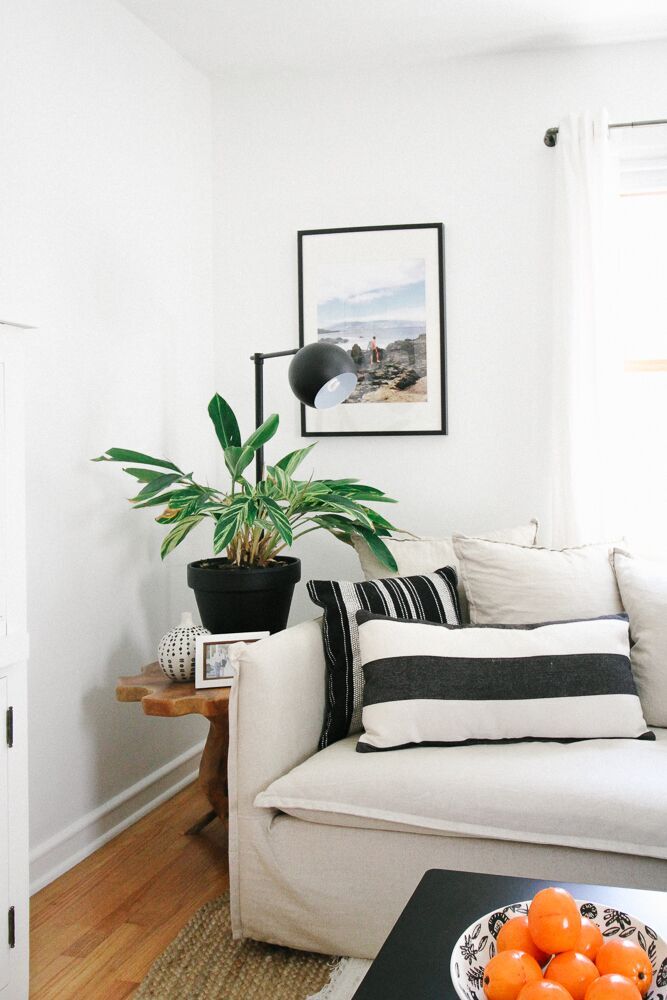
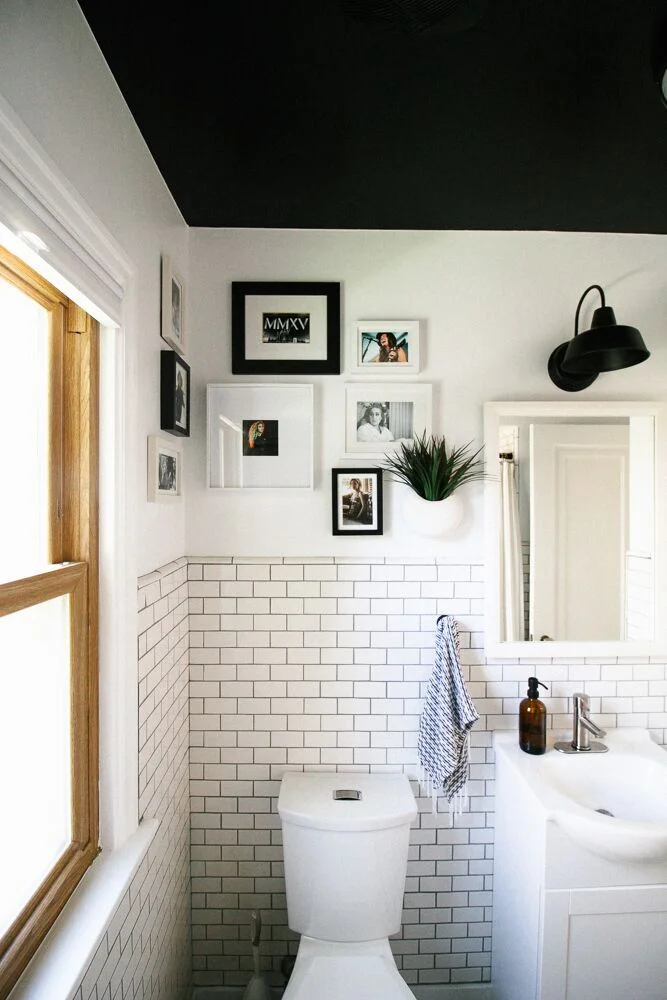
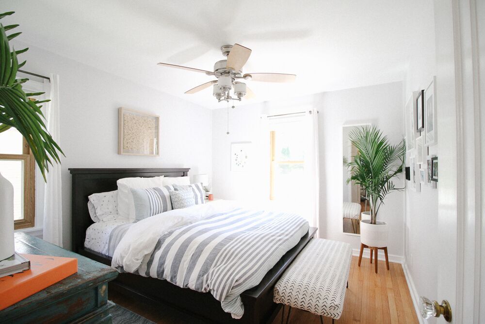
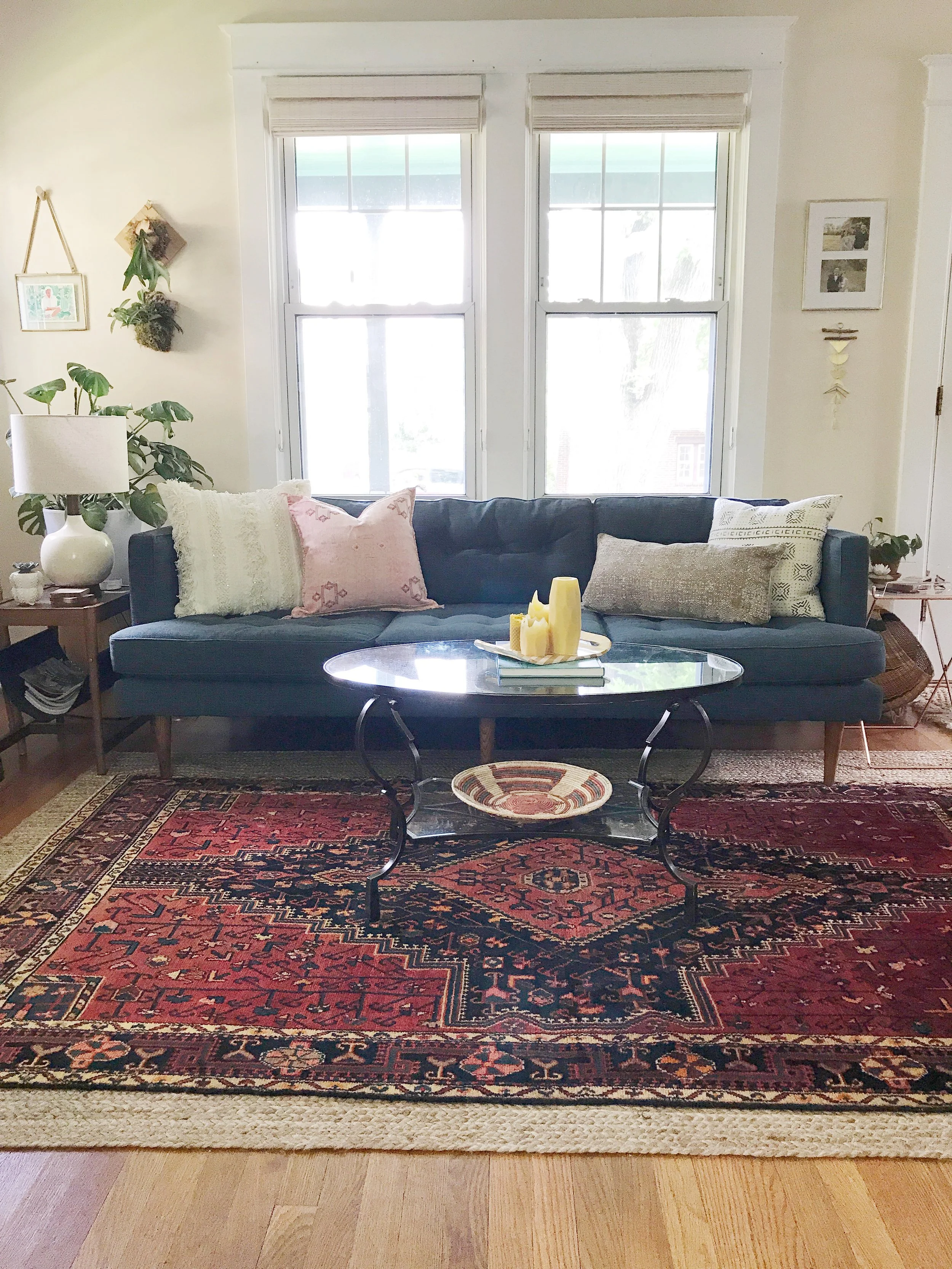
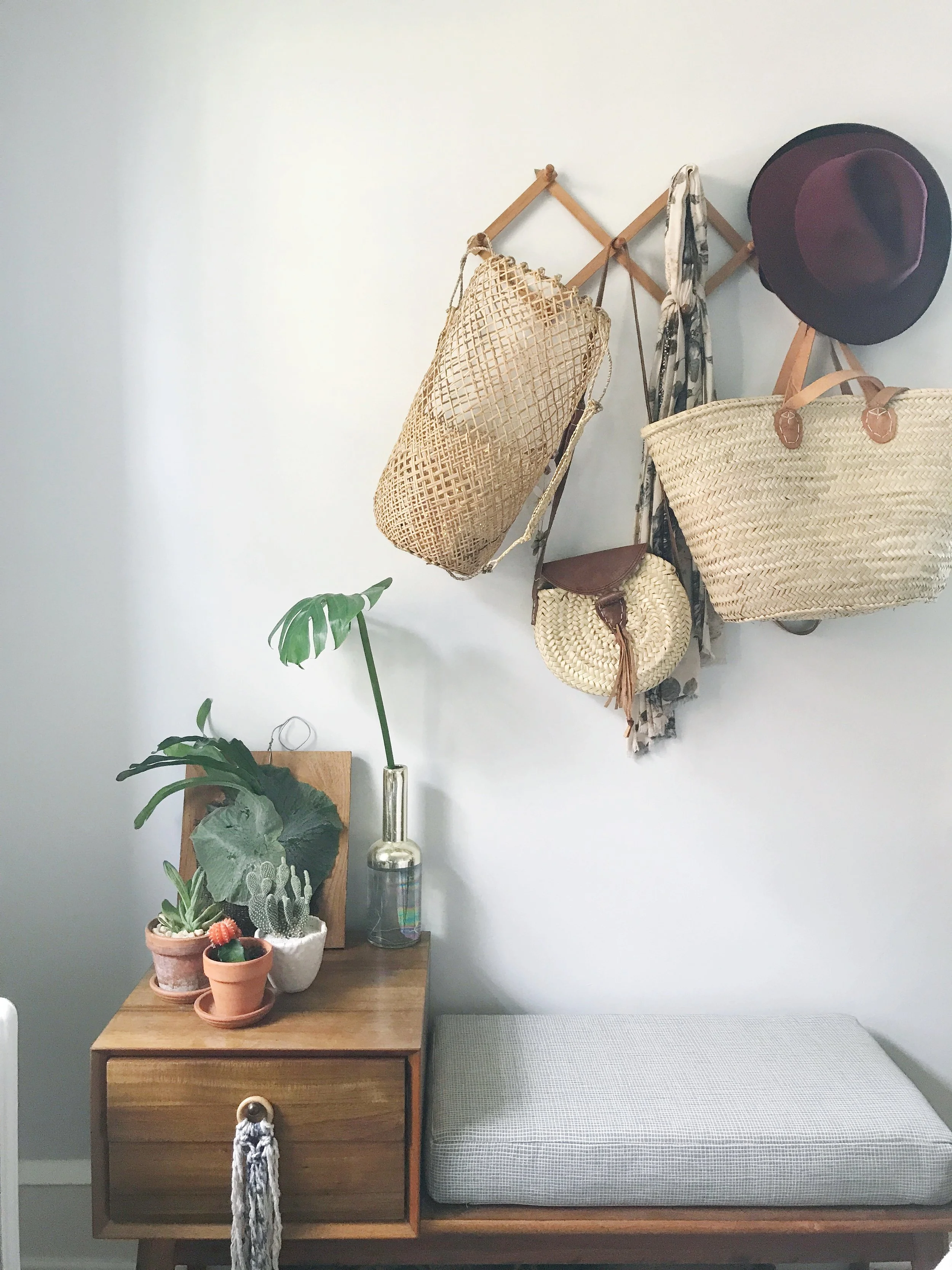
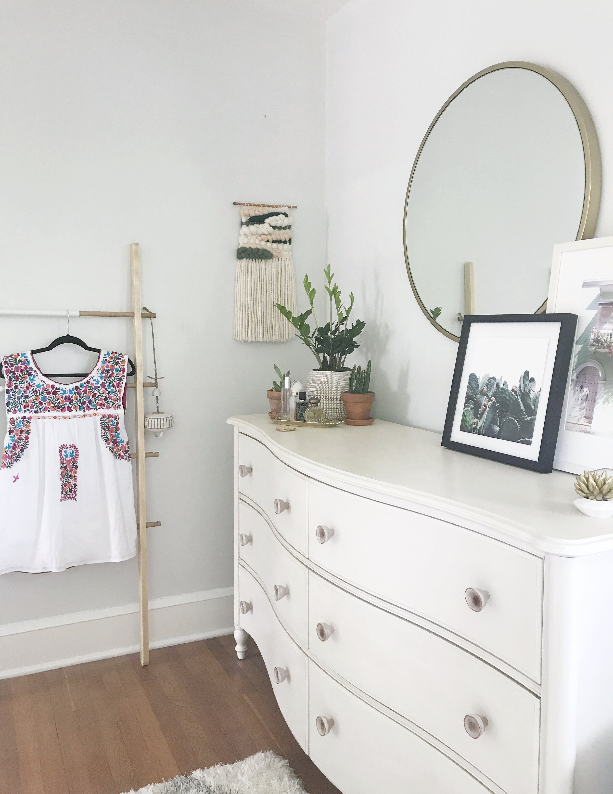
I am so excited to share today's feature with you all! I know you're all probably curious as to what Scandifornian (a term Kiel himself coined) means - but fear not, you will quickly understand once you see what this home is all about.
Their Milwaukee, WI home was built in 1951 and was slathered in orange and brown paint when they found it. Kiel, an architect, and his husband, an apparel designer, were clearly the perfect buyers for this fixer-upper and quickly got to work making it their own.
“We love the neutral, minimal qualities of Scandinavian/Nordic style, which also delicately balance modern, traditional, and rustic sensibilities, but we also go after the light, airy, organic qualities we loved from our Californian lifestyle. We have shoved all of those into a Cape Cod in Middle America and feel that it’s a recipe that lends to a very happy life for us.”
Both having backgrounds in design, Kiel and Andrew each had strong opinions on the direction they wanted to follow for their home. Andrew gravitated toward color and pattern, while Kiel preferred neutrals. They used a familiar favorite for designers and amateurs alike, Pinterest, to curate their inspiration. Surprisingly, they quickly realized they were pinning the same images and landed on their aesthetic: "bright white spaces with minimal-leaning appointments."
They stuck to their guns, even when others questioned their decisions, and used social media inspiration to pull off the look.
“Our all-white rule is often not understood by Wisconsin locals, who rightfully question how we could possibly want to spend the Winter months, when the ground is covered in snow four months out of the year, trapped inside a white box. But we counter by reminding that those same four months are also very grey and dark, and that our white rooms maximize what light there is and bring to us a great amount of peace and serenity.”
The couple took their time picking finishes, large-scale items, and accents alike, realizing and appreciating the importance of each choice.
“The mobile lighting fixture in the dining room was the first thing we bought for the house, and we feel it set the tone for us to add some streamlined accents in this very traditional house.”
One of the most difficult decisions was that of the tiles. Kiel was drawn to the look of graphic painted concrete tiles and even placed a huge order. But they eventually realized that it was time bound trend, and their money would be better invested elsewhere. They instead to decided to focus on creating a home that would make them happy for years to come.
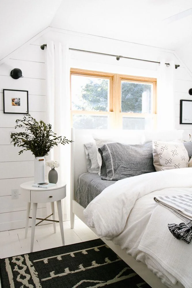
My personal favorite space in their home is the master bedroom. The shiplap detail and white painted floor created a space that is immediately restorative and serene. As Kiel says, "It's an incredible room to wake up to in the morning!" ...I'll bet!
This entire home is just full of memorable and beautiful design moments. Kiel, hats off for a job well done, and congratulations on owning your first home! Thank you for inviting us in.
Follow Kiel along on Instagram @kielaaron for more!
Until next time,


