DIY (aka Frankensteined) Chandelier || Flip List Item No.3 ||

Happy Halloween Style Mutts!  As you may well know that this summer, I made lofty promises that I would soon be posting a BIG REVEAL of my 2016 Furniture Flip Bucket List item No.3...   Well, the end of October may not classify as "soon" exactly but what better day for a reveal of a frankensteined chandelier than all hallows eve?

IMG_5137.JPG

God must've had a good chuckle when I ended my post back in July with "I'm still working on the wiring for the sputnik chandelier and [if all goes well] will be sharing the results soon!"  Unbeknownst to me, He obviously knew I was in for a wild electrical wiring ride, a puzzle of a mounting mechanism, and a treacherous install while balancing on the back of our couch.

Before we continue, let's pause for the obligatory disclaimer: I am not an electrician.  I built, wired, and installed this light fixture at my own risk.  If you are interested in building, wiring, or installing your own light fixture - please do EXTENSIVE research before you lift a finger and consult a professional electrician.

We good?  We good.  

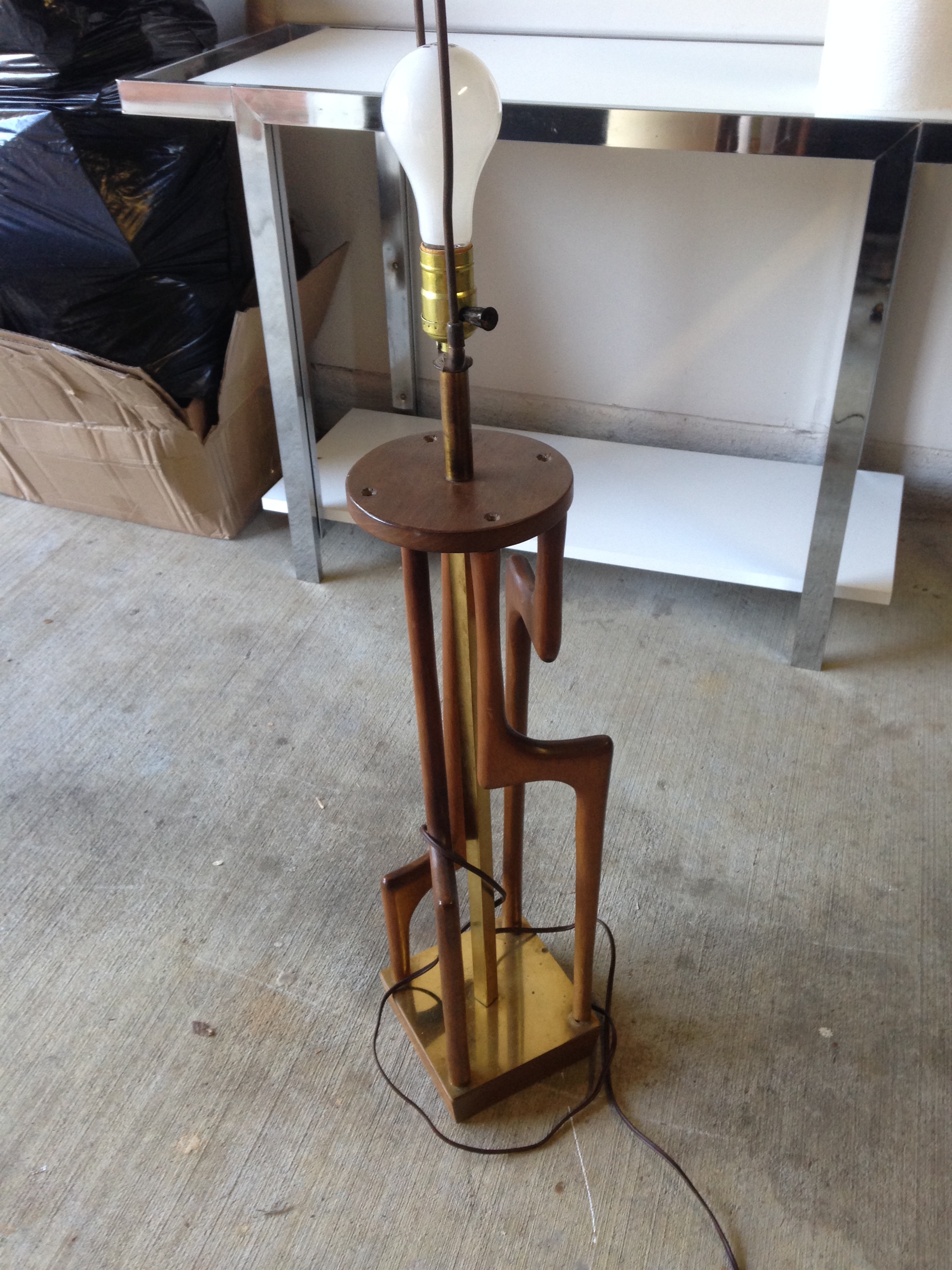
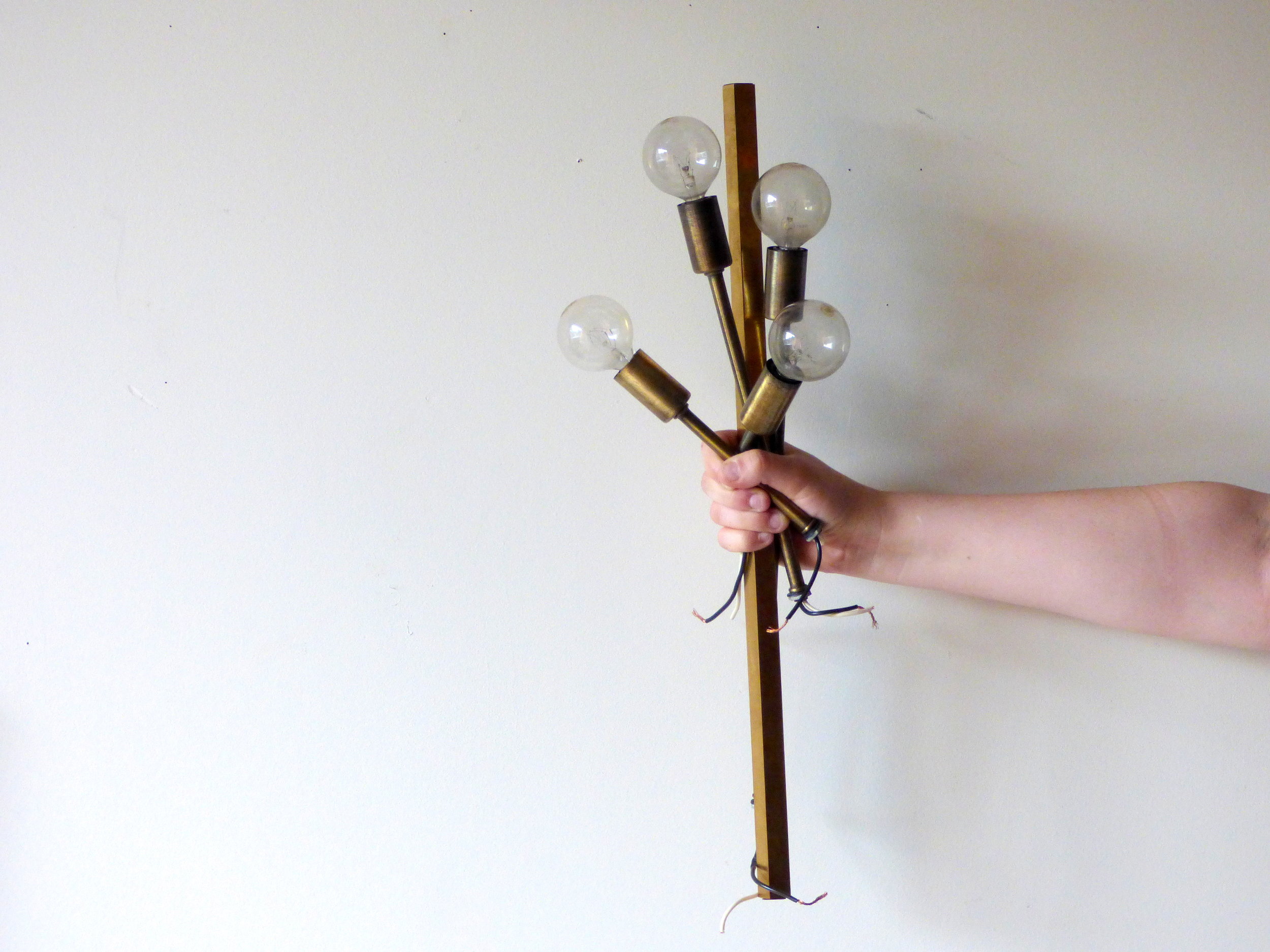
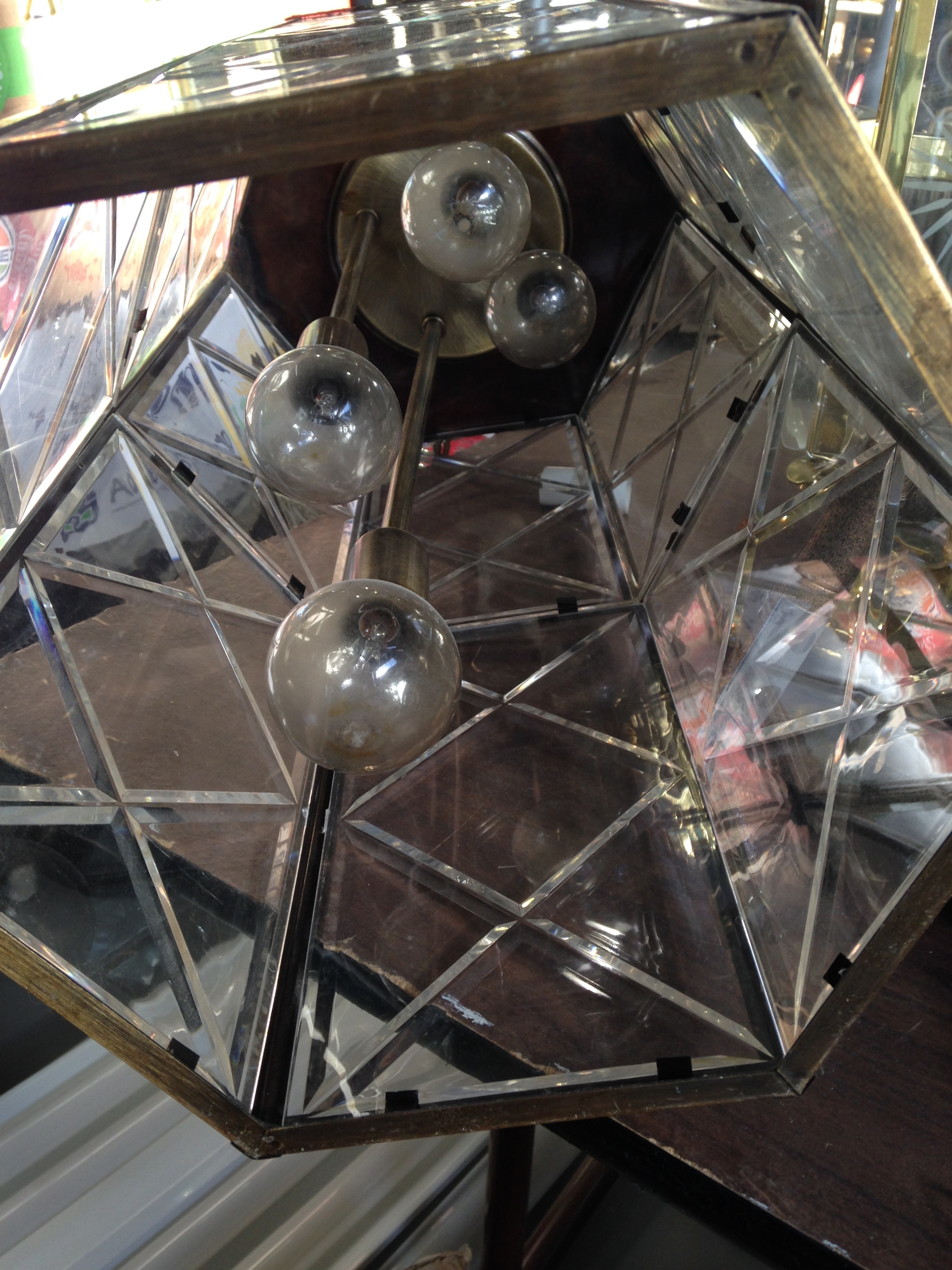
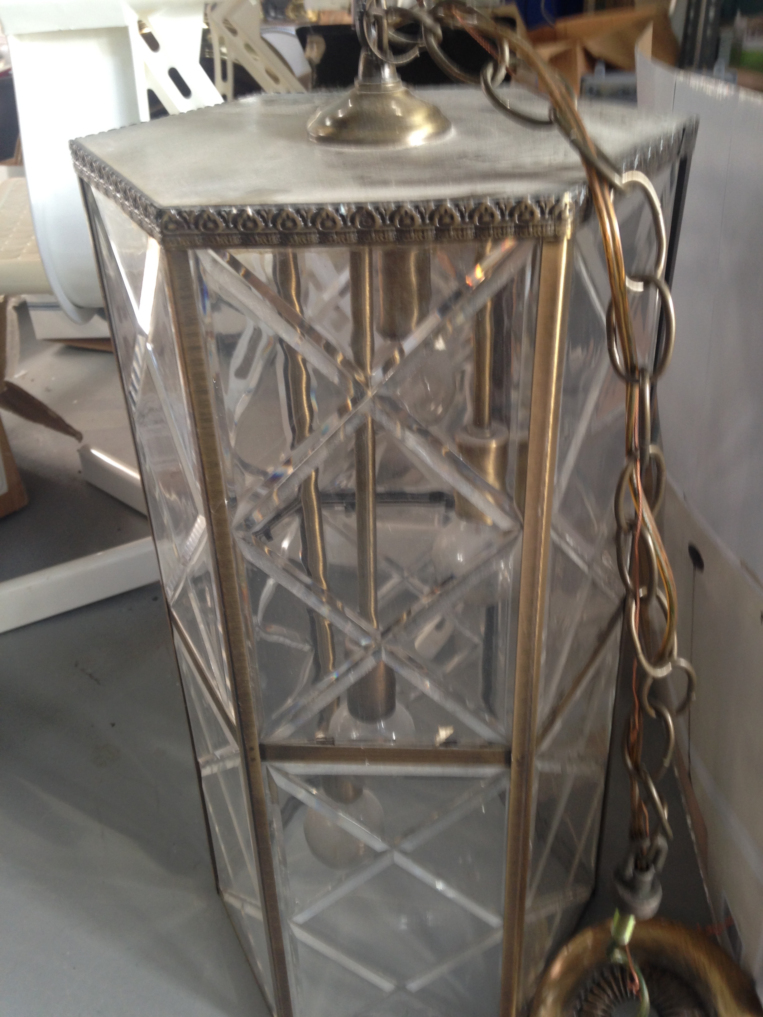
Ok so this project started when I found an old foyer lantern in August 2015.  The bulb apparatus inside was so cool!  The staggered lengths.  The brass finish.  I harvested what looked useful and repurposed the glass shell as an umbrella stand.  Now that I had the arms for a sputnik light, I needed to find a body.  I was considering building an angular wooden skeleton that I could route wires through until I found a quirky mid-century modern table lamp for a whopping $15.


The lamp's hollow brass square rod was perfect!  I officially had what I needed to build the frame.

And in case you're wondering, the rest of the table lamp didn't go to waste either.  It became a plant stand:

Making the complete family tree as such:

IMG_5136.JPG

So at this point, I'm staring at the light-less frame of what could be a really cool chandelier after over a year of planning and I. Am. Stuck.

First off, the hollow cavity in the brass rod I took from the MCM lamp was very very narrow.  I tried splicing the existing wires from the foyer light bulbs and running those up through the rod.  When I finally hooked it up to a plug in socket to test it, only half of the bulbs were working.  

We need more power Igor!


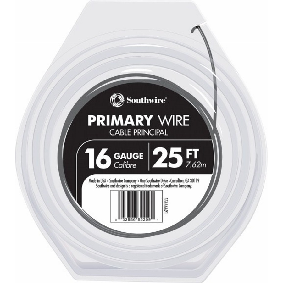
Ruling out a dead light bulb or two, I had to disassemble the entire thing and start from scratch.  After consulting a professional at the Lamp Factory Outlet in Fairfax, Va, I learned that I needed to buy a new sockets for the faulty foyer bulb arms.  They were so cheap (like $2 each) that I order a new one for each of the arms (just to be safe) and picked up some new 16 gauge stranded copper wire from home depot.  I bought the wire in both black and white so I could keep my hot (black) and neutral (white) connections straight for when it came time to install.  


When I was researching all these issues, I found this tutorial by ModFruGal to be very thorough and helpful.  Plus - they have a shopping list if you a building a brass arm chandelier from scratch instead of going all Dr. Frankenstein on some poor lamp parts.


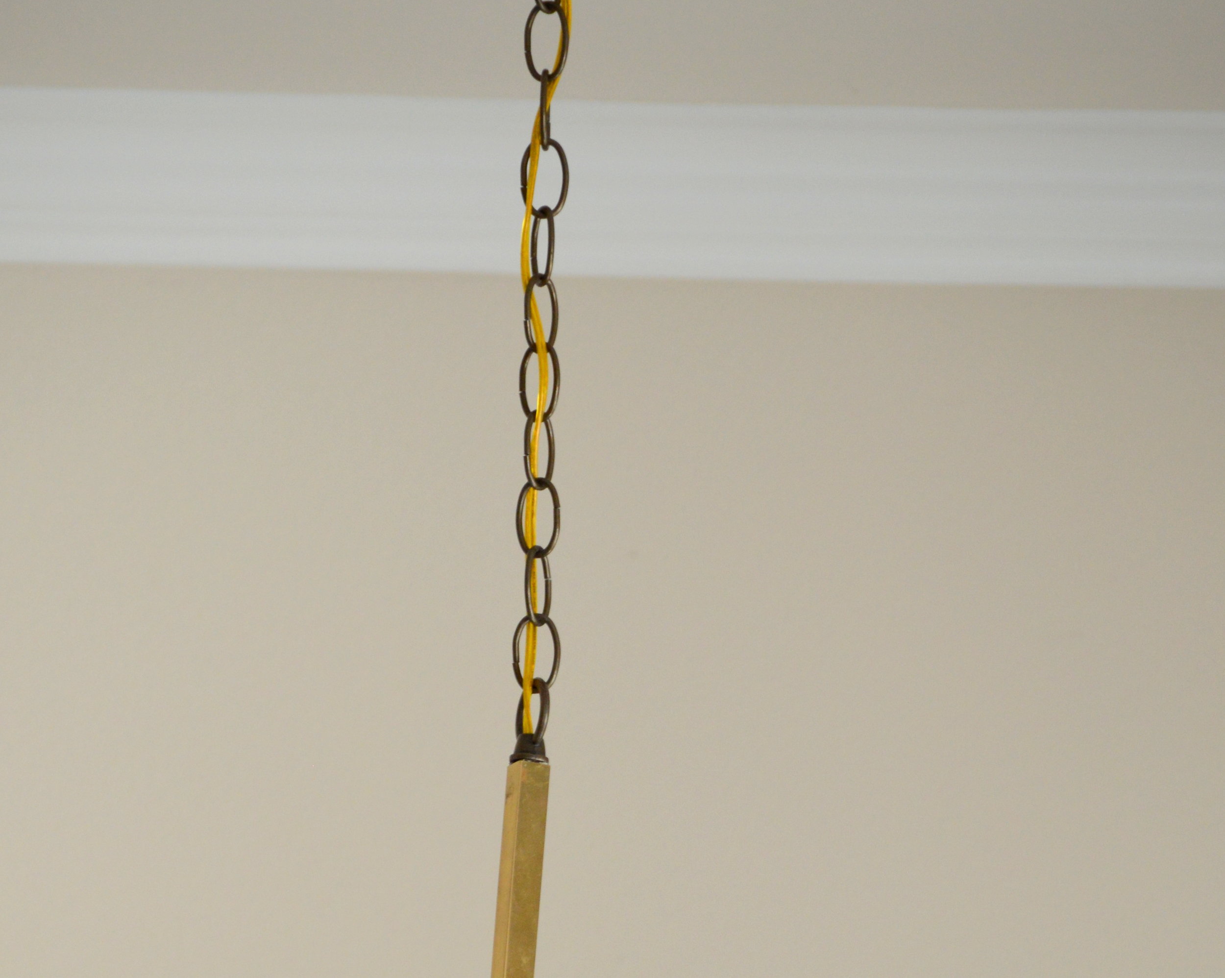
Once got all the sockets working and threaded the 8 wires (one black and one white per socket) through the center piece, I then had to conjure up a way to cap the center cavity with a chandelier ring to attach the chain to.  When working with your standard light, a chandelier ring would simple screw in to the top of your fixture.  But this was not standard light and I had to figure out how to secure a round peg in a square hole.  Now here is where I MUST reemphasize to not do this at home without consulting a professional first...

I glued it on.  I know - not the best solution.  I tried metal epoxy and couldn't get a strong enough connection for it to set.  I ended up straight up gorilla gluing it.  And it's working great so far.


Ok.  So now I have a fully wired brass lamp frame (we did it Igor!) but still have to figure out how to install it.  Caleb and I are still renting so whatever we did, it had to be reversible.  Luckily Home Depot has an awesome recessed can light conversion kit by Westinghouse and our apartment has a can light directly above our dining room table.  The kit was really easy to install thanks to a handy step-by-step video.  

Source: Home Depot

Source: Home Depot

This is where it gets a little hairy to explain.  Not everyone will have the unique problems that I encountered  in my non-standard chandelier install, so for your sake, I'll spare you the details.  But you can always email me for more troubleshooting deets if you are somehow in a similar pickle.

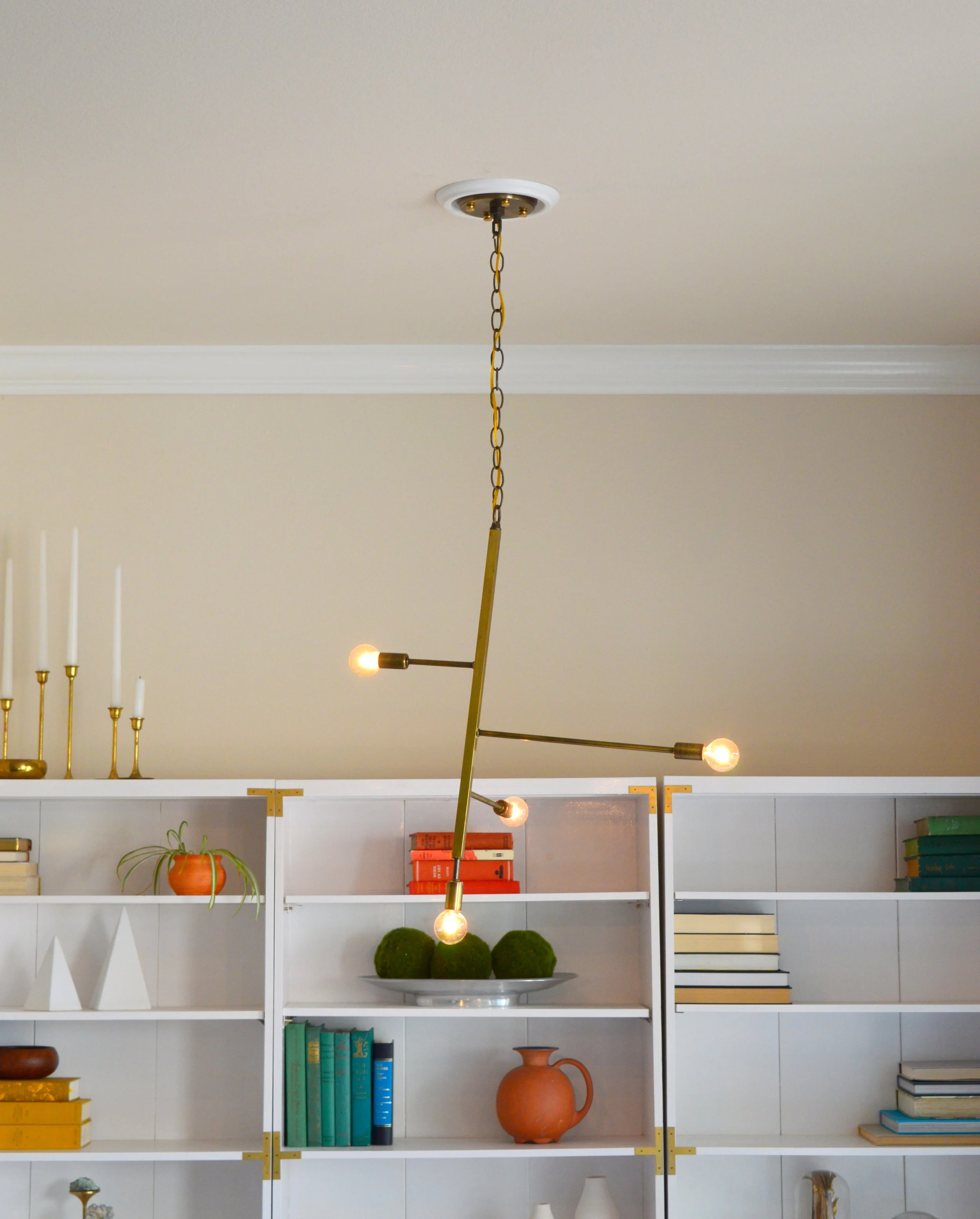
Even with all my planning and sketching, I didn't have a solid plan for the mounting plate.  Luckily I don't often throw things away and I still have the leftovers from the original foyer lantern that started this whole thing.  Inside the lantern was a round plate with four holes for each arm and one in the center.  

I only needed the hole in the center to thread the wires through the chandelier loop at the other end of the chain.  But the extra holes did end up coming in handy. They allowed me to screw the mounting plate onto to the brace assembly from the can converter kit,  After it was secure and I could pull my screwdriver out, I capped the four extra holes with some threaded nipples, a few nuts, and four brass finishing caps,

Ok.  Enough tech talk.  Let's get to the juicy reveal already!!!

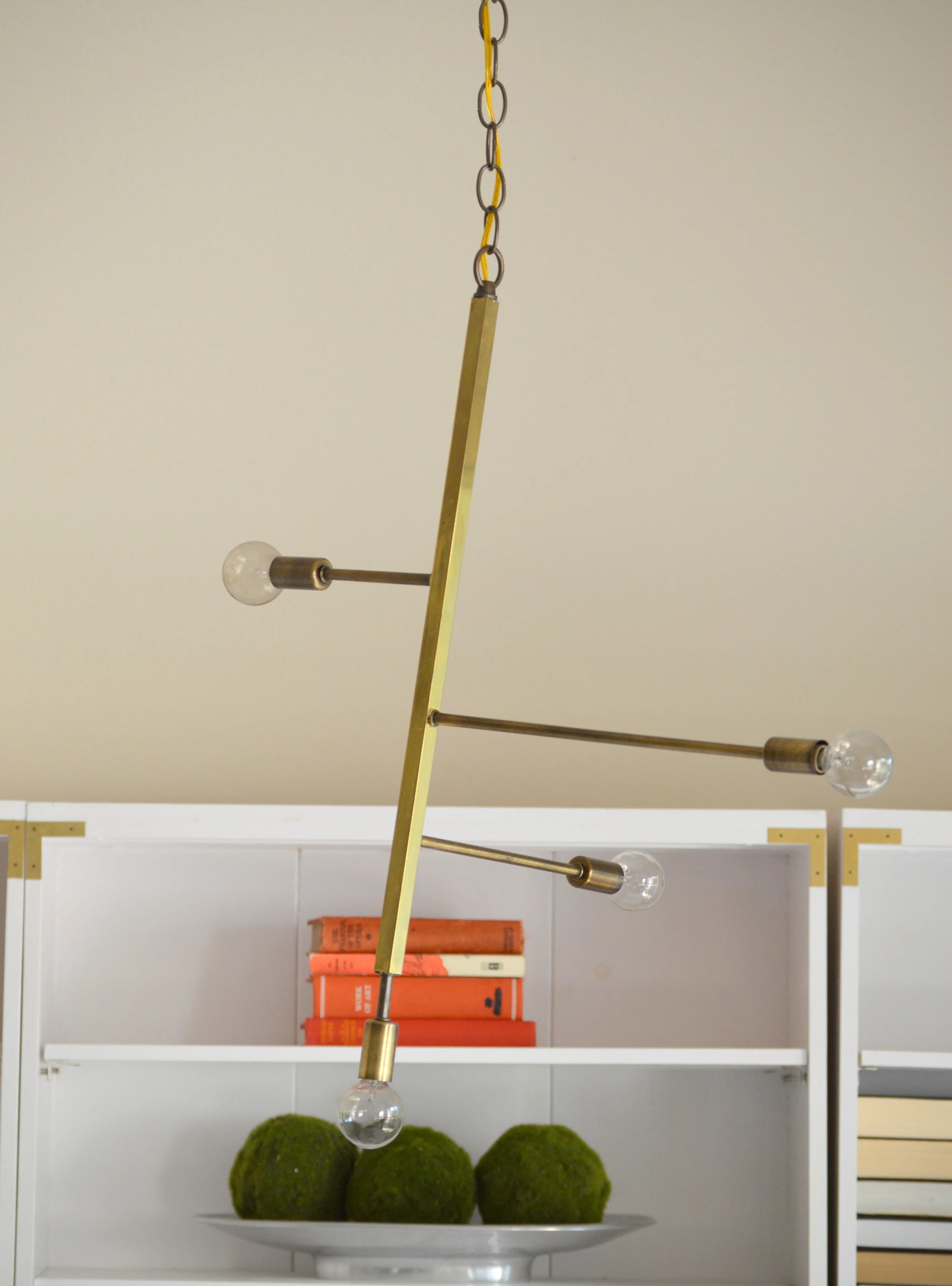
In all my mad-sciencing, I didn't think to account for the balance of the varied brass arms.  

But I don't even mind that he doesn't hang straight - it gives him an angular mid-mod playful vibe.  And hey - Frankenstein's monster wasn't perfect either.  He could only say yaaaaaaaaaaaaaaaaaaaaaarp after all.

Alright Igor - flip ze switch!

DSC_0254-001.JPG
IMG_5130.JPG
IMG_5131.JPG

So all in all this project was a monster to gather, a monster to build, and a downright monster to install!  But when it was all said and done, I still only spent a little over $100 on this project.  Although that's a little higher than I like to spend for pieces in our own home, this was still a winner in my book compared to buying new.

Stay safe trick -or-treating out there tonight friends!  And if you need something to binge read while you're raiding your candy haul, catch up on the other completed furniture flip bucket list items:

Industrial Bench

Remember these puppies er... ponies?

When I bought them, I thought I would make a massive desk supported by both sawhorses.  But their size length would make for a desk with a HUGE footprint (and quite possibly too large to appeal to potential buyers).  So I split up the set and used only one to make a narrower desk complete with a hutch and detachable lamp.

As for the other sawhorse, I was stumped.  Fortunately when I get myself into these kind of conundrums, I have a secret weapon: I call Chelsea in for a consult.
Now the LORD knew what He was doing pairing me up with such a creative and supporting business partner.  She took one look at them and said, "What if you make an industrial bench?"

Genius.

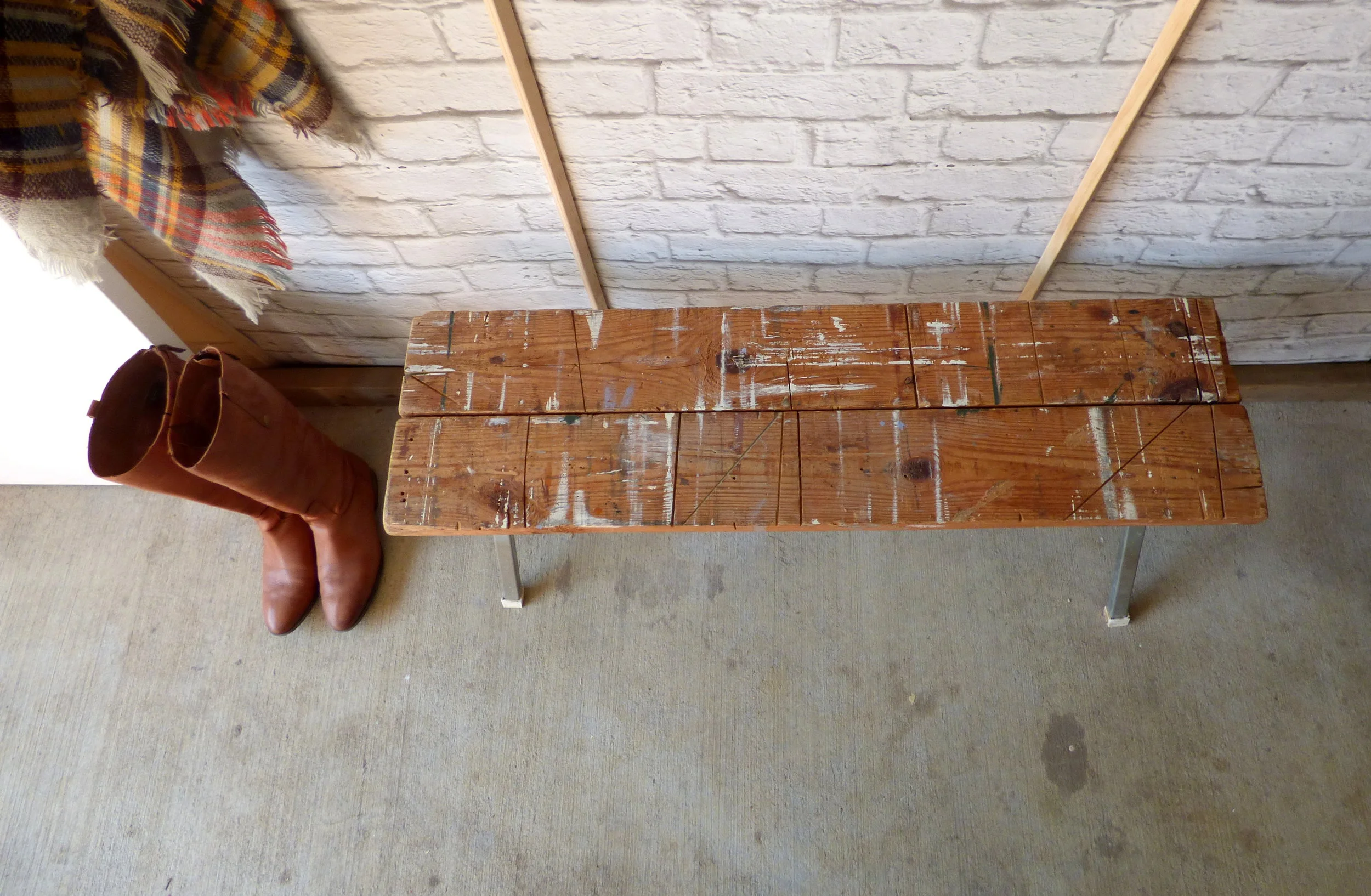
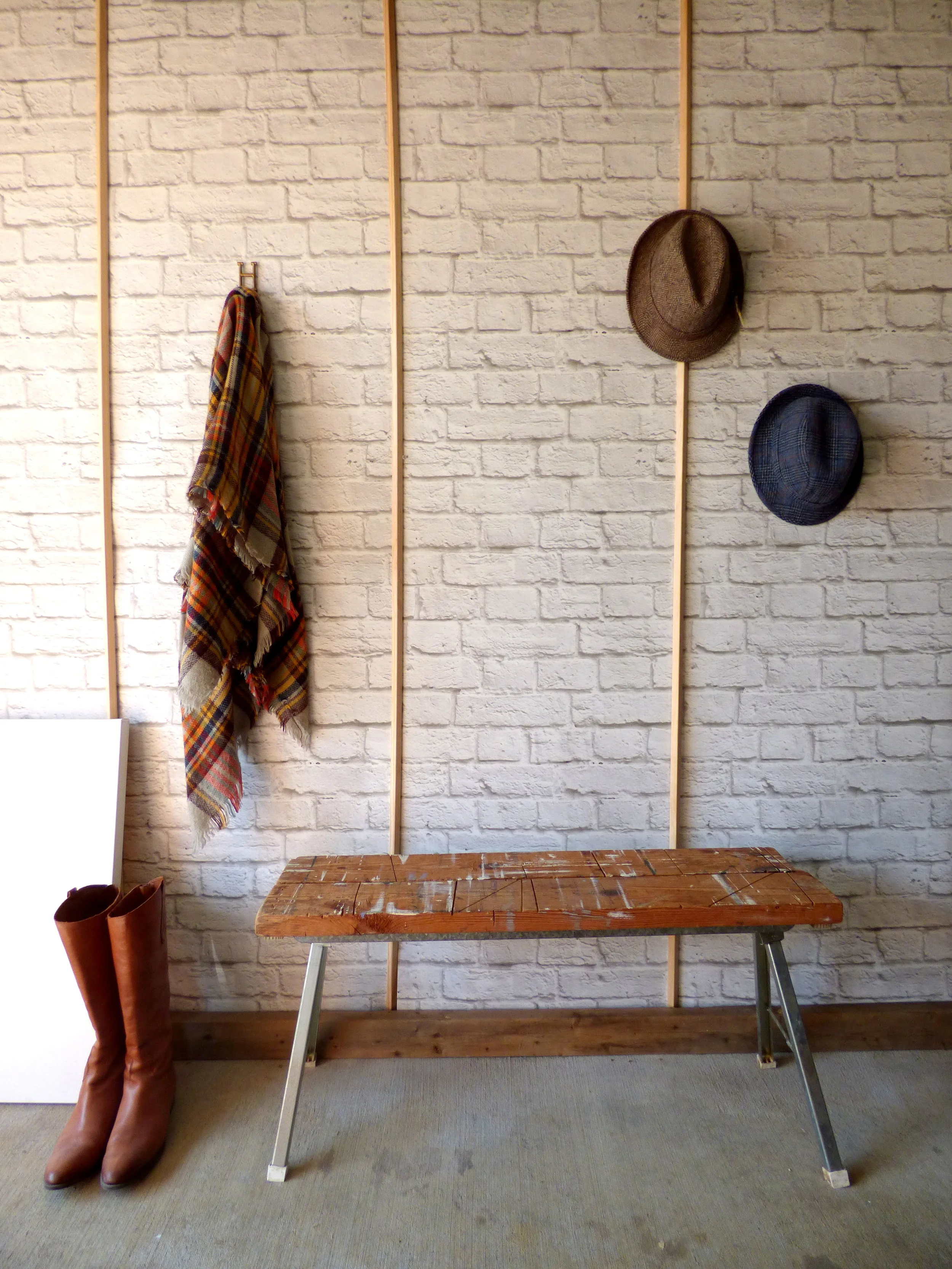
Chelsea lent me her hacksaw so I could cut down the legs of one of the sawhorses to the right height.  I combined both pieces of storied wood from each sawhorse into one bench surface and remounted it on the galvanized metal base.  

I just LOVE the saw and paint streaks - it makes me wonder what projects these sawhorsed saw(ed) in their day. 

See (saw) what I did there? 

Ijustcanthelpmyself.

So what magical rugged loft did I drag my new bench to for the perfect industrial backdrop?  Where else do I stage my pieces these days...

Now, if you're clever and observant (which I'm sure you are) you may be thinking to yourself, "Cate, when did your garage get a brick wall?  All of your other staged pieces have always had regular old drywall as the backdrop..."

Clever, clever you.

Take a closer look at the photo - did I fool you?  Or are you onto my little ruse?

It's not brick, it's wallpaper.

I'll admit, I was skeptical about using a 2D wallpaper to make a 3D effect.  I don't often go for faux unless it's really convincing - but I live in a new(ish) apartment complex that doesn't have old charm in spades.  Cue Milton & King Wallpaper.  (Remember this wall hanging giveaway using their Gluttony print?)  Well they were generous enough to also send me a roll their very popular Soft White Bricks.

And I was surprised to see just how believable the pattern was even in person!  The only way you would know it wasn't brick would be to run your hands along it expecting to feel a gnarled texture and instead finding it's baby smooth.  

Disclaimer - I do live in a rental so I couldn't bring myself to install wallpaper only to take it down in a few months when our lease is up.  I just tacked up the panels and used wood trim to hide the seams that would otherwise be invisible if the paper had been glued.  (Plus it adds a little architectural interest.)

And just because it's Fall (and I'm obSESSED with cooler, crisper weather), I used my favorite fall accessories for this shoot. 

Thank you Milton & King for opening my eyes up to the wonders of high-quality wallpaper prints!  One of these days I'm going to have to get my hands on your Marble and your Dandelions prints.  (Insert 17 heart-eye emojis)

It's only fitting that this industrial bench ended up in a cool DC apartment.  That's right!  If you've been following along with us you may recognize this bench from yesterday's eDesign reveal:  

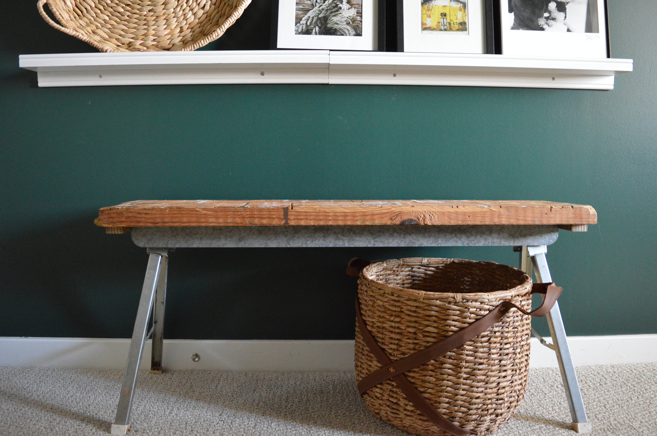
May he forever grace our client's moody dark green hallway!

Navy Yard Condo || Soft Boho Master Bedroom

Welcome to our Navy Yard Condo Reveal Part 2! Actually, I suppose it's part 3 since we revealed the main living spaces last Summer, but it's our second day in a row revealing the bedrooms! So let's reccap:

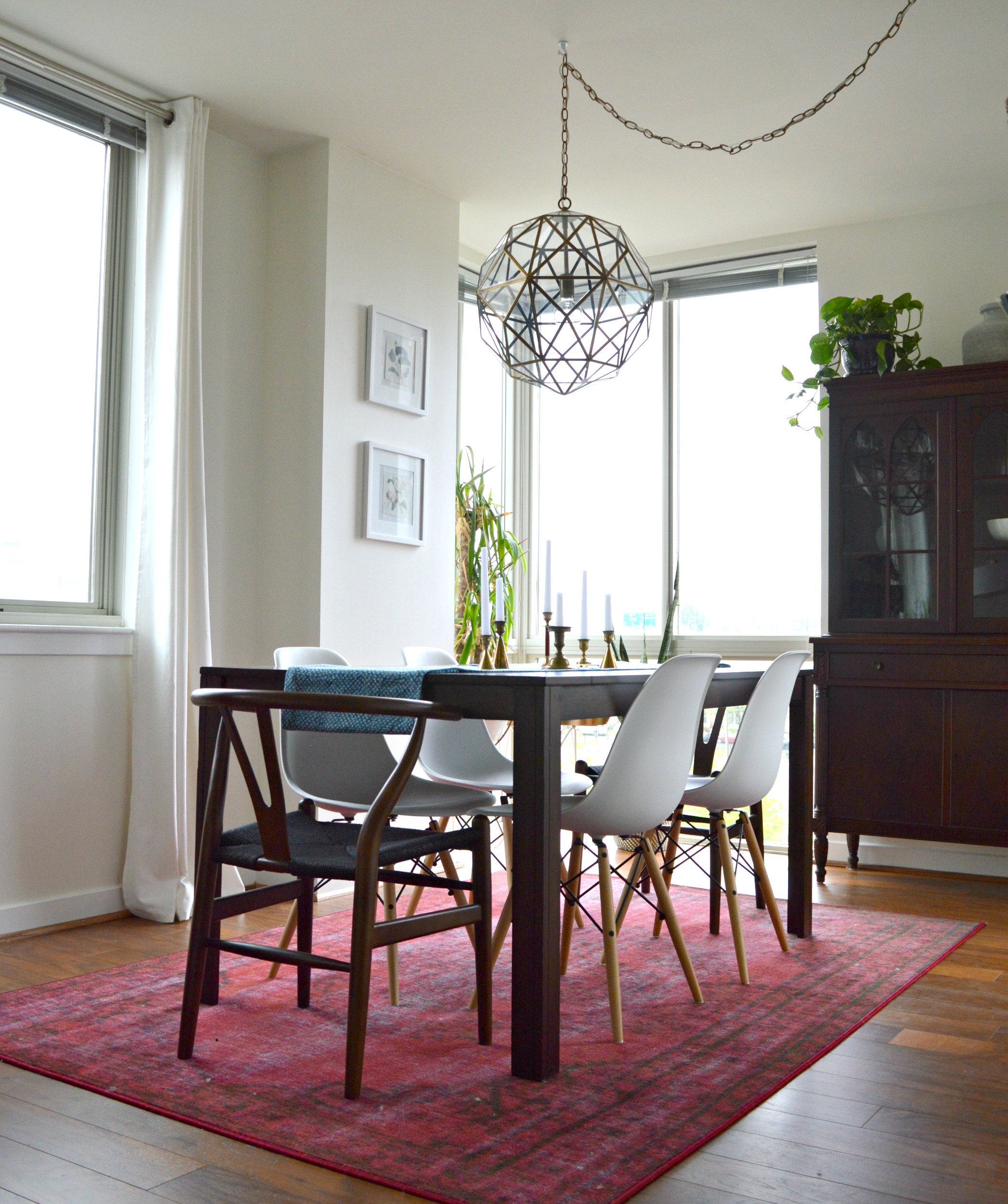
Living Room / Dining Room: Full Tour Here

Then we hit the Guest Bedroom, where we scaled back in order for renting potential: Full Tour Here

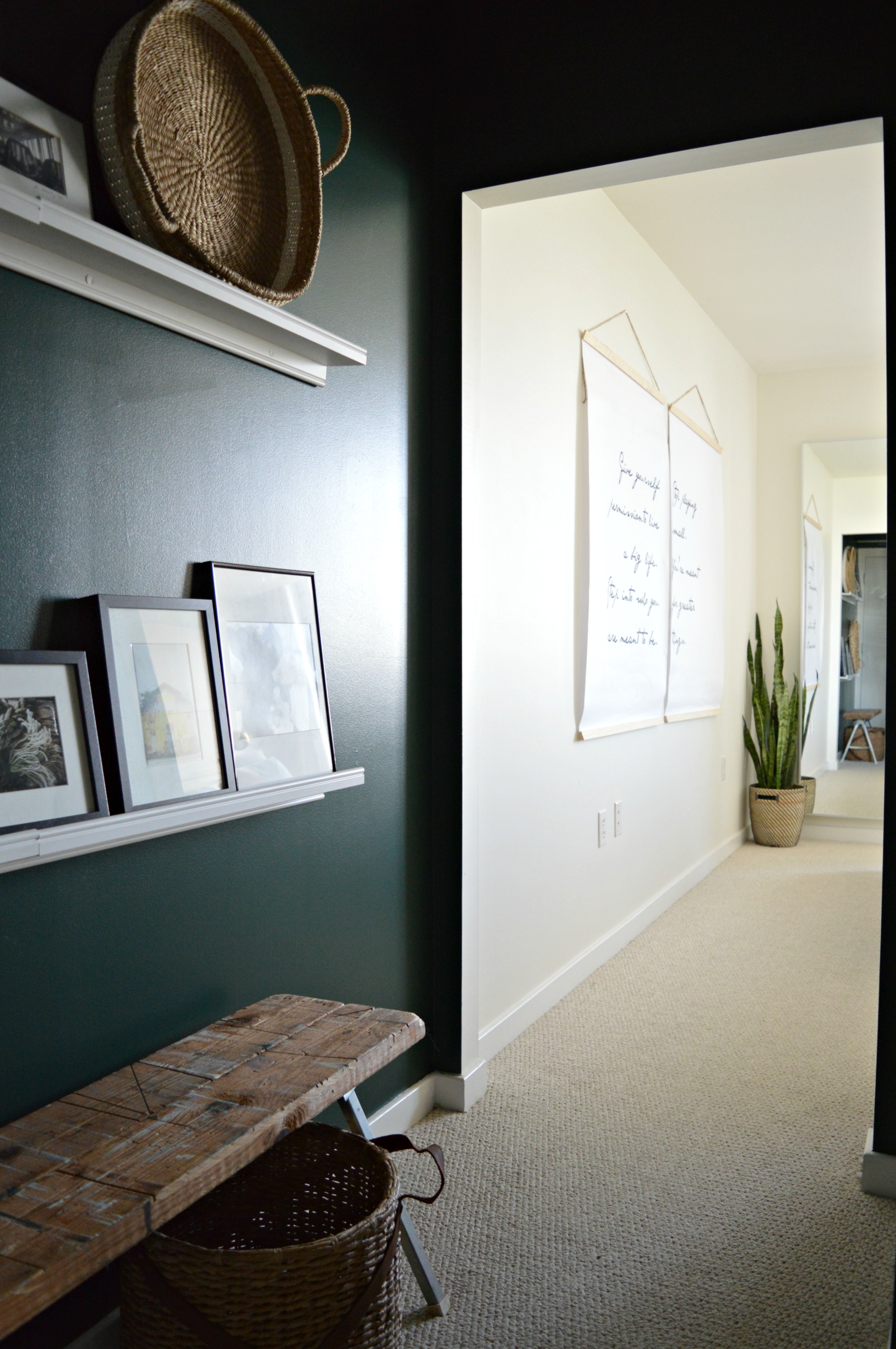
Now all that's left is the Master Bedroom! We feel that the master bedroom is quite possibly the most important space in ones home, and we design them as such. This particular master opens to a private hallway/lounge area where our client can access her en-suite bath and closet. We felt that this hallway was as much a part of her living space as the others so we designed it with quite the dose of moody drama!

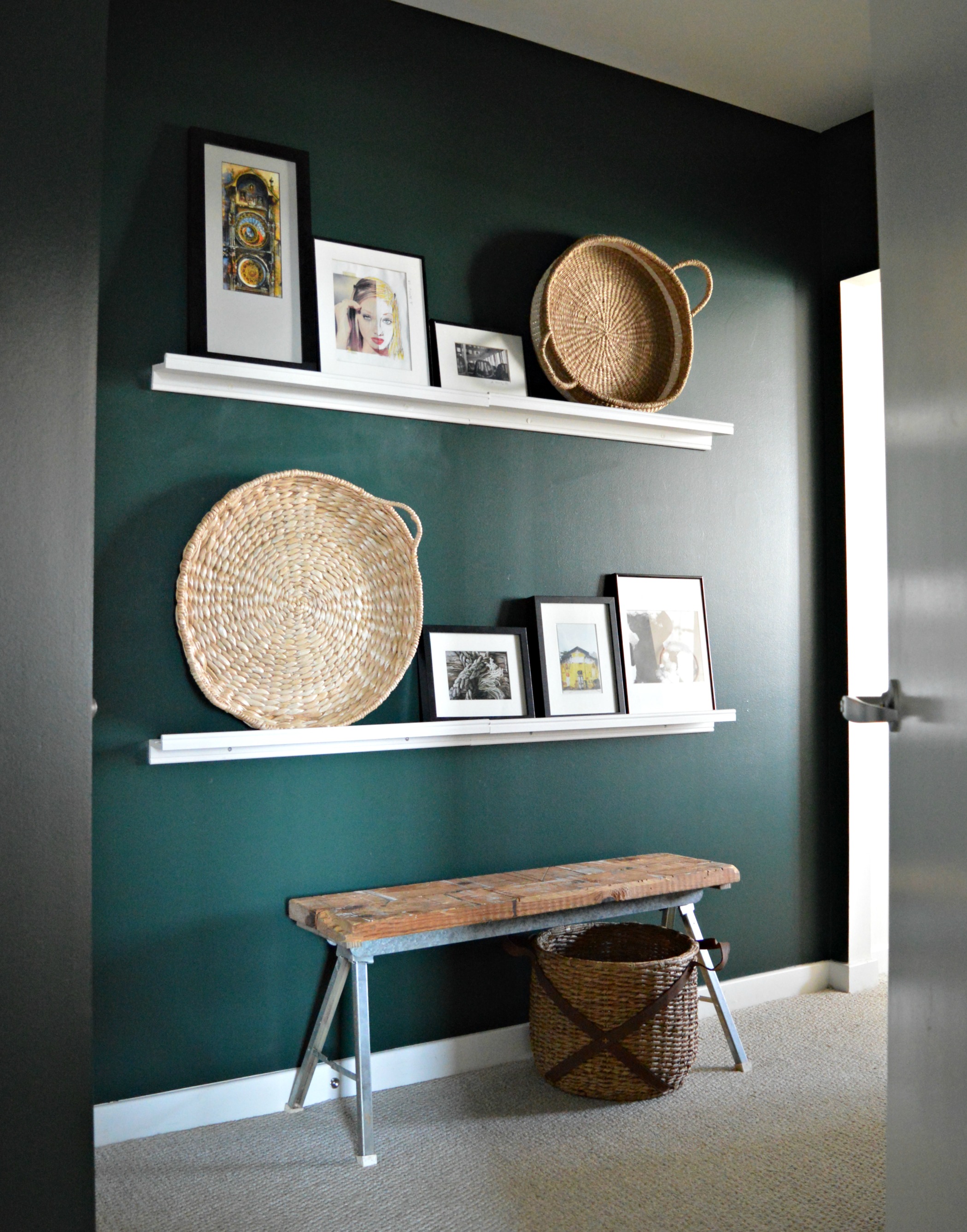
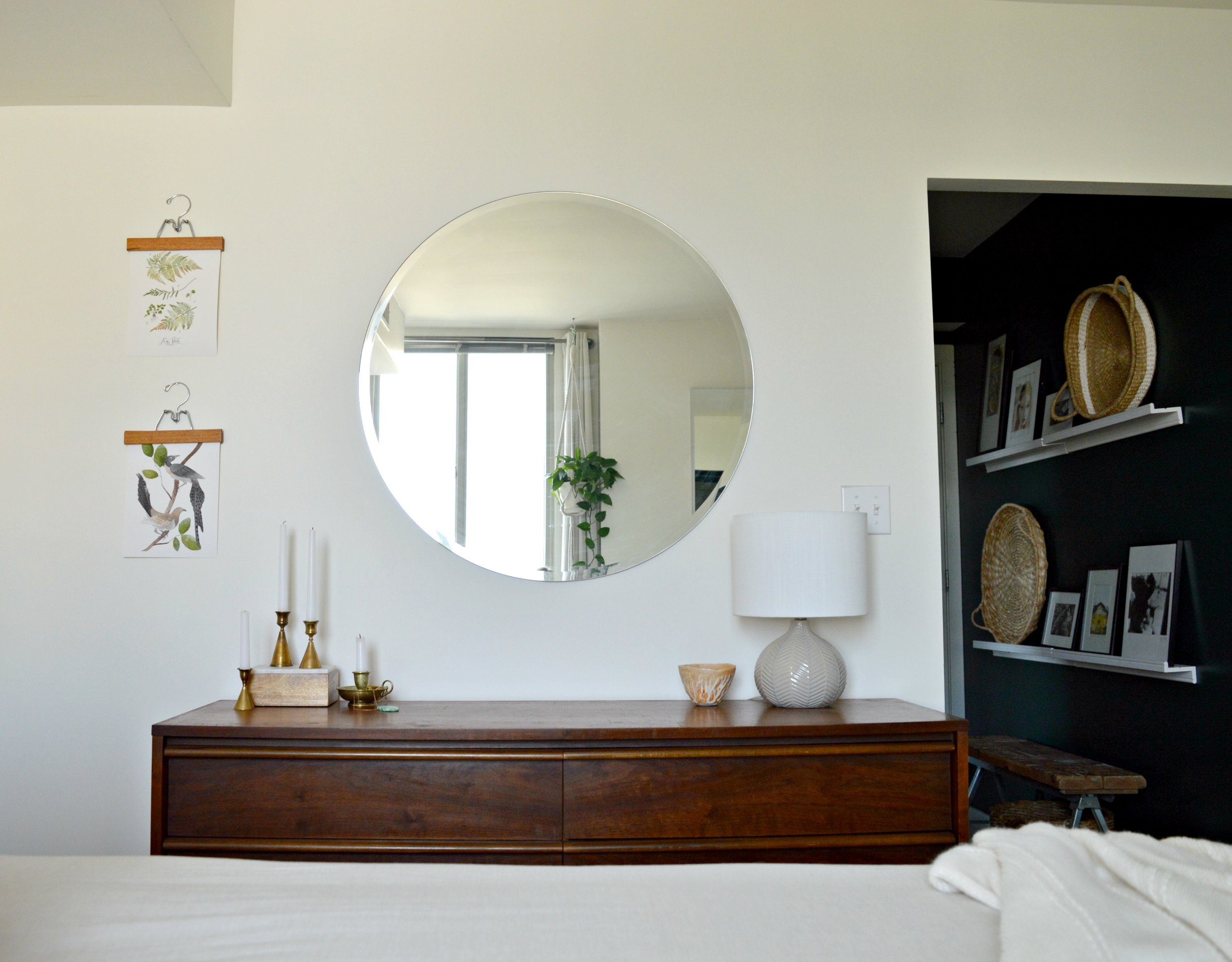
Wrapped in 'Hunter Green' by Benjamin Moore, (the same paint we used on the guest room dresser), and styled with picture ledges for convenient art swapping, (of which our client has quite the collection!), this passageway is special and instantly makes one feel as if they're entering a unique part of this home. We built the bench from metal sawhorse legs and scrap wood, and at just 11" wide it's able to serve as a quick-drop surface without interfering with walking space.

Picture ledges are a fantastic alternative to a gallery wall - you'll do a lot less damage to your walls and you can change things out as often as you please! These white ledges were from IKEA.

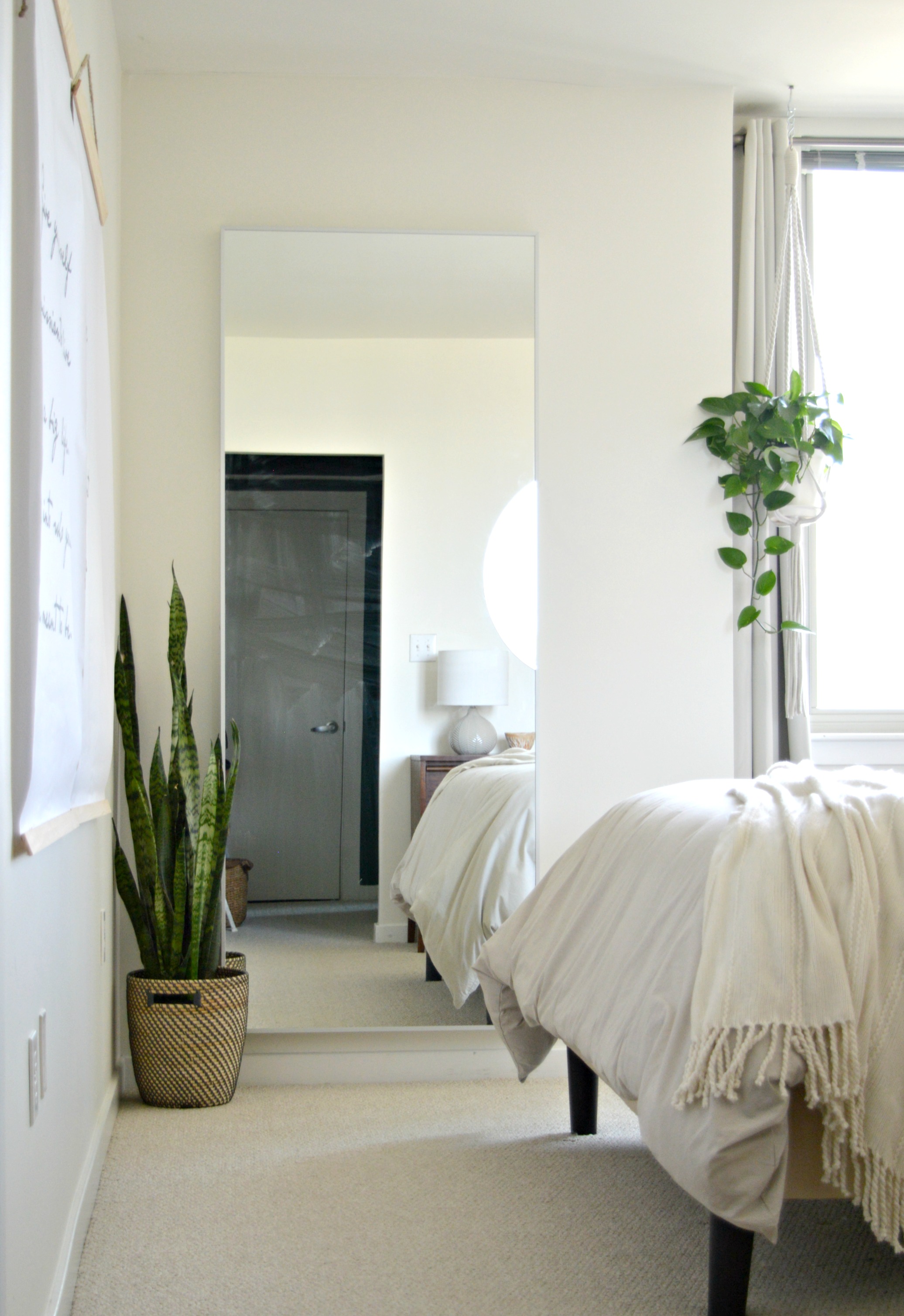
From dark and moody to bright and airy; the perfect contrast.

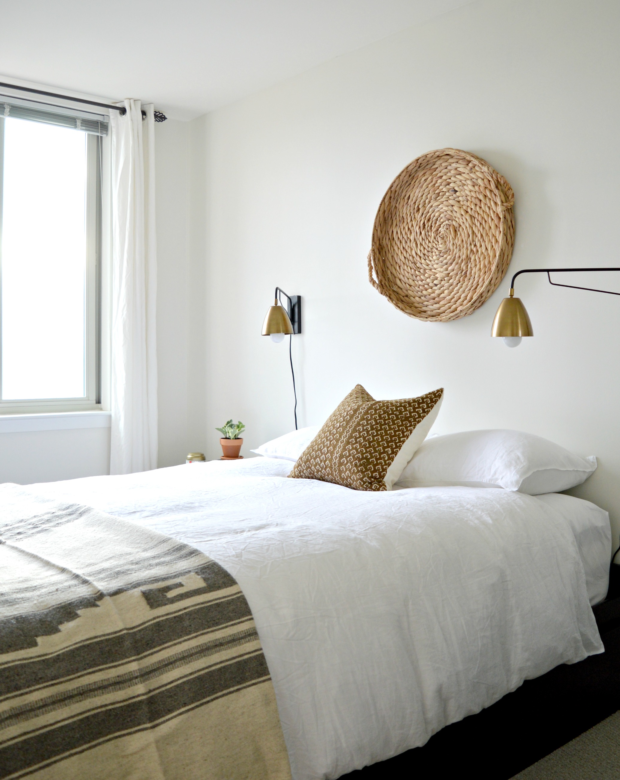
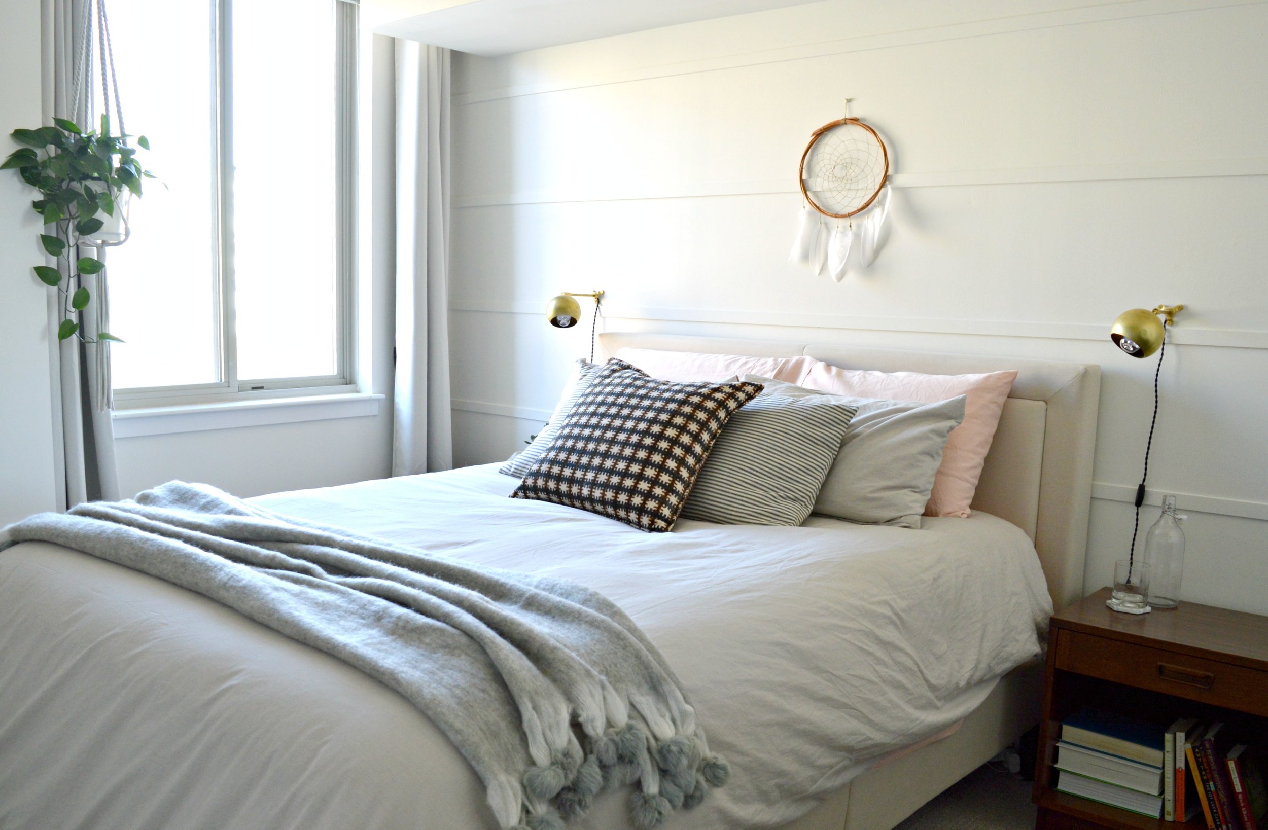
We wrapped the bedroom in 'Swiss Coffee' by Benamin Moore and contrasted the neutrals with warm wood. Similar to the guest bedroom we kept the lines of the furniture very simple and clean, and similar to the main living spaces we layered more pattern and texture.

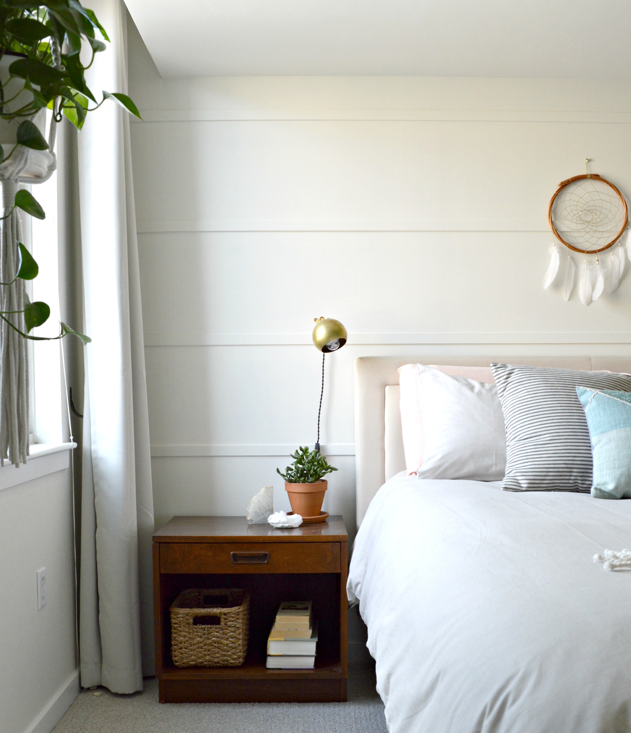
Since our client came in with a real 'let's do it!' attitude we were able to present some really exciting ideas to her. The dark green moody hallway was just the beginning and she really nailed it! This wall treatment behind her bed was another project we included in our design for this space. We had all agreed that an accent wall of sorts behind the bed would make this room really special, but we wanted to keep it monochromatic, subtle, and easy! Since our client would be handling these projects on her own, (reminder, this was all done through eDesign!), we wanted them to be very manageable. After she suggested a shiplap wall, we thought about some more affordable and easier alternatives. We stumbled upon this idea on Pinterest of using just pieces of wood trim horizontally spaced apart and nail-gunned to the wall. It was a project that didn't cost a lot of time OR money, but the impact is exactly what we were looking for. It speaks the same language as shiplap, but it's a little more modern looking and different from the currently trendy wall treatments out there right now.

This colorblock pillow from Urban Outfitters was one of the first pieces of this design! We wanted to contrast the dark, rustic hallway with a light and airy space using soft textures and warm pastels.

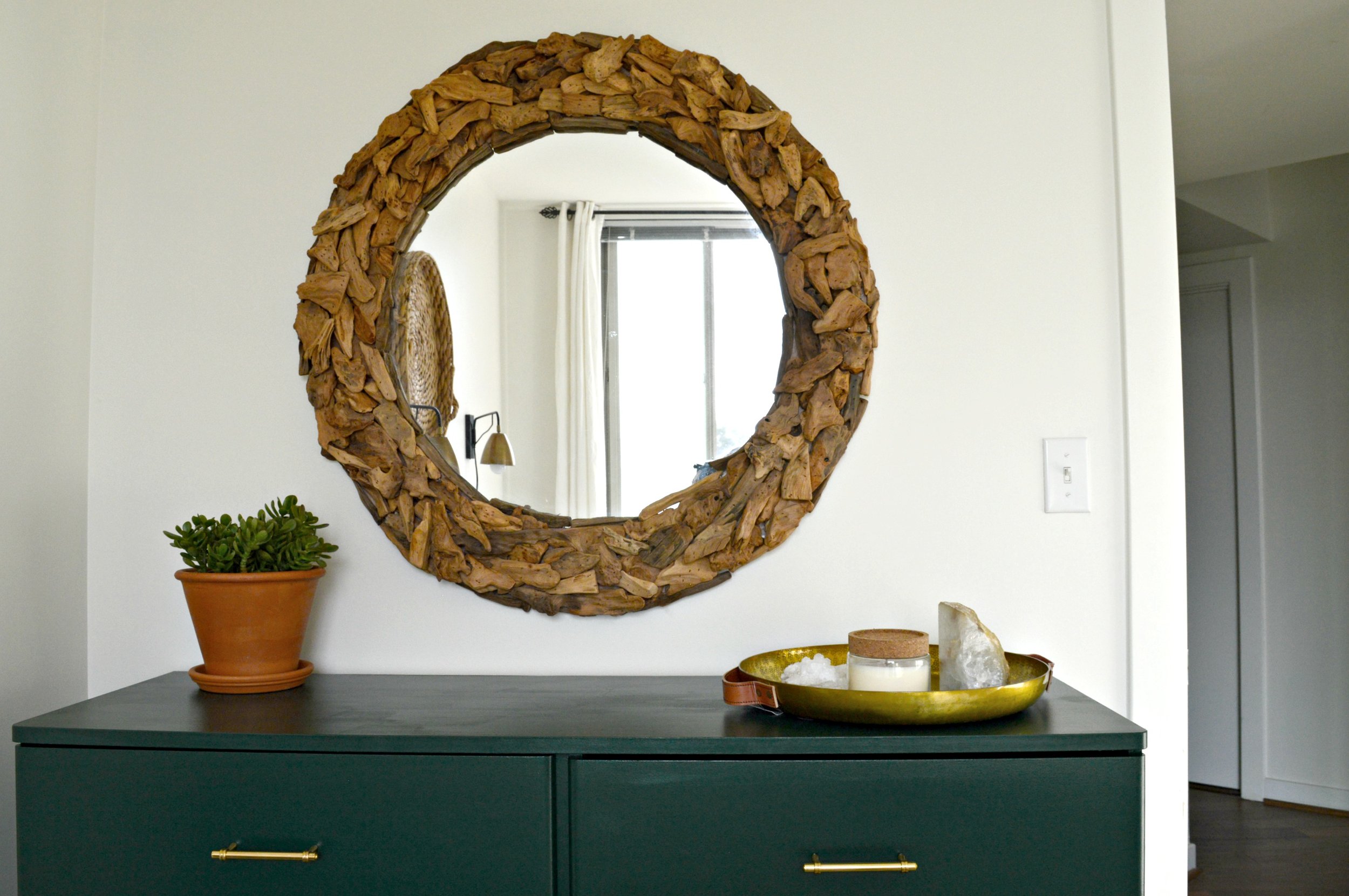
The dresser and nightstands were a fantastic mix and match Craigslist maneuver - we wanted to use walnut wood in here and after using 'walnut' in the search bar, these pieces popped right up! We've mixed woods in various rooms before, but in a smaller space like this where the goal was a really clean and fresh feel, we wanted the few wood pieces brought in to be of the same finish.

For less than $10/each we created the wall hangings that incorporate a favorite quote our client gave us. Aren't these words by Joan Burge, (author of Give Yourself Permission to Live a Big Life), inspiring?! Solid choice to wake up and see every day. For more info on how to create large scale charts like these, see post here.

A pair of 8x10 prints from our dear friend Jessica over at Vol.25 look just perfect next to the warm wood dresser.

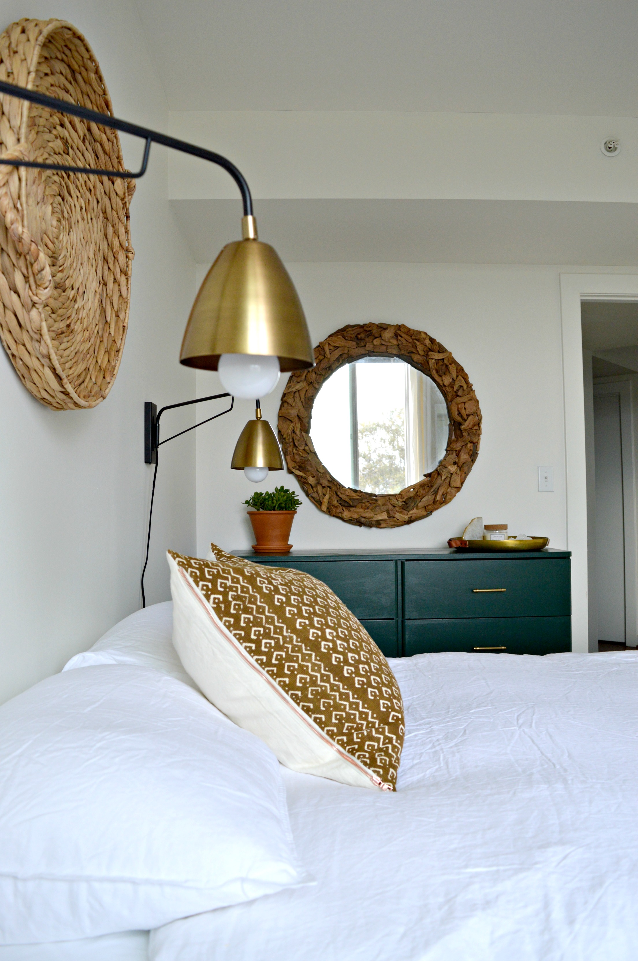
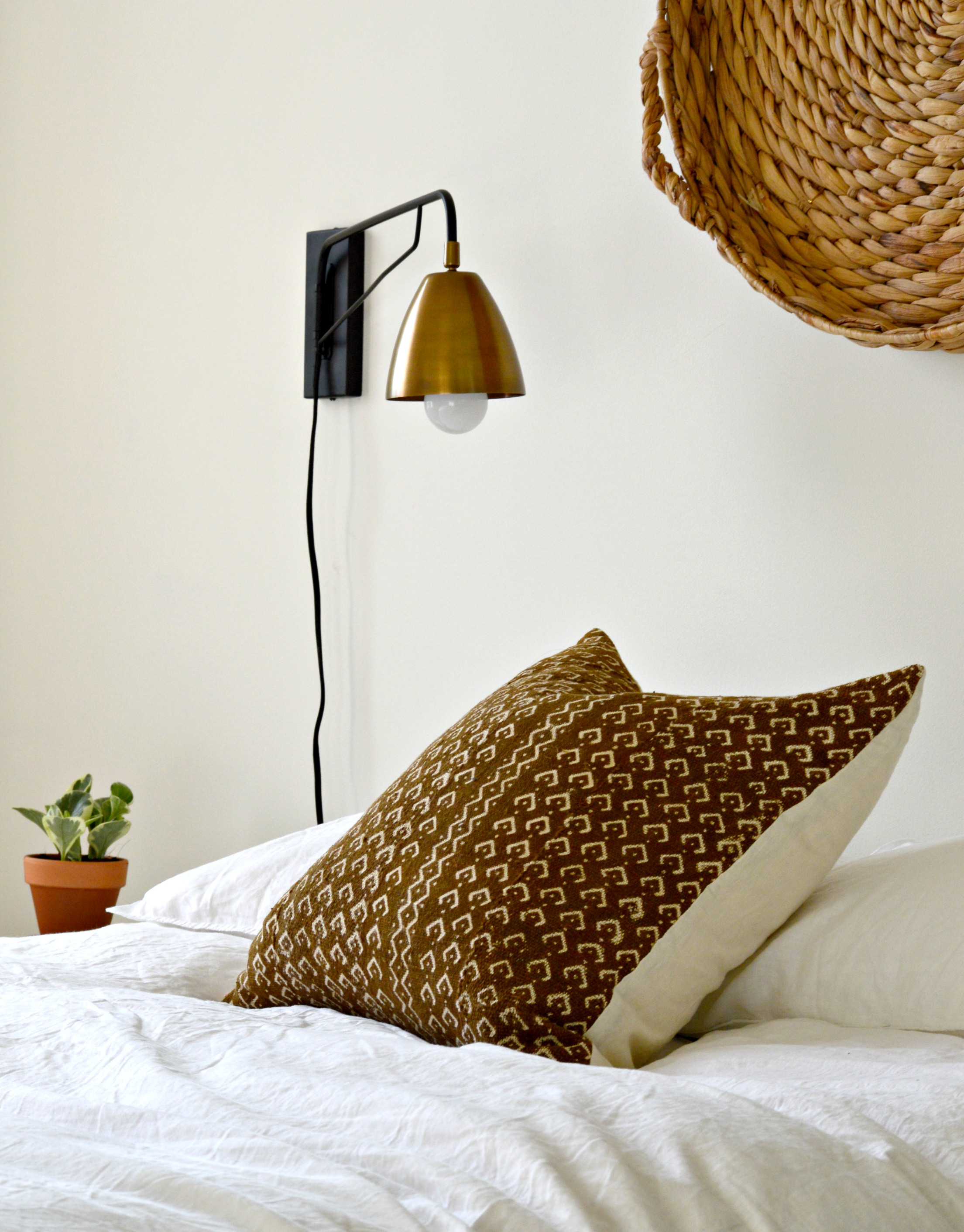
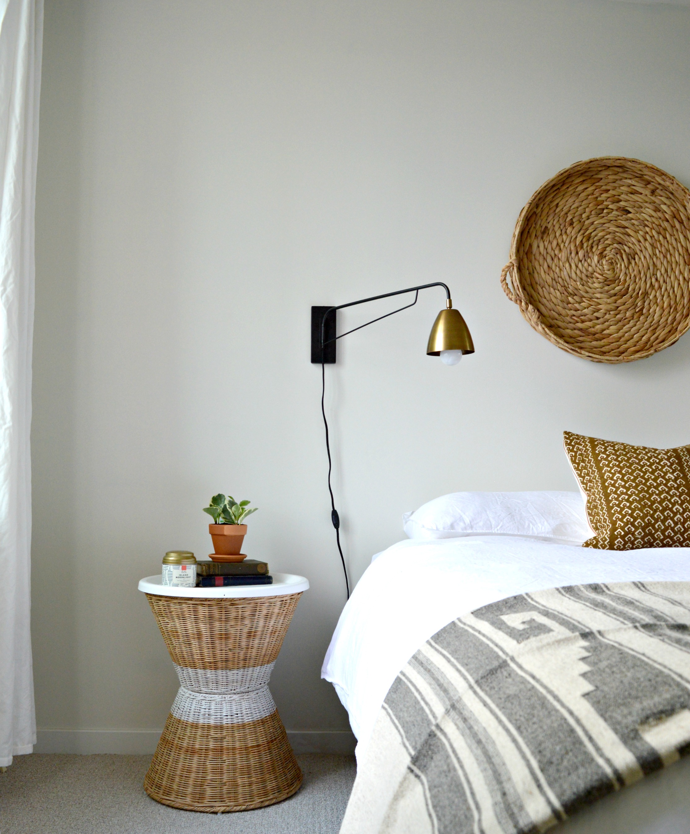
These brass sconces are from a seriously talented small business on Etsy called Rough Luck Studio. Their collection is extensive, affordable and we absolutely can't wait to use them again!

Because our client was a fellow 'style-mutt', she was very eclectic and liked all the things, (is there anyone who can't relate to this?!). Near the end of this project, when the air was starting to turn crisp and the colors on the trees were changing, she expressed interest in incorporating some richer colors in place of the pastel. The wonderful thing about the design of this room is that it's so neutral she can swap out pillows and throws for instant seasonal change. We suggested a gorgeous velvet rust, ivory and dark gray pillow as well as a mohair throw with pompom fringe from a local small shop, Valerianne.

Nothing else changed in the room, but look how fall/winter ready it is now!

That's a wrap folks! We sure are grateful to do this work; what an honor it is when someone invites us to help them create their home - of all the places in the world, home should feel truly special. Feel free to contact us through the 'free consultation' form linked on our eDesign page if you're interested in chatting about your own space!

Thank you all so much for coming by!