Simple Christmas Tour

Hello, hello! 'Tis the season for Christmas decorated home tours, and while it's been really fun to see how other friends have decorated their homes for the holiday season, I wasn't planning to share my own home until yesterday afternoon! We've enjoyed getting our Christmas decorations out as a family and setting up our tree and lights, but it's kind of been something I just wanted to enjoy with my family this year. It's easy to feel pulled in a lot of different directions during the holidays, and with our plates full of other really good things, this was one that I was planning to shed. I confided my conflict to Cate who wisely advised that if it doesn't bring me joy, then don't worry about it. And at that, I decided to whip up this post!

I don't share a lot about life behind the scenes of StyleMutt Home, (not as much, anyways). But it's moving forward at Polar Express speeds, (just like anyone's). The way I decorate our home is every bit a reflection of that passage of time, our growing children, myself. Our home has always been an extension of the character of our family and my personal development as a creative individual. The reason I enjoy documenting our home is the same reason I journal - to be able to look back and see growth and movement. So, despite the simplicity, it warms my heart to share our Christmas 2017 home with you, friends!

6.jpg

Notice the angel on the far left, with her nose in the air and arms crossed. No candle, baked good, seashell or wreath like the others....she's my favorite. Hah!!

13.jpg
3.jpg
8.jpg

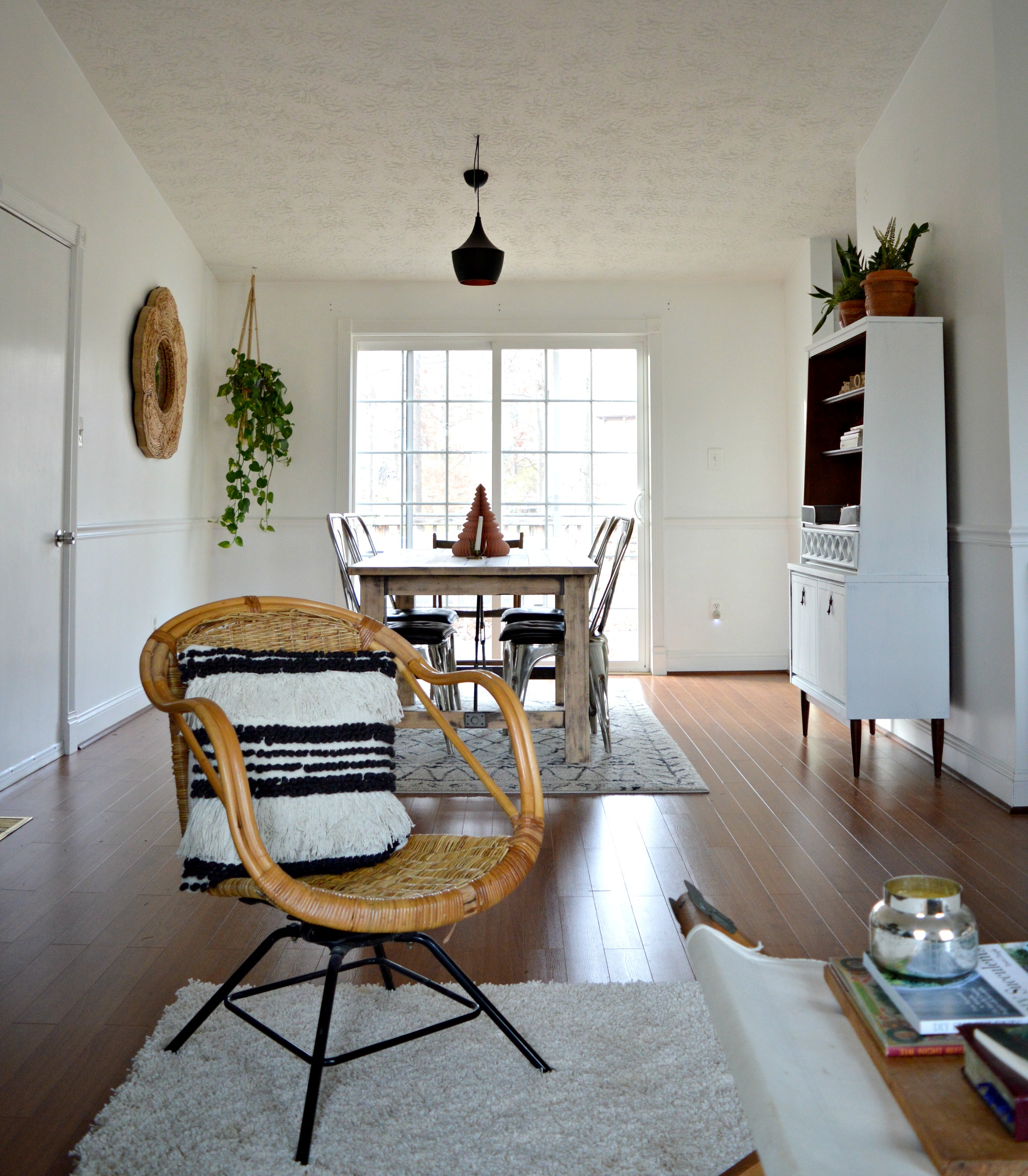
Oh my goodness, I hope I can still remember in years to come how funny it was trying to figure out a layout this year! We are right smack in the middle of a sofa debacle that is a story for another day, but we figured things out by using only the chaise part of a massive sofa / chaise combo.

24.jpg
14.jpg
7.jpg
25.jpg
9.jpg
16.jpg
10.jpg
11.jpg

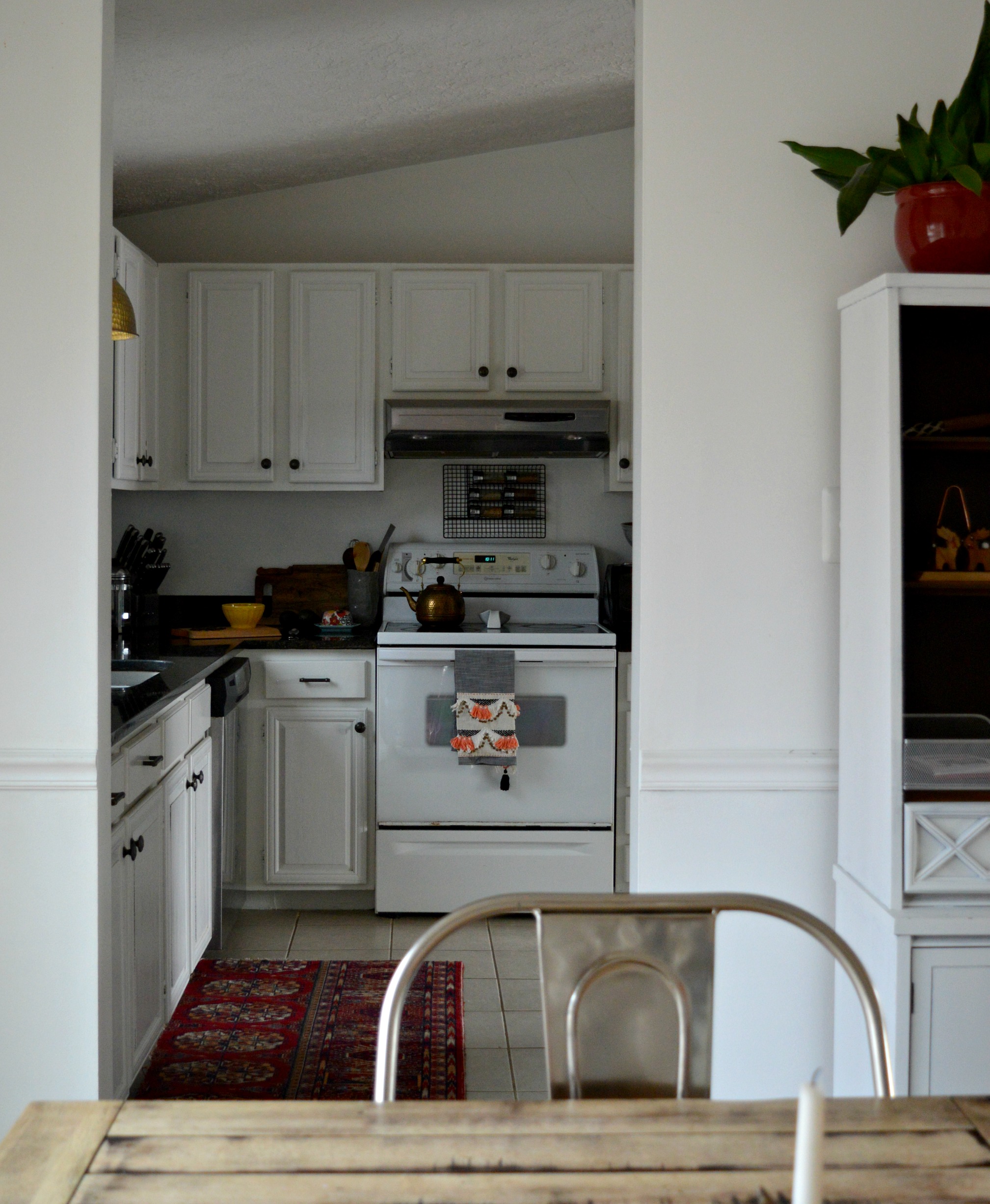
Our kitchen has seen A LOT of action lately now that we're in full swing holiday party season. Yup, lots of mediocre baking going on in here. If you like quantity over quality, I'm you're gal! Lol! Between the kids' classrooms and their various activities, it's been one party after another!

12.jpg
15.jpg

Shire's bedroom is pure Christmas magic to me. I find myself in here without any reason to be; it's just a happy place. The bedspread was from my grandparents' old lake house, and the mini tree is on loan from my sister. I love that Shire's room is a compilation of special memories, people and places.

1.jpg
2.jpg

Our bedroom is the last stop because the boys room is just done being photographed. It's a charming hot mess and I love it because I birthed them, but their door is officially closed to the public. :)  I enjoyed adding a tiny bit to our own bedroom, though, to make it special for the holidays! The bunch of boxwood was just the kind of small festive nod I was looking for for our room. It suits the simplicity of the space well and because there's not a lot going on, I feel like you really see it, you know? I often tell clients, the less there is, the more you see.

19.jpg
18.jpg
20.jpg

The only other impactful addition to the room is the kilim rug  covered bench at the end of the bed! Both the rug and the bench were found on a neighbors curb on trash day, so I brought both pieces home and turned them into one!

17.jpg
22.jpg

Well that's it! Thank you so very much for taking the time to come by. I hope you enjoy these days until Christmas and have peace about what is on your own plate. A bit of advice - no one else will really notice what you don't get done. As I walked into yet another children's holiday party last night for my son's cubscout pack, I placed my 4 dozen brownies on  table full of other various treats and thought to myself, no one would have noticed if I didn't bring these. Here's to shedding the excess so we can focus on the priorities.

Merry Christmas and God bless!

Chelesa.jpg

Dramatic Studio in the Theatre District

Hello dear friends! It's my first post since one of the dearest people to my heart passed away, my grandpa, ("Bampy"). He gave us so much to celebrate and a helluva lot to miss. It seems so fitting today to get to share a recent project I had the opportunity to do in the beautiful city of Boston, home of his Red Sox. We shared a love for New England and although I don't get to call it home anymore, the next best thing is having the chance to design beautiful homes nestled in some of Boston's most beloved neighborhoods.

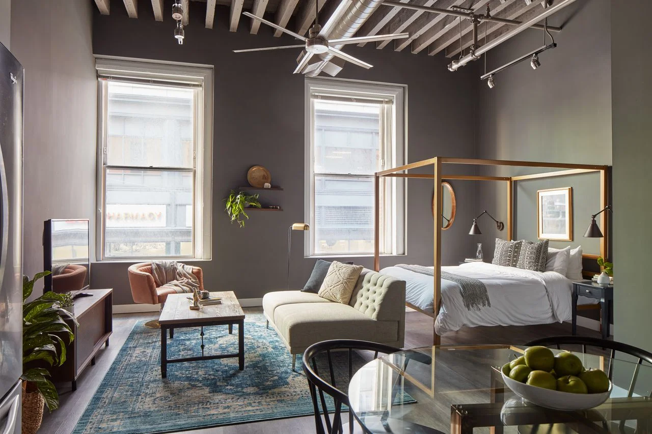
Today's reveal is a studio right on the outskirts of the Theatre District. I've always wanted to design a studio - Something about the challenge of cramming your living, dining and sleep into one room just piques my interest! Hah! While this one is definitely of generous proportions, I still had a tricky time with layout. But it was an exciting challenge to take on and I'm so happy with out it turned out!
Let's take a look around:

finished 3.jpg

First, you can't beat these windows. All that natural light is making the design look goooood! I wanted to wrap the space in something dramatic so I chose a charcoal gray, (Kendall Charcoal by Benjamin Moore), that could move well from the lighter side near the windows, to the walls furthest out.

finished 2.jpg

That Red Sox literature is for you, Bampy. :)

finished 7.jpg
finished 4.jpg

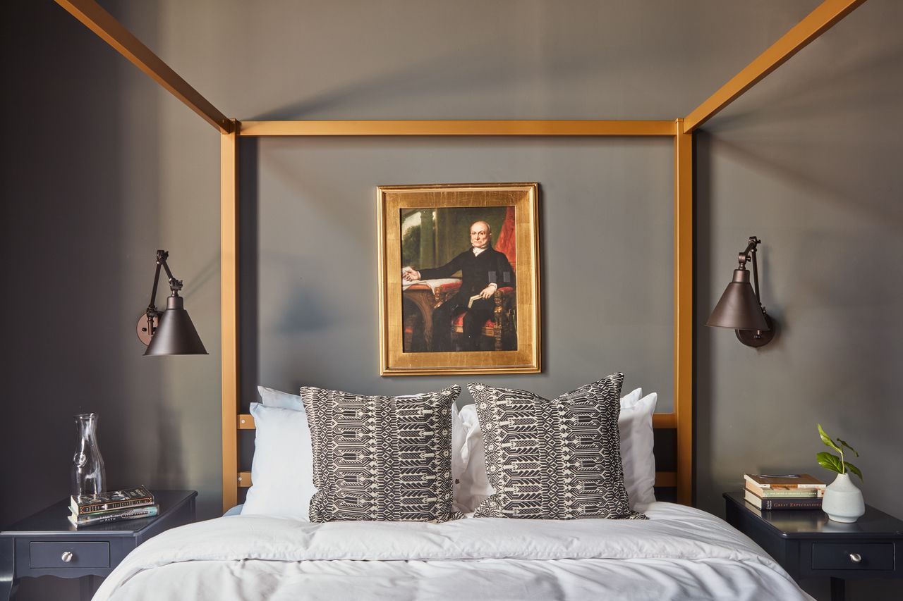
Another first for me was using a canopy bed! I figured creating a cozy sleep space in a studio could be a challenge. I wanted it to feel set apart and intimate, and I'm so pleased with how this piece, (found for a great price at Wayfair), fits into the space!

finished 12.jpg
finished 13.jpg
finished 14.jpg
finished 10.jpg

And if you're in to the behind the scenes process, here is one of the floorplans and design boards from this project! There are always edits but I try to hit the big picture concept early on so it's just tweaks from there. For this job I wasn't given pictures of the space beforehand nor measurements of the windows or between the windows, so when we saw how close together the windows actually were it made sense to rotate the living area.

Floorplan.jpg
Moodboard Bed.jpg

That's it - Pretty short tour when it's all one room! If you have any questions about where I found what please don't hesitate to ask in a comment below! I'll be back next week with another design reveal from the Windy City!

Thank you so much for stopping by!

Chelesa.jpg

Reveal: Industrial Meets Cozy in Beantown

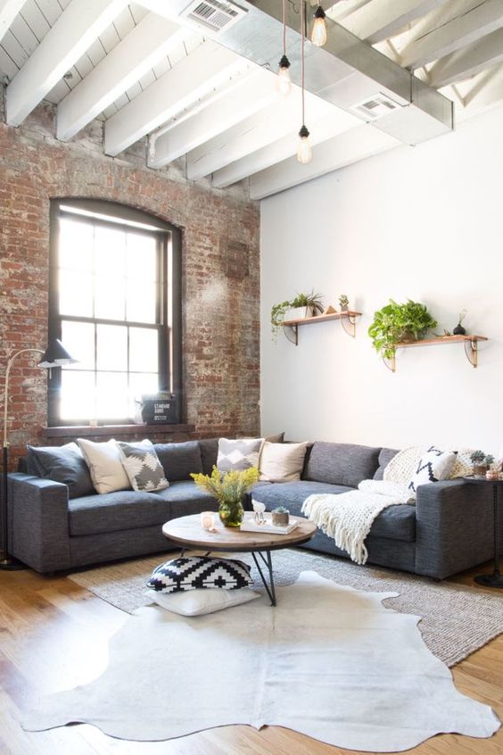
Got another eDesign reveal today! The client started with a very industrial 2 bedroom space - interior brick, city views and large windows; all my favorite things together! I had complete stylistic freedom, but a limited budget and limited time to get it complete, so I started with some design inspiration to help me hone in on the ideas I wanted to prioritize. Some of my favorite inspo images are below and with each one I had made a note of what caught my eye most.

For this project I was given a sketched floorplan and a video tour of the space. Since I didn't have photos to go by, I was meticulous with the floorplan. I had a vision of what I wanted the space to look and feel like, but a vision is just a vision if the pieces don't fit perfectly and the flow is not a hundred percent comfortable. I created a floorplan for each room in the space and several for the living room - it was an oddly shaped room and I wanted to try some different layouts, but the one seen below is what we ultimately followed the closest!

Finding the right pieces for this space was an absolute blast, but not without some particular challenges! The client needed the design completed 2 days from handing me the specs on the space, so I needed pieces that were not only friendly to our budget, but that offered a speedy delivery! Below is one of the final moodboards of the living room. I used several to indicate some specific details, but this one shows the jest of it.

Boston Sonder Living Room 1.jpg

And voila!

1.jpg

I really trusted the client's measurements of the space as well as the measurements indicated with this sofa - if either had been off it wouldn't have worked. Luckily it was a perfect fit and I got to tuck the sofa cozily inside this brick clad nook.

3.jpg

I'm so grateful to the hardworking installation team that carried out this design to 'T'! eDesign is most successful when the designer can clearly indicate the details of the design and the installation team interprets the instructions properly. The team did a fantastic job carrying this design to fruition; it turned out exactly as I had imagined and hoped!

4.jpg
5.jpg

Although the kitchen was an itty bitty little thing, the client desired a small eating area that could accommodate 4. I used a modest round table and simple chairs on the smaller side, but also shared in the design boards a couple fun alternative options for one of the chairs to be used elsewhere for when space is needed during meal prep. Options are always good!

8.jpg
7.jpg

I wanted to give the bedrooms a cozy, sophisticated feel that is so true to Boston. Bostonians are not excessive in their style; nothing too contrived, function over form. Always. It's been a while since I've lived there, but that aspect of the city as a whole has been around for ages. There's an old story of a Boston matriarch bein where she got her hat, to which she responded, "We don't buy our hats, we have our hats."

Bedroom 1:

12.jpg

Nothing too fancy here, just classic, comfortable design.

13.jpg
14.jpg
15.jpg
16.jpg

Bedroom 2 is the slightly less sophisticated younger sibling of Bedroom 1. But they 'speak the same language', as Cate says, and the laid back, comfortable vibe is consistent between the two.

9.jpg
10.jpg
11.jpg

It's such a delight to see this space finished - it was a whirlwind putting it together in a matter of days but I absolutely adore how it came together! Even with such a short timeline to work with, the creative freedom to do just about anything I wanted with this space was an incredible opportunity to be entrusted with. I look forward to sharing more such projects with you soon!

Thank you so much for coming by!

Chelesa.jpg