eDesign: Finding the Right Fit

This post is sponsored by all of our extended family members who've asked over the last year, "So, what exactly is eDesign again?". Whether you're a curious family member or a home owner/renter who is contemplating eDesign to complete your own space, we're sharing what we hope will be some very helpful information! It's going to get a little wordy here today, so if lots of text and finer details are your jam, you're in for a treat! If not, we've sprinkled in some pretty pictures to help you get through. Like this one:

45.jpg

So what exactly is eDesign?

eDesign is interior design done remotely. Rather than visiting clients' homes and doing all the work in-person, the design is put together without ever stepping through the front door. Using simple technology like FaceTime and email, clients and designers are able to work together to execute a detailed and personalized design plan for any space in the home! Clients often send measurements and photos of the space they'd like help with, and the designers are then able to create customized design ideas for the room complete with floor plans, design boards which help the client visualize the finished look, and in some cases a complete shopping list of items in the design plan that the client can purchase and put in place on their own.

Isn't eDesign more work for the client?

It is. eDesign certainly isn't for every homeowner, but if a client is willing to put a bit of their own time into transforming their home, they can easily save hundreds, (and thousands), of dollars on in-person designer fees. But there are tools that make it very easy for designers to communicate ideas and final looks, so the ultimate goal is for the client to be able to follow a clear step-by-step plan that's easy to follow and execute on their own.

Just to hold your attention:

There, are you still with us?

Now that we've explained what eDesign is, let's discuss how to go about finding the right eDesigner for you. Just because eDesign is done remotely doesn't mean it's meant to be impersonal; it's your home, after all! Since eDesign is becoming increasingly widespread there are many eDesign businesses to choose from and it can be overwhelming to know where to start! Here are some questions that can not only help you decide what you'd like to get from eDesign, but what exactly you'll get from your eDesigner!

Getting started

Understanding what you'll get from an eDesign business before you pay is crucial. Many larger eDesign companies employ somewhere between 200-500+ designers. Be clear about how you'll be matched with a designer - do they match you by style? Location? Availability? Will you have the opportunity to have a virtual consultation with your matched designer before you pay?

Understanding the fee

First of all, when deciding on your budget for your home make sure you consider the design fee. This will be what you pay the eDesigner, not what you pay for new things for your home. So if your total budget is $$$ and the design fee is $, you'll have $$ left on new purchases. Across the board, most companies charge a flat fee for a specific package, while a few charge an hourly rate. Hourly rates encourage prompt decisions and a clear vision from the client - the more back and forth there is the more the fee grows. Make sure you understand when the clock is ticking. For example, do you pay when you email them with questions and they respond to you? With flat fees make sure you understand exactly what you'll receive from each package, (if they offer multiple packages). While the least expensive package may look appealing, (some of the basic packages that we've found start at $79, $150, $299, and $725, just to give you an idea), just make sure you understand exactly what you'll get. Most of the basic packages offer only 1-2 finished looks, (so if it's not exactly what you were looking for for your home, you're stuck), with no additional tools, (no floor plan, no shopping list or guide to finding the pieces in the plan), and no further assistance. Regardless of what plan you choose, do some digging as to what exactly you'll get and have a clear idea of what you hope to receive.

Here are some questions to ask:

-How long do I have my designer? Most eDesign packages give you your designer for an allotted amount of time, (some even as short as one week - 10 days). This leaves very little room for 'life' to happen and requires your prompt attention to decisions.

-Once the final look is handed over how much room for iteration is there? Will you be cut off from getting feedback from your designer after the final look is delivered? Will there be an hourly rate for any necessary feedback?

All this numbers talk is exhausting! Let's break:

Whew! Ready to move on?

Affiliation with retailers

This is a biggie. Most larger eDesign companies profit two ways - through design fees and through collaborations with big box stores. This means that they are required to use only pieces from affiliated retailers in their designs. The final look can get very pricey and lose the personal touch you may desire for your home. So just ask them where they'll shop for you! Where will the elements of your final look be coming from? If your style is relaxed and you like unique finds, will they be able to accommodate? If your budget is $$, will they be researching the very best deals that are out there, or are they limited to specific stores? Just ask.

We are delighted to tell you that StyleMutt Home is not affiliated with any box store and that we have experience using resources that help us find character pieces for less, as well as the very best deals in your area. This allows us to deliver without limitation a personalized look unique to you, within budget. We are most passionate about helping others create the home of their dreams regardless of limitations, (budget, size, renting rules, location and the like). StyleMutt Home began eDesign as a solution to a problem - we want to help you wherever you are and feel confident that even if we can't be there in person, we can work with you to deliver a home as unique as you.

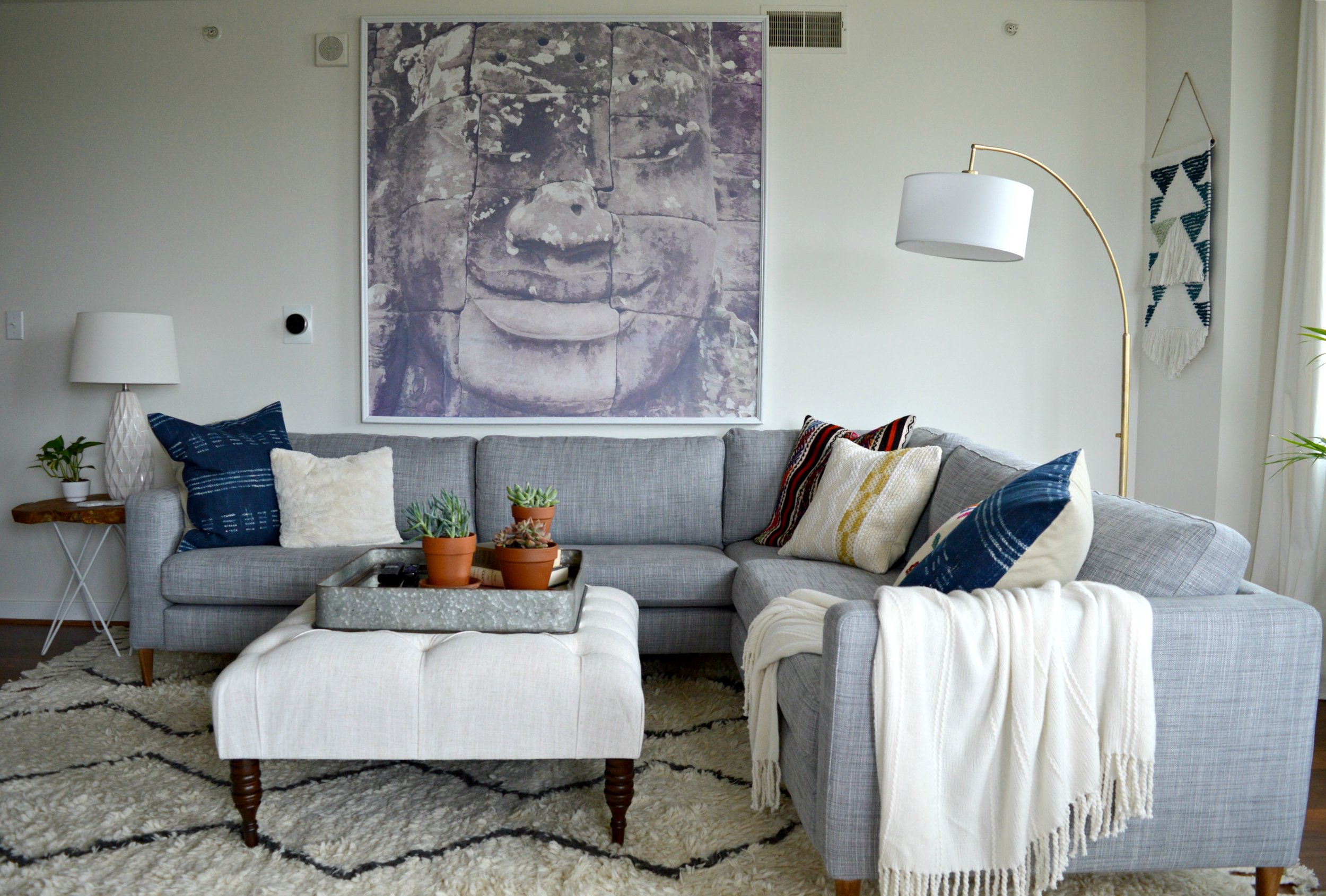
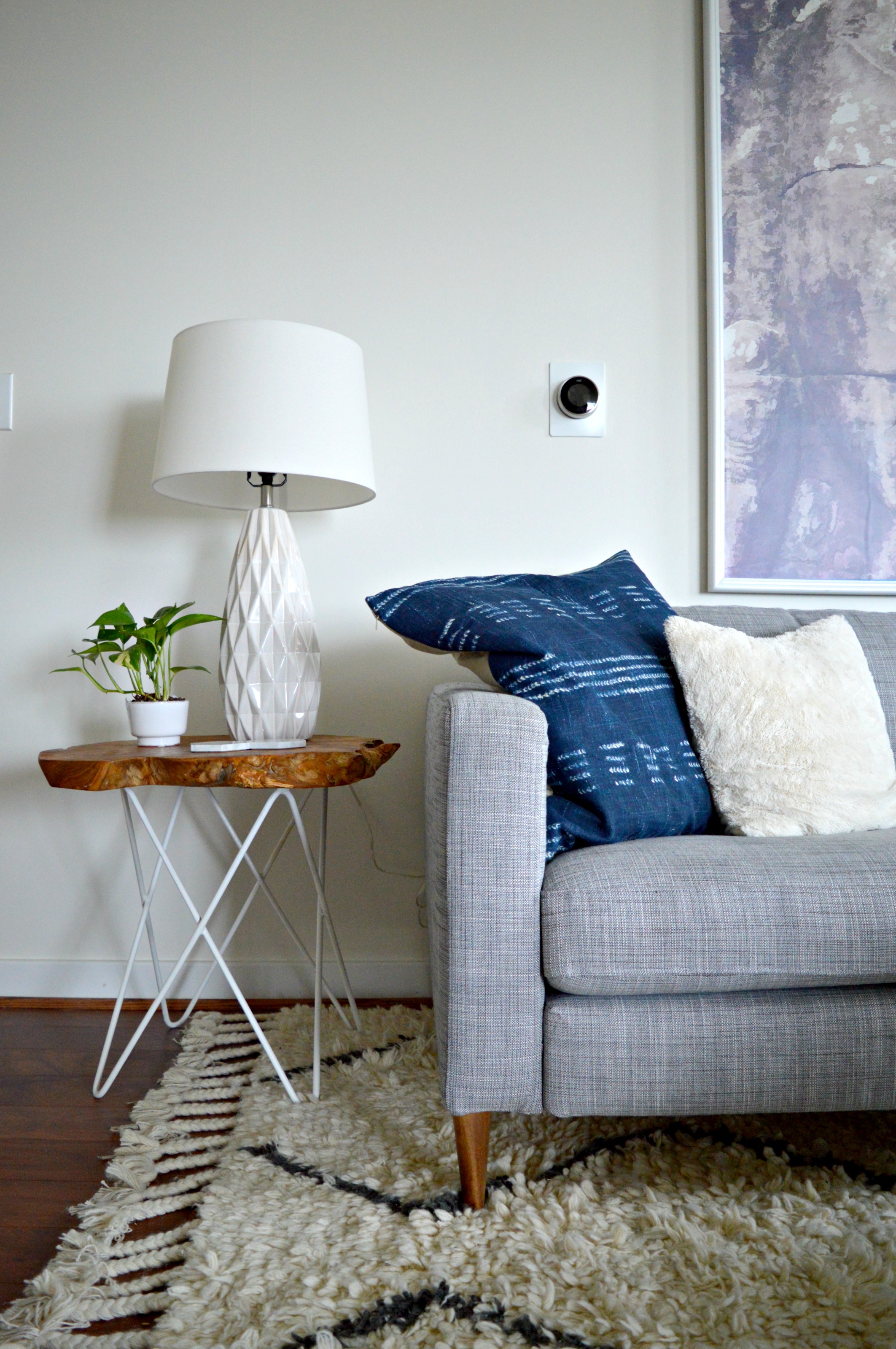
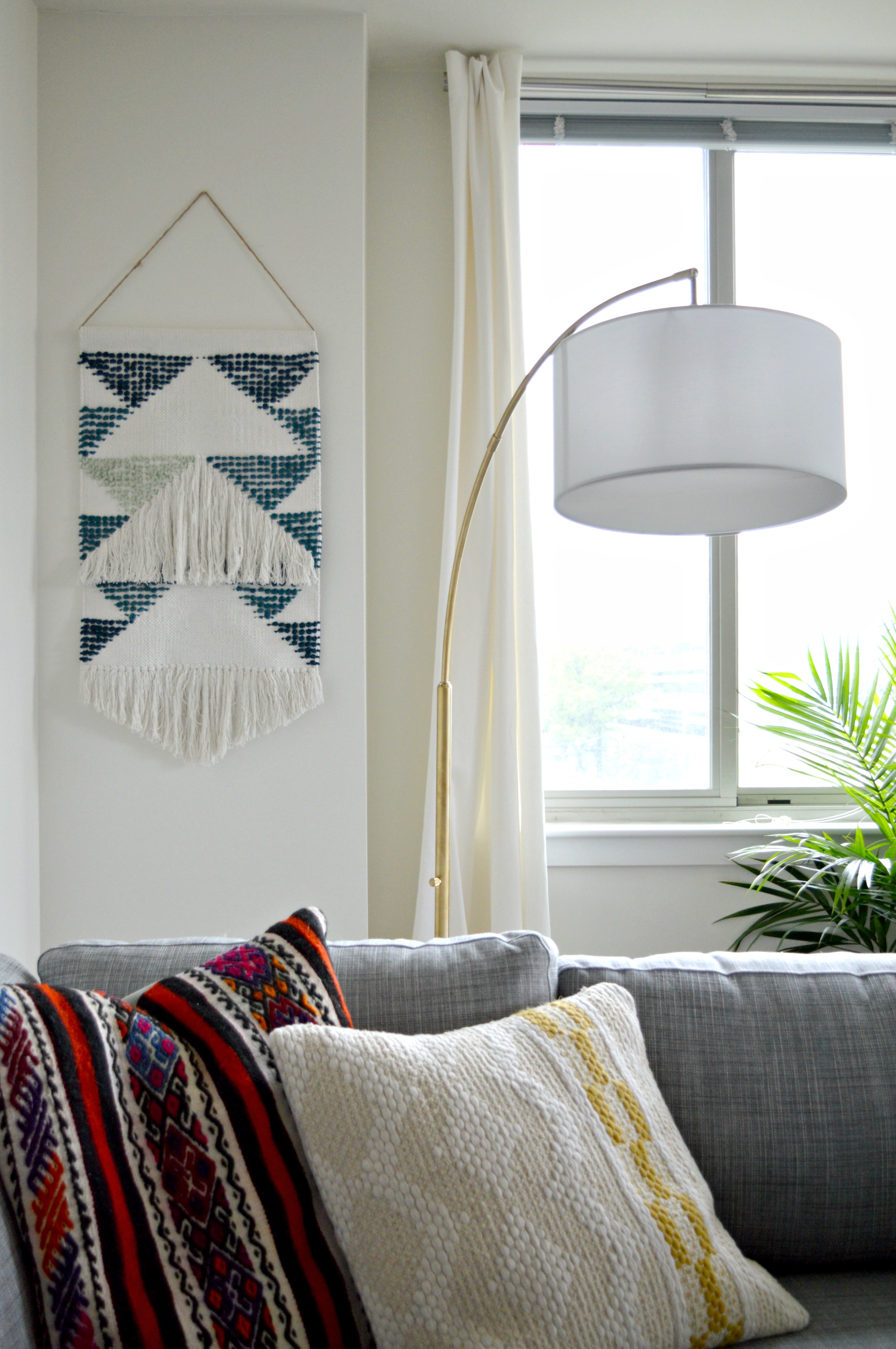
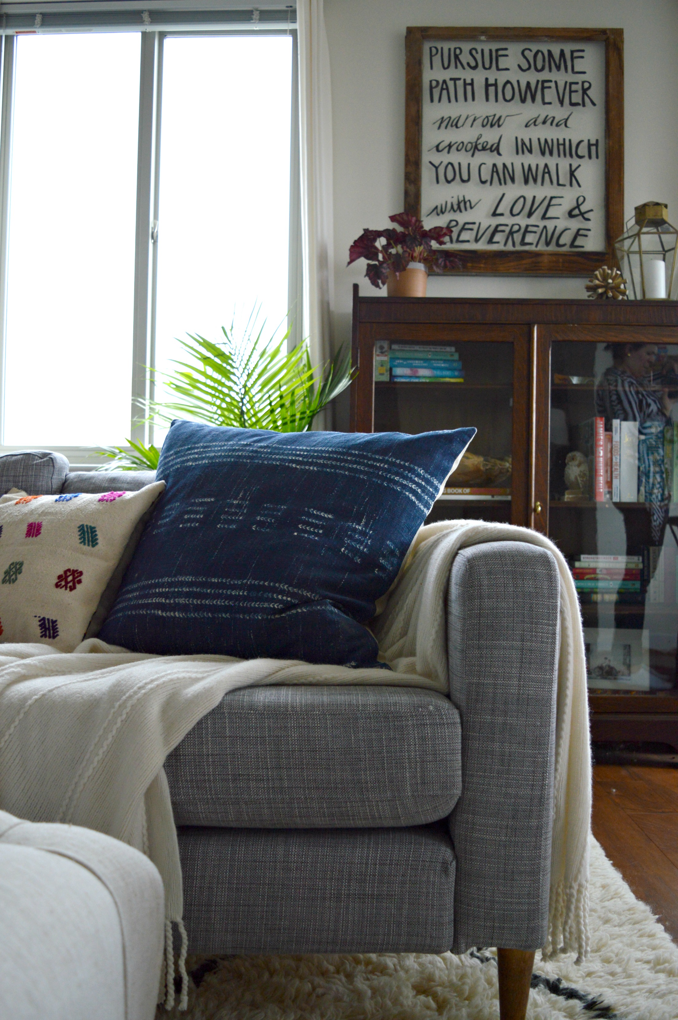
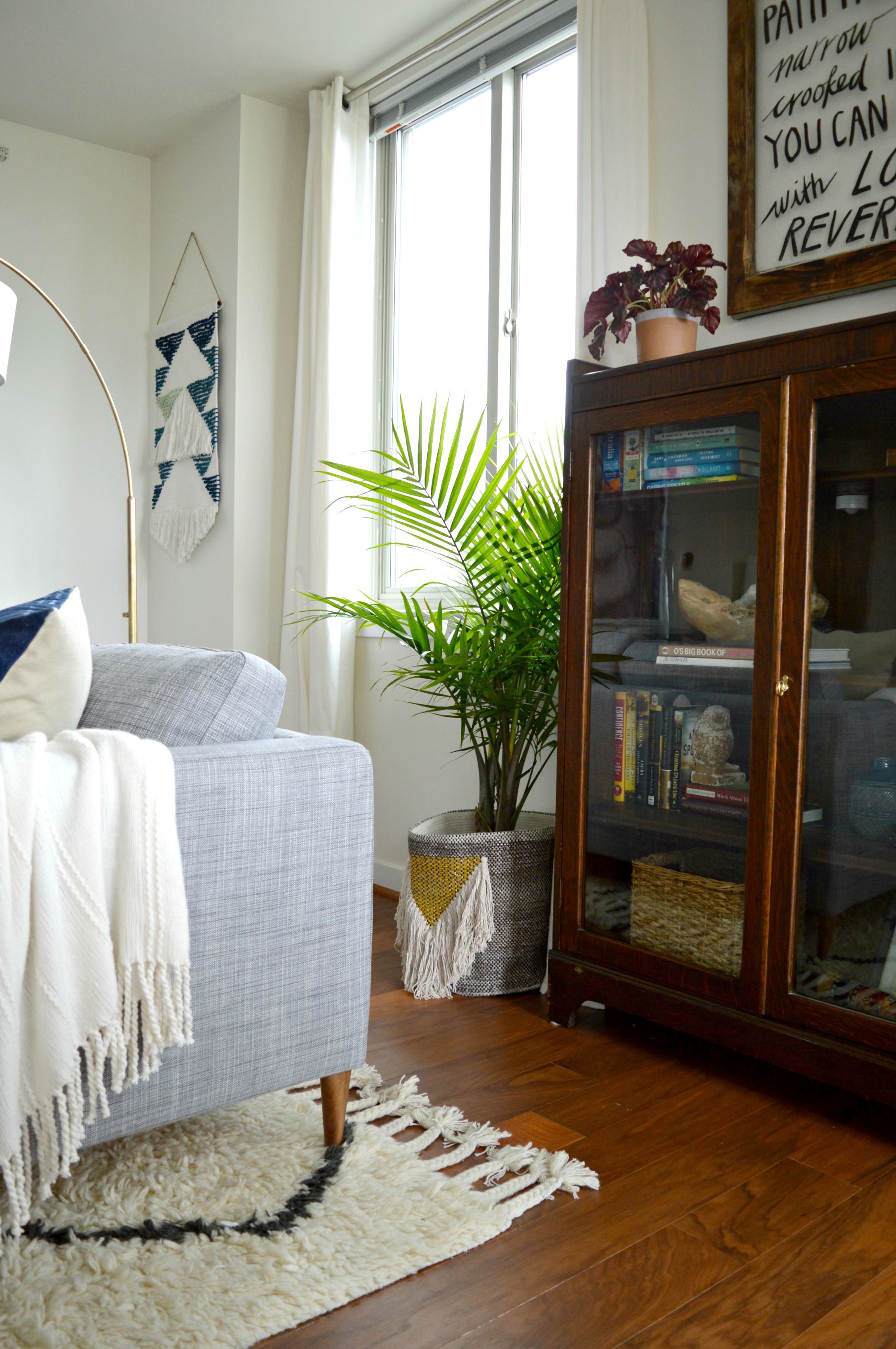
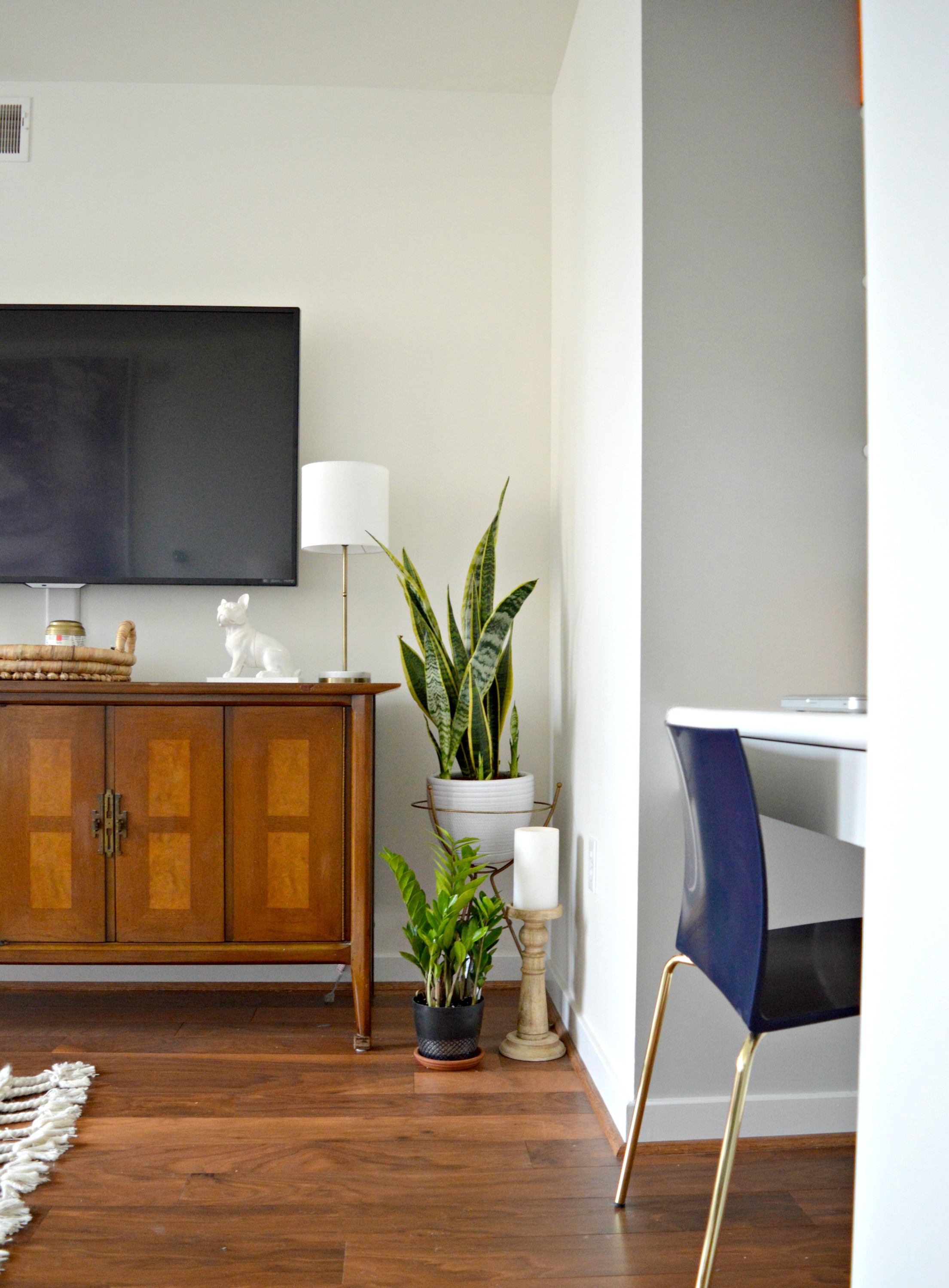
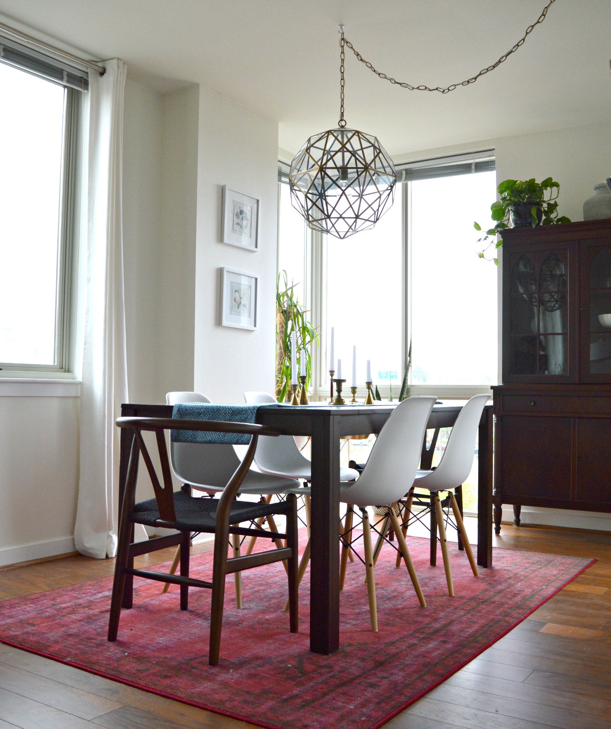
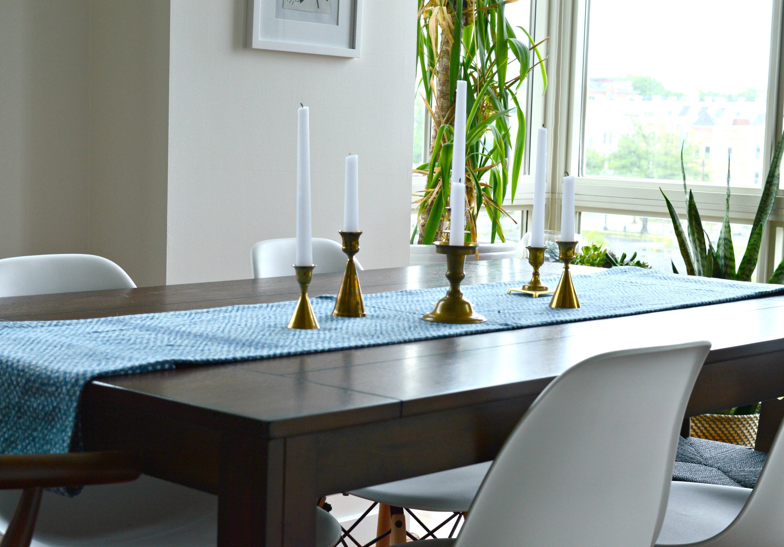
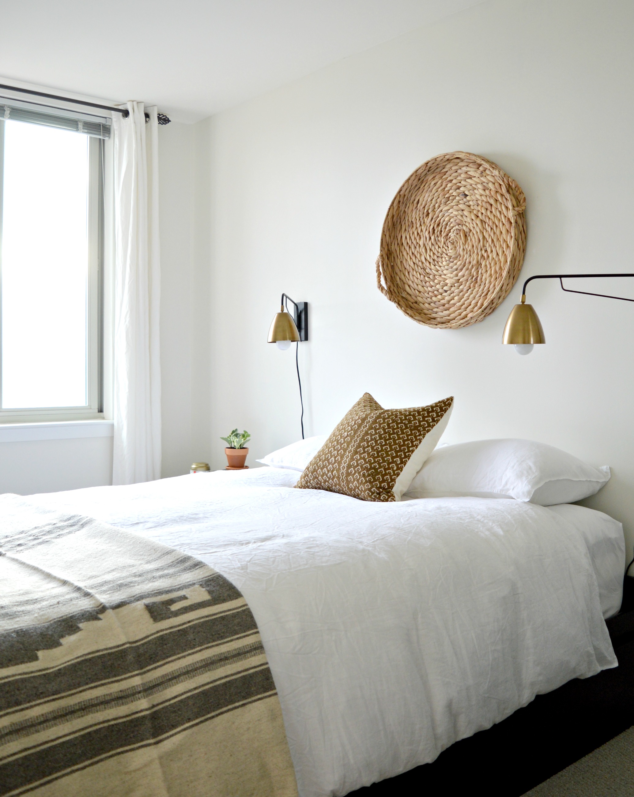
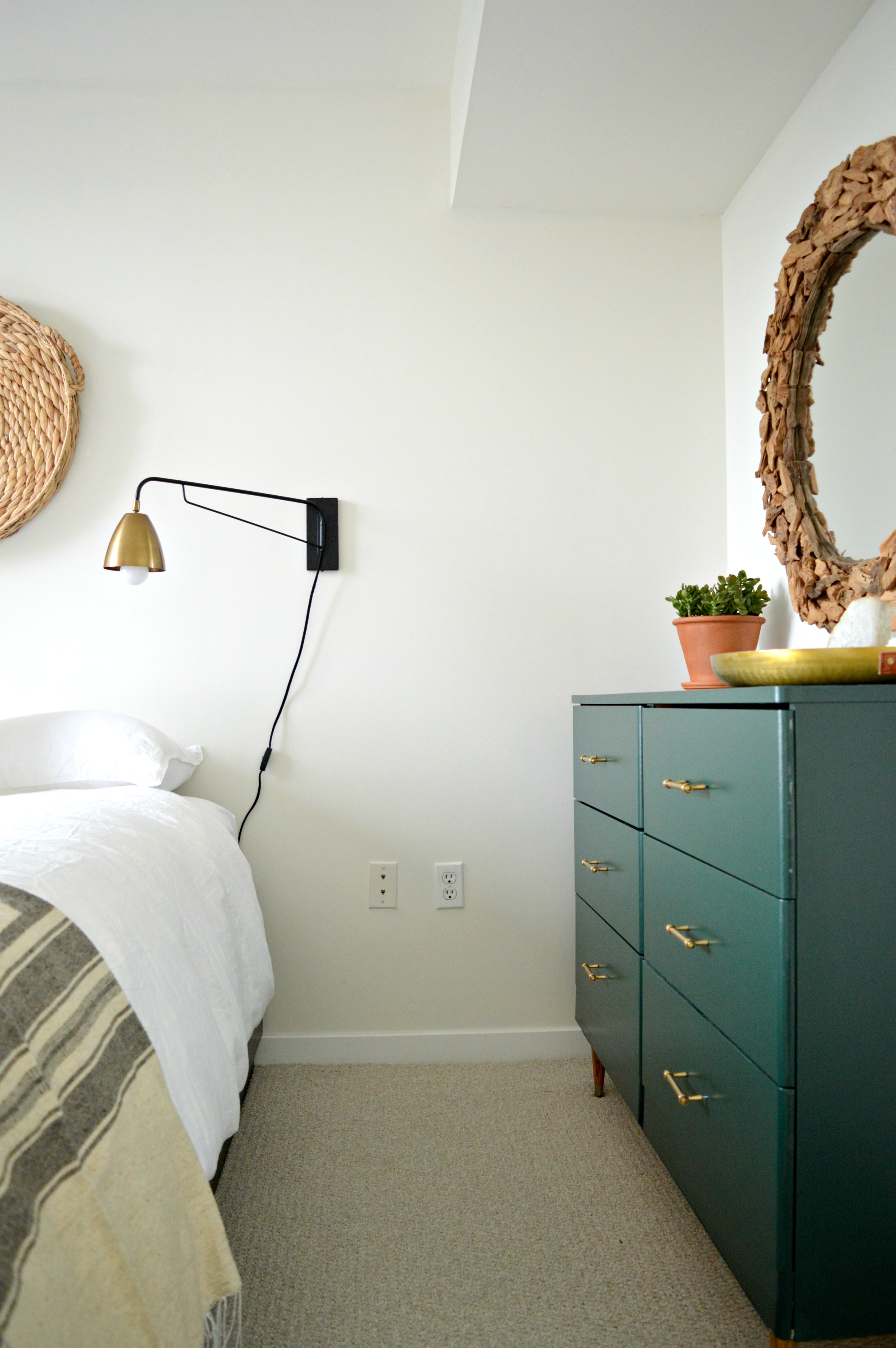
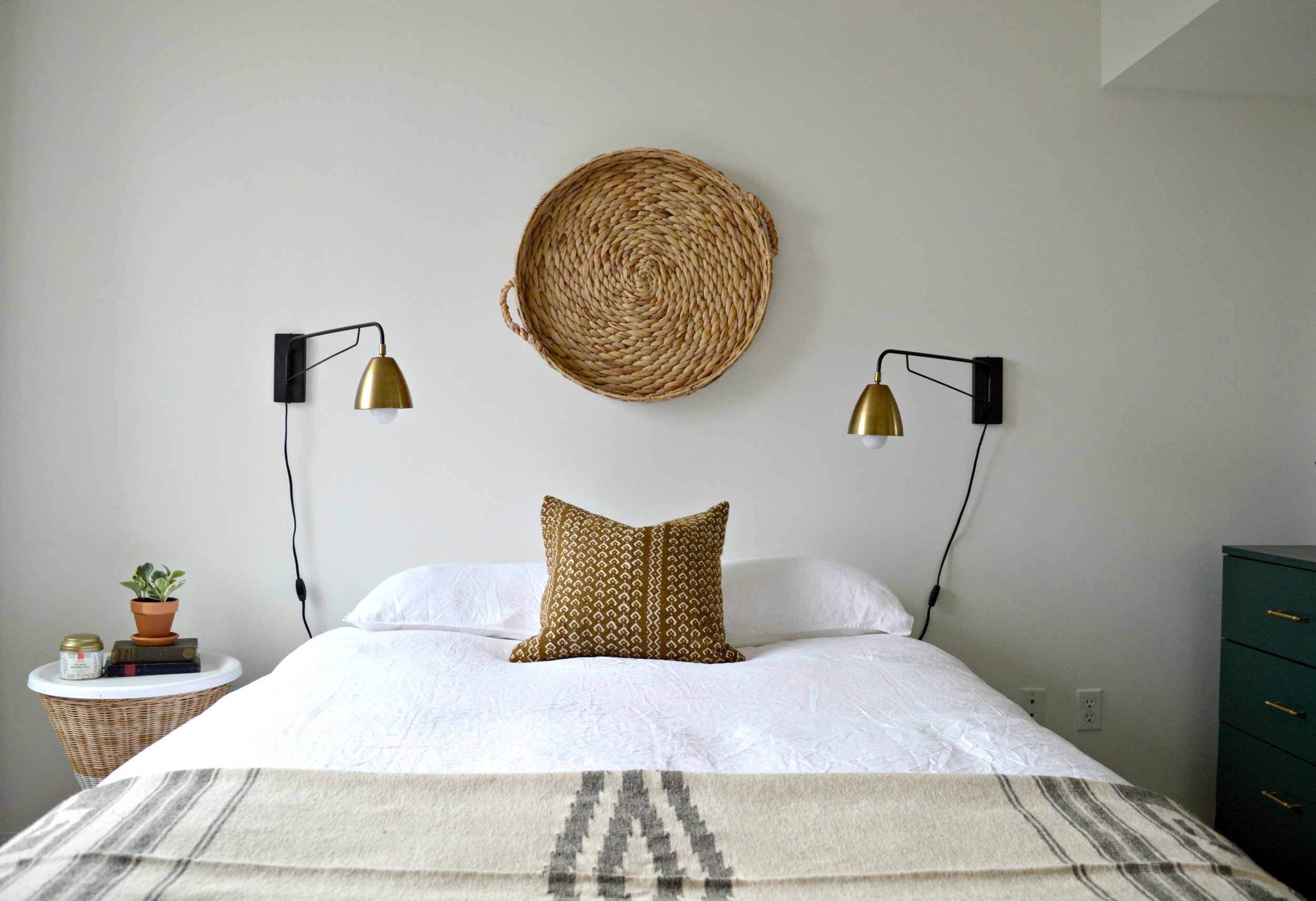
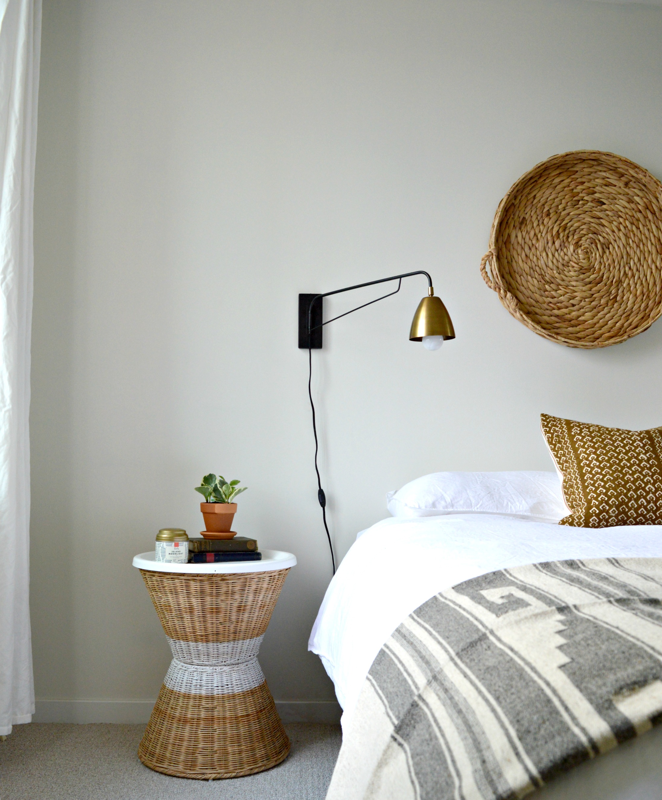
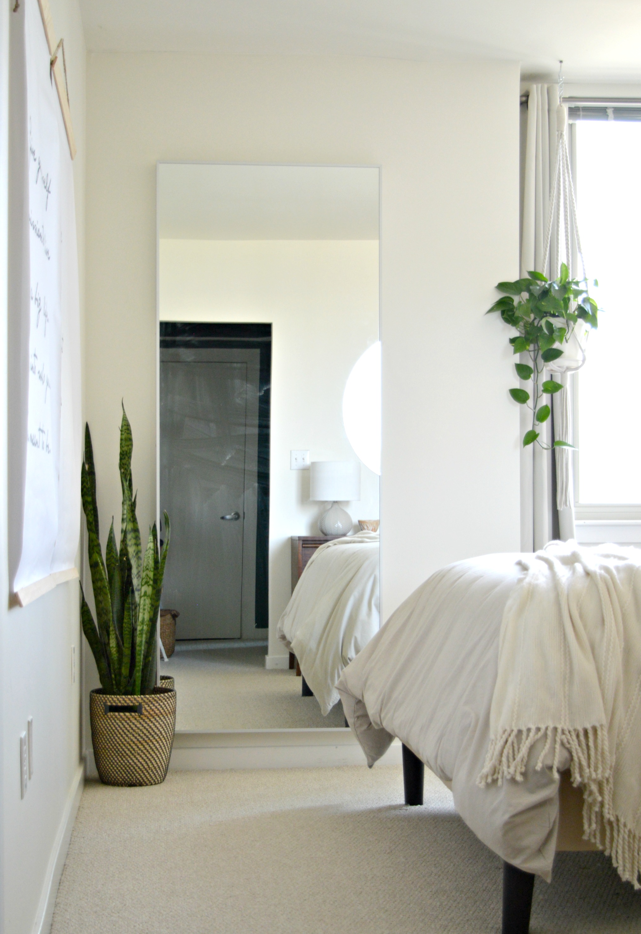
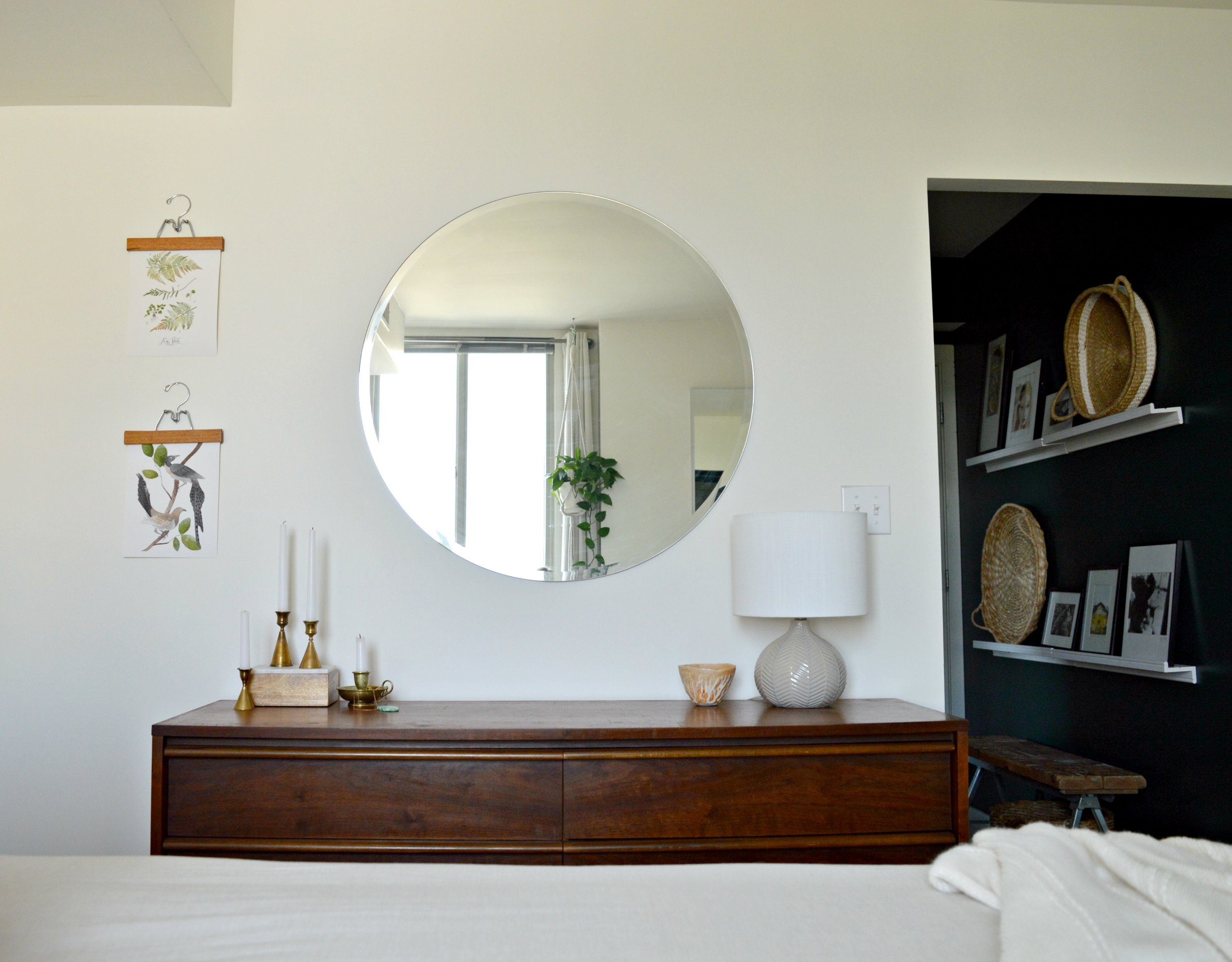
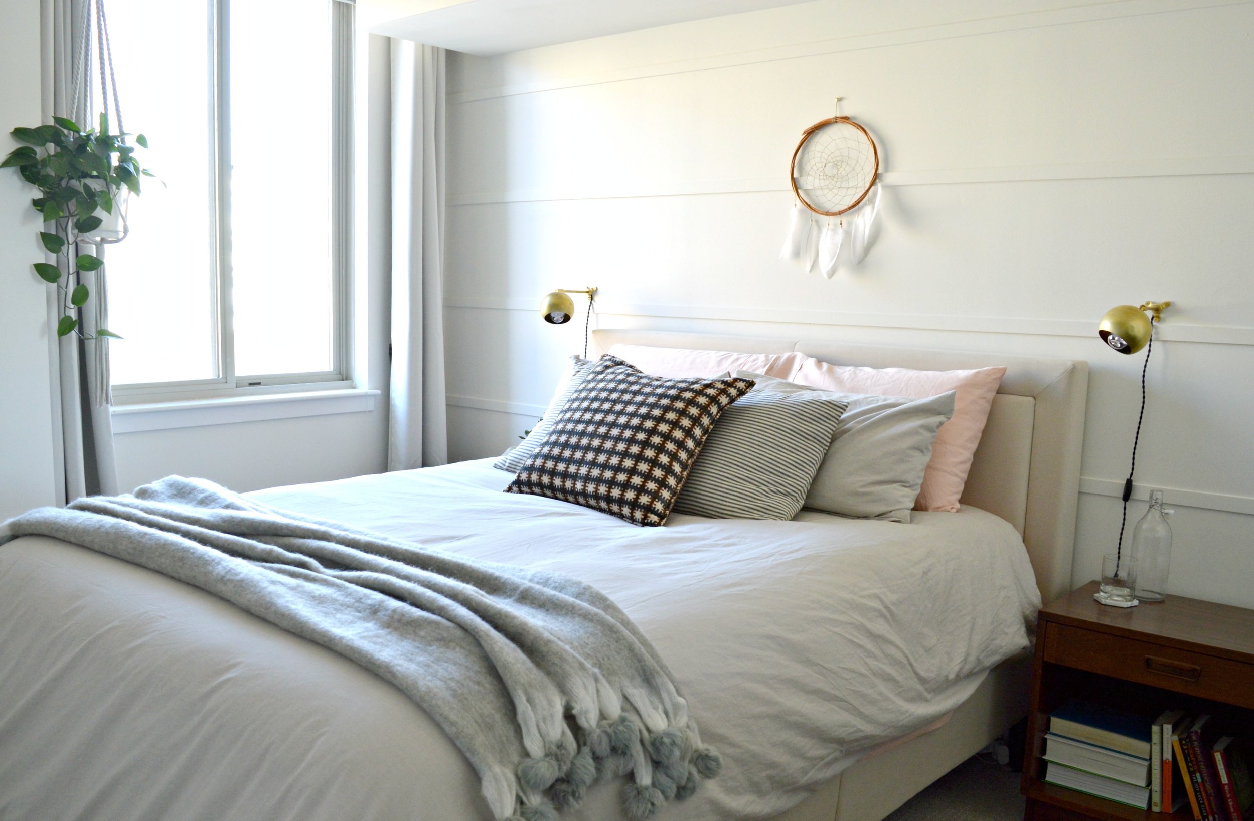
We hope this post has been helpful to you! The above images are just a few of the eDesign projects we have had the pleasure of working on and photographing and we invite you to view our eDesign page if you'd like to see more!

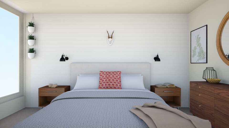
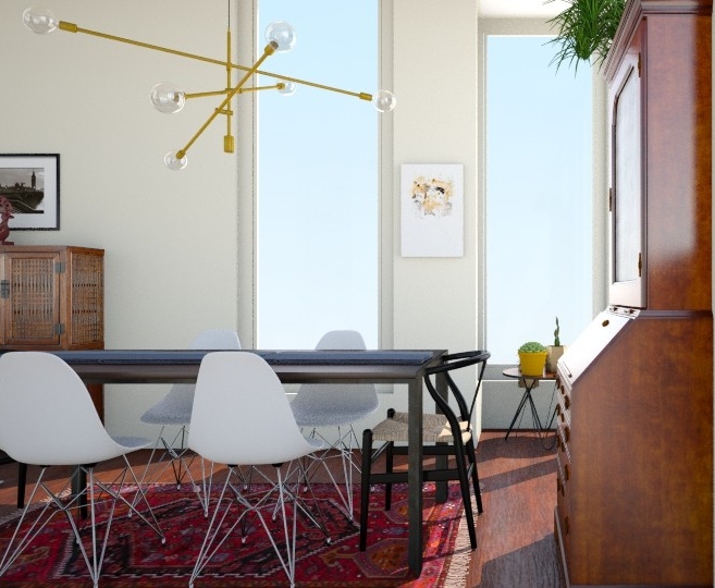
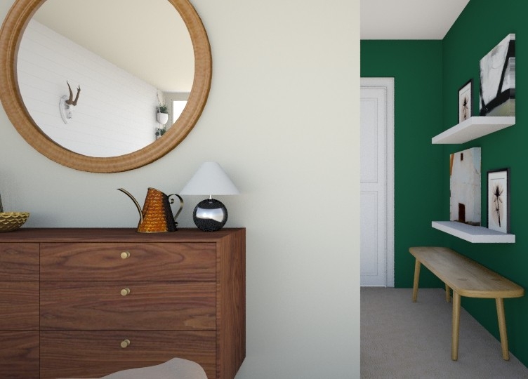
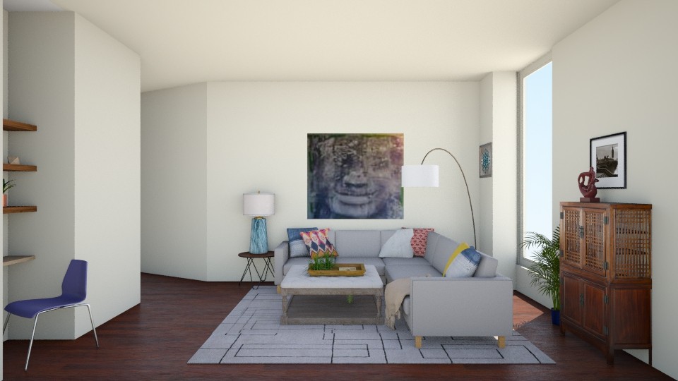
If you're interested in eDesign for your own home please fill out this form! You don't have to know your style to get started - sometimes figuring that out can feel overwhelming! We are pleased to offer life-like examples of various style options custom to your home and floorplan. The sample of images below are 3D renderings we have created using past clients' spaces! Sometimes it just helps to see options. We get it and we got your back!

Thank you all for stopping by!


Main Floor Redesign: The Plan!

Hi Friends! We're all in that weird limbo week between the hype of Christmas, the depressing day after, and the mustering of energy to ring in the New Year. I'm 32 and even I don't handle all those emotions well!

Between games of Mousetrap with my kids and reassuring them that life doesn't end when Christmas is over, I've been doing a bit of scheming for a redesign of our main floor! I'm never good at doing progress posts so I thought I'd give it a try and see how it goes!

Here is our main floor as it is now, (Christmas tree and all)!

The plan is really very simple, (well, in theory at least)! Move the thousand pound industrial shelves about 14 feet to the center wall in the living room as the focal point between the sofas. I may be exaggerating about the weight, but you've got to respect a structure made entirely of steel and solid wood! It legit frightens me. Once the shelves are moved we'll bring in a special mid-century cabinet I refinished a while ago and have been saving for our dining room for months. I intended to sell the piece but once it was finished and I took a good look at it, I got attached! This is why I stay away from PetSmart.

I created these 3D renderings of what this little switch-a-roo could look like once all is said and done! Warning, these images were the first I created with this program, (RoomStyler for anyone interested), so I've got a lot of learning still ahead!

I love these shelves as an anchor for the living room - this space has needed a strong statement and I've never been able to figure out how to pull it off! We'll still use the shelves for craft supply storage and my desk, but they'll be a few steps away from the dining room now.

So that's the plan, folks! And as we all know, even the best laid plans can go awry. I'll check back in soon with the progress!

Thank you so much for coming by!
Navy Yard Condo || Soft Boho Master Bedroom

Welcome to our Navy Yard Condo Reveal Part 2! Actually, I suppose it's part 3 since we revealed the main living spaces last Summer, but it's our second day in a row revealing the bedrooms! So let's reccap:

Living Room / Dining Room: Full Tour Here

Then we hit the Guest Bedroom, where we scaled back in order for renting potential: Full Tour Here

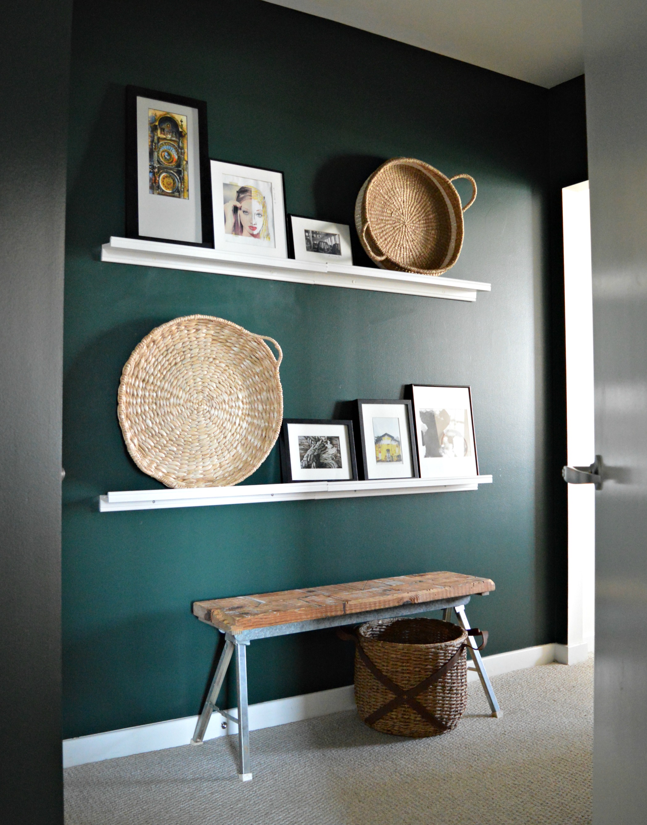
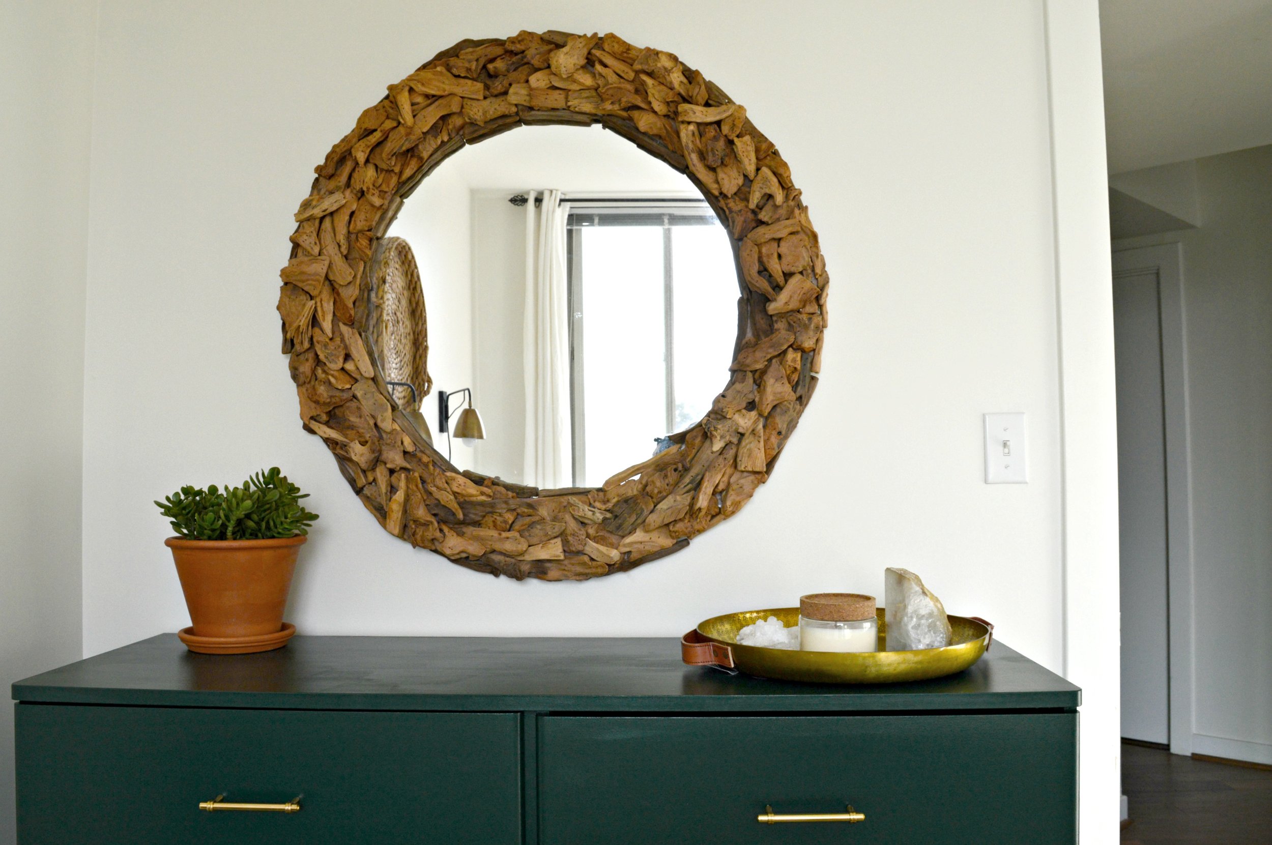
Now all that's left is the Master Bedroom! We feel that the master bedroom is quite possibly the most important space in ones home, and we design them as such. This particular master opens to a private hallway/lounge area where our client can access her en-suite bath and closet. We felt that this hallway was as much a part of her living space as the others so we designed it with quite the dose of moody drama!

Wrapped in 'Hunter Green' by Benjamin Moore, (the same paint we used on the guest room dresser), and styled with picture ledges for convenient art swapping, (of which our client has quite the collection!), this passageway is special and instantly makes one feel as if they're entering a unique part of this home. We built the bench from metal sawhorse legs and scrap wood, and at just 11" wide it's able to serve as a quick-drop surface without interfering with walking space.

Picture ledges are a fantastic alternative to a gallery wall - you'll do a lot less damage to your walls and you can change things out as often as you please! These white ledges were from IKEA.

From dark and moody to bright and airy; the perfect contrast.

We wrapped the bedroom in 'Swiss Coffee' by Benamin Moore and contrasted the neutrals with warm wood. Similar to the guest bedroom we kept the lines of the furniture very simple and clean, and similar to the main living spaces we layered more pattern and texture.

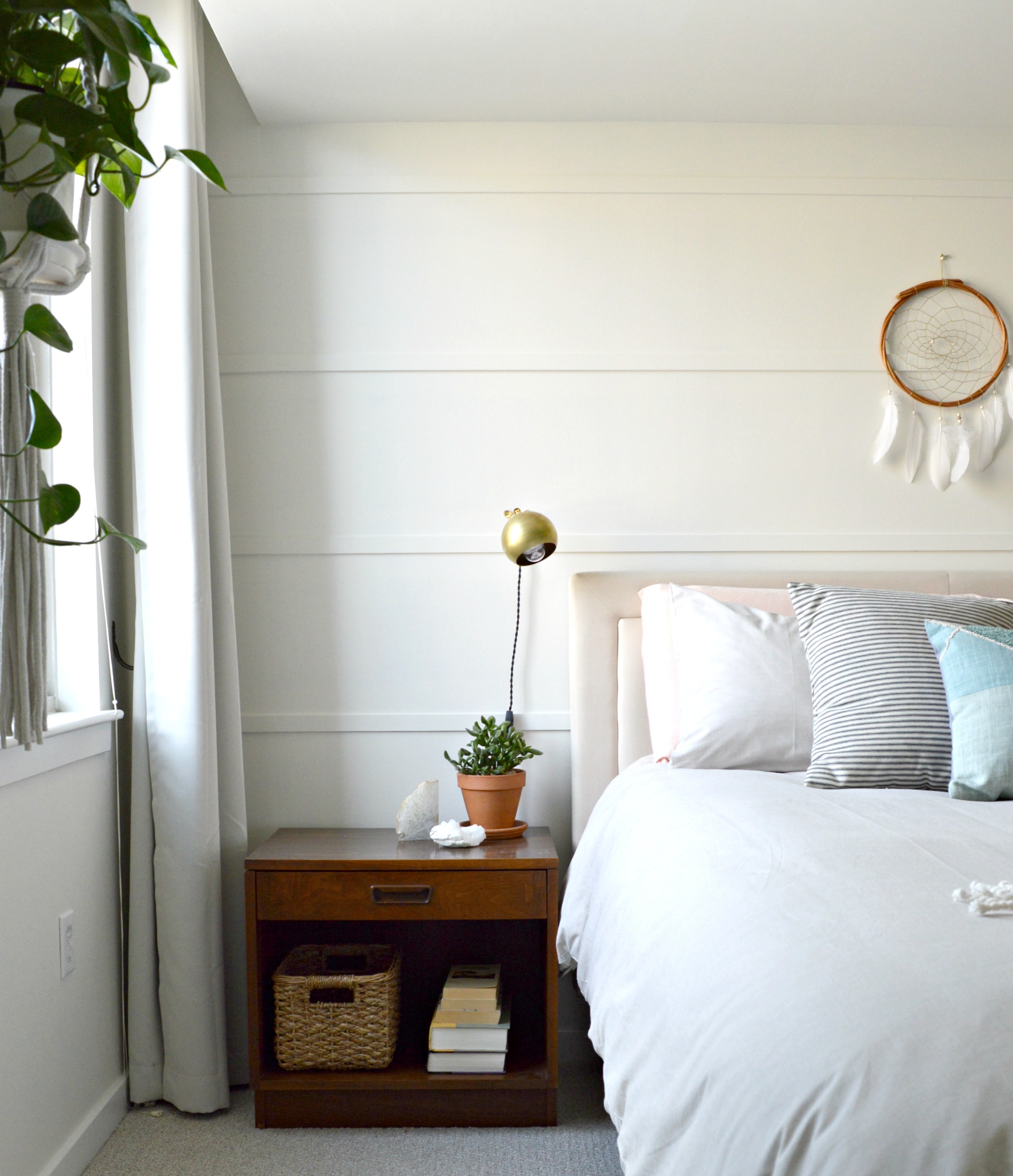
Since our client came in with a real 'let's do it!' attitude we were able to present some really exciting ideas to her. The dark green moody hallway was just the beginning and she really nailed it! This wall treatment behind her bed was another project we included in our design for this space. We had all agreed that an accent wall of sorts behind the bed would make this room really special, but we wanted to keep it monochromatic, subtle, and easy! Since our client would be handling these projects on her own, (reminder, this was all done through eDesign!), we wanted them to be very manageable. After she suggested a shiplap wall, we thought about some more affordable and easier alternatives. We stumbled upon this idea on Pinterest of using just pieces of wood trim horizontally spaced apart and nail-gunned to the wall. It was a project that didn't cost a lot of time OR money, but the impact is exactly what we were looking for. It speaks the same language as shiplap, but it's a little more modern looking and different from the currently trendy wall treatments out there right now.

This colorblock pillow from Urban Outfitters was one of the first pieces of this design! We wanted to contrast the dark, rustic hallway with a light and airy space using soft textures and warm pastels.
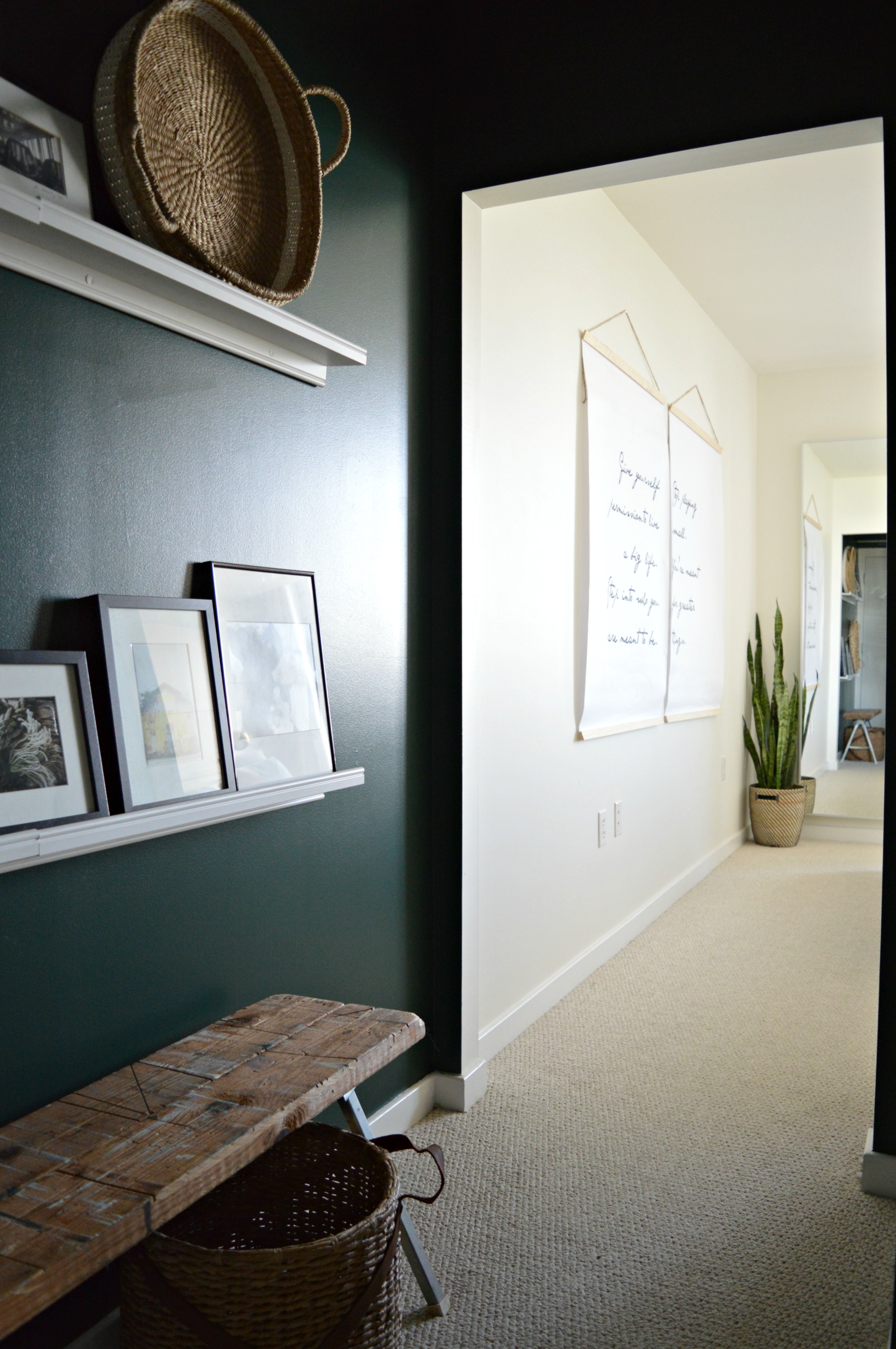
The dresser and nightstands were a fantastic mix and match Craigslist maneuver - we wanted to use walnut wood in here and after using 'walnut' in the search bar, these pieces popped right up! We've mixed woods in various rooms before, but in a smaller space like this where the goal was a really clean and fresh feel, we wanted the few wood pieces brought in to be of the same finish.

For less than $10/each we created the wall hangings that incorporate a favorite quote our client gave us. Aren't these words by Joan Burge, (author of Give Yourself Permission to Live a Big Life), inspiring?! Solid choice to wake up and see every day. For more info on how to create large scale charts like these, see post here.

A pair of 8x10 prints from our dear friend Jessica over at Vol.25 look just perfect next to the warm wood dresser.

These brass sconces are from a seriously talented small business on Etsy called Rough Luck Studio. Their collection is extensive, affordable and we absolutely can't wait to use them again!

Because our client was a fellow 'style-mutt', she was very eclectic and liked all the things, (is there anyone who can't relate to this?!). Near the end of this project, when the air was starting to turn crisp and the colors on the trees were changing, she expressed interest in incorporating some richer colors in place of the pastel. The wonderful thing about the design of this room is that it's so neutral she can swap out pillows and throws for instant seasonal change. We suggested a gorgeous velvet rust, ivory and dark gray pillow as well as a mohair throw with pompom fringe from a local small shop, Valerianne.

Nothing else changed in the room, but look how fall/winter ready it is now!

That's a wrap folks! We sure are grateful to do this work; what an honor it is when someone invites us to help them create their home - of all the places in the world, home should feel truly special. Feel free to contact us through the 'free consultation' form linked on our eDesign page if you're interested in chatting about your own space!

Thank you all so much for coming by!