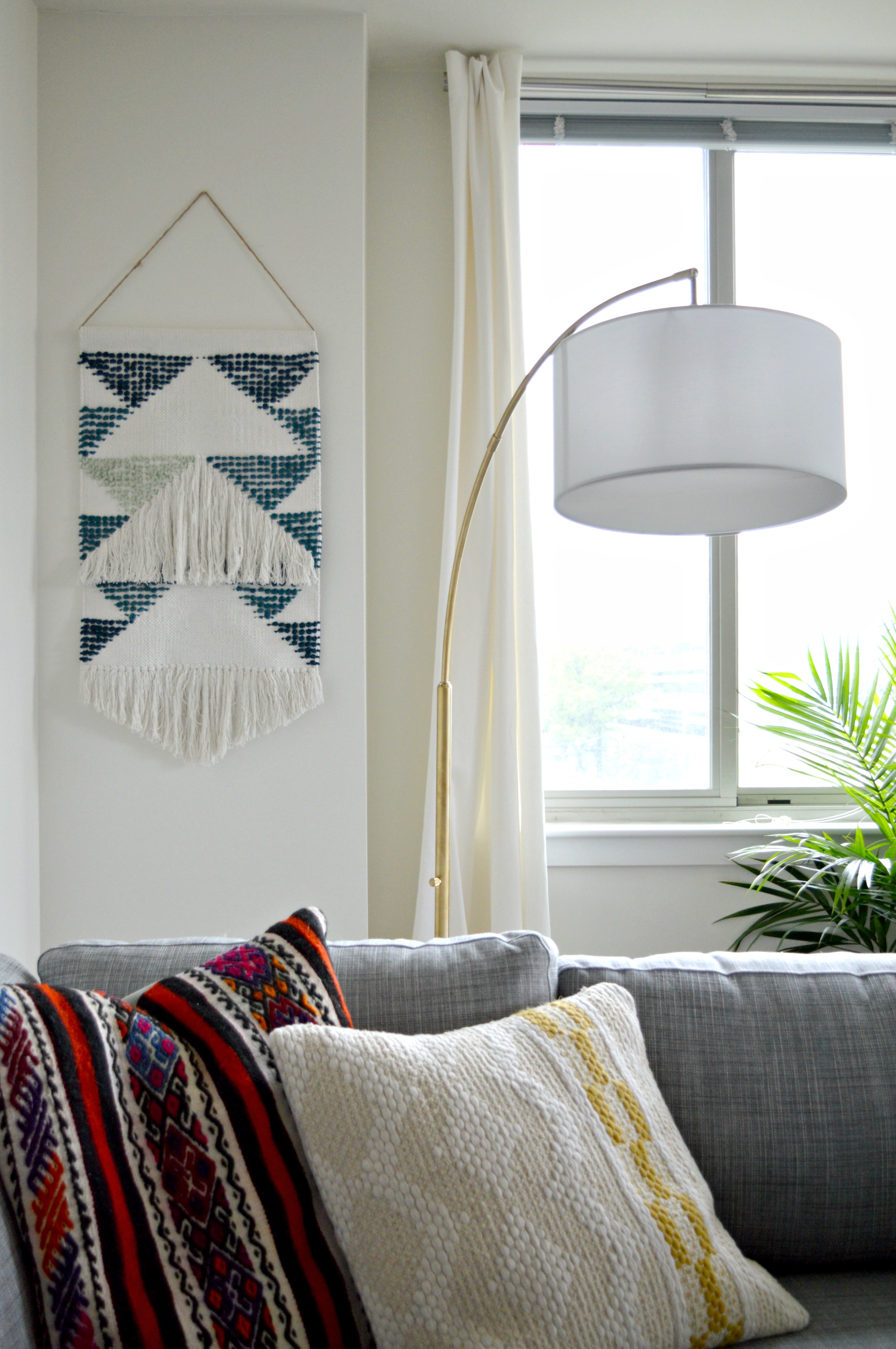
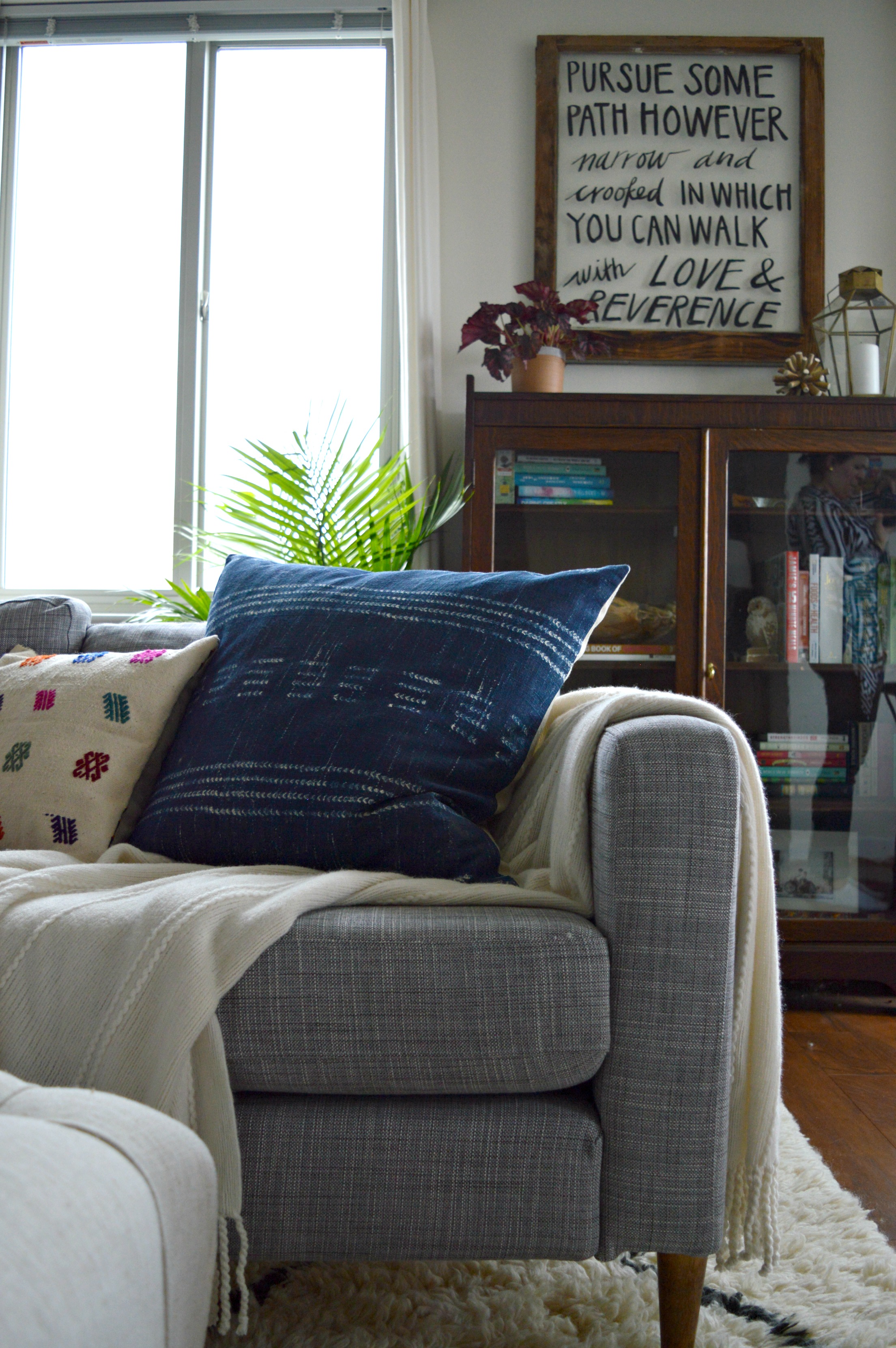
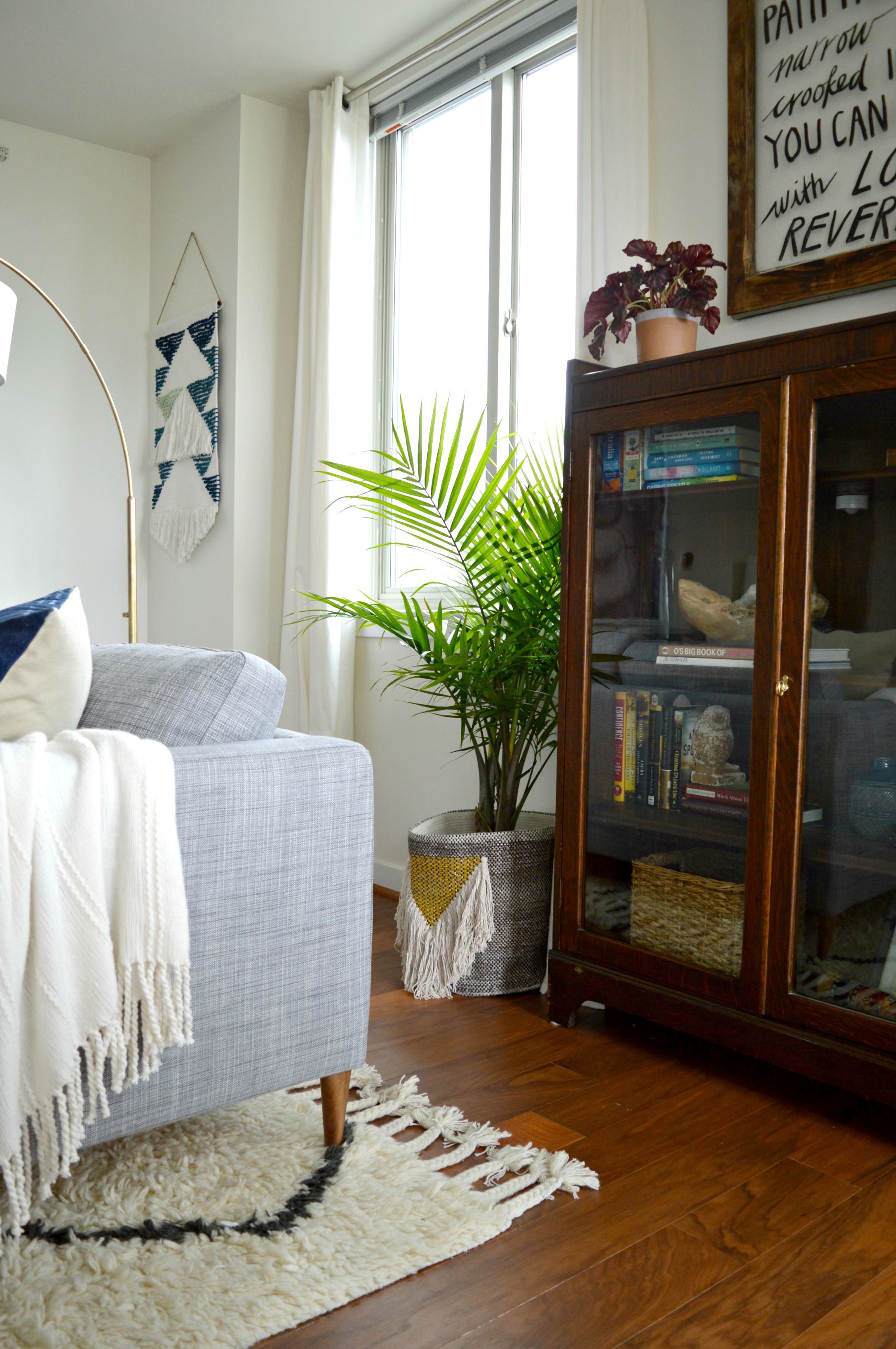
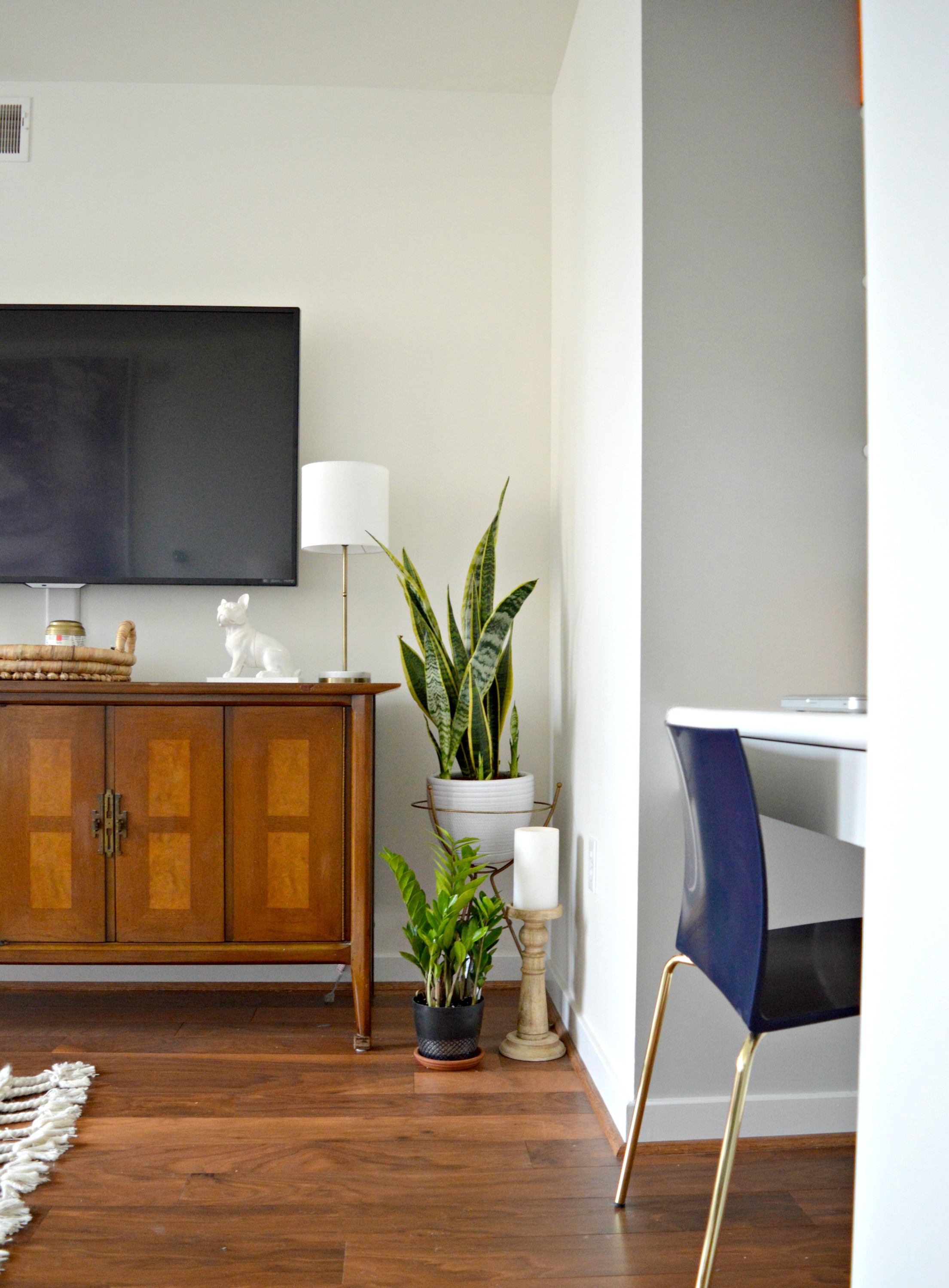
Reader Design: Laura's Minimalist Boho Home

Today, we're off to a place that has recently felt like my second home: California. Fun fact: I worked so many hours for my day job in California in 2017 that I'm fortunate enough to get to file taxes there - yay! 

Specifically, we're headed to Dana Point, CA to Laura's family home, which is both perfect for a family and full of personality at the same time. 

 
IMG_1334.jpg
 
Making our home feel comfortable is something that’s always been very important to me. I never want to evoke the feeling of a museum-home, where “don’t touch that” is the motto. We have little kiddos that love to make messes and I want to embrace, enjoy, and live in those messy moments with them. I want our family and our friends to always feel relaxed when they’re here.

That doesn't mean she just lets to house go though. In fact, Laura has a self-proclaimed aversion to clutter. That's why keeping it simple with her minimalist bohemian decor is the way to go.  

familyroomedit.jpg
IMG_1259.jpg

One of the keys of minimal decor is ensuring purpose of the pieces in your home. Now, the purpose doesn't have to just be functional; it can be sentimental, too! Often, those become the most important pieces of all, and even if they're small in size, they can make the space feel perfect and complete.

Take the item in Laura's kitchen for instance, which at a distance may be hard to find. 

The small cactus figurine was given to me by my husband when we were engaged. He’d been gone on a trip and came home with it for me and it’s just been a cute “I missed you” momento that I’ve always loved.
IMG_1292.jpg
 
IMG_1291.jpg
 
 
IMG_1242 (1).jpg
 
In the Living Room there are two things: One is a vintage record player that belonged to my late grandparents. Though I never knew my grandpa, my grandmother and I had an extremely close relationship and this hand-me-down is one of the most meaningful things that I own. The other sentimental piece is the longboard on the wall. It’s a vintage board that was shaped by my husband’s favorite surfer, Phil Edwards. It was one of the last boards he shaped before he stopped shaping.”
 
IMG_1237.jpg
 
IMG_1297.jpg
We definitely are true to our coastal southern CA roots. My husband, Jason, grew up surfing and there are hints of beach culture throughout our home.

All those special elements make this house a home, and it's an honor to get a peek inside. Thank you for showing us around, Laura! You can follow along with Laura on Instagram at @helmick_hacienda. See you next week, Mutts.

McKenna Sig.jpg

Mark Your Calendar!

Hi Friends! Jumping on to share a really quick announcement with you today - on January 10 I will be over on Roomhints sharing tips, tricks and fixes, for any and all pesky home decor questions you may have! Whether you're trying to find the right layout for a particular space, which paint color to use, or what size sofa to purchase, I'll be available with decisive advice to help you move forward! I sought this opportunity as a way to offer help for those who don't necessarily need a full design package but have questions that are beyond the expertise of their Joanna-Gaines-obsessed coworkers. Sometimes we just need a few experienced pointers to be well on our way, right? The process is three simple steps:

  1. Register with me, Chelsea Bieber, for $49, (a fraction of a full design package)
  2. Upload photos of your space to the Roomhints app, (you'll be directed how to do this, it's very easy)
  3. Ask away! Let me know what's nagging you about that space and I'll respond with 5 practical tips, pieces, ideas, etc!

When the holiday buzz has quieted and you've swept up the last of the dried Christmas tree bristles, it's a perfect time to re-think your space and hit the reset button. I would love to talk it out with you and lend my help so you can love your home that much more in 2018!

16.jpg
Chelesa.jpg

Navy Yard Condo || Soft Boho Master Bedroom

Welcome to our Navy Yard Condo Reveal Part 2! Actually, I suppose it's part 3 since we revealed the main living spaces last Summer, but it's our second day in a row revealing the bedrooms! So let's reccap:

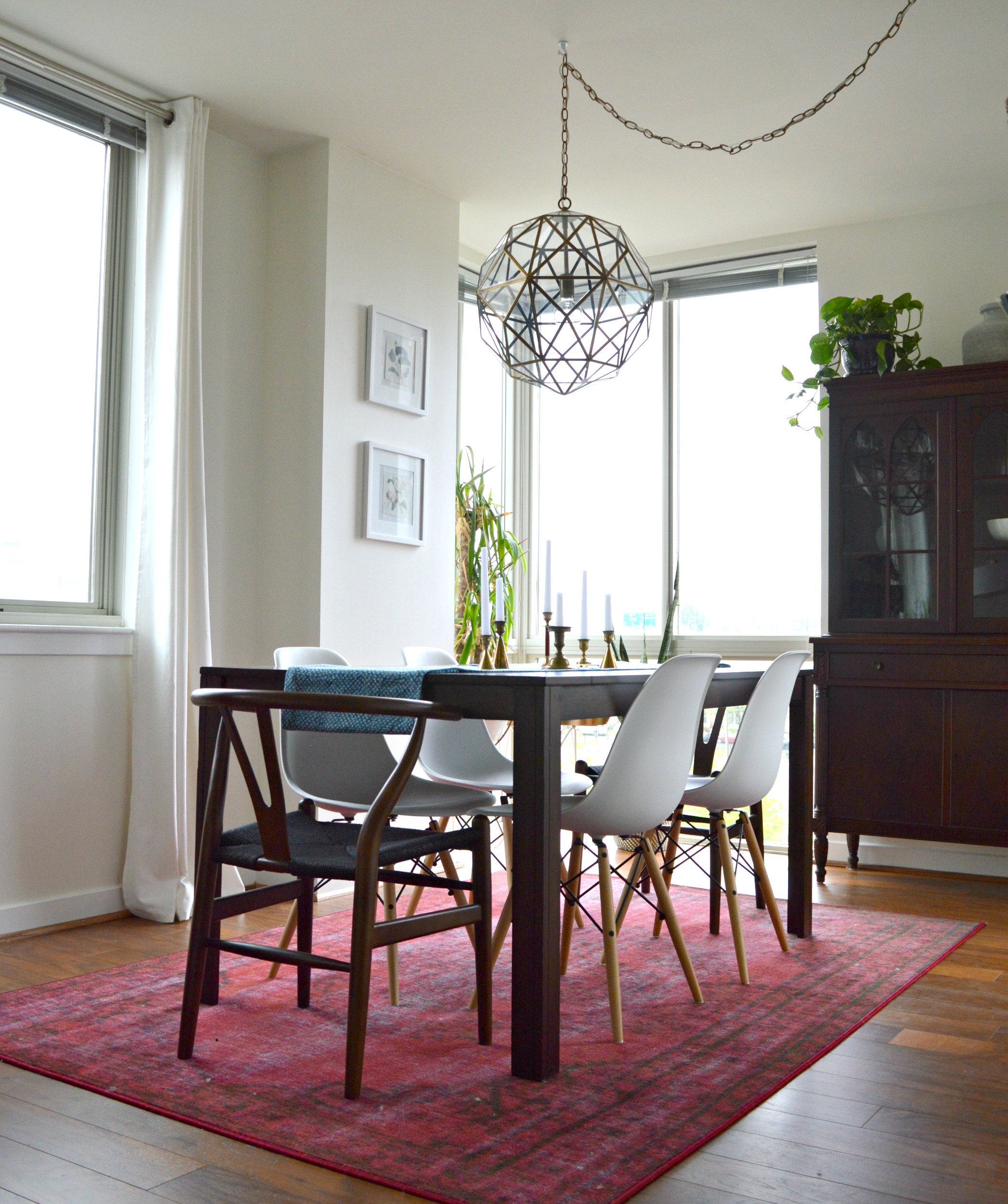
Living Room / Dining Room: Full Tour Here

Then we hit the Guest Bedroom, where we scaled back in order for renting potential: Full Tour Here

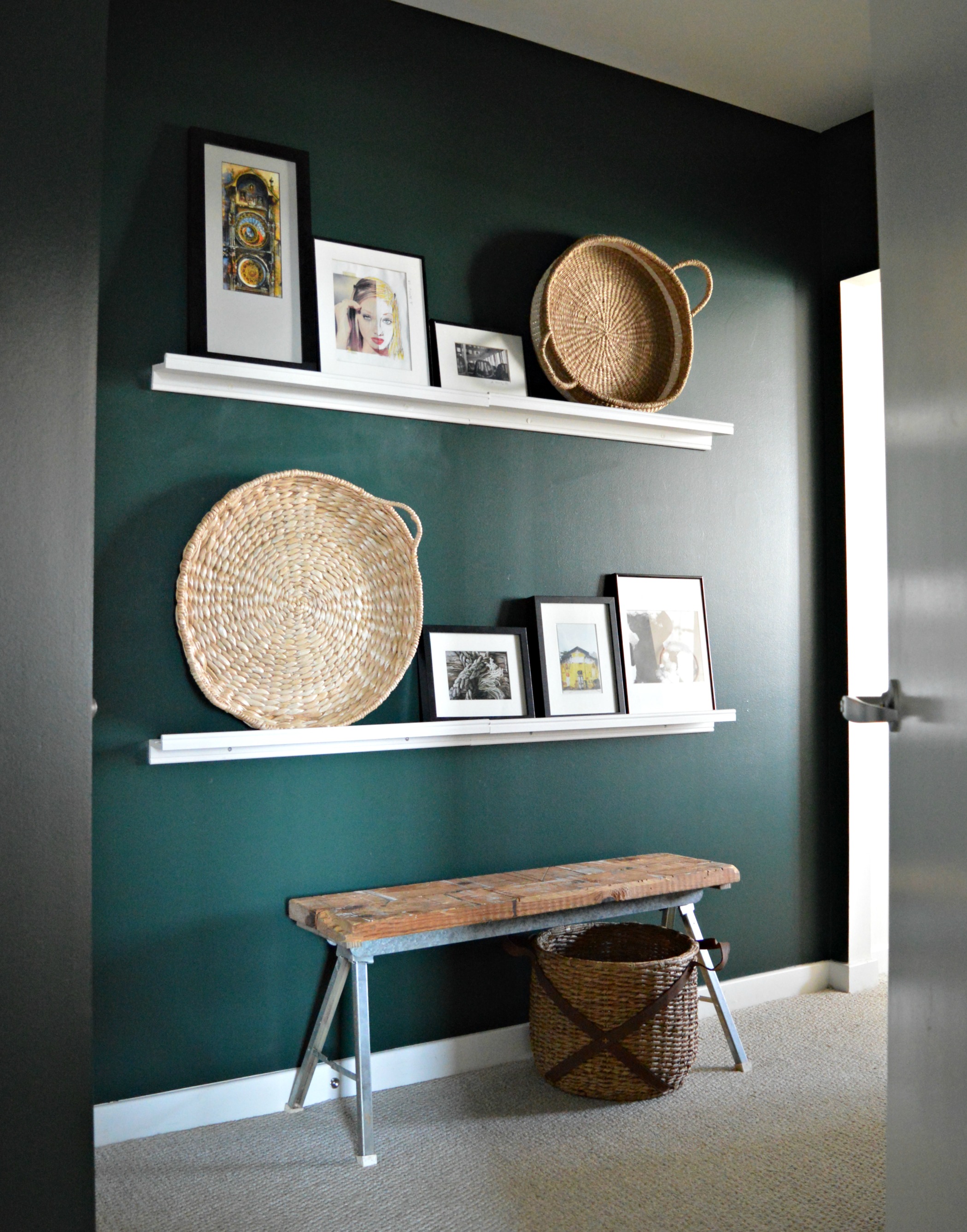
Now all that's left is the Master Bedroom! We feel that the master bedroom is quite possibly the most important space in ones home, and we design them as such. This particular master opens to a private hallway/lounge area where our client can access her en-suite bath and closet. We felt that this hallway was as much a part of her living space as the others so we designed it with quite the dose of moody drama!

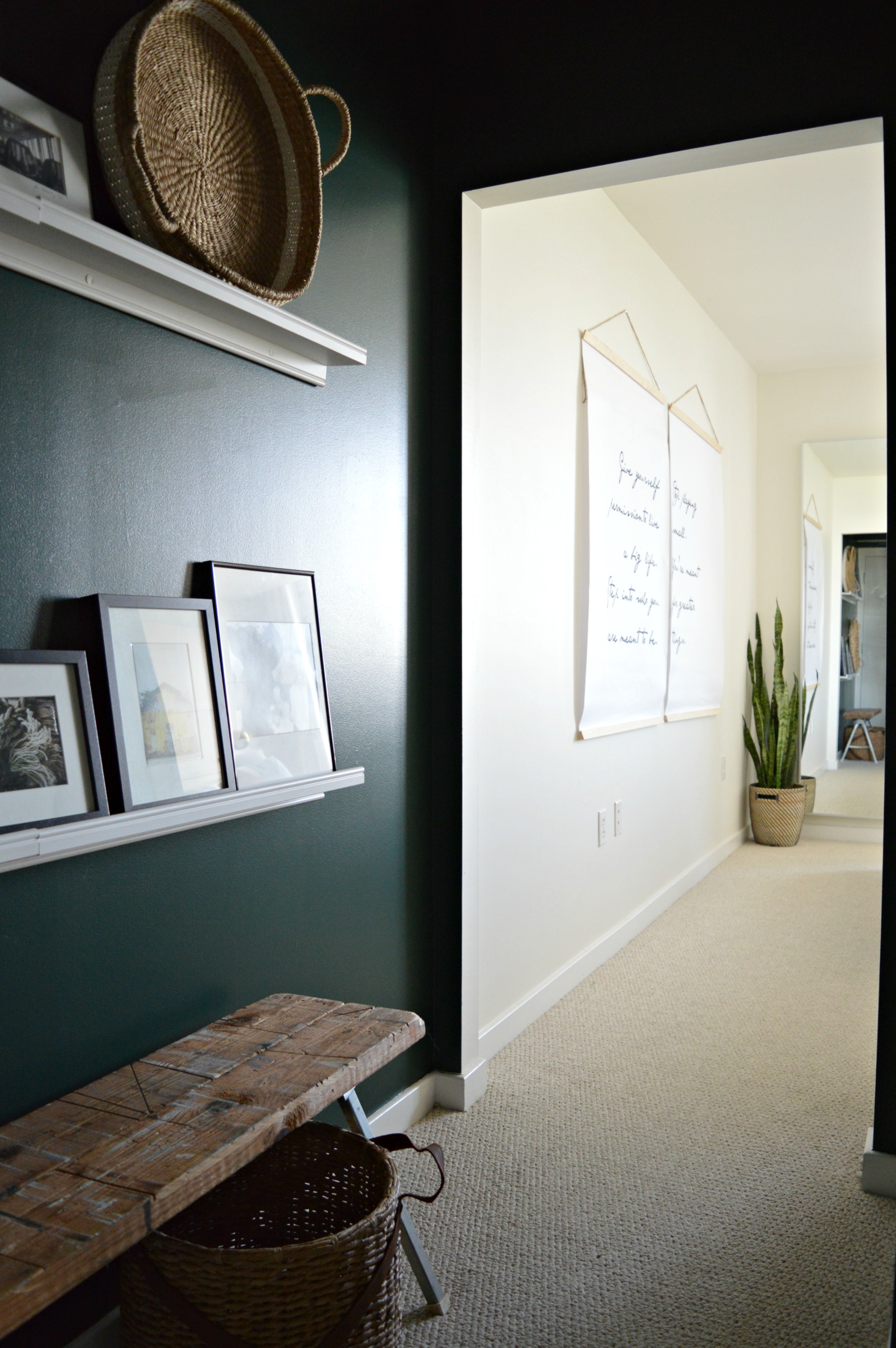
Wrapped in 'Hunter Green' by Benjamin Moore, (the same paint we used on the guest room dresser), and styled with picture ledges for convenient art swapping, (of which our client has quite the collection!), this passageway is special and instantly makes one feel as if they're entering a unique part of this home. We built the bench from metal sawhorse legs and scrap wood, and at just 11" wide it's able to serve as a quick-drop surface without interfering with walking space.

Picture ledges are a fantastic alternative to a gallery wall - you'll do a lot less damage to your walls and you can change things out as often as you please! These white ledges were from IKEA.

From dark and moody to bright and airy; the perfect contrast.

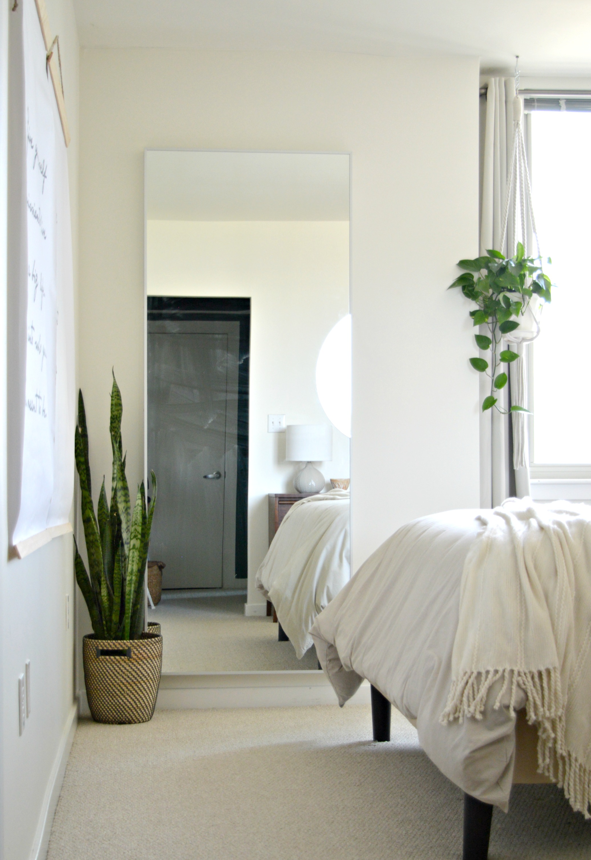
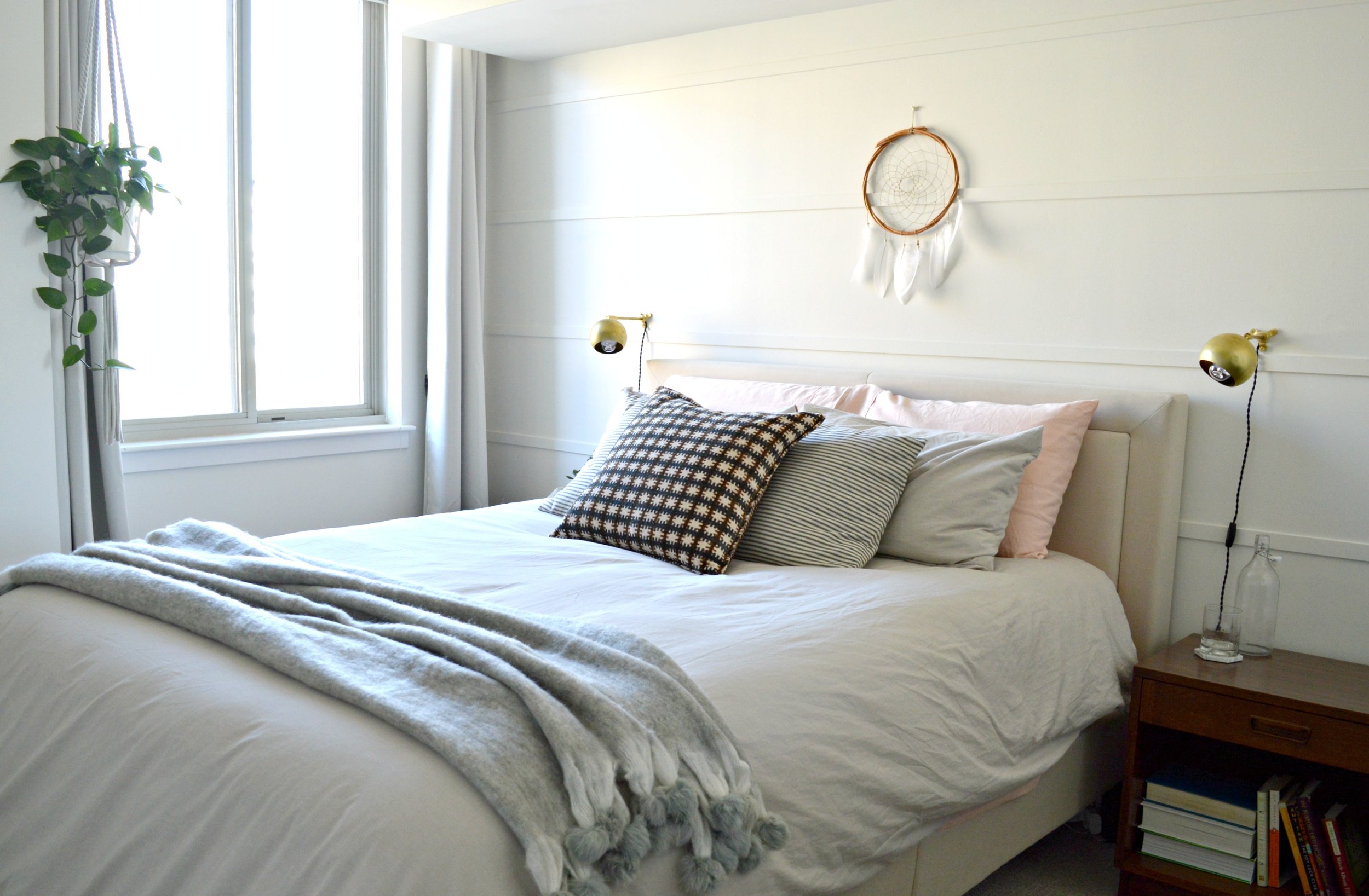
We wrapped the bedroom in 'Swiss Coffee' by Benamin Moore and contrasted the neutrals with warm wood. Similar to the guest bedroom we kept the lines of the furniture very simple and clean, and similar to the main living spaces we layered more pattern and texture.

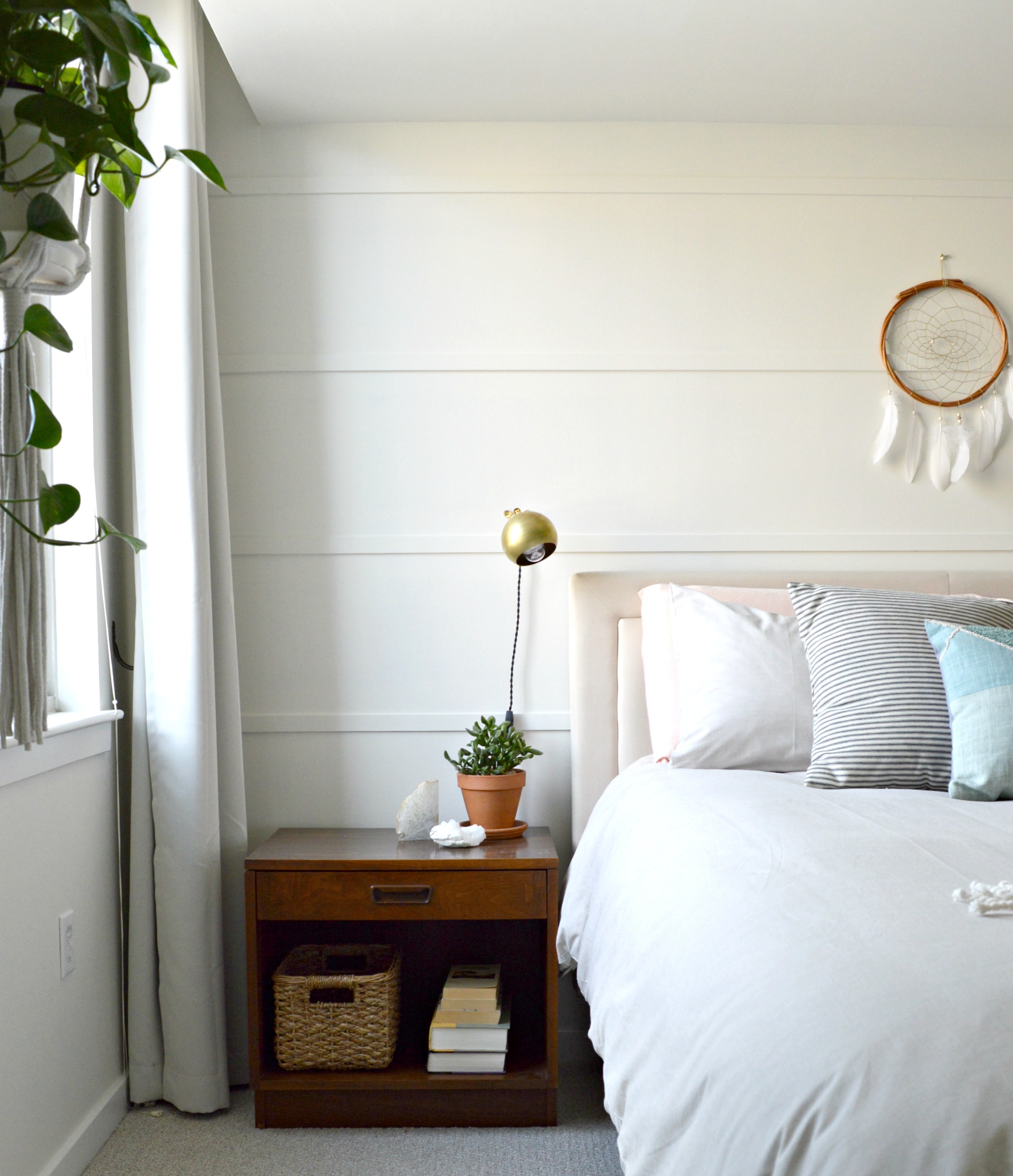
Since our client came in with a real 'let's do it!' attitude we were able to present some really exciting ideas to her. The dark green moody hallway was just the beginning and she really nailed it! This wall treatment behind her bed was another project we included in our design for this space. We had all agreed that an accent wall of sorts behind the bed would make this room really special, but we wanted to keep it monochromatic, subtle, and easy! Since our client would be handling these projects on her own, (reminder, this was all done through eDesign!), we wanted them to be very manageable. After she suggested a shiplap wall, we thought about some more affordable and easier alternatives. We stumbled upon this idea on Pinterest of using just pieces of wood trim horizontally spaced apart and nail-gunned to the wall. It was a project that didn't cost a lot of time OR money, but the impact is exactly what we were looking for. It speaks the same language as shiplap, but it's a little more modern looking and different from the currently trendy wall treatments out there right now.

This colorblock pillow from Urban Outfitters was one of the first pieces of this design! We wanted to contrast the dark, rustic hallway with a light and airy space using soft textures and warm pastels.

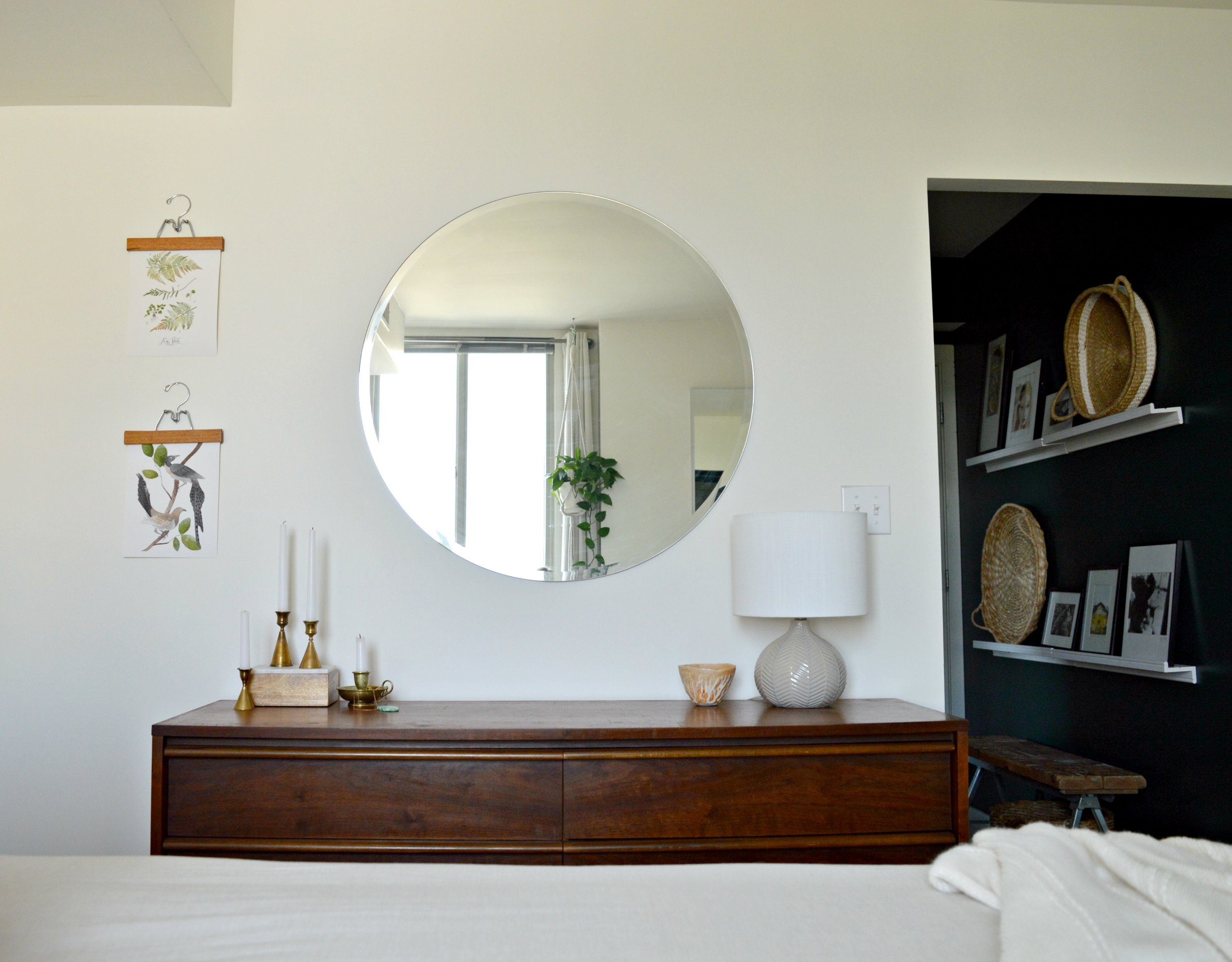
The dresser and nightstands were a fantastic mix and match Craigslist maneuver - we wanted to use walnut wood in here and after using 'walnut' in the search bar, these pieces popped right up! We've mixed woods in various rooms before, but in a smaller space like this where the goal was a really clean and fresh feel, we wanted the few wood pieces brought in to be of the same finish.

For less than $10/each we created the wall hangings that incorporate a favorite quote our client gave us. Aren't these words by Joan Burge, (author of Give Yourself Permission to Live a Big Life), inspiring?! Solid choice to wake up and see every day. For more info on how to create large scale charts like these, see post here.

A pair of 8x10 prints from our dear friend Jessica over at Vol.25 look just perfect next to the warm wood dresser.

These brass sconces are from a seriously talented small business on Etsy called Rough Luck Studio. Their collection is extensive, affordable and we absolutely can't wait to use them again!

Because our client was a fellow 'style-mutt', she was very eclectic and liked all the things, (is there anyone who can't relate to this?!). Near the end of this project, when the air was starting to turn crisp and the colors on the trees were changing, she expressed interest in incorporating some richer colors in place of the pastel. The wonderful thing about the design of this room is that it's so neutral she can swap out pillows and throws for instant seasonal change. We suggested a gorgeous velvet rust, ivory and dark gray pillow as well as a mohair throw with pompom fringe from a local small shop, Valerianne.

Nothing else changed in the room, but look how fall/winter ready it is now!

That's a wrap folks! We sure are grateful to do this work; what an honor it is when someone invites us to help them create their home - of all the places in the world, home should feel truly special. Feel free to contact us through the 'free consultation' form linked on our eDesign page if you're interested in chatting about your own space!

Thank you all so much for coming by!