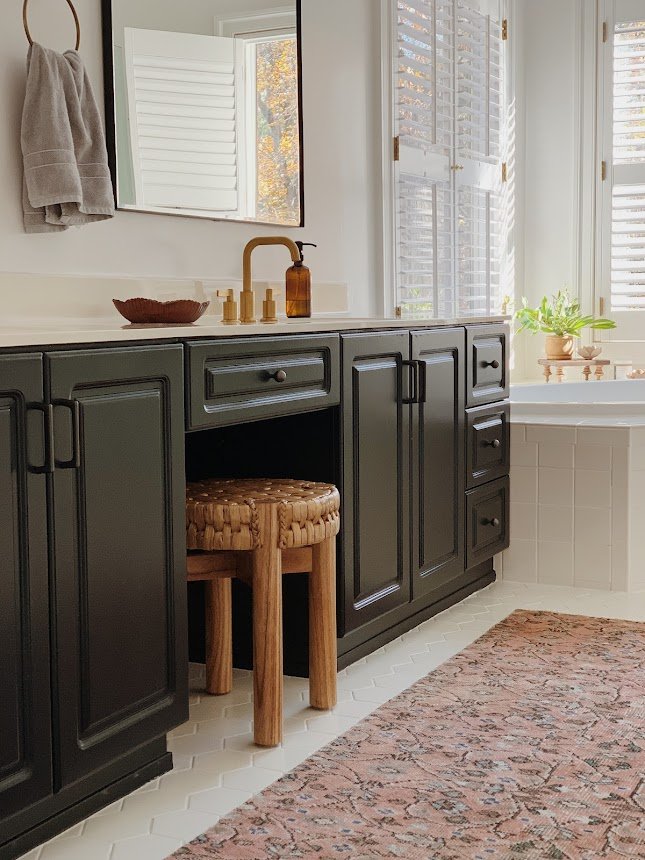
Hey there! It’s been quite the start to 2025, sharing three wrapped projects by mid-March! My heart is full and I am so grateful for such amazing work with awesome people. Today’s project was not only local, but a friend of a friend of a friend - both of whom I’ve worked with before! This client came to me after she and her husband had completed some high-quality DIY projects in their family room. She admittedly shared they had seen the ideas in various images on Pinterest and just went for them! The outcome was not what they were hoping for and left them feeling a little disappointed with this room. Understandable when you’ve already put so much time and effort in! I think this story is pretty common; with access to thousands of home interior images, it’s easy to get inspired when you see something in someone else’s home! The problem is lacking a fuller vision for your own home. What works out beautifully in one home may not translate as well in yours. It’s tricky!
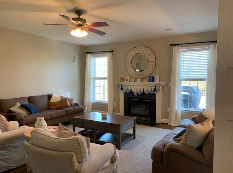
Before
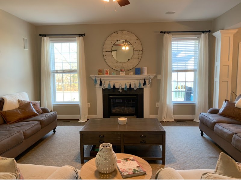
Such was the case here. The accent wall over the fireplace mantle and the accent wall directly behind the TV were competing with each other and making the room feel all chopped up. Without undoing the work they had already put in, my goal was to create one strong focal point and one soft focal point. By painting over the blue accent above the fireplace, the focus is no longer on a big blue square, but on the surrounding pieces throughout the space.

After

Before
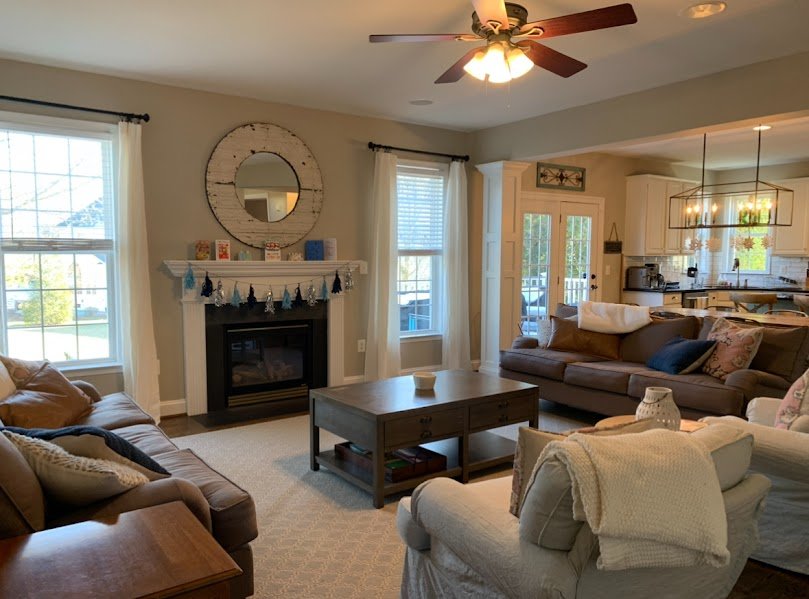
I loved where they were going with the vertical shiplap behind the TV! Great instincts there. But limiting the accent to just behind the TV was not benefiting the space. I advised them to extend the shiplap the entire length of the wall and paint it in a soft, earthy green (we used Acacia Haze by Sherwin Williams).

After

Before
One of the most common things I encourage clients is to mount their curtain rods as close to the ceiling as possible and then we select a length of curtain that just kisses the floor. This maximizes the vertical space of a standard height room, making it appear just a little taller.

After


I also pulled in a patterned rug that is a better scale for the size of this room and the layout of furniture. Lots of floorspace for kiddos to sprawl out!


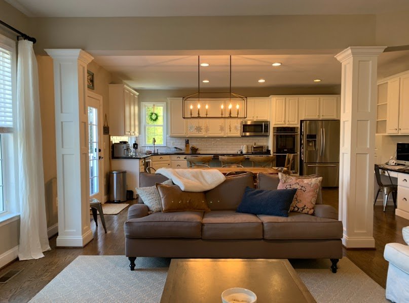
This client’s visual inspiration was full of soft, earthy colors and warm wood toned accents. The previous blue elements didn’t align with what they seemed naturally drawn to. Keeping their sofa was a no-brainer as it was a new purchase and working really well for them, but pretty much everything else went out! Rather than keep to as tight of a color palette as the blues had been, I wanted to use a variety of tones in the same ‘earthy’ family. It’s a funny rule of thumb, but I never look outside and think the sky clashes with the trees or the ground. There’s so much beauty in nature and I’m very much inspired by it’s colors!


These battery operated wall sconces are the perfect finishing touch to this side of the room and help balance out the lighting in the evenings.


That’s a wrap! This project actually flew; these clients are super go-getters and without hesitation tackled the implementation of these ideas and purchases so fast! They were definitely ready to go and are now able to relax and enjoy the fruits of their labor.
Thank you all for stopping by!