Mark Your Calendar!

Hi Friends! Jumping on to share a really quick announcement with you today - on January 10 I will be over on Roomhints sharing tips, tricks and fixes, for any and all pesky home decor questions you may have! Whether you're trying to find the right layout for a particular space, which paint color to use, or what size sofa to purchase, I'll be available with decisive advice to help you move forward! I sought this opportunity as a way to offer help for those who don't necessarily need a full design package but have questions that are beyond the expertise of their Joanna-Gaines-obsessed coworkers. Sometimes we just need a few experienced pointers to be well on our way, right? The process is three simple steps:

  1. Register with me, Chelsea Bieber, for $49, (a fraction of a full design package)
  2. Upload photos of your space to the Roomhints app, (you'll be directed how to do this, it's very easy)
  3. Ask away! Let me know what's nagging you about that space and I'll respond with 5 practical tips, pieces, ideas, etc!

When the holiday buzz has quieted and you've swept up the last of the dried Christmas tree bristles, it's a perfect time to re-think your space and hit the reset button. I would love to talk it out with you and lend my help so you can love your home that much more in 2018!
16.jpg
Chelesa.jpg

Reveal: The Concrete Cave

Hi friends! Jumpin' on with another eDesign reveal today - this week's space is tucked inside Chicago's Wicker Park neighborhood and was a real test to my cozier sensibilities. Last week's space I did in Boston was easy peasy- exposed brick, large windows, warm wood floors - all the ingredients to go cozy to the max! The space I'm sharing today gave me a bit of a chill when I first saw the photos the client sent over:

5.jpg
6.jpg

The window-less room above is the bedroom. So what to do? Embrace the uber modern elements or go against the grain and add warmth and texture? I settled on both and found some helpful inspo images before finding the right mix of pieces!

With the influx of eDesign reveals here I cannot express enough how much I value floorplans! They are the least visually appealing aspect of a job but allow me to really understand the space. I play with various arrangements until I find one that enhances the elements of the room best. Here's a peek at the final arrangement and the floorplan we stuck to the closest.

Floorplan.jpg

And to help the client 'see' the space, an example of one of the design boards used for this project:

Chicago Sonder 404 Living Room.jpg

Without further adieu, welcome to Chi town!

IMG_0364.jpg
IMG_0332.jpg
IMG_0340.jpg

The physical space is unlike anything I've ever worked with; it's industrial, yes, but also modern in an almost sterile way. My objective was to embrace both the industrial and modern, but also to warm things up, (without going all bohemian with layers).

IMG_0357.jpg

If you can't beat em', join em'! I really love how this concrete coffee table pulls it all together; like it was grown right from the floor!

IMG_0359.jpg

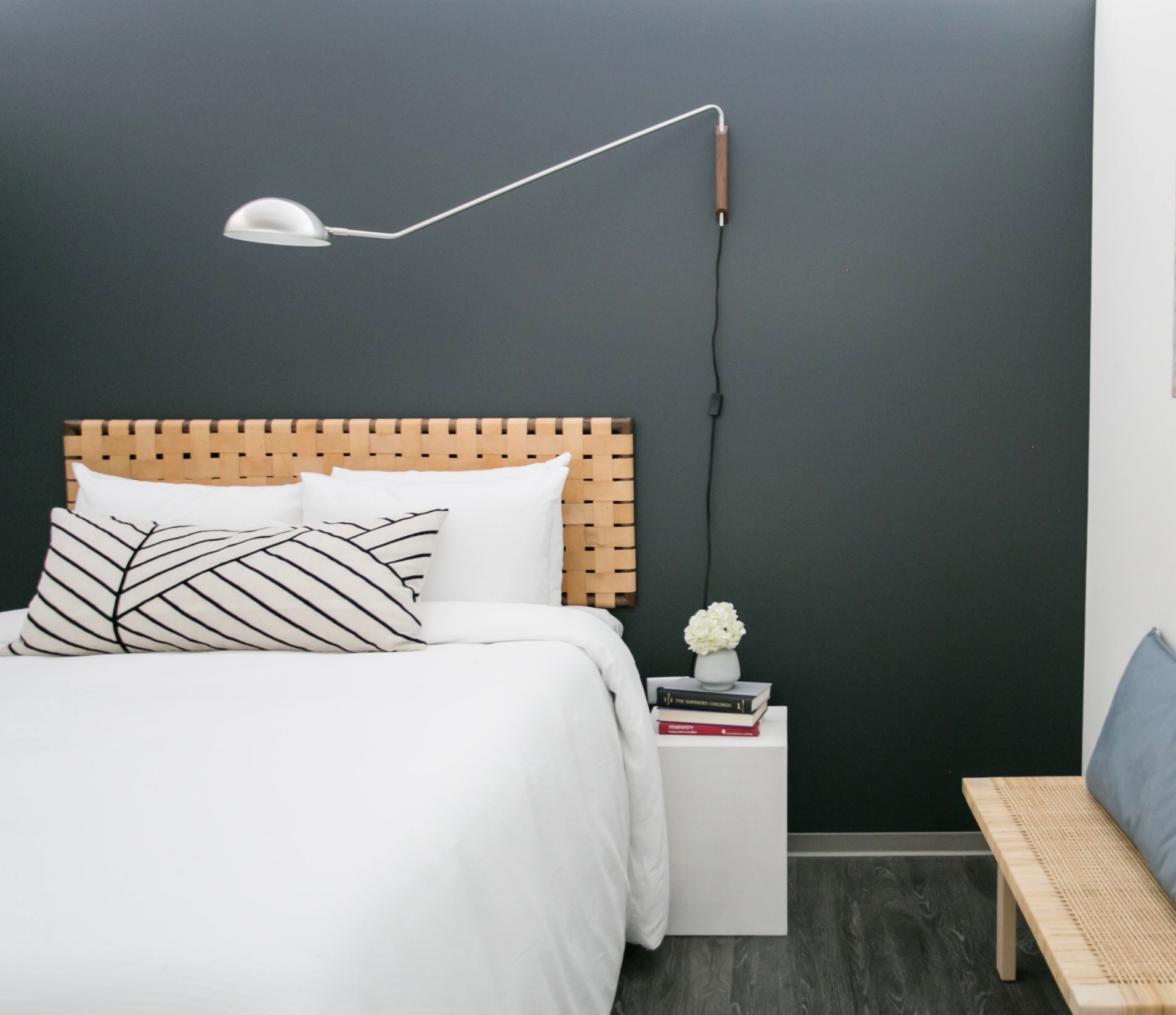
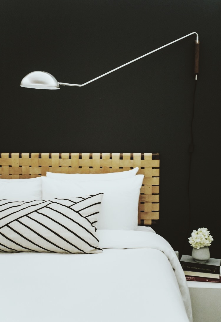
The bedroom was really exciting to me! A room without windows - no problemo! I chose a dark charcoal gray for the walls and my favorite CB2 Mantis sconce in nickel and wood. A leather headboard finishes it off and it's transformed into a sleek hideout cave complete with concrete bedside tables.

IMG_0371.jpg
IMG_0377(1).jpg
IMG_0399.jpg

That's it! A short and sweet tour for today. Thank you to the installation team up there who hammered it out and got it done! I always have a feeling of anticipation when I know a design is getting installed and I'm hundreds of miles away waiting to see how it turns out! It's exciting, indeed, and good for my blood pressure, too. ;)

Thank you so much for coming by today!

Chelesa.jpg

Reveal: Industrial Meets Cozy in Beantown

Got another eDesign reveal today! The client started with a very industrial 2 bedroom space - interior brick, city views and large windows; all my favorite things together! I had complete stylistic freedom, but a limited budget and limited time to get it complete, so I started with some design inspiration to help me hone in on the ideas I wanted to prioritize. Some of my favorite inspo images are below and with each one I had made a note of what caught my eye most.

For this project I was given a sketched floorplan and a video tour of the space. Since I didn't have photos to go by, I was meticulous with the floorplan. I had a vision of what I wanted the space to look and feel like, but a vision is just a vision if the pieces don't fit perfectly and the flow is not a hundred percent comfortable. I created a floorplan for each room in the space and several for the living room - it was an oddly shaped room and I wanted to try some different layouts, but the one seen below is what we ultimately followed the closest!

Finding the right pieces for this space was an absolute blast, but not without some particular challenges! The client needed the design completed 2 days from handing me the specs on the space, so I needed pieces that were not only friendly to our budget, but that offered a speedy delivery! Below is one of the final moodboards of the living room. I used several to indicate some specific details, but this one shows the jest of it.

Boston Sonder Living Room 1.jpg

And voila!

1.jpg

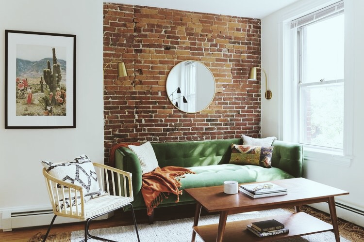
I really trusted the client's measurements of the space as well as the measurements indicated with this sofa - if either had been off it wouldn't have worked. Luckily it was a perfect fit and I got to tuck the sofa cozily inside this brick clad nook.

3.jpg

I'm so grateful to the hardworking installation team that carried out this design to 'T'! eDesign is most successful when the designer can clearly indicate the details of the design and the installation team interprets the instructions properly. The team did a fantastic job carrying this design to fruition; it turned out exactly as I had imagined and hoped!

4.jpg
5.jpg

Although the kitchen was an itty bitty little thing, the client desired a small eating area that could accommodate 4. I used a modest round table and simple chairs on the smaller side, but also shared in the design boards a couple fun alternative options for one of the chairs to be used elsewhere for when space is needed during meal prep. Options are always good!

8.jpg
7.jpg

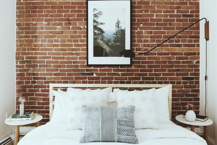
I wanted to give the bedrooms a cozy, sophisticated feel that is so true to Boston. Bostonians are not excessive in their style; nothing too contrived, function over form. Always. It's been a while since I've lived there, but that aspect of the city as a whole has been around for ages. There's an old story of a Boston matriarch bein where she got her hat, to which she responded, "We don't buy our hats, we have our hats."

Bedroom 1:

12.jpg

Nothing too fancy here, just classic, comfortable design.

13.jpg
14.jpg
15.jpg
16.jpg

Bedroom 2 is the slightly less sophisticated younger sibling of Bedroom 1. But they 'speak the same language', as Cate says, and the laid back, comfortable vibe is consistent between the two.

9.jpg
10.jpg
11.jpg

It's such a delight to see this space finished - it was a whirlwind putting it together in a matter of days but I absolutely adore how it came together! Even with such a short timeline to work with, the creative freedom to do just about anything I wanted with this space was an incredible opportunity to be entrusted with. I look forward to sharing more such projects with you soon!

Thank you so much for coming by!

Chelesa.jpg