Navy Yard Condo || Minimalist Guest Room

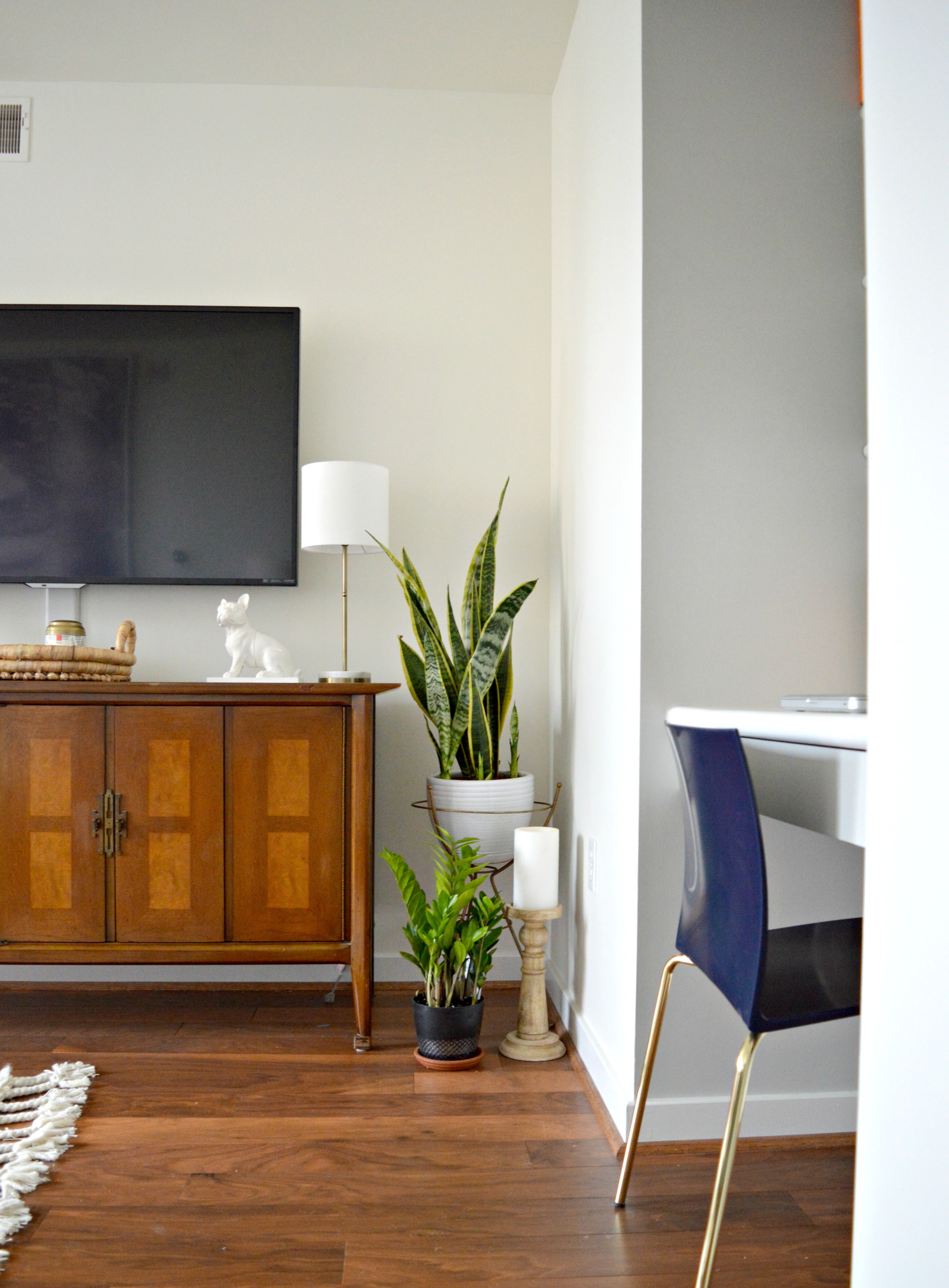
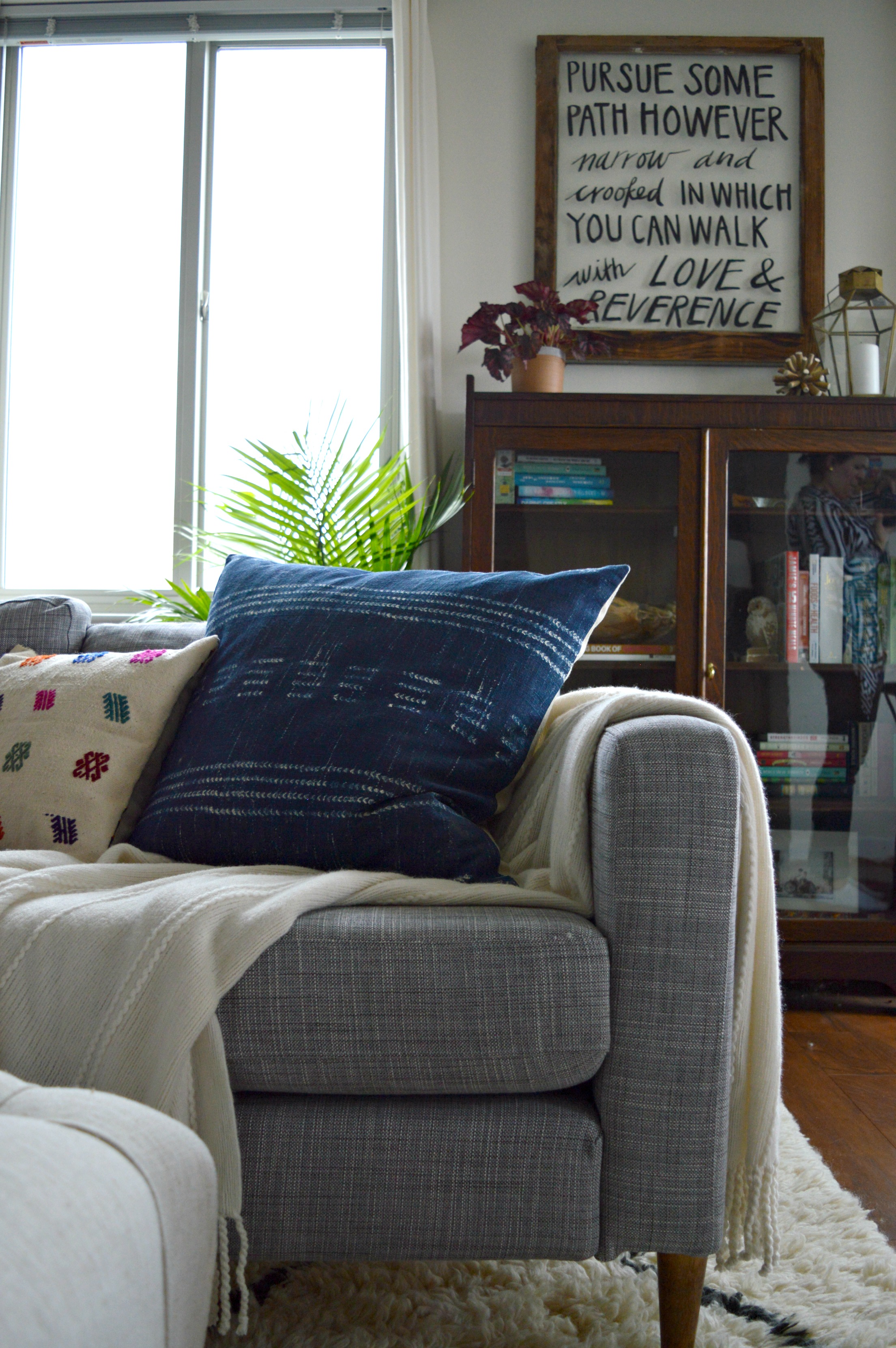
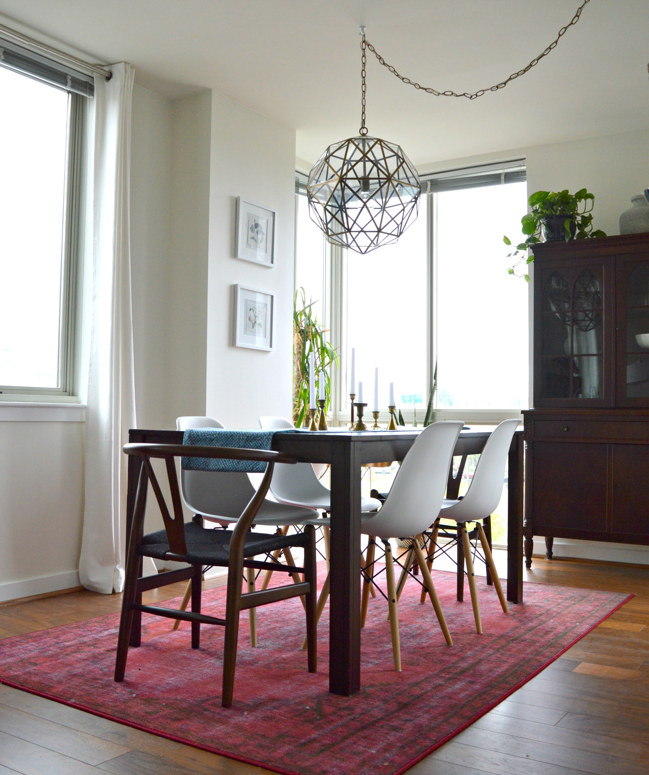
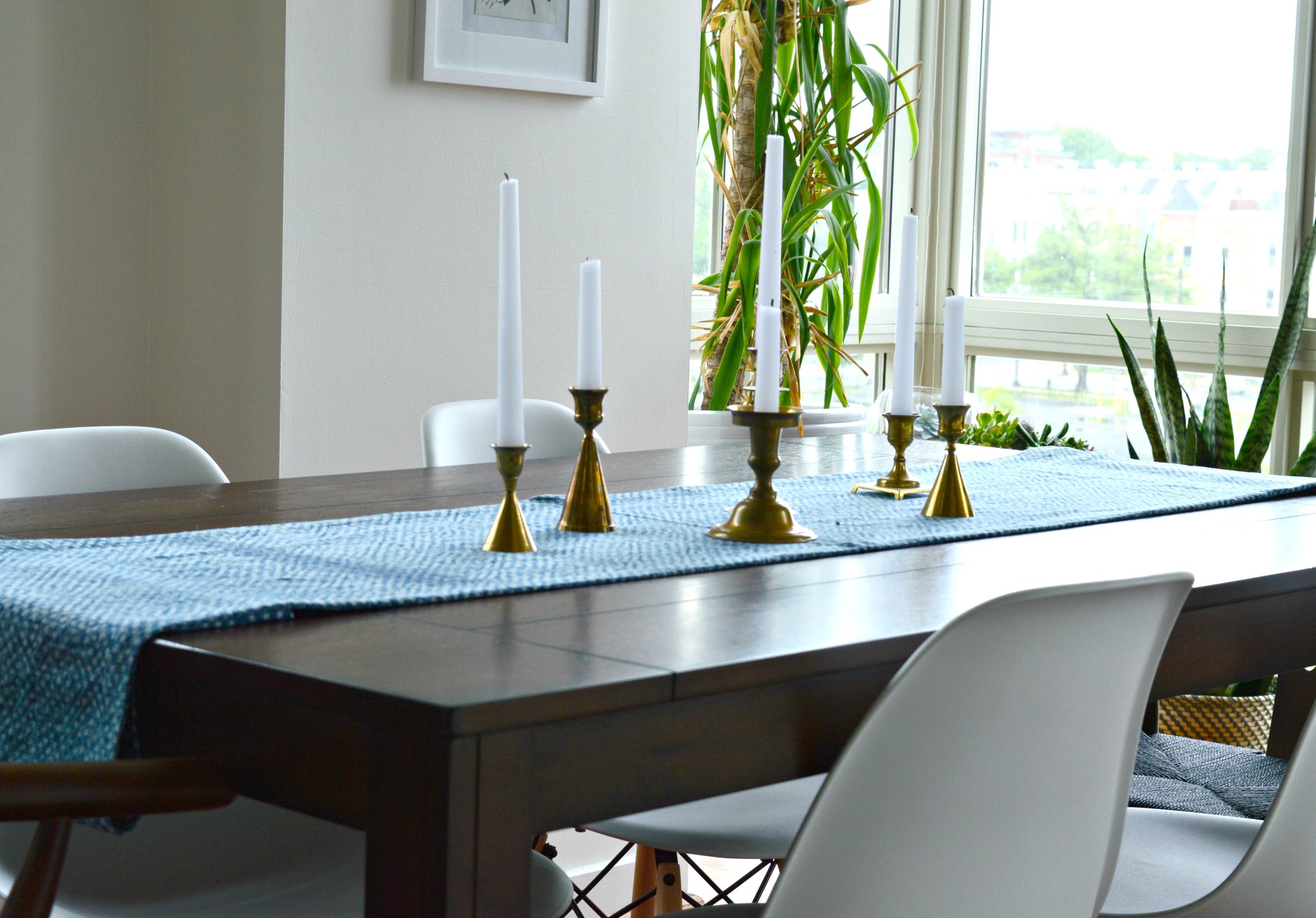
Hi friends! We are so tickled to finally get to share one of the coolest projects we've had the pleasure of working on recently! Today and tomorrow we'll be revealing the bedrooms from this condo you may recall from last Spring. Situated in the heart of the trendy Navy Yard neighborhood of Washington D.C., this home is where our young world traveler client can truly kick back and find rest. Just like with the main living spaces, we completed these bedrooms remotely through E-Design!

Here's a look back at what we did in her main living spaces, but you can catch the full tour here!

Our client had a real 'let's do it!' attitude so we were able to present some pretty big ideas to her, (wait until you see what we did with her master bedroom tomorrow)! Not only was she open minded, but she tackled them fearlessly, (serious kudos to her)! This is what E-Design is all about - TRUST! Fortunately, she was kind enough to let us drop by after the rooms were finished so we could snap some photos to share with you!

We're kicking off the reveal today with the guest room. Since our client may potentially rent out her guest space we wanted it to be fairly neutral but also very inviting. Although we kept the furniture and decor to a minimum, the right mix of pieces give this space a warm and stylish feel. Come on in!

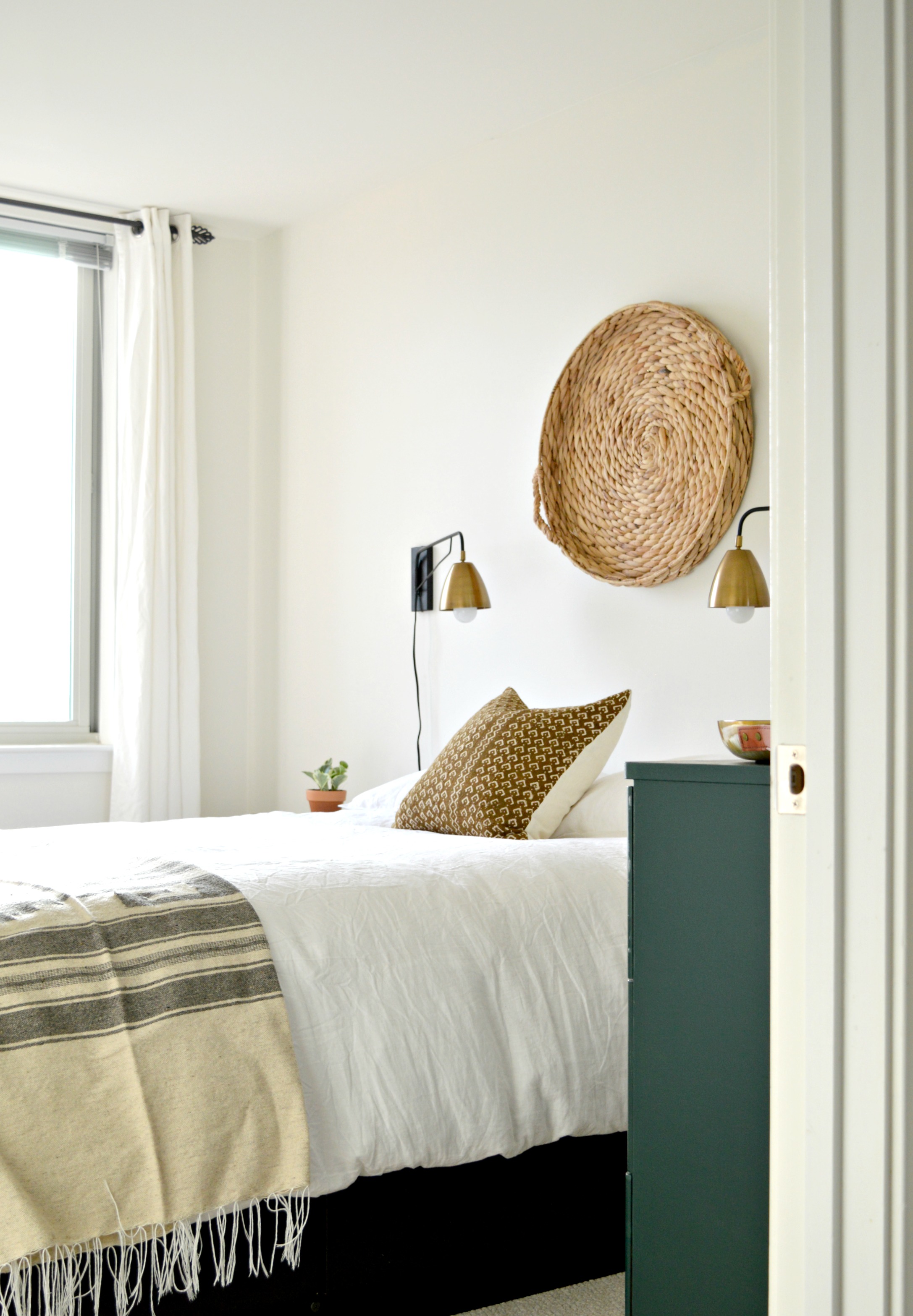
You truly can't go wrong with ivory and rust. The plan from the start was a very simple color palette that mixed natural wood tones, black, brass, and ivory. We started with this design board and followed it pretty closely until we got to the dresser. The dresser was a fantastic Craigslist find with good bones but the surface of the wood was not in tip-top condition, so we had our client paint the piece in a dark hunter green, (which she had leftover from a little surprise we'll be revealing tomorrow), and added brass pulls, (which we found for her here).

We found these sconces affordably at World Market, and added a basket she already owned above the bed. The rusty brown pillow we found in Etsy shop, I Heart Norwegian Wood, completes that end of the bed, while a folded Mexican blanket our client found while in Mexico anchors the foot. Ivory linen duvet set from H&M.

This woven bedside table from IKEA adds subtle texture.

This woven mirror was one of the few pieces our client had when we first met, but it's so large there wasn't an appropriate spot for it in her main living spaces. It's absolutely the perfect piece over this dresser! We love looking at the items our clients have with fresh eyes and reworking them in new ways.

That completes today's reveal! We hope you'll come back tomorrow when we share the gorgeous master bedroom! It's got several treats we think you guys will enjoy.

Thank you so much for stopping by!
 

Reader Design: Brooke's Tranquil Tree House

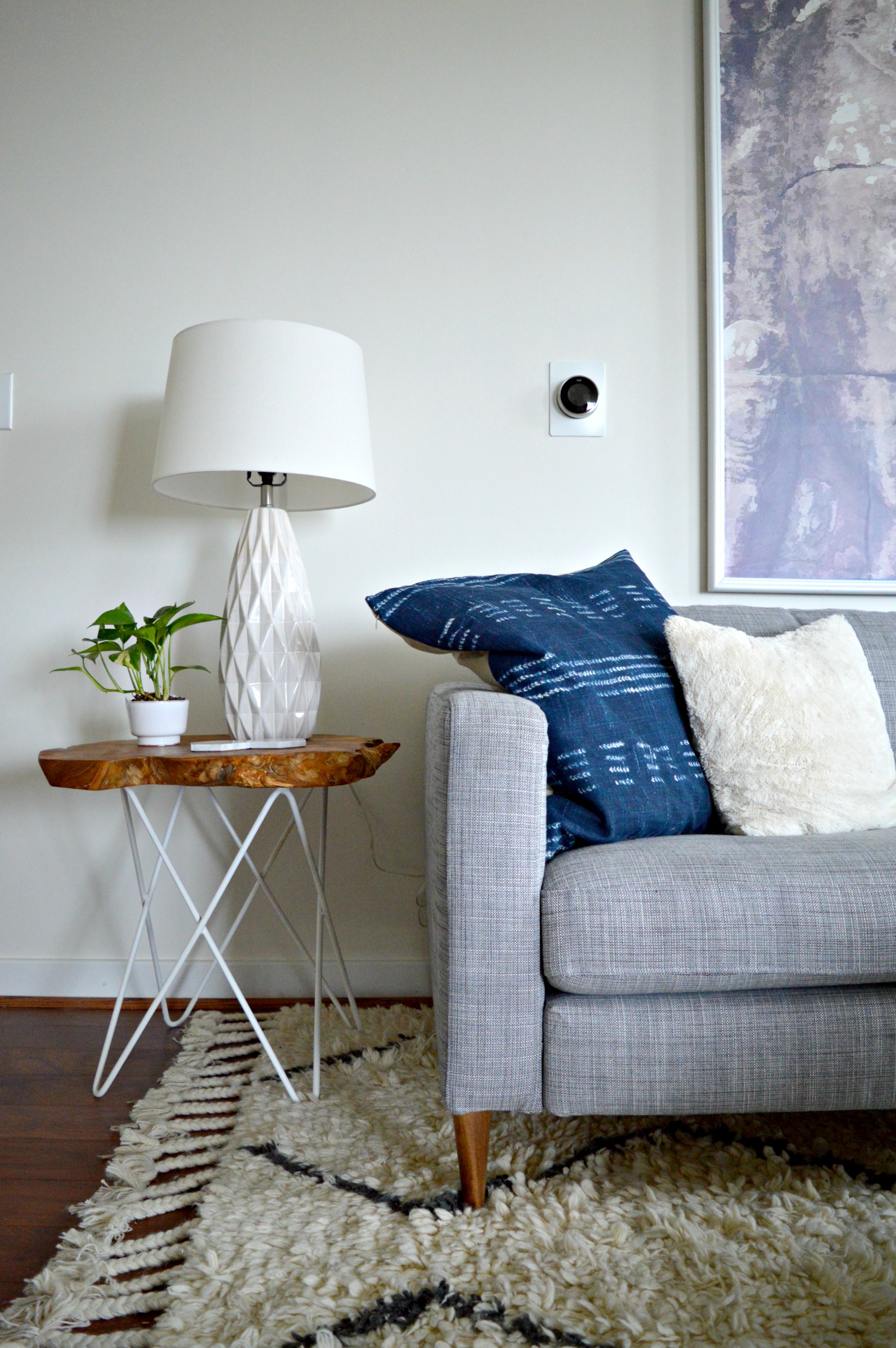
The owner of this self-proclaimed "tree house" has it going on. Brooke is busy mothering, renovating her St. Louis home, operating her business, Sucre Shop, and managing the social media for West Elm St. Louis. WOAH! Color me impressed.

And, Brooke is a serious, self-diagnosed style mutt. From Brooke: 

The house is mid-century modern, and that kind of simple, inside / outside aesthetic is what we wanted to stick with. But I’m no mid-century expert, and at the end of the day, I like what I like. It ends up being eclectic, and that doesn’t bother me at all.
I call our house the tree house because it is so open inside and open to the outside, with its huge sliding doors, floating stairs, and tall windows. I fell in love with the backyard that you could see from almost anywhere on the ground floor, but the house needed a ton of updating!

Every surface you see has been touched in some way or another - the tiger stripe bamboo floors which replaced a mix-match of carpet and hardwoods; the amazing orange that looks vintage but was a splurge Brooke and her husband agreed on early in the renovation process; the raw, uneven, and totally unique kitchen backsplash; and the bright walls that went in to cover up the stained woven wallpaper.

We have so many windows on our ground floor that there isn’t actually much space for pictures or art. To fit in all the pieces that are special to us, we did a gallery wall around our TV in the living room. A smart friend recommended I use Command hooks to test things out and make sure I liked everything before I committed. It may be the best advice I’ve ever gotten!
The ‘I carried a watermelon’ poster on the wall is from Etsy and is a tribute to my childhood. Fun fact: I was an extra in the movie Dirty Dancing when I was 7 years old! I was doing the merengue in the gazebo in my Kellerman’s t-shirt! People get such a kick out of seeing that on my wall.


Now, you can tell why Brooke calls her home a "tree house" - it's light, bright, and airy. The only problem? No privacy! Luckily, Brooke had a solution. 

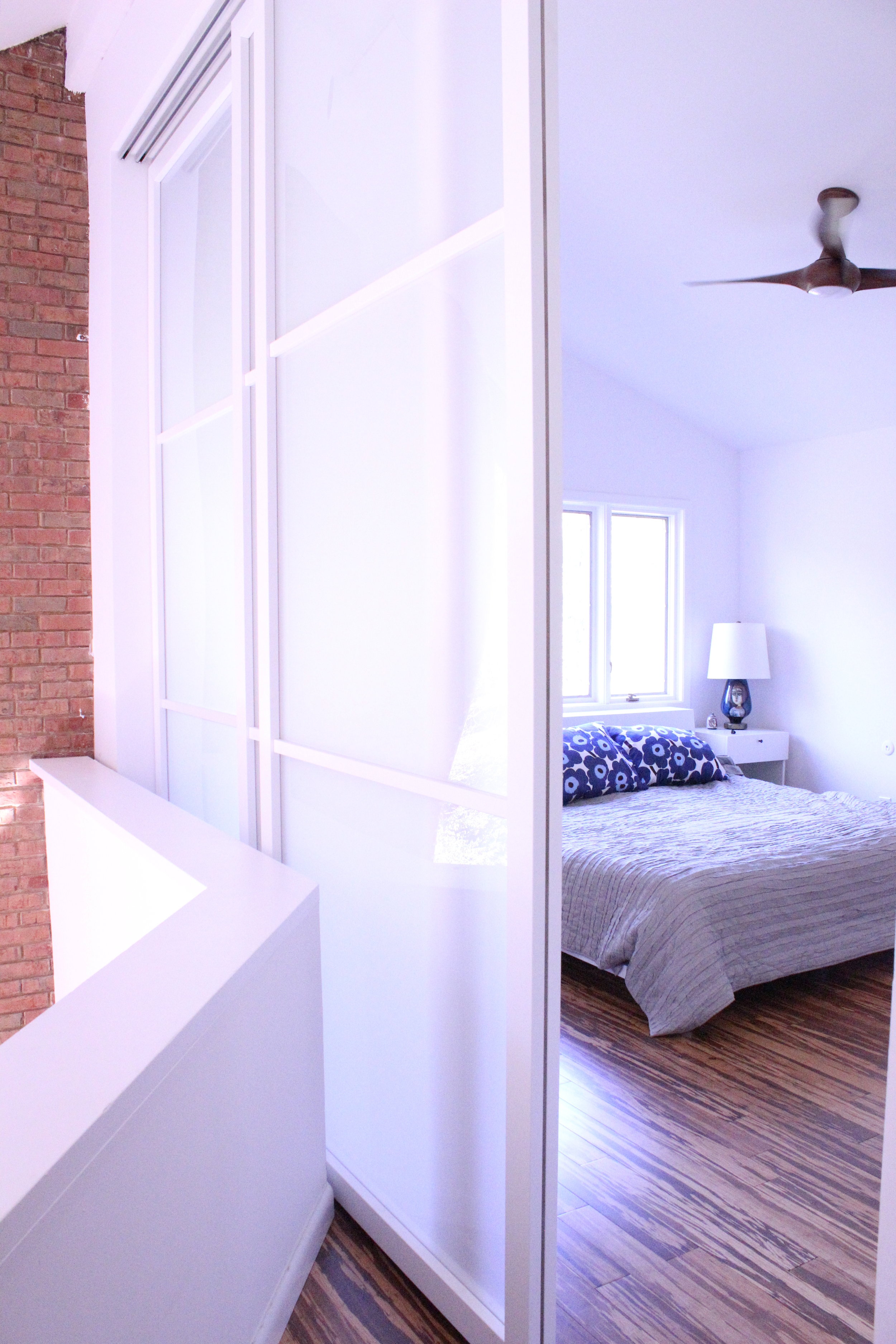
Our a master suite is a loft area above the living room. It used to be a sunken living room, which we converted into a closet, because there was so little closet space. The master bedroom has to be closed off with a cardboard accordion door. The huge sliders we put in give us privacy, but we can open them all the way and still have the open feel and views original to the house.

We commend you, Brooke, for achieving beautiful design with some serious practicality! 
Follow Brooke along on Instagram and check out her shop! 

See you next week, Mutts! 

Tricked-Out Industrial Desk

I seriously never know what's going to jump into my cart when I go thrifting.  But that's kind of the point though: go out with open expectations and see what projects will reveal themselves to you.  And on a recent treasure/ trash hunt, I came home with these babies:

Sawhorses.

Right away I noticed they were just the right height for an industrial-style desk but I needed to find a desk top.  In the spirit of using what you have, I dug up that old  tri-fold chalkboard we used as a giant program at our wedding and decided to repurpose one of the panels.

The chalkboard had been collecting dust in our garage for a few years with the exception of when it got a moss & bookpage makeover to be the "something borrowed" at a dear friend's wedding:

But collecting dust does no one any good (especially if you have allergies) so I introduced a chalkboard panel to one of the sawhorses and they hit it off!

How perfect is that?  The chalkboard surface makes it easy to jot down tasks that can be wiped clean when completed.

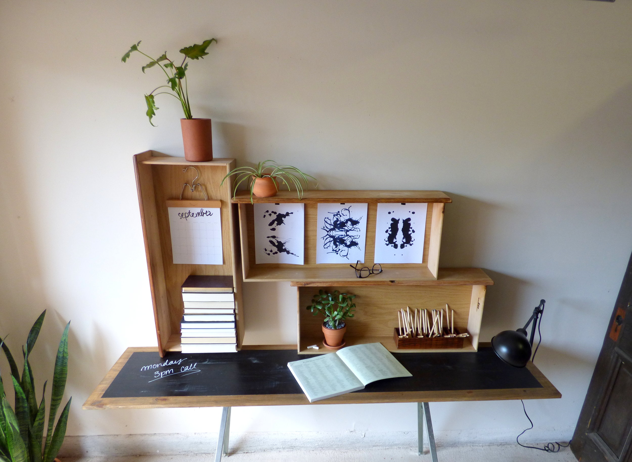
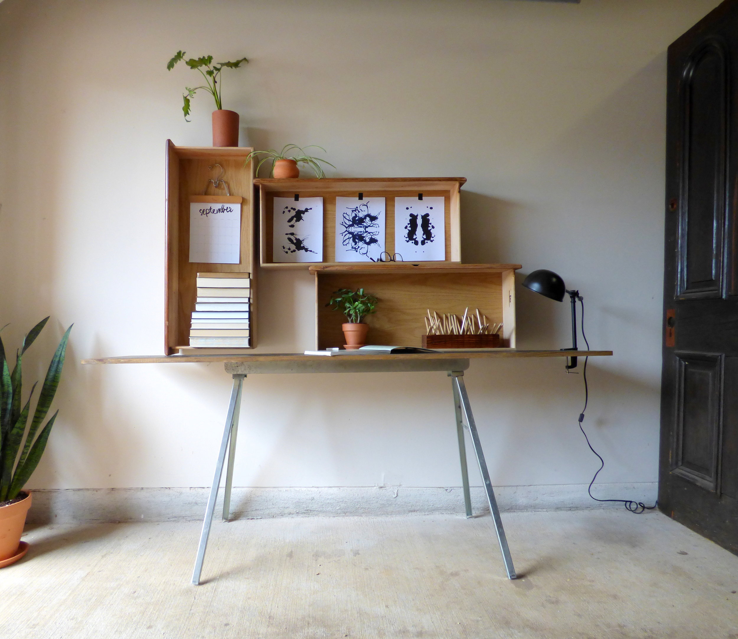
I built the hutch out of 3 old drawers that can be reconfigured to suit.  They were also collecting (saw)dust in the garage from a dresser that was too damaged for me to repair and were serving no purpose until I also introduced them to the sawhorse and chalkboard.

They're like a blended family - Mr. industrial Sawhorse meet slender Chalkboard and they adopt three orphaned drawers to make a little desk family.

P1020196-001.JPG

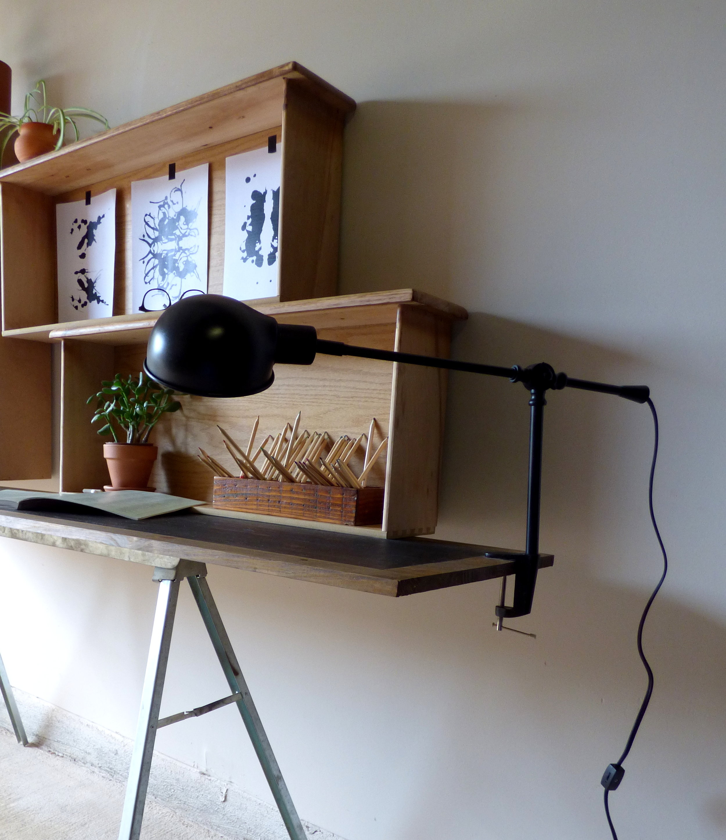
The desk also comes with a pet cLamp (which is Cate for "clamp lamp").  

It has adjustable angles and an on switch on the cord.  And unclamps for easy repositioning.

(To be honest with you, I'm not sure what person I staged this piece for: a college-bound hipster majoring in psychology with a double minor in botany and art maybe?)

Chelsea and I are currently hatching a plan for the other sawhorse as we speak so you'll have to stay tuned to find out what juicy client project that will turn out to be...

Oh and the lucky buyer of the Desk family can also opt to take home uncle Chair (complete with black leather and thick retro vibes) at no extra charge. 

Industrial Sawhorse Desk [ + Hutch + Lamp + Chair]
SOLD
[Sawhorse Desk] 72"L x 17.25"D x 30"H
[Re-Configurable Hutch Drawer Shelves] 34"L x 14"W Each
Price: $245

If you are interested in this piece or a custom order like it, please contact cate@stylemutthome.com.