The owner of this self-proclaimed "tree house" has it going on. Brooke is busy mothering, renovating her St. Louis home, operating her business, Sucre Shop, and managing the social media for West Elm St. Louis. WOAH! Color me impressed.
And, Brooke is a serious, self-diagnosed style mutt. From Brooke:
“The house is mid-century modern, and that kind of simple, inside / outside aesthetic is what we wanted to stick with. But I’m no mid-century expert, and at the end of the day, I like what I like. It ends up being eclectic, and that doesn’t bother me at all.”
“I call our house the tree house because it is so open inside and open to the outside, with its huge sliding doors, floating stairs, and tall windows. I fell in love with the backyard that you could see from almost anywhere on the ground floor, but the house needed a ton of updating! ”
Every surface you see has been touched in some way or another - the tiger stripe bamboo floors which replaced a mix-match of carpet and hardwoods; the amazing orange that looks vintage but was a splurge Brooke and her husband agreed on early in the renovation process; the raw, uneven, and totally unique kitchen backsplash; and the bright walls that went in to cover up the stained woven wallpaper.
“We have so many windows on our ground floor that there isn’t actually much space for pictures or art. To fit in all the pieces that are special to us, we did a gallery wall around our TV in the living room. A smart friend recommended I use Command hooks to test things out and make sure I liked everything before I committed. It may be the best advice I’ve ever gotten!”
“The ‘I carried a watermelon’ poster on the wall is from Etsy and is a tribute to my childhood. Fun fact: I was an extra in the movie Dirty Dancing when I was 7 years old! I was doing the merengue in the gazebo in my Kellerman’s t-shirt! People get such a kick out of seeing that on my wall.”
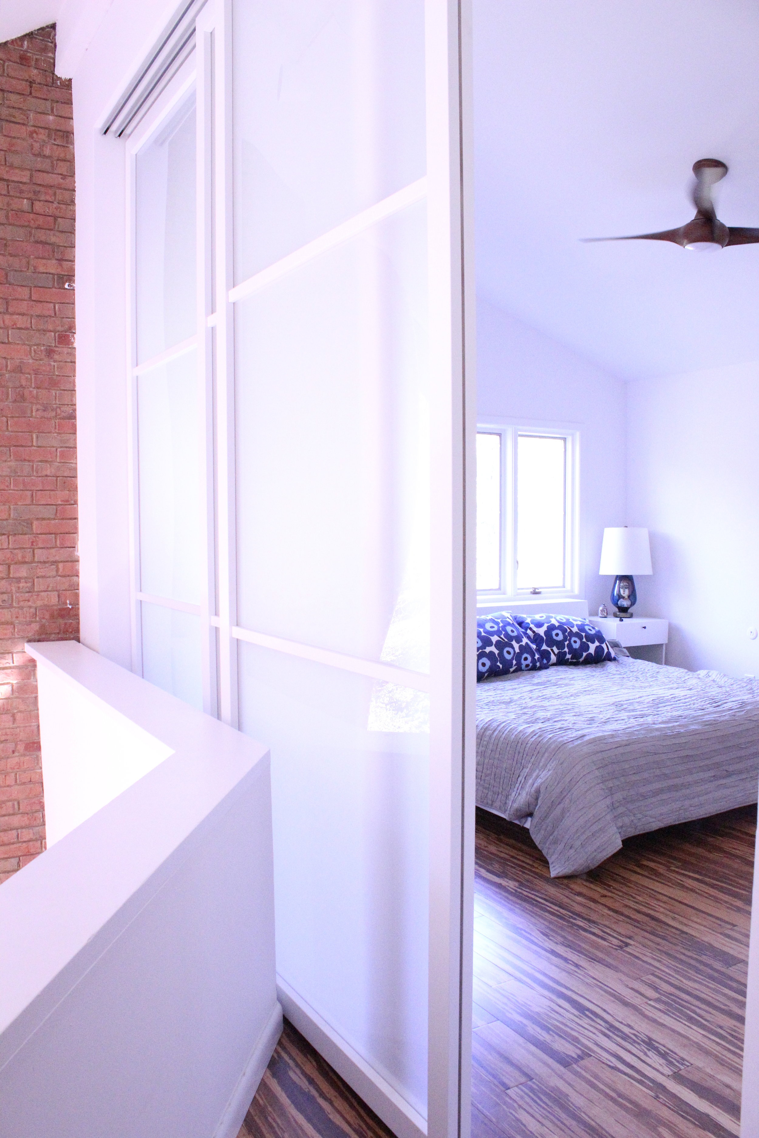
Now, you can tell why Brooke calls her home a "tree house" - it's light, bright, and airy. The only problem? No privacy! Luckily, Brooke had a solution.
“Our a master suite is a loft area above the living room. It used to be a sunken living room, which we converted into a closet, because there was so little closet space. The master bedroom has to be closed off with a cardboard accordion door. The huge sliders we put in give us privacy, but we can open them all the way and still have the open feel and views original to the house.”
We commend you, Brooke, for achieving beautiful design with some serious practicality!
Follow Brooke along on Instagram and check out her shop!
See you next week, Mutts!


