Addition Reveal: Shire's Room

It might be a long time until our Addition Reveal series is done, but I am so stinkin glad we are on this end of the project! To have rooms we can start making our own now that the heavy construction is done is almost overwhelming. We are so proud of all the work that went in to this little house. We spent so many years imagining this, to one year ago actually producing drawings to follow, to now walking through the very hallways and rooms as we laid them on paper. This feels like a once in a lifetime experience and we are just in awe of how incredible everything has turned out!

While we still have work ahead of us, the first rooms of our newly imagined 3-5 year house 12 years later are coming to a finish. The kids’ rooms had the least impact of this reno so they’ve been closing in hot as they’ve been the easiest to work in amidst the rubble elsewhere.

Shire is a gal amongst the boys. She’s incredibly tough yet has such a gentle spirirt. Patient for days, she is a natural and gifted teacher who loves seeing others blossom. She prefers going against the grain of trends and doing her own thing, which makes her a magnet for all kinds of people. She loves easily, forgives quickly and is generous with her service to others.

Shire is different from me in ways that I thoroughly enjoy, (and am grateful for), but we share the same sense of humor. Laughing together can bridge many differences, and she and I can really get rolling with no turning back pretty often. It’s just the best!

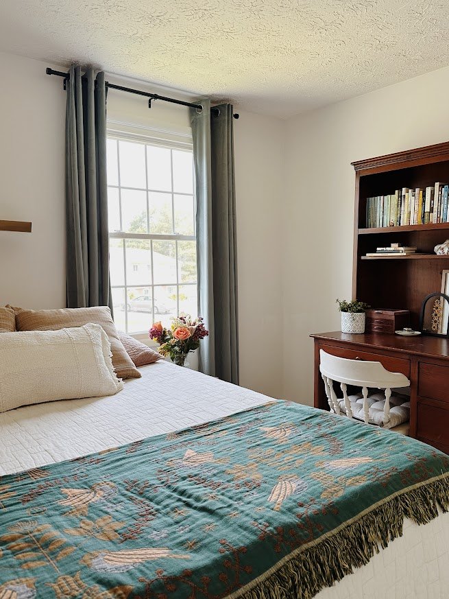
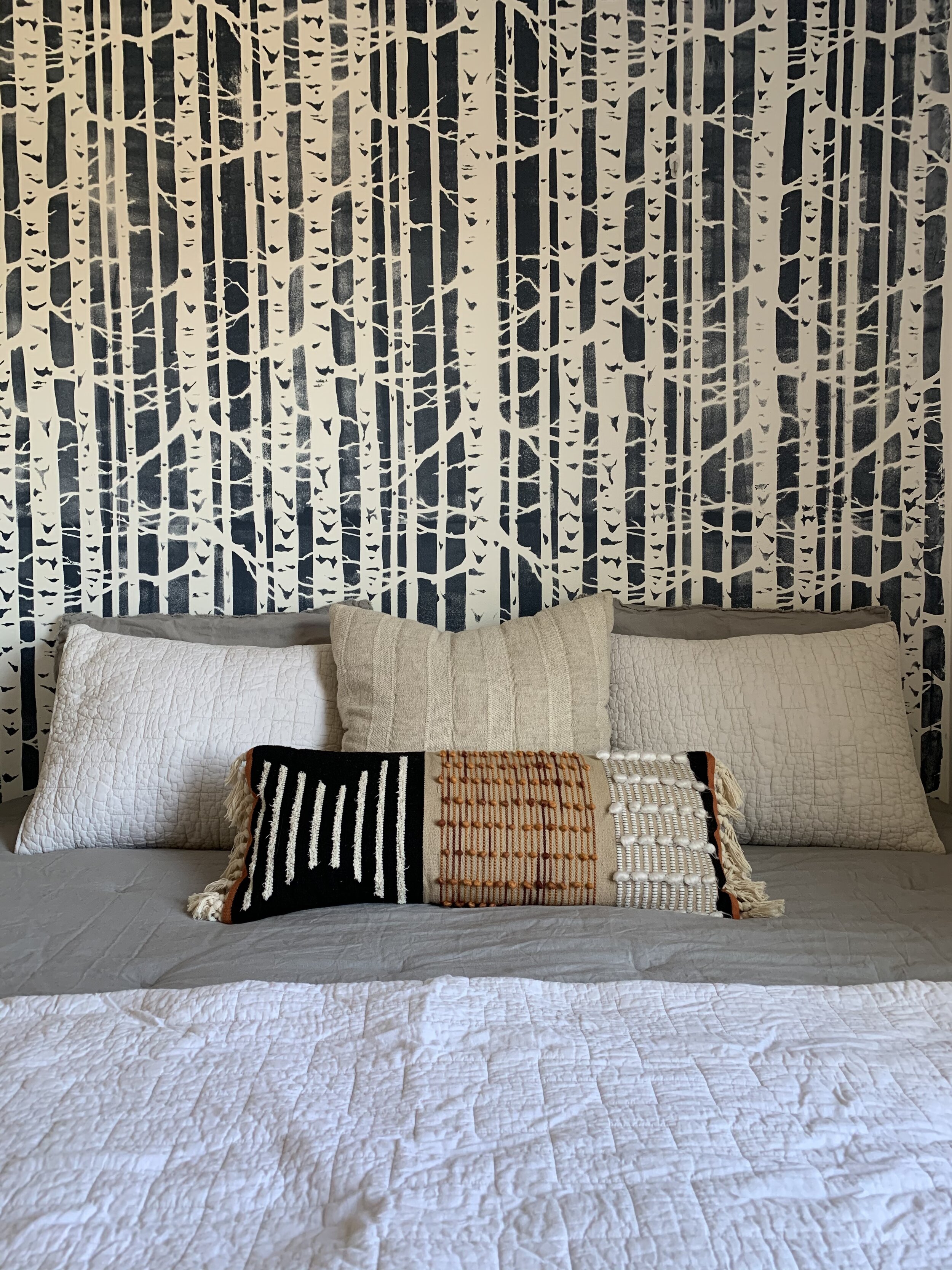
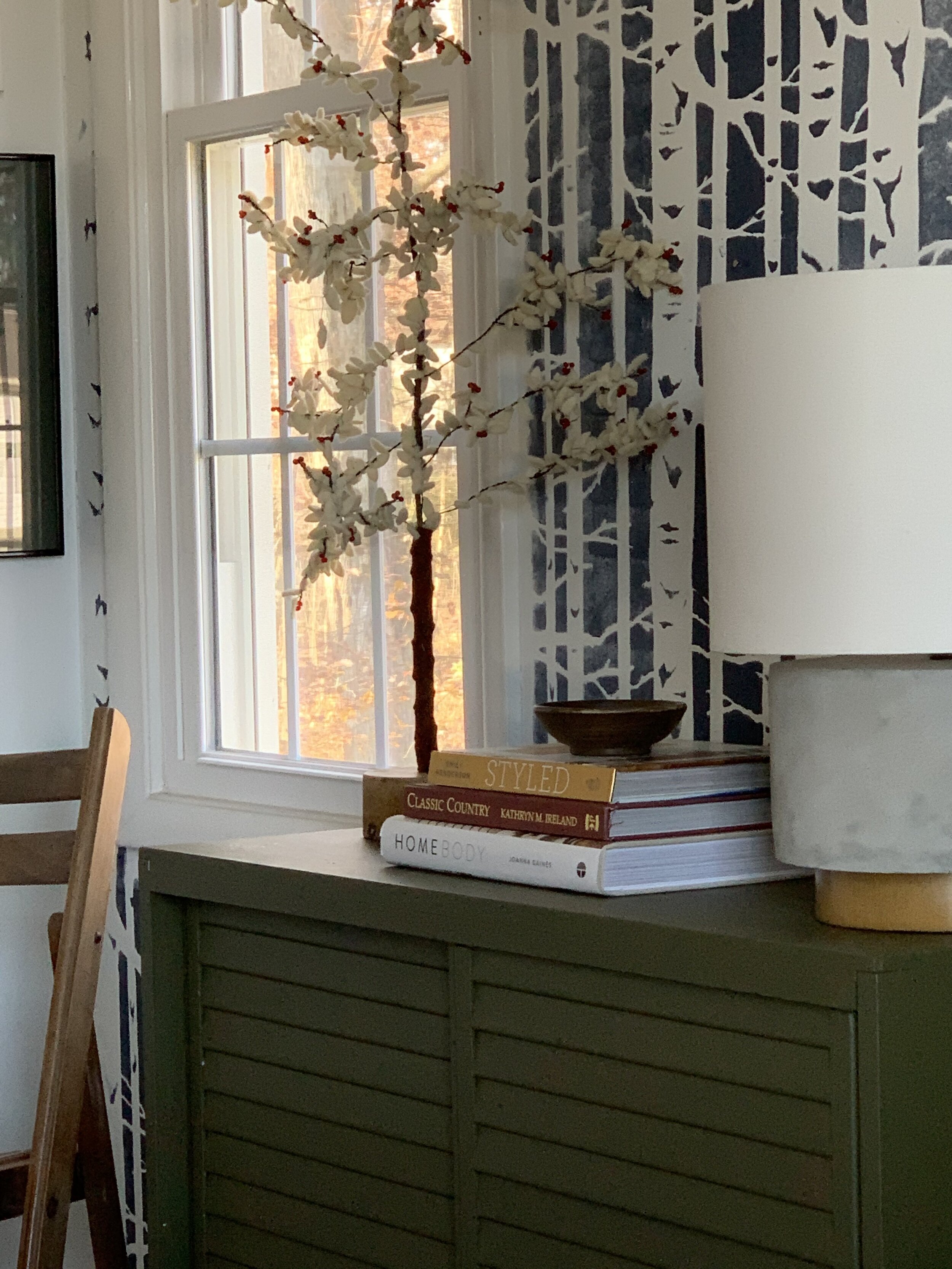
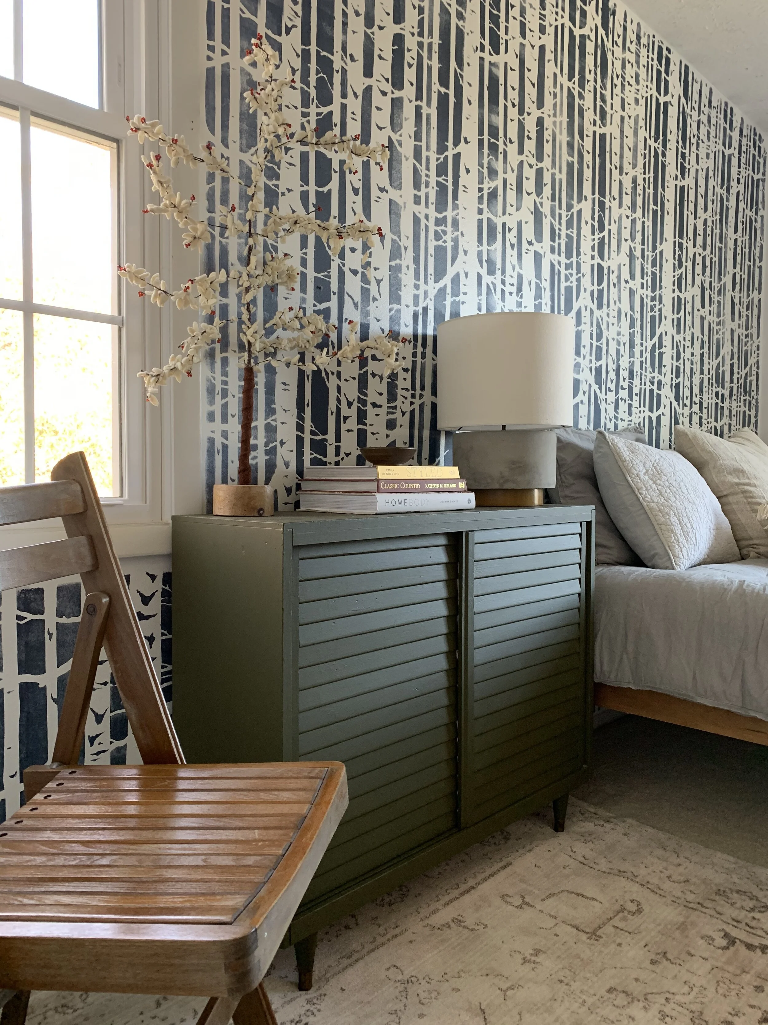
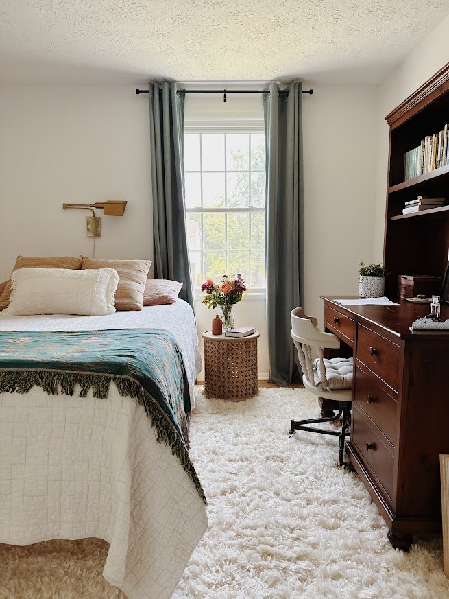
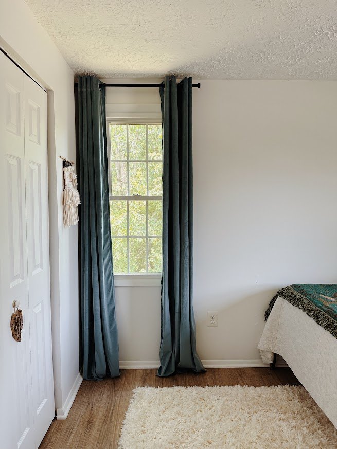
So what does Shire’s personality have to do with this room? Absolutely everything! Shire is walking sunshine, but she is not flashy or desiring of attention. Her room strikes that unique balance as well. It’s happy without overwhelming - it draws you in closer and makes you want to stay, just like Shire has the ability to do. It’s a peaceful room with details on which you want to linger because they’re unique and interesting.

We are a family of very diverse personalities and I love when a homes spaces can reflect that. Our three kids rooms are as unique as each kid, and I love pulling out those characteristics that make them who they are and working those in through the elements used in each room! This is precisely what I love so much about design and why I’ve grown a business from it for the past 7 years.

Thank you so much for taking the time to check out this very special first room of our Addition series! Very grateful for this little corner of the web to celebrate these milestones with, and I so appreciate all of your encouragement. And a very special thanks to my sweet friend, Meredith, for coming over on a whim to help get this room together! She has helped me before and I love hear heart for creating spaces that reflect a persons unique personality. And she’s only just graduated high school so huge future ahead for her!
Kids Room Converted For Guests

It’s the heaviest travel time of the year, but this year we’re staying put and hosting for a few days between Thanksgiving and Christmas! We love having guests stay with us but frankly, never know where to put them. Our family of five home is a 3-bedroom partial split-level, so with no designated guest room and somewhat close quarters, we have to get clever to host guests comfortably.

Our shared boys’ room has always been the go-to since it’s the larger of the kids rooms, and I recently discovered an unconventional trick to make it more suitable to couples. Here is their typical arrangement:

Old1.jpg

And if I push the twin beds together, we’ve practically got a king with loads of extra floorspace! (granted, the king bed hack is in the corner)

new10.jpg
new2.jpg

I cover each twin bed with its own fitted sheet, then cover with Queen size top bedding, (flat sheet and comforter), since it’s what I have. There’s not a lot of extra but queen size does do the trick if it’s what you’ve got.

new7.jpg
new4.jpg

I shopped around our home to complete this adult-friendlier space. This room is shared by my sons, 8 years and 10 years, and while I am charmed by their choice of decor and reading material, it is only because I am their Momma. I’m not sure our friends and family would care much for rocks, shark teeth, the Bed Kitty books or 435 cut out paper sharks.

new3.jpg
new1.jpg

The benefit of pushing the conjoined beds into the corner is it opens up the floor space substantially! I wanted to create this space how I live in a room when I’m traveling, and let me tell you, I settle in. You wouldn’t know the difference between me staying for a night or a month. Hah! The rug, (found here), was sent to us by Home Dynamix and is a really pretty, sophisticated element in this space. Definitely feels a lot more luxurious underfoot than our carpet!

new6.jpg
new8.jpg
new9.jpg

That’s a wrap! Staying or going, we hope you have a wonderful holiday season!

Thank you so much for coming by today!

Chelesa.jpg

Navy Yard Condo || Minimalist Guest Room

Hi friends! We are so tickled to finally get to share one of the coolest projects we've had the pleasure of working on recently! Today and tomorrow we'll be revealing the bedrooms from this condo you may recall from last Spring. Situated in the heart of the trendy Navy Yard neighborhood of Washington D.C., this home is where our young world traveler client can truly kick back and find rest. Just like with the main living spaces, we completed these bedrooms remotely through E-Design!

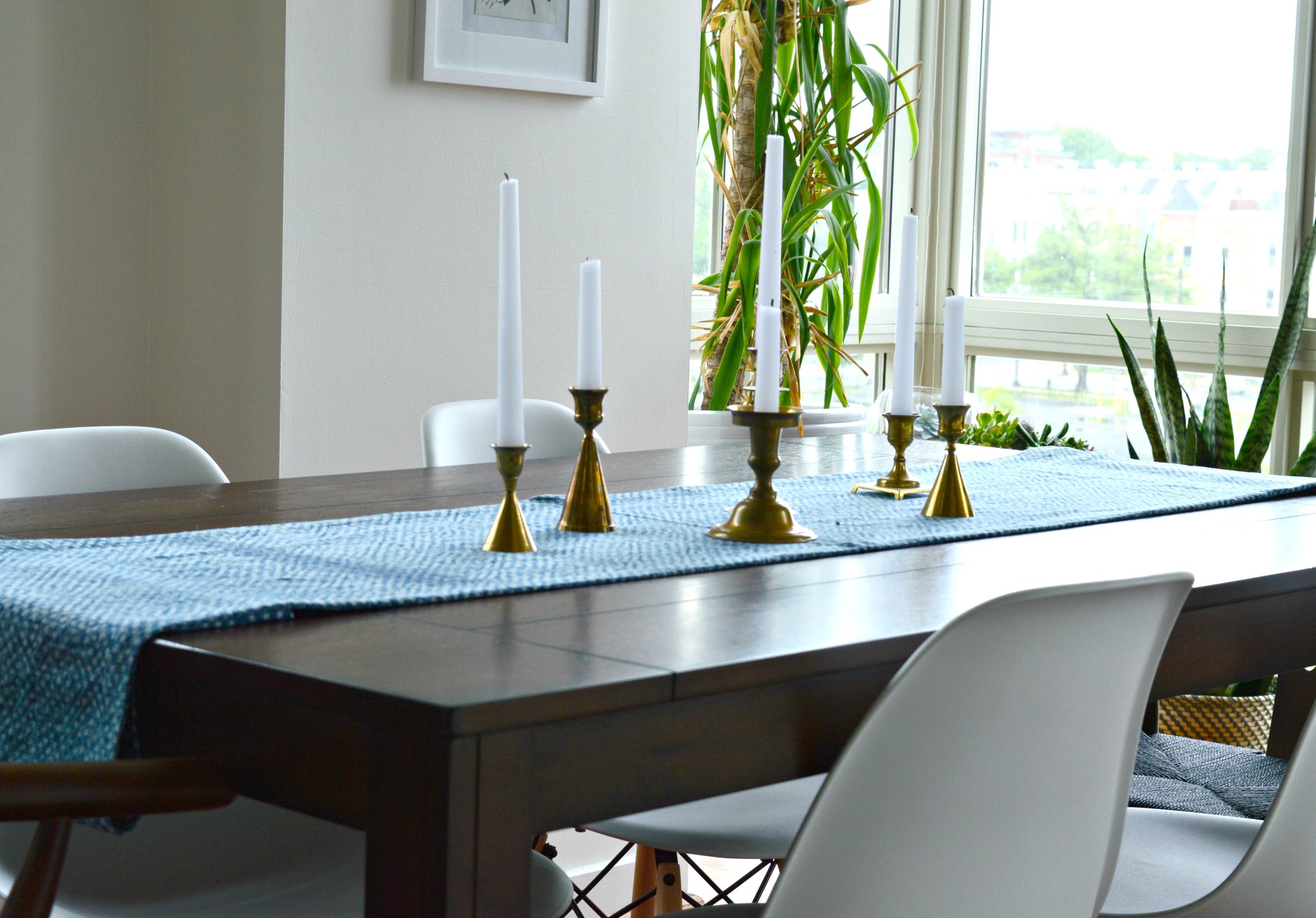
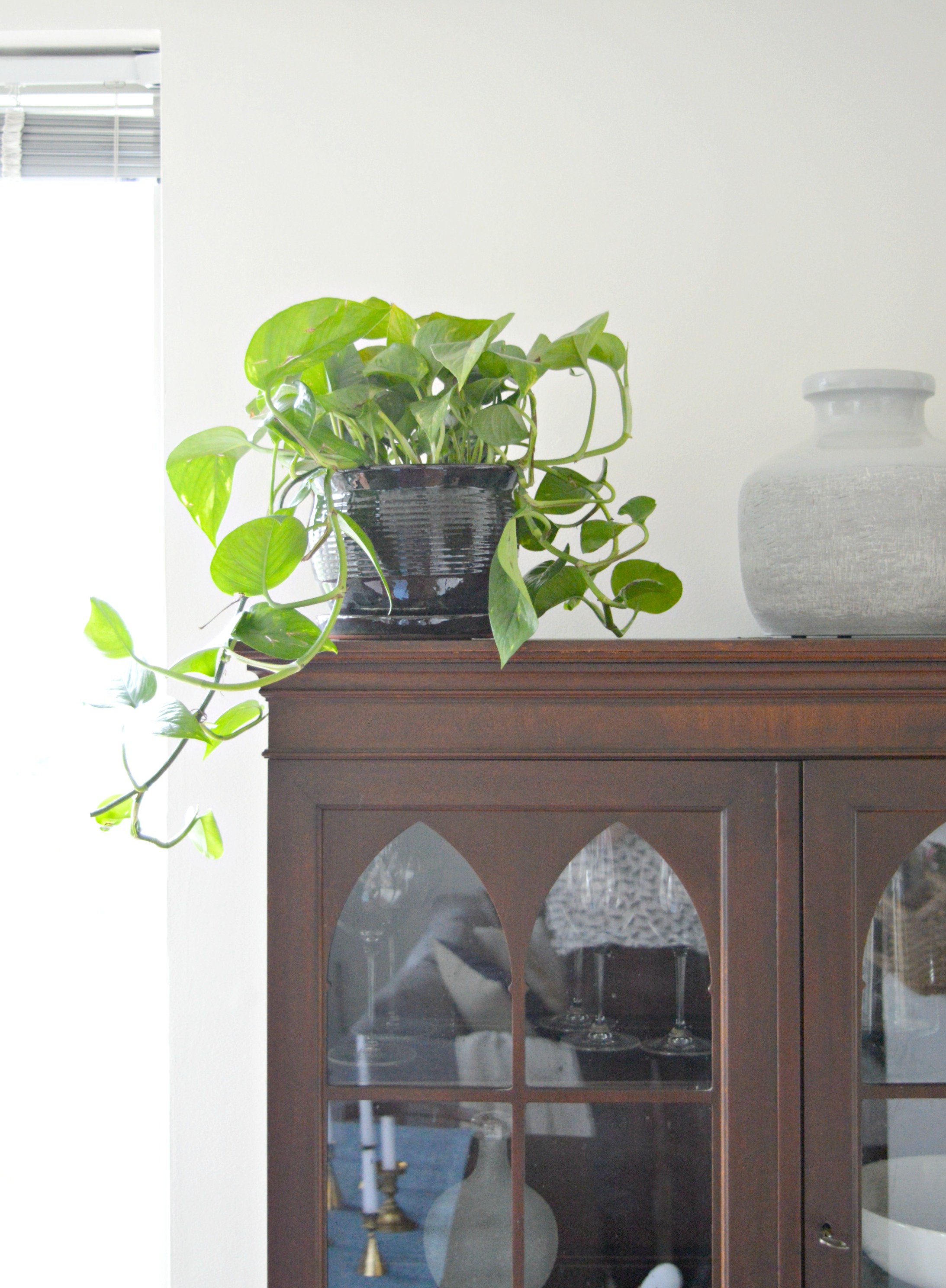
Here's a look back at what we did in her main living spaces, but you can catch the full tour here!

Our client had a real 'let's do it!' attitude so we were able to present some pretty big ideas to her, (wait until you see what we did with her master bedroom tomorrow)! Not only was she open minded, but she tackled them fearlessly, (serious kudos to her)! This is what E-Design is all about - TRUST! Fortunately, she was kind enough to let us drop by after the rooms were finished so we could snap some photos to share with you!

We're kicking off the reveal today with the guest room. Since our client may potentially rent out her guest space we wanted it to be fairly neutral but also very inviting. Although we kept the furniture and decor to a minimum, the right mix of pieces give this space a warm and stylish feel. Come on in!

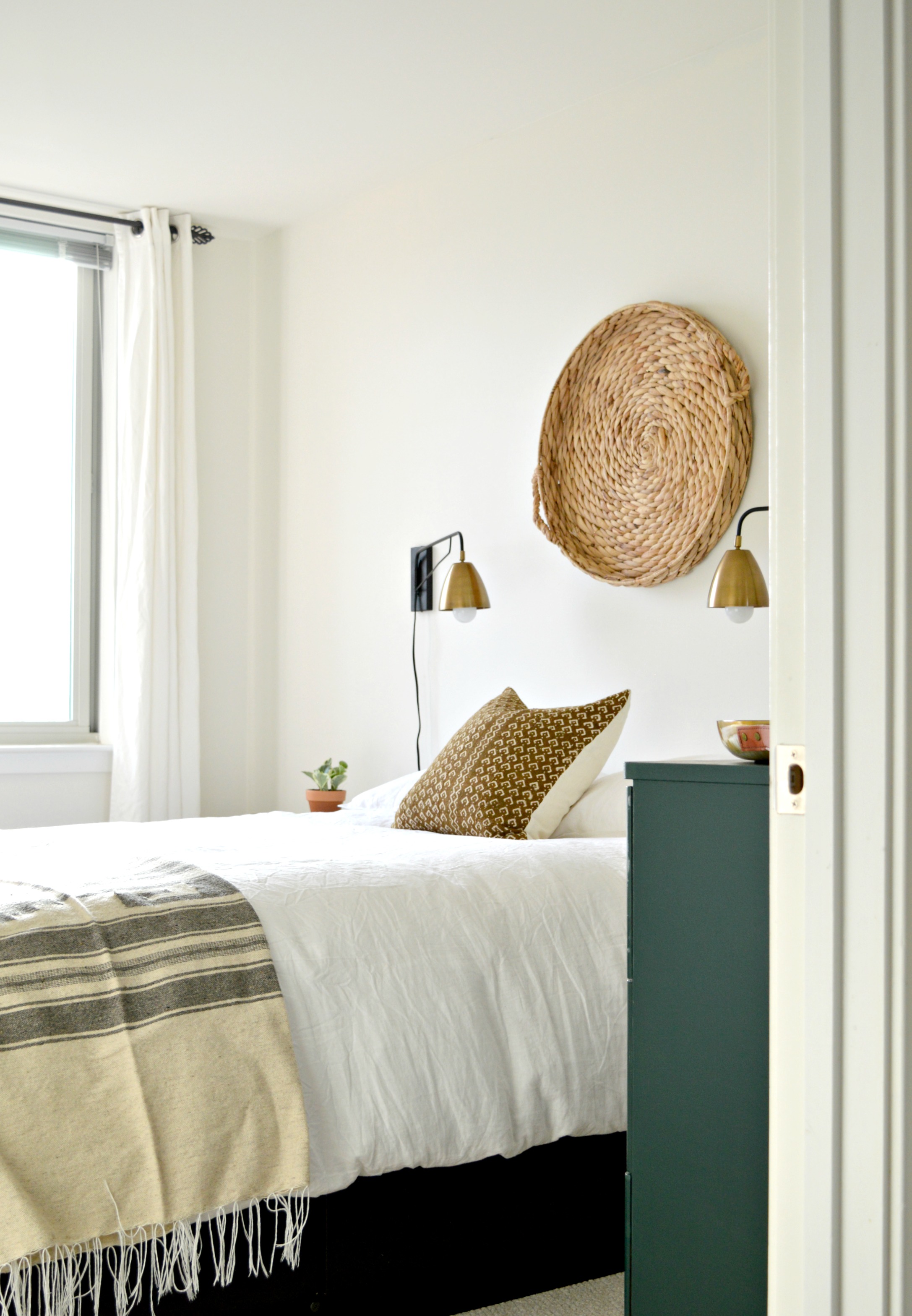
You truly can't go wrong with ivory and rust. The plan from the start was a very simple color palette that mixed natural wood tones, black, brass, and ivory. We started with this design board and followed it pretty closely until we got to the dresser. The dresser was a fantastic Craigslist find with good bones but the surface of the wood was not in tip-top condition, so we had our client paint the piece in a dark hunter green, (which she had leftover from a little surprise we'll be revealing tomorrow), and added brass pulls, (which we found for her here).

We found these sconces affordably at World Market, and added a basket she already owned above the bed. The rusty brown pillow we found in Etsy shop, I Heart Norwegian Wood, completes that end of the bed, while a folded Mexican blanket our client found while in Mexico anchors the foot. Ivory linen duvet set from H&M.

This woven bedside table from IKEA adds subtle texture.

This woven mirror was one of the few pieces our client had when we first met, but it's so large there wasn't an appropriate spot for it in her main living spaces. It's absolutely the perfect piece over this dresser! We love looking at the items our clients have with fresh eyes and reworking them in new ways.

That completes today's reveal! We hope you'll come back tomorrow when we share the gorgeous master bedroom! It's got several treats we think you guys will enjoy.

Thank you so much for stopping by!