eDesign Reveal: A Fresh Start & Our Biggest Reveal Yet

Hello, sweet friends! This is a special reveal and one that’s been close to my heart for quite some time. Last April during my kids’ Spring Break I read through Chip Gaines’ book, Capital Gaines. It’s an all-around motivating, get-it-done read, but the thing that stuck with me the most was the encouragement to bet on yourself. And it got me thinking that one person betting on their own selves can’t possibly have the same power as people betting on one another. I started mulling over the idea of looking for a design job to do for peanuts for someone in need. I wanted to give someone that oomph to keep on keeping on, even if just through the simple act of improving the way they feel at home. One month later in May, we were contacted by an amazing woman who was at a point of reinvesting in her life. Gods timing astounds me.

I think most all of us can attest that life doesn’t always, (or usually!), go as expected, and this woman had just been pitched a curve ball. With two young children in toe she was starting fresh with a new home, an old sofa, and a very happy fiddle leaf fig tree. The thing that just overwhelmed me with emotion while speaking with her was the fact that she wanted to make the most of this next chapter. It was apparent that there hadn’t been joy in her home for quite some time, and that’s what she wanted to bring back. ‘Happy’ was a frequent word that came up when discussing the vision and design of her home.

So with a strict $5,000 budget, I waved more than half of my design fee and cracked down on tackling her Family Room, Dining Room, Kitchen and Living Room. And this reveal may be one of our happiest yet! :)

DSC_0406.JPG

BEFORE

b4.jpg
DSC_0397.JPG

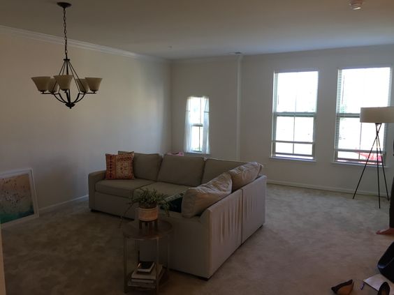
The first order of business was rotating that sofa and pushing it against the wall! This family room space is shared with the children in a big way, and the original placement of the sectional floating in the middle of the floor just made it too chopped up and separated. Also, PSA: With $40 and an 8 minute YouTube video, you, too, can update your overhead lighting.

b3.jpg
DSC_0435.JPG
DSC_0400.JPG
DSC_0439.JPG
b1.jpg

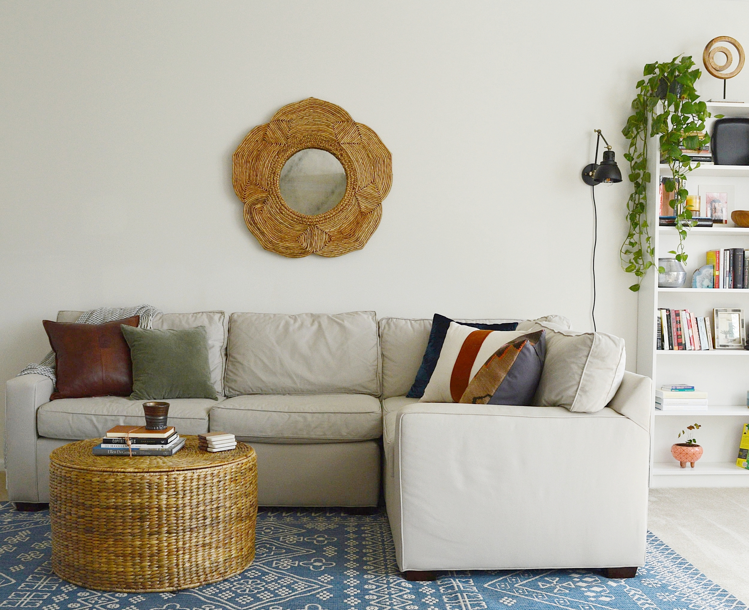
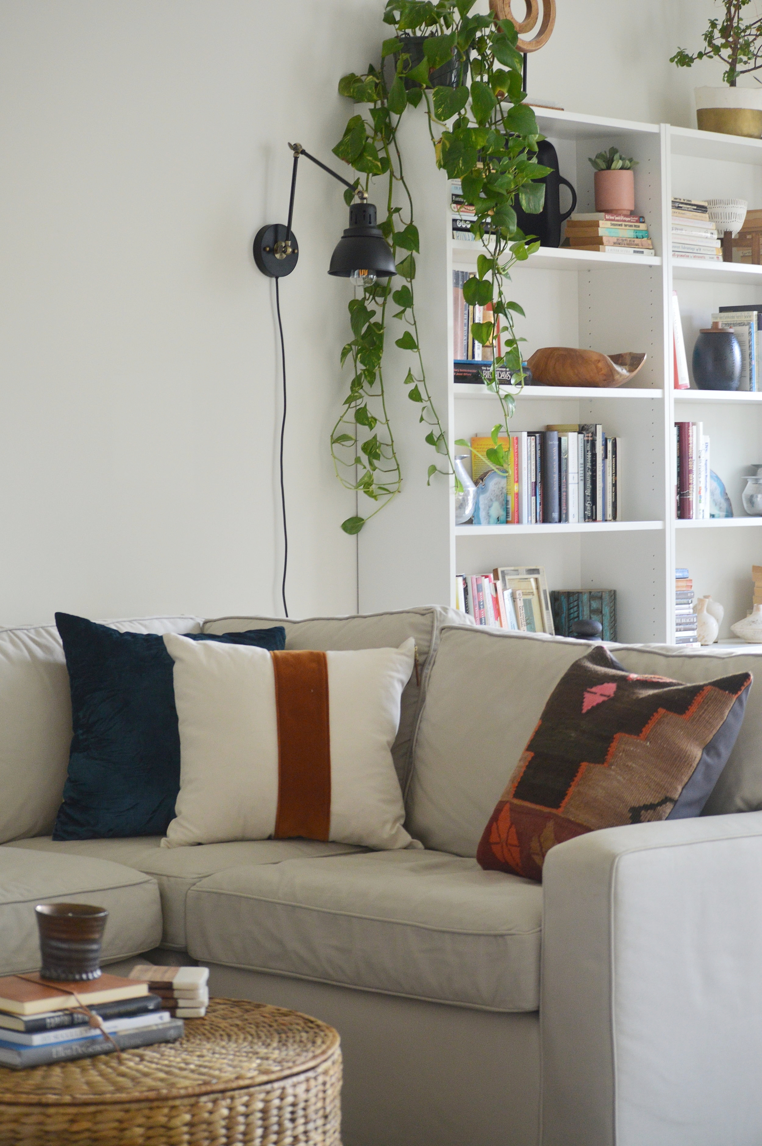
So. Much. Beige. With an emphasis on creating an environment that feels happy, color was top priority. The catch, however, was that because this is a rental, the wall color and carpet could not be updated. And because the client requested to use her sofa, (a smart move that allowed her to put her budget in SO MANY other places), that was another shade of beige to overcome.

DSC_0407.JPG
DSC_0409.JPG

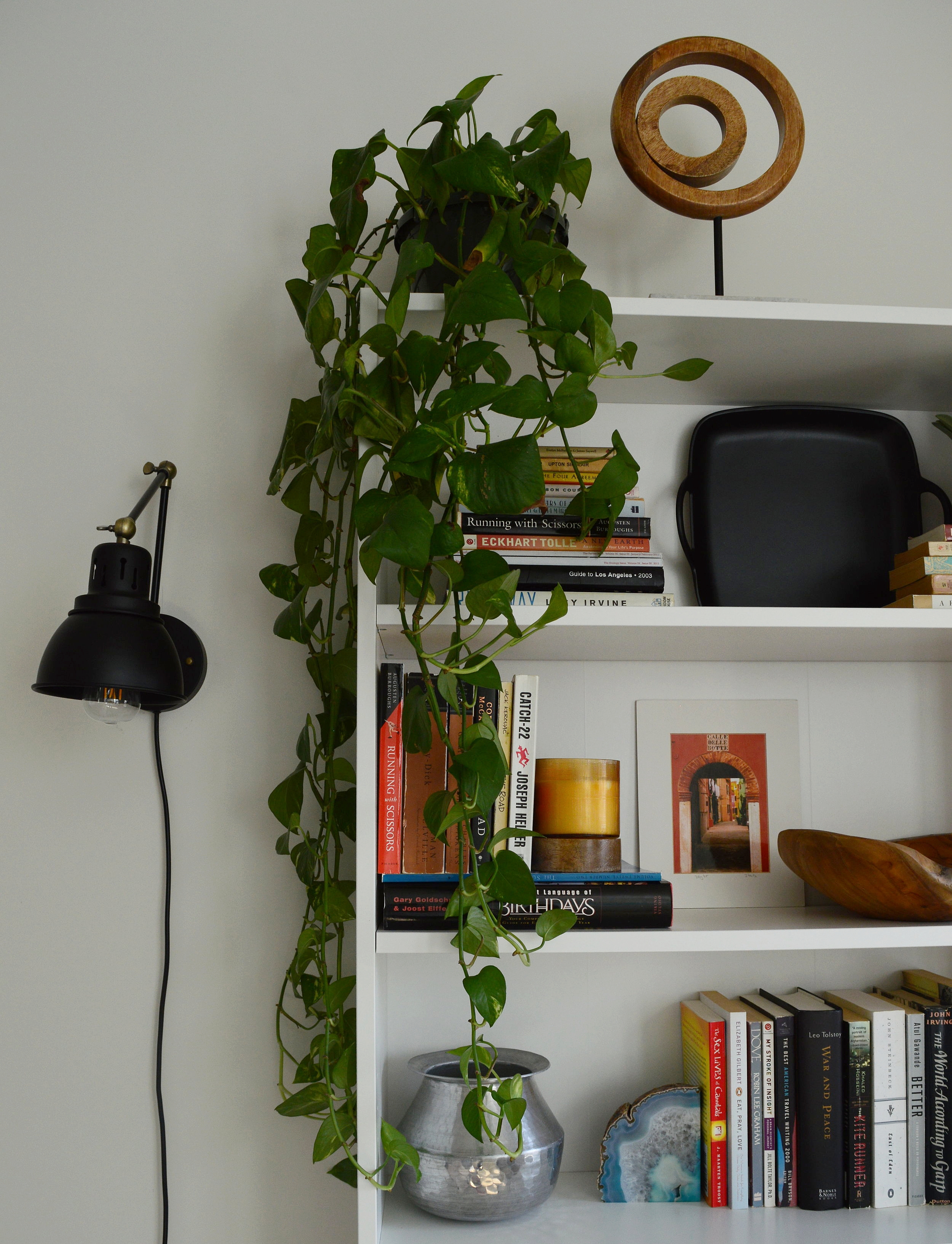
Picking pillows and accent pieces for this space was an absolute blast. With a bland canvas to work with the sky really was the limit, so I had to uncover what palette spoke to my client best. She is extremely inspired and rejuvenated by the coast, but I didn’t want to do anything too literal. Creating a relaxing vibe with pops of vibrant color was the way to go. Blue is a favorite color of hers so I peppered it around subtly.

DSC_0415.JPG
DSC_0427.JPG
DSC_0434.JPG
b2.jpg

Ah, yes - the wall mounted Ikea IVAR cabinets. This is the third design since last Spring that we used wall mounted IKEA cabinets to create a custom, clean-lined storage option, (see here and here). You can always add hardware, legs, etc to these to blend them into your own space, but my favorite way to use them is to mount them over the floor 6-8” and give them a fresh coat of paint, (they come in wood). And at just $80 per set of cabinets, that means this massive custom media storage unit cost just $240 + cheap paint.

DSC_0402.JPG

There wasn’t much to do in the kitchen but change out the pendants and add some stools - leather for the win!

DSC_0446.JPG
b5.jpg

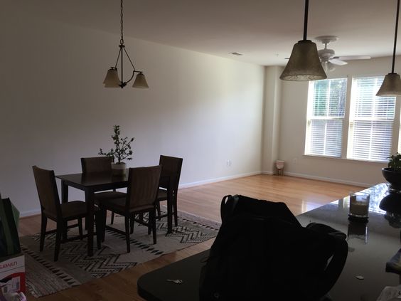
More beige! For the particular vision and feel this client wanted, I knew the dark matching dining set had to go. A new mix of pieces pieced together from various retailers creates a one-of-a-kind dining set for the family. The first item we decided on was that rug - even prettier in person if you can believe it!

DSC_0448.JPG
b8.jpg
DSC_0453.JPG
DSC_0454.JPG
DSC_0499.JPG
b7.jpg

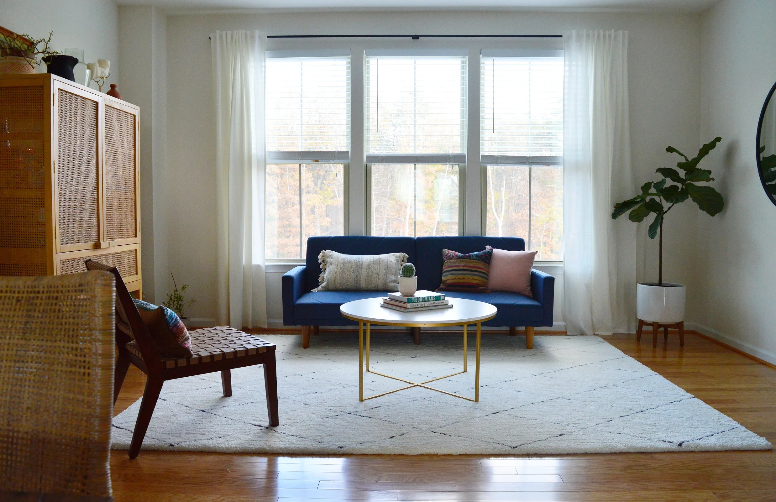
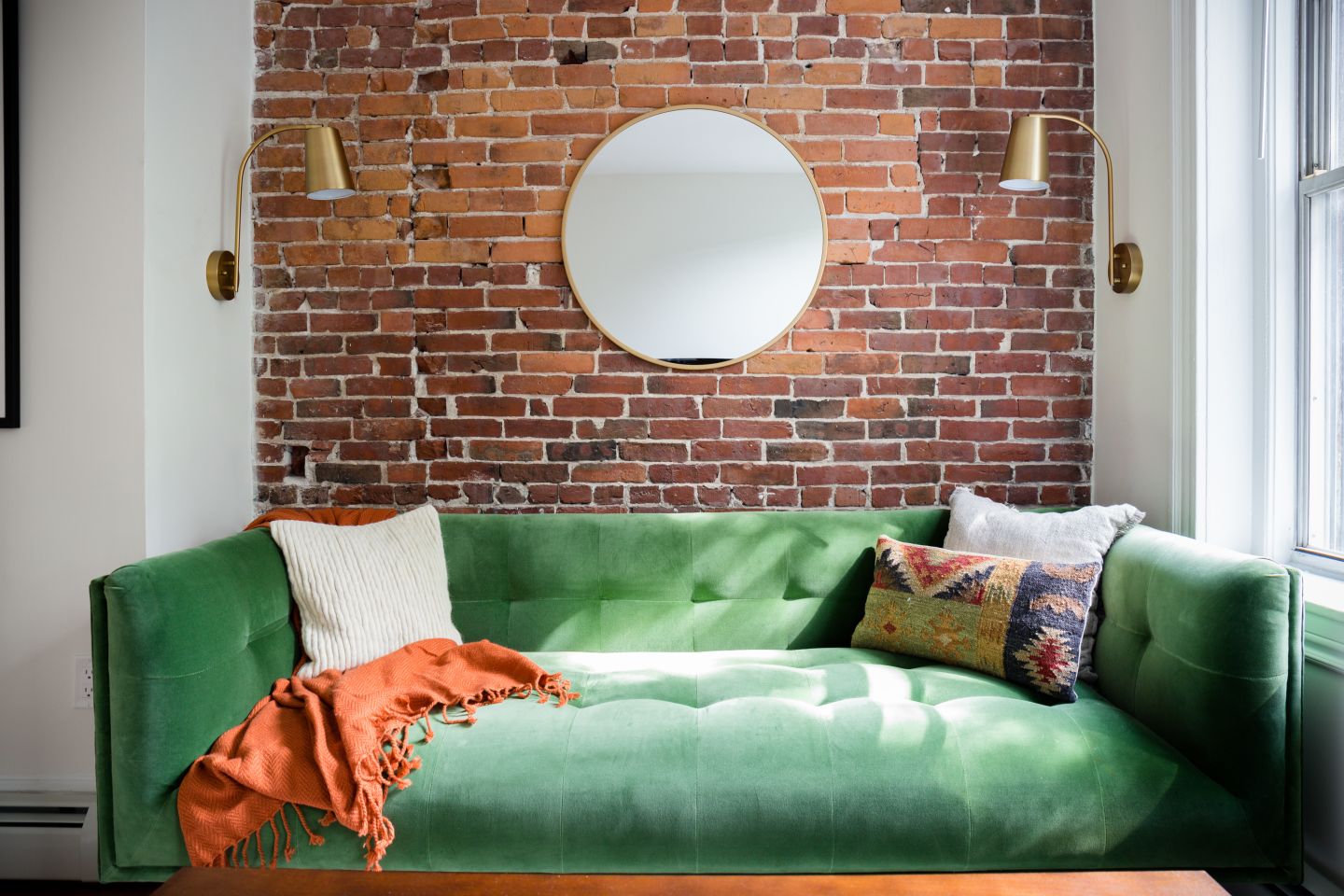
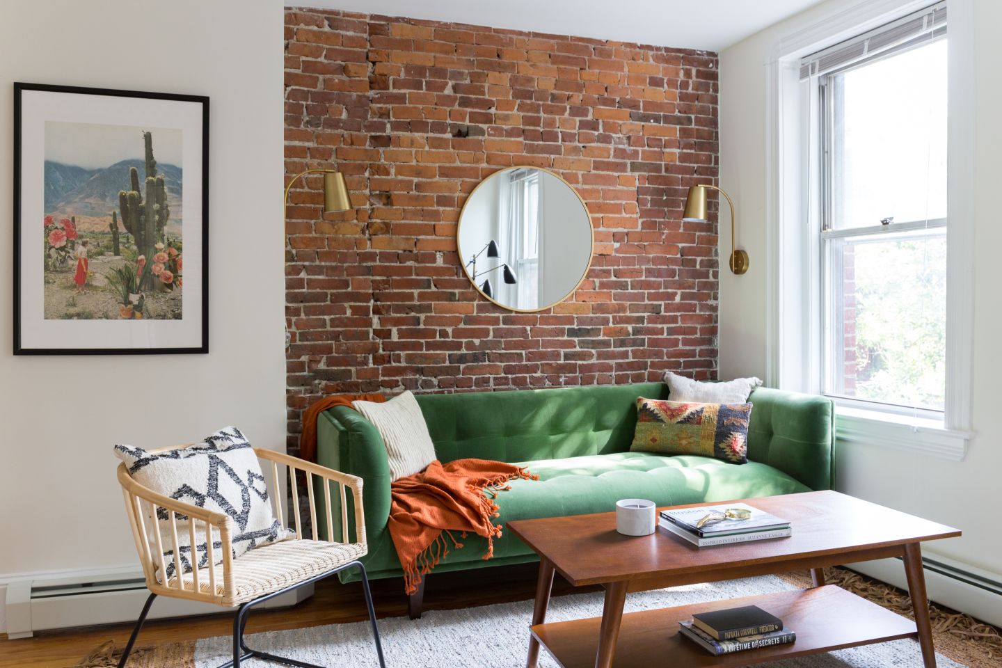
This cheery space feels special to me - the colors echo the rest of the home but there’s something about it that makes it feel set apart. It’s grown up but fun, simple but interesting, stunning but functional, (the cabinet is packed with board games)! I have never ever used a sofa in that color before but my gut was pulling for it and I was excited to fill in around it with some contrasting tones - even moodier rich and earth colors!

DSC_0459.JPG

I think the vibrancy of the sofa just adds some sophisticated drama here when surrounded by earthier tones and textures.

DSC_0456.JPG
DSC_0465.JPG

Anchoring one whole side of the room by itself is one of my favorite go-tos; an oversized black framed mirror. Not right for every home, but right for this one in this place. It’s a beast in person, and emphasizes the drama of this room.

DSC_0476.JPG
DSC_0484.JPG
DSC_0482.JPG

Well that’s a wrap! The first thing this sweet client told me when I sent her a sample of these photos was that she can’t believe this is her home and can’t wait to start on her bedroom together in the new year. I can’t wait, either!!!

You all have a wonderful Thanksgiving! It’s a treat every time I have an opportunity to jump on here and share something with you. You make this landing place so much fun and it brings me joy to get to bring finished projects here to show you. So thank you for taking the time out of your day to stop by - it really touches our hearts!

Chelesa.jpg


eDesign Reveal: Jess and Keith's Soulful Row House

Well this is a very special reveal, indeed! Remember last March when we welcomed a much needed addition to the StyleMutt Home design team? Well since then our girl Joy has been representing the SMH brand well, tackling jobs across the world in Australia and right here on our home turf. As we have learned since branching out to include design services, getting to actually see a finished job is a BIG deal! StyleMutt Home has been beyond blessed to work with many clients who are as passionate about seeing their homes transformed as we are, and we’ve had just the opportunity with a particularly fun client over this past year.

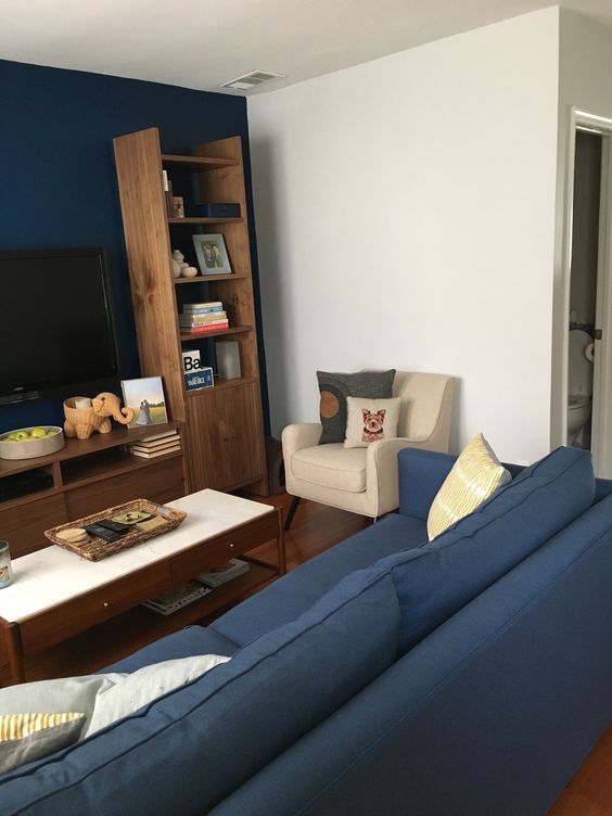
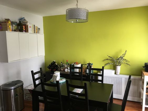
Jessica and Keith are a SUPER sweet couple living in a quaint DC row house on a street oozing with charm. When they came to us they had only been living there for a few months but had come a long way putting their style on their home. While their living room was more or less finished, (just needed some of those final details), their dining room was only just beginning. Let’s take a look at the ‘before’ shots they sent us!

Joy and I decided to divide and conquer on this project; I took the entryway and living room, and she tackled the dining room. Having two designers working on one home can be tricky because you really want to make sure that there is a consistent point of view from one room to the next. Communication from all parties involved needs to be tight, and I can honestly say this crew made it happen without a hitch. Jessica and Keith were amazing to work with, and Joy’s design for the dining room left me in awe. It was just so much fun! So let’s look around the finished home!

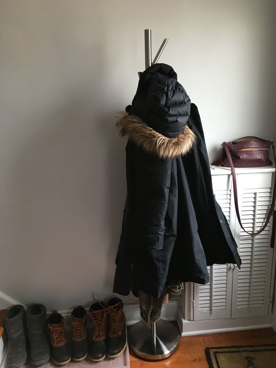
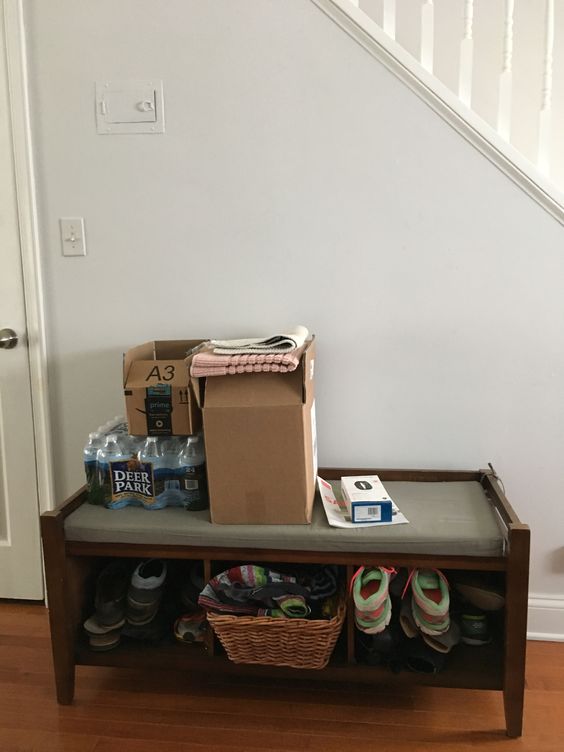
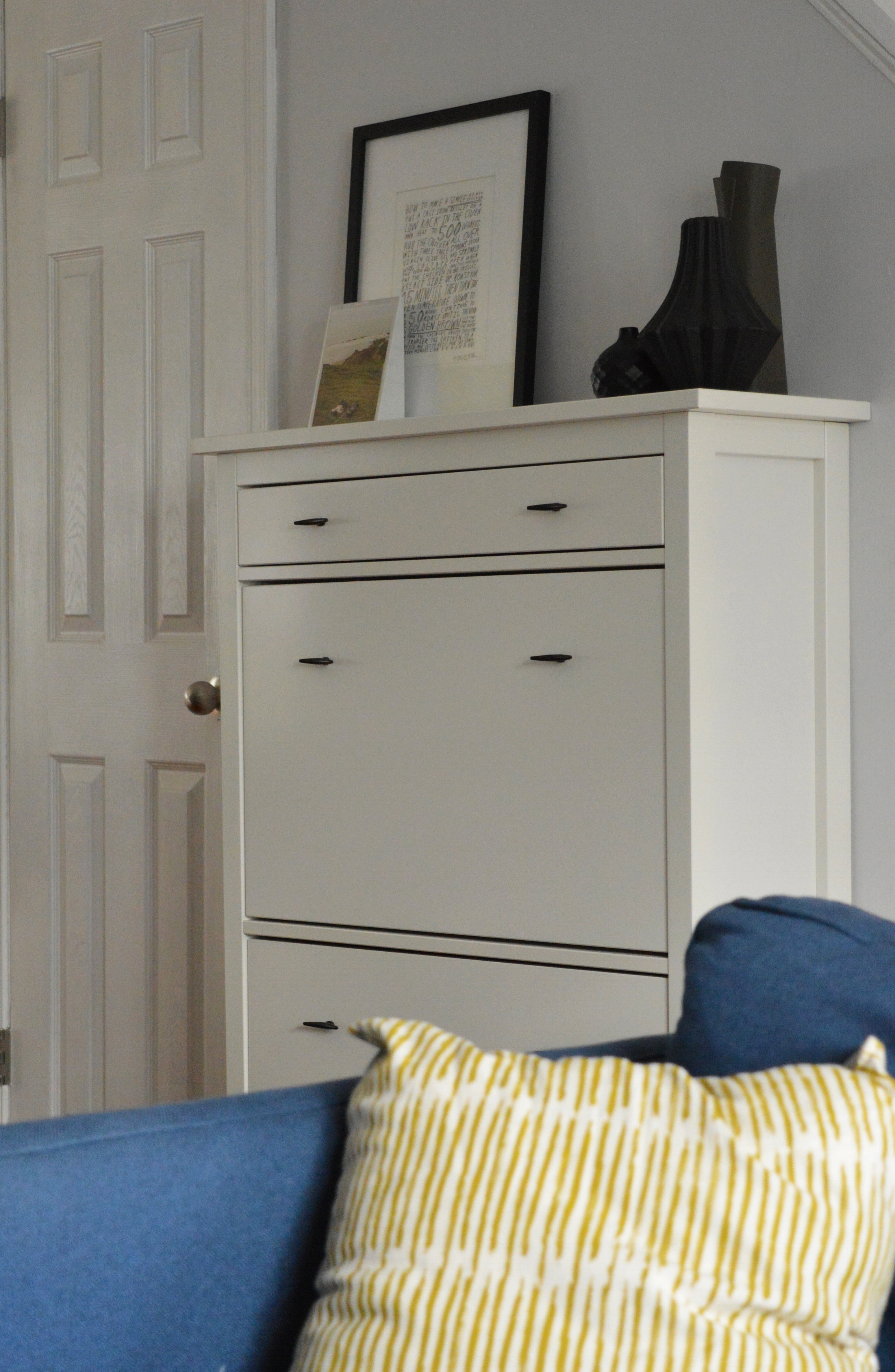
In the entryway we wanted to get things off the floor and hugging the wall. We swapped the coat tree for a hanging rack, and got all the shoes in a narrow storage cabinet on the adjoining wall.

DSC_0330.JPG
DSC_0315.JPG

The living room was so close when Jess and Keith came to us - they just needed a bit of advice for styling accessories, lighting, art and a rug! It never ceases to amaze me how a space suddenly looks awake! with just a few additions and styling!

DSC_0319.JPG
DSC_0318.JPG
DSC_0323.JPG
DSC_0321.JPG

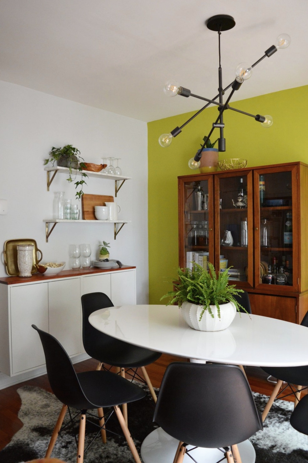
The dining room, on the other hand, was closer to the beginning of its makeover than the end! (This would be a good time to jump back up to the top and take a look at the ‘before’ picture!) The only element Jess and Keith wanted to keep was the freshly painted accent wall, SW ‘Citrine Dream’. And after Joy took the reigns in here, I don’t think I’ve ever loved an accent wall more!!!

To point out the obvious first, the use of warm woods in here mixed with stark white and black pieces makes this bright color take on a highly sophisticated personality. A punchy color works remarkably well when the remaining elements are strong and LOOK expensive, (even if they are not).

finish2.JPG
finish6.jpg
finish3.JPG

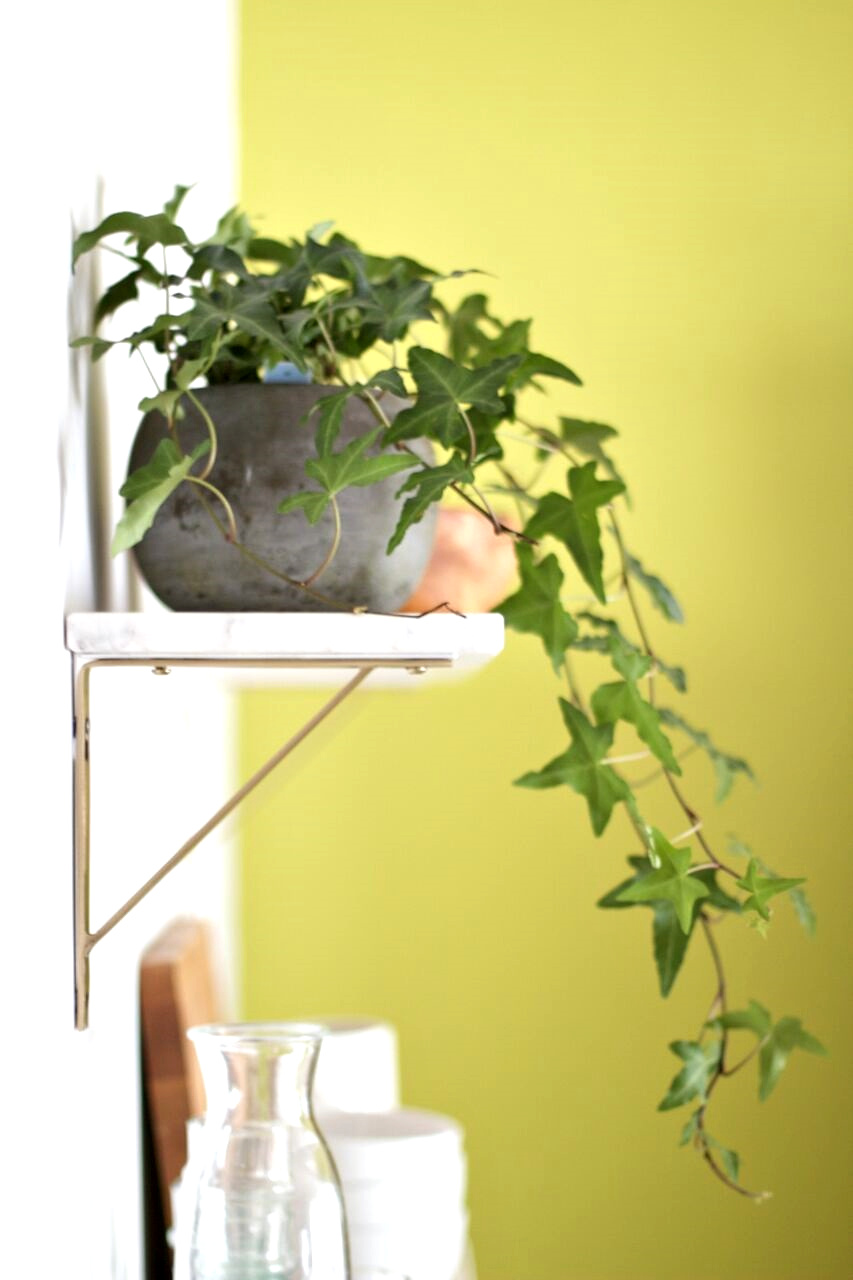
Less obvious touches of brass and marble speak volumes in this multi-functional area, and prove that small doses of these finer materials go a long way.

finish7.JPG

An intentionally selected statement art piece doesn’t cower against the statement wall - anything softer would have been absorbed by the citrine color, but this piece pops right out - exactly what it was intended for!

finish4.JPG

It has been such a treat to get to work with Joy on this amazing home with these incredible clients. Everyone put in the time and effort to see this home to the finish, and we wish Jess and Keith the very best life together here.

So ridiculously proud to get to share Joy’s hard work here! It is truly a pleasure to have her on our team and I’m still pinching myself that we are lucky enough to offer her talents to our design clients. You can see more of Joy’s work on her site, Joy Lewis Design.

Thank you all so much for stopping by!

Chelesa.jpg

SOURCE LIST

Entryway hooks, Urban Outfitters
Entryway mirror, Pottery Barn

Living room shelves, Room and Board
Living room sofa, Crate and Barrel
Living room coffee table, West Elm
Living room drink table, West Elm
Living room chair, West Elm
Living room rug, West Elm
Living room sconce, Lamps Plus
Living room art, Laura McGuigan
Living room accessories, primarily CB2 and what the client had on hand

Dining room table, Overstock
Dining room chairs, Poly and Bark
Dining room rug, Overstock
Dining room chandelier, West Elm
Dining room art, Minted
Dining room shelves, World Market
Dining room white storage, IKEA
Dining room vintage storage cabinet, Craigslist

StyleMutt Home Designed Stay-Places

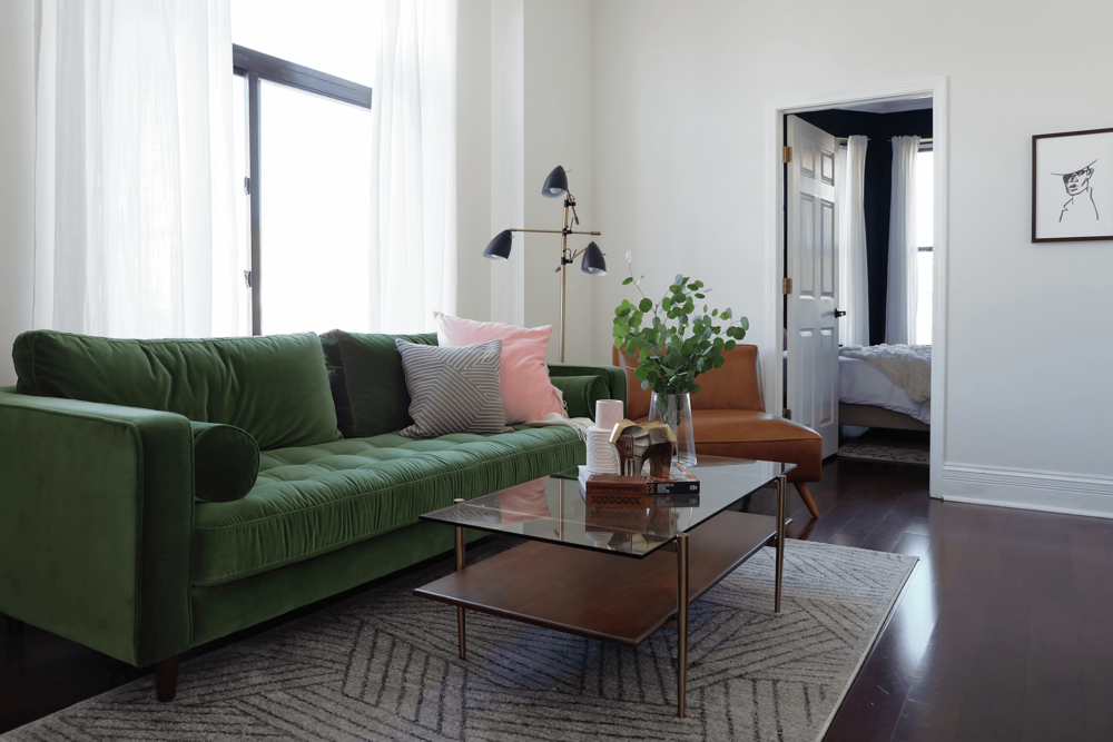
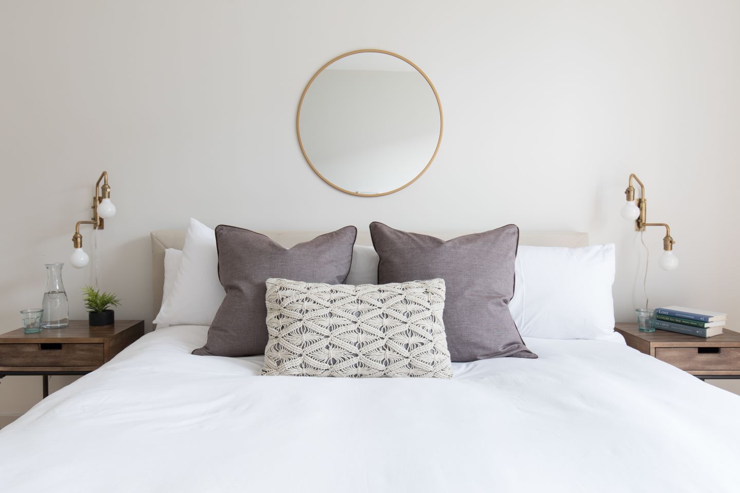
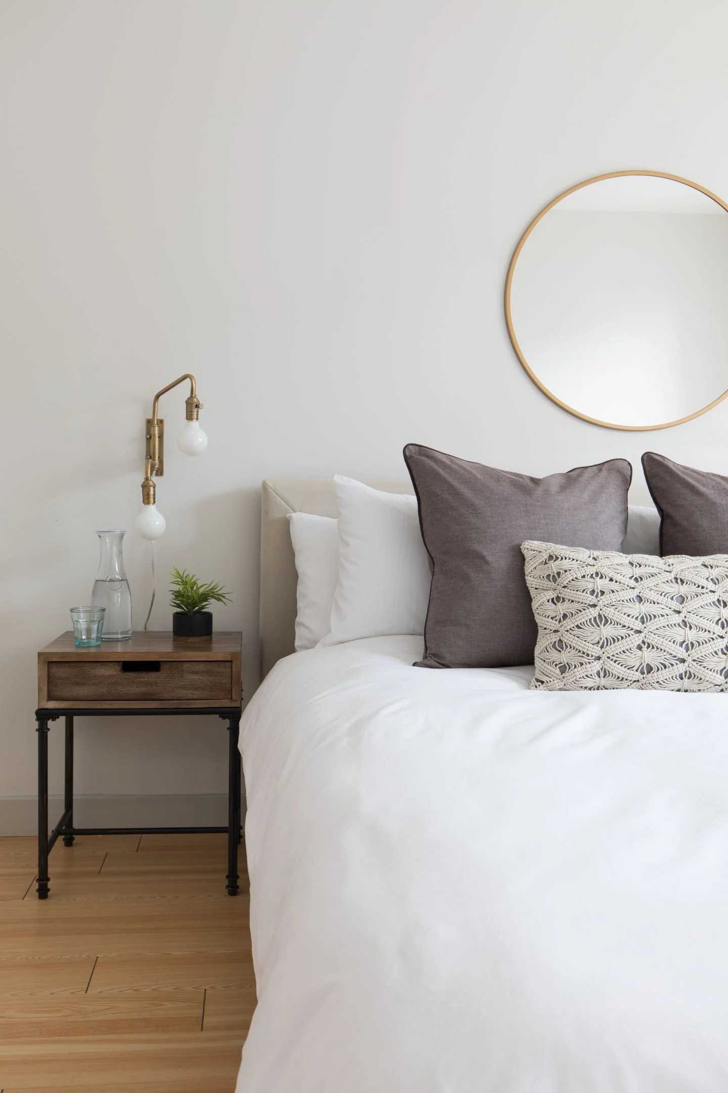
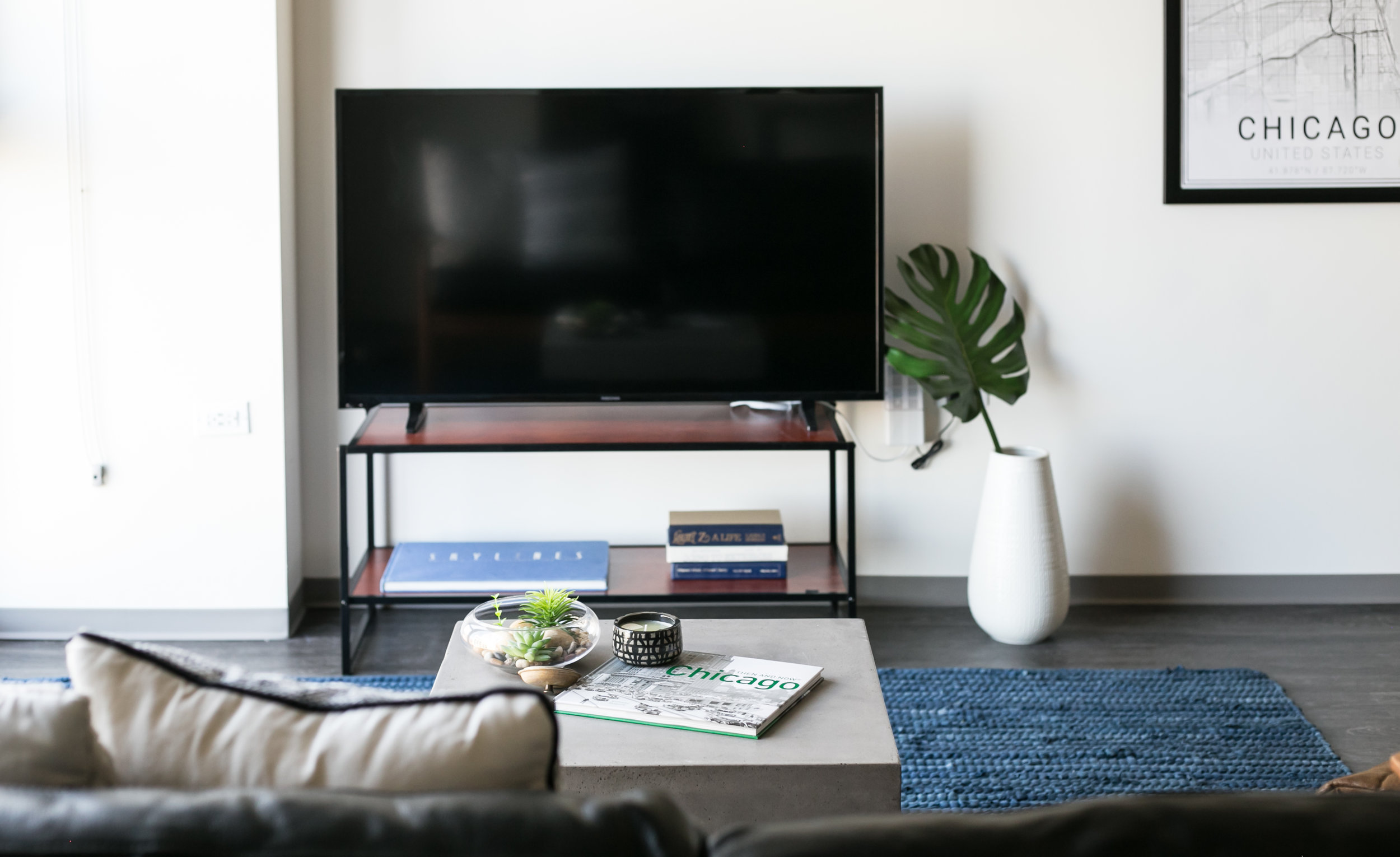
Hi Friends! It was this time last Summer that I had the privilege of designing 8 or 9 short term rental spaces over a two and a half month span in several major U.S. cities. The opportunity ended as quickly as it began when the company that hired me as a freelancer restructured and brought all the designing in house. But I still think about each of the units and randomly wonder from time to time if there is anyone occupying them right at that moment. And I pray that they're safe during their travels and feeling the comforts of home while they're away, and that they have loved ones to return to. I have never been a frequent traveler but have family and friends who travel regularly and exhaustively for work. I designed each stay-place as I would if one of my own loved ones were staying there.

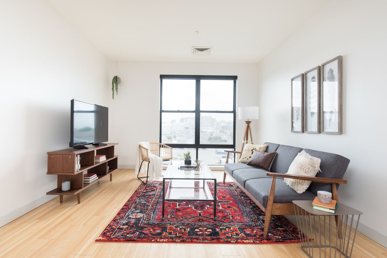
Sharing a round up of some of my favorite units from last Summer! Each has it's own style and vibe, some more 'me', others a bit experimental. All were completed on a budget the size of a chocolate chip and turned in within 36 hours of being handed the sketched out floorplan. Some didn't even come with 'before' pictures so I was going on measurements alone! But the experience was invaluable to me as a new designer and I'd say the nights I worked through to complete any of these jobs on time was worth it.

Let's take a trip down memory lane!

Cozy Up In Beantown

 
Triangles.png
 
01.jpg

Color Rich Sanctuary

 
Triangles.png
 
1.jpg
013.jpg

Sophisticated Playing It Cool

 
Triangles.png
 
finished 11.png

Inviting LivingBedDining Room

 
Triangles.png
 
studio8.jpg
studio2.jpg
studio6.jpg

"Serenity Now!!!"

 
Triangles.png
 
finished 3.jpg
finished 1.jpg
finished 7.jpg

Concrete Cave

 
Triangles.png
 
IMG_0340.jpg
IMG_0364.jpg
IMG_0377(1).jpg
IMG_0399.jpg

That's a wrap for today! Thank you all so much for stopping by!

Chelesa.jpg