Matt + Chelsea's Christmas Home Part 2: Main Living Spaces

Back as promised with the second part of our holiday home tour! We sure do have fun decorating our home to celebrate this most special birthday, just as we do for one of our own family birthdays. This season, despite all it’s busy-ness, is covered in so much joy. I pray that you’re feeling it in some way.

On Wednesday I shared our bedrooms, so today please come on in and explore our main living spaces!

4.JPG
5.JPG
37.JPG
6.JPG

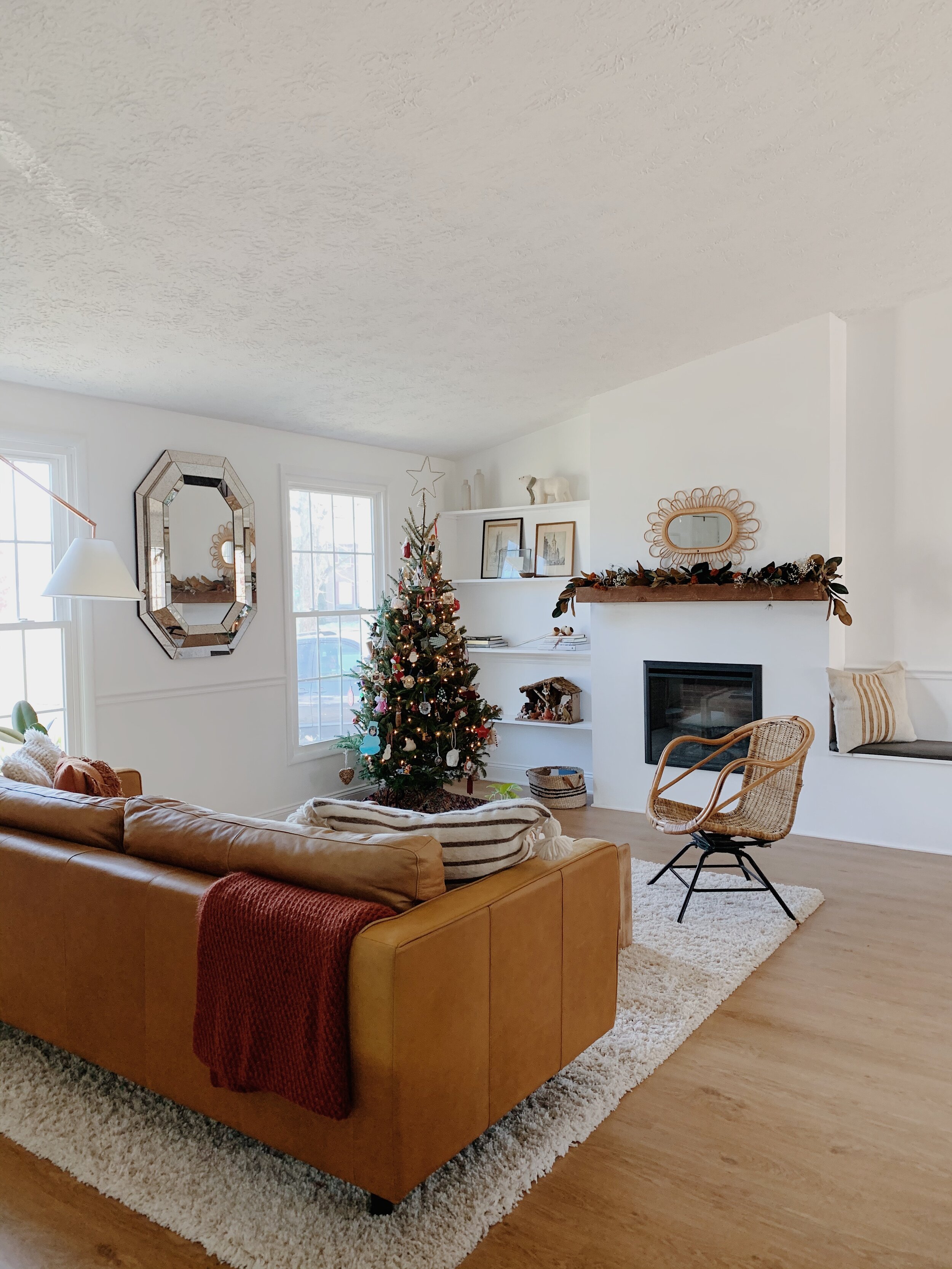
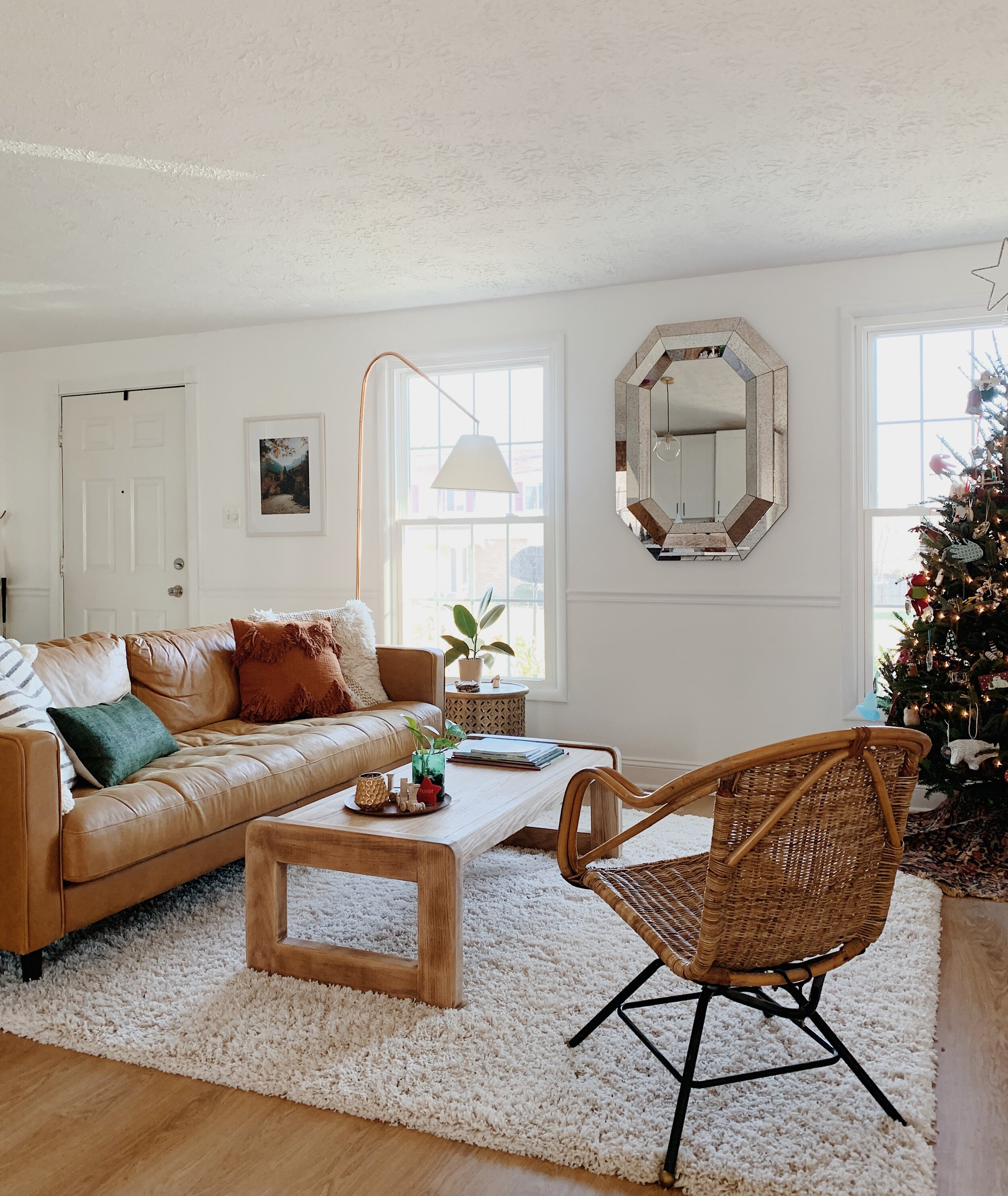
A few subtle and not so subtle additions in here this year - garland is easy but with such an open main living space now, I didn’t want to just drape it everywhere and overwhelm the space. I love it over our sliding glass doors and decided this would be it for garland this year. Just enough.

22.JPG
28.JPG

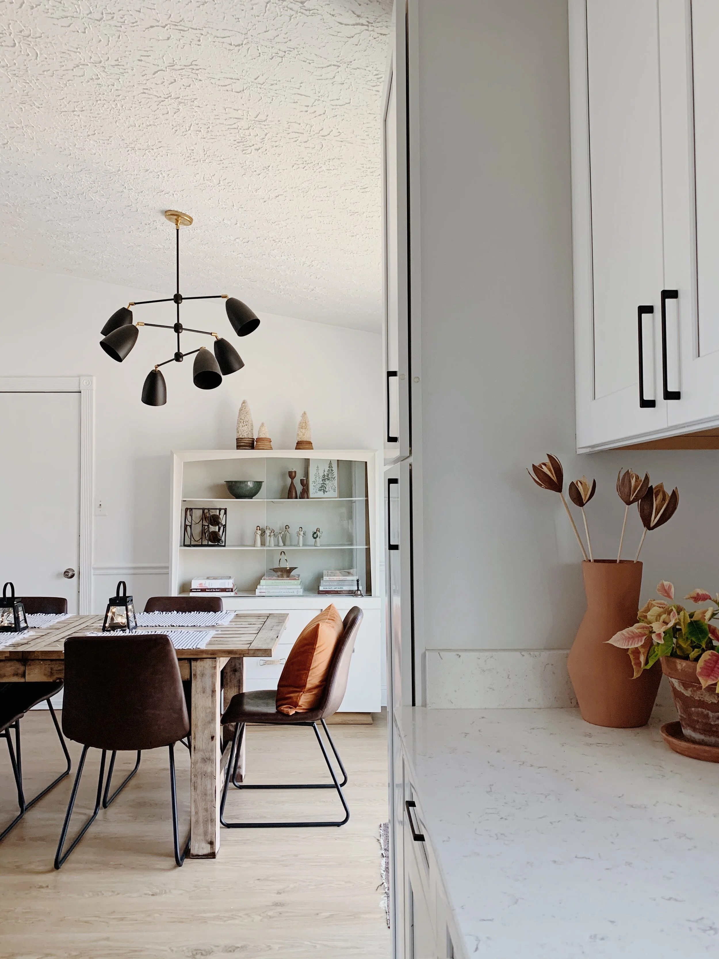
In such a shared space as this I am more aware than ever of any ‘excess’. For Christmas decorating this year we unpacked a lot from our Christmas boxes, but less than usual. I more just wanted the space to feel comfy and cozy for the family and guests over the holidays, so adding plush pillows on the dining chairs where we don’t usually have pillows and twinkly lights where we don’t usually have twinkly lights, have been subtle additions that add a lot of impact.

19.JPG
20.JPG

Our tree this year is small but mighty! For such a stout little thing it is happy, healthy and strong as an ox! Not a single dropped ornament and completely self sufficient. Last years tree, which we named Mariah Carey, was a regular diva, requiring us to anchor her to the wall because she couldn’t stand straight on her own, and her flimsy branches wouldn’t even support our homemade paper ornaments. In honor of our Mason’s favorite Eagles player, we’ll call this years tree Darren Sproles; a 5’6” pack of dynamo.

7.JPG

Our one of a kind Christmas tree skirt was a fun DIY a few years ago when I scored a 9x12 vintage rug for $20. It was a steel because the entire thing had been severed in half and then duct taped back together. (!!!) I used my old tree skirt as a template and cut out 6 tree skirts from the rug, (and a few coasters)!

16.JPG
36.JPG
21.JPG
18.JPG

Our kitchen is seeing a whole lot of action this season, wth weekly batches of pumpkin bread and hundreds of Christmas cookies, (I mean, you can’t just have 2 sandtarts in a sitting, people). I need to keep my counters somewhat open but a couple pretty plants and a wintry windowsill make it a very happy place to work and play, indeed!

3.JPG
2.JPG
8.JPG

Well there you have it! I hope you’ve enjoyed coming through; it’s so fun inviting you in every holiday season! This time of year comes with a lot of expectations that are hard to meet; but there is One we can count on each and every day, who came to triumph our despair and give us hope. May the God of hope fill you with all joy and peace as you trust in him, so that you may overflow with hope by the power of the Holy Spirit.

Thank you so much for coming by today and Merry Christmas to you and yours!

Chelesa.jpg


eDesign Reveal: A Fresh Start & Our Biggest Reveal Yet

Hello, sweet friends! This is a special reveal and one that’s been close to my heart for quite some time. Last April during my kids’ Spring Break I read through Chip Gaines’ book, Capital Gaines. It’s an all-around motivating, get-it-done read, but the thing that stuck with me the most was the encouragement to bet on yourself. And it got me thinking that one person betting on their own selves can’t possibly have the same power as people betting on one another. I started mulling over the idea of looking for a design job to do for peanuts for someone in need. I wanted to give someone that oomph to keep on keeping on, even if just through the simple act of improving the way they feel at home. One month later in May, we were contacted by an amazing woman who was at a point of reinvesting in her life. Gods timing astounds me.

I think most all of us can attest that life doesn’t always, (or usually!), go as expected, and this woman had just been pitched a curve ball. With two young children in toe she was starting fresh with a new home, an old sofa, and a very happy fiddle leaf fig tree. The thing that just overwhelmed me with emotion while speaking with her was the fact that she wanted to make the most of this next chapter. It was apparent that there hadn’t been joy in her home for quite some time, and that’s what she wanted to bring back. ‘Happy’ was a frequent word that came up when discussing the vision and design of her home.

So with a strict $5,000 budget, I waved more than half of my design fee and cracked down on tackling her Family Room, Dining Room, Kitchen and Living Room. And this reveal may be one of our happiest yet! :)

DSC_0406.JPG

BEFORE

b4.jpg
DSC_0397.JPG

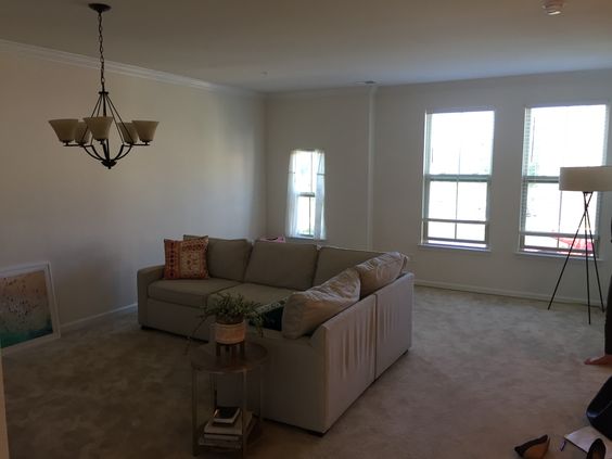
The first order of business was rotating that sofa and pushing it against the wall! This family room space is shared with the children in a big way, and the original placement of the sectional floating in the middle of the floor just made it too chopped up and separated. Also, PSA: With $40 and an 8 minute YouTube video, you, too, can update your overhead lighting.

b3.jpg
DSC_0435.JPG
DSC_0400.JPG
DSC_0439.JPG
b1.jpg

So. Much. Beige. With an emphasis on creating an environment that feels happy, color was top priority. The catch, however, was that because this is a rental, the wall color and carpet could not be updated. And because the client requested to use her sofa, (a smart move that allowed her to put her budget in SO MANY other places), that was another shade of beige to overcome.

DSC_0407.JPG
DSC_0409.JPG

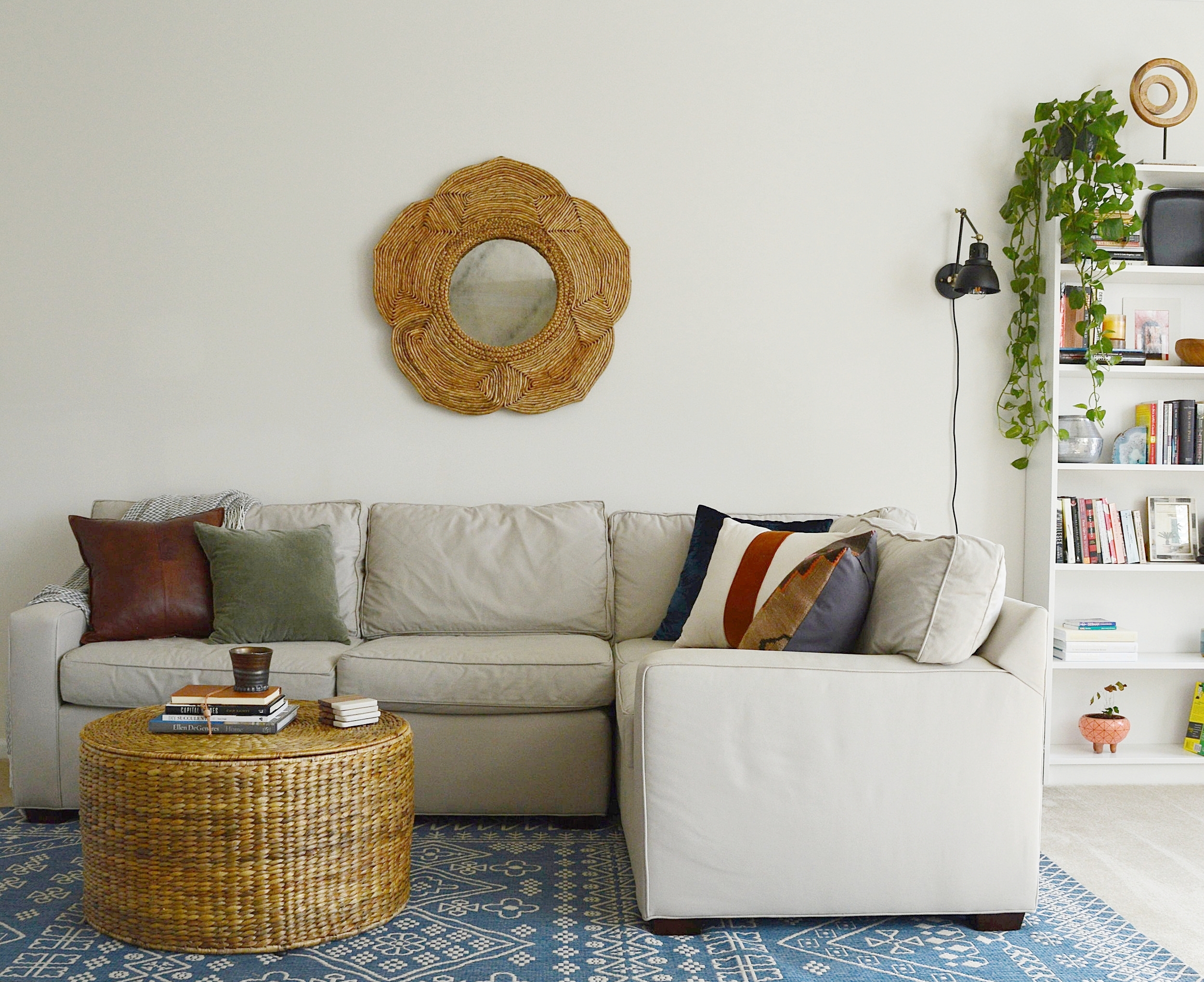
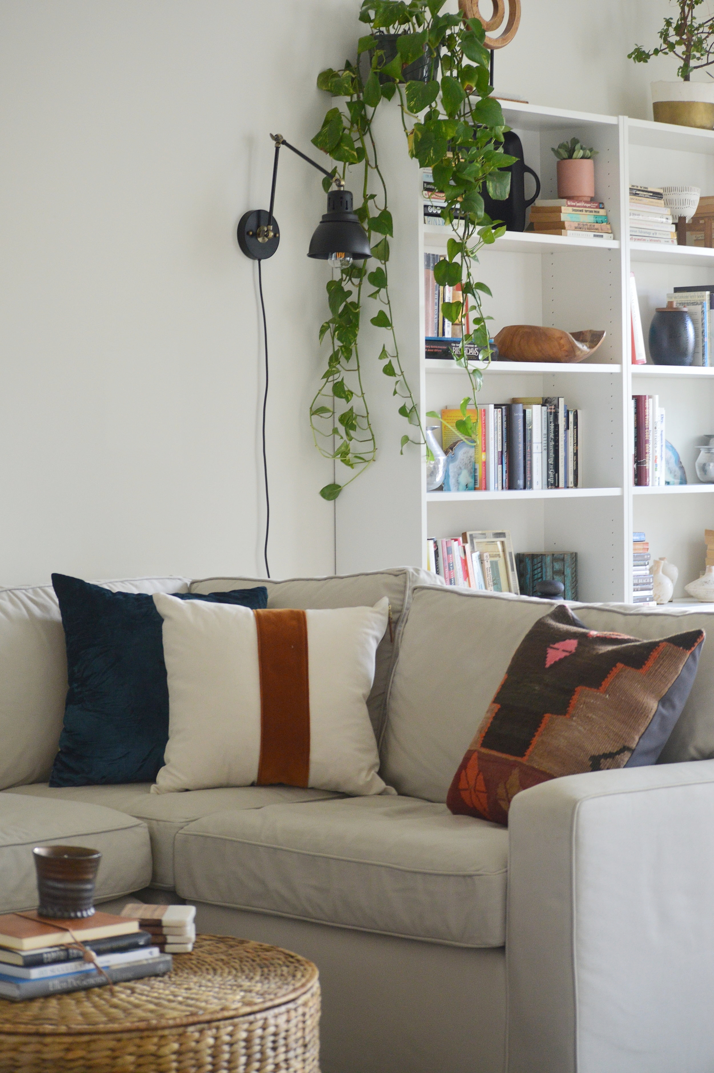
Picking pillows and accent pieces for this space was an absolute blast. With a bland canvas to work with the sky really was the limit, so I had to uncover what palette spoke to my client best. She is extremely inspired and rejuvenated by the coast, but I didn’t want to do anything too literal. Creating a relaxing vibe with pops of vibrant color was the way to go. Blue is a favorite color of hers so I peppered it around subtly.

DSC_0415.JPG
DSC_0427.JPG
DSC_0434.JPG
b2.jpg

Ah, yes - the wall mounted Ikea IVAR cabinets. This is the third design since last Spring that we used wall mounted IKEA cabinets to create a custom, clean-lined storage option, (see here and here). You can always add hardware, legs, etc to these to blend them into your own space, but my favorite way to use them is to mount them over the floor 6-8” and give them a fresh coat of paint, (they come in wood). And at just $80 per set of cabinets, that means this massive custom media storage unit cost just $240 + cheap paint.

DSC_0402.JPG

There wasn’t much to do in the kitchen but change out the pendants and add some stools - leather for the win!

DSC_0446.JPG
b5.jpg

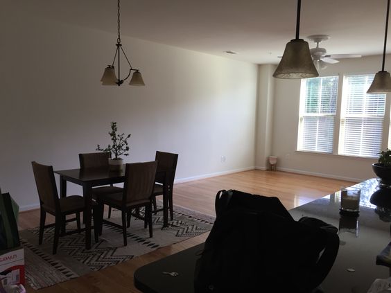
More beige! For the particular vision and feel this client wanted, I knew the dark matching dining set had to go. A new mix of pieces pieced together from various retailers creates a one-of-a-kind dining set for the family. The first item we decided on was that rug - even prettier in person if you can believe it!

DSC_0448.JPG
b8.jpg
DSC_0453.JPG
DSC_0454.JPG
DSC_0499.JPG
b7.jpg

This cheery space feels special to me - the colors echo the rest of the home but there’s something about it that makes it feel set apart. It’s grown up but fun, simple but interesting, stunning but functional, (the cabinet is packed with board games)! I have never ever used a sofa in that color before but my gut was pulling for it and I was excited to fill in around it with some contrasting tones - even moodier rich and earth colors!

DSC_0459.JPG

I think the vibrancy of the sofa just adds some sophisticated drama here when surrounded by earthier tones and textures.

DSC_0456.JPG
DSC_0465.JPG

Anchoring one whole side of the room by itself is one of my favorite go-tos; an oversized black framed mirror. Not right for every home, but right for this one in this place. It’s a beast in person, and emphasizes the drama of this room.

DSC_0476.JPG
DSC_0484.JPG
DSC_0482.JPG

Well that’s a wrap! The first thing this sweet client told me when I sent her a sample of these photos was that she can’t believe this is her home and can’t wait to start on her bedroom together in the new year. I can’t wait, either!!!

You all have a wonderful Thanksgiving! It’s a treat every time I have an opportunity to jump on here and share something with you. You make this landing place so much fun and it brings me joy to get to bring finished projects here to show you. So thank you for taking the time out of your day to stop by - it really touches our hearts!

Chelesa.jpg


Reader Design: Hannah's Stunning Home Reno

If there was a home that personified that term "a picture is worth a thousand words," it's Hannah's. This total renovation project in Dallas, Texas isn't the first one for Hannah and her husband Chayce, who recently started a renovation business called Blank Slate Renovations. They got their start early - in fact, Chayce flipped his first home when he was a senior in high school! Life took them from Texas to England and back again, and in the process of moving around, they had a sort of awakening:

More and more, we’re becoming convinced that we were all made with special talents and unique gifts. True joy and lasting fulfillment aren’t far behind when you couple these with your profession—I think some of the best products come from these individuals. It’s almost like you become the truest and most natural version of yourself, and the products you create are just an extensions of who you are. Our goal for Blank Slate Reno is that we wouldn’t even be able to call it work, but that it would be more like play.
Frontwindow.jpg
Living.jpg

The home was completely opened up and updated with mid-century and Scandinavian elements, plenty of interesting architectural elements, and some bright colors to keep things interesting. 

 
Kitchen2.jpg
 
Livingandkitchen.jpg
For this particular project, my favorite piece in the entire house was an original midcentury fireplace (that we bought from our friend Craig off his List…;) that we placed in the living room and paired with a fun pink cement tile. We also experimented with a few new elements such as wallpapering, and wall panelling that turned out fab!
Wholeliving2.jpg
 
Fireplace.jpg
 

The experimentation has certainly paid off, even if it took some time.

Five years ago, I didn’t really have a specific aesthetic style, and when we first got married...I’m too embarrassed to even talk about it. Over the past four years of being more thoughtful and intentional about my look, the more my style has developed and evolved into what it is today. At the moment, Scandinavian minimalism particularly intrigues me. I love how blending neutral palettes, organic materials, natural lighting and live plants blurs the lines between the outdoors and indoors.
Masterbed.jpg
Masterbath4.jpg
Bathroom2.jpg

But even as styles and tastes change, the goal remains the same, whether you're designing for yourself or for a client:

My goal for most spaces is to create something simple and beautiful, while at the same time maintaining functionality and relaxation. Natural lighting, green plants and cozy nooks are key!

Hannah, we can't wait to see where you take Blank Slate Renos next; and thank you for letting us in to your home! 

Follow Hannah along on Instagram at @blankslatereno.

McKenna Sig.jpg