Design Reveal: Sweet Dreams, Brooklyn

It’s weird times, indeed. I know every single one of you has had to adjust your regular way of life in some way, shape or form. If you have been fortunate enough to still have your job, there’s a good chance that looks a lot different now than it did 6 months ago - So many companies are figuring out how to continue their operations remotely and out of office. While I have always done my design work remotely, there is one aspect I’ve thoroughly enjoyed doing in person - finishing photos! I’ve shared before that I only get to take photos of about 15% of my completed projects, so when the opportunity arises to take pictures it feels like Christmas morning!

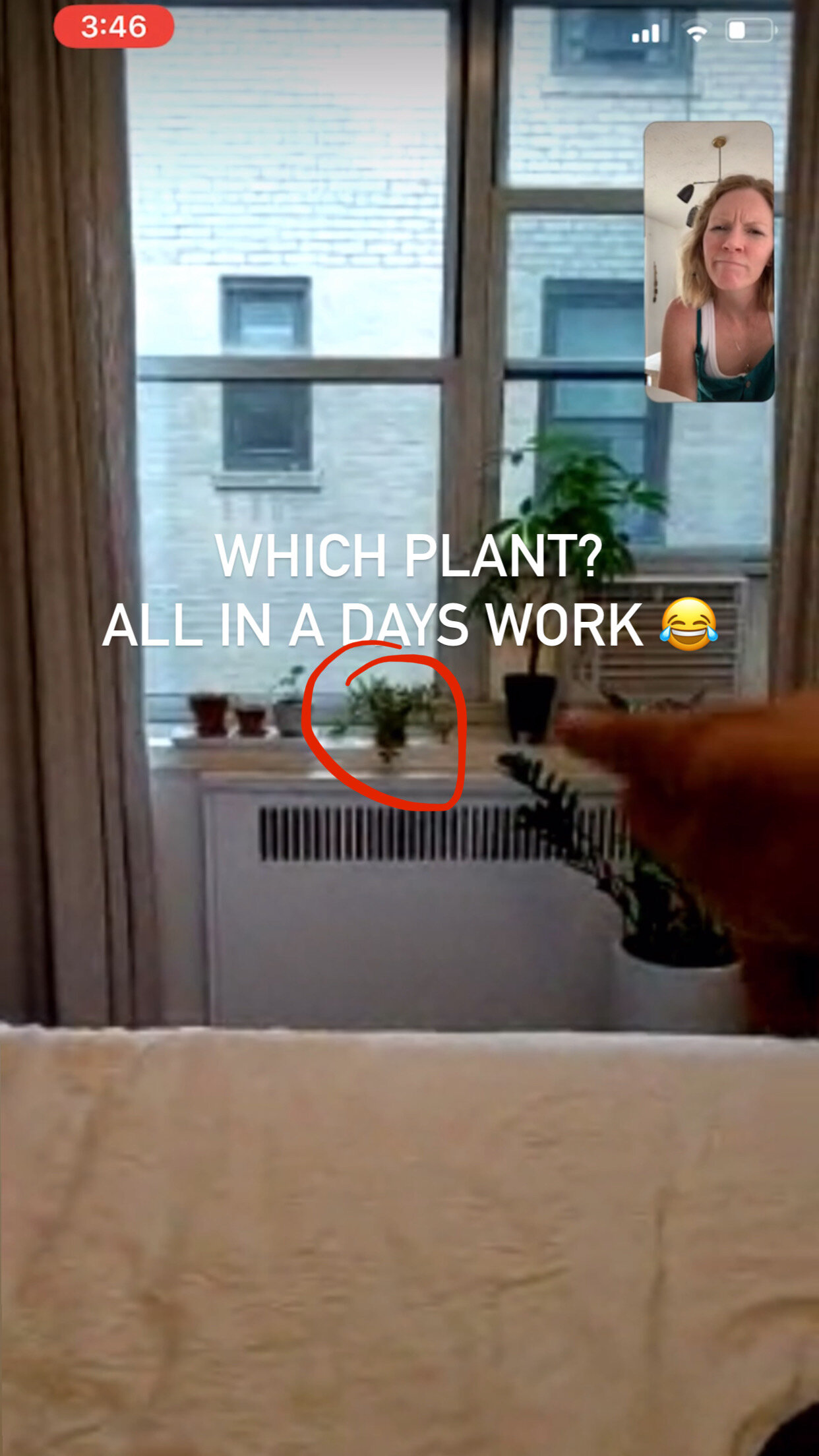
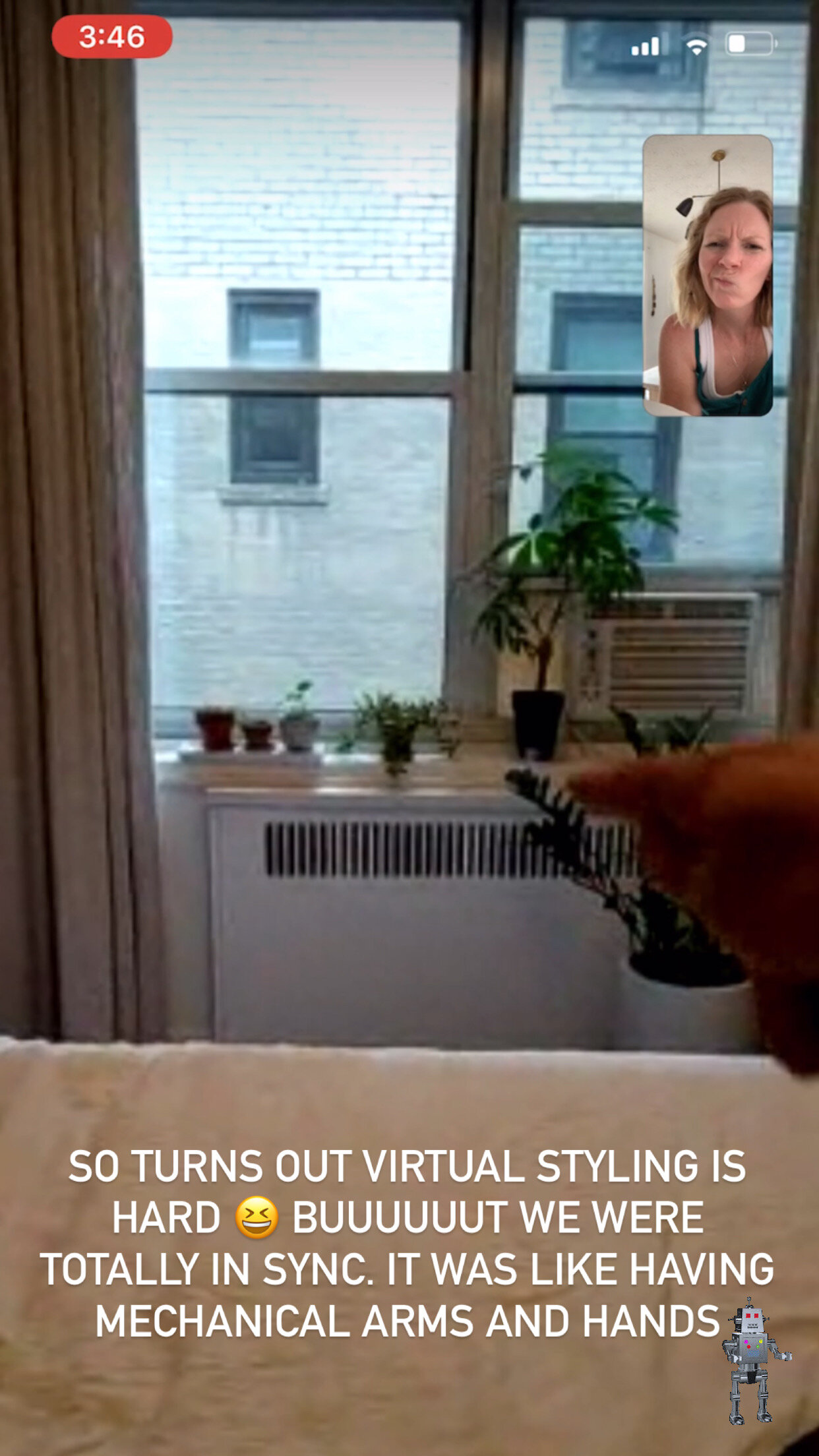
About a year ago one such project was wrapping up just beautifully in Brooklyn, NY, and I was hoping to make it up to take pictures along with another project in the Chelsea neighborhood. As it happens, COVID struck before I made it up there and I was sorely missing this project in my portfolio (and getting to share it here with you)! So I reached out to the client who I’ve been in touch with by the natural evolution of friendship in the process, and she was totally open to taking the pictures for me! We even scheduled a virtual styling session, which looked a lot like this for an hour:

Despite my face it really was a lot of fun! Hah! Having someone else take pictures was such a good practice in letting go of something I normally like to have control over, and boy am I glad I let go. She absolutely knocked it out of the park! I sent her the same photography tips outlined in our Interior Design Starter Guide, and she nailed it.

Before I show you around let’s take a look back at what this room started as. Now, I have nothing against lime green walls. In fact, our design assistant, Joy, absolutely rocked this StyleMutt Home project with lime green walls. But when this client and I were discussing her ultimate vision for this space, her bedroom, the lime green walls just didn’t support the end-goal.

before 3.jpg

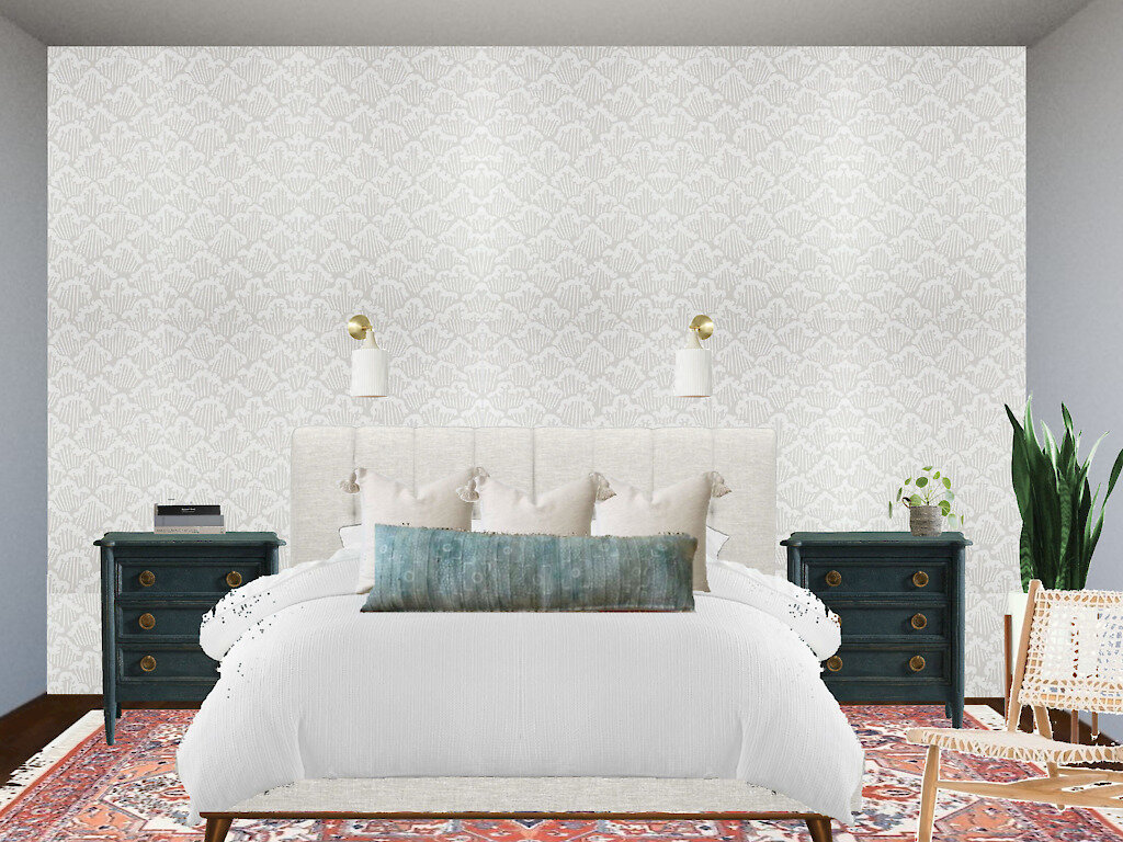
The plan, shown below, was to create a really soft and soothing space using various neutral textures and patterns, contrasted by just a few grounding elements. We wanted to create a sophisticated retreat that represented the client’s fun and joyful personality.

440482.jpg

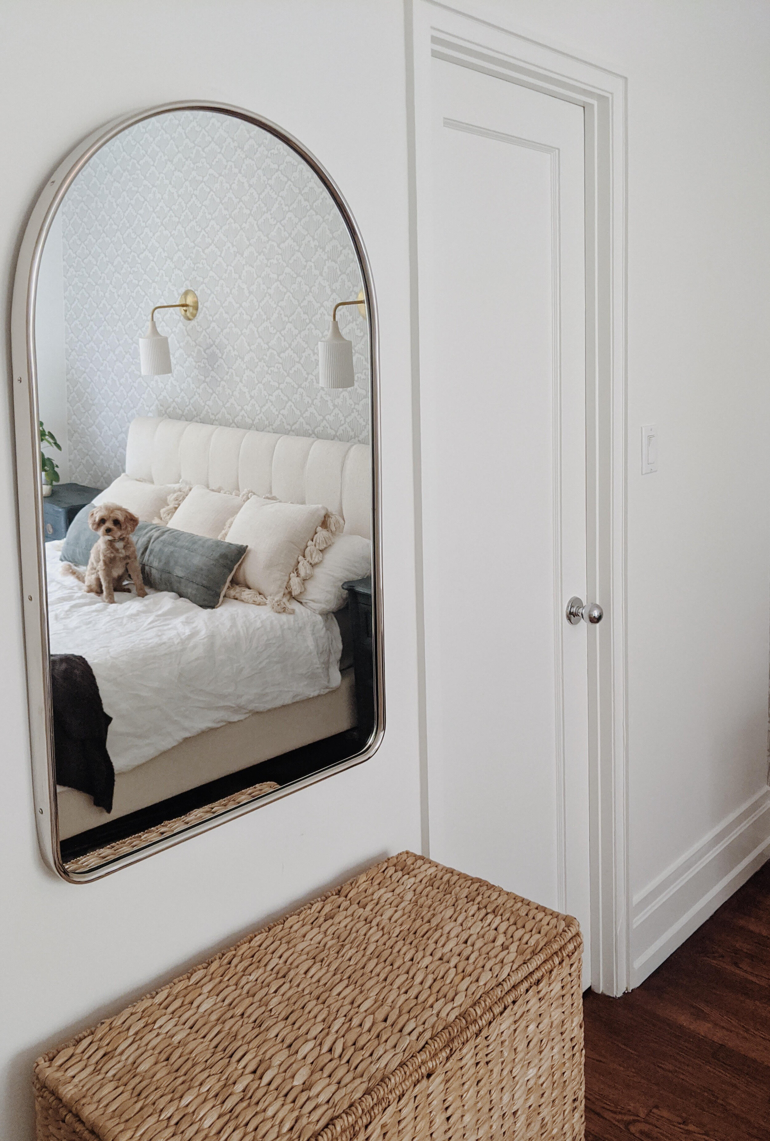
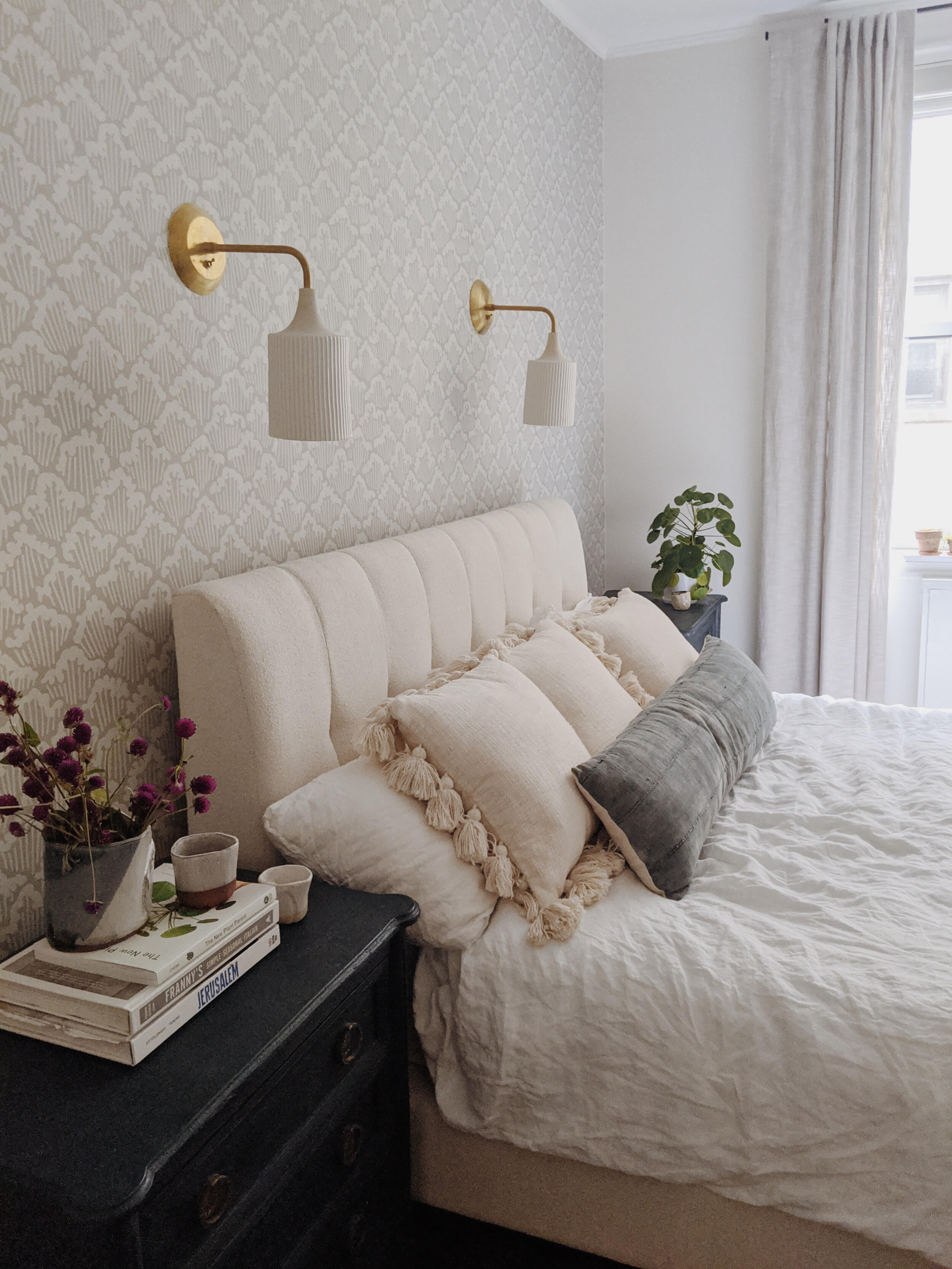
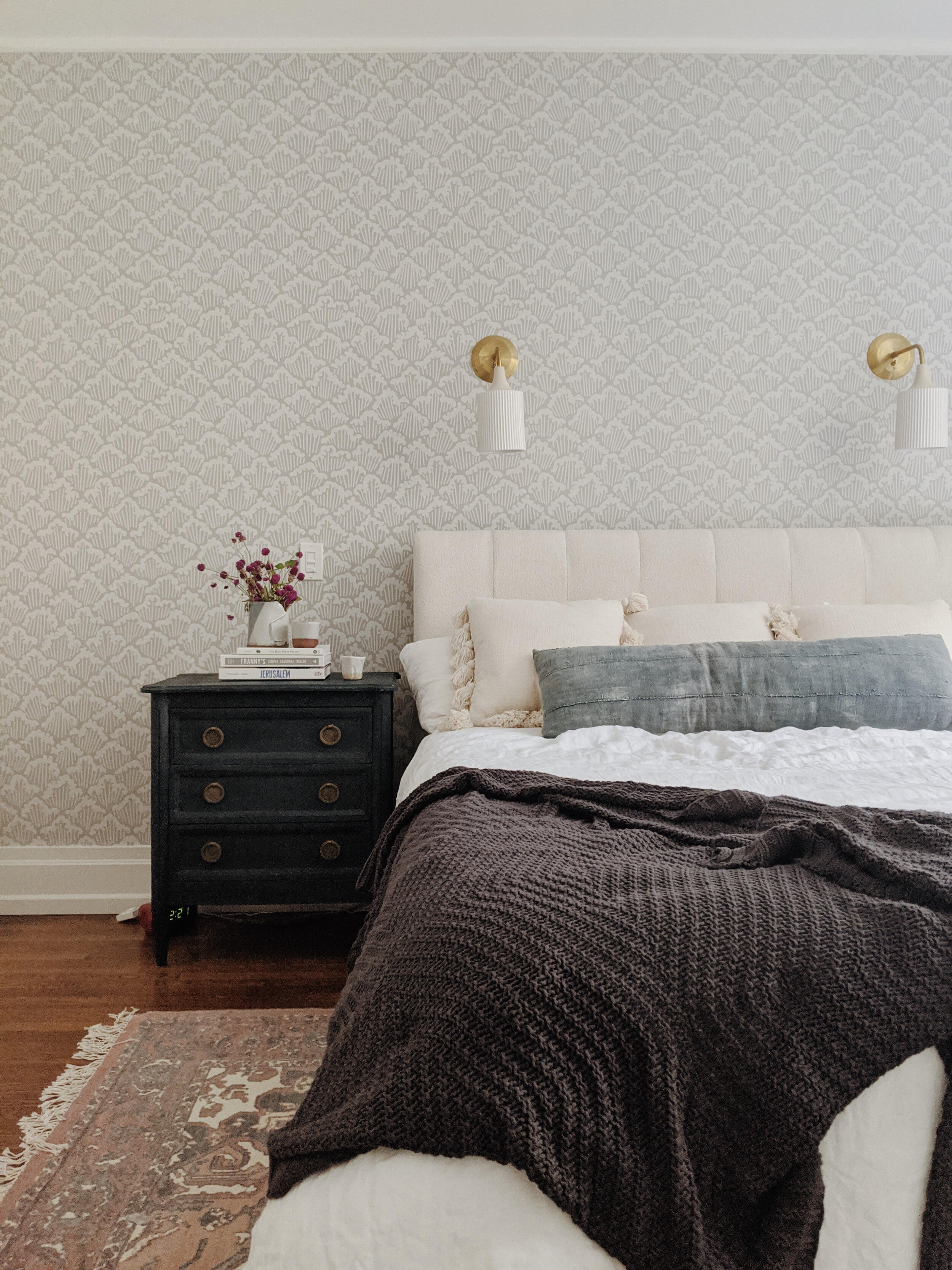
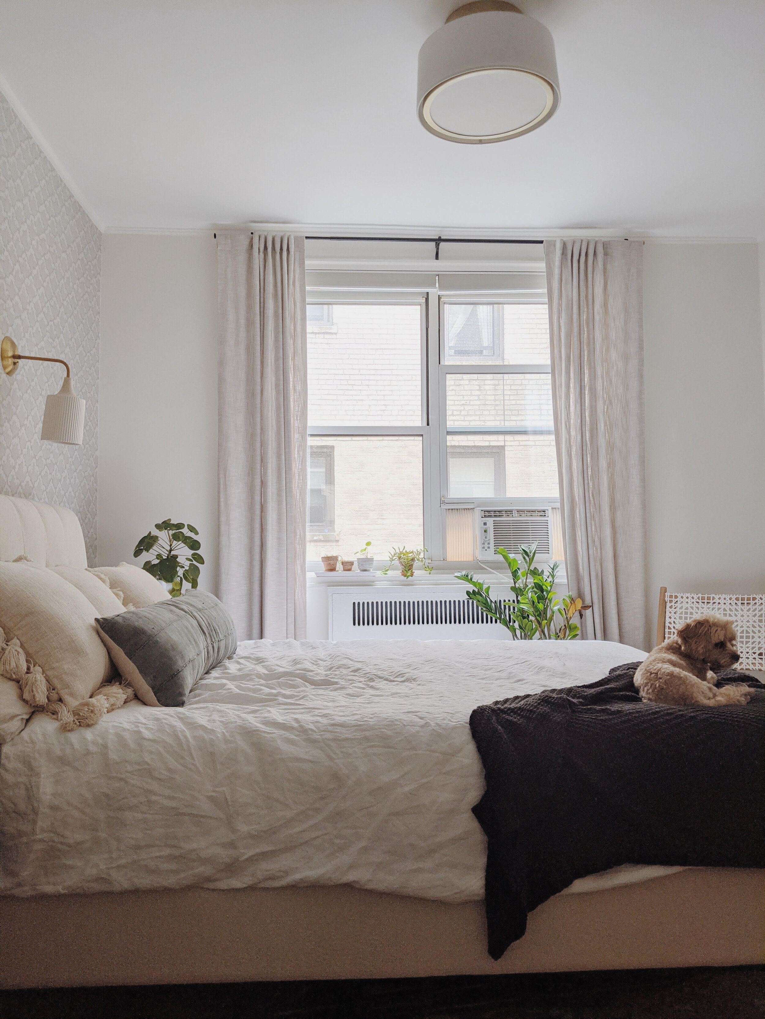
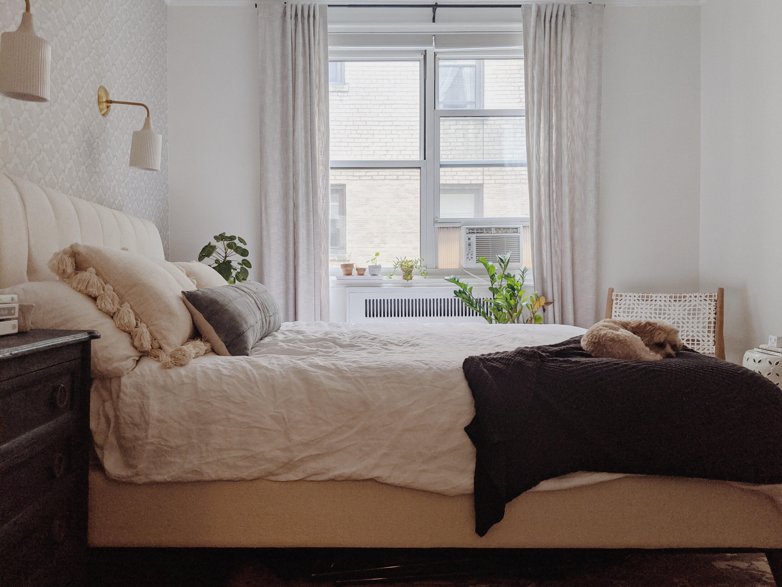
And here is our plan brought to life! ALL pictures are in huge thanks to this sweet client. Her pup, Peggy, seized the opportunity, for sure!

28.jpg
27.jpg

Another look back at the beginning:

before 1.jpg

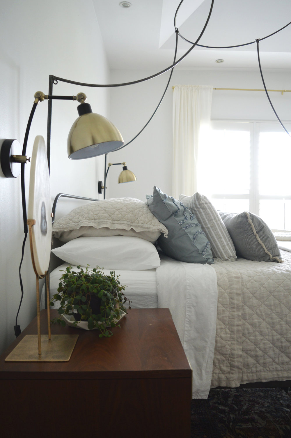
One of my favorite aspects of this project was getting to source from some small businesses I’d had my eye on for a little while. The sconces and overhead fixture by Cedar and Moss really make this room feel special. They were an opportunity to use something a little different from the mainstream. All by themselves these lights fold in that sophisticated vibe we were looking for, but they’re still unique and fun.

Hey, over here, Peggy!

25.jpg

This is such an awesome example of how to make a neutral palette visually interesting. Breaking up a monochromatic palette with varying textures and patterns and elements brings a room to life.

23.jpg

And then adding in a few contrasting elements in deeper, saturated tones grounds the space, and actually helps in making the whole room feel lighter and airier!

21.jpg

The beginning again,

before 2.jpg

and now.

20.jpg

One more time:

before 4.jpg
16.jpg
15.jpg

It was important to remember while working on this space that the same person I was designing this room for was the same person that, at one time, liked the lime green - you know that person has a bold aesthetic that doesn’t feel the need to fit in any one style box. While we wiped the green clean, we replaced it with a fun graphic paper that nods to the vibrant personality of the client.

14.jpg

A single statement pillow by my talented friend, Abbie at a. Naber Design pulls together the blues from the nightstands and the rug.

4.jpg
8.jpg

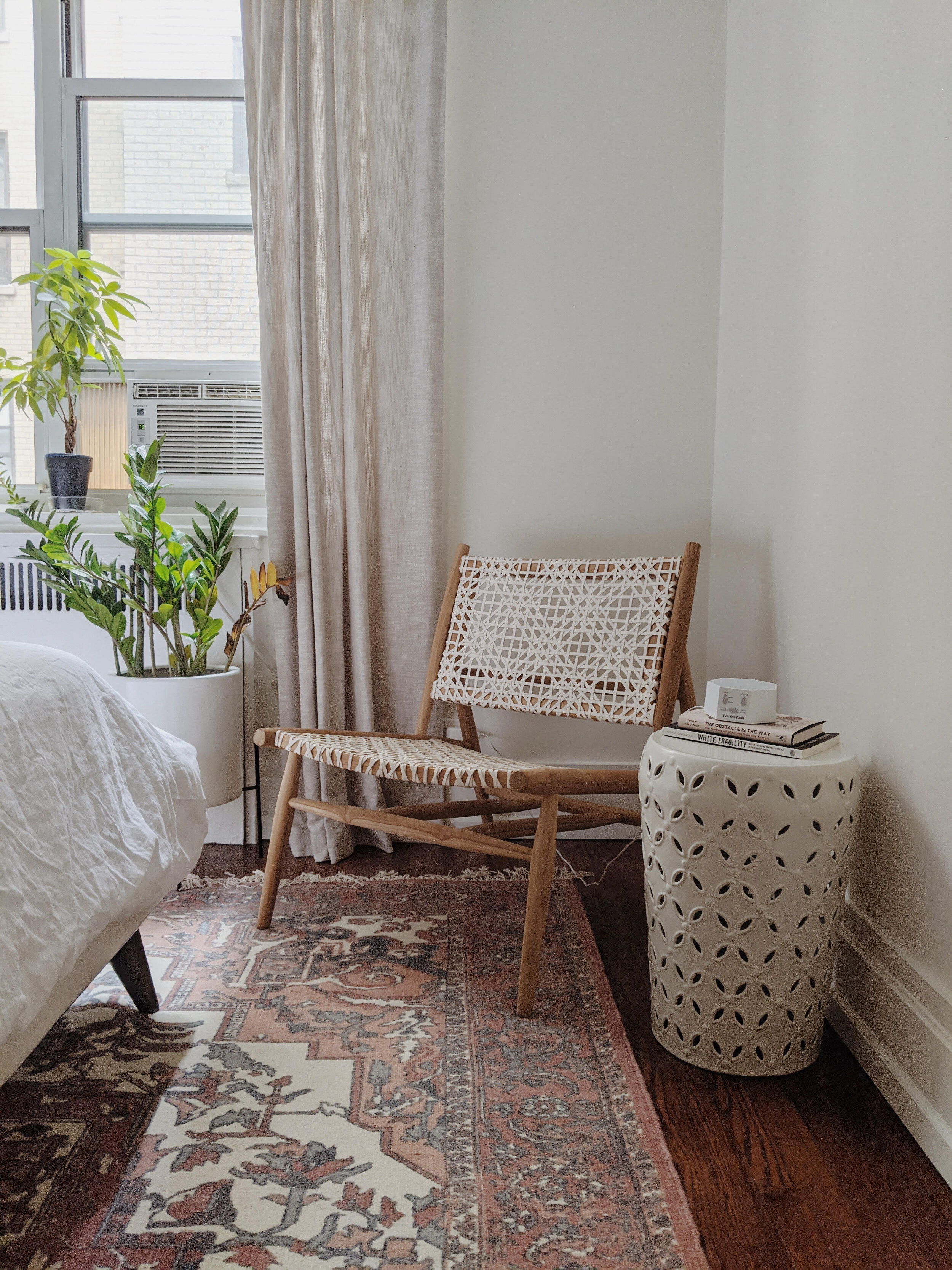
With bedrooms I like to make the bed and bed wall the focal point of the room. Since this client said she didn’t have any use for a dresser, we decided on a chic low lounge chair nestled near the natural light, and called it a day.

5.jpg
7.jpg

That’s a wrap, folks! This is one of my all time favorite bedrooms I’ve had the opportunity to design, and getting to share it with you is all because of the great effort of my client. Sarah, thank you. You are amazing and this was such a treat to work on with you.

6.jpg

Thank you all so much for stopping by today!
Chelesa.jpg

eDesign Reveal: Jess and Keith's Soulful Row House

Well this is a very special reveal, indeed! Remember last March when we welcomed a much needed addition to the StyleMutt Home design team? Well since then our girl Joy has been representing the SMH brand well, tackling jobs across the world in Australia and right here on our home turf. As we have learned since branching out to include design services, getting to actually see a finished job is a BIG deal! StyleMutt Home has been beyond blessed to work with many clients who are as passionate about seeing their homes transformed as we are, and we’ve had just the opportunity with a particularly fun client over this past year.

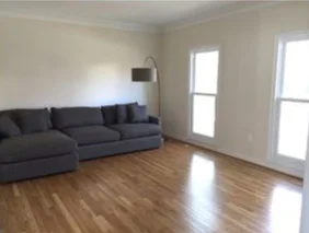
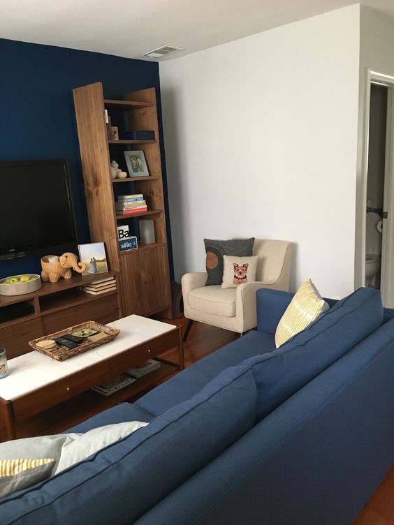
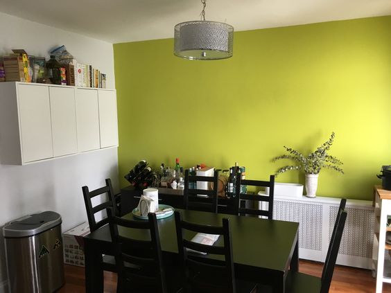
Jessica and Keith are a SUPER sweet couple living in a quaint DC row house on a street oozing with charm. When they came to us they had only been living there for a few months but had come a long way putting their style on their home. While their living room was more or less finished, (just needed some of those final details), their dining room was only just beginning. Let’s take a look at the ‘before’ shots they sent us!

Joy and I decided to divide and conquer on this project; I took the entryway and living room, and she tackled the dining room. Having two designers working on one home can be tricky because you really want to make sure that there is a consistent point of view from one room to the next. Communication from all parties involved needs to be tight, and I can honestly say this crew made it happen without a hitch. Jessica and Keith were amazing to work with, and Joy’s design for the dining room left me in awe. It was just so much fun! So let’s look around the finished home!

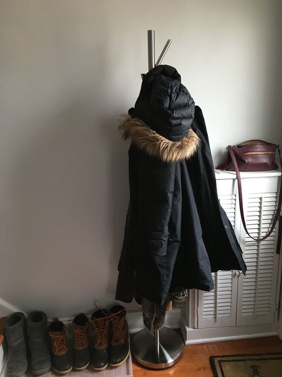
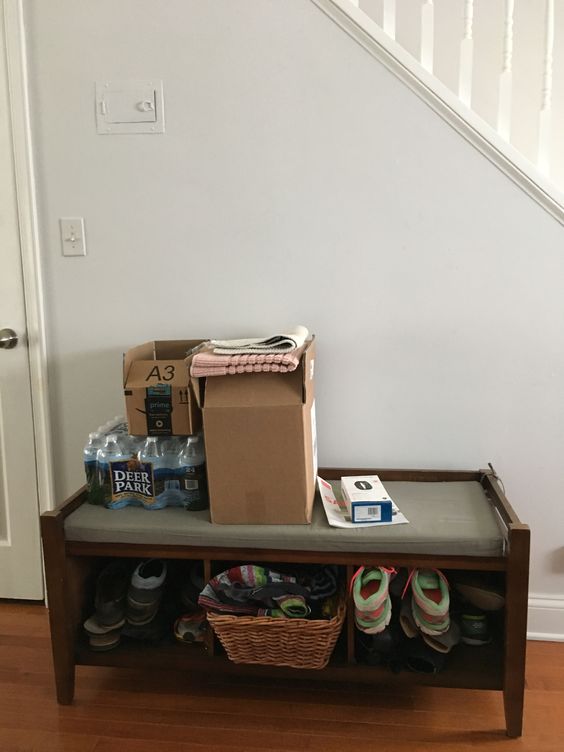
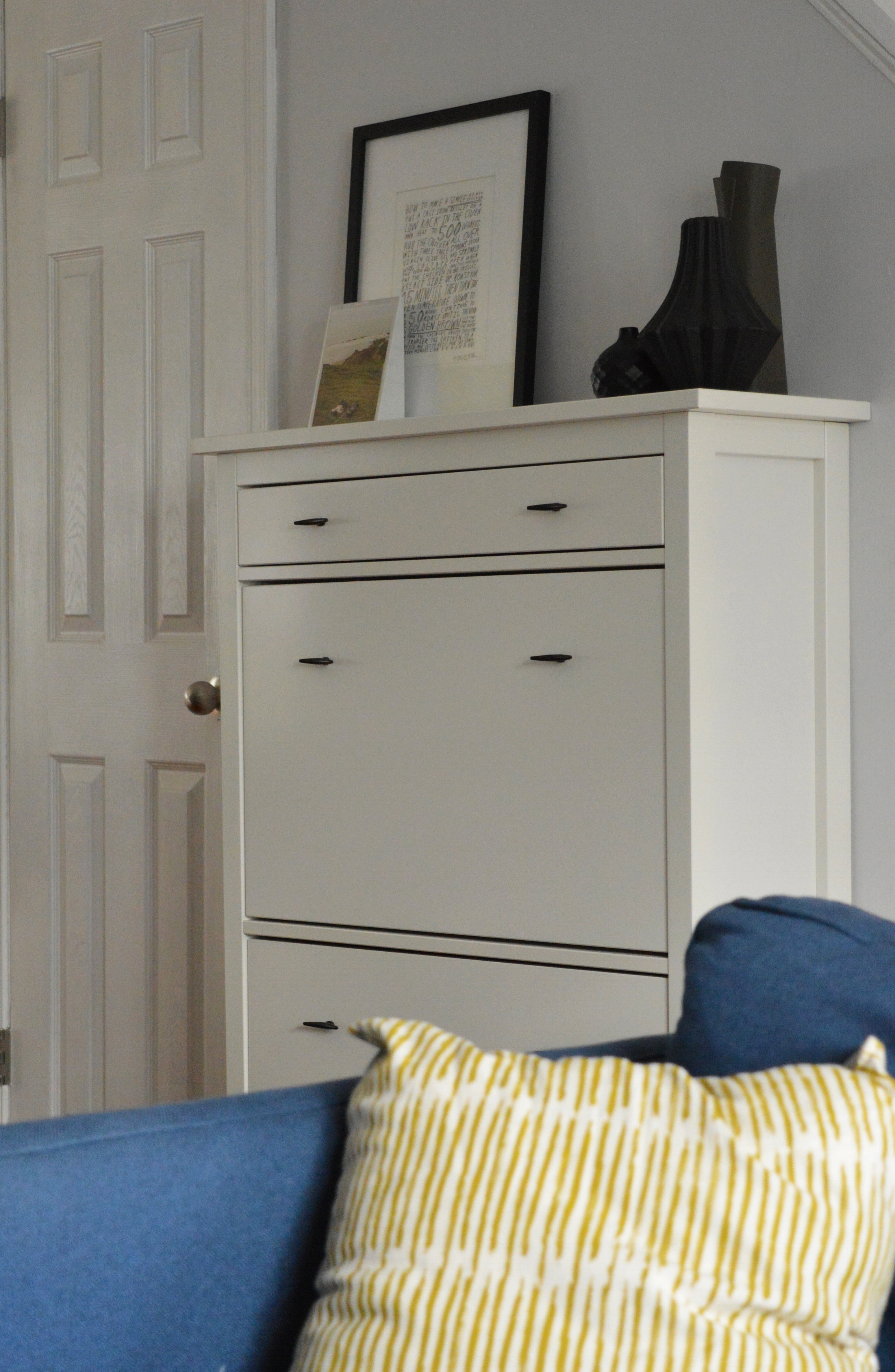
In the entryway we wanted to get things off the floor and hugging the wall. We swapped the coat tree for a hanging rack, and got all the shoes in a narrow storage cabinet on the adjoining wall.

DSC_0330.JPG
DSC_0315.JPG

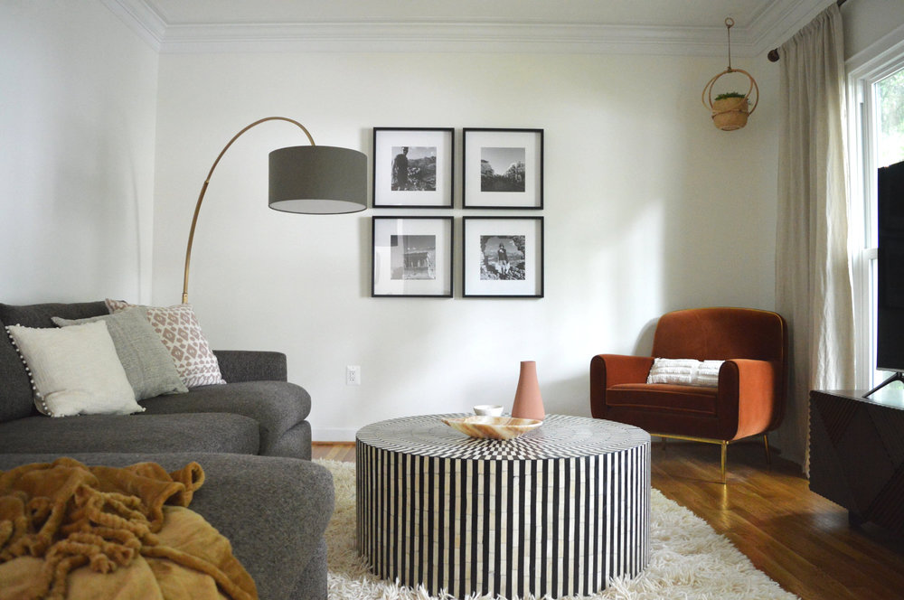
The living room was so close when Jess and Keith came to us - they just needed a bit of advice for styling accessories, lighting, art and a rug! It never ceases to amaze me how a space suddenly looks awake! with just a few additions and styling!

DSC_0319.JPG
DSC_0318.JPG
DSC_0323.JPG
DSC_0321.JPG

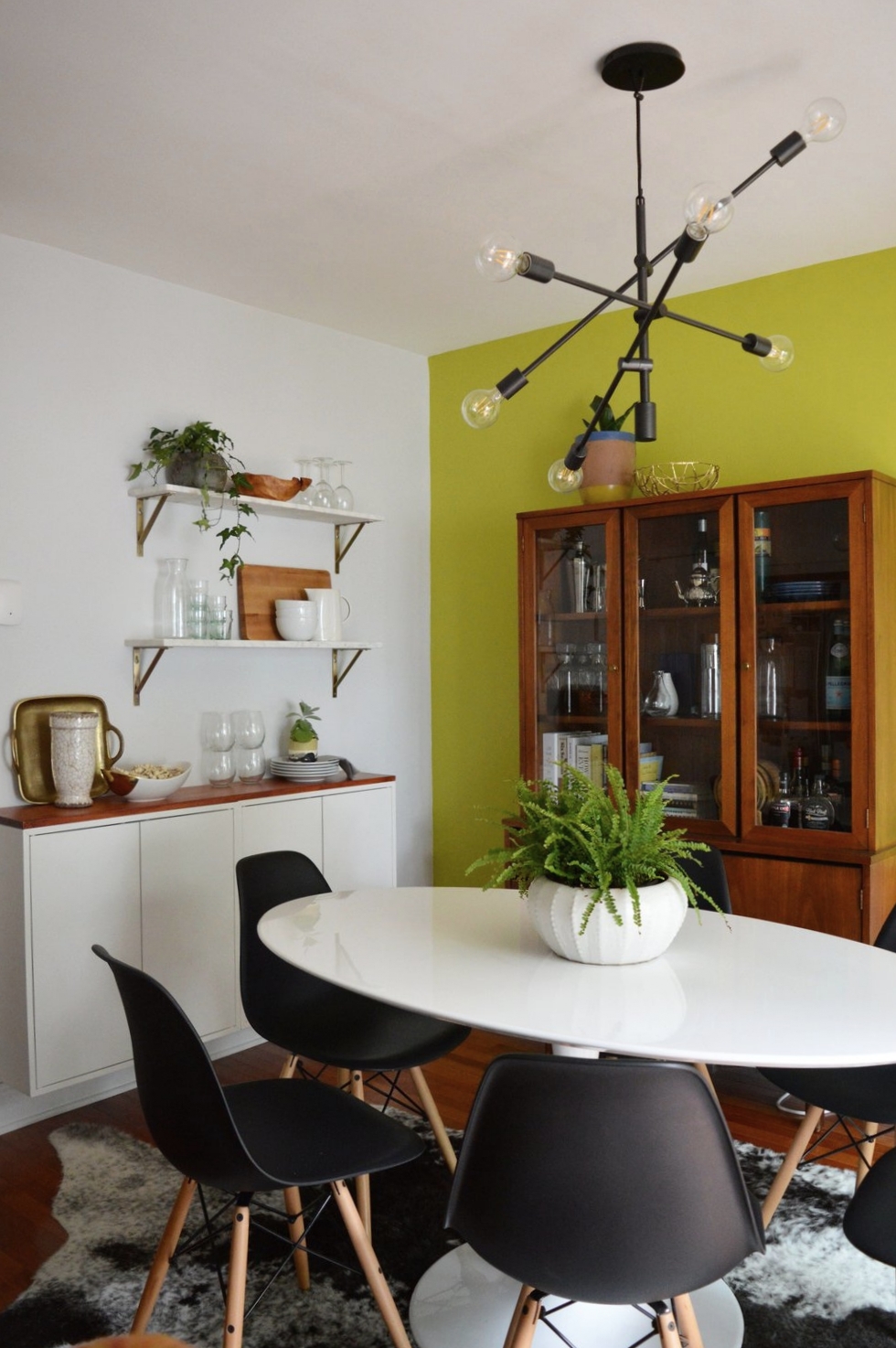
The dining room, on the other hand, was closer to the beginning of its makeover than the end! (This would be a good time to jump back up to the top and take a look at the ‘before’ picture!) The only element Jess and Keith wanted to keep was the freshly painted accent wall, SW ‘Citrine Dream’. And after Joy took the reigns in here, I don’t think I’ve ever loved an accent wall more!!!

To point out the obvious first, the use of warm woods in here mixed with stark white and black pieces makes this bright color take on a highly sophisticated personality. A punchy color works remarkably well when the remaining elements are strong and LOOK expensive, (even if they are not).

finish2.JPG
finish6.jpg
finish3.JPG

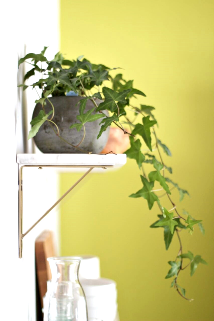
Less obvious touches of brass and marble speak volumes in this multi-functional area, and prove that small doses of these finer materials go a long way.

finish7.JPG

An intentionally selected statement art piece doesn’t cower against the statement wall - anything softer would have been absorbed by the citrine color, but this piece pops right out - exactly what it was intended for!

finish4.JPG

It has been such a treat to get to work with Joy on this amazing home with these incredible clients. Everyone put in the time and effort to see this home to the finish, and we wish Jess and Keith the very best life together here.

So ridiculously proud to get to share Joy’s hard work here! It is truly a pleasure to have her on our team and I’m still pinching myself that we are lucky enough to offer her talents to our design clients. You can see more of Joy’s work on her site, Joy Lewis Design.

Thank you all so much for stopping by!
Chelesa.jpg

SOURCE LIST

Entryway hooks, Urban Outfitters
Entryway mirror, Pottery Barn

Living room shelves, Room and Board
Living room sofa, Crate and Barrel
Living room coffee table, West Elm
Living room drink table, West Elm
Living room chair, West Elm
Living room rug, West Elm
Living room sconce, Lamps Plus
Living room art, Laura McGuigan
Living room accessories, primarily CB2 and what the client had on hand

Dining room table, Overstock
Dining room chairs, Poly and Bark
Dining room rug, Overstock
Dining room chandelier, West Elm
Dining room art, Minted
Dining room shelves, World Market
Dining room white storage, IKEA
Dining room vintage storage cabinet, Craigslist