New Decade, New Dreams!

But one day at a time! I feel like I’ve lived two drastically different lives in this past decade! At the beginning I was a young first-time Mom with twins and one on the way and I dreamed of making more out of my days at home raising wildlings, (nod to the show of the decade). And the second half as a self-taught interior designer learning how to navigate life with a growing business and three unique kids at their own critical stage that I want to be every bit as present and available for. I had no idea what God had up his sleeve in 2010 and there is something so thrilling when I think about what He’s cooking up now. Not because the last 10 years have been without deep, personal, and intense challenge, but because God moved and lead me towards things I never, ever would have thought to try for. It’s a vulnerable place to put so much effort into something you aren’t sure will pan out or not! But I’m getting more and more comfortable each year with setting goals and having personal aspirations, because I know from the experience of these last 10 years that the Lord will carve the path ahead. I don’t have to worry about what will be or not be; I just want to commit and give my absolute best in whichever doors He opens.

One of the things I’ve found to be true in this season with school-age kiddos is that when they’re home, I really need to be ‘on’. This is one door that God has swung wide open in front of me and made clear I’m needed. The twins are in 4th grade, and Mason is in 3rd. Between the three of them there is always someone that needs help with homework, help studying, a little push of motivation, guidance towards responsibility, a ride to an activity, etc. It’s just the stage we are in and like it’s always been with multiples, each stage is intense because we are in it times three. So when the holidays were approaching and I was hanging by a thread, I told Matt that I thought I’d need to re-calibrate my schedule a bit in the new year in order to manage the various balls in the air, (this is probably a good time to mention the new puppy we brought home last week)!. One very intentional decision has been to be more selective in the jobs I work. Over the last few years as my skills have grown, so have the opportunities for work. And while I’m very proud of that, I’ve done a great deal of jobs that have been discouraging and creatively limiting, (like the combination office/playroom/laundry/workout room with the stationary bike I had to find a place for). Looking ahead, I have a better sense of what type of business I want StyleMutt Home Design to be and what type of work I would like to spend time on.

On that note, I have some long term dreams for SMH that I’ll get into later, but in the immediate future there are three mega-fun jobs that I think you guys will be excited to hear about and follow:

  1. My first new-build! I’ve been in kahoots with THE sweetest family, the Masons, and they are building their forever home practically right down the road! I’ve never been so involved in building a house before so it’s been quite a fun learning experience and one that I am already loving! Their style is contemporary, which is also new territory for me, but since they want this to be a family home to grow into and, eventually, host all their kids’ friends, I am helping them find that warm and relaxed balance where modern contemporary meets family home. So far our direction feels so very Scandinavian which is just ridiculously fun!

  2. If you’ve been following this blog over the last 3 years you are likely familiar with Dani Barbe’s home, (here and here). Well, our dear friend and her family are getting ready to move on for a more convenient location to her husband’s work. We were delighted when she reached out and asked if we would help with their next home and her jewelry studio! Absolutely thrilled to work alongside this creative to design a home that feels personal and unique to this special family!

  3. My first commercial space! Our church is completely ravamping its cavernous lobby with unfinished ceilings and loads of natural light! I started the design back in October and it was finalized in November, (it was a fast process!). Items have already been ordered and plans for some of the DIY projects within the space are underway! I will keep you guys posted on the progress as I am able, but this is going to be one amazing transformation that we pray will be a warm and inviting atmosphere to the community. Here are some before and afters followed by the design plan!

Ignore the giant red slashes, I used these shots to indicate to our contractor the exact walls we want to have painted. Also, I happened to come and take pictures of the space on the designated day of the week they organize a giant food collection for the community. Did you know grocery stores, restaurants and even Starbucks donate all their unused food at the end of the week to give away to those in need?

before1.jpg
before2.jpg
before3.jpg
before4.jpg
before5.jpg

As you can see it’s a GIANT space to work with.The main focus here is to create cohesion and to use design elements that are the appropriate scale to the space. Here’s the plan we are working towards right this very moment:

CCC+Dining+%282%29.jpg

One thing I noticed is how low and squatty our windows are. There is 9 feet of ceiling above the windows! So to create some subtle visual interest, we’ll be incorporating a trim treatment of simple boxes along the upper portion of the walls. Again, the emphasis is on subtle, this trick will bring a finishing touch to the space as a whole. We’ll have a cozy seating area right by the doors, and then further in - and this may be my favorite part - a camel leather booth that is 25ft long, paired with white metal cafe tables and natural wood chairs. I cannot get over this combo! Durability and versatility were two of the most important factors when discussing this space with the team, so I sourced all our dining furniture from restaurant furniture sources. The booth is on it’s way right now and I am just itchin’ to see it!

CCC Kitchen (2).jpg

There is a much bigger plan for this kitchen space down the road, so I didn’t want to make any updates that were too costly or time consuming for the time being. I decided to add a graphic allover pattern using a stencil to the kitchen peninsula, pendant lights to create a cozier, more intimate space, and a large scale letterboard where we can incorporate encouraging messages. To the left of the picture I’d like to paint all doors a saturated beige, and update the coffee station with a vintage mid-century piece.

CCC Lounge Area (3).jpg

There is a very talented local muralist who has offered to lend her amazing skills to this space, and I thought what better place to incorporate her vision of a large scale botanical wall than the entrance to the youth wing. There’s something so wild and fitting about this idea, I absolutely can’t wait to see it in real life!

CCC Entryway2 (3).jpg

We have this one giant wall that we wanted to do something with that wasn’t too loud or busy - the most perfect opportunity for a planked wall I ever did see! Did I mention these are 16ft walls?! We also needed an obvious, but simple, information center, so I’ve added my favorite go-to Ikea IVAR cabinets because they’re easy to mount, easy to paint, and are only 11” deep. Simple, functional, and only $70/set.

So that’s the plan for this very unique project! I’ll be sharing updates here as things happen so please stay in touch if you’re interested in following! My heart already feels so full to look ahead at the projects lined up for this year. I’ve said it before and I’ll say it again, this work is a privilege to get to do.

Thank you for stopping by!

Chelesa.jpg

Design Reveal: Charming Living Room in Alexandria

I told my family I was only going to be at this newly completed client home for an hour - hour and a half tops! It was relatively close in nearby Alexandria, and just a small living room. But as it goes, I just had the most fun getting to talk to my sweet client, Annie, in person for the first time since we started working together a few months ago! Five hours later, I did eventually get home. ;)

As we have proven here over and over again, remote interior design, (aka eDesign), is every bit as personal as in-person. We communicate very closely with each and every client regarding every decision on the space. And even though we develop a unique and individualized communication flow with each person, the months of FaceTiming, texting, calling and emailing always come to the same end result: a space that person truly feels is theirs and lucky to call home. As people who love people, this line of work is right up our alley! We adore getting to connect with others and put our heads together to create the very best home that suits their style and needs.

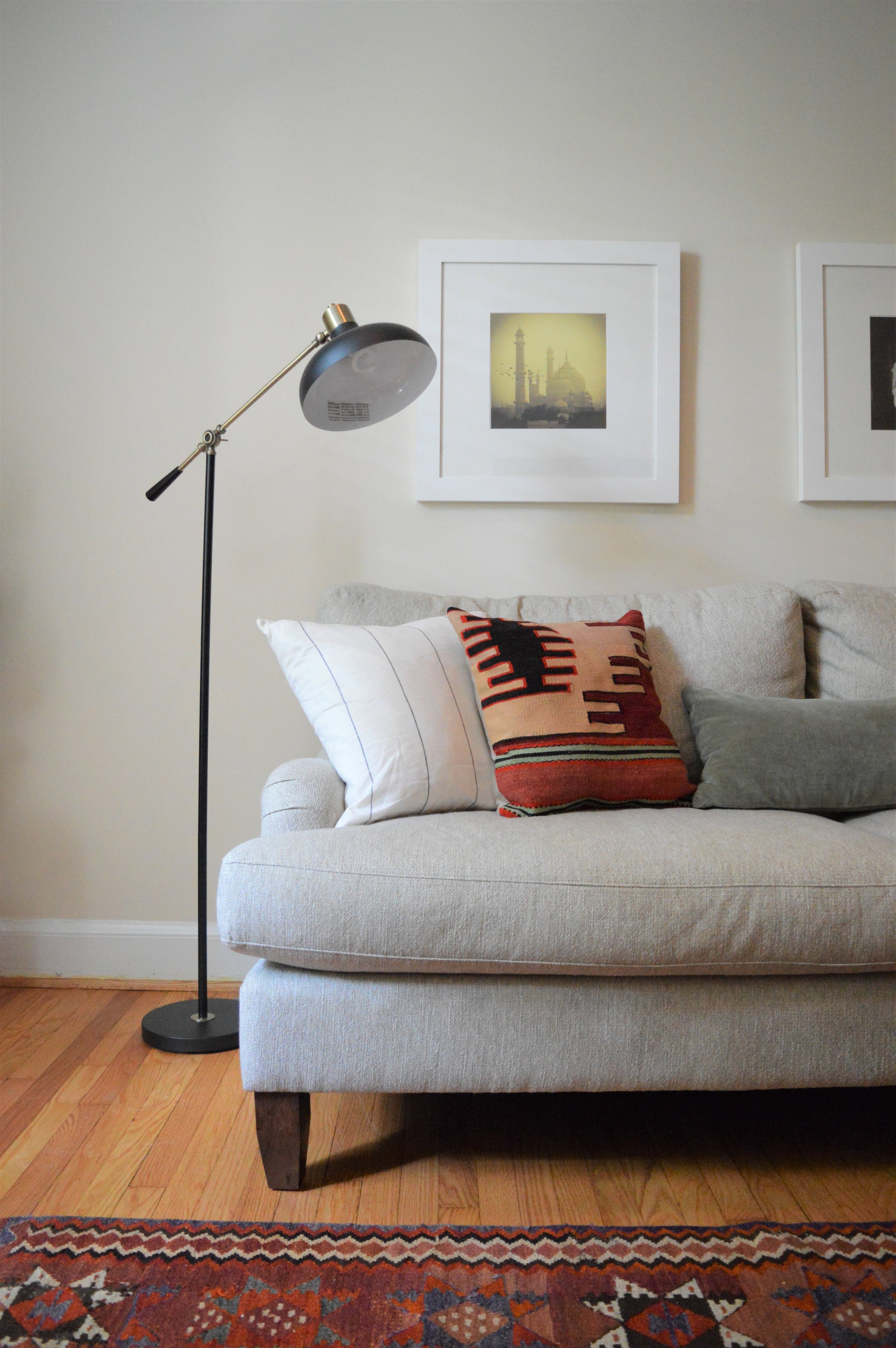
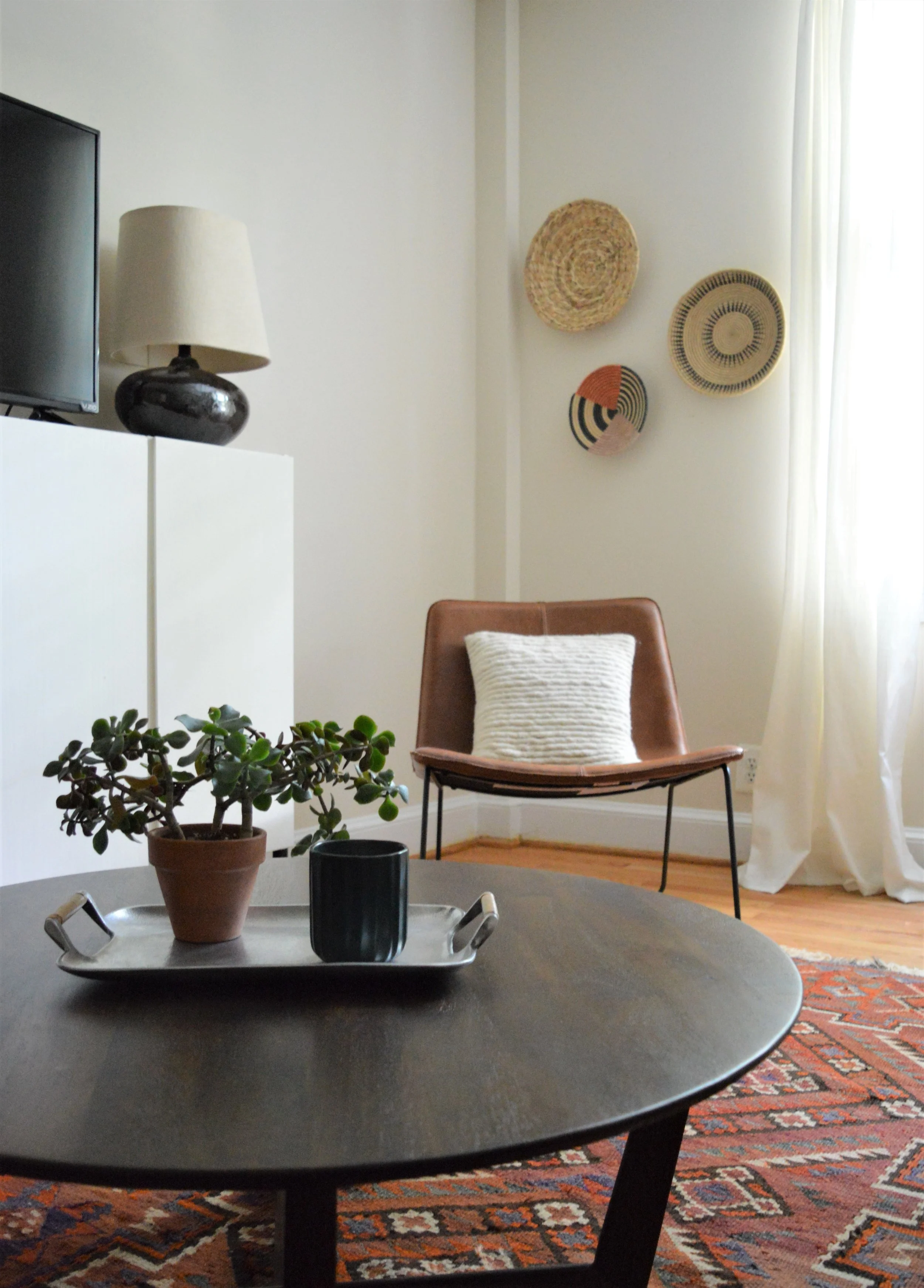
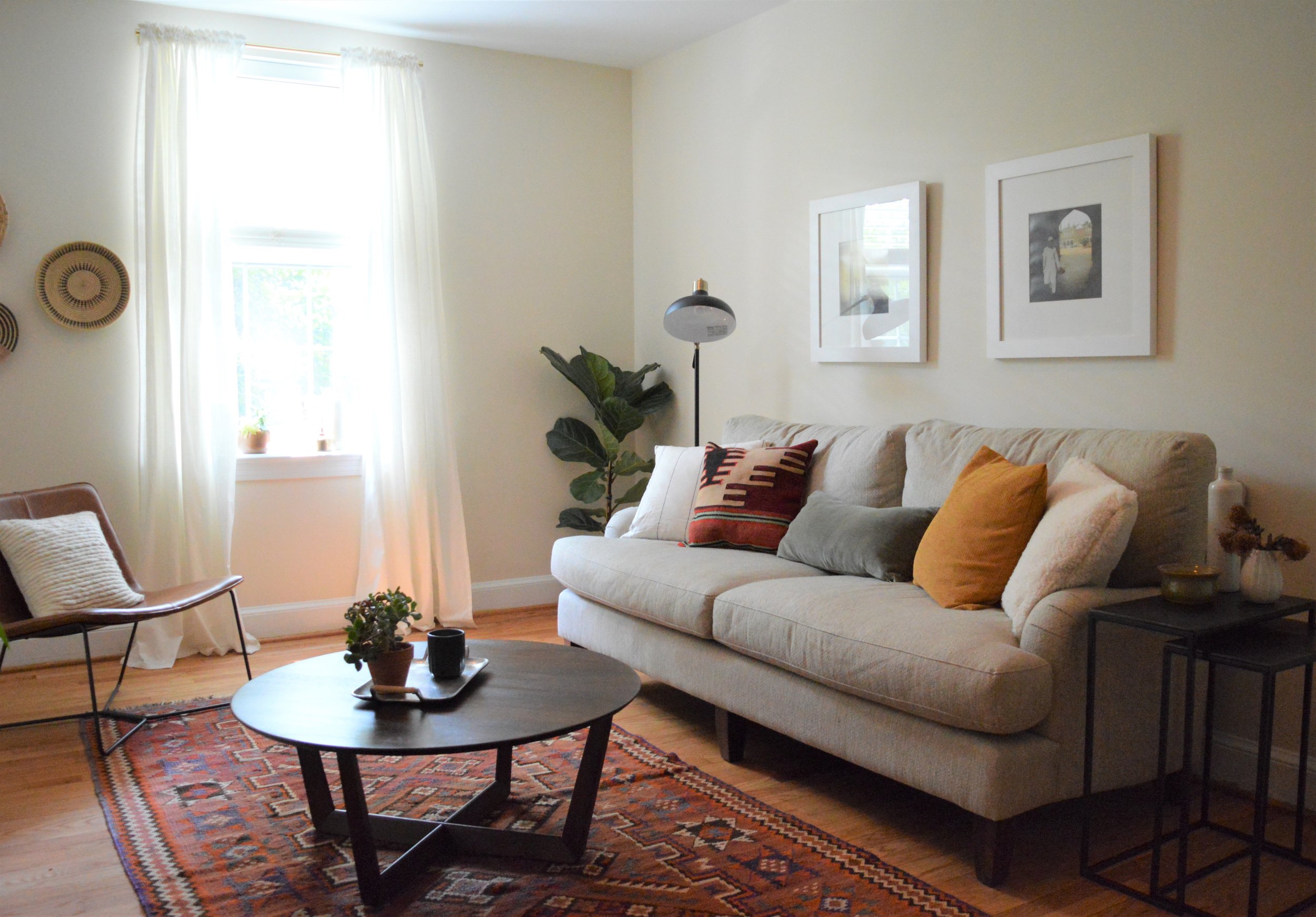
Today’s reveal is really fun because Annie’s style is very eclectic and she had the COOLEST stuff to start with! She has spent time immersed in so many cultures around the world, her collection of artifacts and photography is seriously impressive. So fun for a designer to play with! Want to see what the space started out as?

before.jpg

Lots of stuff going on here, but also some really cool stuff. Our aim was to highlight the beautiful pieces Annie already had, add pieces that complimented those, and find a visually pleasing, inexpensive way to hide the rest! Take a look!

1.JPG
2.JPG
4.JPG
3.JPG

One of our design concepts sent along the way. We had yet to decide on the coffee table and exact pillow placement, but that’s what a concept is - a check on the visual feel of the space. These are meant to help us know if we are heading in the right direction and what adjustments, if any, we need to make moving forward!

Design+Concept+Edit+2+b.jpg
7.JPG

Before you say anything I am fully aware that this is maybe the 4th or 5th time we used the IKEA Ivar cabinets. But you guys, at $70/unit, completely customizable, and only 12” deep, these babies are a small space small budget best friend. Not to mention ideal hidden storage for a small apartment with (almost) no closets. We hiked these Ivars up on black stainless steel legs which set them at a much more versatile height, and gave them a much needed layer of visual interest for this small space.

9.JPG
24.JPG
11.JPG

Big fan of this chair in this space! It’s modern but rustic enough to pair well with the English roll arm sofa.

23.JPG
13.JPG

This home wears the glow of Summer well. I may have to book some time here come February!

18.JPG
16.JPG
20.JPG

That’s a wrap! Happy to say we are already locked in to work with Annie on her bedroom next! But before we start on any new projects I’ve got a few more weeks of Summer to maximize with the kids. Taking this season off has resulted in the best time with my kids. I love this age so much and have thoroughly soaked in this time together practically distraction free.

I hope you all enjoy these last weeks of Summer and amidst whatever your responsibilities are can find moments of joy and rest. Thank you so much for taking the time to come by today!

Chelesa.jpg

Design Reveal: Prospect Park in Brooklyn, NY!

We’re in Brooklyn!! This project represents a long time dream - designing in New York City! What can I say, I’ve always been charmed. This was actually my sixth or seventh design job in the Big Apple but the first one I’ve had the opportunity to take photos of. Coincidentally, I am working on two more apartments just around the block from here, (one being a generous word of mouth recommendation from these home-owners!).

When these adventurous globe-trotting clients approached me with little more than a random piece here and there in each room, I was so smitten with them, the stunning archways in their home, and their goldendoodle, Nala, that I couldn’t wait to jump in. Over the course of six months we worked together room by room, item by item, detail by detail. Oh how I have looked forward to this day!

It all came together SO well and I can’t wait to walk you through! The MO with this home was to achieve a simple but eclectic look with a balanced global vibe. With space being limited, we enlisted the help of local contractor Ethan Abramson to design and install storage in every room. I’ll point out his work as we go along but I can’t tell you how fun it was to work on custom pieces with such a skilled craftsmen. Would highly recommend Ethan to anyone in the area! Let’s head in, everyone!

Entryway

DSC_0054.jpg

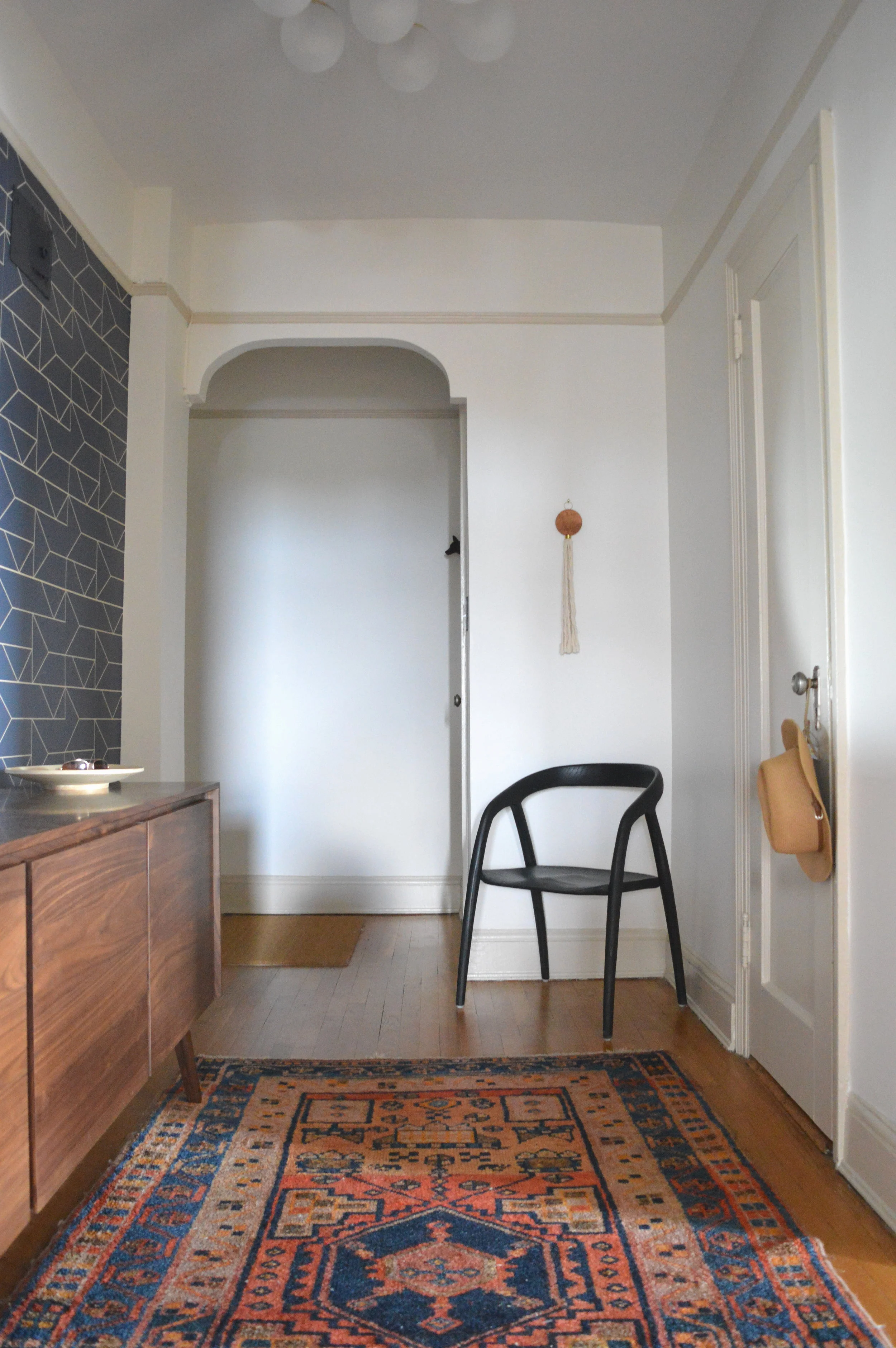
You walk into this apartment and immediately enter a long hallway. Creating depth of view is one of my favorite design elements - giving you something to see down the length of a space from either end. A personalized curated gallery wall pulls you into the home, while a graphic wallpaper, and architectural accent chair bid you farewell. (If you’re interested in the sources used throughout this home, please see our list at the end)

2.jpg
DSC_0049.jpg

When less is more, I like to use interesting pieces. A single accent chair by itself had better be something special, otherwise, why?

DSC_0053.jpg

The wallpaper was possibly one of the first decisions in the whole home! This is the only place it’s used which I think just makes it that much more dramatic.

DSC_0051.JPG

Speaking of dramatic…

Dining Room

DSC_0105.jpg

We were so intentional with every detail in this space I can’t help but look at the collective whole and remember the conversations and design renderings created for particular elements. It is a process of pure creativity that I have fallen so in love with over the years.

DSC_0093.jpg

The clients had this idea for a gallery wall here and my gosh did they hit a home run. Notice the continuity among the frames - all thin, and either black, white, or natural wood. That’s it! There is nothing visually connecting the actual images, but the carefully collected frames create cohesion and freedom to display whatever suits them.

4.jpg

The light fixture was actually left by the previous owners and totally works for our purposes. Its thin and the right scale and the only brass used throughout, setting it apart as the primary decorative accent in the dining room. With the cutout looking into the gallery wall hall, I opted not to add anything else to the wall space surrounding the table, so this visually impactful fixture works beautifully.

DSC_0059.jpg

Living Room

DSC_0107.jpg

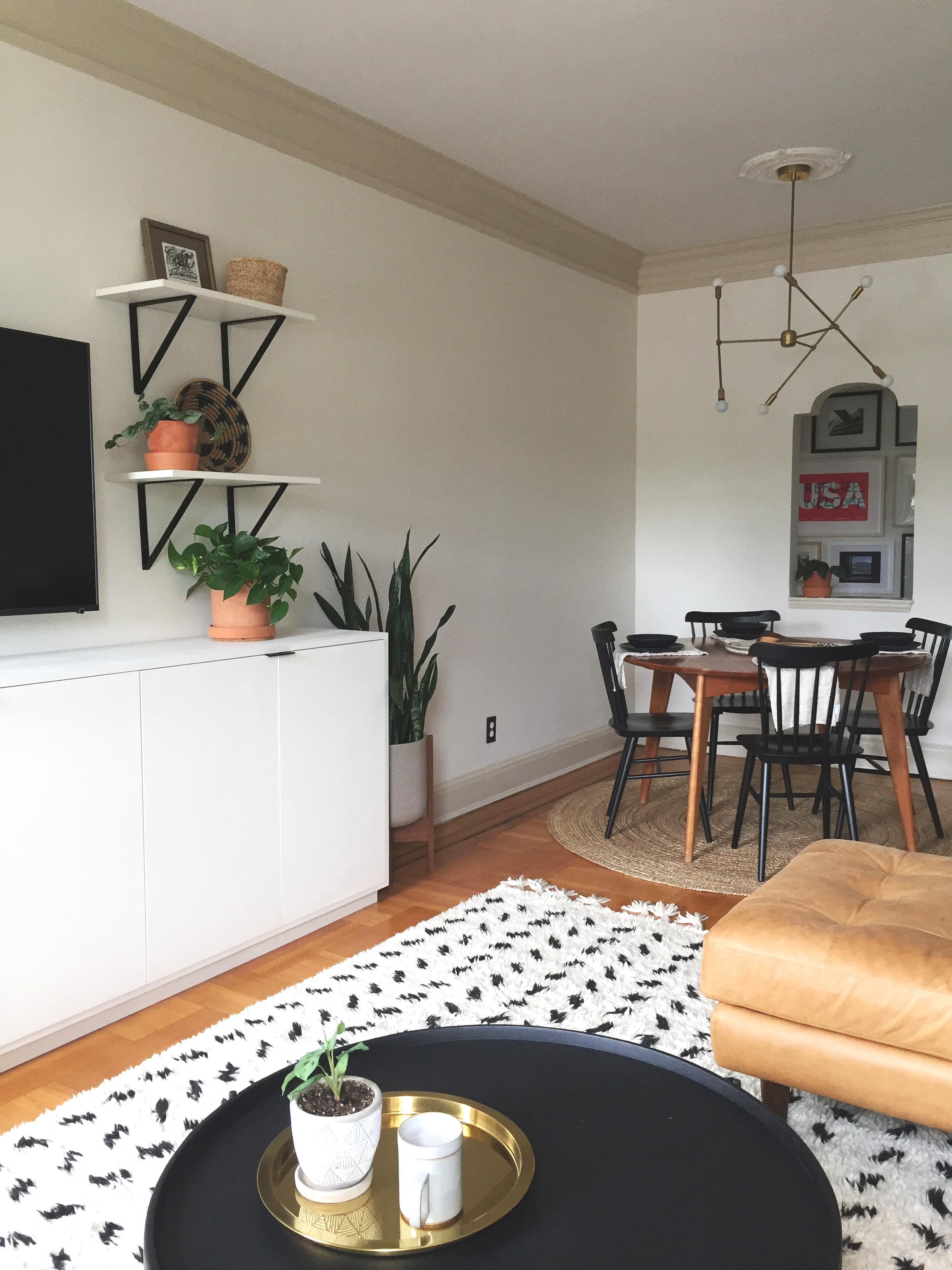
I can’t move on without pointing out the trim. First of all, so thick, old and regal. I’ve never ever painted trim a contrasting color, but the clients had this idea to do something different and accentuate it. In the early renderings I used black and that felt too stark. Gotta start somewhere, right?! After doing some research on similar architecture I found three images with white walls and beige trim and fell. in. love. I sent over three color options, the clients tested, and we came to a unanimous decision to use Clay Beige, by Benjamin Moore. Walls in Swiss Coffee, BM.

DSC_0115.jpg
DSC_0064.jpg

The first of Ethan’s pieces - this wall unit! He built the cabinets and shelves above, using Rejuvenation brackets we selected.

DSC_0063.JPG
DSC_0068.jpg

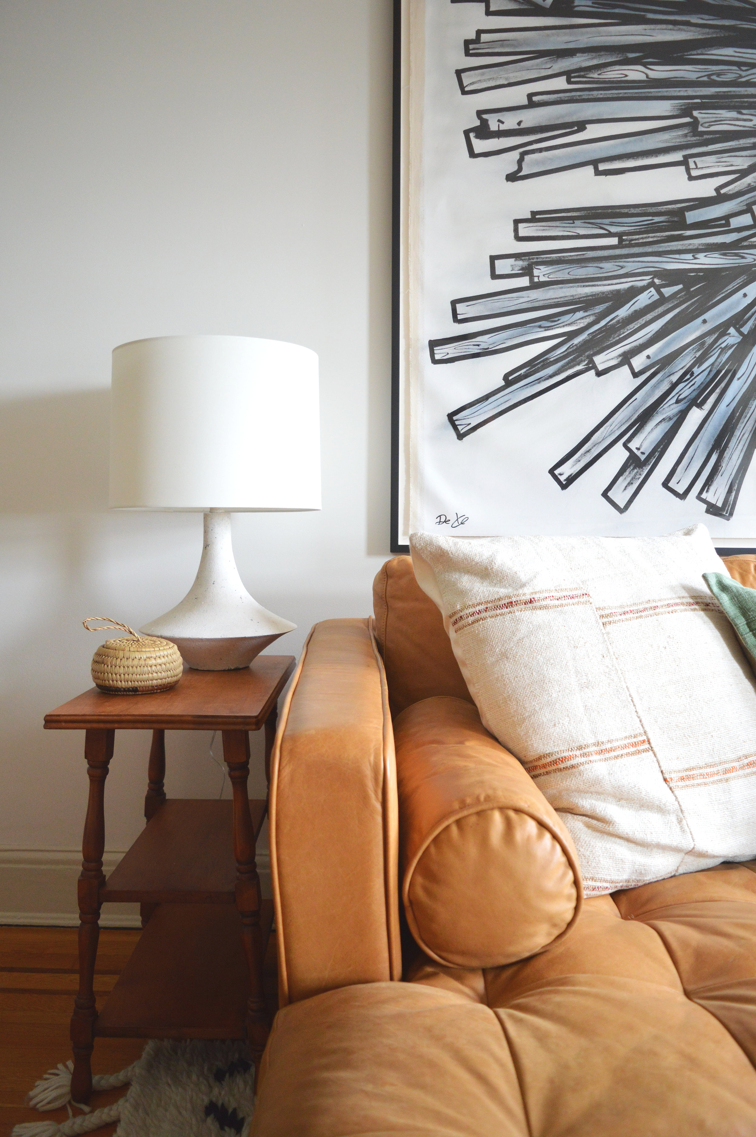
The triptych is just the bees knees! The clients found the street artist, Dede, in Israel and looked him up upon returning to the states. They commissioned this special piece for their last apartment and were not sure it would have a place in this one. My top choice was over the sofa if the dimensions fit. It’s just the right kind of drama needed for this room! Still so thankful this installment fit!

DSC_0070.jpg
DSC_0071.jpg

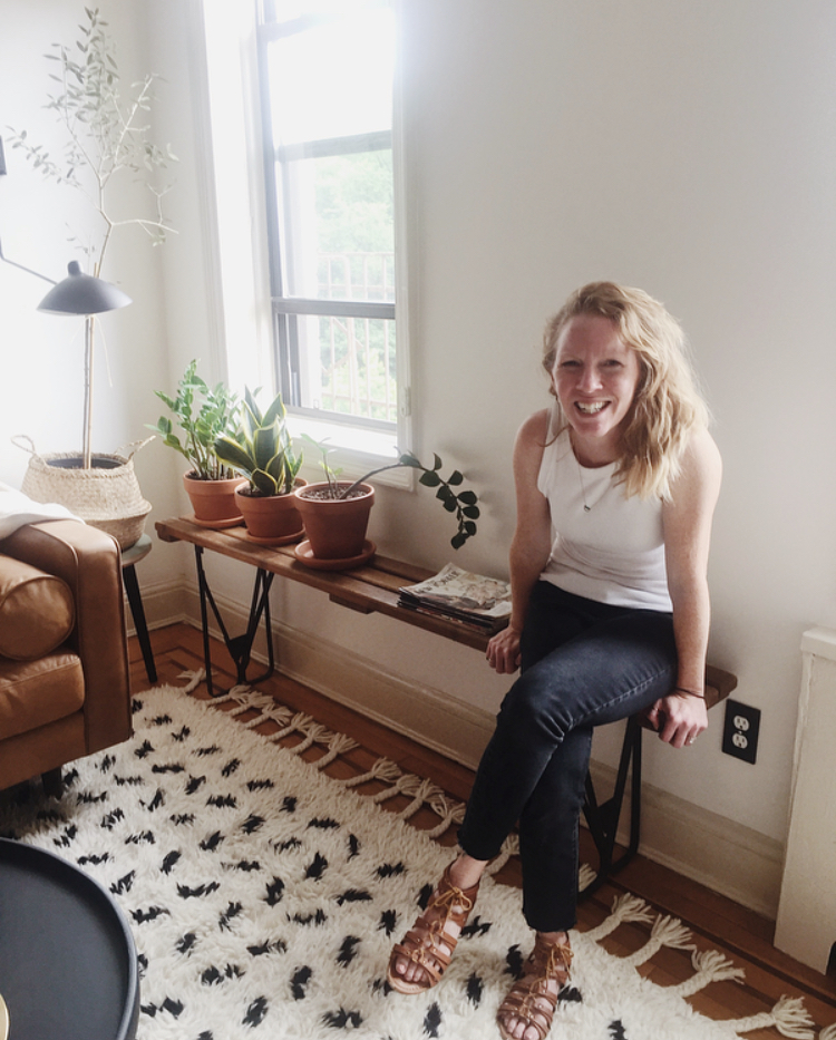
I honestly don’t believe we ever considered any other light! We had started down this road of edgy pieces with a subtle flair of drama. I’ve used similar sconces before and this France and Son number was just right for our far corner here. Can we also take a moment to acknowledge the clients incredibly green thumb - I’ve been loading up on her generous tips!

DSC_0081.jpg
DSC_0075.jpg
DSC_0077.jpg
DSC_0113.jpg
6.jpg
DSC_0098.jpg

Bedroom

DSC_1040.jpg

Hold on, scroll back up and take in that pocket door pull. The details of this home are just incredible! What a privilege to work on such a fun space!

DSC_1043.jpg

You’ll notice in this room as well as the office coming up next that we opted for reverse walls - beige walls with white trim. They’re itty bitty spaces so it just felt like a fun opportunity to try something different in this home.

DSC_1046.jpg

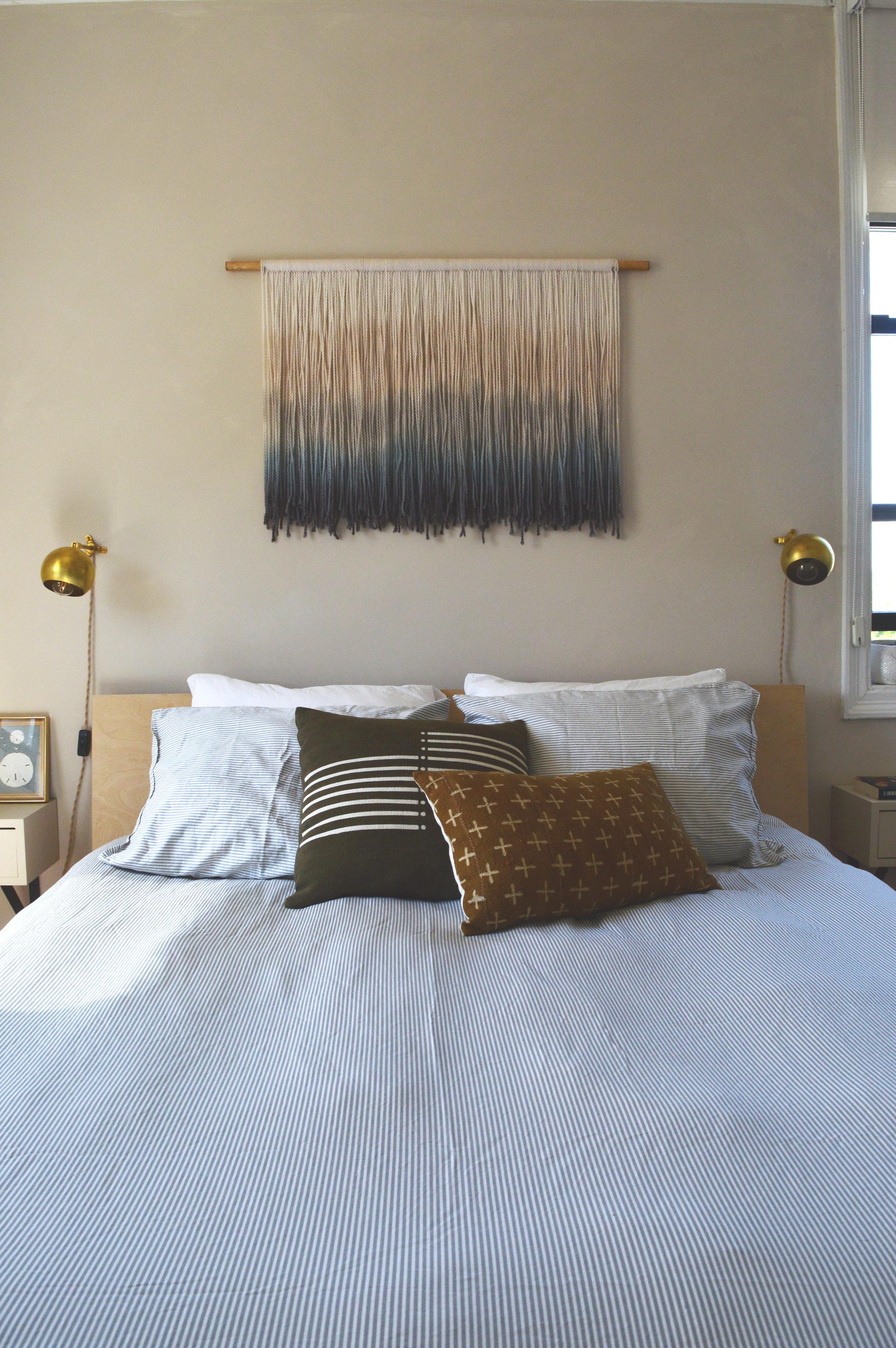
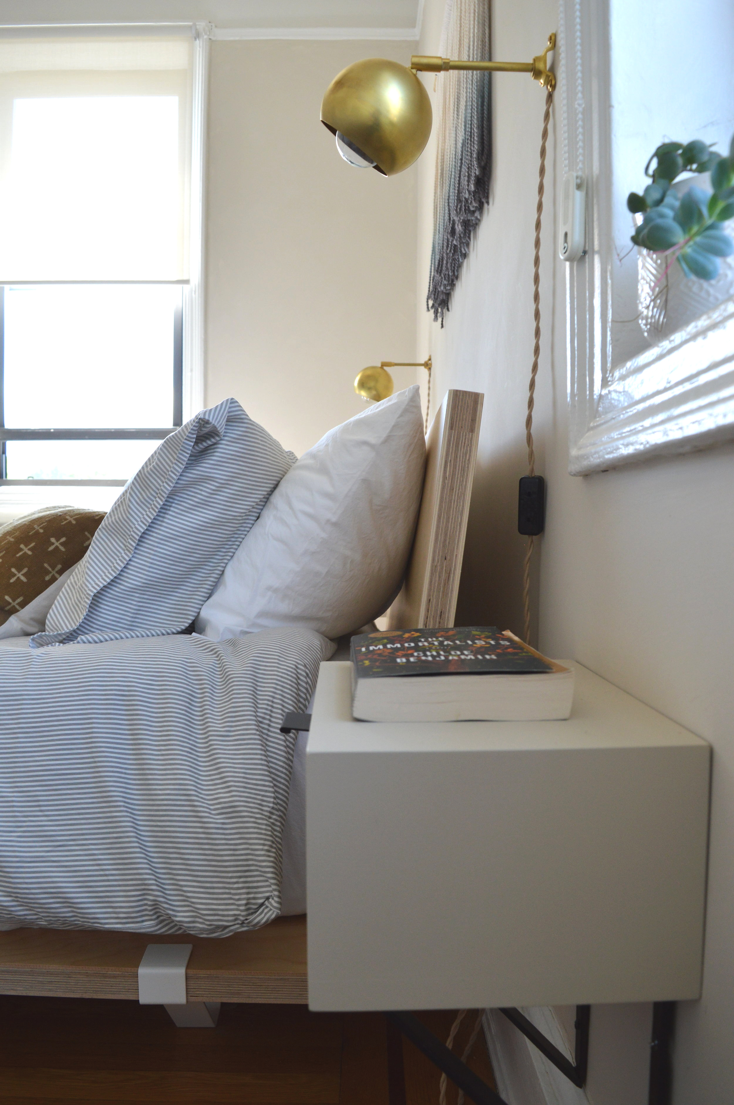
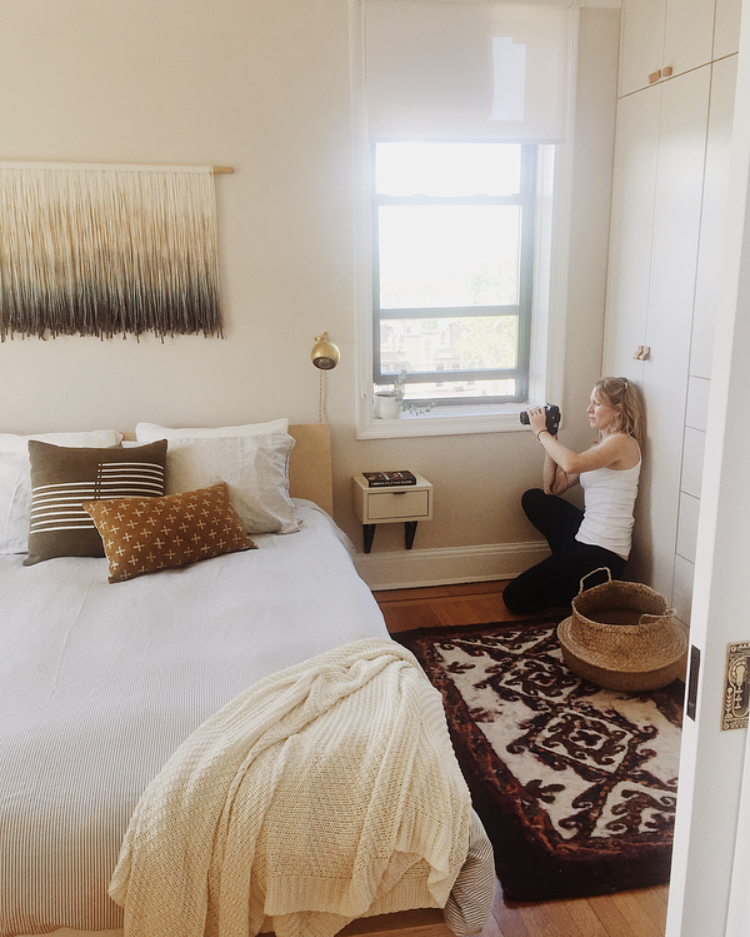
The bedroom is a story of small business owners. You may recognize Ethan’s work in the bedside tables, (inspired by similar I found on Etsy). You may also recognize some items StyleMutt Home has used before! The Marylou sconce from our friends at Rough Luck Studio, and the fibre art by a favorite, Designs by Filia.

DSC_0001.jpg

More small businesses are represented on the bed. Pillows from fair trade global artisans, The Citizenry and Mae Woven, as well as Brooklyn local business, Brooklinen. The bed itself, as well as the office desk, (coming up), and the olive tree stand, (living room), are from Floyd - a company establishing the standard of modern-day furniture. They make furniture that is easily portable to those often relocating, but without sacrificing quality. West Elm recently partnered with them so I’m sure you’ll see more of them soon!

DSC_0002.jpg

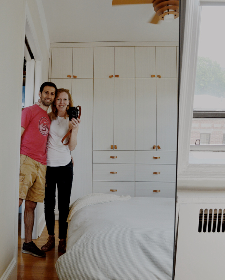
Curious how New Yorkers manage such tiny spaces? Epic closets. These were installed by the previous owners who gambled some solid square footage in the room. And worth every inch, if I do say so! Who could deny those leather pulls…

DSC_0018.jpg

Office

DSC_0022.jpg

We have two fine installments from Ethan in this space - a cute corner shelf that I wanted to use to soften the deep narrow space,

DSC_0043.jpg
DSC_0027.jpg

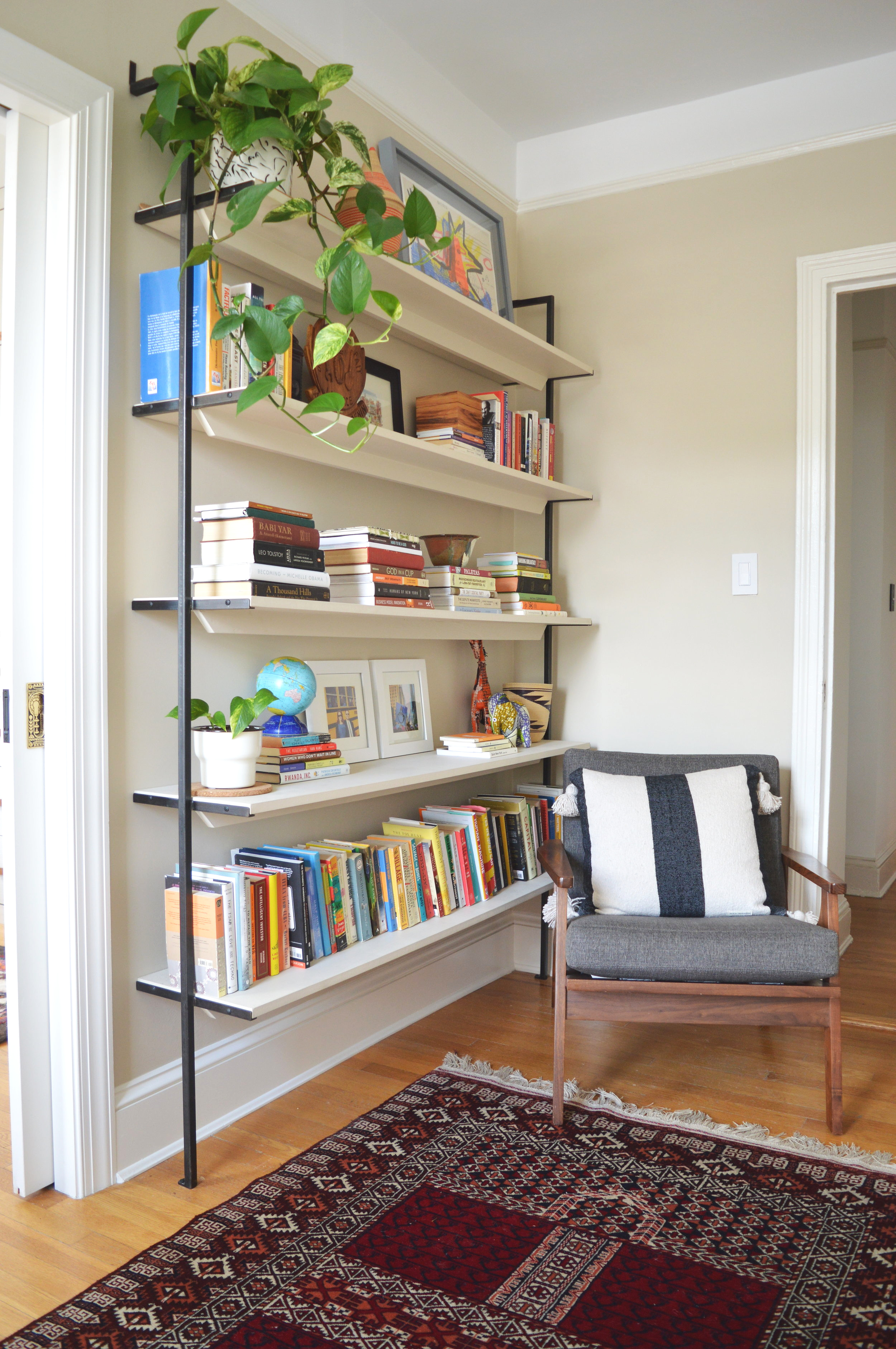
and the coolest bookshelves I ever did see!

DSC_0039.jpg
DSC_0032.jpg

This is artists work right here, people. The detailing is just everything!

DSC_0033.jpg
DSC_0038.jpg
DSC_0036.jpg

And that’s it! I had so much fun working on this home I feel guilty calling it work - not every job feels that way but this one was a joy every step. The clients were beyond amazing and, as always, I am so touched to be trusted so fully with their home. Designing someones home is an honor I don’t take lightly, so when it’s all said and done there is definitely a bittersweet feeling left that it’s all over.

We have worked so hard to get here with StyleMutt Home Design but it still feels surreal to be sought after from around the country. It takes so much time and strategy to establish yourself not only as capable of doing the work, but as the top of your field. I don’t know what is next for us, but I have had this desire for some time to dig into how we got to this point in our business and use what we have learned to help other aspiring designers. With the completion of this project and wrapping up a couple others this week, my plan is to take the rest of the summer off from design projects and eat up the time with my babes. With design work on hold until September, I’d like to dabble in some writing to publish an eBook loaded with all the info of how we got to this point from scratch. It’s so much more than just dreaming big and I am really excited about creating a guide to help others reach their goals! If you’re interested in doing interior design and/or eDesign, shoot me an email at chelsea@stylemutthome.com and I’ll be sure to send you a note when the guide is complete!

Thank you all for coming by today! It’s always so fun to get to share these projects with this community and I truly am so grateful for you.

Chelesa.jpg

Some more photos of the trip - Matt and I went up together and had the BEST weekend celebrating our 13 year anniversary! I still can’t believe our marriage is a teenager now. There is absolutely no aspect of our life now that I would have guessed for us on the day we got married, and I think that’s just what makes it feel so grand. Making a life together with this man has been the adventure of a lifetime, that’s for sure!

SOURCE LIST
Entryway:
Sideboard - Article
Lamp - CB2
Rug - Loom and Kiln
Runnger - Etsy
Chair - Stowed Home
Wallpaper - Etsy
Tassel wall hanging - Holistic Habitat

Dining Room:
Table - Room and Board
Chairs - Serena and Lily
Linens - Parachute Home
Rug - AllModern

Living Room:
Rug - Serena and Lily
Sofa - Article
Coffee Table - Anthropologie
Table Lamp - AllModern
Sconce - France and Son
Pillows - Serena and Lily, Mae Woven, Anthropologie
Planters - Holistic Habitat

Bedroom:
Bed - Floyd
Duvet - Brooklinen
Pillows - The Citizenry, Mae Woven
Fibre Art - Designs by Filia

Office:
Desk - Floyd
Desk chair - Urban Outfitters
Yellow planter - West Elm
Pillow - Mae Woven