Welcome back, friends! In case you missed it or want a recap, part 1 of this 9-room reveal is here. But I’m especially excited for what’s in store with this second half of our design reveal! We’ve got wallpapered walls, bold built-ins, a refinished stone fireplace, and some serious Pearl Jam appreciation. In my opinion, today’s rooms are even more dramatic than what I shared on Monday in part 1!
But I’m going to start with the most laid back of the bunch - the family room! As I mentioned on Monday, the clients hired me to really make this home feel 100% them - vibrant, fun and echoing their California roots. This was a tall order for a heavily traditional colonial style home - complete with rounded windows and lots of dentil trim throughout. This job was all about making intentional decisions big and small - doing what we could and making the rest work.
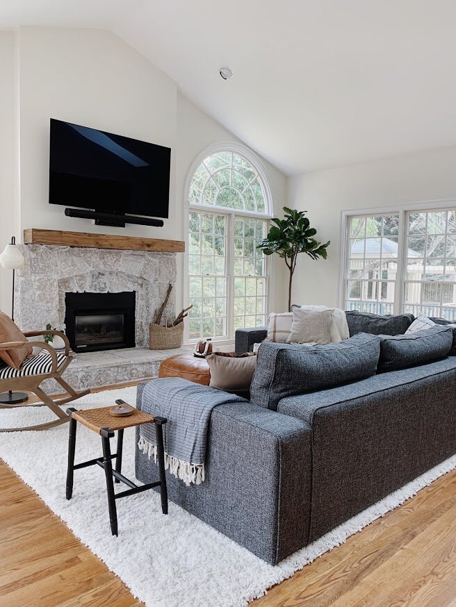
The one major update in the family room, aside from white paint which I had them do throughout, was the fireplace. The clients were on the fence with the stone - they didn’t hate it but something wasn’t right. We decided to do a limewash treatment which made a drastic difference. After swapping the mantle for a rustic wood piece, the fireplace looked brand spankin new!
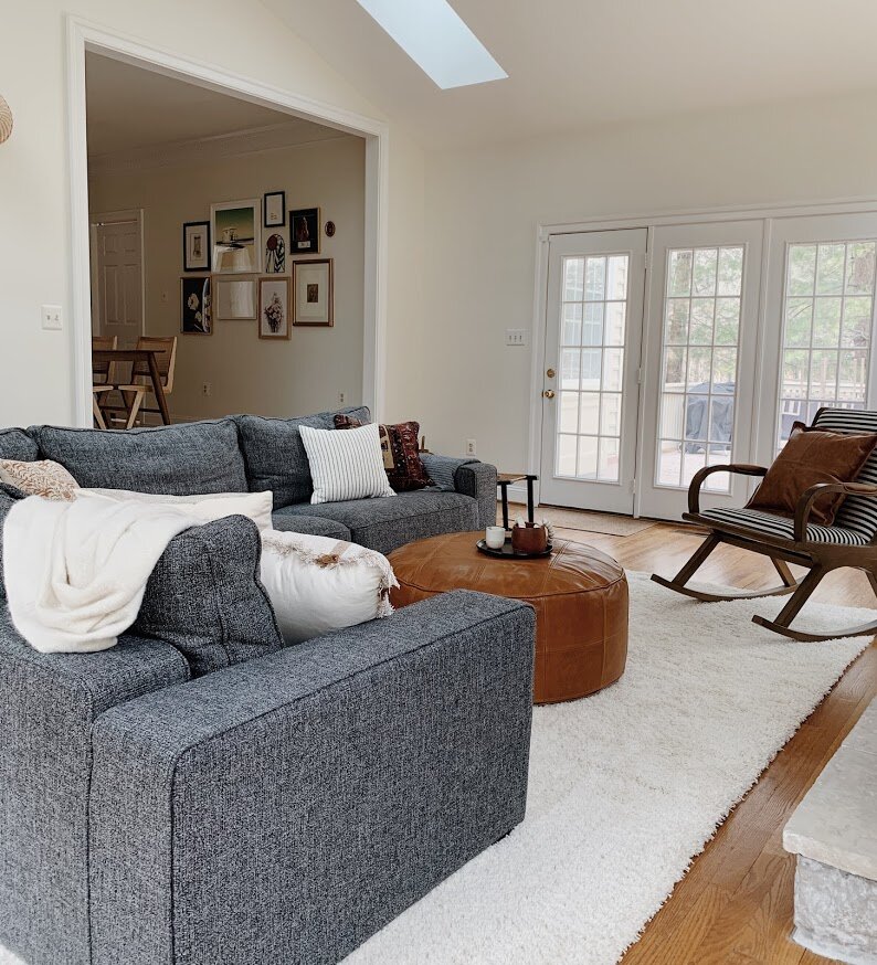
Here was my strategy with this room: Since I couldn’t do anything about the obvious traditional style of the home itself, I could at least bring in an overall organic feel with woven pieces, camel leathers, and natural dyes. I wouldn’t say organic is a style, but rather a feel, or a tone you can incorporate just about anywhere.
Due to the very long and narrow shape of this room, we had a custom sofa made by Interior Define, covered in an extremely family friendly fabric, (we used ‘Pepper’). Surrounding pieces had to be comfortable, durable, and interesting (without being loud). A striped rocking chair, for example, is visually interesting and balances the left side of the room, but it’s not distracting from everything else.
TVs are just not something you see in a lot of design reveals, but I’m here asking, Why not?! They are a part of most homes and I don’t like pretending they aren’t. Why designers refuse to show the TVs in their projects is perplexing to me. When styling this room with finishing details I pondered what to do on the fireplace mantle. I like a well dressed mantle just like anyone else. But nothing felt right. Books, plants, candles - any items I added just felt like clutter. I think when the only place for your TV is over the mantle, a nice clean mantle is the way to go. Instead, I focused on the hearth which balances the visual weight of the TV above.
I need to point out this brass and rattan sconce. The previous light fixture was a half dome that had moons and stars punched out - like a child’s nightlight. Actually, I just need to show you:
It’s not the best picture but you get the idea. It had to go! This light below is one of my favorite pieces in the house (interpret as you will - I have lots of favorite elements in this home)
Is this what people did before open floorplans became a thing? A little unusual, but we worked it out and I don’t mind it at all with a bit of soft styling.
One more fireplace appreciation shot. I can’t get over how gorgeous this stone turned out. I mean, I imagined it and loved it in my head, but seeing it in real life is just so much fun.
I mentioned this on Monday, but one of the best parts about designing in a colonial is getting to do whatever you want in each room! I mean, I aimed to give this home a consistent feel throughout - fun, vibrant, laid back - but how we achieved that feel from room to room is so different! The couples’ two offices are a prime example of how I created two TOTALLY different rooms to reflect them as individuals. And because they are on completely opposite sides of the home, it really doesn’t matter! Here is her office:
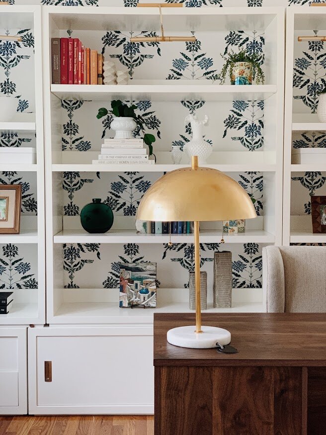
The star on all her zoom meetings? Why yes, yes she is. (No really, she told me so) We had the idea to paper this wall right off the bat, and float her desk in front. The paper itself is secretly edgy - there are snakes woven into the pattern which lend to her edgy personality. The family moved with the white base under the shelves, so I added on with additional units from this CB2 line.
Battery operated picture lights finish off these shelves for a subtle evening glow highlighting the various pretties on the shelves themselves.
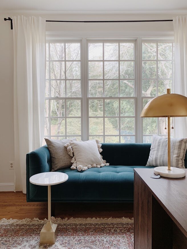
If you must work from home, you may as well add a sofa to that office! A perfect lounge place to answer emails, review files, etc. A little movement throughout the work day feels like a luxury these days, and since she had the room for it I wanted to give her a second option during the work week.
Not once did I compare the blue velvet of the sofa to the blues in the wallpaper. I didn’t need nor want them to be a perfect match, and I love that the sofa has a very subtle green tone.
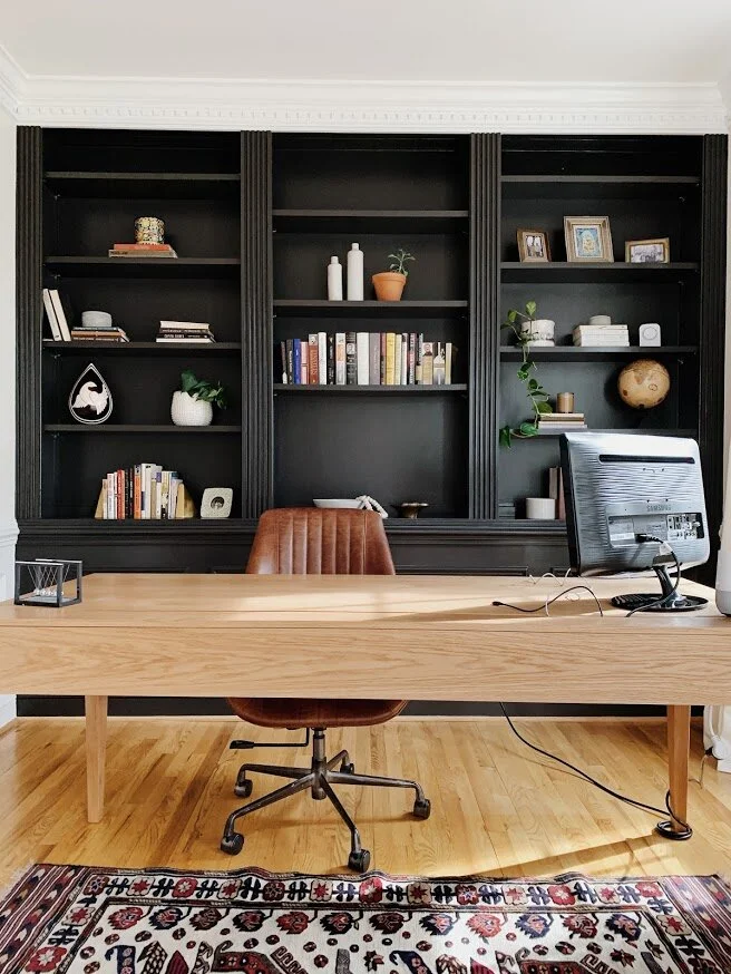
Like I said, the two home offices are polar opposites! Where I went soft and feminine in one, I went hard and bold in the other.
If I had to guess, I would bet his coworkers appreciate his zoom meeting background, too. Even if they aren’t outright saying it. ;)
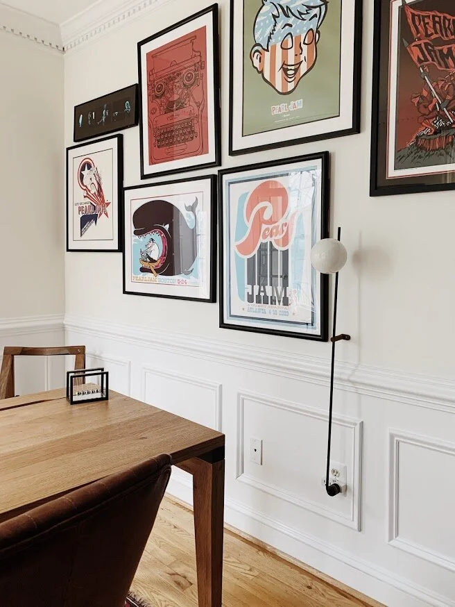
True story, this space was designed and complete before one evening when I got a text from the clients asking if there would be anywhere to add their collection of Pearl Jam concert posters. It was like meeting them again for the first time. A shared obsession with one band?! I was THRILLED to use these pieces and promptly had them frame their collection at Framebridge and played with an arrangement that would suit this office. I had actually picked that pole wall lamp before knowing about these pieces, so it was really fun to work the gallery wall around that piece. I am still beyond words excited with how this turned out!
Sophisticated meets rock n’ roll? Oh yes. Please and thank you.
Hard pivot now from Pearl Jam’s shrine to adorable childs room. Hope you’re hanging on tight, lots of twists and turns in today’s reveal! From black and bold to…butterflies!
I need to stop us here really quick to say, I think we can all agree the wallpaper MAKES this room. Well guess what? I was utterly stuck on wallpaper. I was chasing after big bold florals, enchanted forests and everything in between. But nothing felt right. I wanted a wallpaper that would suit this 5 year old little one as she is now, and when she’s a teenager. Everything I was finding seemed either too nursery, or too sophisticated. Fast forward to one of several afternoons I got to spend with a teen from our church over the summer, when her and her brother would come over and literally just play with my kids (and the other 234 kids in our neighborhood) for a few hours. I asked if she’d help me with this room if I paid her for her time, and within an hour she sourced THIS PAPER. It knocked me right over. So, huge shout out to my friend, Meredith Jolly! Thank you!!
The velvet teal bed felt like an unexpected pairing with this wallpaper, which made it feel just right. I really got into this groove of making brave choices with this home, and their daughters bedroom was no exception. Don’t overthink design, friends! You never know what you’ll uncover.
The rug felt like another unusual choice - the bed doesn’t really match the wallpaper which doesn’t really match the rug - and it all totally works and is glorious.
I wanted to finish the room off with more neutral pieces - you don’t really see the winks of black and brown in the wallpaper until you layer those colors in and it hits you.
I think if happiness were embodied in a physical room, this is what it would look like. It’s just pure delight in here!
I can’t believe that’s it for this reveal! Or is it? Good news, the family has just hired me to work on the master bedroom with a quirky adjoining side room, and their finished basement. Who knows what we’ll get into but I’m all in. After these rooms I am sure it’ll be very exciting, indeed!
Thank you so very much for coming by! Every hit to our website helps our little business so much, so we sincerely appreciate you taking the time to visit on our very special reveal days. It truly means a lot! Have a wonderful rest of your week!

