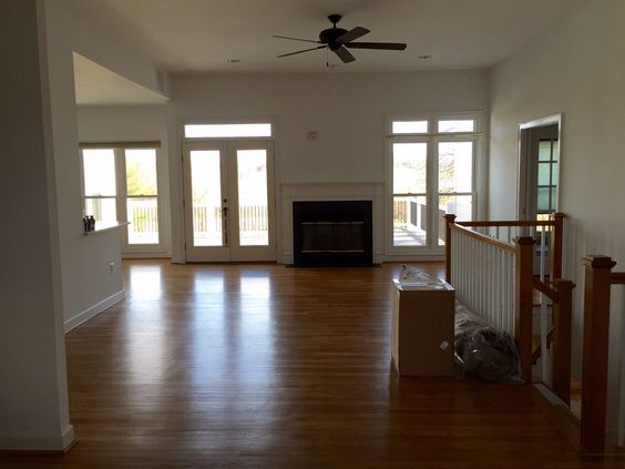
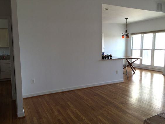
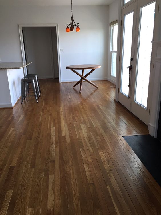
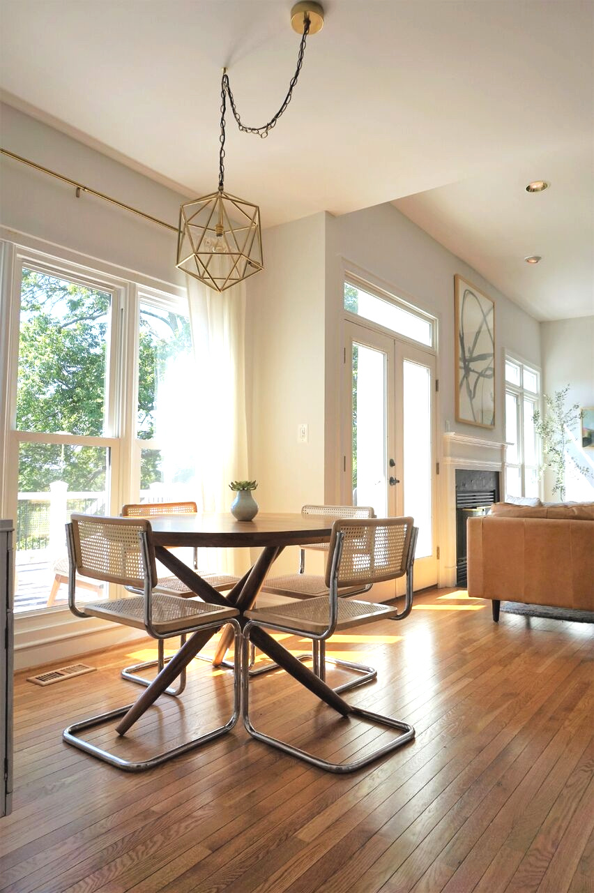
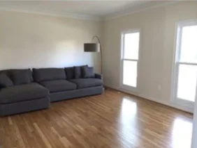
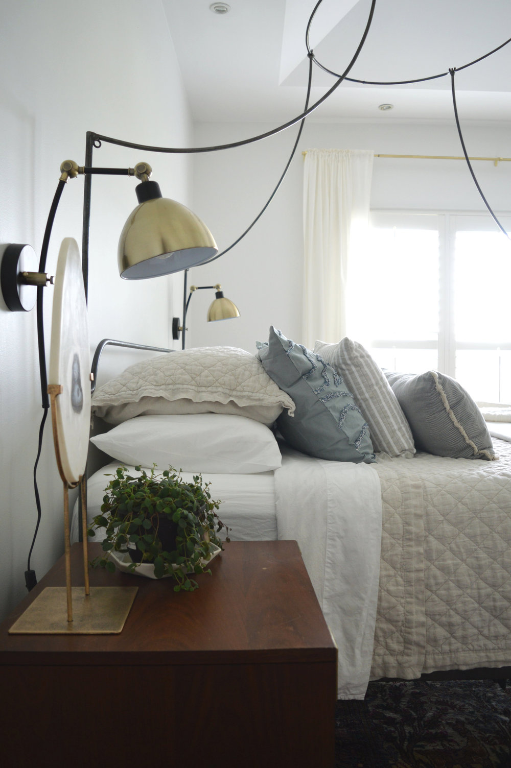
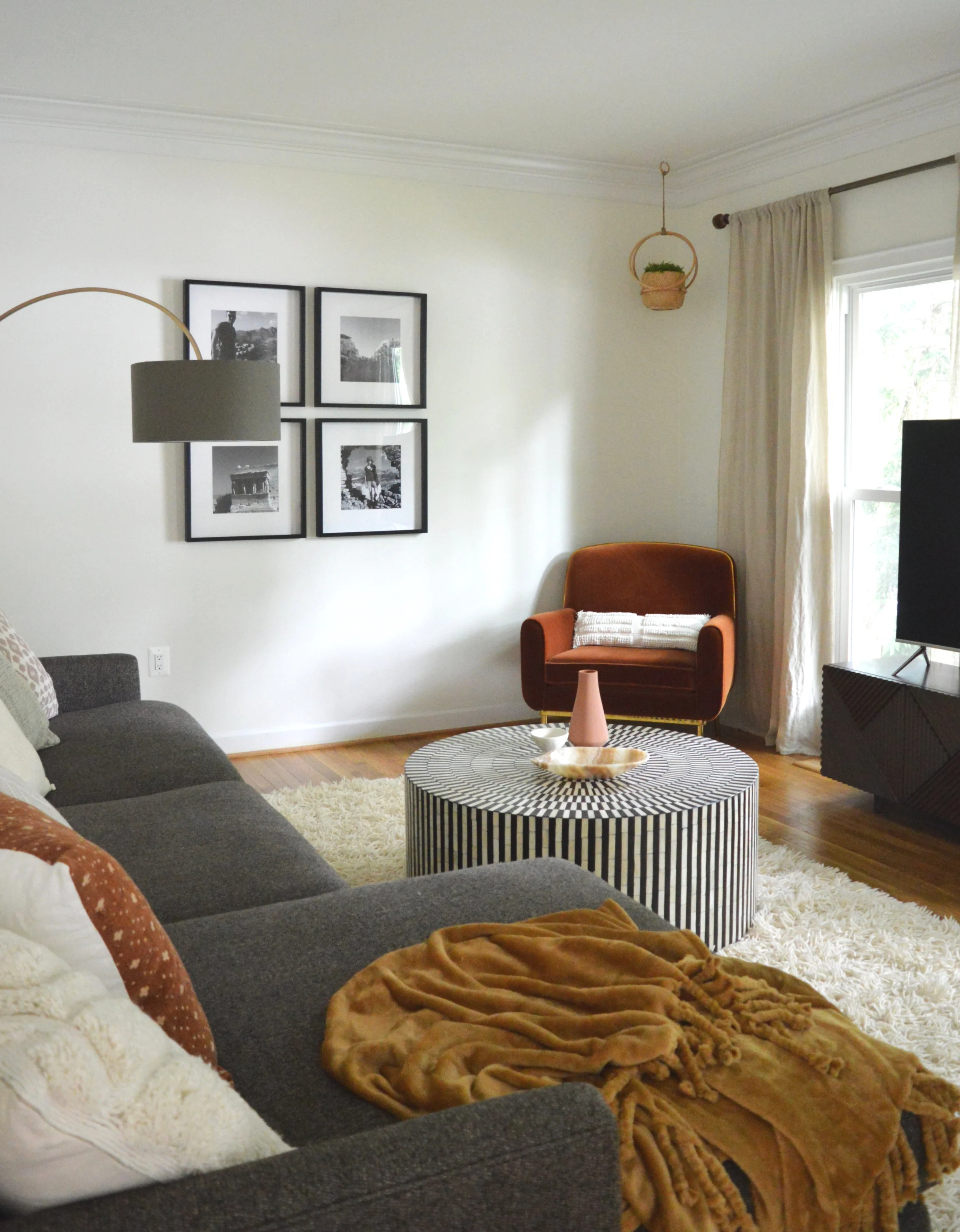
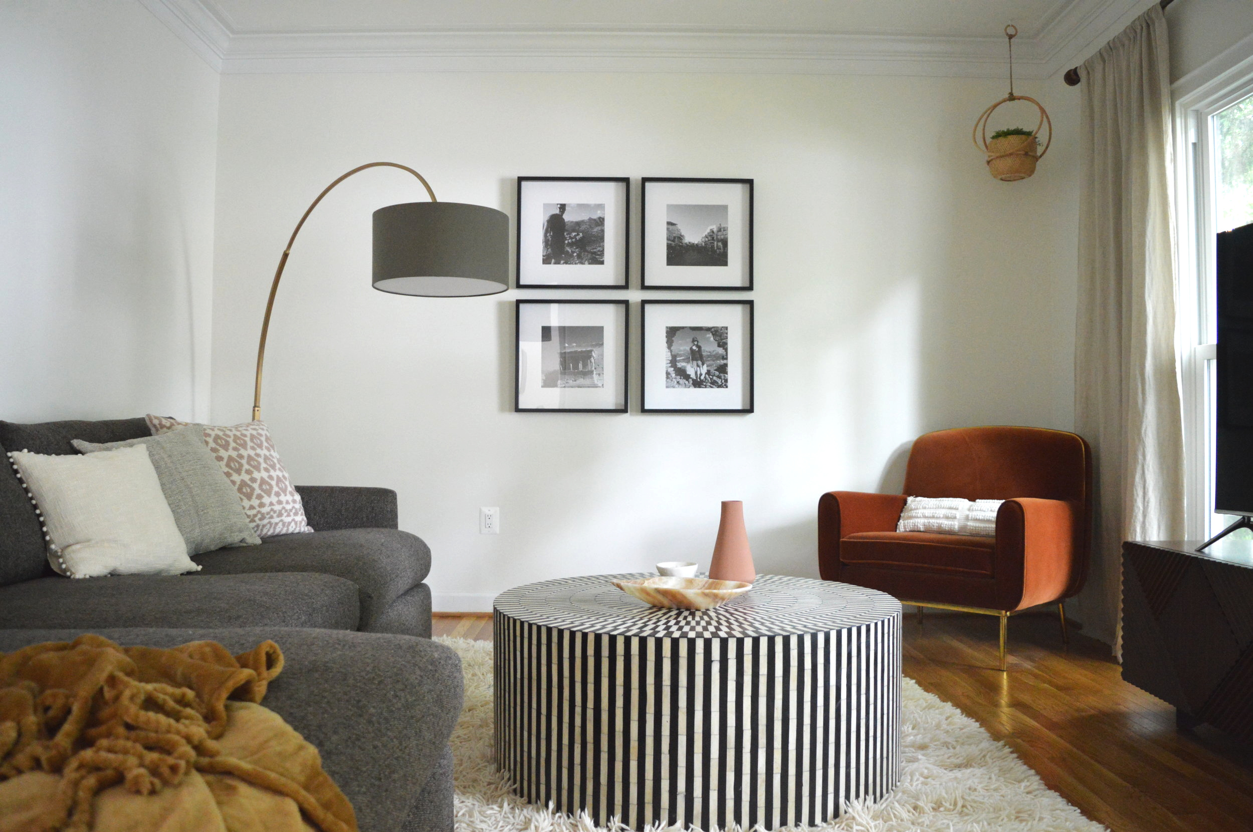
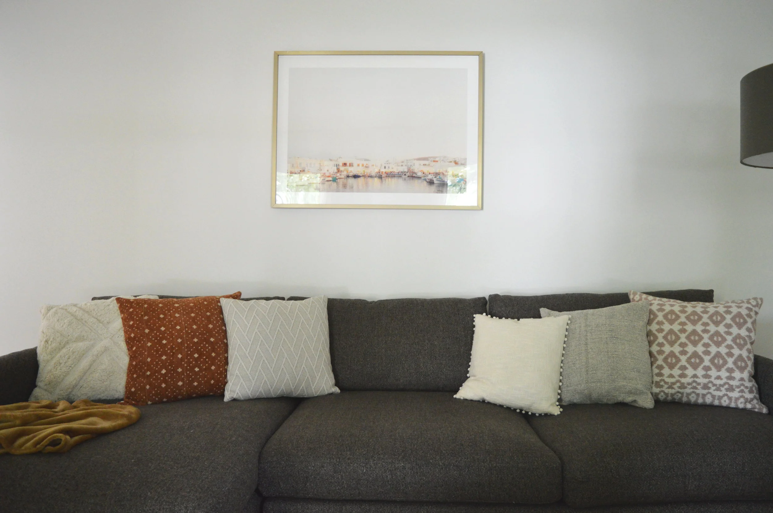
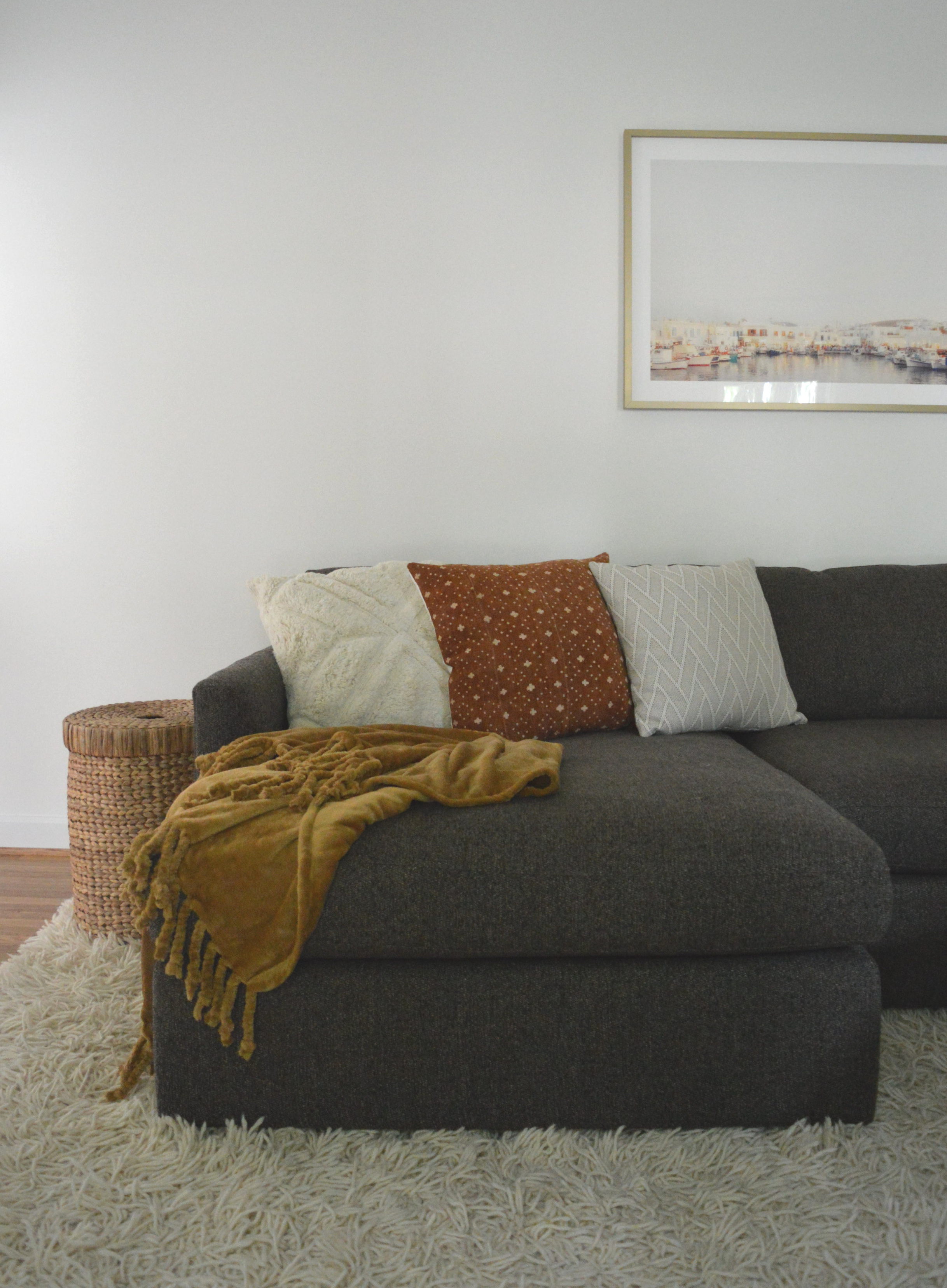
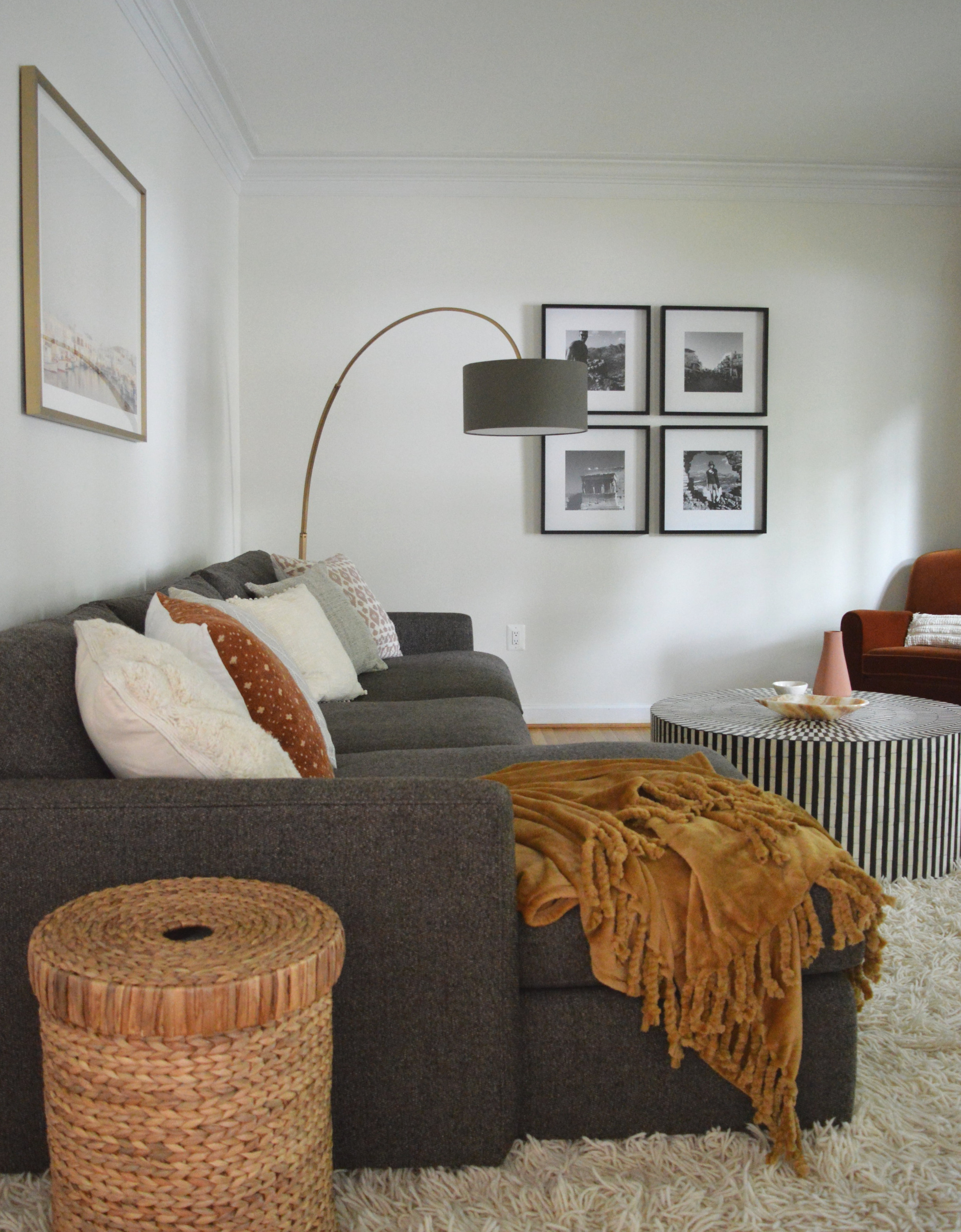
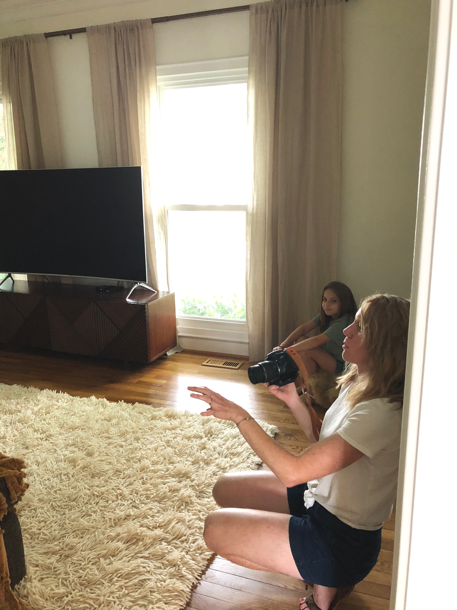
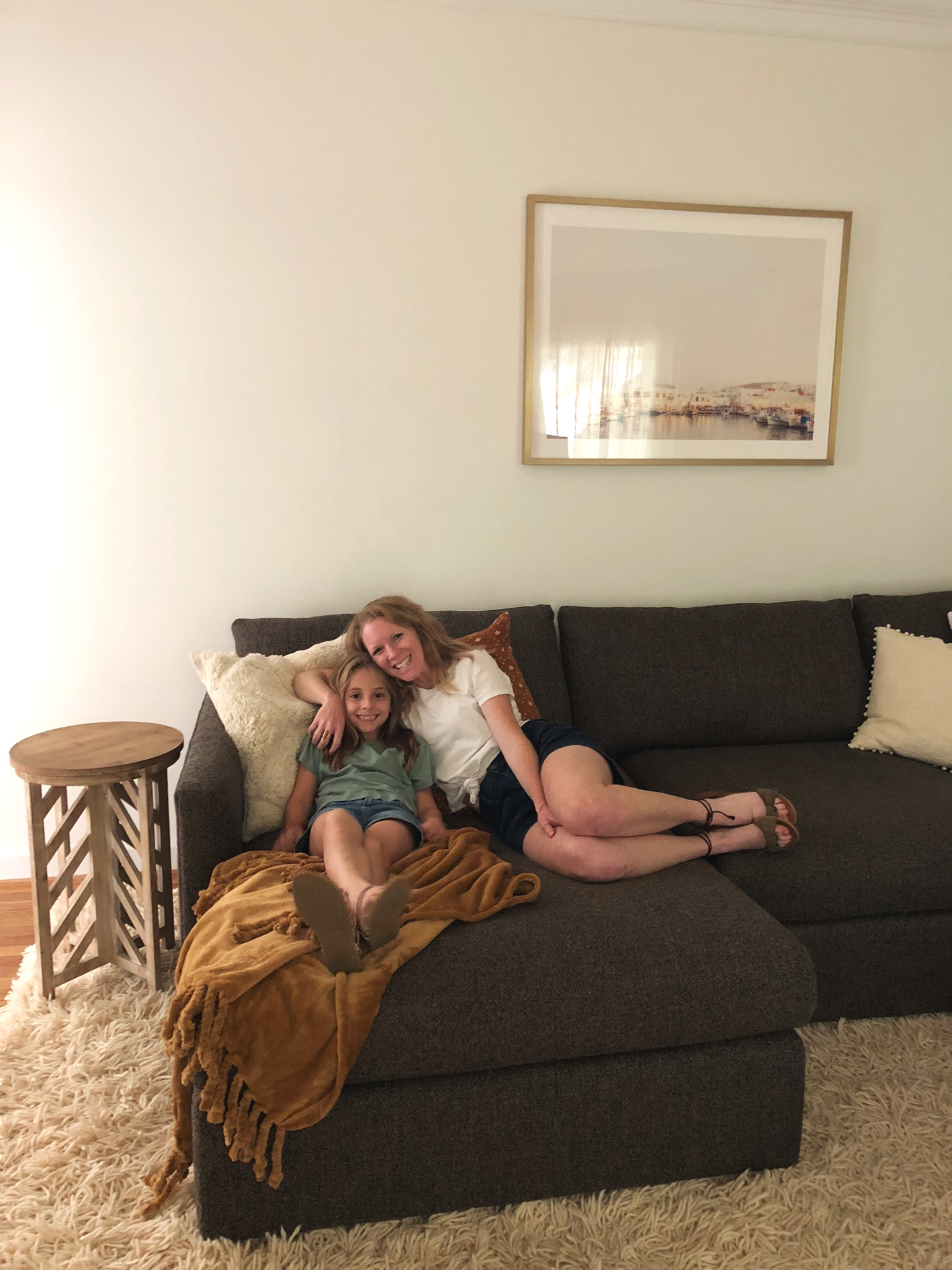
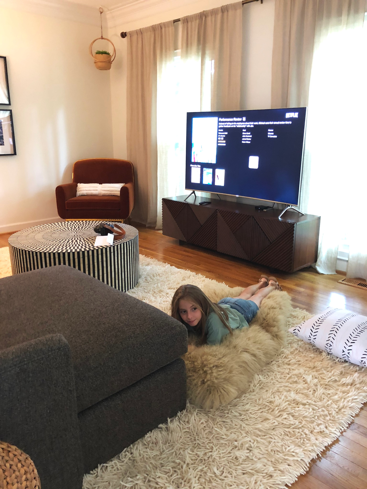
Hard to believe the images above were taken several years ago! As promised, I’m sharing one final tour of this beautiful single family home in rural MD we have had the pleasure of working on the last few years. What started as a single-room project turned into a full home as Dani added room by room to have done. Over the course of working on her home I have had design opportunities beyond my wildest dreams, but when Dani first came to us, all I had were dreams. Dani had full trust and confidence in us before we had even proven we were capable. Do you know how valuable that is to a small business?
It’s everything.
I can’t even count the number of design renderings that went into completing this home, or the hours spent sourcing the various elements of each individual space. The scope of this home was larger than any project we’ve worked on before, but it was important to me every step of the way to make intentional design choices and thoughtful decisions. When I walked through one final time last week, I just felt so blessed by this home, this job, and this sweet family. Every second spent on this home was worthwhile.
So let’s walk through, shall we?
Great Room
Breakfast Nook
Dining Room
Family Room
Master Bedroom
Studio Workspace
Image by Paula B Photography
Image by Paula B Photography
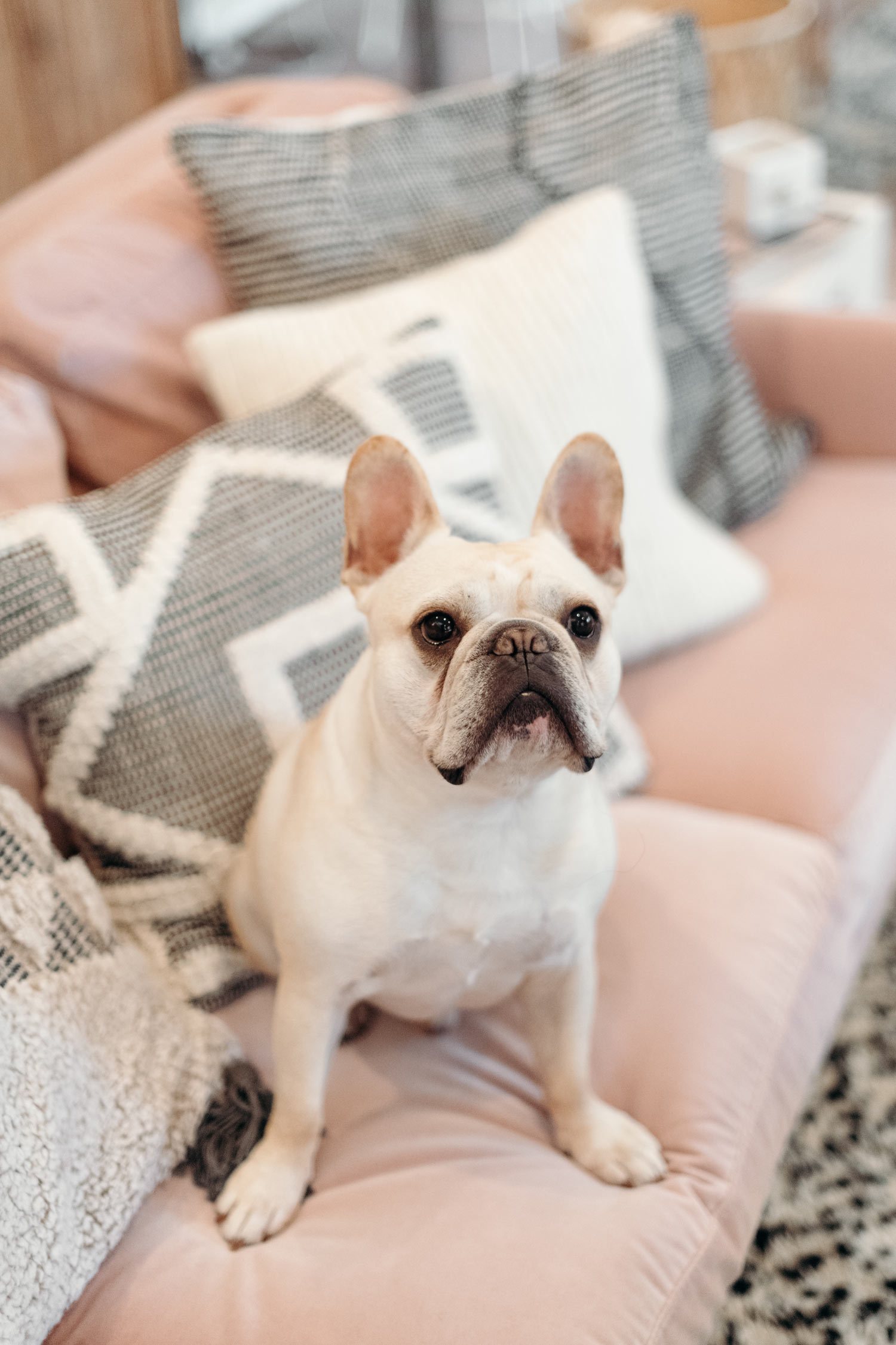
I can’t wrap up this tour without including my buddy, Lonny! I’ve never seen so much personality in such a little package!
Image by Paula B Photography
Hard to believe there are no rooms left for us to work on in this home! It’s bittersweet to be finished but I am so proud of the work that was accomplished on this home. It was a total team effort, with Dani and Nate tackling every single aspect of the design laid out, and now they can truly sit back and just enjoy it all.
“Due to the success of the first room and their one-of-a-kind warm personalities we went on to work with StyleMutt Home for 5 additional rooms. I just couldn’t imagine pulling a room together without them! They transformed a boring rental home into the coolest house on the block. When we eventually say goodbye to this beautiful space it will be tough, of course, that also means we will be back to working with Chelsea and Cate all over again!
”
Thank you so much for coming by today and following the process of this beautiful home!
