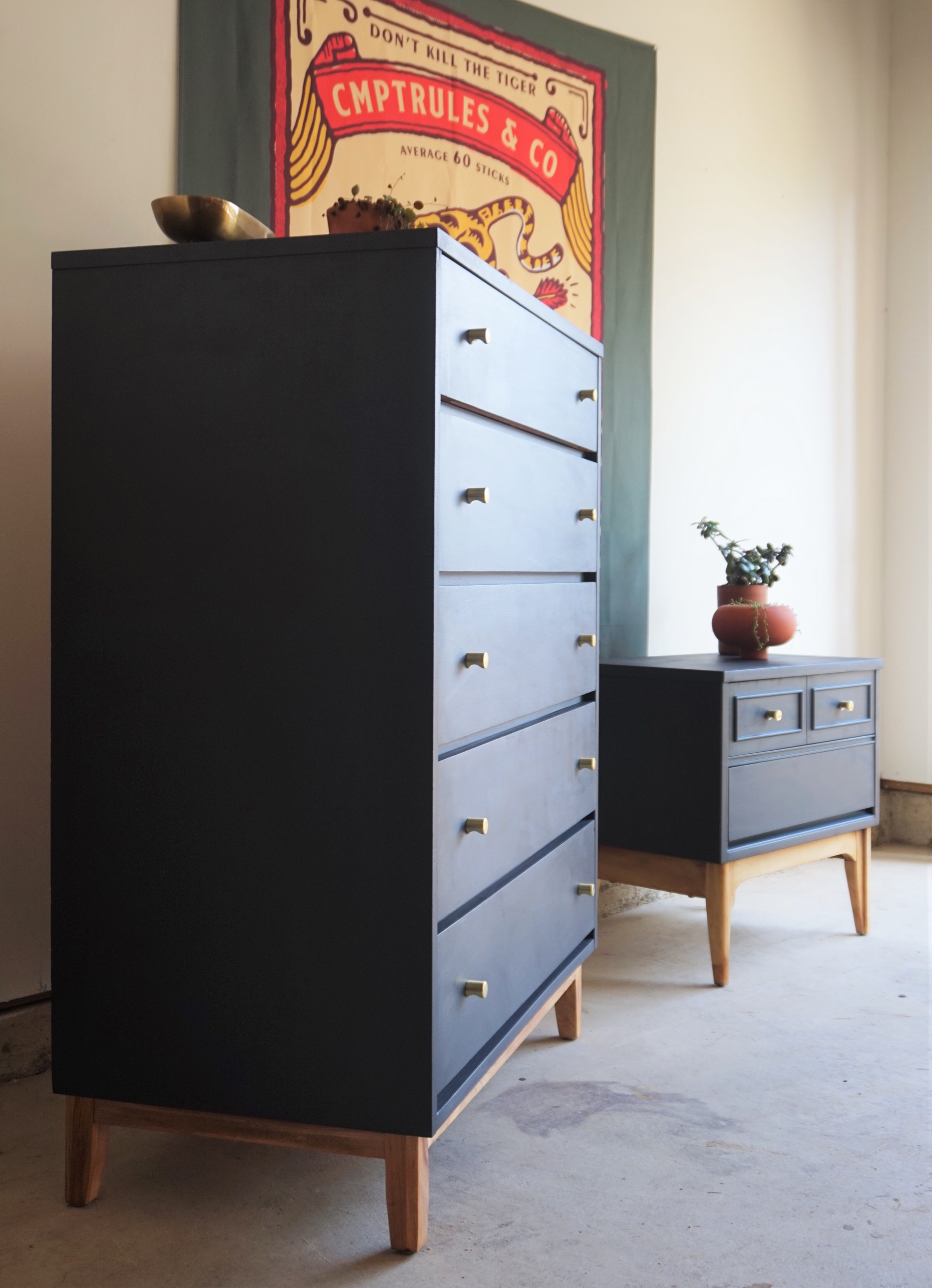
Sometimes I rather fancy myself a matchmaker of sorts. I like to pair raw pieces with the right refinish and then pair refinished pieces with the right buyer. I’m like the Hitch of furniture if you will. I’ve even been known to take lonely-heart items in my workshop and fix them up together (remember my light fixture family tree for example?).
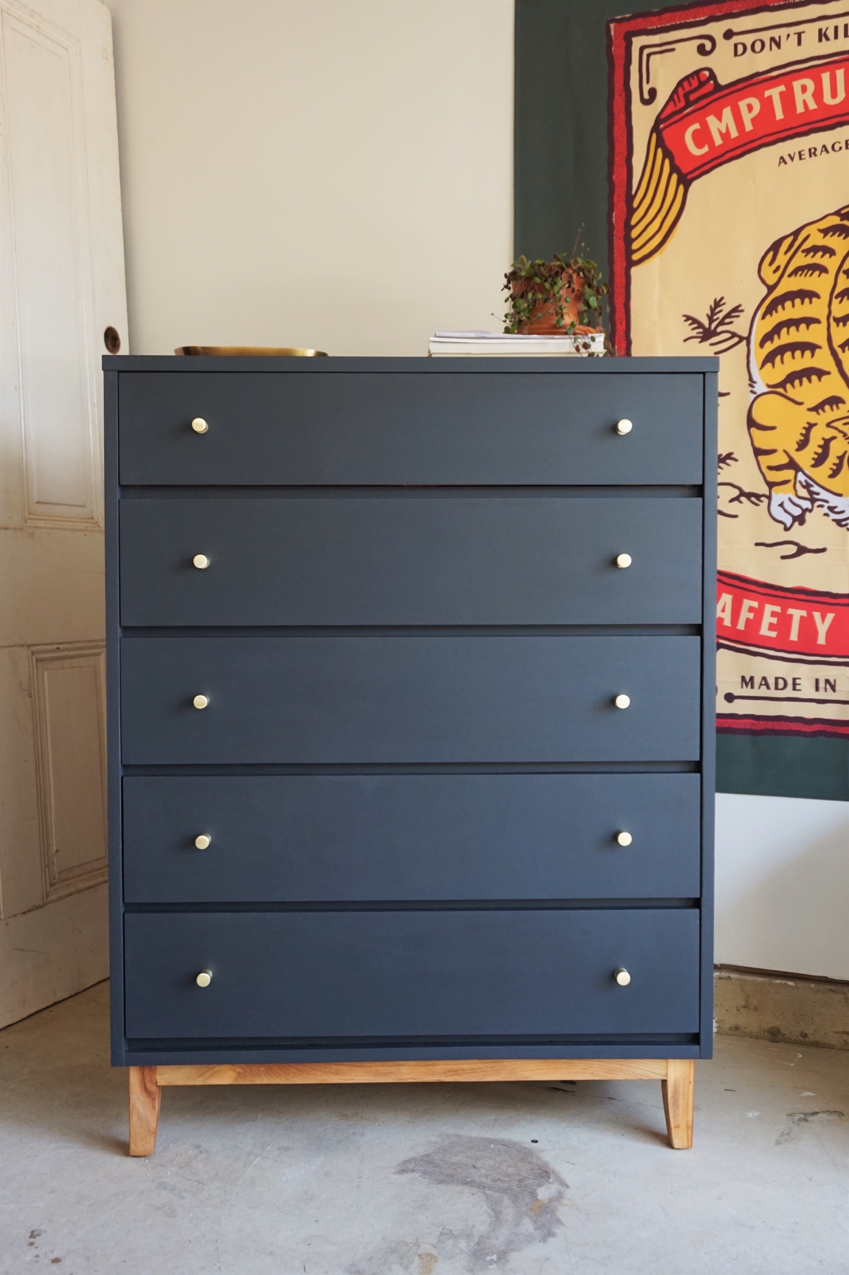
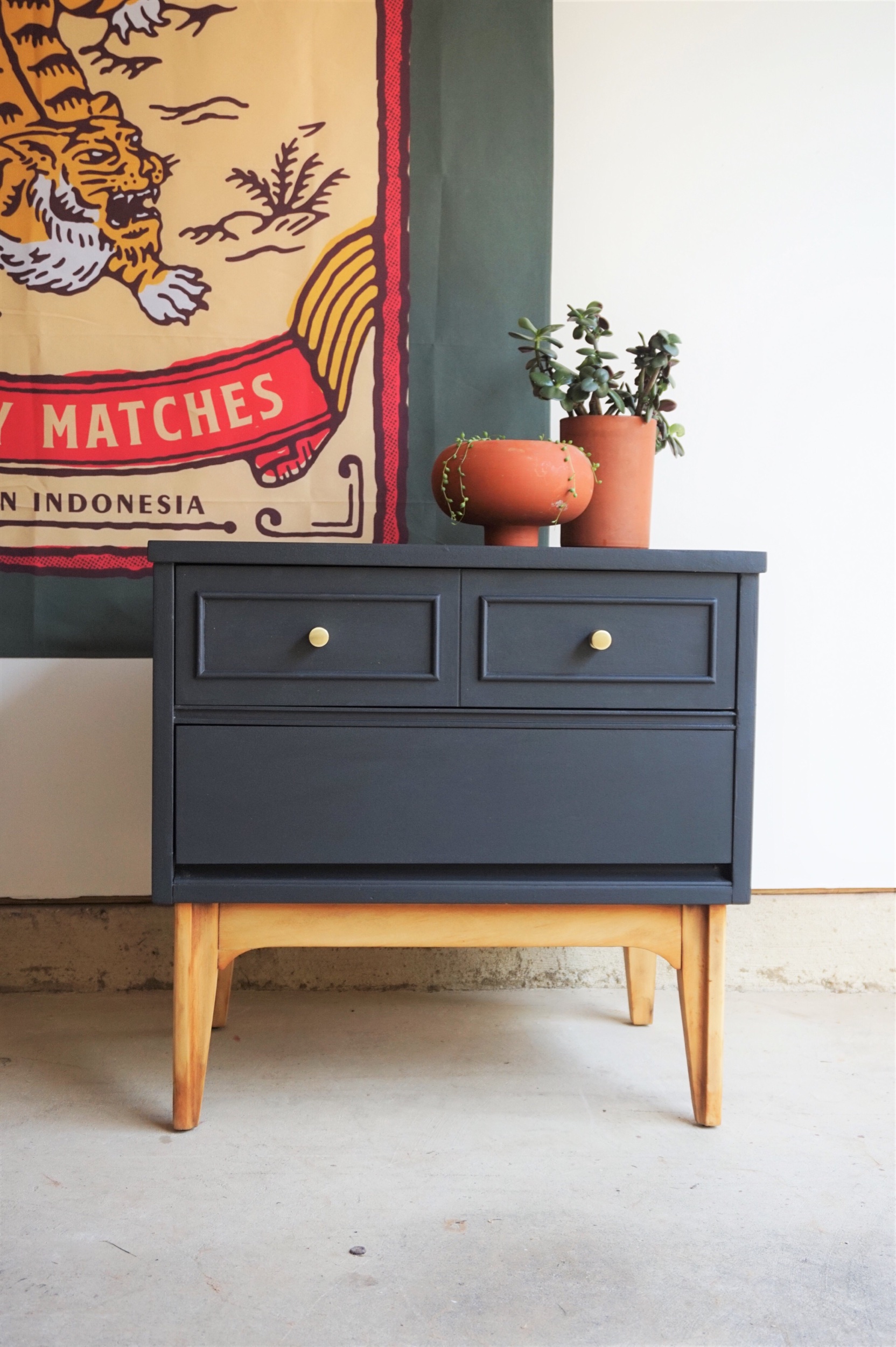
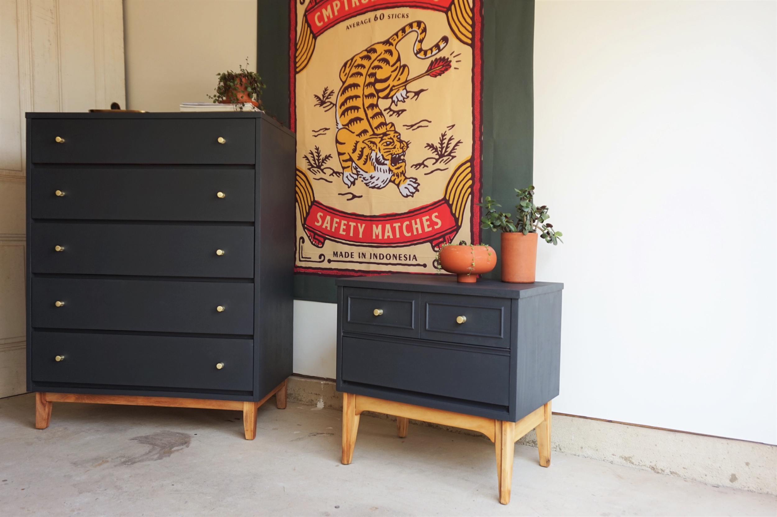
I didn’t originally plan to pair this dresser and nightstand together, but the longer they sat next to each other in the workshop, the more I realized their clean lines and tapered legs “spoke the same language” as we like to say. Both had debilitating body damage that made paint inevitable. The dresser had some serious scratching and that nightstand - some water damage (did you see the glaring chunk of missing veneer?). So I decided to bring them together in holy refinishing matrimony.
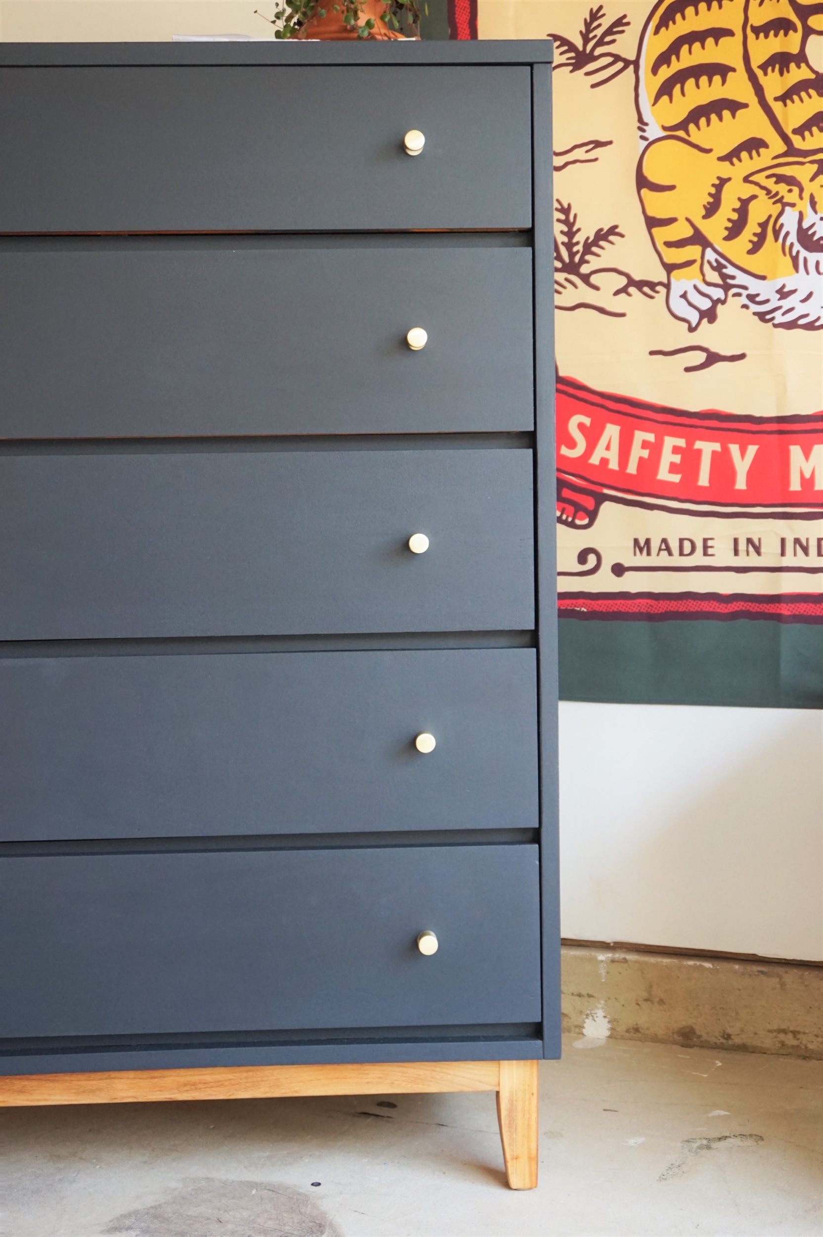
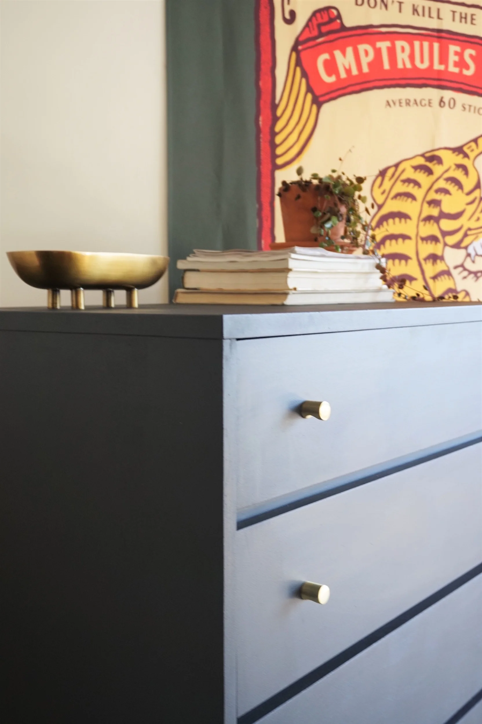
Both pieces were perfect candidates for a coat of “Black Boudoir” by Behr - a favorite inky blue/ black shade that plays well with brass hardware and warm wood tones.
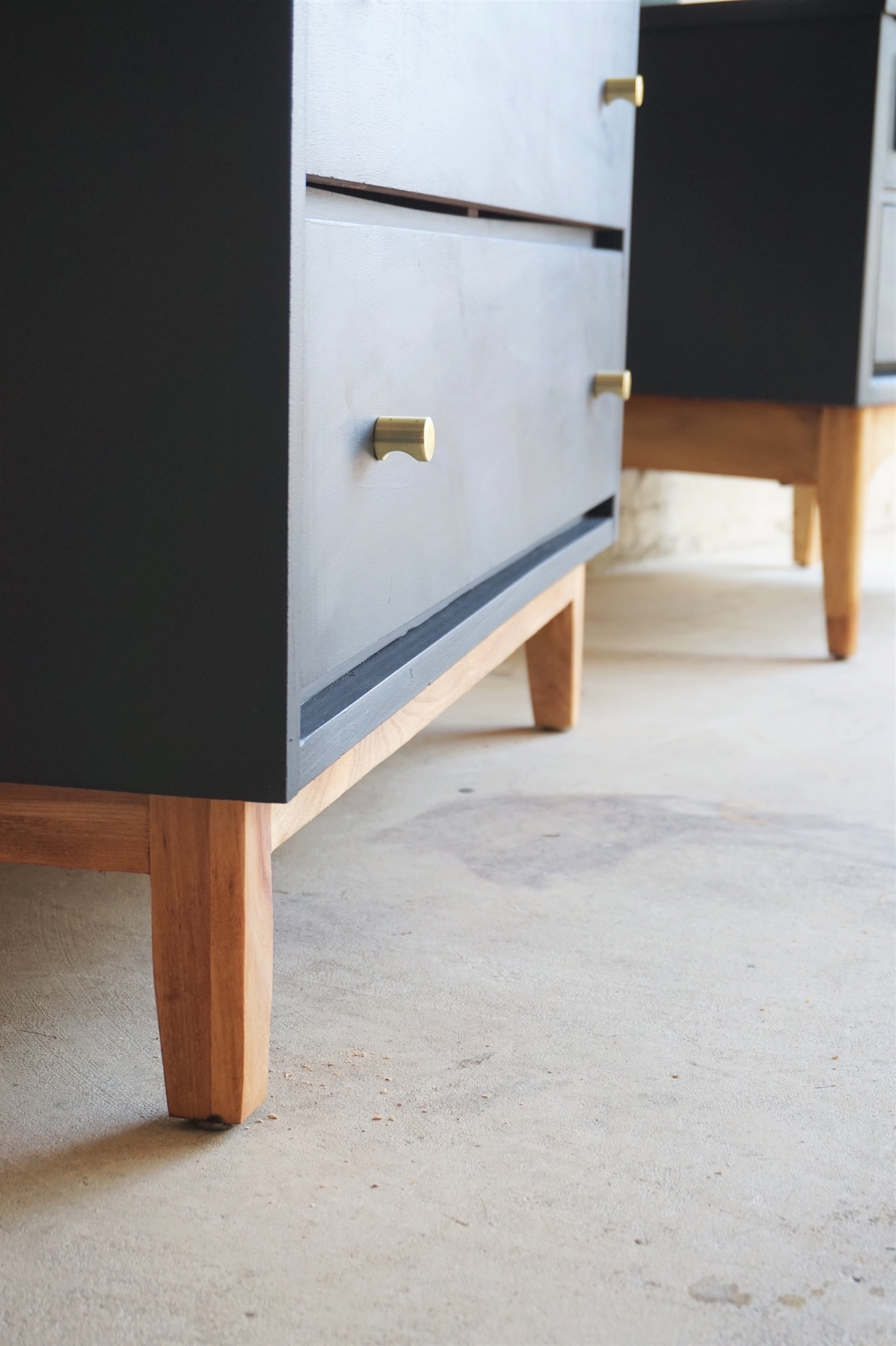
Although their original stains were similar, I sanded both sets of legs down to their skivvies and gave them a buttery wax finish.
Ok so I might be a bit of a one-trick pony. In addition to the repeat color pallet, I also deployed a favorite for the hardware - these Amazon.com brass whistle knobs have made their appearance here and here - oh yeah and here too. But really people - I am who I am *insert shoulder shrug emoji here*
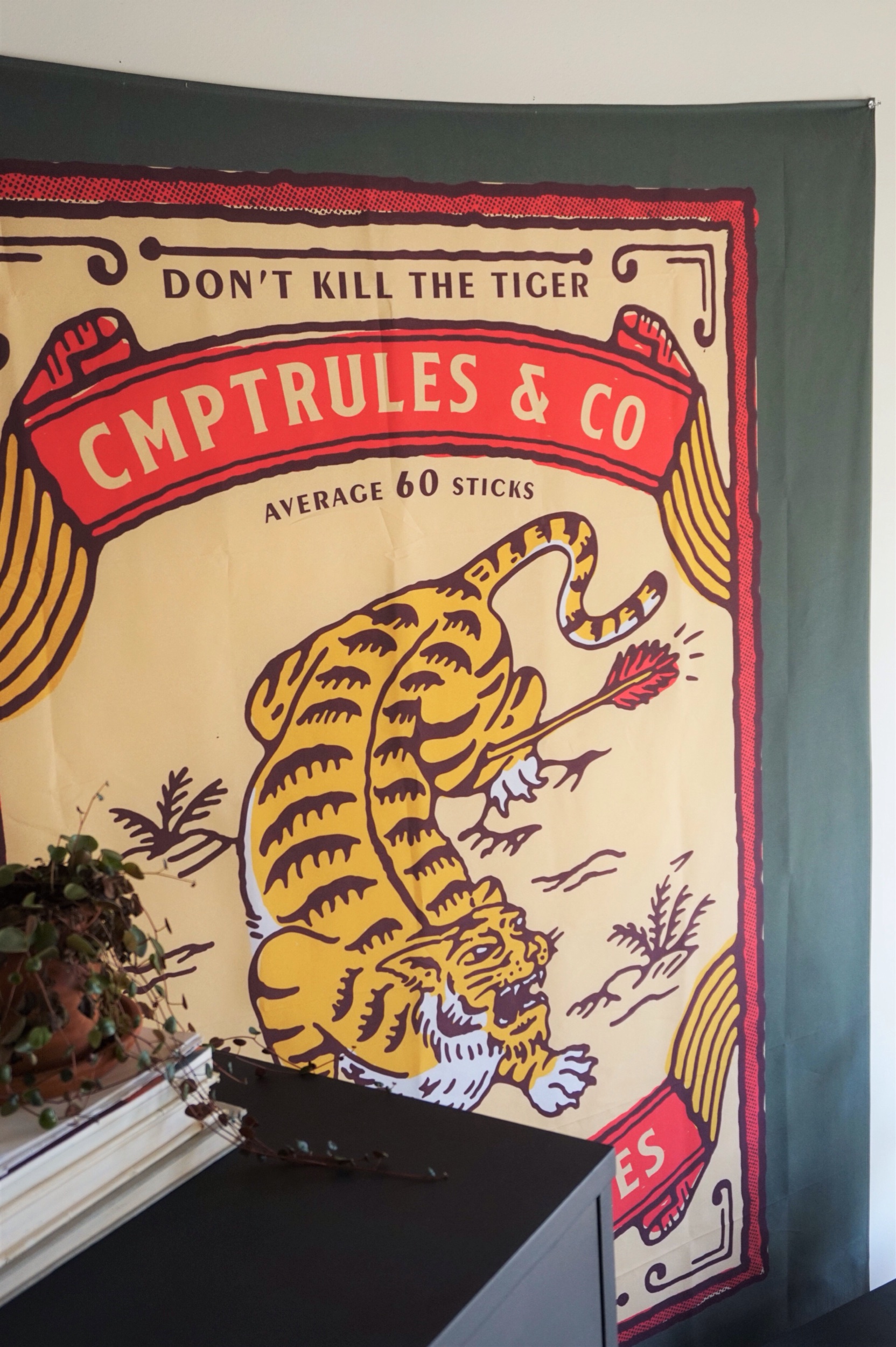
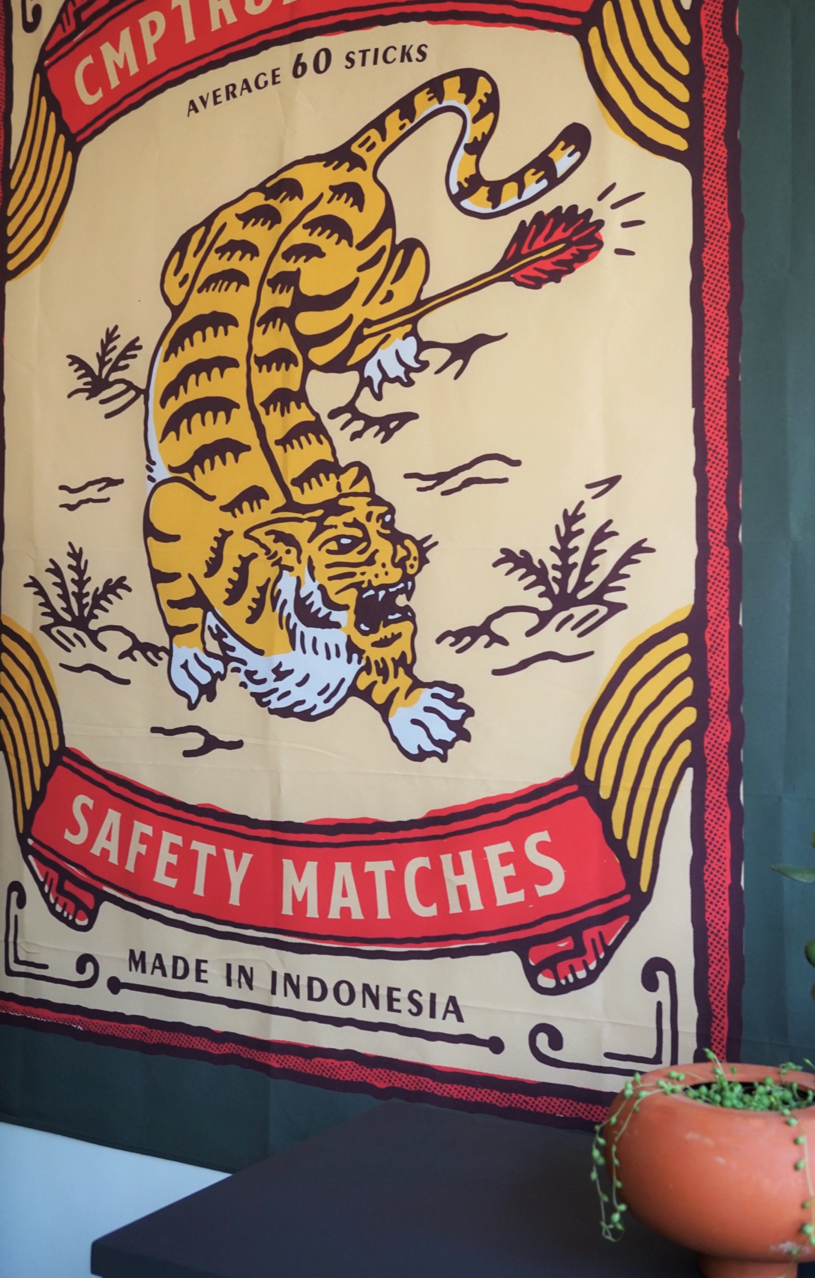
For the styling, I had a fun opportunity to play with a new-to-me product: an oversized tapestry from Tapart - a company that sells modern tapestries by independent artists. The silky quality to the tapestries almost makes it feel more like a vintage scarf than a wall hanging, but they adds an easy punch to any space and have a variety of designs from surreal to graphic, abstract to cheeky matras.
I love to play around with art in our home but sometimes I catch myself craving something with a HUGE impact (just preferably not to my wallet). I mean, how many of you have resorted to hanging a sarong on the dorm room wall for this very reason? Well save your sarong for the beach ladies - you can still keep your wall décor casual with this hanging piece of fabric while simultaneously offering up some upscale visual impact.
It’s no wonder that Tapart and it’s contemporaries at Urban Outfitters and Society6 are now offering tapestries as a simply stylish way to dress your vertical décor space.
What I love most about this company is that each tapestry supports the artist who designed it as an alternative way for them to sell their work.
TapArt is an online marketplace of artists. We handle and market our artist's designs while they focus on what they do best - creating artwork.
Inky Dresser + Nightstand
Now Available for Sale
Dresser: 34”W x 19”D x 45.5”H
Nightstand: 24”W x 15”D x 23.5”H
$695 for the set
If you are interested in this piece or a custom order like it, email me at cate@stylemutthome.com


