Reader Design: Nicole's Thrifted Nest

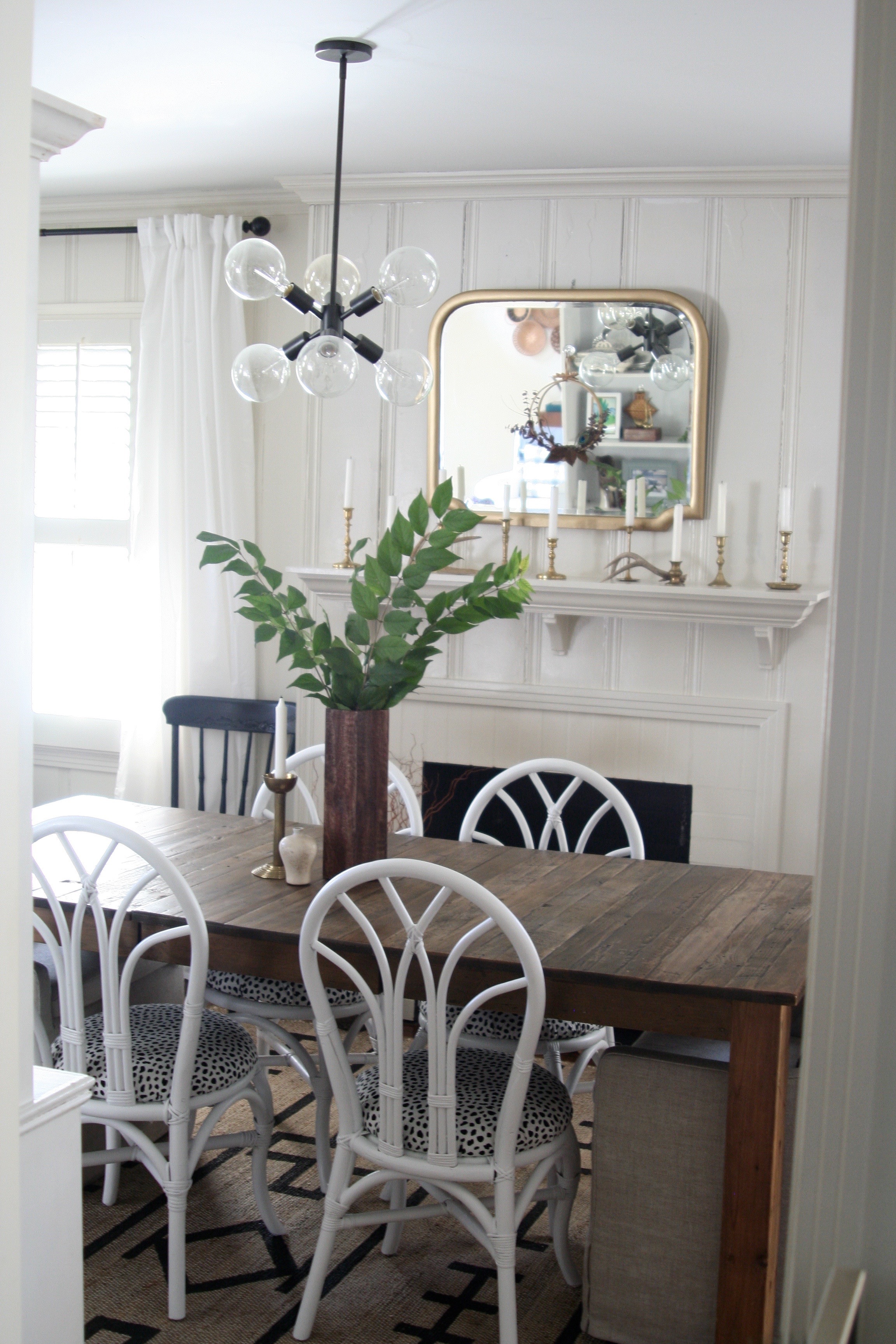
A moment of levity comes this week with Nicole's beautiful home. Now, most of you know Nicole as a #howyouhome co-host along with our very own Chelsea. Today, she's giving us the inside scoop on her Nashville home that we've come to admire often in those little Instagram squares. 

Nicole and her husband moved from NYC to Nashville several years ago and are now renting in the area. That means Nicole gets the opportunity to be extra creative about her decorating!

From Nicole:

I like to define my style as eclectic but with a classic spin. It’s definitely a mix of midcentury modern, boho and eclectic with traditional touches. All of the styles together create a more unique look.


Her living room here has it all - boho elements, thrifted finds, plant life, and some amazing mix-and-match patterns to keep it interesting. 

I’m inspired by the ocean so blue seems to be my go-to choice of color to decorate with. I love pictures of the ocean, boats, and anything tropical. It just relaxes me. A home that is collected over time and from many different sources makes it more unique to you. A ton of my home is from Craigslist and thrift stores! Not only does that make my home more personal to my family but it also makes it more affordable. I prefer to keep a more polished look though so I get rid of unnecessary clutter or pieces that don’t add anything to my space.

I wouldn't call Nicole's style minimalist, but she's certainly careful about the items she chooses to surround herself with. 

‘m not gonna spend a lot of money on things that are trendy. I’ll either thrift them, come up with a way to DIY it, and use accessories as a way to change things out with the trends and seasons. We’d rather spend our money on things that are timeless and will stick around with us for years to come.


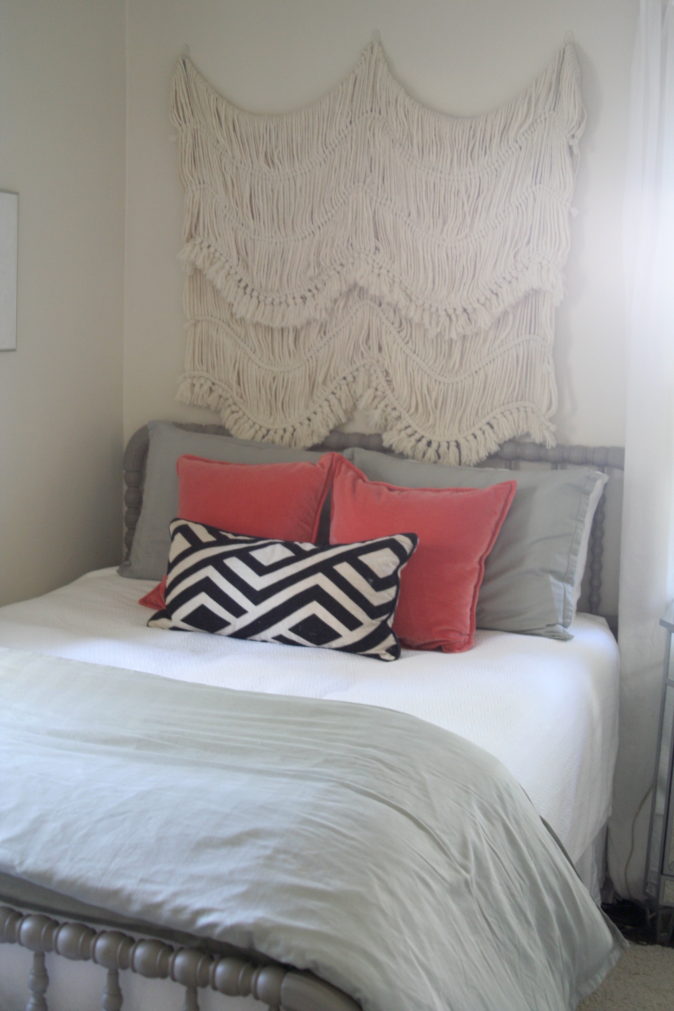
The bedrooms are all kinds of wonderful with their textiles and wall hangings. They're the kind of bedrooms I would have loved to slumber in after Tuesday night - anyone agree? 

Nicole, thank you for letting us in to see more outside those tiny squares. Your home is beautiful! Follow Nicole along @sweet_domicile for more! 

We're off the Reader Designs next week for Thanksgiving but I'll see you all in December!

Modern or Coastal ||Flip List Item No.2||

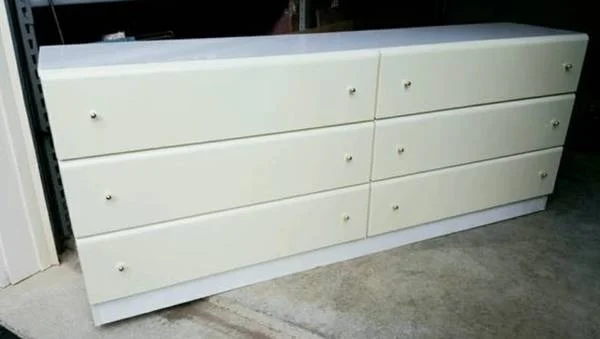
So I'm trolling craigslist [like I've been known to do] and I found a modern dresser in need of some TLC.  Now normally, I would pass right by a laminate dresser but this piece was... special.

It's hard to tell in this pic, but this "white monster" as I've affectionately nicknamed it, had a weird cream/white two tone thing going on.  But it was still a modern dresser with glossy-fronted drawers that slide like butter.  It the perfect candidate for Furniture Flip Bucket List item No.2: wrap a piece in a wood shim treatment.  

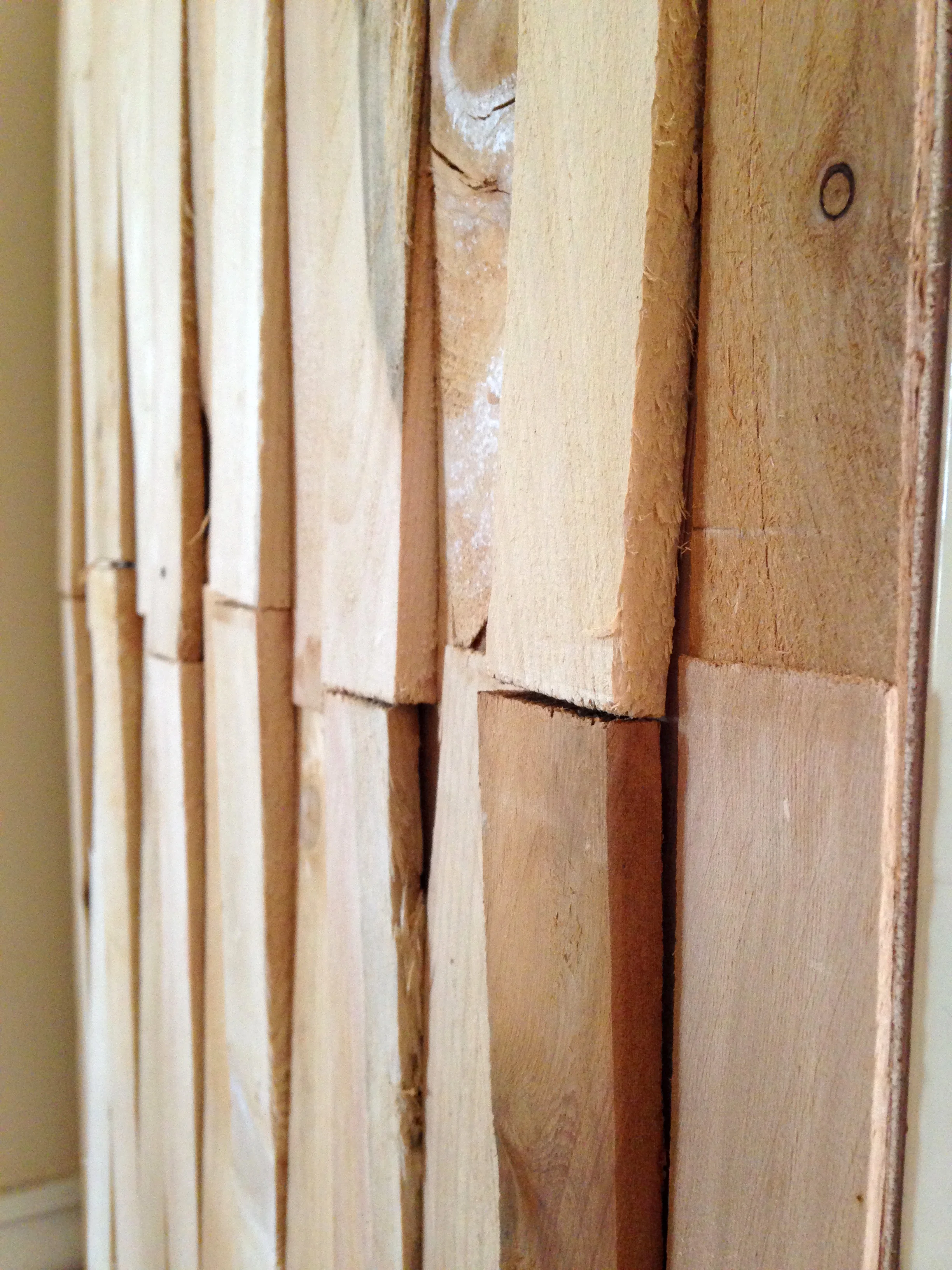
wood shims taper off to one end so that you can wedge them in to help level something.  I could have used flat wood and gotten more of a butcher-block look, but I wanted to use shims to recreate this uneven affect in my inspiration photo:

So I went about covering the bright-white yucky laminate portions of the dresser with the wood shims: the top, sides, and toe-kick.  I started out with the intention of creating a polished modern look like the photo above but as I worked on it, it began to steer me in a different direction.

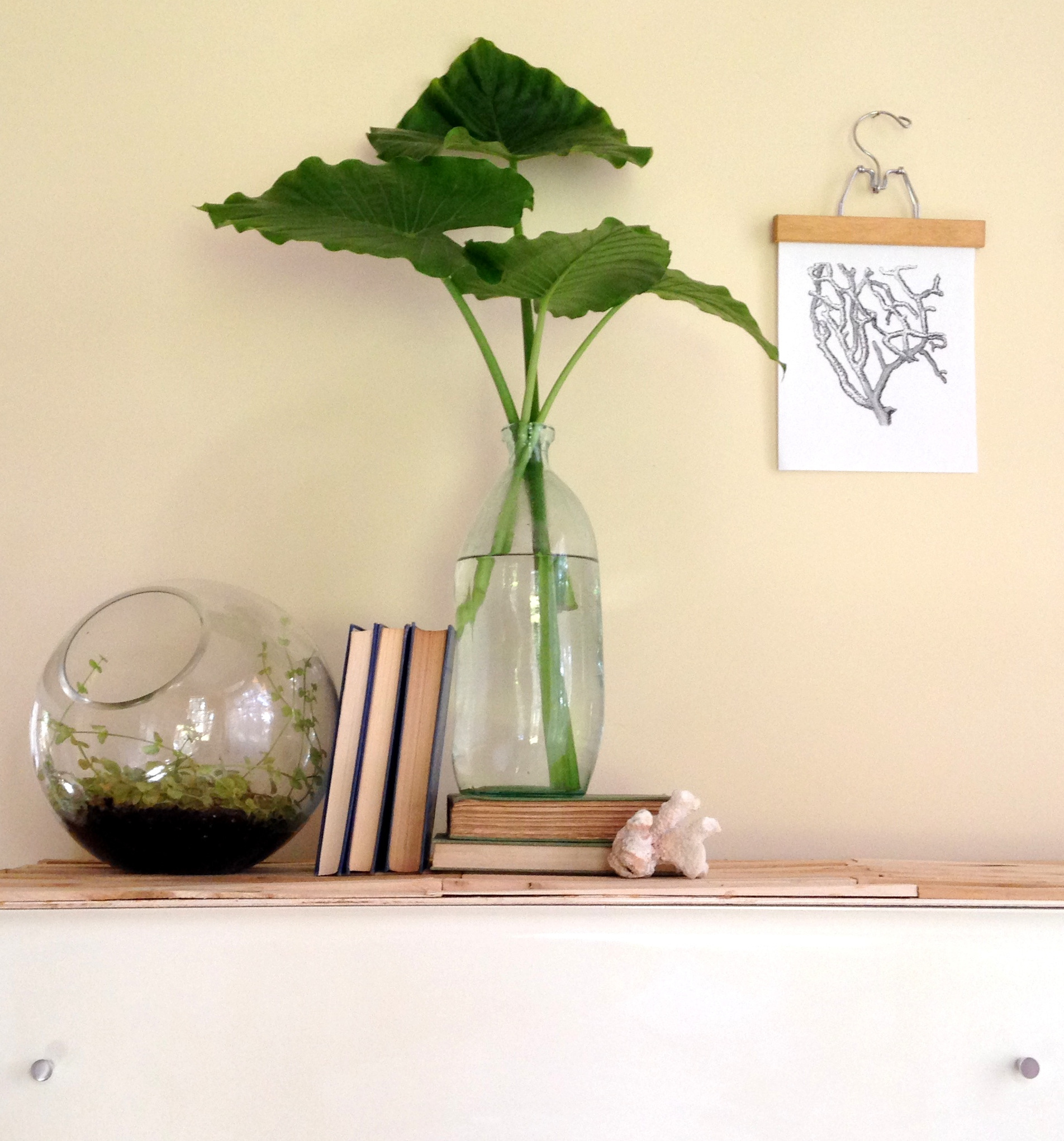
I liked how raw and rustic the cedar shims looked untreated (and not to mention the cedar smelled AH-MAH-ZING).  So I just went with it and ended up with a piece that's both modern and coastal:

To play off the unfinished wood's beachy vibes, I styled it with some tropical leaves [that I may or may not have harvested from a decorative potted plant in a parking lot.  I kinda felt like Chelsea did when "smuggling" home some paint sticks for this DIY project].

I then added a couple seaside touches like this piece of coral.

To play up the dresser's more modern side, I added vintage candle sticks with clean lines.  Despite the uneven surface, the shims are narrow enough that items large and small can find a flat surface to rest on anywhere across the top.

Photo Oct 31, 11 45 44 AM-001.jpg

And modern satin nickel knobs on the glossy drawer fronts make a nice modern finishing touch.

All together the piece sings a modern-coastal song:

Photo Oct 31, 11 43 38 AM (1)-002.jpg

Modern Coastal Dresser
$600
SOLD


As for the progress on my 2015 flip bucket list, that means I've got 6 down and 1 to go before the end of the year.  Woot Woot!

Want to catch up?  Since January, I've crossed off items:
No.6
No.5
No.7
No.4
No.3
and now No.2: wood shim treatment

Here's to hoping that I can squeeze in item No.1: Build my Own Bakers Rack before 2016!

Reader Design: Amber's Peaceful Backdrop

Hi friends! As Summer and Fall seem to be in a bit of a tug-of-war here in Northern Virginia, this coastal inspired home tour seems pretty perfect for this 80 degree Friday in November! Amber, (Restless Arrow, @restlessarrow) has been a beach lover her whole life, but more recently began using it as her primary inspiration for decorating her home. After a good run with loads of color, she's found her nitch with creamy neutrals - and it suits her young family just right!

From Amber:

My first living room had one brown wall, yellow walls and black and red furniture! I used so much color and used it so wrong! Now, please know: I absolutely love color and so many of my friends do it so extraordinarily well. But me?  I’m much better with soft whites and neutrals. Our white couches stand up to the test of our wild boys, yet provide the perfect backdrop for my love of neutrals.

Fact - White slipcovered seating is incredibly easy to keep clean. Zip off, toss in wash with a bit of bleach, and it's new again. NEW I tell ya!

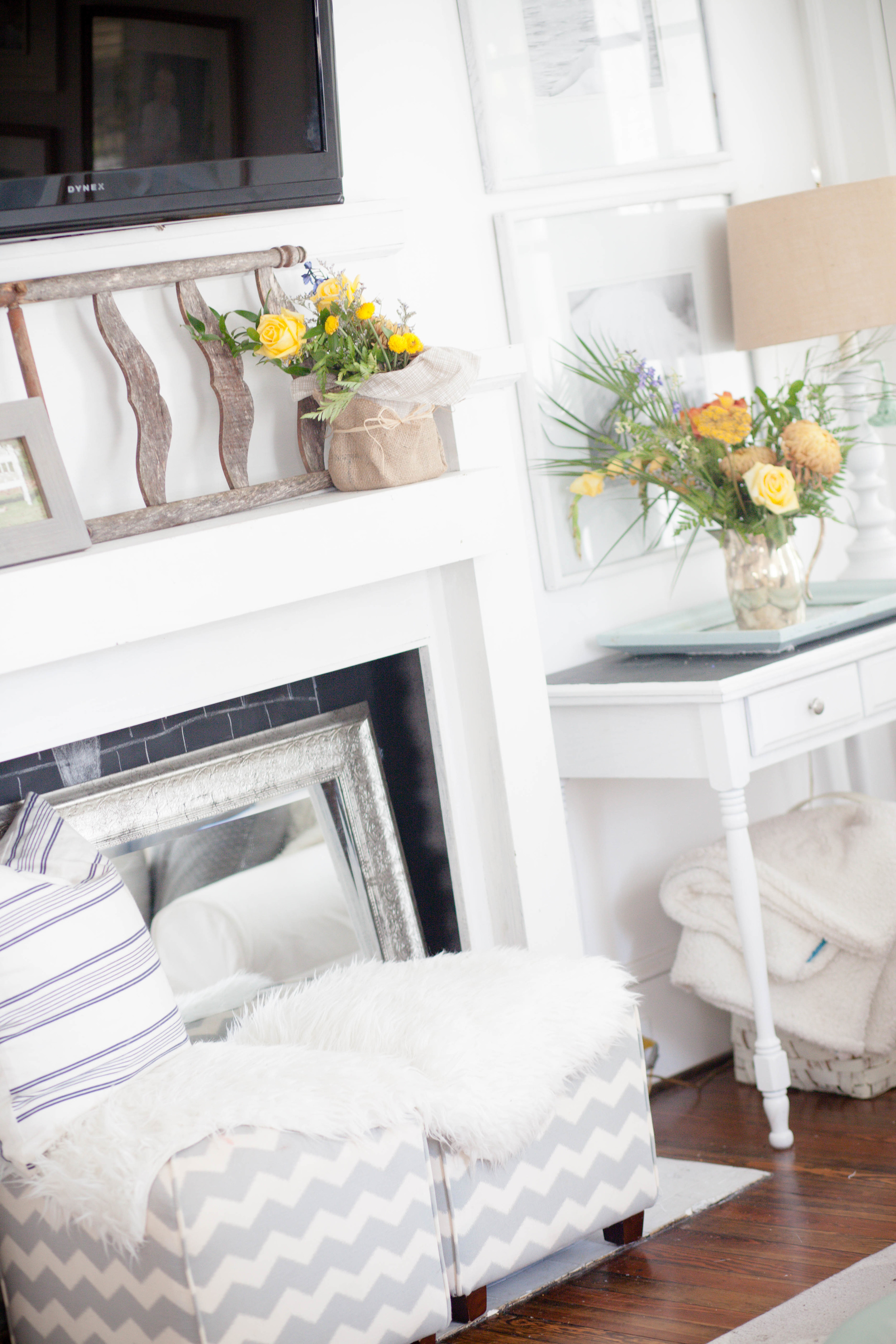
This mantle was dark, dark wood and one day, I finally got the nerve to paint it white and I never looked back!
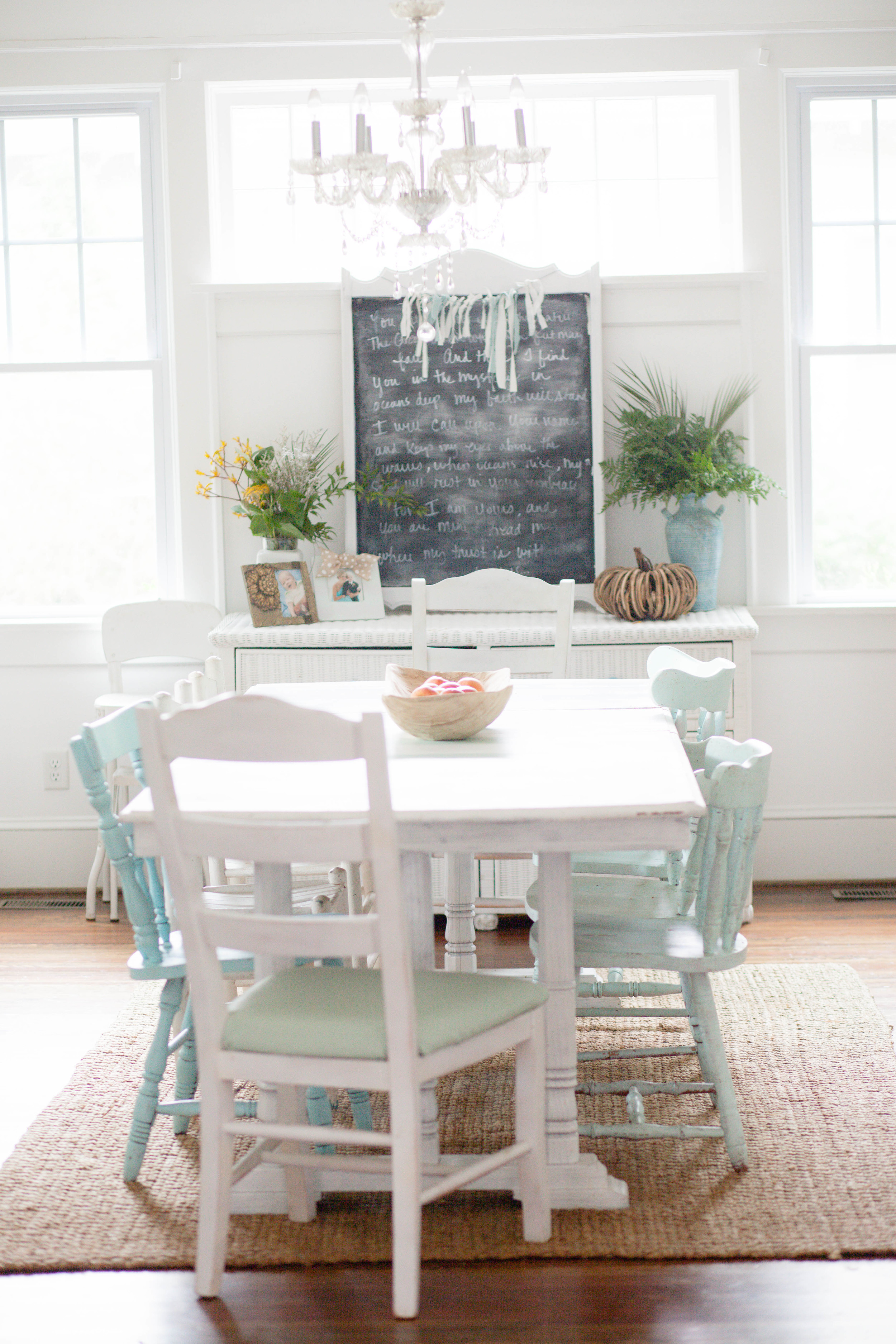
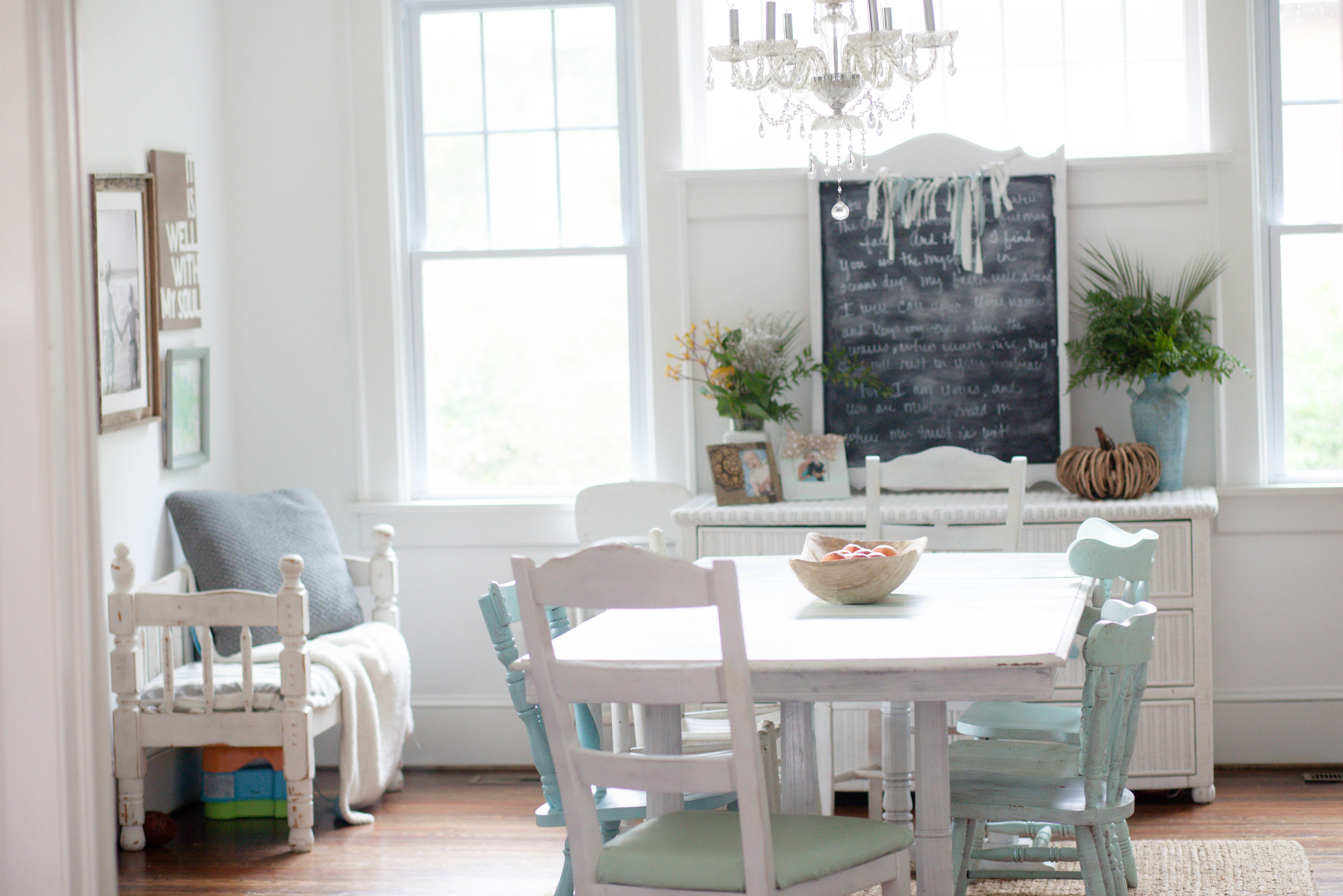
I found this table at Goodwill when we began the process of renovating our foreclosure. I painted it white, of course, and then added stripes since I can never find a tablecloth long enough.

Well there's a fun trick - paint on a pattern rather than use a tablecloth!

I love this little bench in the corner because, again, it provides just a few extra seats for any surprise guests.
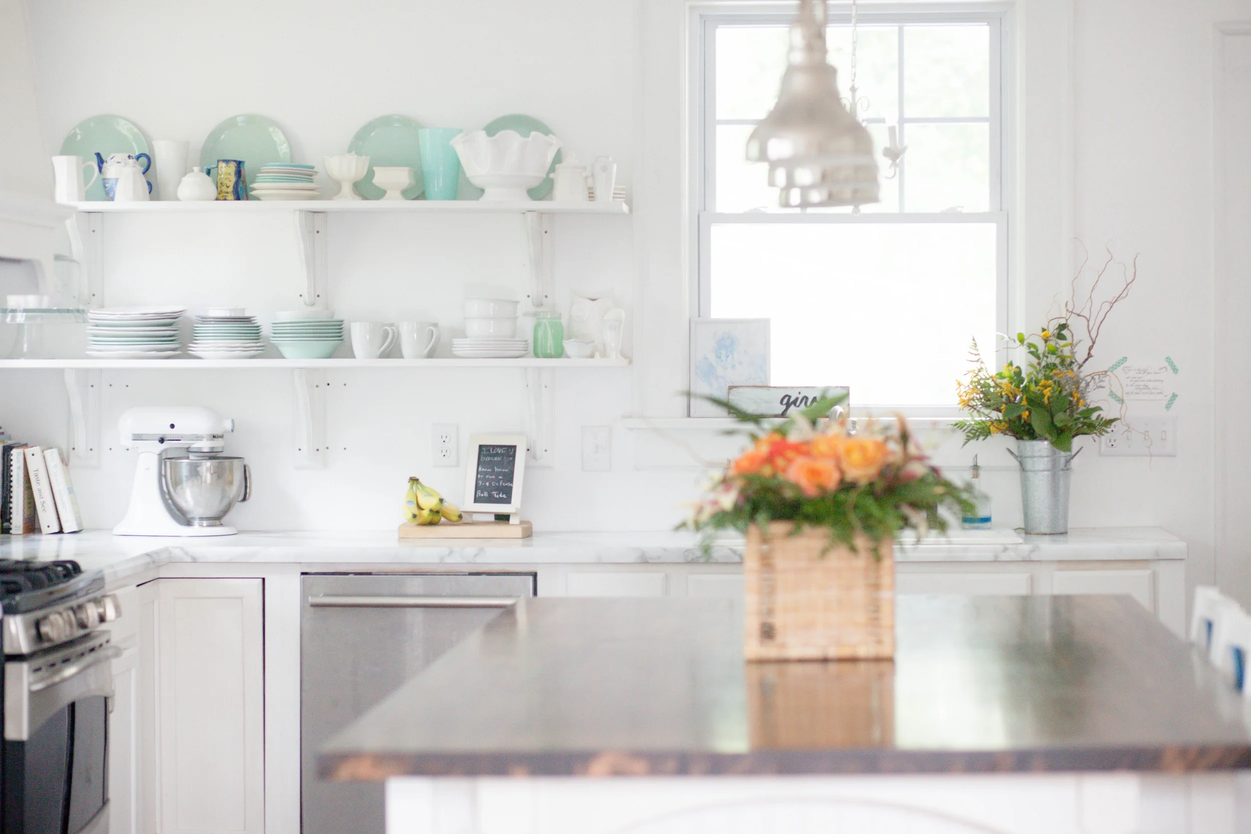
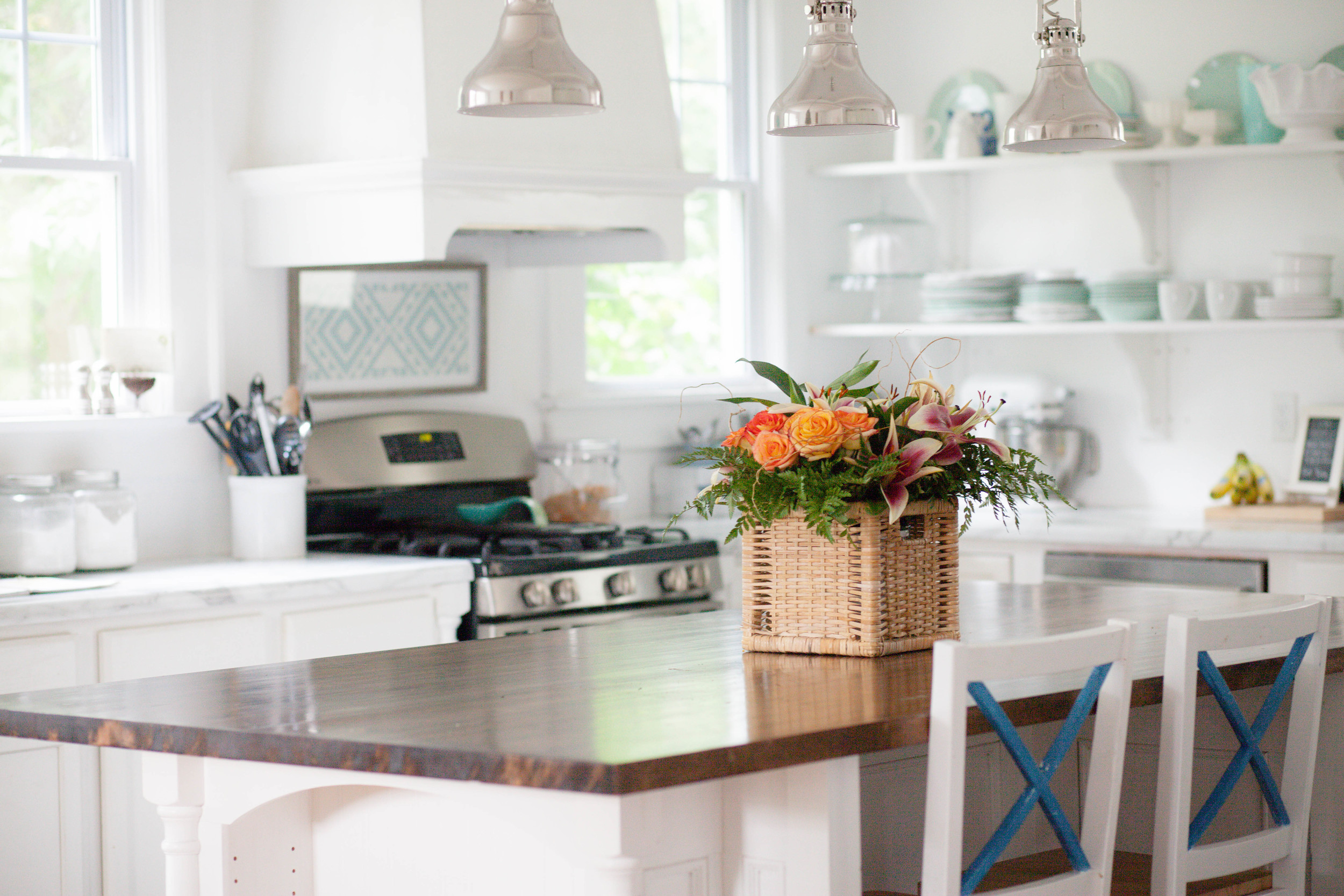
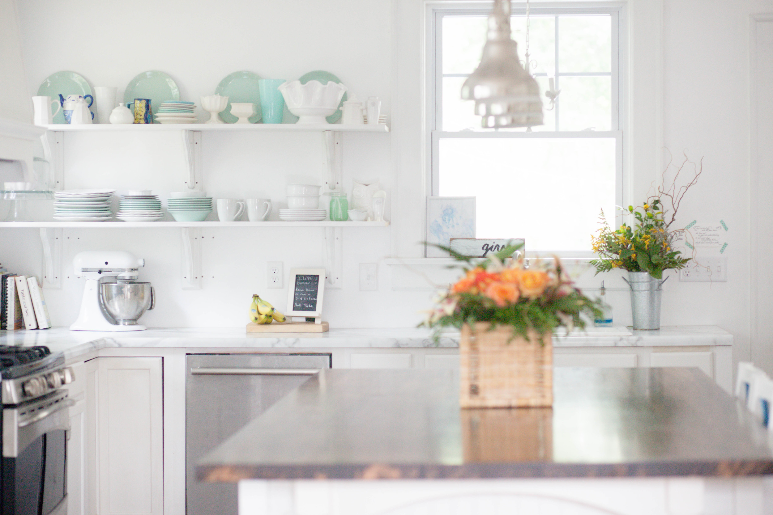
Our kitchen is by far the biggest transformation in our entire home. Tearing down a chimney and ripping out all of the walls allowed us to start from scratch. Laminate counter tops, stock cabinets and open shelves helped us achieve this look on a budget. A DIY hood my dad made and butcher block counter tops as our island made our kitchen complete.

Can't you just smell the salty air of the beach from looking at this space?!

As the story of our yellow house evolves, we fall more in love each day. It seemed the more I started doing what I loved and not what I thought I was “supposed to do,” I saw my style evolve. What worked for us turned out to be comfort first then style. And somehow, for us, it ties together perfectly. Not for anyone else, but for our wild family of young boys and a little girl on the way. It may not look perfect but it welcomes a basketball team on Saturday mornings and a group of girls every Tuesday morning to gather around this imperfect little ottoman and stained couch cushions. And that, we would not change for the world. The story of our house is a true story of love at first sight. A relationship that certainly took way more than it gave for the first three years of the journey, but today, it is our dream come true.

We sure love a happy ending - thank you, Amber, for sharing yours!

If you've got some time to swoon, head over to our SPACES page where we collect all our Reader Designs for your viewing pleasure - and then tag your own home so we can feature you, too! Tag #stylemuttspaces on Facebook or Instagram, or email a few photos to admin@stylemutthome.com.


Thank you so much for kicking off your weekend with us! Have a good one!