Reader Design: Gemma's Artsy Home

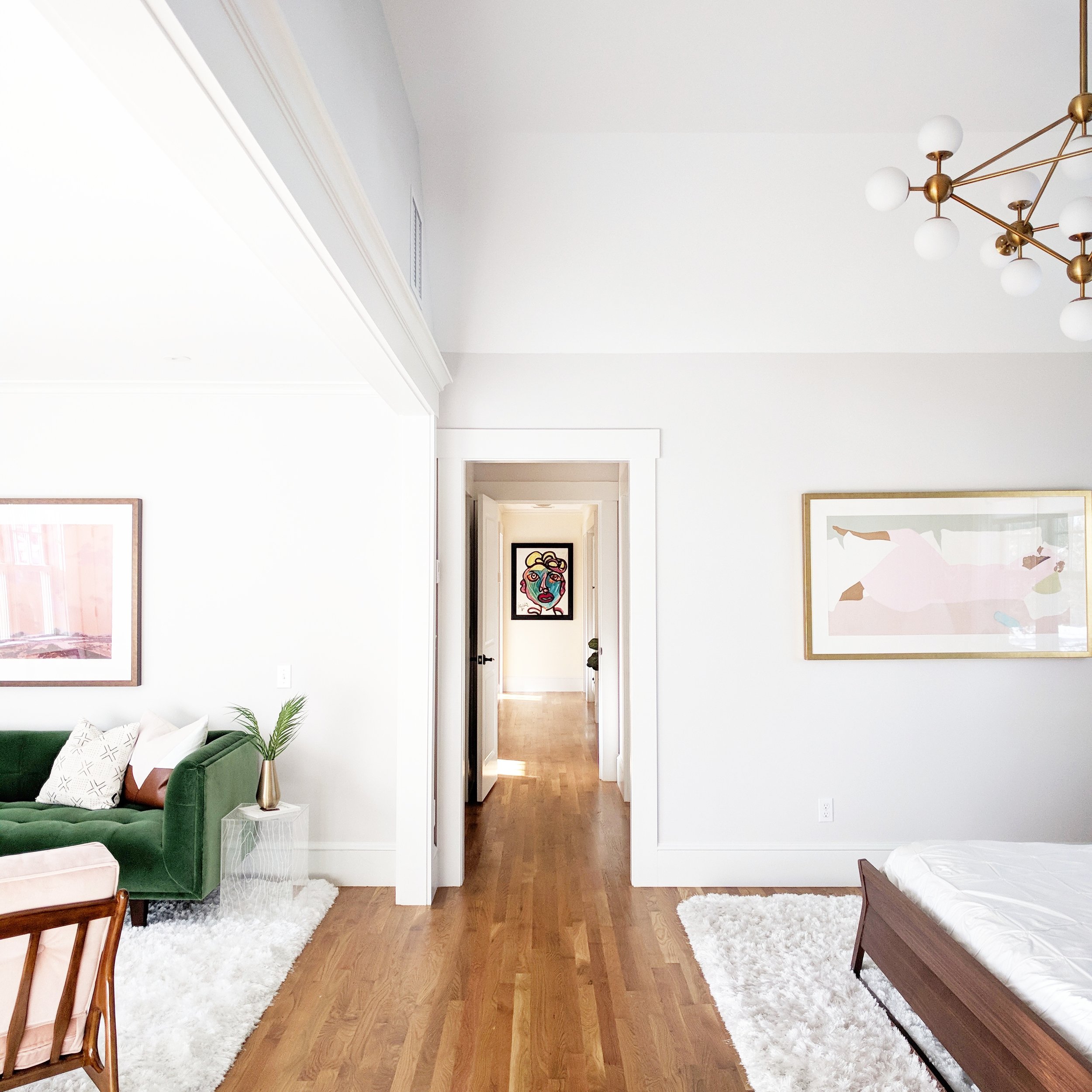
Today, we're off to visit Gemma's bright and fresh home; this Boston place boasts a ton of quirky prints, color and texture, tons of natural light, and some seriously amazing art. Ready for the tour? 

IMG_20180130_144210-01-01.jpeg
IMG_20180105_132407-01-01.jpeg
IMG_20180130_135701-01.jpeg

Even the entry way smacks you with style right away! From the design extraordinaire herself:

I have a hard time defining or labeling my own design style in my home; it’s more of a feeling. I definitely have certain shapes that I prefer; for example, I always pick furniture with clean simple lines, and art tends to be the same way. I prefer minimal designs, and I don’t like anything ornate which is probably why I’m attracted to mid century furniture pieces. By sticking with fairly simple shapes, it gives me a lot of room to decorate with other aspects like color, wallpaper, art, and lighting.
IMG_20171106_111700-01-01.jpeg
IMG_20171111_131552-01-01.jpeg

Each room uses that basic formula - simple, clean furniture + geometric shapes + interesting accents - and just knocks it out of the park. The use of natural elements like wood also helps each space feel incredibly balanced. 

One of my major design goals is to have the house be interesting and inviting but not cluttered. Some areas have really bold wallpapers, but I try to keep all the other elements very simple so as not to overwhelm the room.
IMG_20171231_084904-01-01.jpeg
 
IMG_20180226_112916-01.jpeg
 
IMG_20180208_132224-01.jpeg

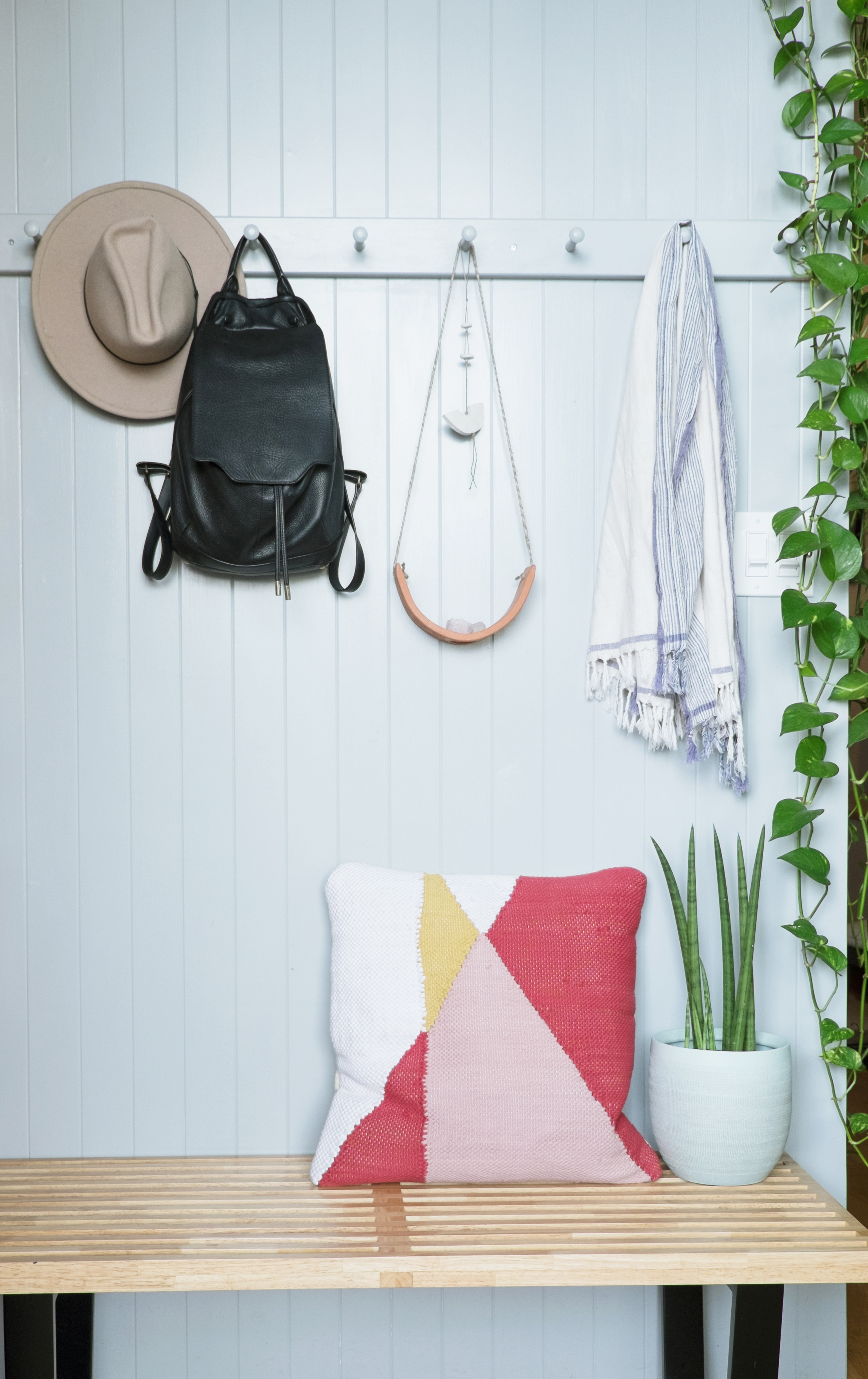
Even the mudroom gives a major statement!

My mudroom is a good example of an over the top wall covering, balanced by very little else in the space - necessities only. But that said, the house is comfortable. We have 3 little boys and they play all over and do what little kids do, so storage is a must. Every cabinet in our family room is packed with games, toys, legos, and stuffed animals so that they can easily access stuff they want to play with, but also put it away again.
IMG_20180219_141924-01-01.jpeg
IMG_20180319_115636-01-01.jpeg
IMG_20180101_131234-01.jpeg

One of the key ways Gemma adds interest is art.

My favorite design elements in our house are our pieces of art. Looking at beautiful artwork gives me such genuine pleasure and an emotional connection. We’ve collected our art from all over the place from varying sources, and the pieces are all very different. Many are one of a kind items we’ve found in vintage stores, others are from estate sales, and others are from galleries. Art is the one place we are willing to splurge.
 
IMG_20171114_091903_688.jpg
 

In the bathroom, the star of the show (other than that tub...wow!) is the iconic Slim Aarons Palm Springs photograph (he's a personal favorite of mine). 

Two other ways to add detail? 

Lighting is another great way to express yourself; it can be a forgotten element yet can bring so much interest into a room. And a personal favorite of mine, books - I read a ton and I love holding and having books. My next project in fact involves some serious shelving to house all of our books that are currently homeless!
IMG_20170828_161315-01.jpeg

This house has to be one of the most original ones I've seen in a while. What a place to raise and spend time with your family!

Gemma, thank you so much for the tour.  Follow Gemma along on Instagram @gemmavanderswaagh for more! 

McKenna Sig.jpg

Vintage Hotel Dresser || And a Giveaway ||

Have you heard the news?  We're hiring!  We were so thrilled and humbled to find ourselves wrapping up 2017 with a waitlist of eDesign clients.  But making our customers wait is not our MO so we're onboarding a new design assistant to keep 'em happy and keep 'em coming!  If you meet our qualifications and are interested in applying, we want to hear from you!  Applications are due February 12th so get to it!

IMG_9363.JPG

While Chelsea is heading up the expanding design branch of our business, I'm still steering the furniture front - and I've landed a new piece with quite the untold history!

Photo Jan 14, 11 06 18 AM.png

The seller told me that his dad rescued it from a closing DC hotel somewhere on Florida avenue.  Let me tell you, he is certainly durable enough to have survived many-a-hotel stay.  But despite being built like a tank, he does have a few marks I couldn't mask: a scratch on the side, a sliver of missing veneer, and a faded water mark on the top.  All things I could have hidden with paint but OH that wood grain!  I couldn't bring myself to do it! 

IMG_9373.JPG

So I shined him up and celebrated the scars of his rich and storied life.  

IMG_9382.JPG

I removed the old damaged apron (those housekeeping sweeps had not been kind to that thing) and added sleek metal legs. 

DSC02979.jpg

I did want to  keep the original knobs so I refinished them to match the new gams.

IMG_9381.JPG

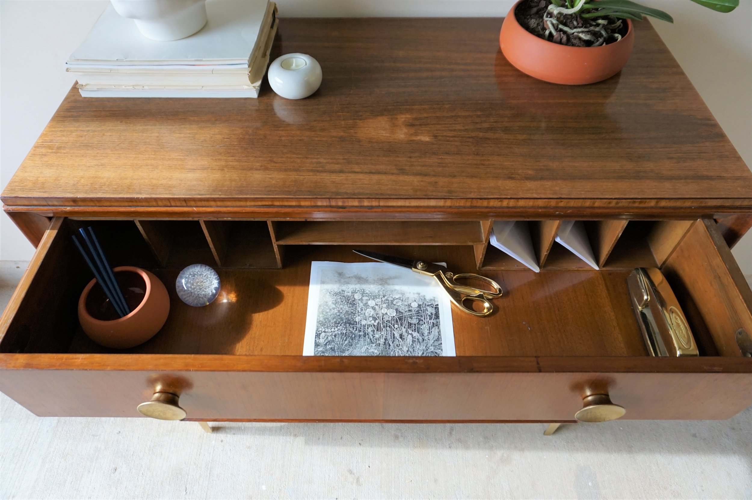
He's also hides a secret: his top drawer is a hidden desk!

IMG_9364.JPG

The drawer front folds down to create a handy little work surface or mail drop spot.

IMG_9383.JPG
IMG_9384.JPG

Complete with cubbies for stationary and office supplies.

IMG_9386.JPG
IMG_9385.JPG

But the crowning jewel of this vignette is this canvas print by a local artist!

IMG_9378.JPG

This piece is just one of the many stunning abstracts by Laura Gunn Art.  I mean just go to her website and you'll be mesmerized by her process - its a riot of color in a dreary world (name that movie!).

Laura Gunn Art

Originals + Canvas Prints
Washington, DC
 

To me, art has always been personal.  I'm most drawn to the emotion in a painting.  Which my abstract mind most often finds in abstract paintings.  I doesn't matter what it makes me feel just that it makes me feel. 

DSC03006.jpg

I could stare at Laura Gunn's "Still" for hours.  Sometimes I think it's a quiet ocean horizon.  Sometimes its a soundwave with the gentlest flutter, a tiny reverb.  I love that it changes for me, and yet stays the same.

DSC02942.jpg

And we're delighted to announce that we at SMH are teaming up with Laura Gunn for a very special giveaway!  You could win your very own 24" giclee reproduction of a Laura Gunn original on gallery-wrapped canvas (that's a $149-$169 value!).  Follow these 3 steps to enter:


1) Follow @cate_stylemutthome and @lauragunnart on Instagram
2) Browse Laura Gunn's the Gallery Wrapped Canvas collection and
3) Comment below with the piece you'd like to win!

Winner will be announced next Wednesday, February 7th on Instagram!

New Logo FINAL.png

+

1516804664121.png
IMG_9364.JPG

Vintage Hotel Secretary Dresser
Now Available for Sale
40"W x 19"D x 38"H
$545

And if you are interested in this piece or a custom order like it, email me at cate@stylemutthome.com for availability or to ask about our third-party shipping policy.

IMG_4088.JPG

Kesslyr's Artistic Flat

Mutts: Allow me to introduce you to Kesslyr. She not only has an incredibly unique name (as a 'McKenna,' which went from unique to fairly mainstream in the world for 4-year-old girls, I'm very jealous) but is also a wonderfully unique and inspiring artist - check out her website which has its soft launch TODAY! 

        Images source: Kesslyr's Pinterest

        Images source: Kesslyr's Pinterest

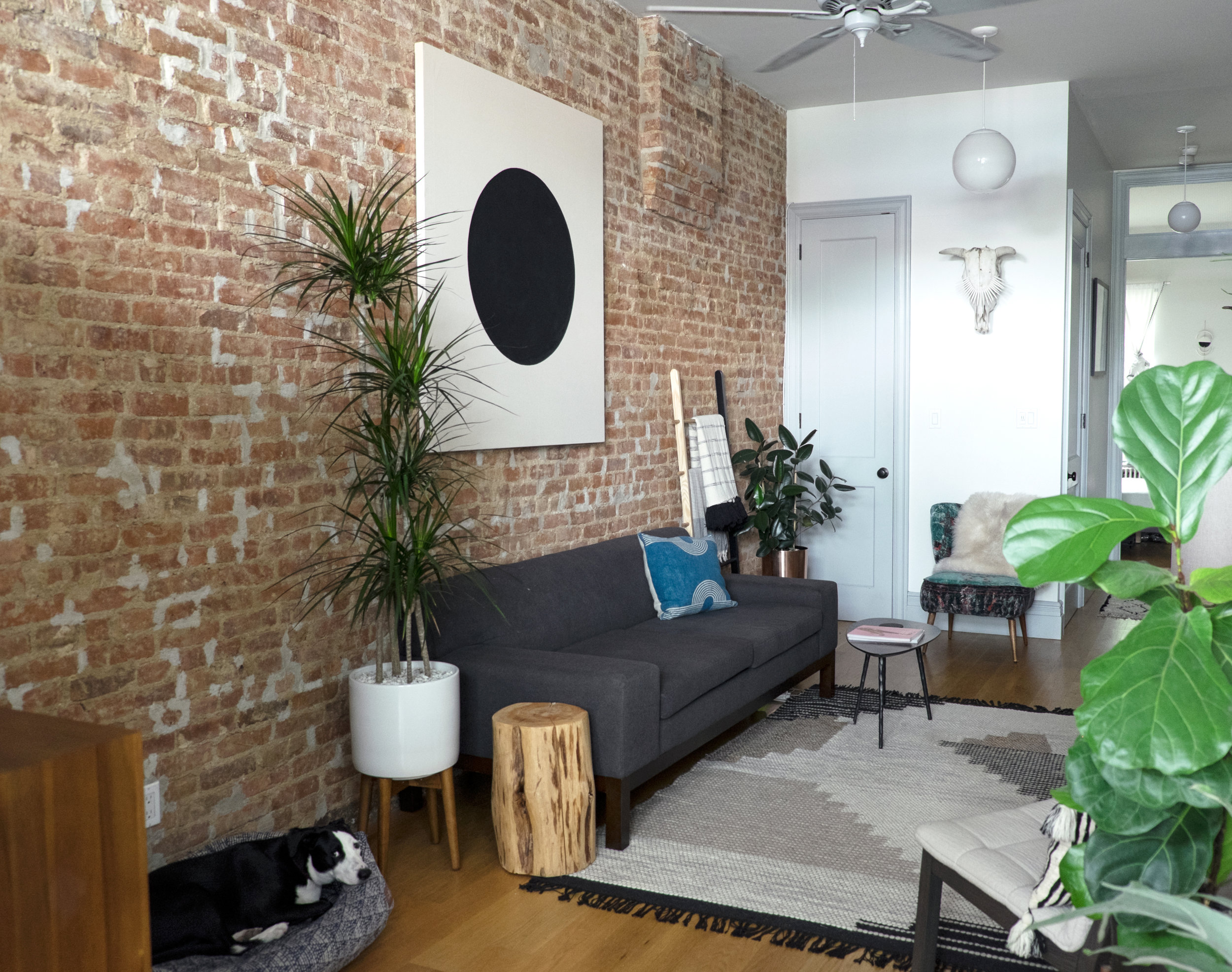
And her home in Brooklyn, New York is the perfect backdrop to showcase her work! 

Here's an important piece of information for you all to keep in mind as you read this post. Kesslyr and her husband moved in to this space in June. Of this year. I'm not telling you that to make you feel bad - but WOW! 

Now, over to the artist herself: 

For us, we start firstly with bringing life into a room; in our case, this means plant life. Then we add a few pieces of necessary furniture, then sit back and let that soak in. Its easy for a space to get cluttered, so we take our time in choosing the mood of the room. The older we get, the fewer things we like to share in our spaces. So simplicity is key.

I know most of our Mutts have cultivated impressive green thumbs recently, but ladies & gentleman, Kesslyr's skills in this area should be taken seriously. Very seriously. 

Our Brooklyn home is pretty small, and [I would describe our style as] simple & modern with an eclectic touch.

Throughout our home, we have tons of locally crafted pieces from our own art to pottery. One of our favorite spots is our office nook. Super cosy little nook with frosted windows that give off warm light throughout the day. The clash of stainless steel from the mirror and brass from the sconce is a unique contrast.

Green Thumb Badge EARNED, Kesslyr. 

Now, if I had you all guess where Kesslyr and her husband got married, do you think you could do it? I'll give you some hints: the natural plant life, the mid-century influences, the welcoming 'stay a while' vibe. Anyone guessing Palm Springs? GOOD! 

We are constantly evolving as people and with that, so does our taste level. We are loving the feeling of modernity but not overtly sterile. We want our home to feel warm and still have character. Some modern homes can feel like museums and make you feel like you cant disturb anything or even sit on the couch. Which is the opposite of what we are going for.

After only three months in this home, it feels so loved - and that is no small feat. 

Its about collecting those quality in pieces that are timeless; lamps, mirrors and art seem to be what draw us in. Its a small collection that builds slowly and methodically and will be enjoyed for years to come.

Kesslyr, thank you for letting us in! And Mutts, show Kesslyr some love and follow her along on Instagram for more design and art inspiration! Now, everyone, go enjoy your weekends!