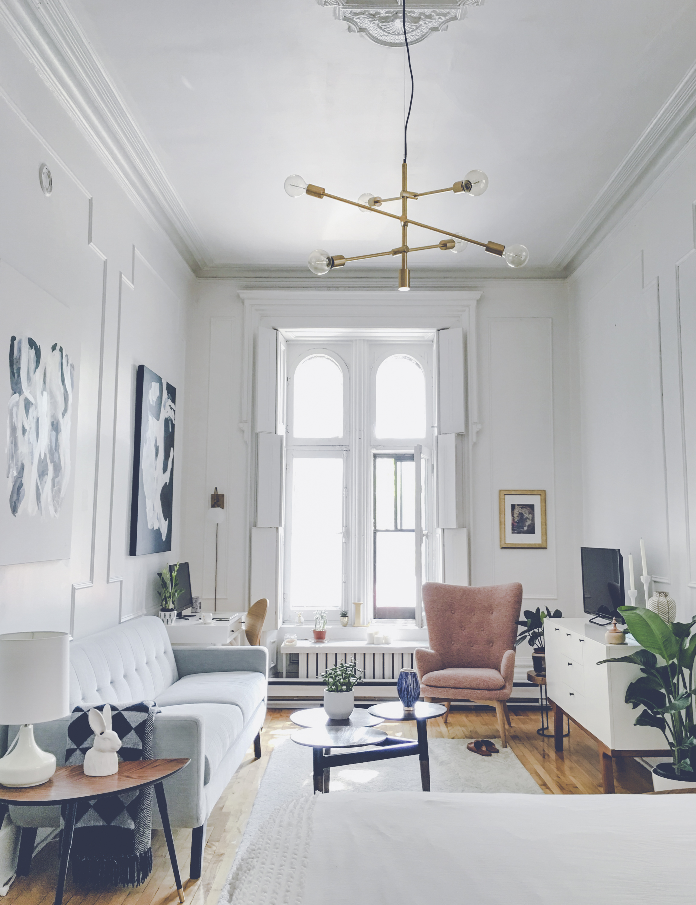
Reader Design: Lauren's Stylish Studio

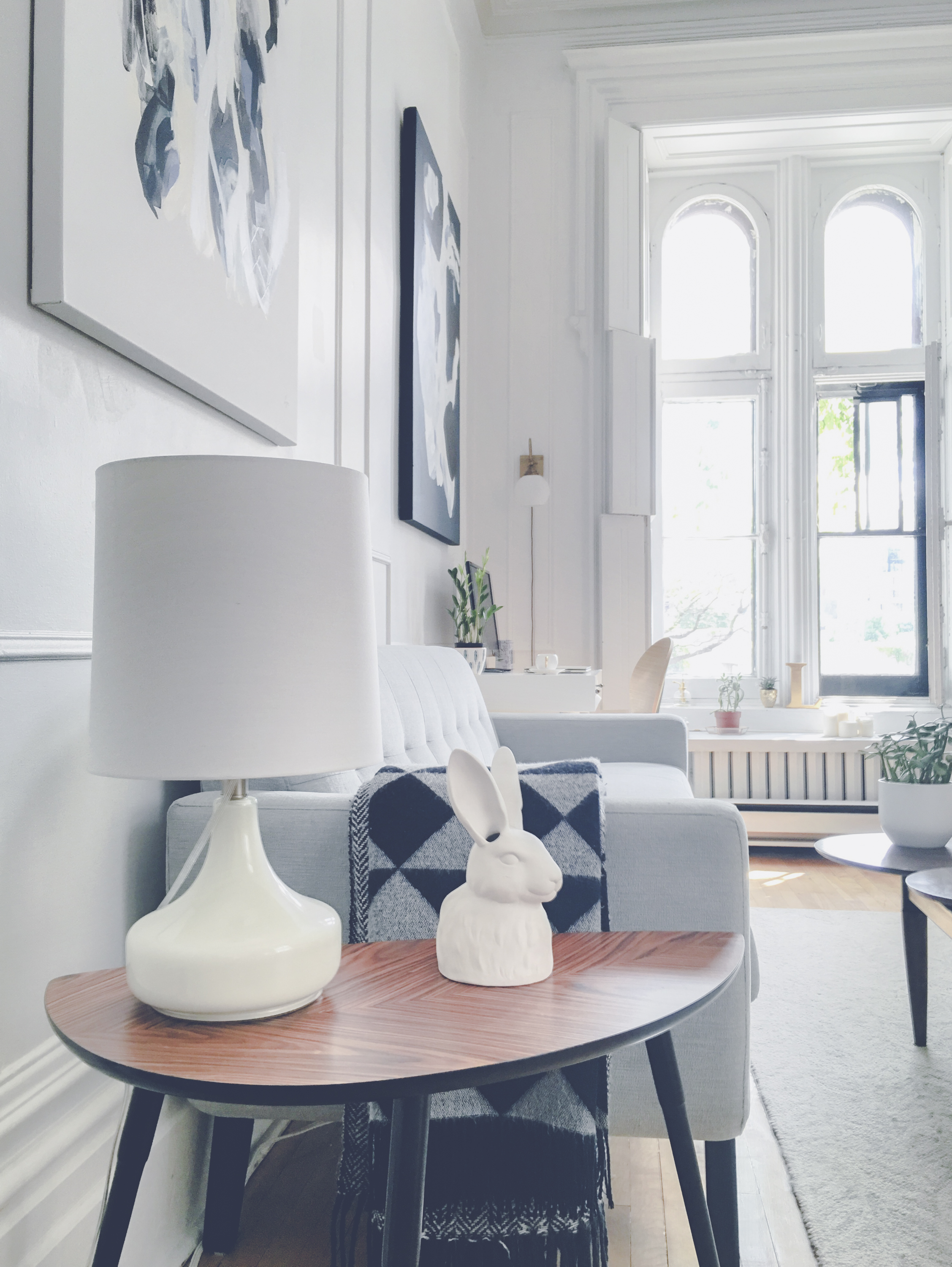
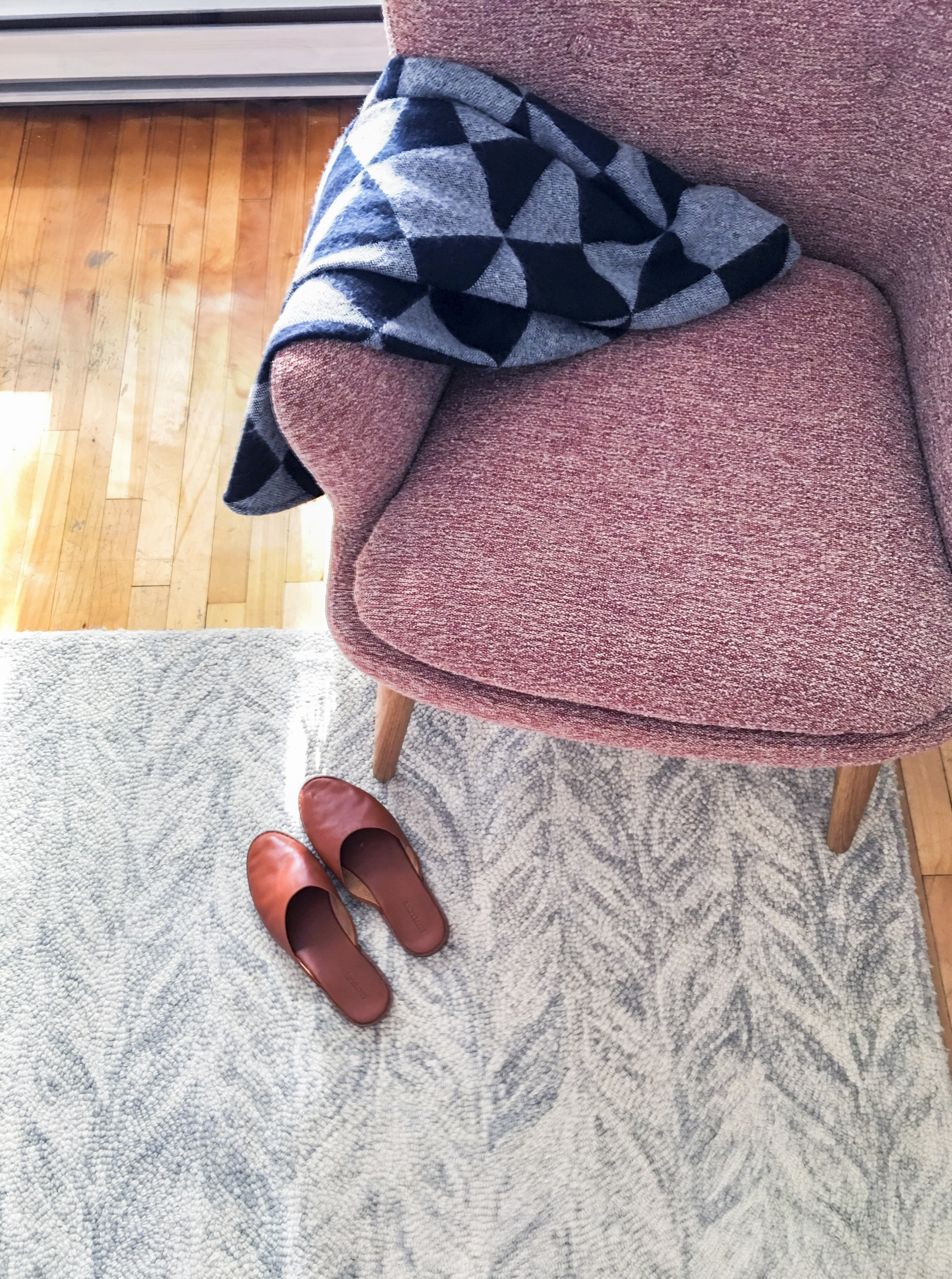
There's a prolific theme out there around doing more with less - mainly more with less time, in my experience. But no one does it better in the realm of design as Lauren, a millennial living in Montreal, Quebec. 

She lives in just 500 square feet, and it does double duty as both her work and living space. But that tiny space is used to its absolute maximum to create a home that is thoughtful, bright, airy, and inspiring. 

Decorating her home started as a creative outlet from her corporate e-commerce job and has turned in to a full on passion project. 

I believe your surroundings can really influence your state of mind so I try to create spaces that are not only visually attractive, but also carry a peaceful energy. I have loved sharing this message through my decorating work. When people tell me they love how it feels to be in my place then I know I have achieved my goal of creating a unique and welcoming space.

She draws influence from mid-century modern, eclectic, and classic Parisian design, and it works out so so so well. As Lauren intentionally knows, the mix of all those elements creates a space that is super interesting and intriguing but still cohesive. 

She also learned a lot about herself. Her affinity to minimalism, for one. 

Throughout this experience I have learned that minimal living is actually quite therapeutic. Not feeling crowded by so much “stuff” lets you appreciate each piece you fill your home with, and what once seemed like a challenge to live in a small studio space has become something I am quite proud of.

A tenet of that minimalistic approach is investing in really high-quality pieces, which Lauren has done in her lighting and art choices. 

With limited square footage and wall space, taking advantage of my ceiling height with a bold light was how I added a statement piece which has become a main feature of my home. Art is also something worth investing in because it is so personal to who you are. When I moved to a new city I really wanted to find art by a local artist so it felt like an extension of my experience in a new place. I was lucky enough to find a wonderful artist named Lysa Jordan who did 2 amazing large canvases for me. They complement my space so well, but also tell a story of my journey.

Lauren, you have this whole work/life balance, all in one place, totally figured out. Thank you for sharing it with us today! Follow Lauren along on Instagram @livingbylo for more... you will not regret it. And to swoon over that amazing art, check out @lysajordan_.

Have a lovely weekend, mutts, and see you all next week! 
Reader Design: Amy's Inspired Family Home

If you've been paying attention, you know it's been a busy week over here at StyleMutt Home! We're ringing in the holidays with holiday tours, fantastic flips, and, of course, a home feature with an Insta #mustfollow.

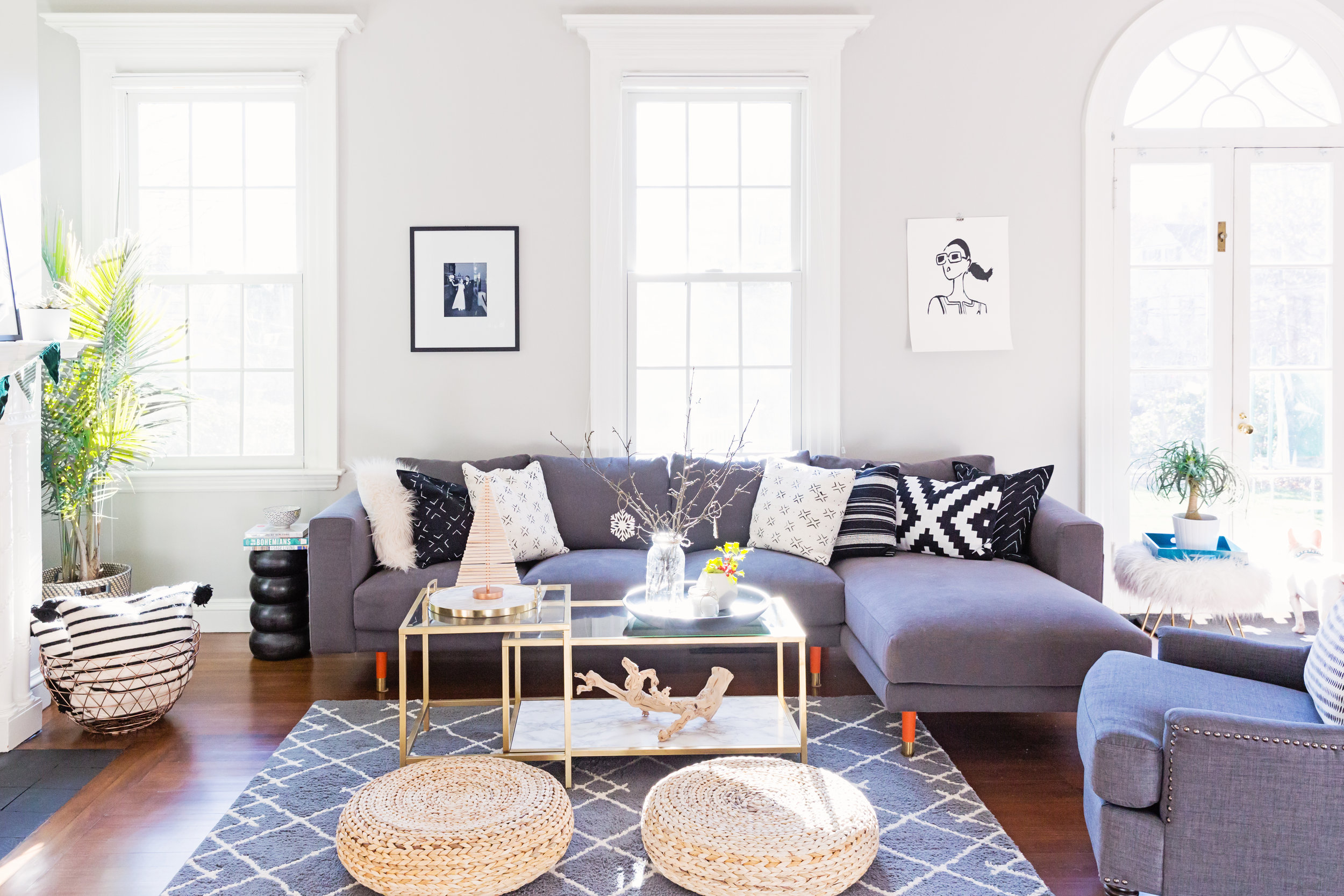
Cue Amy, a small business owner and mom from Massachusetts. Amy's home takes a lot of its inspirations from blogs and social media - and with her creative, professional photographer eye, she executes to perfection. 

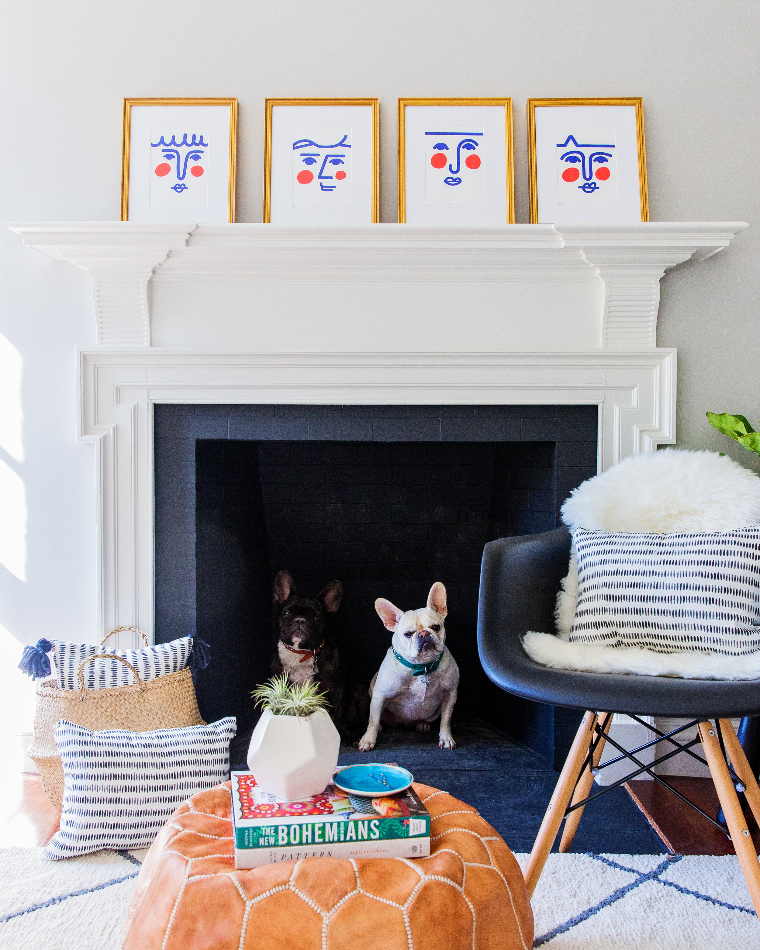
Amy, her husband, their three kids, and two dogs moved in to this Dedham, MA home in August and since then, it's become the ultimate family home. They've taken a big home - with six fireplaces... I mean, c'mon - and made it intentional, with each space serving a special purpose. Take the living spaces - it's actually one long room that is an easy design stump for many people (oh to have the problem of too much space!), half of which is a neutral haven and the other half of which is alive with color. 

This room alone is a perfect illustration of Amy's spoken style.
From Amy:

My style is a combination of simplicity and bold splashes of color. I love a modern look with mid-century lines. While finding a style that is truly mine, I realized my house reflects my photography. Clean and bold.

Amy is also a MAKER . 

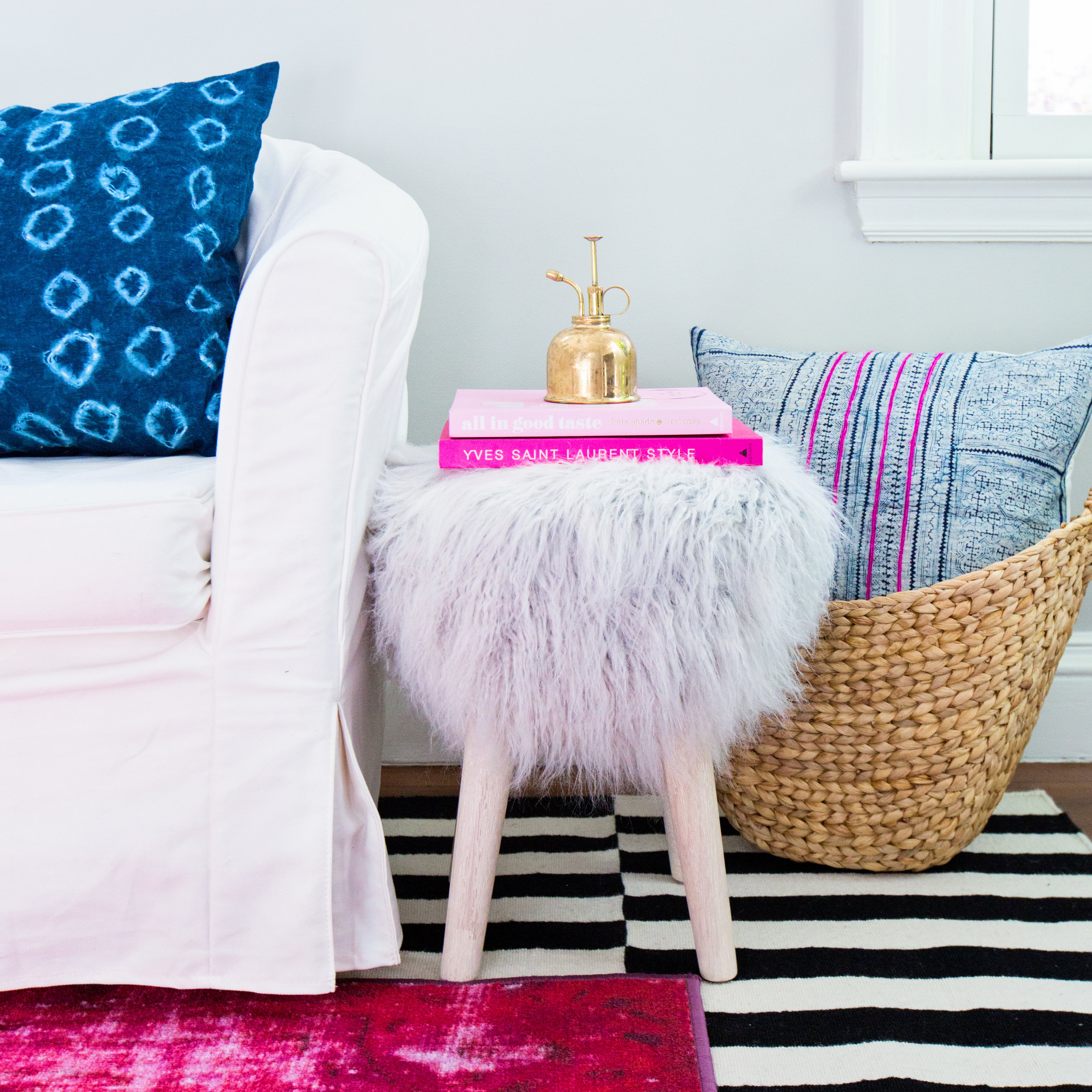
I have a slight obsession with textiles. I like to change my throw pillows like some people change their socks. I have a hard time spending a ton on a pillow. Some I found on Etsy, but all of the mudcloth and shibori pillows, I made out of Ikea shams! For the mudcloth look, it just took a little fabric paint & a ruler!

Amy definitely believes in budgeting, but not at the expense of style!  

I can honestly tell you that everything in my home is completely accessible to anyone on any budget! All it takes is an imagination and some elbow grease. I find nothing more satisfying than creating something beautiful with little to no money. Anyone can decorate a house with an unlimited budget, but creating a gorgeous space on a dime is a labor of love.

Her family moved into this Colonial to be closer to school back in August, but kept their original home as a summer escape - and just about every room proves there's a way to save! ... Every room except the wallpapered powder room, which Amy's son insisted he could have replicated with only a Sharpie. Anyone brave enough to take on that challenge??  

Now, she did let him use that creativity in this amazing comfy & cozy living room! 

I feel like I have kind of mastered Ikea-chic. My 11 year old son is very creative and loves projects. He and I found all sorts of Ikea hacks on Pinterest and we went to town. His proudest piece is the mid-century TV console in the family room. He made it himself from 2 Ikea cabinets, pretty pegs legs, and some pine boards that he carefully measured and stained.

Now for the kitchen - that was a splurge area, but with something so classic, why not spend a little to make it great? 

The master bedroom, with its dressing room complete with a fireplace, and guestroom both feature some of Amy's favorite pieces. 

I knew I wanted a MASSIVE round mirror in the house. I love this one [in the bedroom] from CB2. The bench is a knock off of the Herman Miller Nelson bench, the pillows are DIY mudcloth, and the blanket is one that I made myself with thick thick wool and needles the size of my arms!

In the guest bedroom, the statements are those pair of prints from Etsy, which Amy was able to print professionally thanks to her photography business! I don't know anyone who wouldn't be tempted to longgggg overstay their welcome in this space.

Amy, how you pulled off this home in just four months is beyond comprehension; thank you so much for inviting us in! 

Follow Amy along on Instagram or on her site. And guess what?! If you can't get enough of her pooches, Charlie and Chloe, you can follow them along on Instagram too. If today isn't a win-win-win, I don't know what is! 

Oh Grow Up... Art ||Flip List Item No.4||

For a few months now, my collection of original abstract artwork has felt...off.  It's like you're trying to copy your mom's crowd-pleasing artichoke dip and yet it just doesn't taste the same when you do it - you feel me?

image.jpg

In an effort to solve this art conundrum, I declared "Grown-Up Abstract Art" as item No.4 on my furniture flip bucket list and began to do some research on what ingredients may be missing from my art collection.  After consulting pinterest, I kept stumbling on some delicious abstract art showcased in gorgeous, minimal floating frames.  

Source: Ellen Dodd

Source: Ellen Dodd

And so my first theory was formed.  I rummaged up some spare wood trim to fashion a make-shift gold frame for one of my smaller pieces, but when I finished it still felt juvenile somehow.  

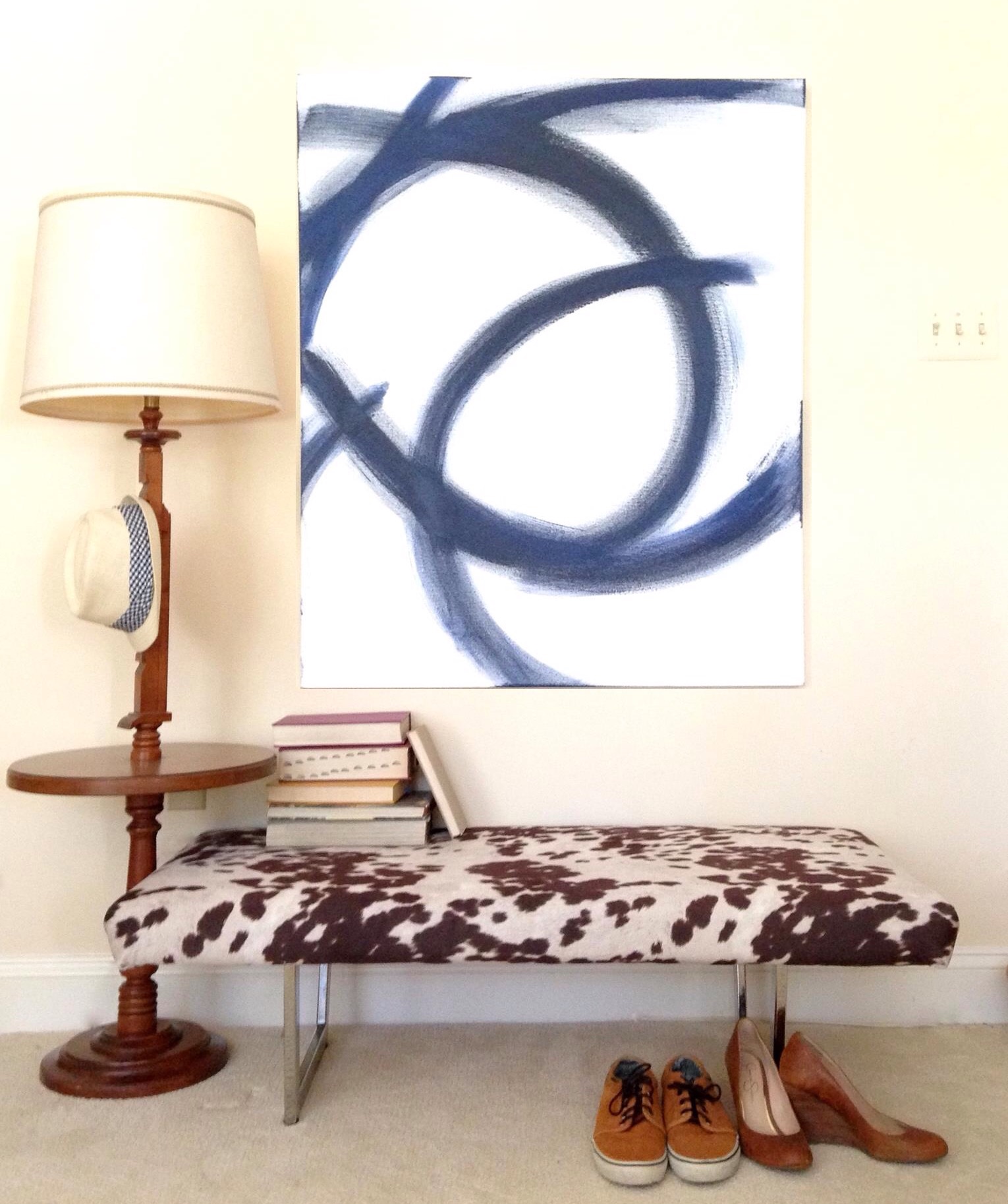
After mulling over it for a little while longer, I began to think that perhaps my portions were off.  I love to paint but I'm no professional artist - when I paint, I can't help myself: I love ALL THE COLORSSSSSS.  But perhaps I need to balance out the generous helpings of bold pops of color with some graphic patterns and white elements like this large piece I painted to help stage the cowprint bench.  [It actually sold at our Pop-Up Shop at Sweet Clover Barn so I never got the chance to mix it into my new abstract art recipe.]   And interestingly enough, despite my obsession with large-scale abstract art, I don't actually have any pieces hanging in our apartment. 

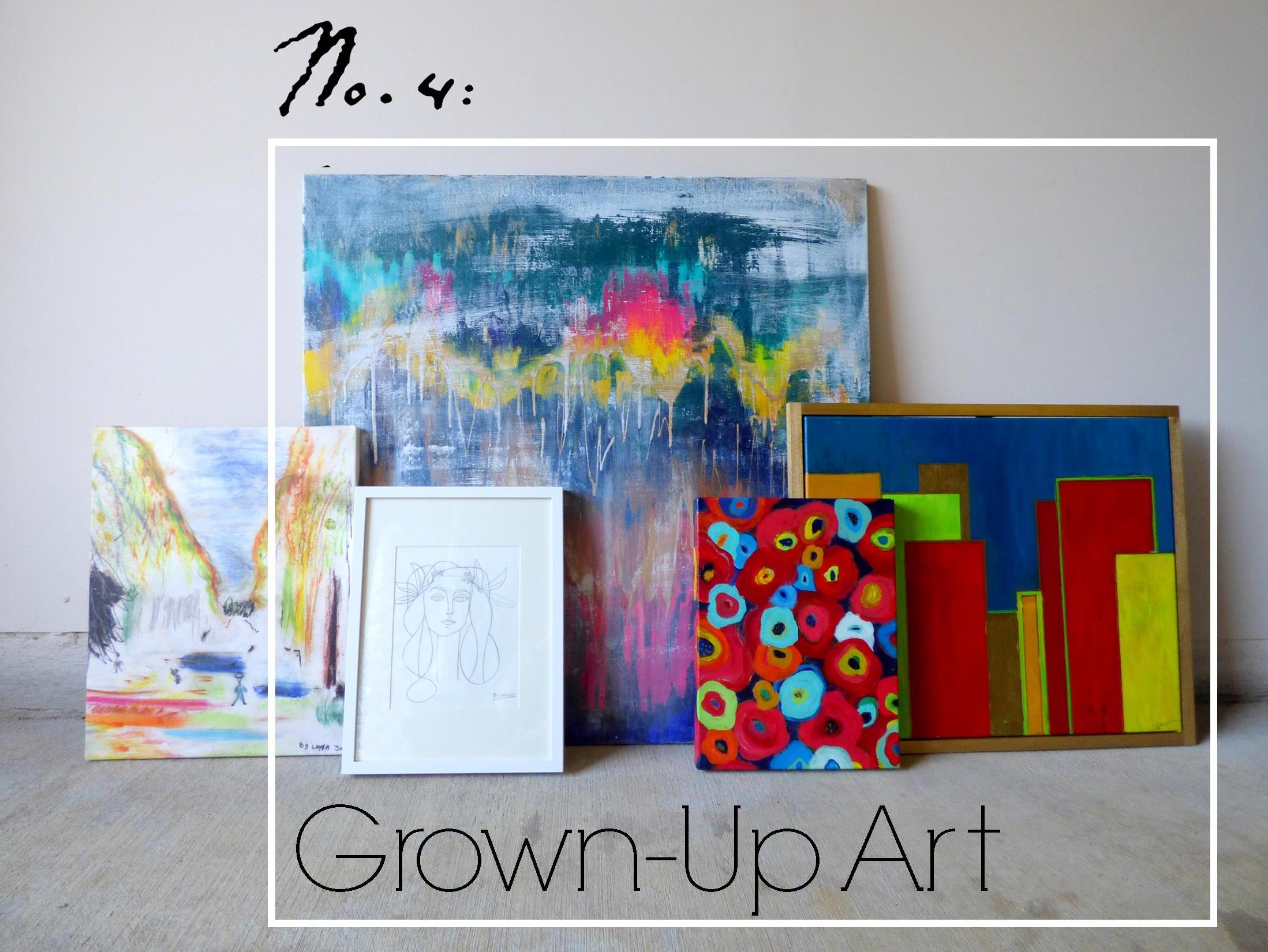
Ok so let's meet the "art ingredients" I do have in stock and let's see if we can mix them together for a winning combo.

Meet Art.jpg
Van Gogh's Les Alyscamps

Van Gogh's Les Alyscamps

  • "Les Ales Camps" - a 3rd Grader made this piece at a school I worked for.  The elementary art program was doing a series on Van Gogh and this young artist was studing Van Gogh's Les Alyscamps (which she mistakenly labeled as "Les Ales Camps" in the top right corner lol.  I loved the playful take so much that I had it printed on a canvas to hang in my office.
  • "Unnamed" - this is the largest piece of abstract art I've done and yet I haven't found a place for it.  I think I feel like it would overpower any of our small spaces so I've never hung it in our home.
  • "Hadley" - this is the piece I tried to give a floating frame.  I think the proportions are off and I would like it better if the frame were thinner and little daintier.
  • "Picasso" - this is another piece I can't take credit for.  I just love this line drawing so much that I traced it on some paper and popped it in a frame - forgive me Pablo P.
  • "A Riot of Color [in a dreary world]" - name that movie!  I painted this poppy-inspired piece while watching a Heath Ledger favorite (may he rest in piece).  You may recognize this pop of red from staging this piece here

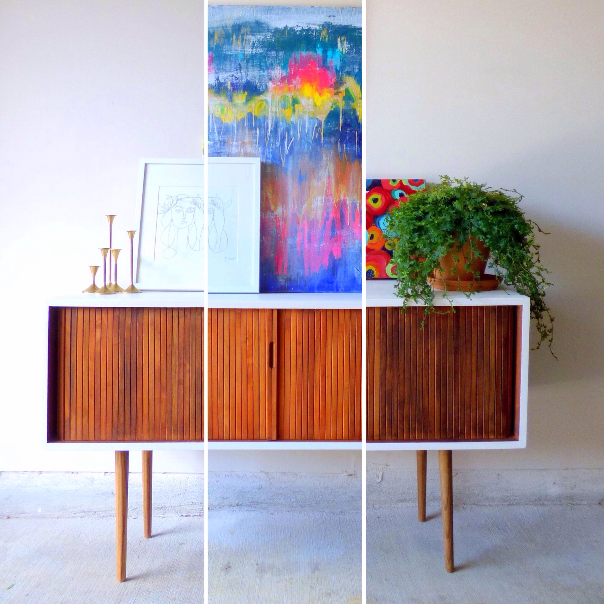
For plating purposes, I've enlisted the help of a fresh flip who'll be heading to his new home in DC soon [I removed the original toe-kick and added tapered legs with the nickle caps cut off and painted the top and sides a glossy white].

P1010468-001b.JPG
image.jpg
image.jpg

Art Recipe No.1:

image.jpg

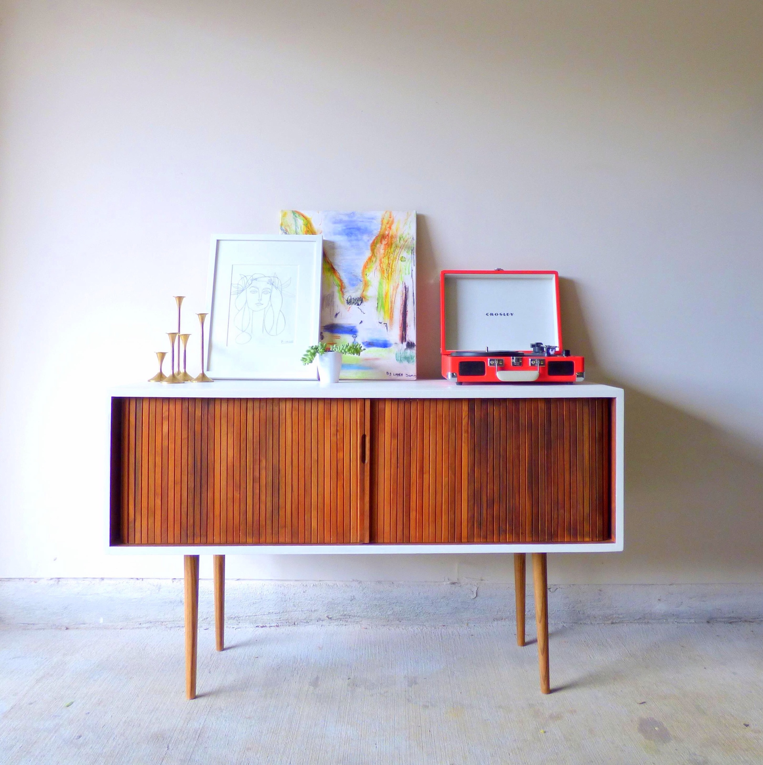
Playful "Les Ales Camps" with a side of "Picasso" garnished with plant, brass candlesticks and record player served on a Mid-Century Record Console Table with storage for your vintage record collection.

image.jpg

[How cool is that rolling door for space-saving storage?!  And there are four compartments inside with removable vertical dividers.] 

image.jpg

To combat my tendancy to over-saturate with color, my thought here was to pair the two "lighter colored" art pieces on a white-wall background.  The smaller graphic "Picasso" cuts the intensity of the color in "Les Ales Camps" and the record player.

Art Recipe No.2:

image.jpg

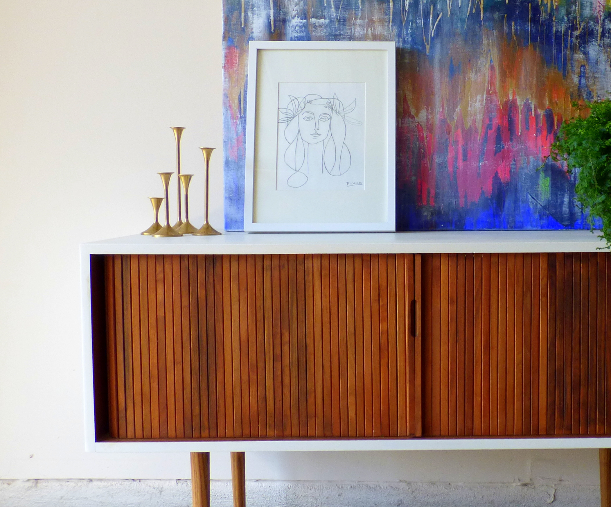
A large helping of "Unnamed" abstract with a side of "Picasso" drizzled with candle sticks and a fern for garnish.  Since "Unnamed" is such a powerful flavor, I also tried to soften it with the dainty print and anchor it with a large plant. 

Art Recipe No.3:

image.jpg

Spiced "Riot of Color" and "Hadley" with creamy "Picasso" served with natural elements encased in glass cloches and garnished with a potted fern.

image.jpg

[Look at that gorgeous wood grain in the slats of the console table's rolling front.]

image.jpg

Since I was using two bold paintings, I again employed the "Picasso"print and accented with the airiness of the glass cloches.

image.jpg

[Fun fact: the stand for the raw mineral is just one of my fluted candlesticks turned upside down].

image.jpg

Which recipe hit the spot for you?  Any suggestions on how to make my art collection more flavorful/ refined/ spicy?  Leave your tips in the comments below!

image.jpg

Mid-Century Record Console Table
48"W X 18"D X 29.5"H
SOLD
$525

If you are interested in a custom order like this piece, please contact me at  cate@stylemutthome.com

image.jpg

Check in on the progress of this year's furniture flip bucket list: