Reader Design: Kristin's Cali Cool Home

I don't know about you, but I am SO ready for Spring. I know I'm a couple weeks past Groundhog Day, but boy do I wish the outcome had been different. I need to trade in my huge parka for a light jacket, my boots for some sandals, and I long for the day when I don't need to add bronzer to look healthy. All I can say is thank goodness I now see the light when I leave my good ole day job. 

That light and hint of summer are two of the reasons for my envy of Kristin's Venice Beach, CA home. 

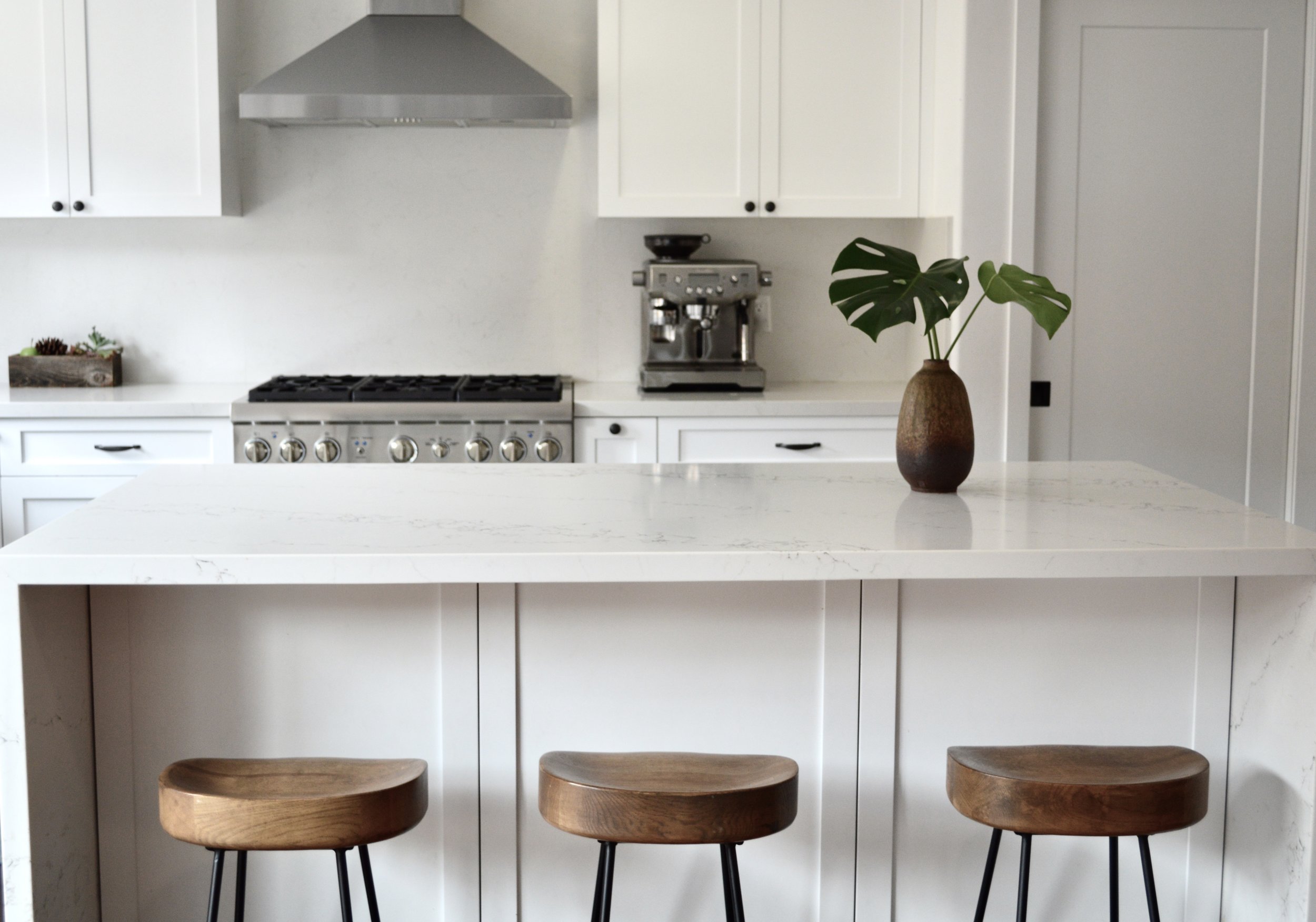
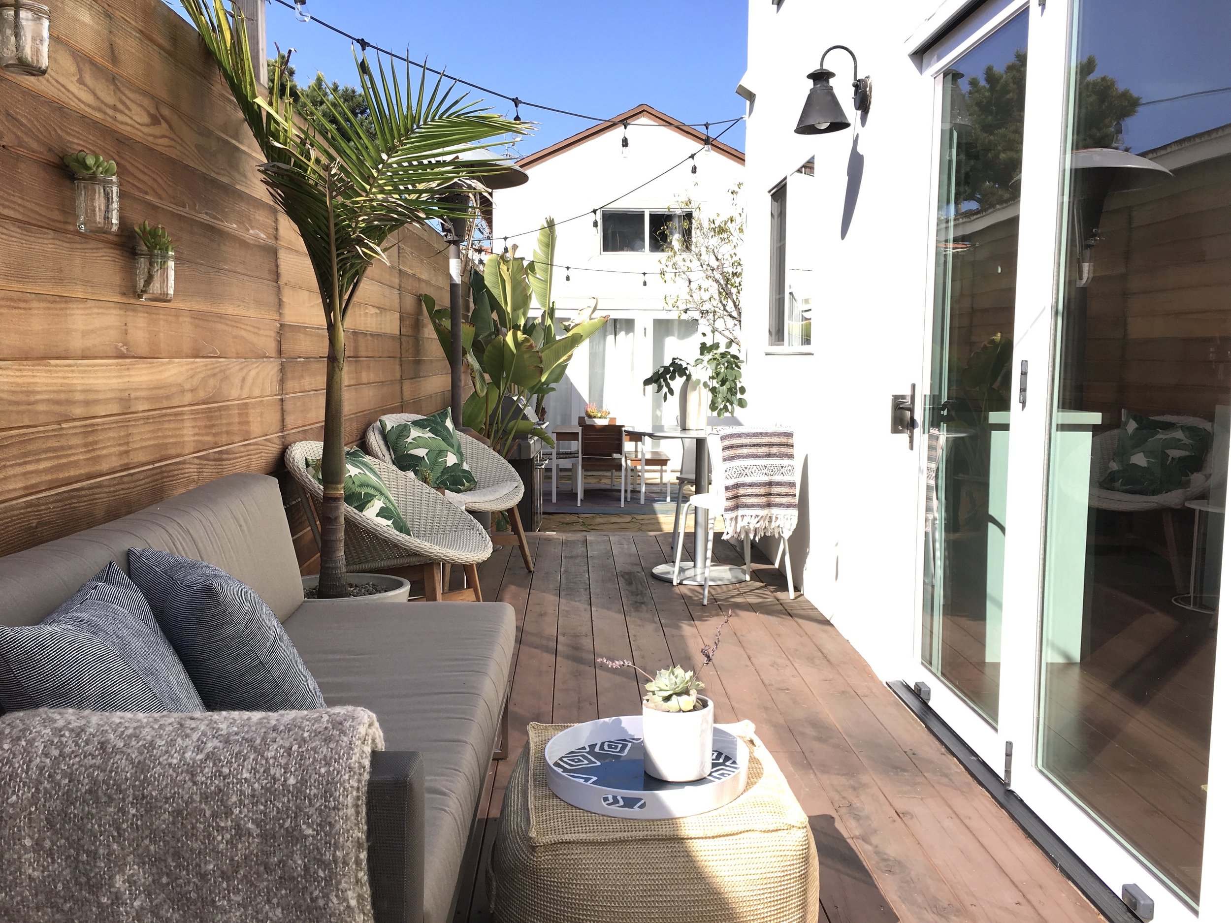
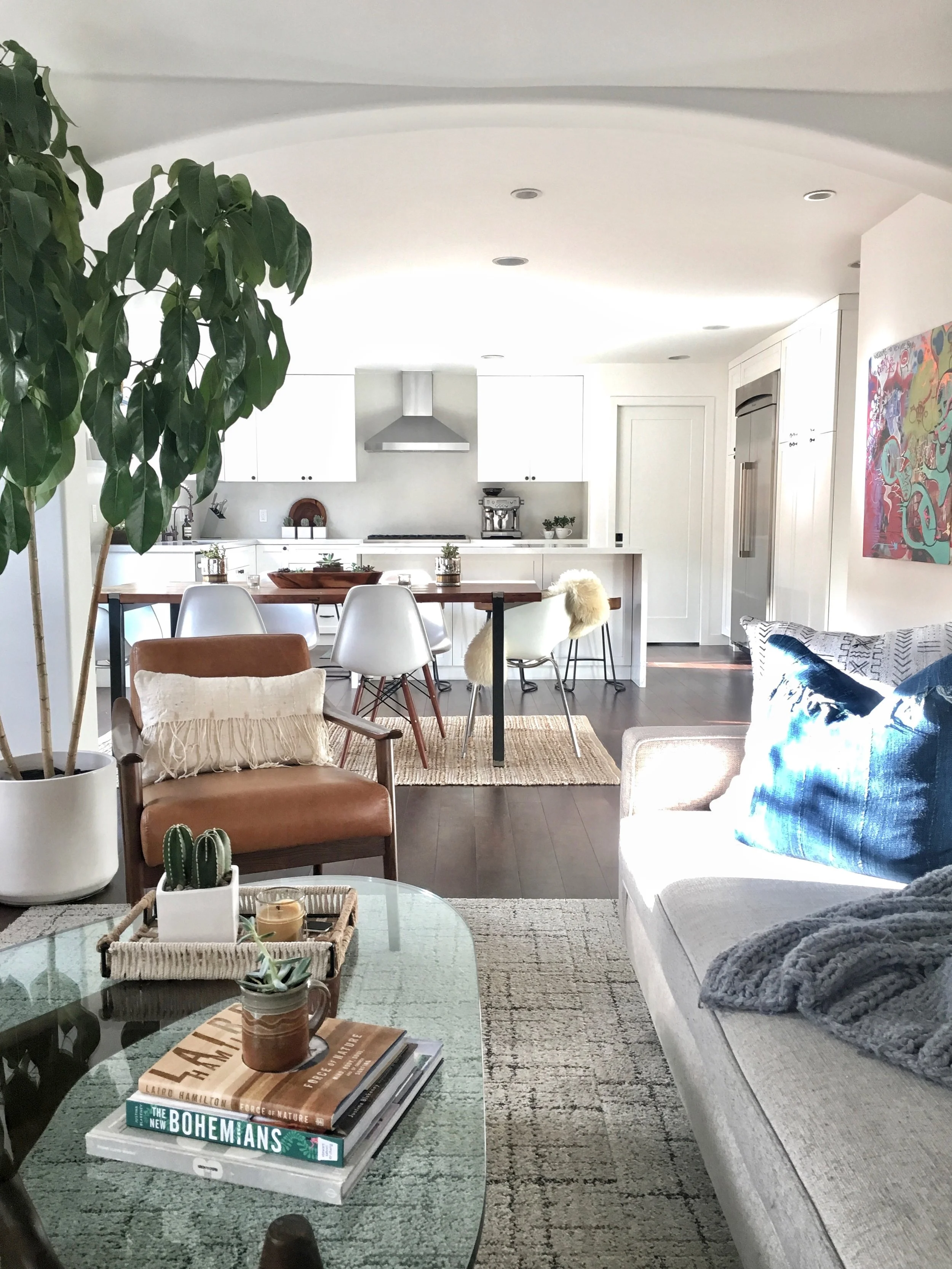
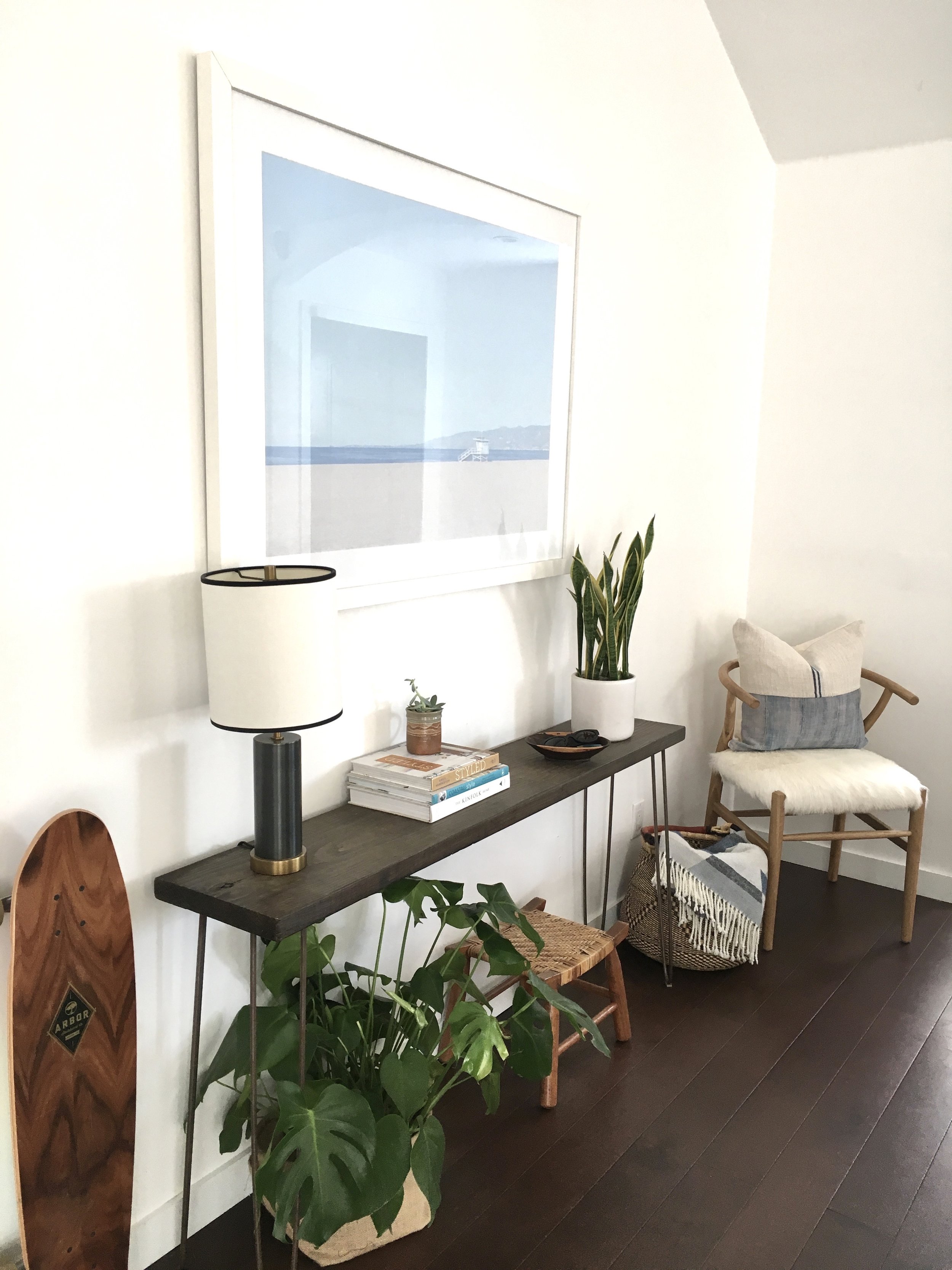
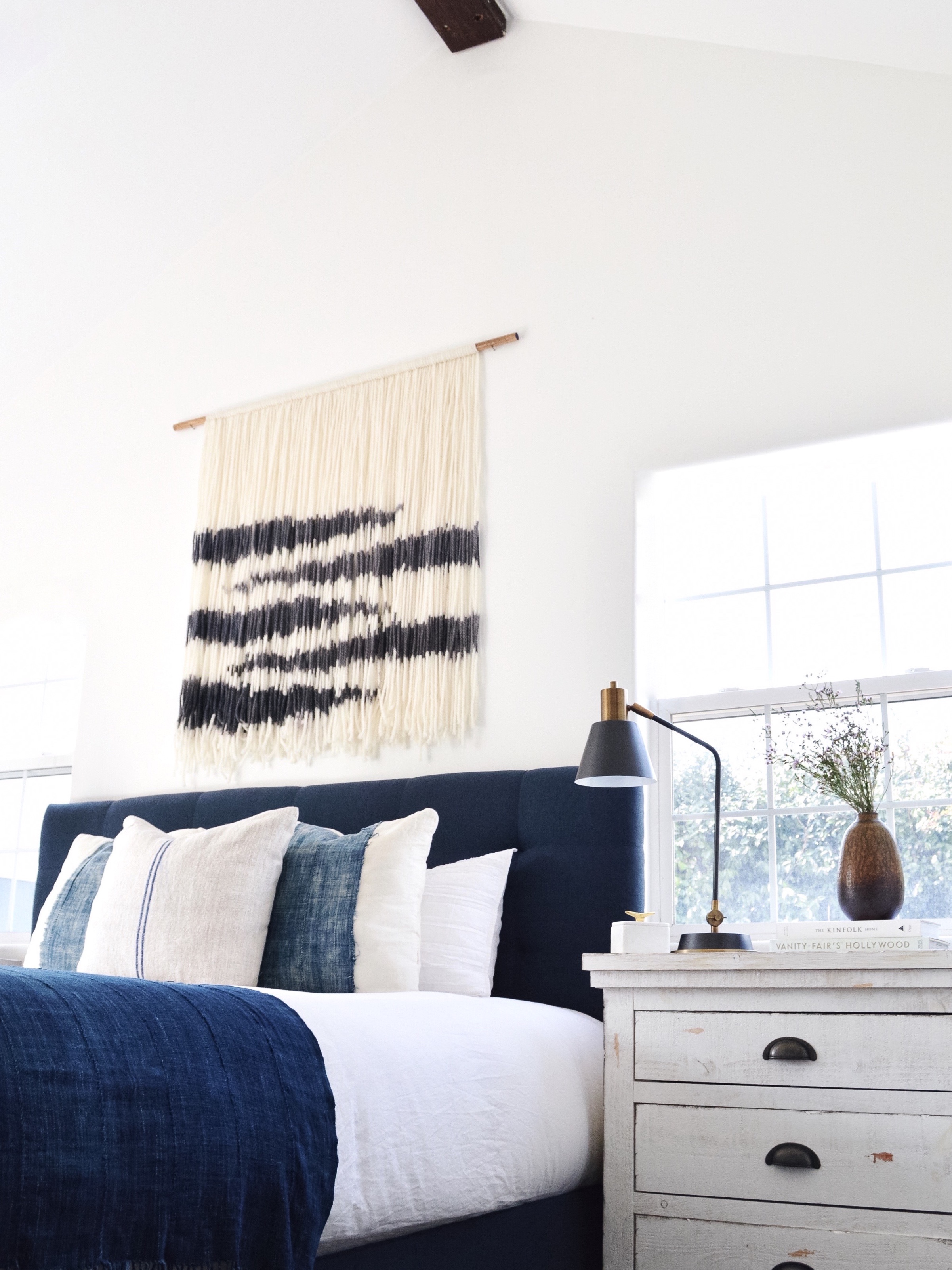
Kristin's family home is mid-century, bohemian, bright, and kid-friendly. It's everything that is right with California style! And that style is the result of some pretty great influences.

One of those? Kristin's mom and her partner.  

They travel to craft fairs and galleries and very carefully hand pick art and pottery. They both have an excellent eye and have taught me the importance of collecting special pieces (furniture, too) over time.

Another? The physical surroundings in which she's chosen to raise her family. 

Venice has gorgeous diverse architecture. It is so inspiring! I love the modern beachy bohemian design trending here and it has definitely influenced my style.


It still takes a heckuva internal compass to get the blending of all those influences right. And for Kristin, that compass is her family. Above all, her space feels like it's made for a family. For movie nights, games, making a mess - all without, as Kristin says, "freaking out."

And with a family, everything has to be built to last.

I love picking furniture that is simple, modern and classic made to last for a very long time. The grey couch in our family room, for example, is a couch I’ve had for 15 years! And then, as trends come and go, I can keep up with them with accessories. Accessories can be sourced for so much cheaper! For example, my bohemian basket wall in my dining room cost $30 total because I found the baskets at antique and thrift stores.

Some of those trends that Kristin just nails are her bright white kitchen (Kristin would like to thank her friend Hannah, @repeatworld, for her valuable input), which is the perfect clean and beautiful family gathering place; the indigo and mudcloth pillows, lovingly placed both for their cuddling abilities and for impromptu photo ops; and the graffiti art that pays homage to none other than Venice Beach itself. 

Kristin, your home represents everything we love about style mutts. It's functional, fun, and most importantly, a reflection of you. Thanks for showing us around! Follow Kristin along on Instagram @ksdion

See you next week, mutts! 

Oh Grow Up... Art ||Flip List Item No.4||

For a few months now, my collection of original abstract artwork has felt...off.  It's like you're trying to copy your mom's crowd-pleasing artichoke dip and yet it just doesn't taste the same when you do it - you feel me?

image.jpg

In an effort to solve this art conundrum, I declared "Grown-Up Abstract Art" as item No.4 on my furniture flip bucket list and began to do some research on what ingredients may be missing from my art collection.  After consulting pinterest, I kept stumbling on some delicious abstract art showcased in gorgeous, minimal floating frames.  

Source: Ellen Dodd

Source: Ellen Dodd

And so my first theory was formed.  I rummaged up some spare wood trim to fashion a make-shift gold frame for one of my smaller pieces, but when I finished it still felt juvenile somehow.  

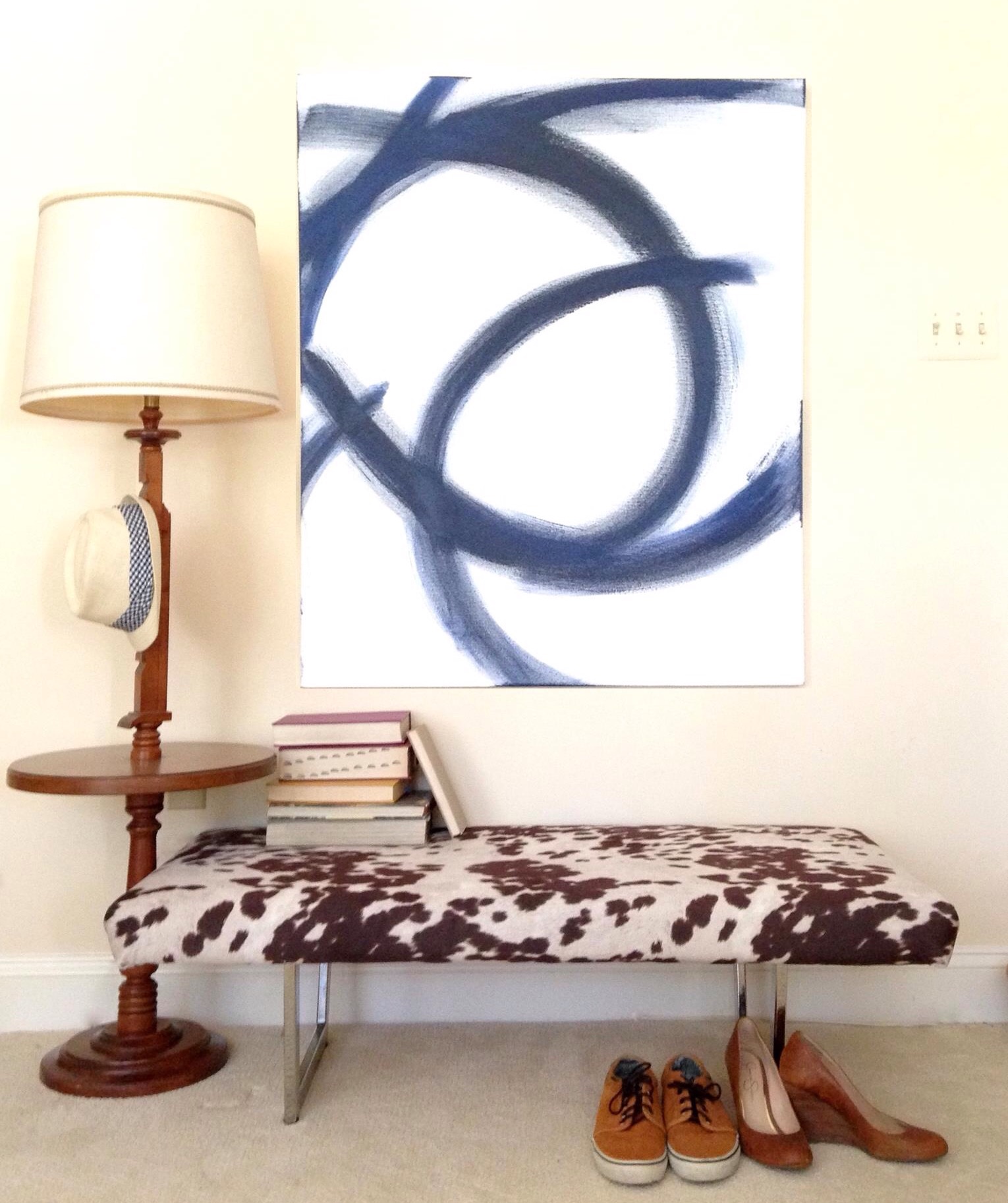
After mulling over it for a little while longer, I began to think that perhaps my portions were off.  I love to paint but I'm no professional artist - when I paint, I can't help myself: I love ALL THE COLORSSSSSS.  But perhaps I need to balance out the generous helpings of bold pops of color with some graphic patterns and white elements like this large piece I painted to help stage the cowprint bench.  [It actually sold at our Pop-Up Shop at Sweet Clover Barn so I never got the chance to mix it into my new abstract art recipe.]   And interestingly enough, despite my obsession with large-scale abstract art, I don't actually have any pieces hanging in our apartment. 

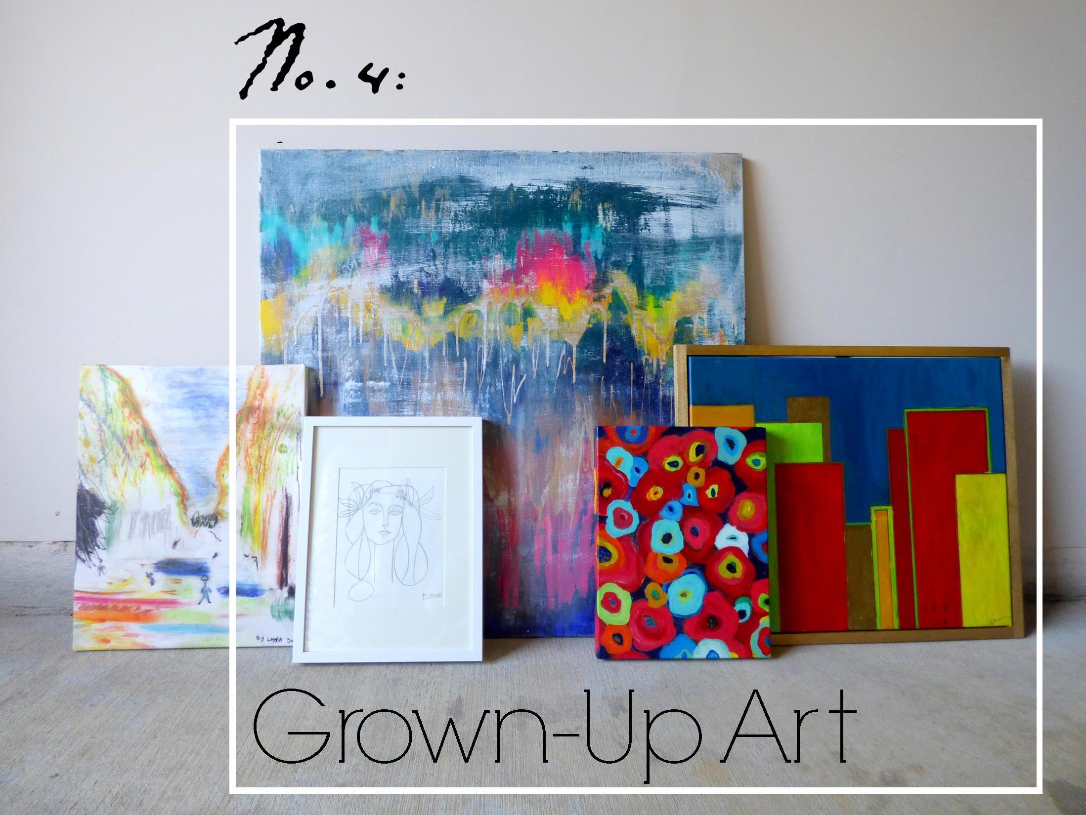
Ok so let's meet the "art ingredients" I do have in stock and let's see if we can mix them together for a winning combo.

Meet Art.jpg
Van Gogh's Les Alyscamps

Van Gogh's Les Alyscamps

  • "Les Ales Camps" - a 3rd Grader made this piece at a school I worked for.  The elementary art program was doing a series on Van Gogh and this young artist was studing Van Gogh's Les Alyscamps (which she mistakenly labeled as "Les Ales Camps" in the top right corner lol.  I loved the playful take so much that I had it printed on a canvas to hang in my office.
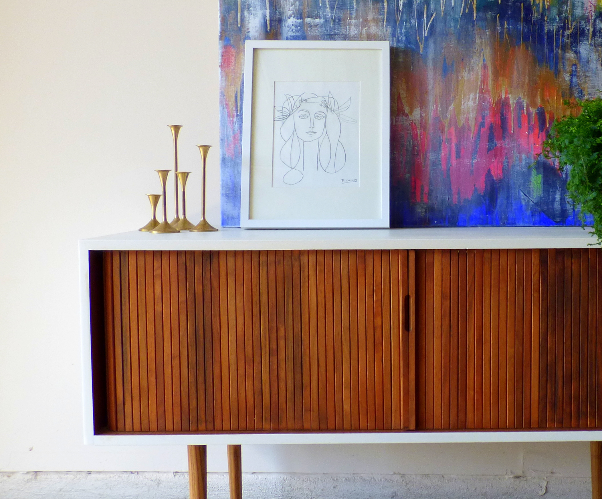
  • "Unnamed" - this is the largest piece of abstract art I've done and yet I haven't found a place for it.  I think I feel like it would overpower any of our small spaces so I've never hung it in our home.
  • "Hadley" - this is the piece I tried to give a floating frame.  I think the proportions are off and I would like it better if the frame were thinner and little daintier.
  • "Picasso" - this is another piece I can't take credit for.  I just love this line drawing so much that I traced it on some paper and popped it in a frame - forgive me Pablo P.
  • "A Riot of Color [in a dreary world]" - name that movie!  I painted this poppy-inspired piece while watching a Heath Ledger favorite (may he rest in piece).  You may recognize this pop of red from staging this piece here

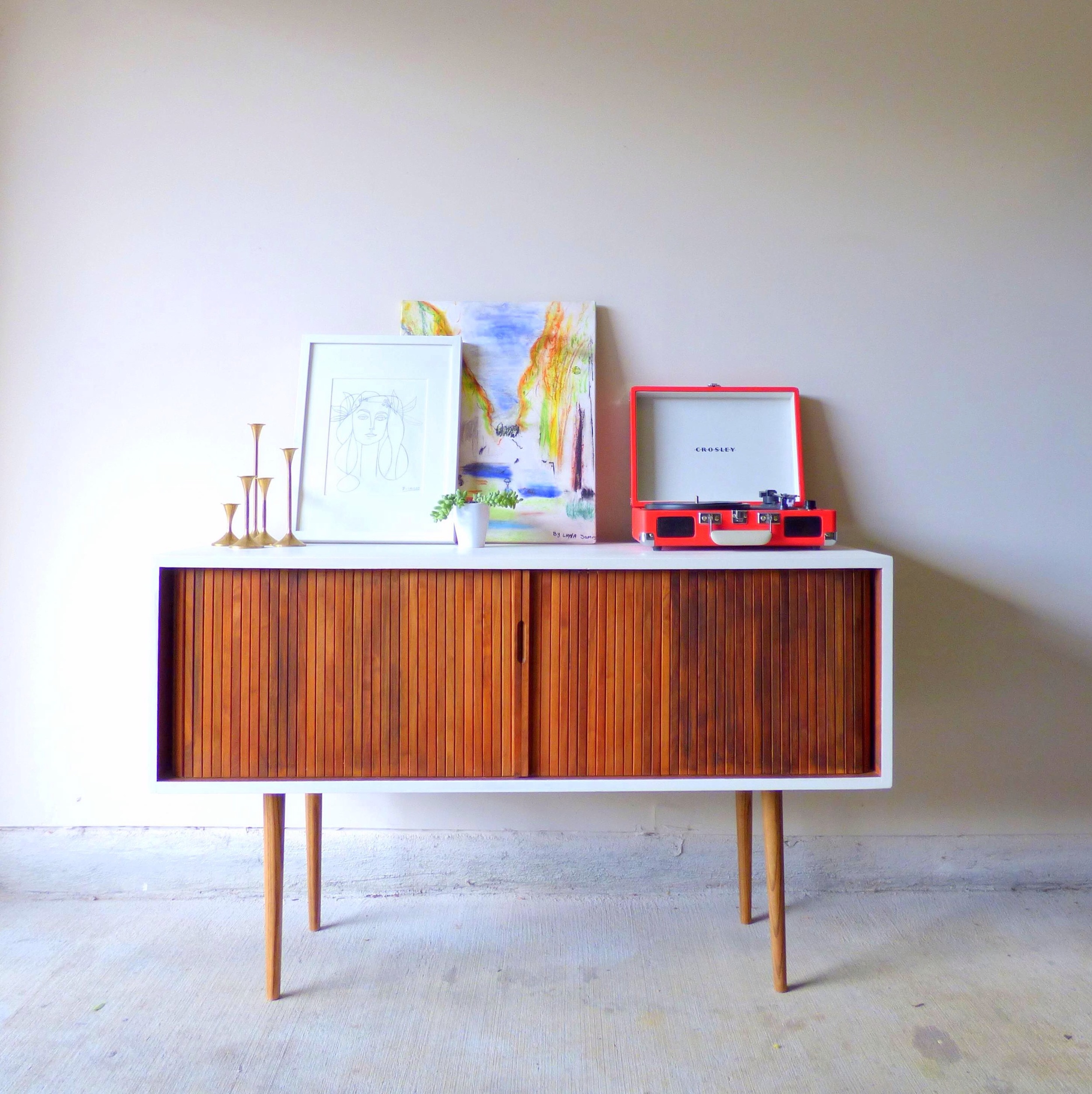
For plating purposes, I've enlisted the help of a fresh flip who'll be heading to his new home in DC soon [I removed the original toe-kick and added tapered legs with the nickle caps cut off and painted the top and sides a glossy white].

P1010468-001b.JPG
image.jpg
image.jpg

Art Recipe No.1:

image.jpg

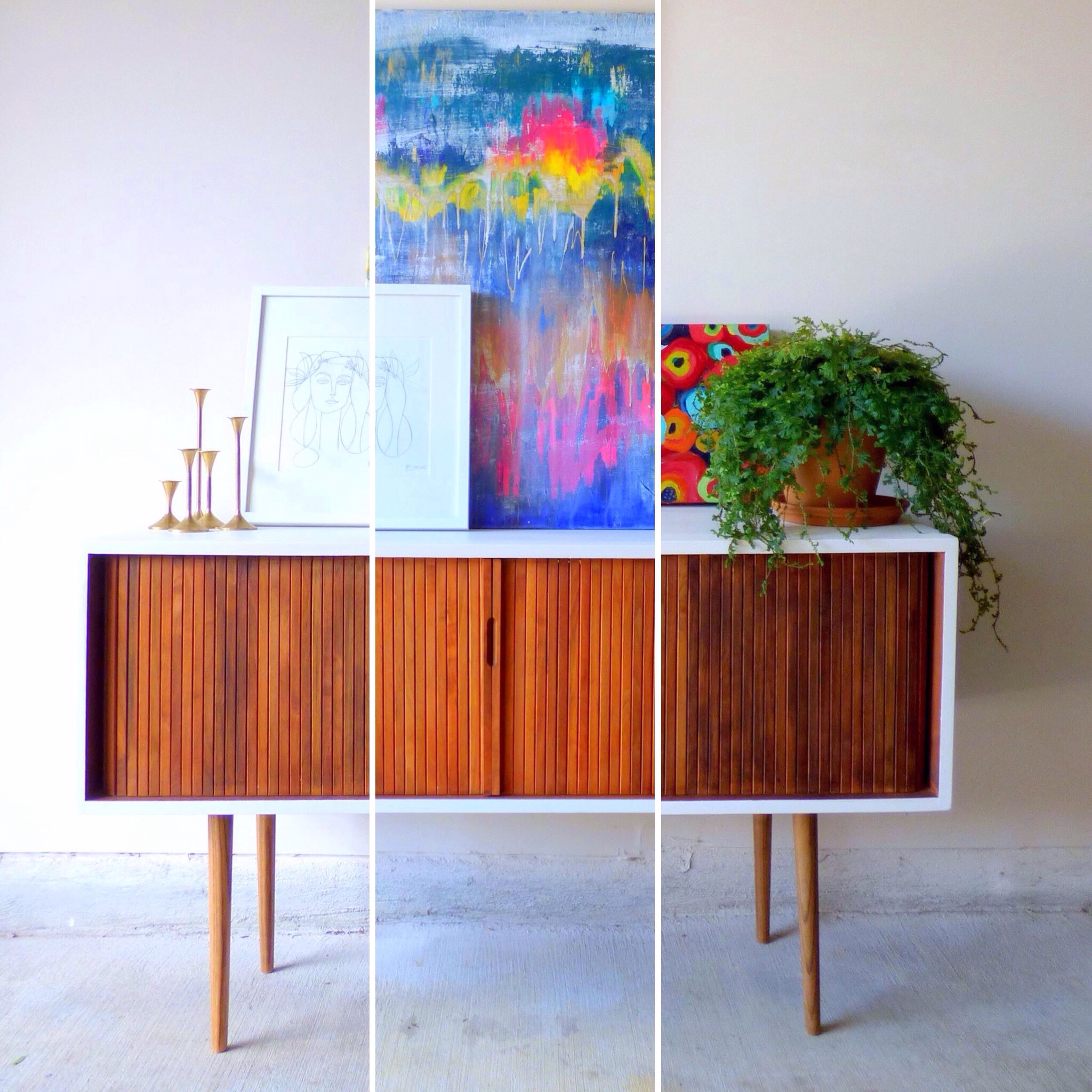
Playful "Les Ales Camps" with a side of "Picasso" garnished with plant, brass candlesticks and record player served on a Mid-Century Record Console Table with storage for your vintage record collection.

image.jpg

[How cool is that rolling door for space-saving storage?!  And there are four compartments inside with removable vertical dividers.] 

image.jpg

To combat my tendancy to over-saturate with color, my thought here was to pair the two "lighter colored" art pieces on a white-wall background.  The smaller graphic "Picasso" cuts the intensity of the color in "Les Ales Camps" and the record player.

Art Recipe No.2:

image.jpg

A large helping of "Unnamed" abstract with a side of "Picasso" drizzled with candle sticks and a fern for garnish.  Since "Unnamed" is such a powerful flavor, I also tried to soften it with the dainty print and anchor it with a large plant. 

Art Recipe No.3:

image.jpg

Spiced "Riot of Color" and "Hadley" with creamy "Picasso" served with natural elements encased in glass cloches and garnished with a potted fern.

image.jpg

[Look at that gorgeous wood grain in the slats of the console table's rolling front.]

image.jpg

Since I was using two bold paintings, I again employed the "Picasso"print and accented with the airiness of the glass cloches.

image.jpg

[Fun fact: the stand for the raw mineral is just one of my fluted candlesticks turned upside down].

image.jpg

Which recipe hit the spot for you?  Any suggestions on how to make my art collection more flavorful/ refined/ spicy?  Leave your tips in the comments below!

image.jpg

Mid-Century Record Console Table
48"W X 18"D X 29.5"H
SOLD
$525

If you are interested in a custom order like this piece, please contact me at  cate@stylemutthome.com

image.jpg

Check in on the progress of this year's furniture flip bucket list:

DIY Abstract Art ||And a Short Video||

Guys!  I made a video!  It's hilariously embarrassing because you're just staring at my butt the whole time [and my shirt was a little low cut - YIKES!]  But because I love you all and trust that you won't make fun of me too much... I'm gonna let you watch it ;)
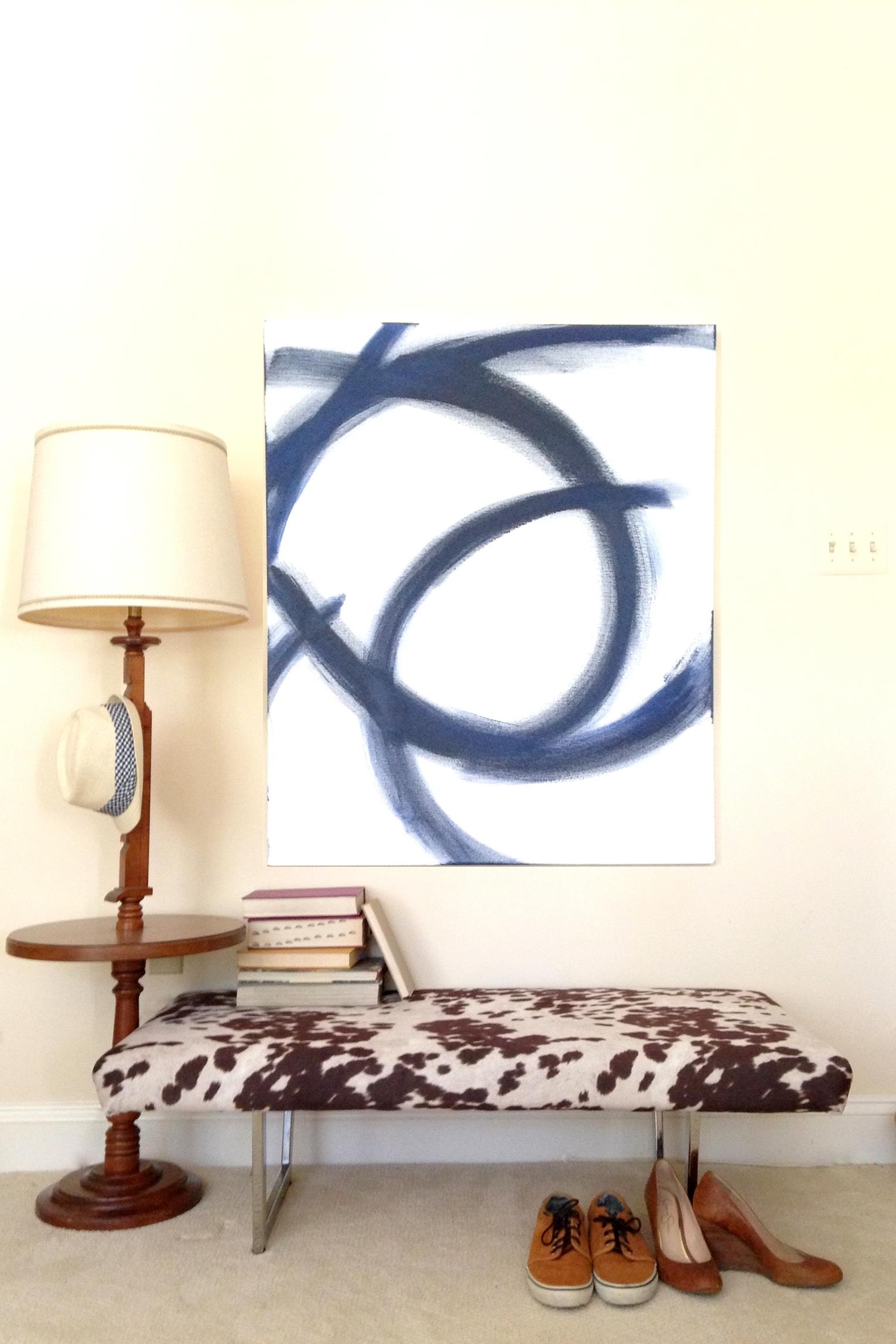
But first let me explain what would possess me to play cinematographer in the first place.  So remember when I used an oversized graphic/abstract art piece for this staging sesh?  

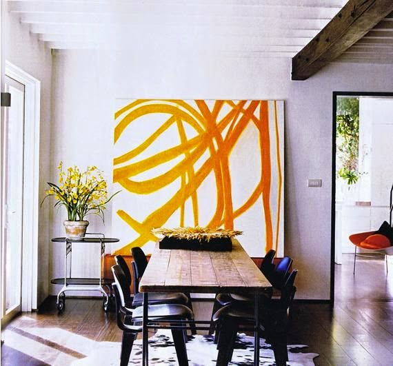
Well I was inspired by the oversized abstract art that is popping up in decor magazines and trendy homes all over the place.

Source: Martha Stewart via Apartment Therapy

Source: Martha Stewart via Apartment Therapy

Source: My Domaine

Source: My Domaine

Source: West Elm

Source: West Elm

But what you didn't know is my DIY version only took me 5 minutes.  What?!  You don't believe me?!  Well that's why I took a video ;)  Before you watch, let me briefly explain my process behind this piece.  First rule of abstract art: there are no rules.  Seriously, just let yourself go wild and stop when you like what you see.  


I opted for a navy paint [mostly because I didn't have any black] but I love that it makes it a little less stark.  Using a large paintbrush loaded with only a little bit of paint, I made broad, sweeping brushstrokes across the canvas.  I wanted the strokes to really show some texture so I only filled in where I wanted a richer hue and stayed more "feathered" at the edges. 

Well.  Here goes nothing.  Thanks so much for watching and I hope it at least makes you chuckle ;)

It's a painting in 5 minutes! You heard me right - now you can watch the evolution of the DIY abstract art from my mid-century-modern-rustic-eclectic photoshoot. Enjoy!*disclaimer* this is my first video so bear with me (and also... I'm sorry)

Posted by StyleMutt Home on Sunday, September 6, 2015