Reader Design: Jan's Eclectic Quarters

And just like that, my week of California vacation has come and gone. I know it was hard getting through last Friday without a Reader Design tour to gawk at, but at least you had Chelsea's home update to keep you company! Did you miss it? Check it out here

Now, back to our regularly scheduled programming... with Jan's Eclectic Quarters!

Jan and her family live in Upper Arlington, OH in their stunningly decorated home. Fun fact: my boyfriend is also from this adorable area just outside Columbus, so I can vouch for its family-orientation and charm. Those qualities have absolutely carried over to the styling of Jan's family home. 
From Jan:

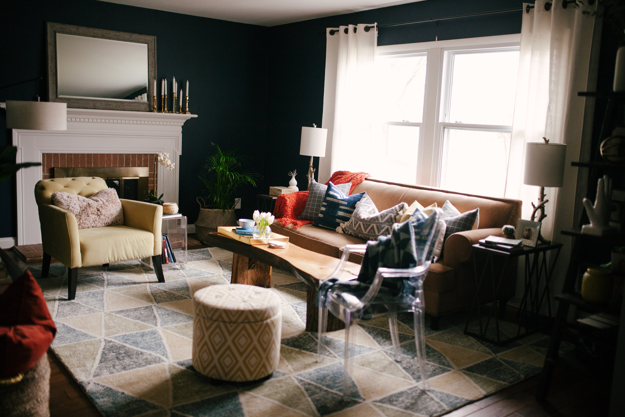
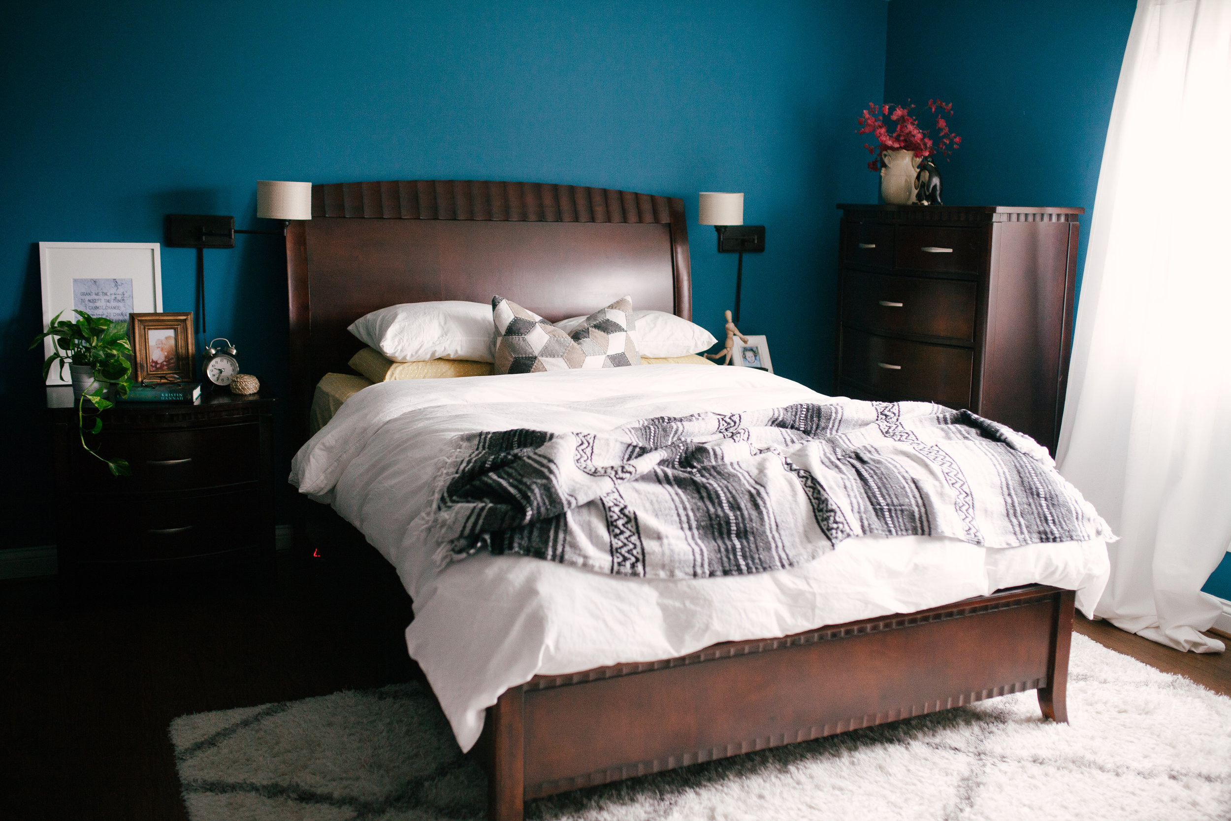
I am not able to describe my style simply perhaps because it is not simple. I would describe my style as modern, colorful, crisp, comfortable, and kid-friendly with touches of bohemian. All those words don’t seem like they would mesh, but that is exactly what our home has become. I’ve created this style based around feelings. I adore a space that is well thought-out and styled but comfortable to be in. I want my family and guests to feel this in my home.


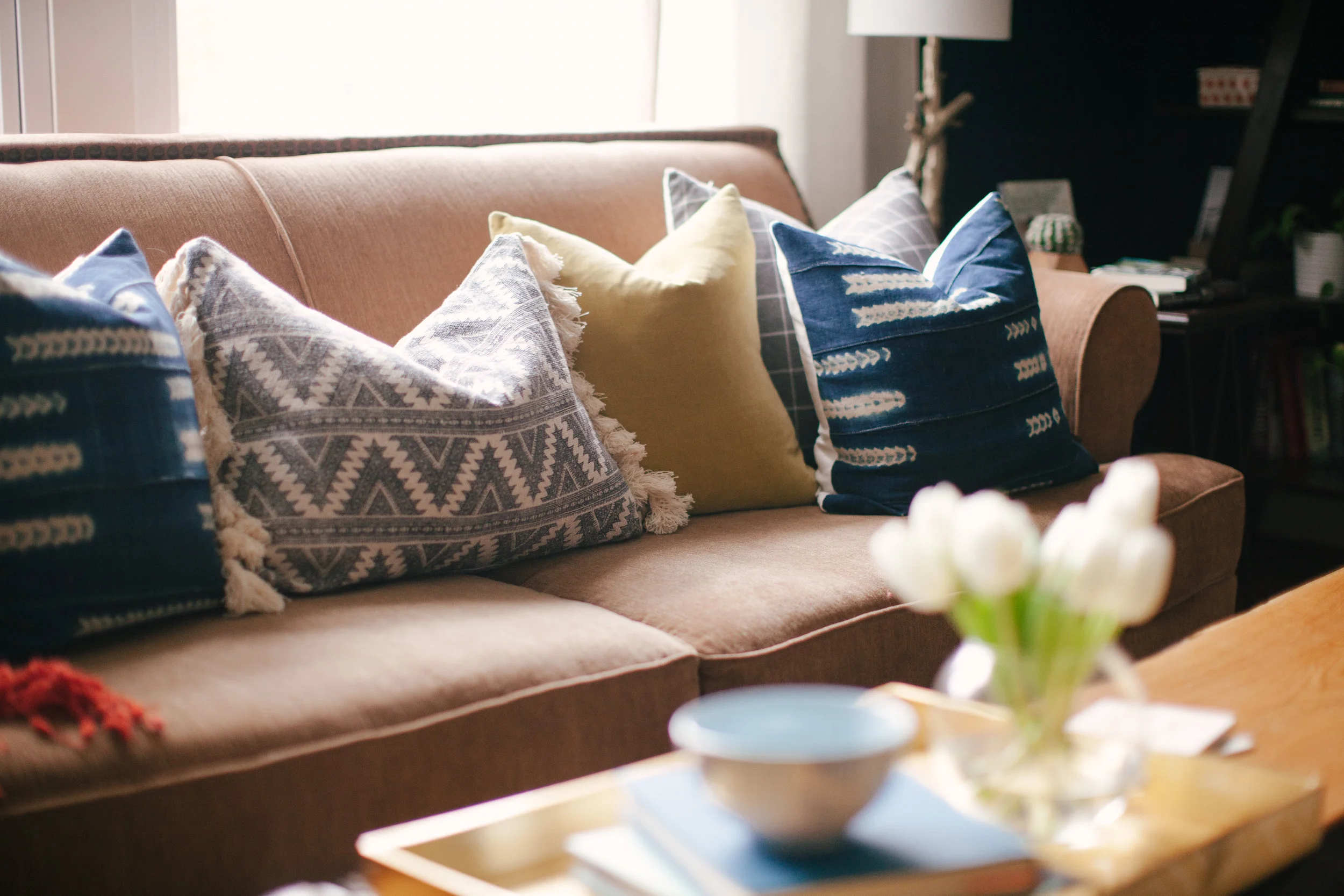
She creates that comfort using rich textiles, white space to ensure the colors she uses are really seen and add to the space, and meaningful pieces. 

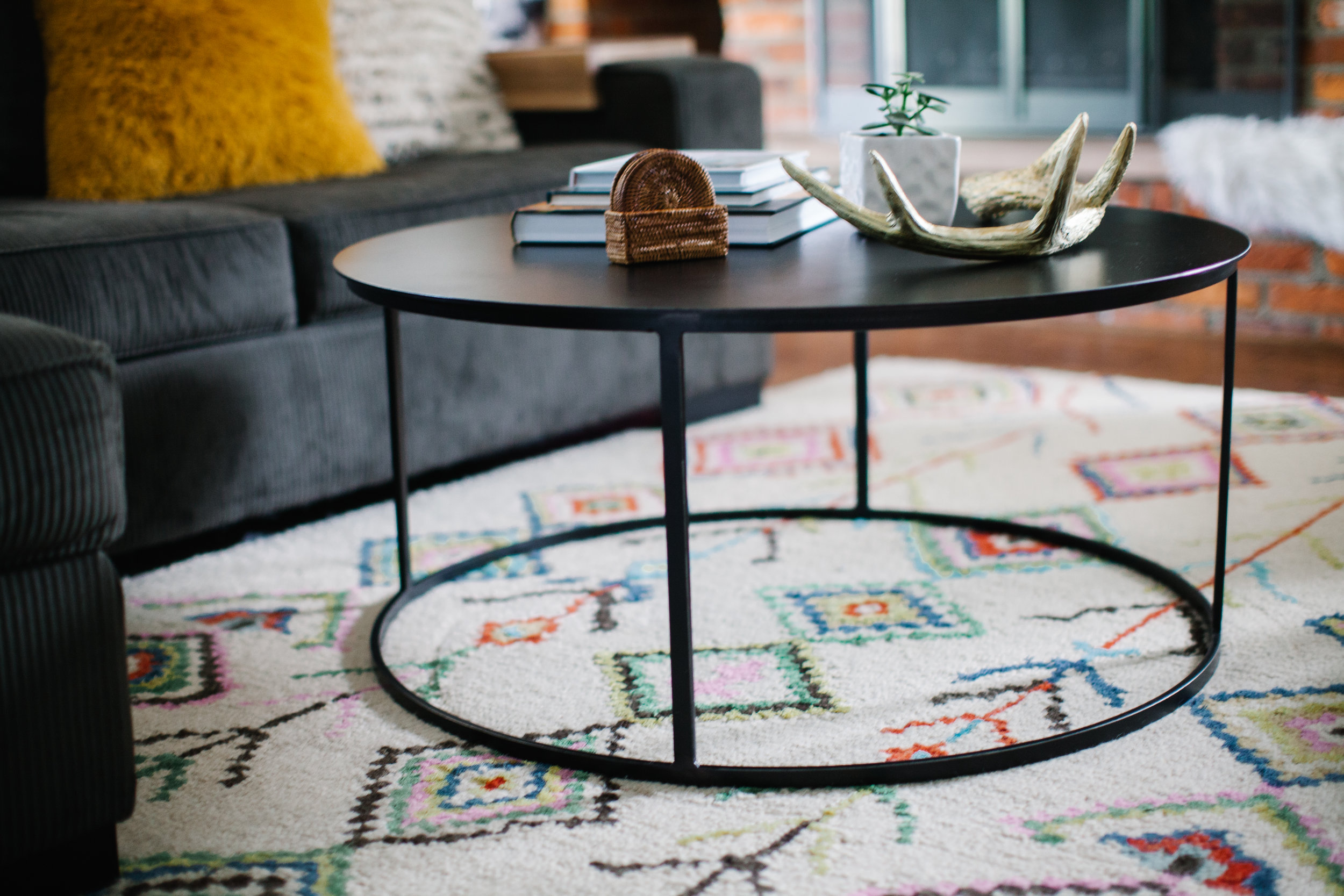
In my living room, I could not live without either my live-edge coffee table or geometric rug. I love the meaning behind my coffee table, as my father-in-law made it for us, and the warm feeling it brings to the space. And the multi-colored geometric rug just encompasses my style to a tee!

Let's break down this space in Jan's kitchen. It almost perfectly illustrates the meshing of all those styles Jan mentioned - bohemian, modern, crisp - and even some she didn't - traditional, Scandinavian, rustic. I am a total sucker for beadboard paneling. I will have it someday, somewhere, somehow; and I just love the way Jan uses it to anchor the dining nook. Paired with the light fixture (quick aside, how refreshing to see something other than brass!!), it's the perfect spot for the kids to tackle homework or to enjoy dinner together. 

Clearly, Jan is quite the style mutt; but just because you're a mutt doesn't mean your design identity changes on a whim! No, Jan definitely knows who she is and what she likes.

I do get a lot of inspiration from trends but will find myself always asking these questions: ‘Will I love this in 5 years?’ and ‘Does this fit my style?’

I try to look at all design inspiration as an option, but I have learned what to weed out based on what works and does not work with my style. A trend that I have fallen for in the last year is greenery. I am a new plant lover and appreciate the life, texture, and color plants add to our home.

Jan, we think you're navigating this crazy, inspo-ridden world of design we all love like a champ. What a beautiful home to raise your family in! Follow Jan along on Instagram @spicysaltysweethome and her blog, and while you're at it, check out her awesome photographer @loribaskinphotography.

See you next week! 

Shire's Room Makeover: The mission & the plan

I absolutely love playing with our home. It's a chance to try some different things and experiment. Playing around with arrangements, layout, colors, pattern, lighting, textures - it helps me learn in an environment where mistakes are accepted, and I can really get some experience under my belt.

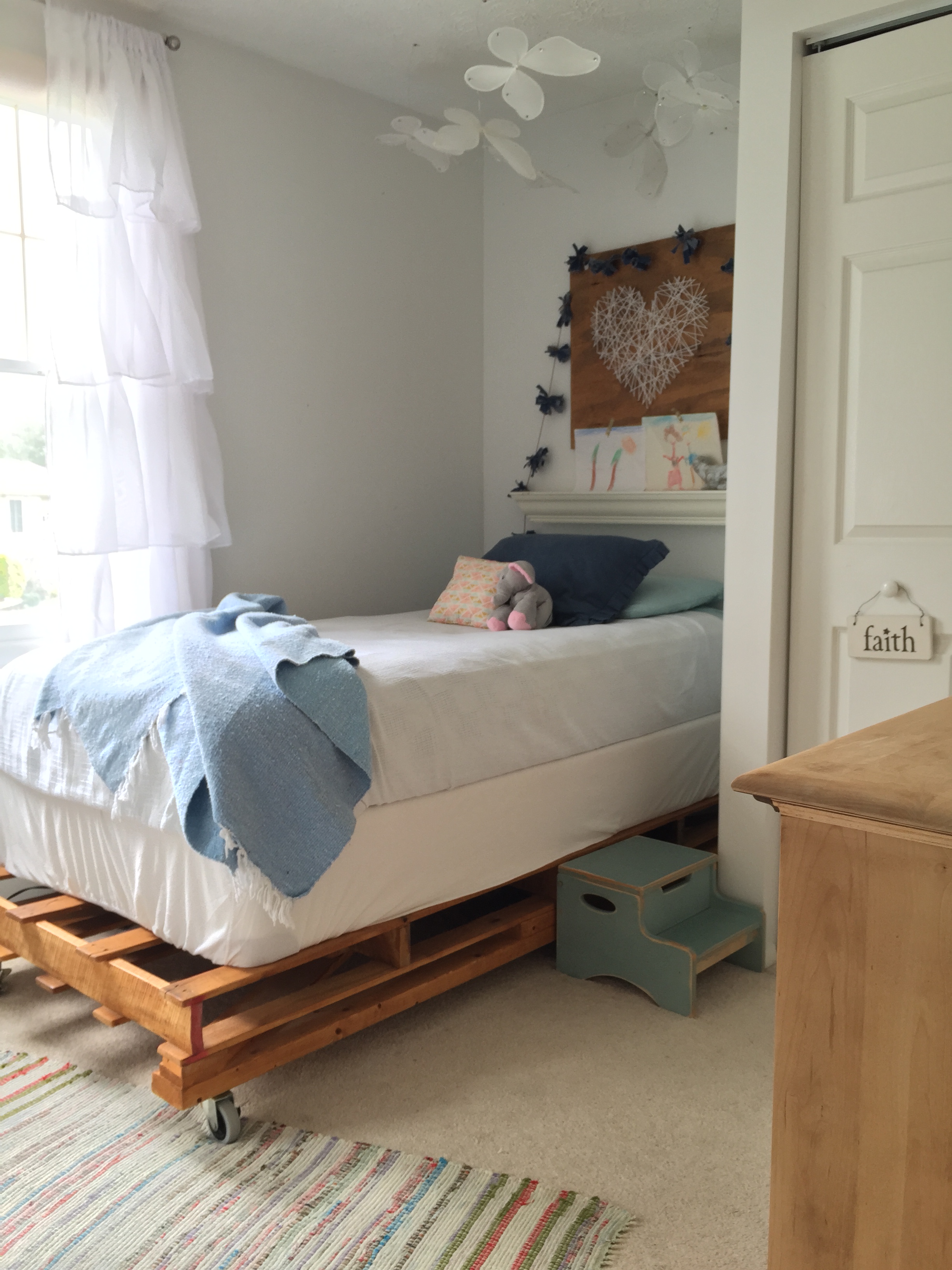
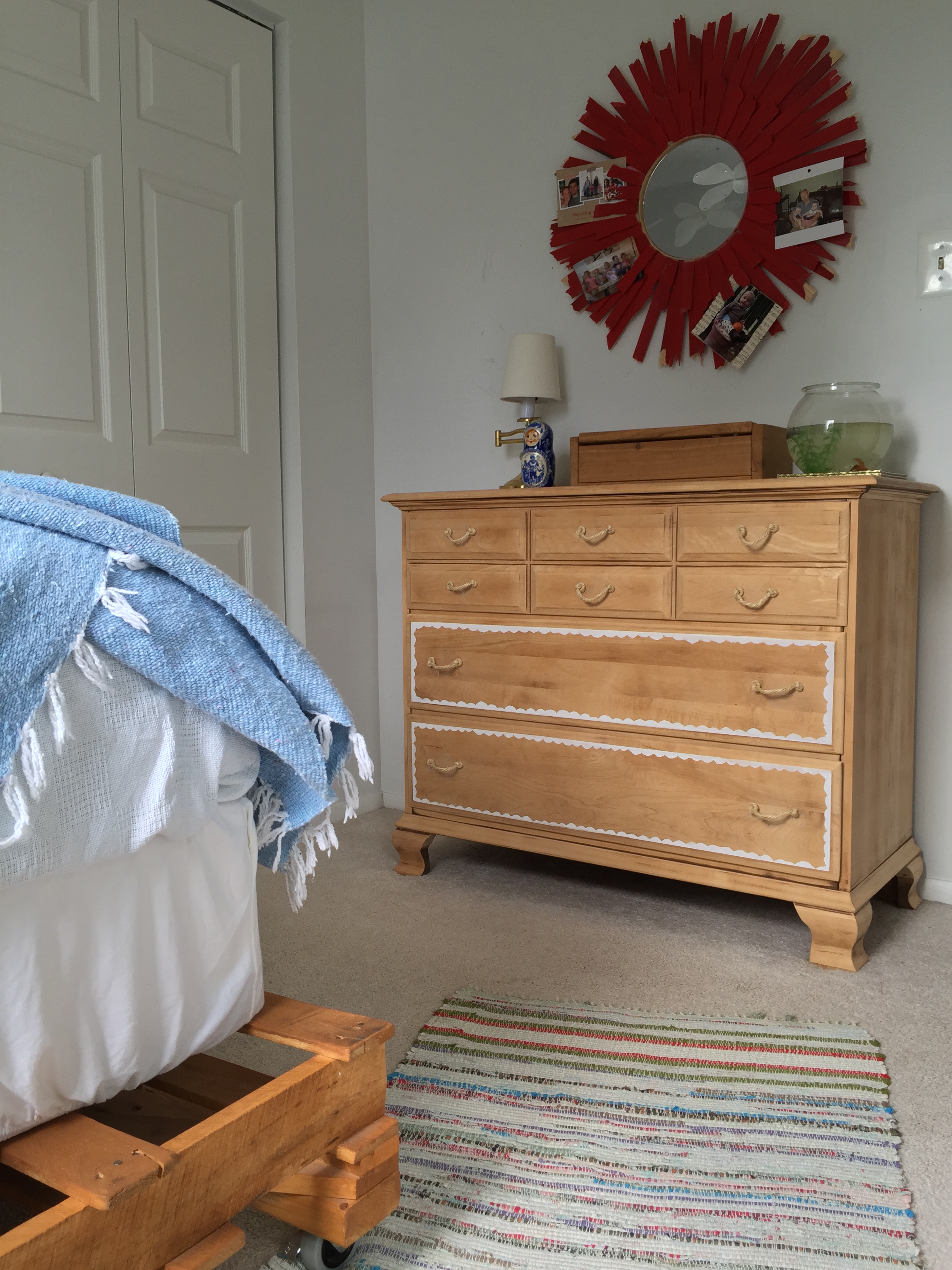
But back to the mistakes. Our daughter, Shire's, room has probably been my greatest mistake yet. It's the smallest room in the house and when we moved her in here, I gave no thought to smart, functional space planning. I shifted things around on a whim, built her a bulky pallet bed platform, (leaving no under-bed storage), snagged a giant used wardrobe from Craigslist in mediocre condition, and called it good enough.

As the only girl under our roof, my heart went out to Shire. While she said she really liked her room, she never played in here. Not even once in a blue moon. Her dolls and doll clothes and puzzles were stashed messily in the wardrobe, (not pictured but just about 20" from the foot of her bed), and because the thing had become so disorganized she rarely opened it's doors, (which were hard to open anyhow because there was hardly any room left). After updating the boys' room when we bunked their beds, I saw how smart space planning really increased the use of their room for play time. Our three kids are all the same age so they naturally play with the same things and always together. It's hard to get alone time here; everyone's interested in the exact same things at the exact same times! This past summer it occurred to me that the kids bedrooms could be used for quiet, alone play time. And to get them that way they needed to be spatially planned better than they were.

So as soon as I was done with the boys' room, I turned my attention to Shire's. The mission was to spend nothing on her room makeover and this was the plan I designed on Olioboard:

olioboard.jpg

The thing about a room makeover rather than a room design is that a makeover implies that you at least have existing stuff in a room. And the thing about having existing stuff is that you can either reuse it in a different way, or try to make a profit from it. And if you can make a profit from it, you've got yourself a little extra $ for your makeover! So up went the pallet bed and a few other things for sale, and with the money I invested in a few things I thought would really make this a special place for our girl.

A few players in the plan above include:
-Black twin metal bed frame from 9 by Novogratz

Sahaj Jute Curtains from World Market, (which would actually just be traveling across the hall from our room to hers)

Paint an unused bookshelf in our basement white, move it to her room

Move this painting by my grandmother above the bed

My goal has been to shop our house for pieces that make better sense for this room and use the extra cash from selling pieces we don't need on items that will compliment the room better. Aside from creating a room that makes better sense functionally and feels special to our Shire, the hope is to have a completely madeover space without spending a dime!

I've got a little ways to go and have deviated from the Olioboard design above just a bit, but will be coming back next week to reveal the full room makeover in it's entirety! Stay tuned, friends!

Thank you for stopping by!