Well hello there! I feel like a gopher every time I pop my head up for a post - unexpected and out of the blue. Hah! Truth is, Cate and I have always put life and family before our little corner of the great web, and these last few months have been richly full to say the least!
With a few design projects wrapping up this month I am going to do my very best to share things as close to live time on here as possible, but if you want the full StyleMutt Home design experience, you may want to head over to Instagram if you aren’t on there already! That’s where projects end up first, (sometimes weeks before the blog), since it’s just so convenient to upload the photos, (with far less words, you’ll be glad to know hahaha)!
But for today, I hope you enjoy the first of several reveals coming up in rapid succession - starting with Dani Barbe’s family room! We have worked through this beautiful home for the past 2.5 years, room by room, and now we are done. Holy smokes!. I’ll save the master bedroom for early next week and then finish with one final full home tour so you can see the cohesiveness of the home as a whole.
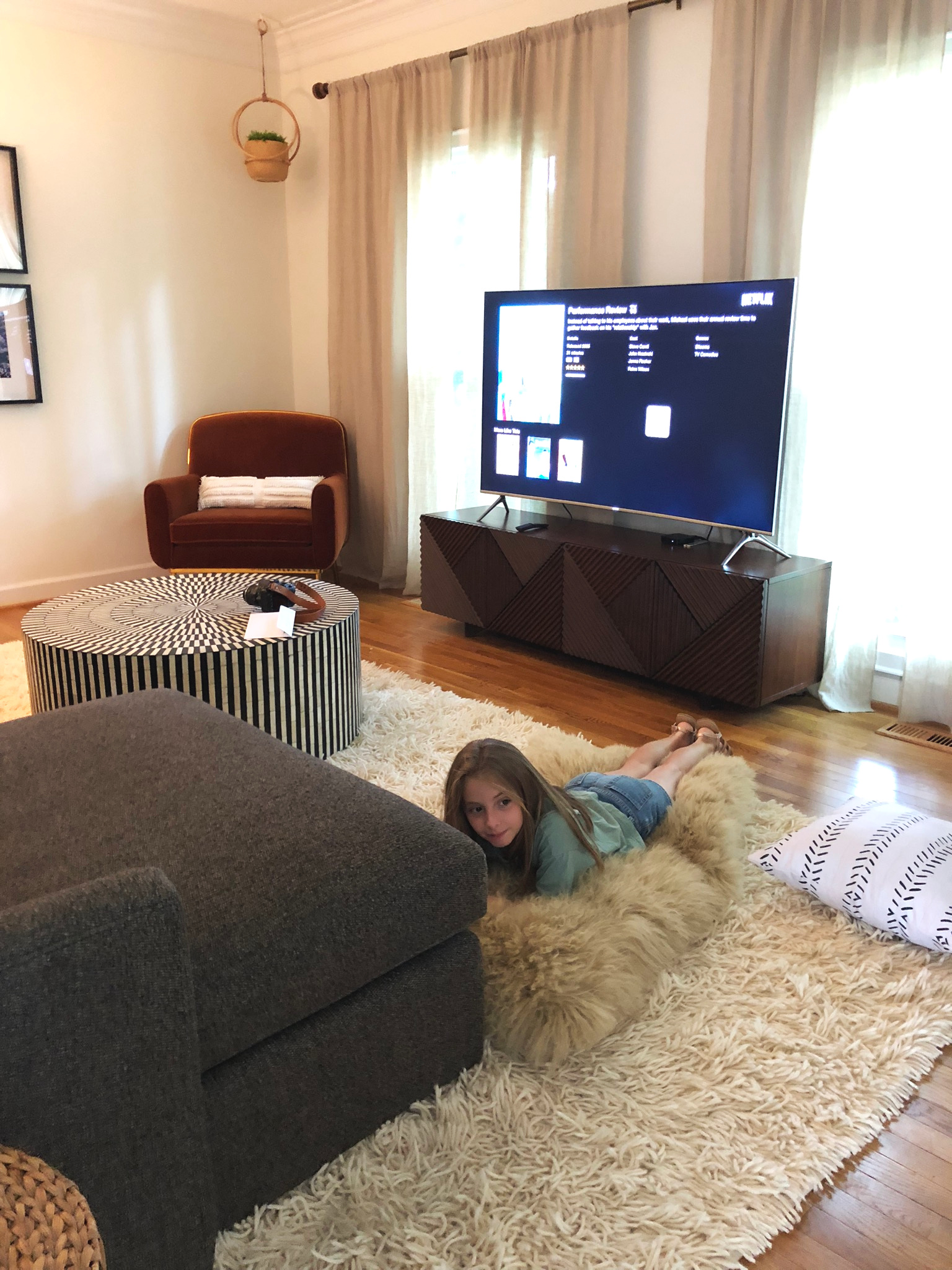
So here we are, Dani’s comfy family room!
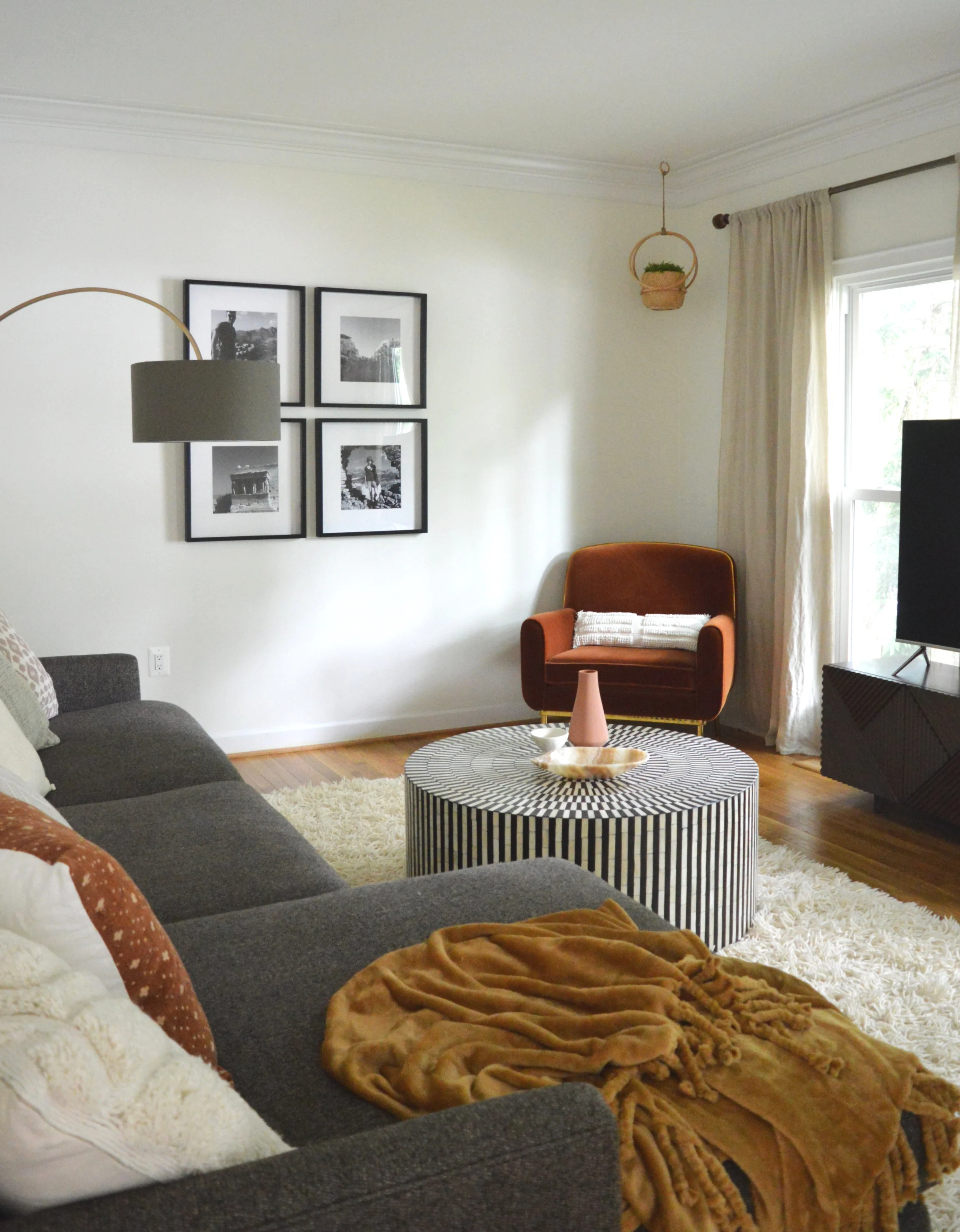
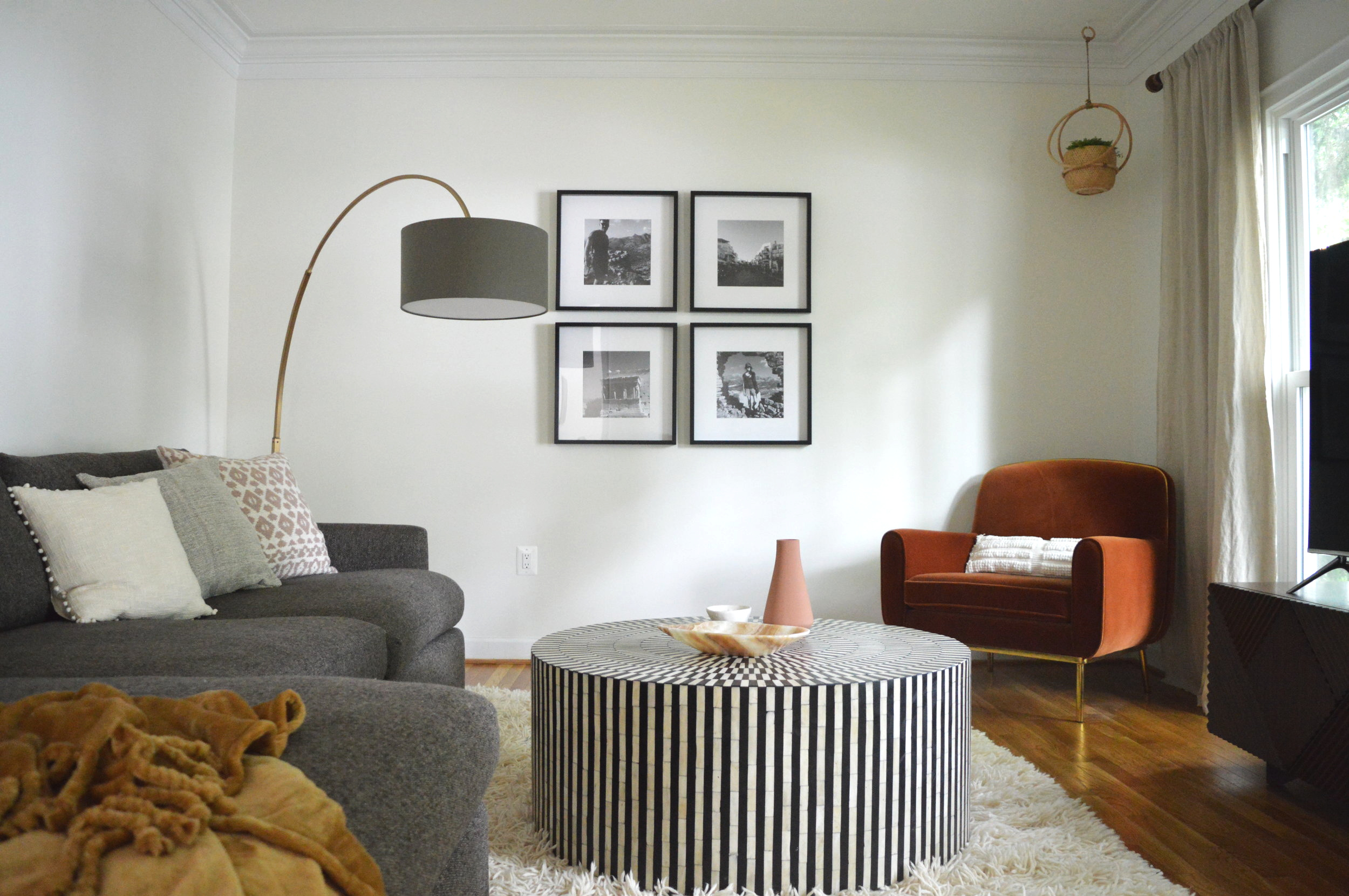
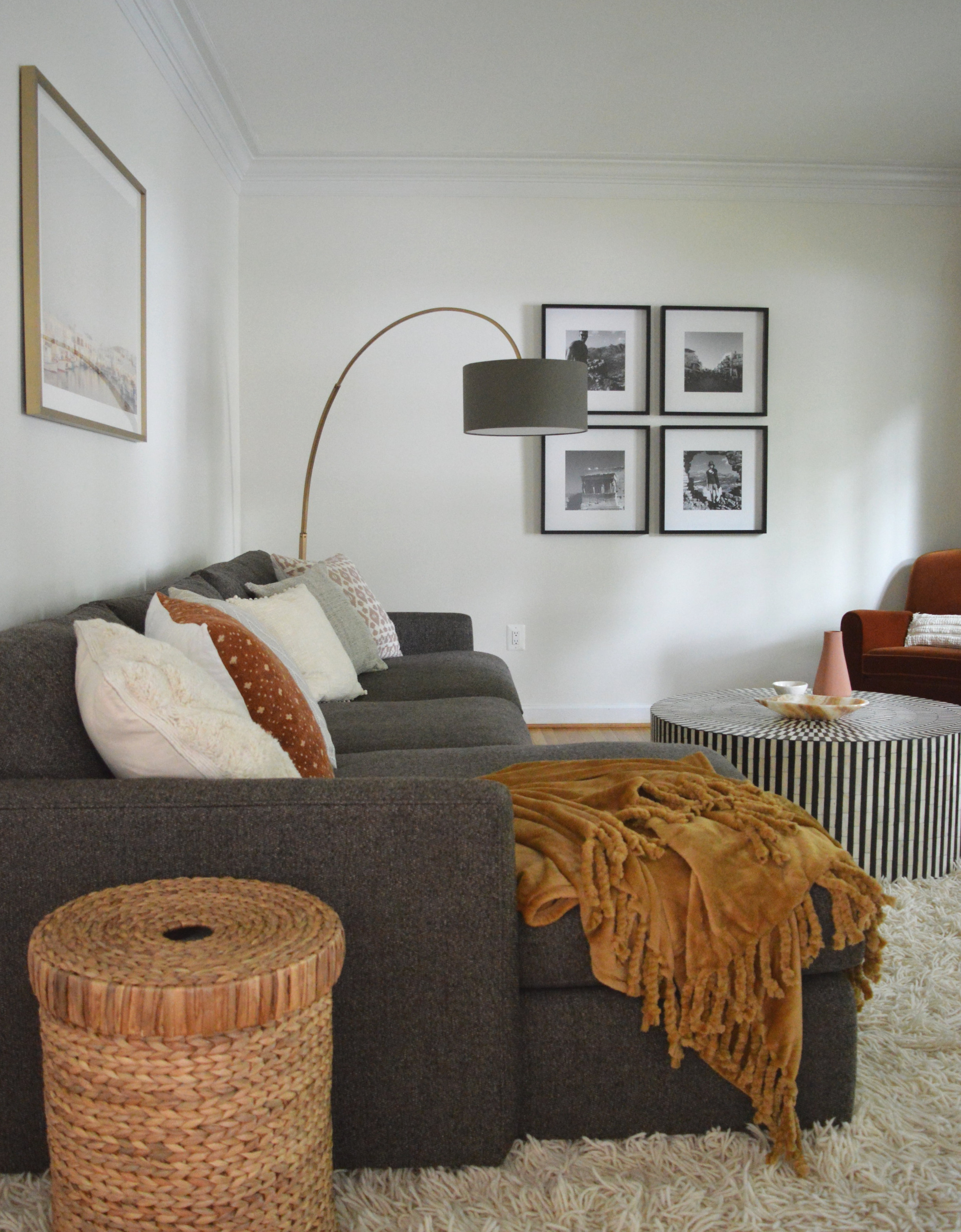
This space went from dark walls to light walls with dark furniture. It let’s the space pretend it’s cave-like without actually being a cave. While the rest of her home is light and bright, we went a touch moodier with this room, focusing on rich colors and bold contrast.
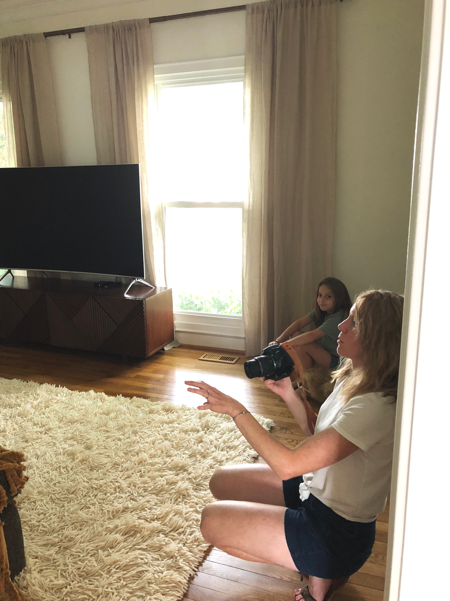
One of the first stops in the process was reorienting the room and moving the tv between the front two windows. This far wall was suddenly opened up and very, very blank! I absolutely did not want to add another furniture piece here just for the sake of filling space, and since Dani and her beau are seasoned globe trotters, I thought this space was the perfect opportunity to add some personal photos from their travels! This simple square grid of black and white iPhone photos framed in $15 IKEA frames might just be my favorite element in the room, (or tied with the chair…).
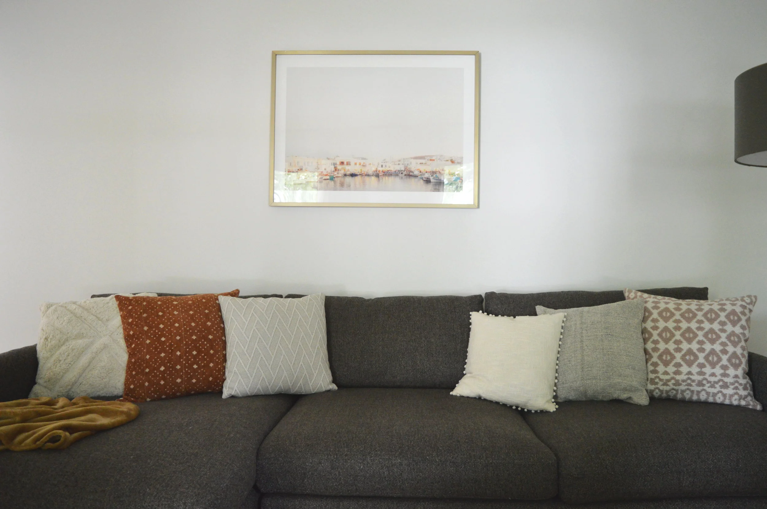
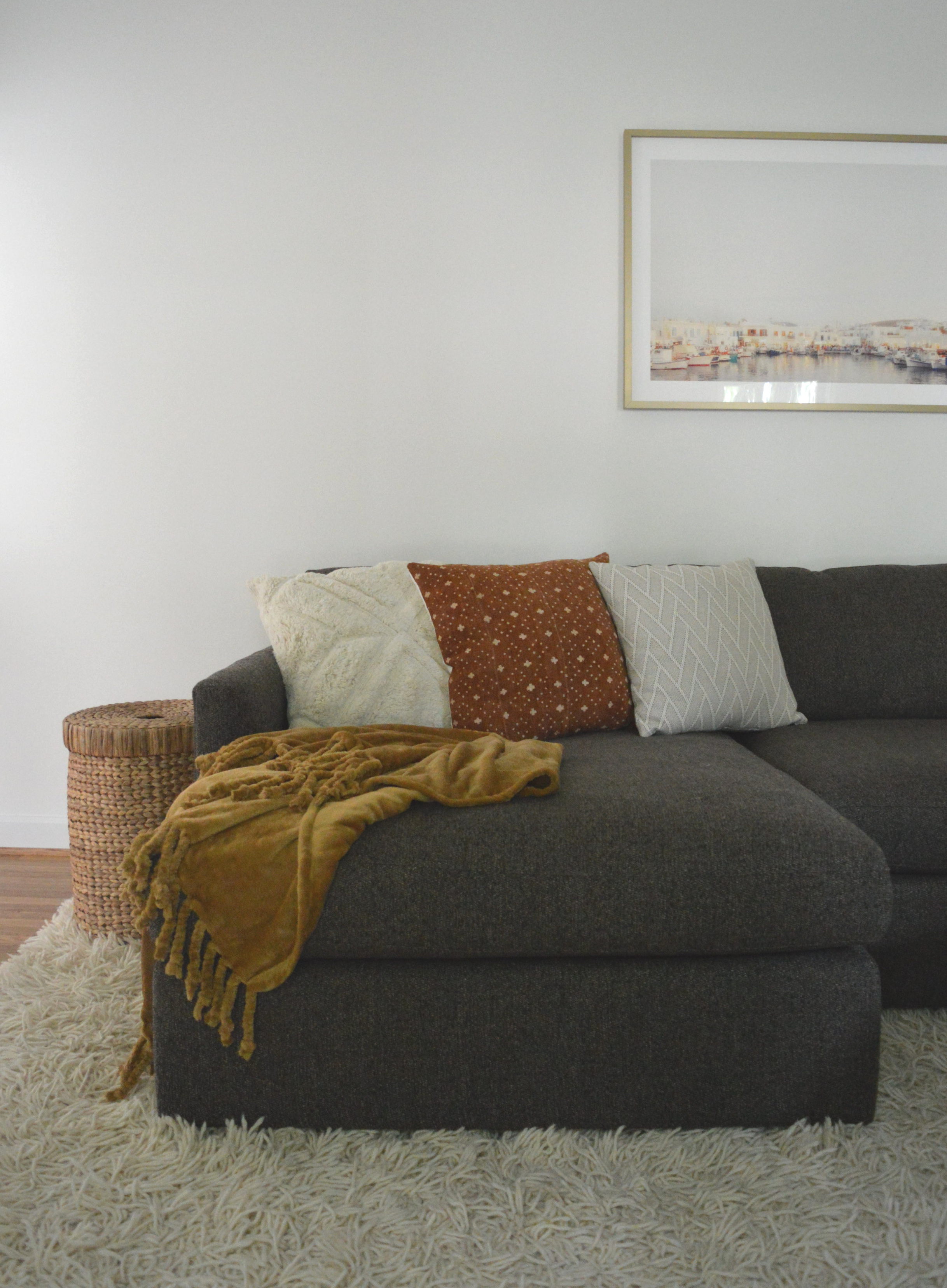
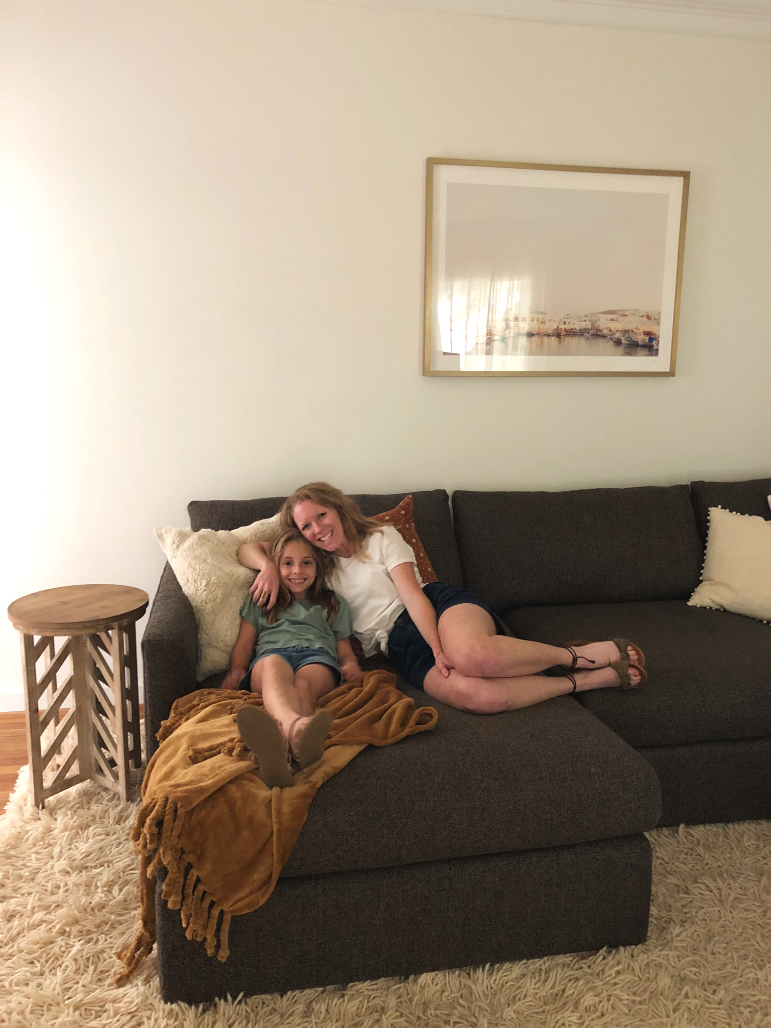
A framed port in Greece is a nod to the framed black and whites which were all taken in Greece. It’s a special place to this fun-loving couple and I wanted to tie it in someway that wasn’t screaming obvious. The pillows were all chosen intentionally to tie this room into the rest of the home, which I can’t wait to share in entirety next week!
Family rooms tend to get used hard in the very best way, which can sometimes result in style sacrifice. I totally get that. From personal experience, I get it. But I love that this space shows an alternative option - a comfy lounge space with durable pieces can also be beautiful. And there isn’t even that much going on! It’s my favorite kind of space; simple, comfortable, and interesting.
I had the pleasure of stealing Shire away from school to join me when I visited Dani’s home for the last time! We used to paint furniture in the garage together! Design is a different type of work but I have always treasured my kids’ being a part of things, however it suits their interest. And right now, missing school to join Momma totally suits her interest! Special thanks to Dani for taking these sweet pics during our time there.
If you stop by on Monday I’ll be sharing the full reveal of the master bedroom! Then I hear Cate has a little eye candy for you as well before I end this project with one final look-through. So bittersweet!
Thank you for stopping by, friends!
