We’re in Brooklyn!! This project represents a long time dream - designing in New York City! What can I say, I’ve always been charmed. This was actually my sixth or seventh design job in the Big Apple but the first one I’ve had the opportunity to take photos of. Coincidentally, I am working on two more apartments just around the block from here, (one being a generous word of mouth recommendation from these home-owners!).
When these adventurous globe-trotting clients approached me with little more than a random piece here and there in each room, I was so smitten with them, the stunning archways in their home, and their goldendoodle, Nala, that I couldn’t wait to jump in. Over the course of six months we worked together room by room, item by item, detail by detail. Oh how I have looked forward to this day!
It all came together SO well and I can’t wait to walk you through! The MO with this home was to achieve a simple but eclectic look with a balanced global vibe. With space being limited, we enlisted the help of local contractor Ethan Abramson to design and install storage in every room. I’ll point out his work as we go along but I can’t tell you how fun it was to work on custom pieces with such a skilled craftsmen. Would highly recommend Ethan to anyone in the area! Let’s head in, everyone!
Entryway
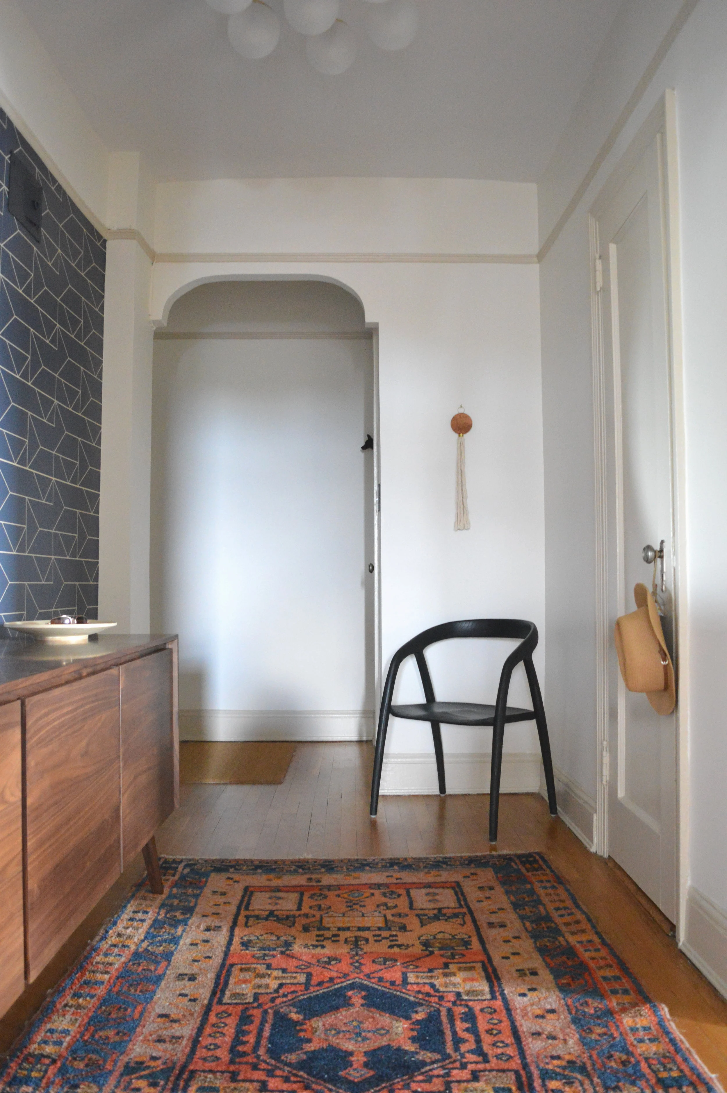
You walk into this apartment and immediately enter a long hallway. Creating depth of view is one of my favorite design elements - giving you something to see down the length of a space from either end. A personalized curated gallery wall pulls you into the home, while a graphic wallpaper, and architectural accent chair bid you farewell. (If you’re interested in the sources used throughout this home, please see our list at the end)
When less is more, I like to use interesting pieces. A single accent chair by itself had better be something special, otherwise, why?
The wallpaper was possibly one of the first decisions in the whole home! This is the only place it’s used which I think just makes it that much more dramatic.
Speaking of dramatic…
Dining Room
We were so intentional with every detail in this space I can’t help but look at the collective whole and remember the conversations and design renderings created for particular elements. It is a process of pure creativity that I have fallen so in love with over the years.
The clients had this idea for a gallery wall here and my gosh did they hit a home run. Notice the continuity among the frames - all thin, and either black, white, or natural wood. That’s it! There is nothing visually connecting the actual images, but the carefully collected frames create cohesion and freedom to display whatever suits them.
The light fixture was actually left by the previous owners and totally works for our purposes. Its thin and the right scale and the only brass used throughout, setting it apart as the primary decorative accent in the dining room. With the cutout looking into the gallery wall hall, I opted not to add anything else to the wall space surrounding the table, so this visually impactful fixture works beautifully.
Living Room
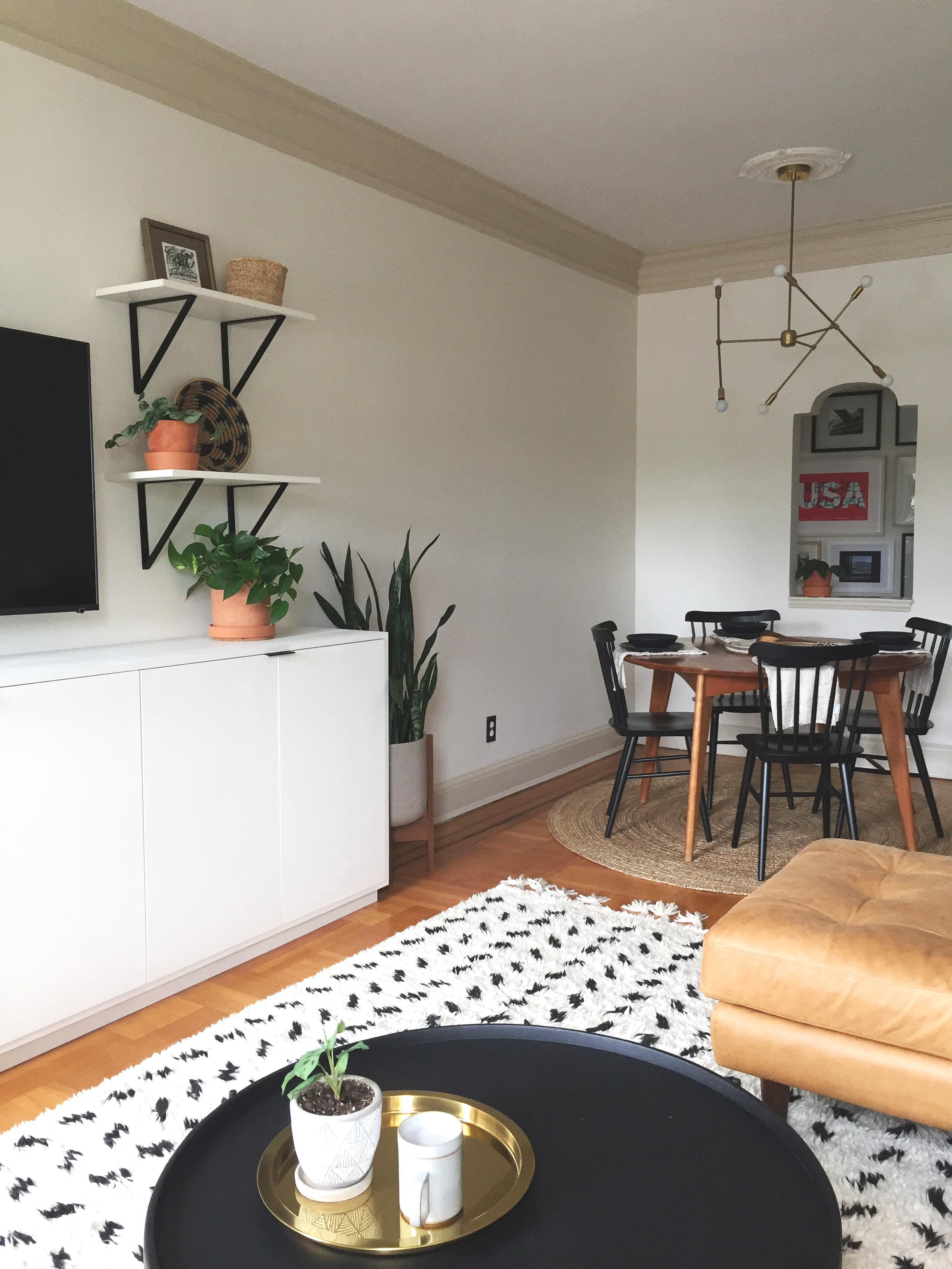
I can’t move on without pointing out the trim. First of all, so thick, old and regal. I’ve never ever painted trim a contrasting color, but the clients had this idea to do something different and accentuate it. In the early renderings I used black and that felt too stark. Gotta start somewhere, right?! After doing some research on similar architecture I found three images with white walls and beige trim and fell. in. love. I sent over three color options, the clients tested, and we came to a unanimous decision to use Clay Beige, by Benjamin Moore. Walls in Swiss Coffee, BM.
The first of Ethan’s pieces - this wall unit! He built the cabinets and shelves above, using Rejuvenation brackets we selected.
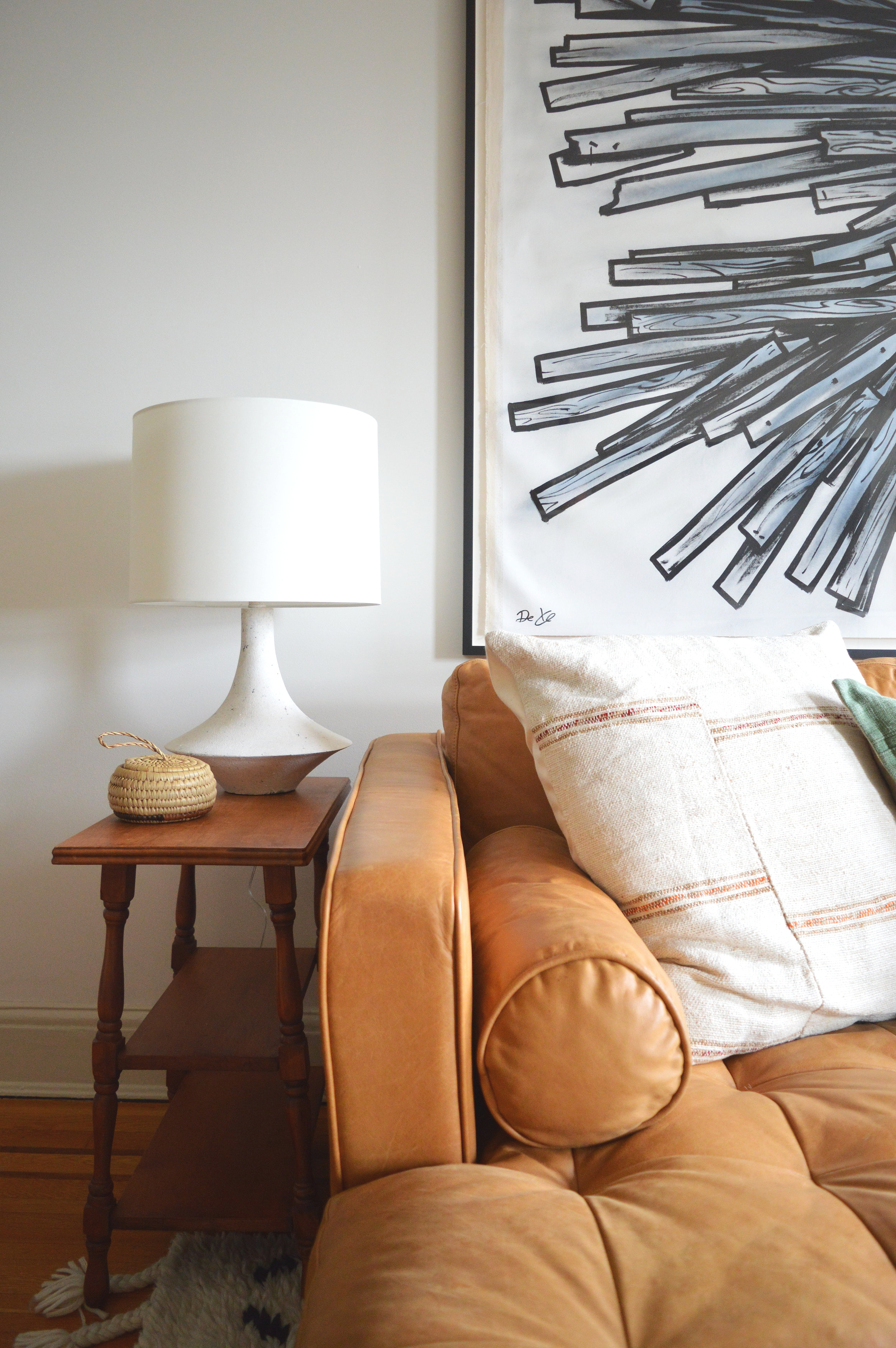
The triptych is just the bees knees! The clients found the street artist, Dede, in Israel and looked him up upon returning to the states. They commissioned this special piece for their last apartment and were not sure it would have a place in this one. My top choice was over the sofa if the dimensions fit. It’s just the right kind of drama needed for this room! Still so thankful this installment fit!
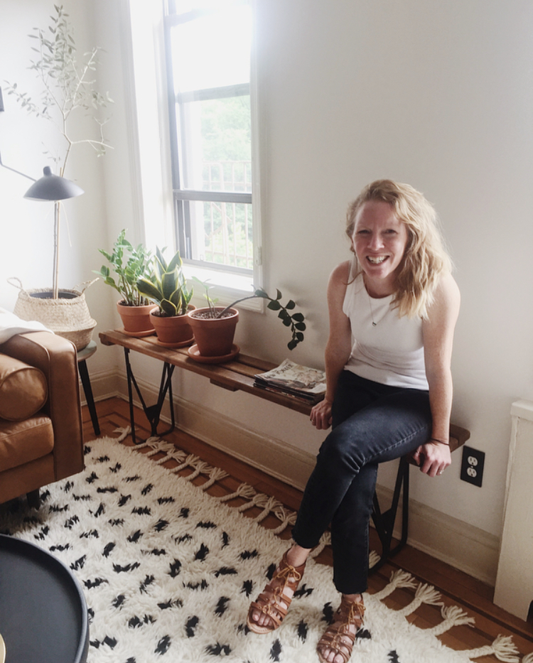
I honestly don’t believe we ever considered any other light! We had started down this road of edgy pieces with a subtle flair of drama. I’ve used similar sconces before and this France and Son number was just right for our far corner here. Can we also take a moment to acknowledge the clients incredibly green thumb - I’ve been loading up on her generous tips!
Bedroom
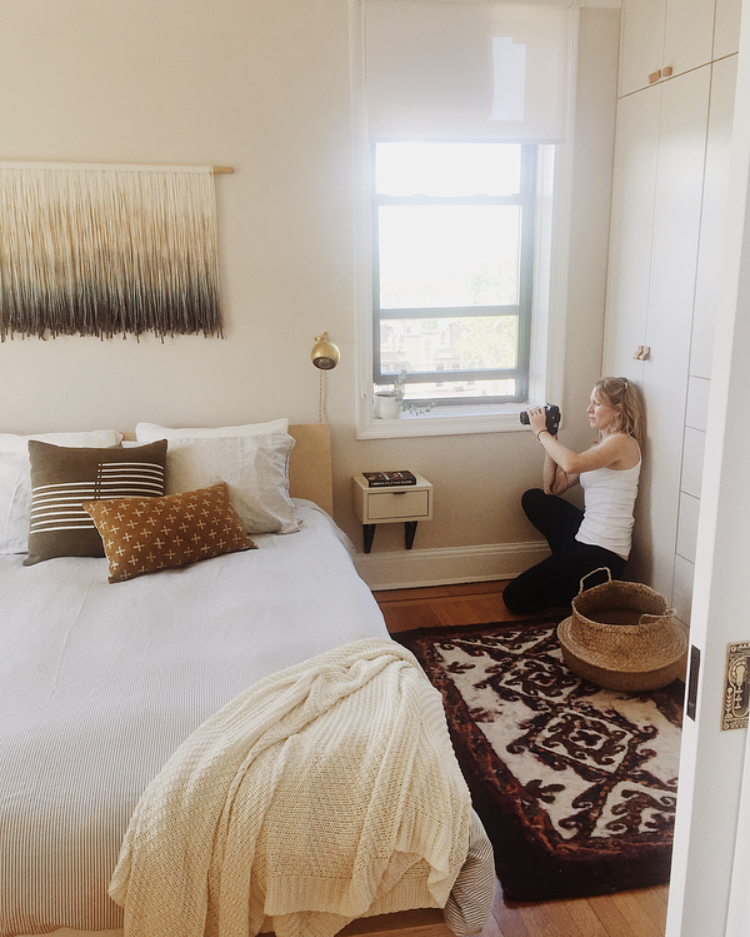
Hold on, scroll back up and take in that pocket door pull. The details of this home are just incredible! What a privilege to work on such a fun space!
You’ll notice in this room as well as the office coming up next that we opted for reverse walls - beige walls with white trim. They’re itty bitty spaces so it just felt like a fun opportunity to try something different in this home.
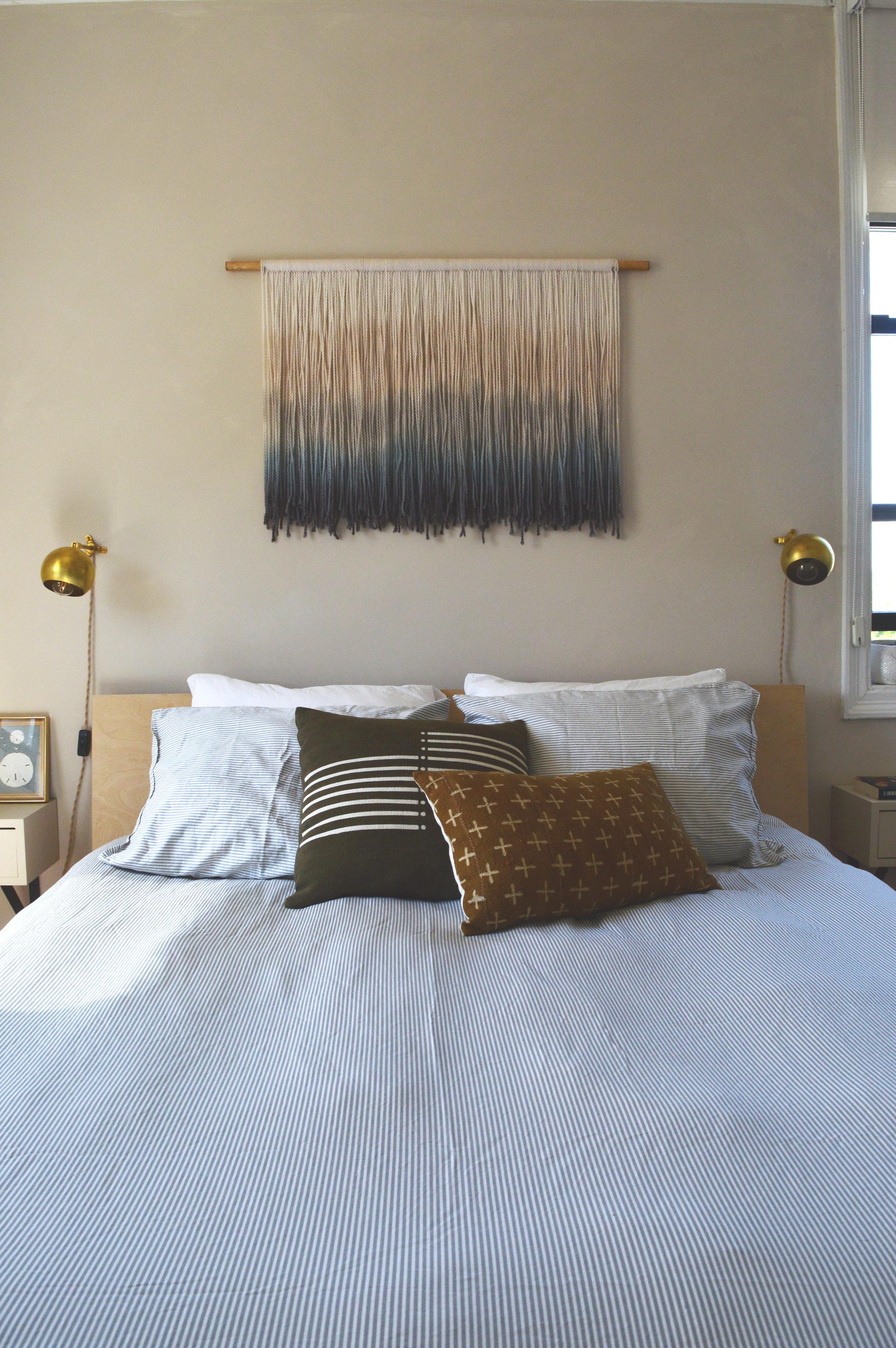
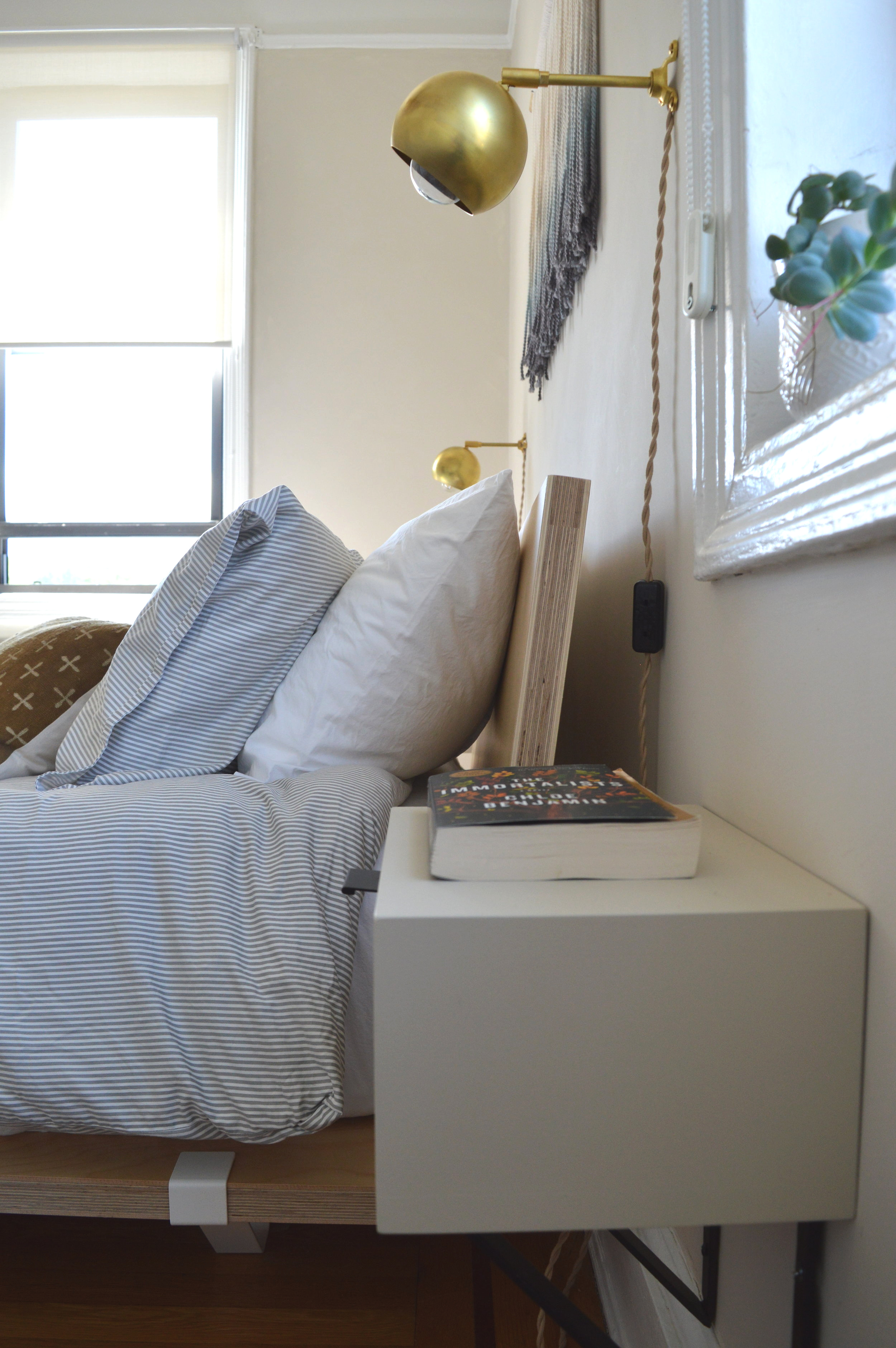
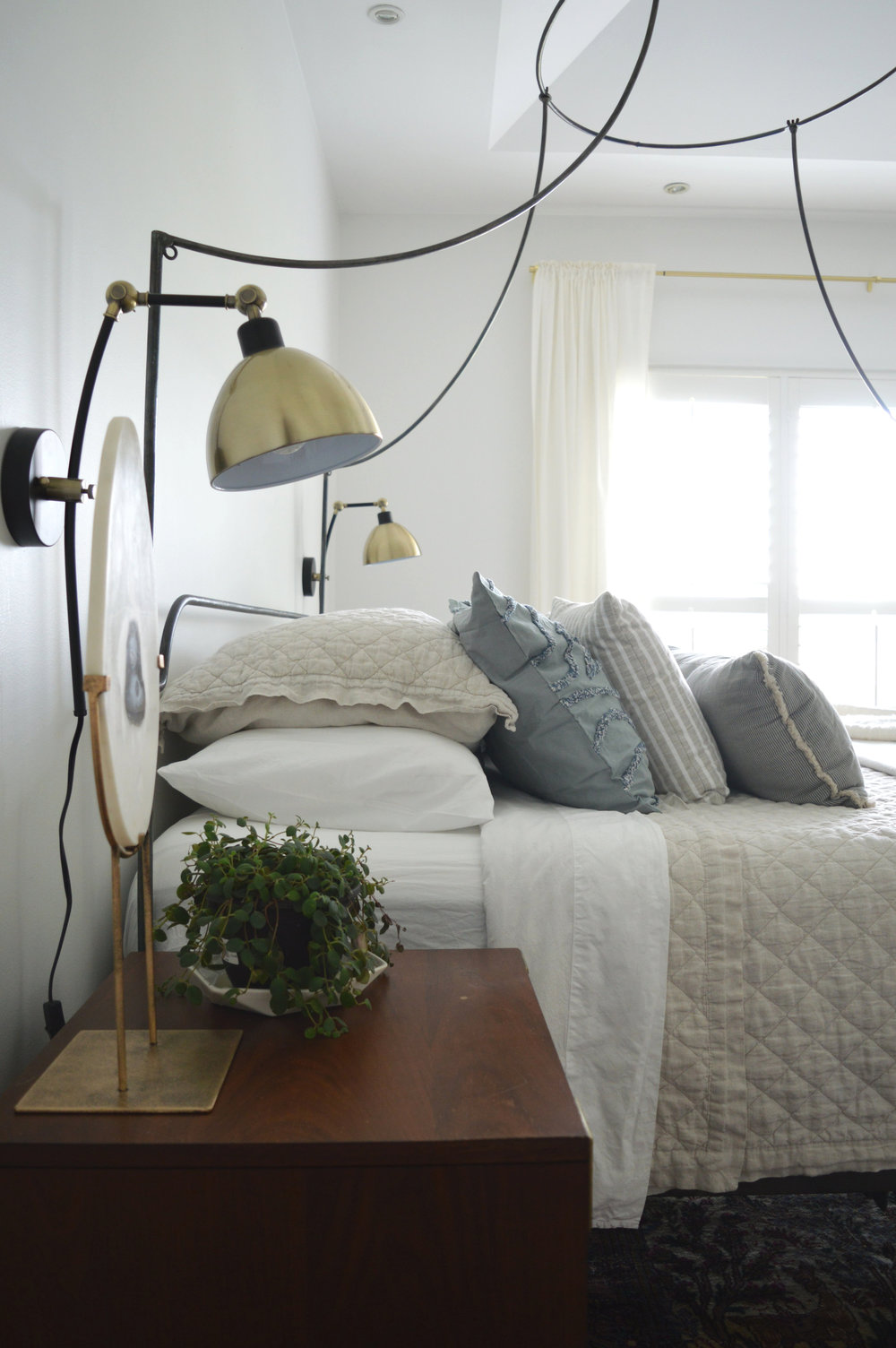
The bedroom is a story of small business owners. You may recognize Ethan’s work in the bedside tables, (inspired by similar I found on Etsy). You may also recognize some items StyleMutt Home has used before! The Marylou sconce from our friends at Rough Luck Studio, and the fibre art by a favorite, Designs by Filia.
More small businesses are represented on the bed. Pillows from fair trade global artisans, The Citizenry and Mae Woven, as well as Brooklyn local business, Brooklinen. The bed itself, as well as the office desk, (coming up), and the olive tree stand, (living room), are from Floyd - a company establishing the standard of modern-day furniture. They make furniture that is easily portable to those often relocating, but without sacrificing quality. West Elm recently partnered with them so I’m sure you’ll see more of them soon!
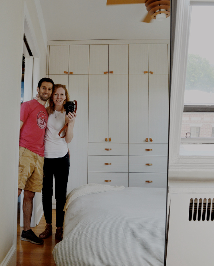
Curious how New Yorkers manage such tiny spaces? Epic closets. These were installed by the previous owners who gambled some solid square footage in the room. And worth every inch, if I do say so! Who could deny those leather pulls…
Office
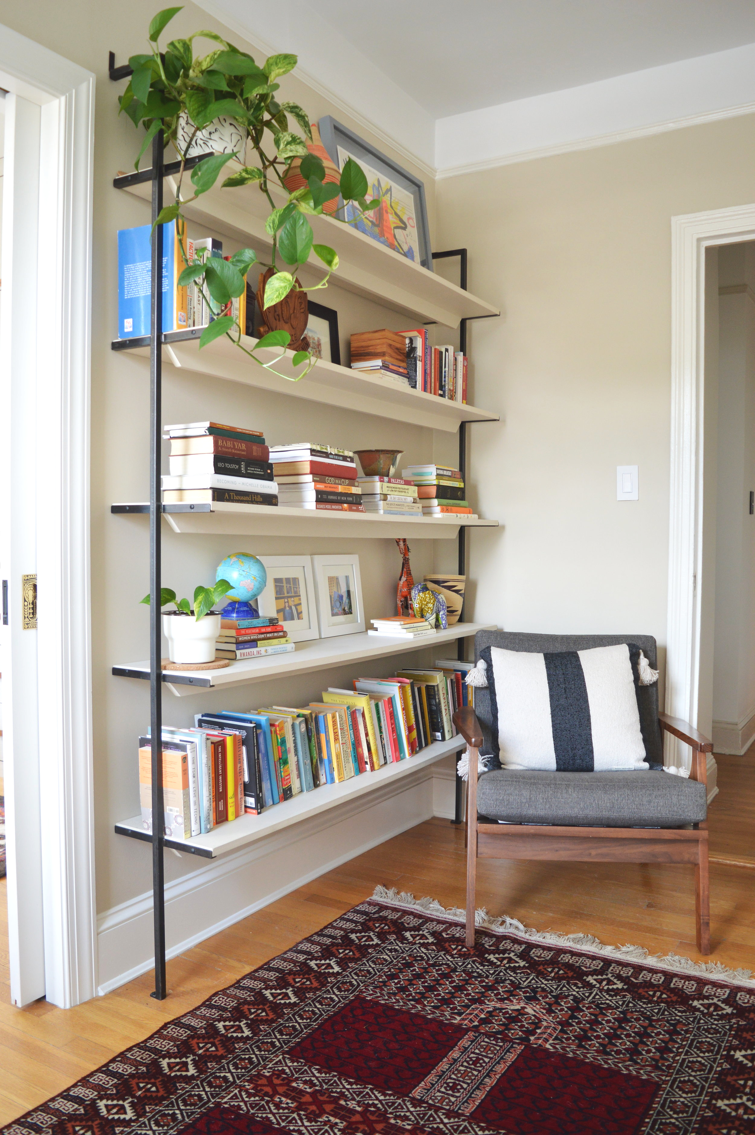
We have two fine installments from Ethan in this space - a cute corner shelf that I wanted to use to soften the deep narrow space,
and the coolest bookshelves I ever did see!
This is artists work right here, people. The detailing is just everything!
And that’s it! I had so much fun working on this home I feel guilty calling it work - not every job feels that way but this one was a joy every step. The clients were beyond amazing and, as always, I am so touched to be trusted so fully with their home. Designing someones home is an honor I don’t take lightly, so when it’s all said and done there is definitely a bittersweet feeling left that it’s all over.
We have worked so hard to get here with StyleMutt Home Design but it still feels surreal to be sought after from around the country. It takes so much time and strategy to establish yourself not only as capable of doing the work, but as the top of your field. I don’t know what is next for us, but I have had this desire for some time to dig into how we got to this point in our business and use what we have learned to help other aspiring designers. With the completion of this project and wrapping up a couple others this week, my plan is to take the rest of the summer off from design projects and eat up the time with my babes. With design work on hold until September, I’d like to dabble in some writing to publish an eBook loaded with all the info of how we got to this point from scratch. It’s so much more than just dreaming big and I am really excited about creating a guide to help others reach their goals! If you’re interested in doing interior design and/or eDesign, shoot me an email at chelsea@stylemutthome.com and I’ll be sure to send you a note when the guide is complete!
Thank you all for coming by today! It’s always so fun to get to share these projects with this community and I truly am so grateful for you.
Some more photos of the trip - Matt and I went up together and had the BEST weekend celebrating our 13 year anniversary! I still can’t believe our marriage is a teenager now. There is absolutely no aspect of our life now that I would have guessed for us on the day we got married, and I think that’s just what makes it feel so grand. Making a life together with this man has been the adventure of a lifetime, that’s for sure!
SOURCE LIST
Entryway:
Sideboard - Article
Lamp - CB2
Rug - Loom and Kiln
Runnger - Etsy
Chair - Stowed Home
Wallpaper - Etsy
Tassel wall hanging - Holistic Habitat
Dining Room:
Table - Room and Board
Chairs - Serena and Lily
Linens - Parachute Home
Rug - AllModern
Living Room:
Rug - Serena and Lily
Sofa - Article
Coffee Table - Anthropologie
Table Lamp - AllModern
Sconce - France and Son
Pillows - Serena and Lily, Mae Woven, Anthropologie
Planters - Holistic Habitat
Bedroom:
Bed - Floyd
Duvet - Brooklinen
Pillows - The Citizenry, Mae Woven
Fibre Art - Designs by Filia
Office:
Desk - Floyd
Desk chair - Urban Outfitters
Yellow planter - West Elm
Pillow - Mae Woven


