Design Reveal: Dani's Master Bedroom

We’re back! I hope you all had a lovely weekend! In case you missed it on Friday, I’m sharing the last couple rooms in our client Dani’s full home we’ve been designing over the last couple of years! Friday was the family room reveal, and today we have the master bedroom. Thursday I’ll be back to share a full final post of the entire home altogether so you can see the cohesion from room-to-room.

The master bedroom was such a thoughtful process that involved collecting pieces over the span of a year. By the time we got to this space I knew Dani’s style fairly well. Our formula has been less, but interesting, pieces. Plain and simple. Dani doesn’t love excess but she appreciates interesting details that set an item, and room, apart. We’ve approached each room this way, and the pieces that have gone into them.

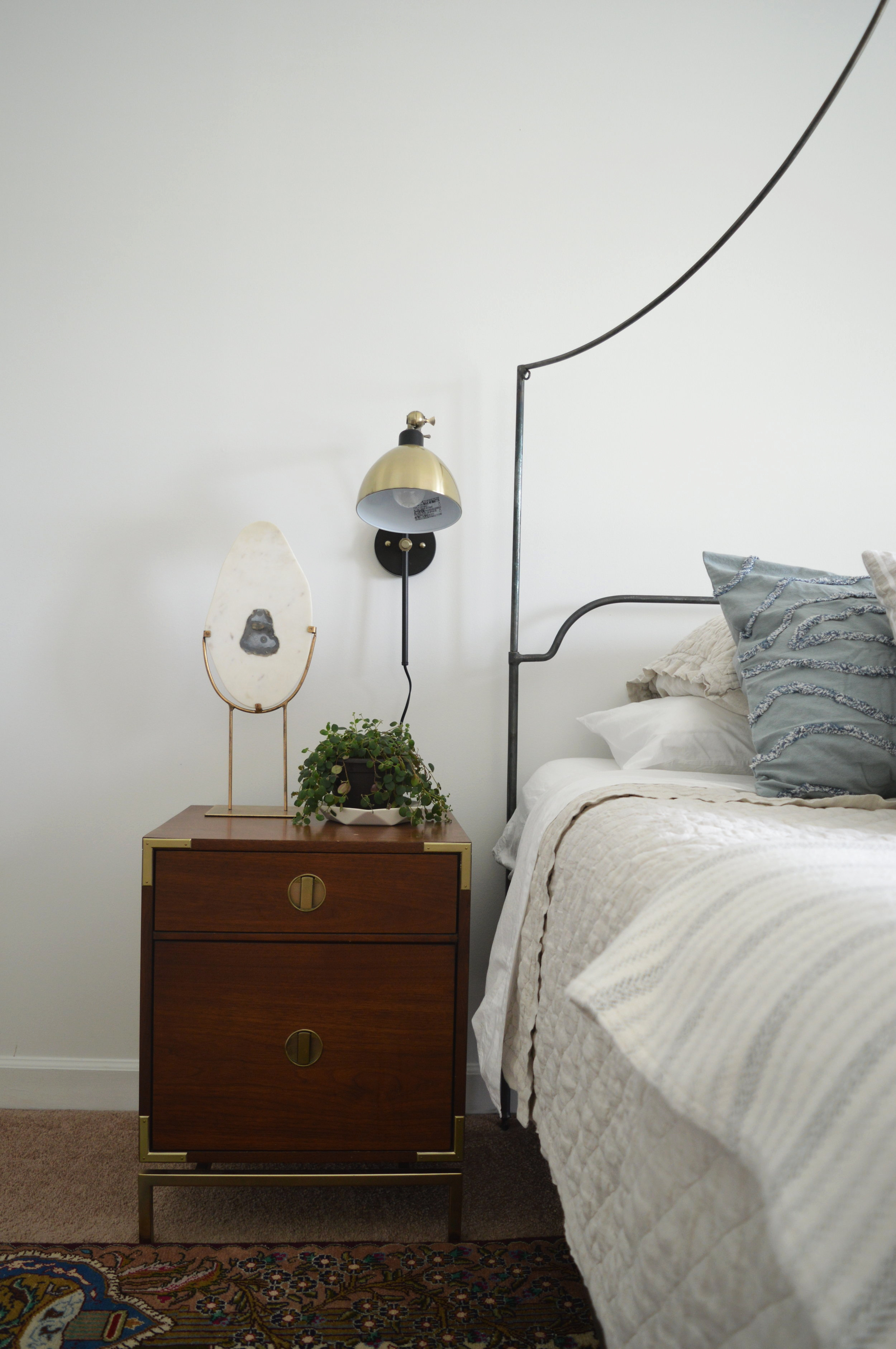
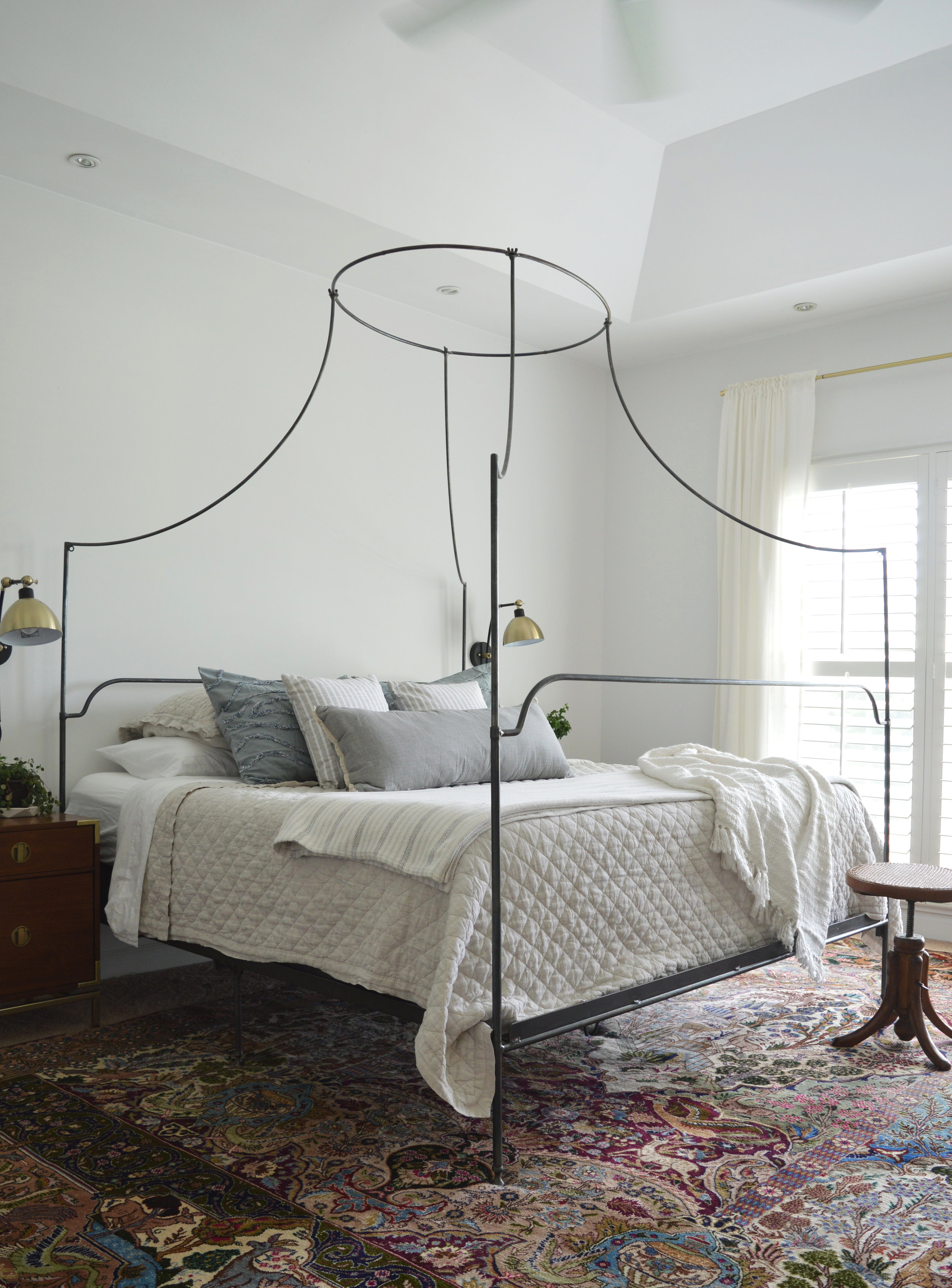
I’m not sure which came first, but the wrought iron bed and vintage rug were two such details that kicked off the design of this room. The bed was a never used Anthropologie piece that we found on Craigslist, and the rug on ebay - such second-hand finds saved over a grand from what these pieces would have been otherwise!

DSC_0994.jpg

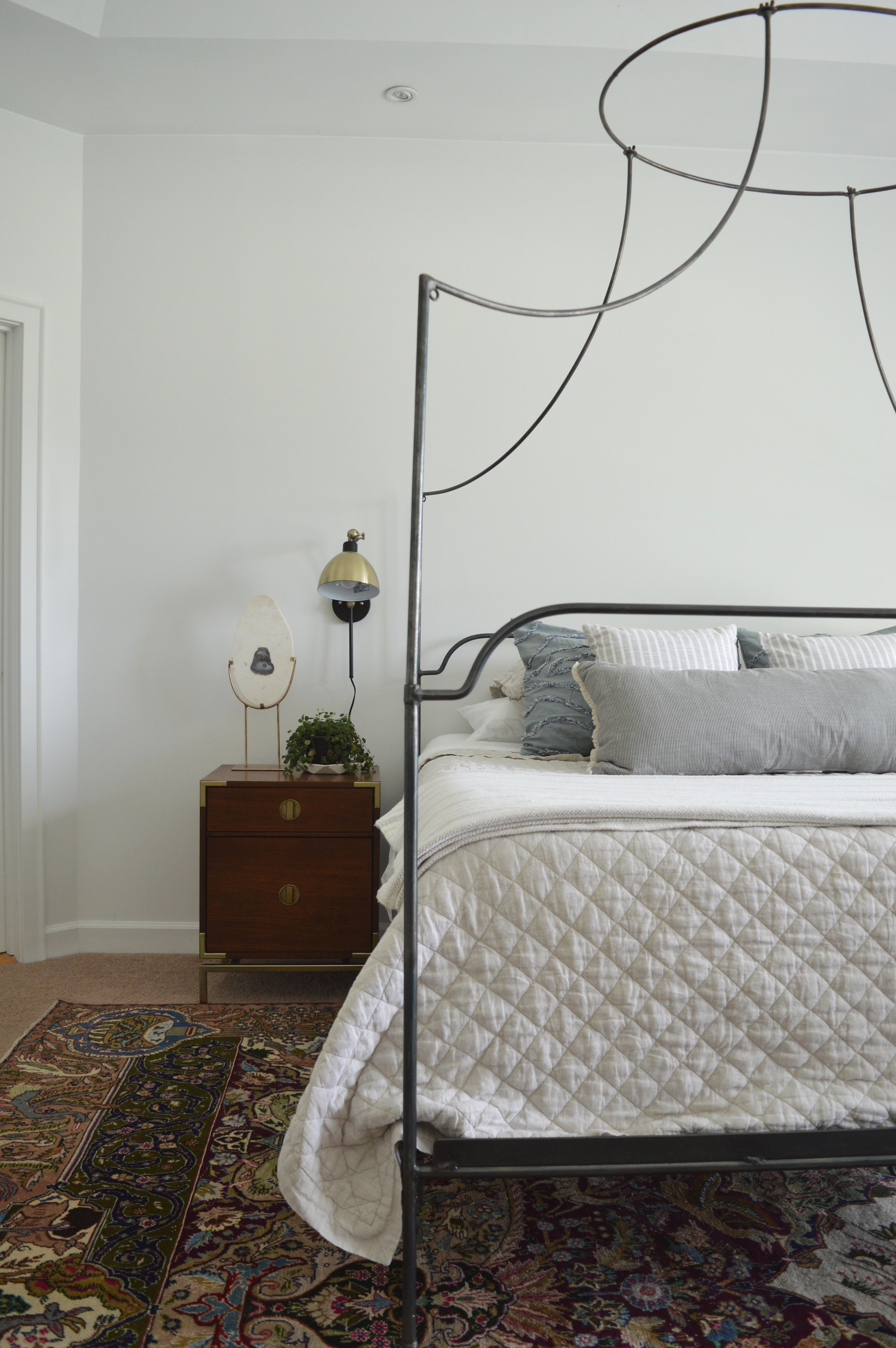
We ended up holding onto Dani’s existing nightstands since they were in great condition and we didn’t want to spend unnecessarily, so to marry the two unique styles between the campaign tables and romantic vintage inspired bed, we used sconces that incorporated aspects of both. There is almost always a way to connect two very different pieces in a room with a bit of intention!

DSC_0996.jpg

We pretty much let the rug play the diva in this show and chose bedding that was easy to lay eyes on, but not distracting! Even the pillows pull subtly from colors in the rug, but don’t scream for attention.

DSC_1001.jpg
DSC_1009.jpg
DSC_0997.jpg

The agate stand we have affectionately named Humpty Dumpty. PLEASE TELL ME YOU SEE IT TOO! That’s another thing you should know about Dani - she and her beau, Nate, have a fantastic sense of humor. I found our friend here at Pier 1 and liked him right away. I almost second guessed grabbing him when I saw the resemblance, but figured Dani would get a kick out of it. Hah!

DSC_1000.jpg

I cannot get over how lovely this pallette came together! These pillows were collected over time and from various sources, and I truly couldn’t be happier with the end result. So soft and serene.

DSC_1003.jpg

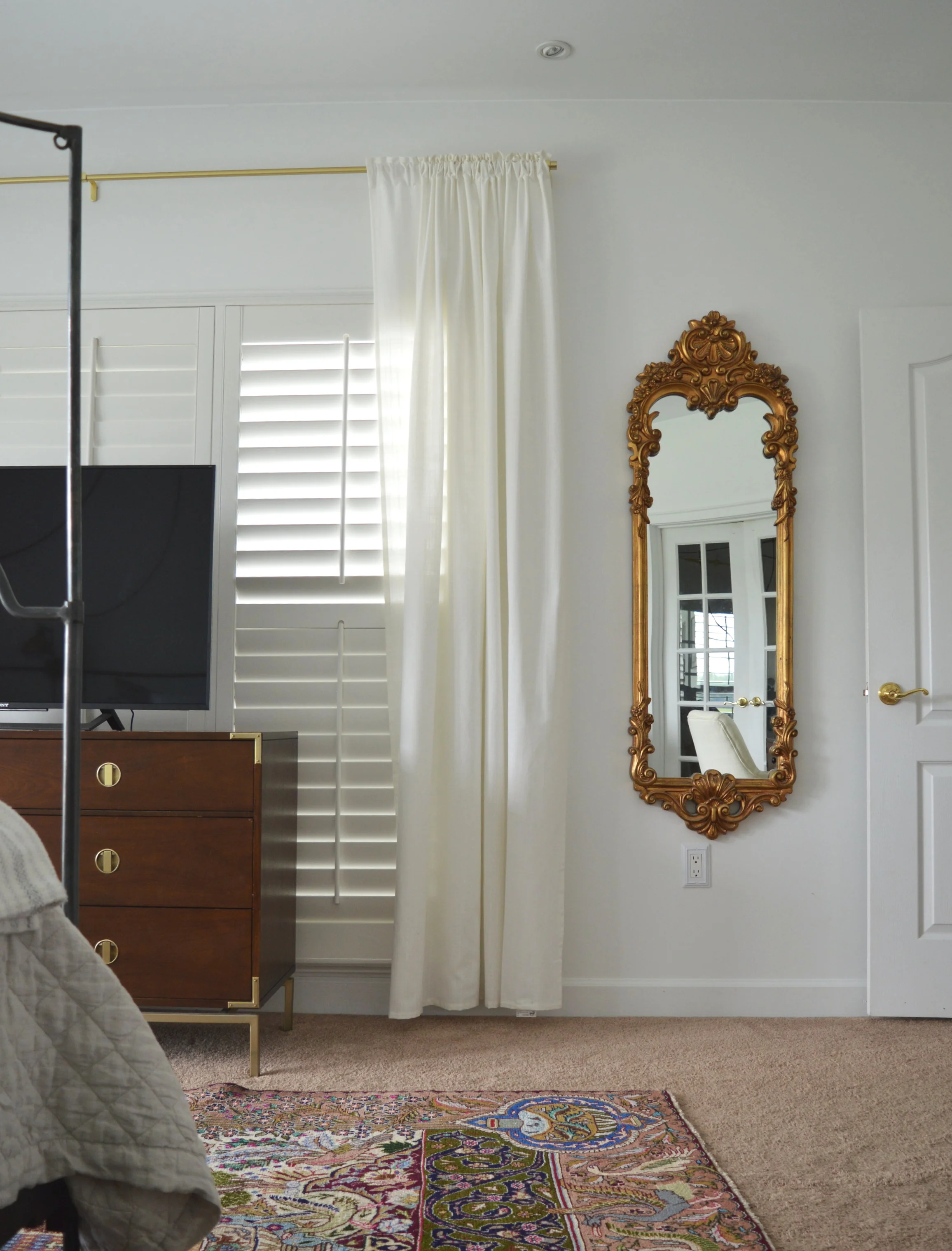
The beautiful ornate mirror belonged to Dani’s mother, a true treasure if ever I saw one. Isn’t it gorgeous? When I first saw it I knew we could take the bedroom in a bit of a romantic vintage direction - in fact, there are more vintage pieces in this room than anywhere else in the home. We sure had a good time digging up these treasures!

DSC_1004.jpg

The green velvet chair is a prime example. Found at an antique market and priced to sell fast, we loved the shape and color for this space. Nate’s grandmother’s original artwork hangs above, and flanked by crisp white curtains and a simple hanging planter, the antique chair looks anything but tired.

DSC_1005.jpg
DSC_1010.jpg

Dani and Nate’s own photography skills came in handy for a solo statement piece above their desk - so stunning! You may recall from Friday’s reveal, they have a special place for Greece.

DSC_1007.jpg
DSC_1008.jpg

That’s a wrap, folks! By far one of my very favorite bedrooms I’ve ever had the honor of designing. I truly believe creativity breeds new inspiration, and I’m quite inspired by this space; ready to do another!

Thank you all so much for stopping by today! Don’t forget I’ll be sharing the entire home on Thursday - it wouldn’t be ridiculous if you wanted to set a reminder. It’ll be so worth it!
Chelesa.jpg

Design Reveal: Dani's Family Room

Well hello there! I feel like a gopher every time I pop my head up for a post - unexpected and out of the blue. Hah! Truth is, Cate and I have always put life and family before our little corner of the great web, and these last few months have been richly full to say the least!

With a few design projects wrapping up this month I am going to do my very best to share things as close to live time on here as possible, but if you want the full StyleMutt Home design experience, you may want to head over to Instagram if you aren’t on there already! That’s where projects end up first, (sometimes weeks before the blog), since it’s just so convenient to upload the photos, (with far less words, you’ll be glad to know hahaha)!
But for today, I hope you enjoy the first of several reveals coming up in rapid succession - starting with Dani Barbe’s family room! We have worked through this beautiful home for the past 2.5 years, room by room, and now we are done. Holy smokes!. I’ll save the master bedroom for early next week and then finish with one final full home tour so you can see the cohesiveness of the home as a whole.

So here we are, Dani’s comfy family room!

DSC_1035.jpg
DSC_1014.JPG

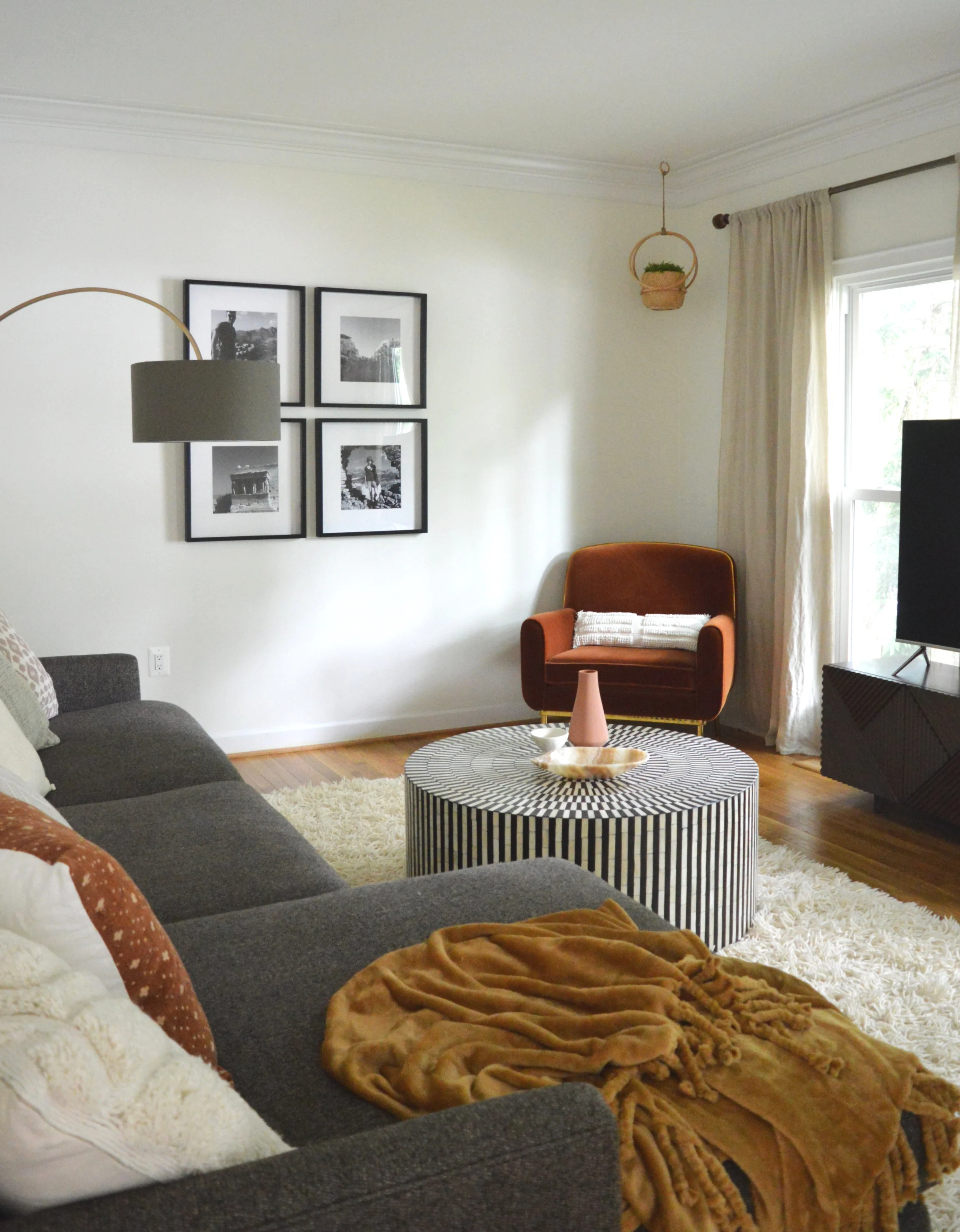
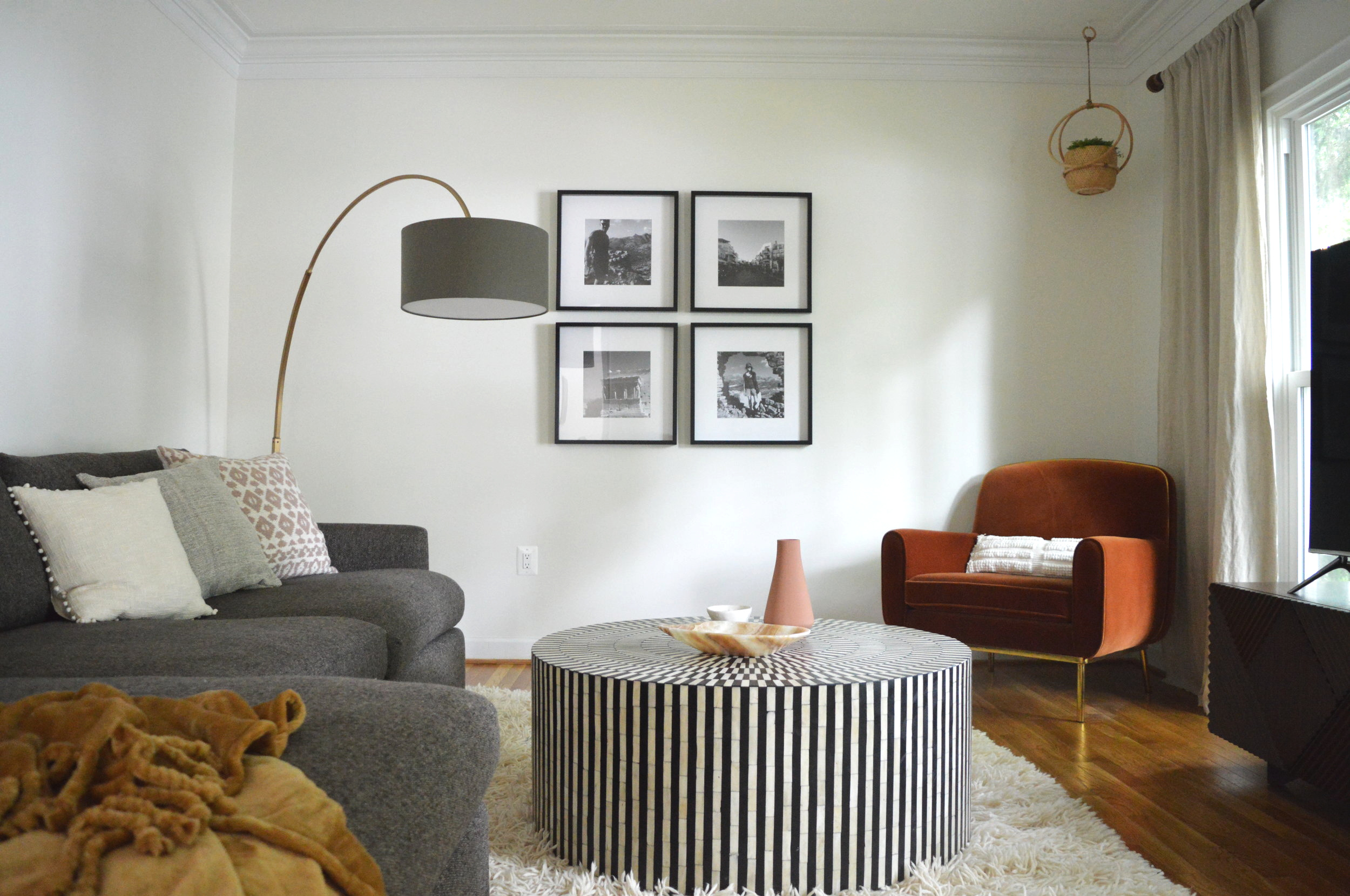
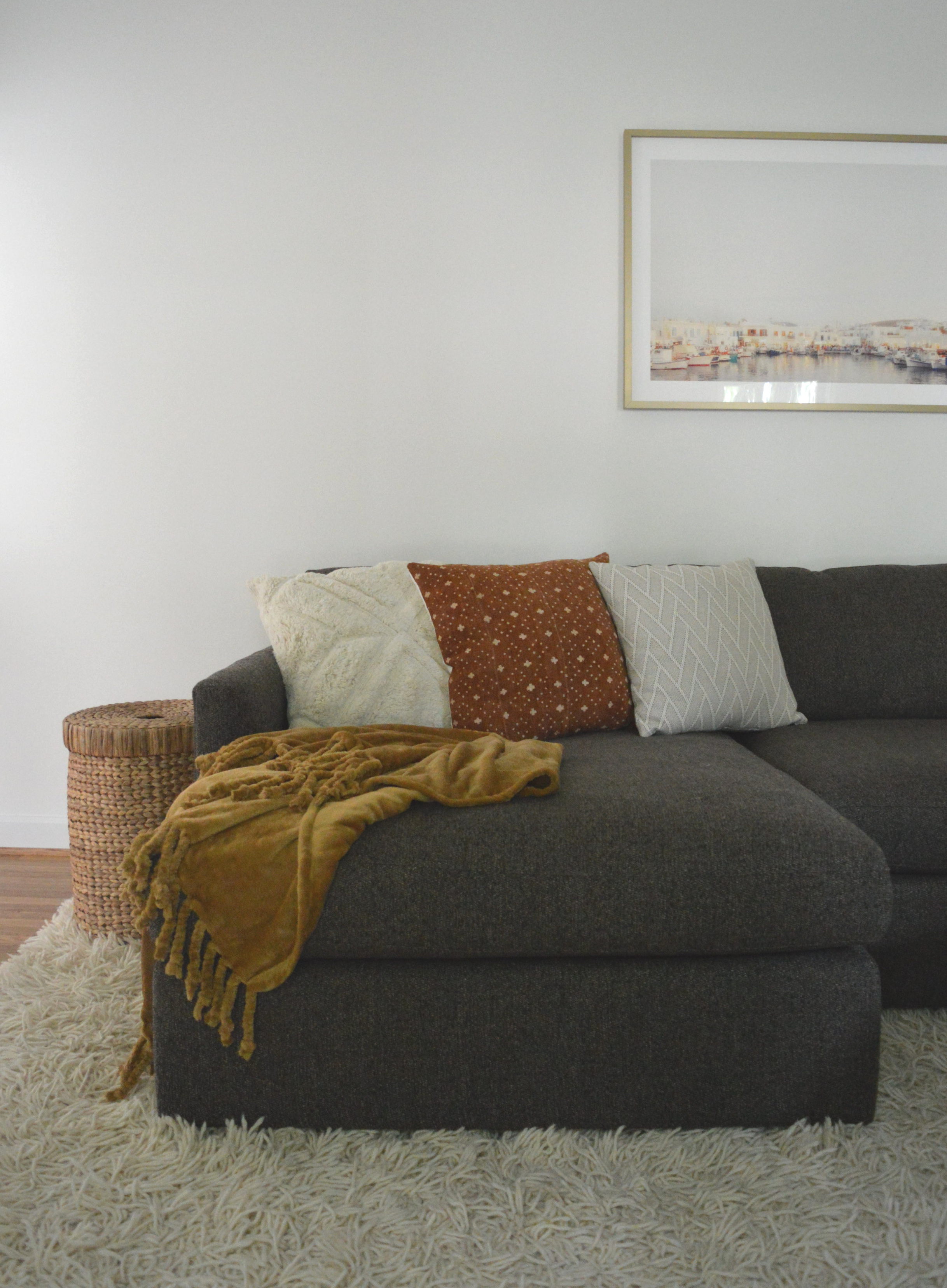
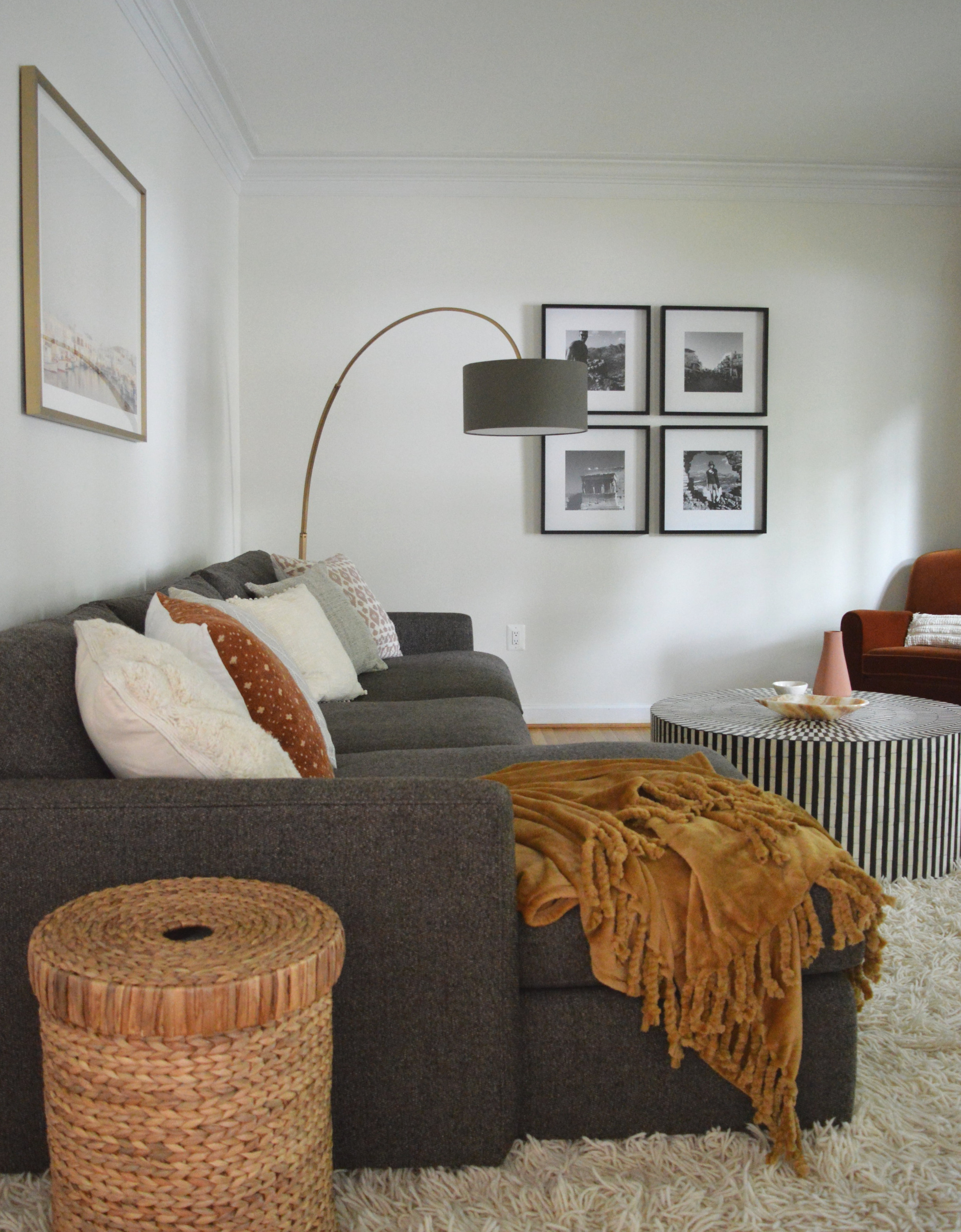
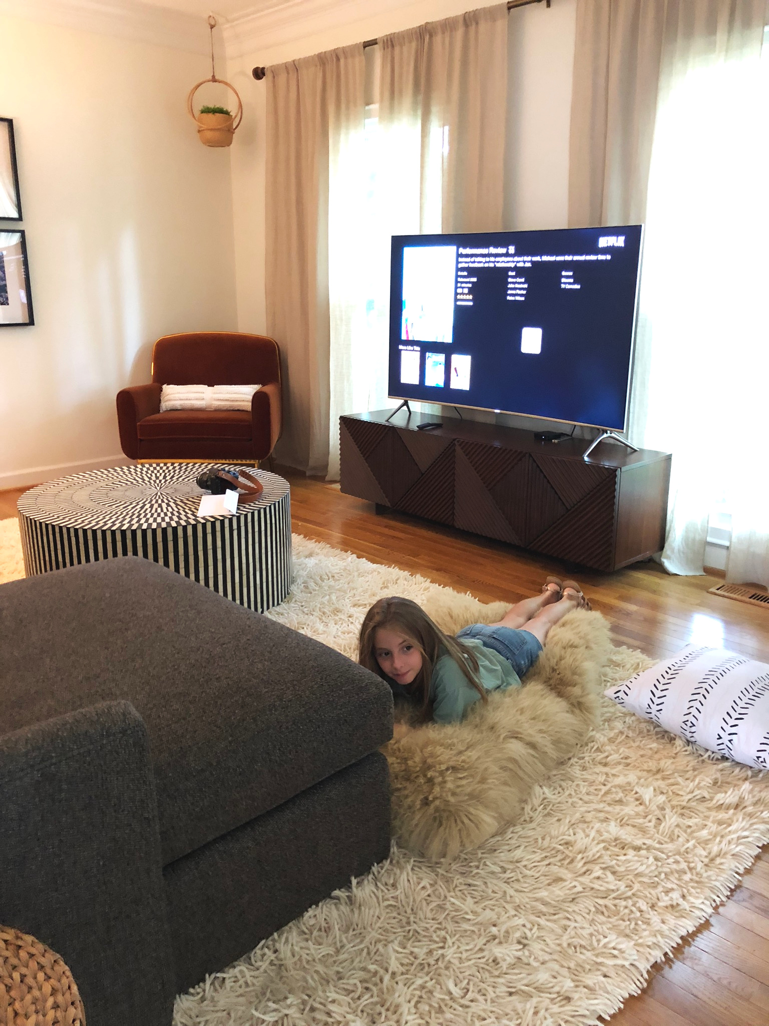
This space went from dark walls to light walls with dark furniture. It let’s the space pretend it’s cave-like without actually being a cave. While the rest of her home is light and bright, we went a touch moodier with this room, focusing on rich colors and bold contrast.

DSC_1033.jpg

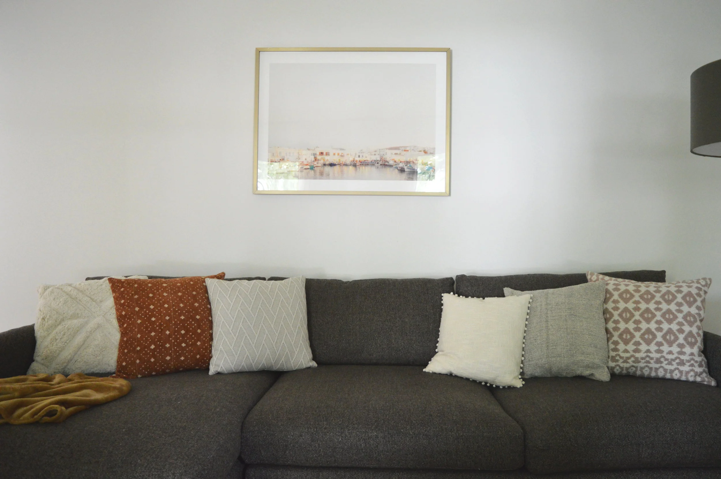
One of the first stops in the process was reorienting the room and moving the tv between the front two windows. This far wall was suddenly opened up and very, very blank! I absolutely did not want to add another furniture piece here just for the sake of filling space, and since Dani and her beau are seasoned globe trotters, I thought this space was the perfect opportunity to add some personal photos from their travels! This simple square grid of black and white iPhone photos framed in $15 IKEA frames might just be my favorite element in the room, (or tied with the chair…).

DSC_1034.jpg
DSC_1019.jpg

A framed port in Greece is a nod to the framed black and whites which were all taken in Greece. It’s a special place to this fun-loving couple and I wanted to tie it in someway that wasn’t screaming obvious. The pillows were all chosen intentionally to tie this room into the rest of the home, which I can’t wait to share in entirety next week!

DSC_1027.jpg
DSC_1018.jpg

Family rooms tend to get used hard in the very best way, which can sometimes result in style sacrifice. I totally get that. From personal experience, I get it. But I love that this space shows an alternative option - a comfy lounge space with durable pieces can also be beautiful. And there isn’t even that much going on! It’s my favorite kind of space; simple, comfortable, and interesting.

DSC_1013.jpg

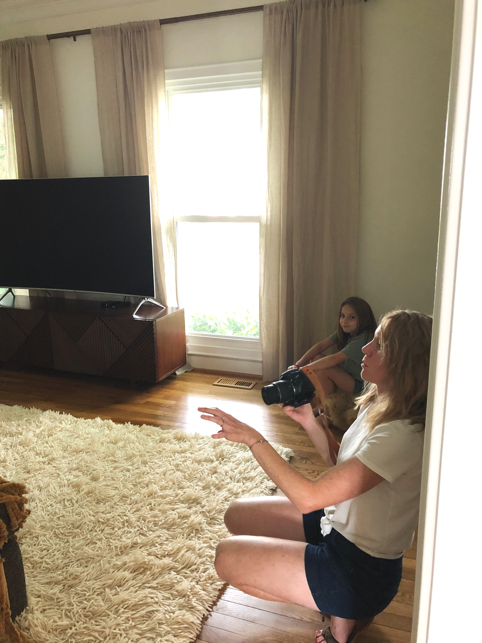
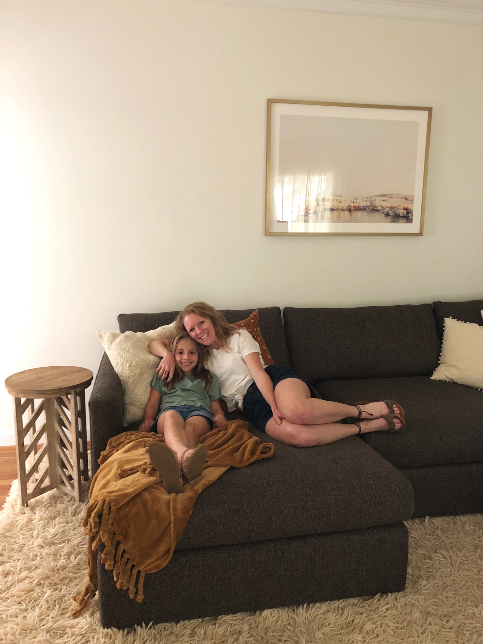
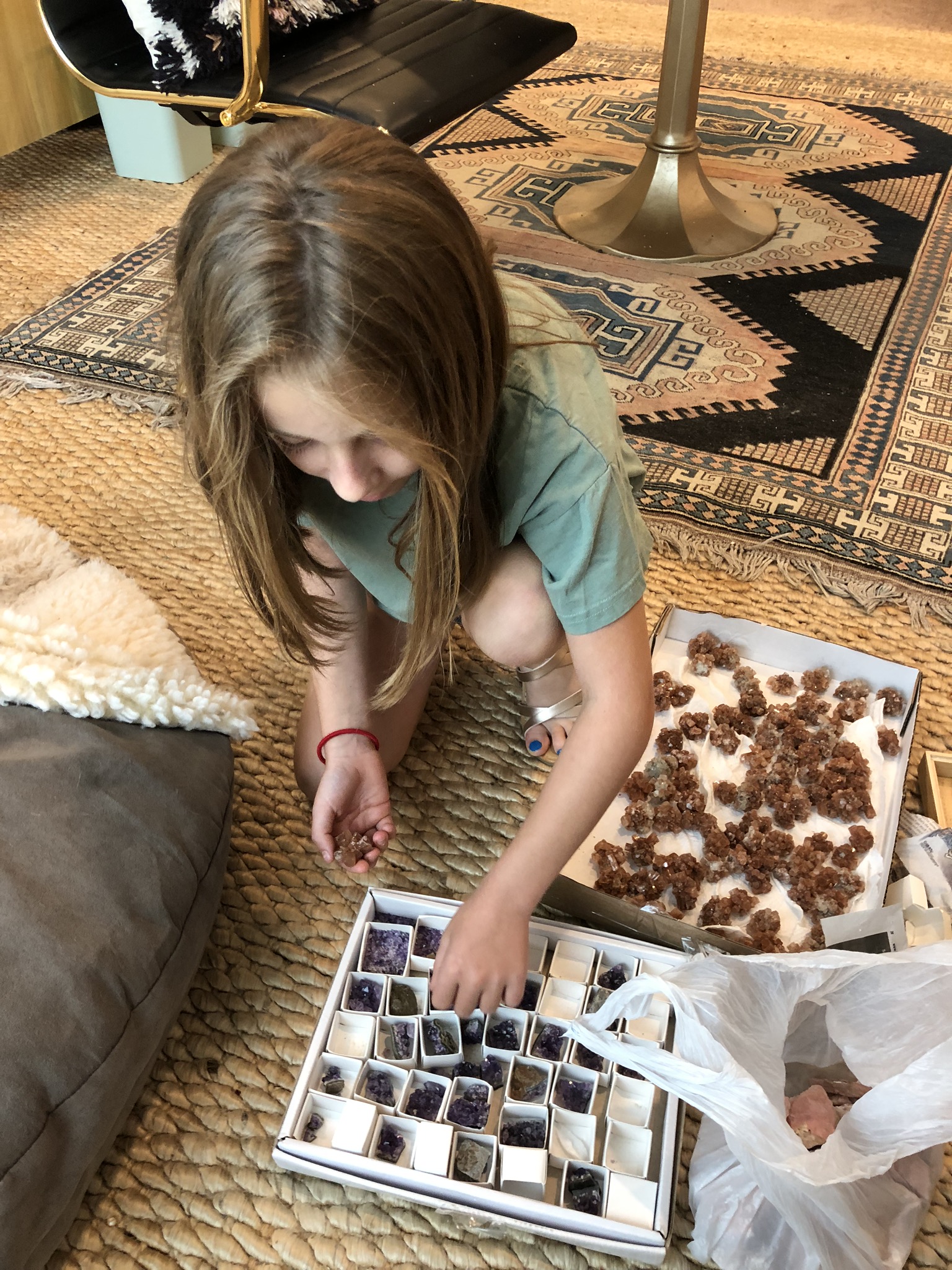
I had the pleasure of stealing Shire away from school to join me when I visited Dani’s home for the last time! We used to paint furniture in the garage together! Design is a different type of work but I have always treasured my kids’ being a part of things, however it suits their interest. And right now, missing school to join Momma totally suits her interest! Special thanks to Dani for taking these sweet pics during our time there.

If you stop by on Monday I’ll be sharing the full reveal of the master bedroom! Then I hear Cate has a little eye candy for you as well before I end this project with one final look-through. So bittersweet!

Thank you for stopping by, friends!

Chelesa.jpg

Heywood-Wakefield Restoration

Yeah ok. I was warned. Newborndome is no joke. Midnight feedings… sleep deprivation… a bazillion dirty diapers. How have people been doing this for centuries?!? Jk. Baby H is totally worth the effort - even if I officially can’t have a cup of coffee in the morning without it going cold.

Caleb has been fabulously supportive. Even though he is back at work, he’s found ways to give me little breaks when he can like downtime to make a craigslist run or have a glass of wine on our deck.​ He even gave me a block of baby-free time to knock out a new piece:

A Heywood-Wakefield Airflow Dresser

FullSizeRender.jpg

I actually scored this dresser somewhere in my 3rd trimester (I think I might have played my last preggo card to convince Caleb to help me pick it up one morning before work) - ha!  It was obvious that the previous owner did not realize what a rare find they had considering they put it in their sticker-loving son’s room.  Just look at the damage to the signature H-W finish! 

FullSizeRender.jpg

The watermark on the back revealed that it’s a “wheat rub.” This means it was truly vintage and not a reproduction since newer H-W pieces sport their signature Amber finish.  This piece could date somewhere in the 1930’s-1950’s when Heywood-Wakefield art-deco-inspired mid-century modern style rose to popularity.  I debated long and hard about how I was going to tackle this project and eventually decided on:

IMG_0836.JPG

A restoration

I was seriously on the fence about restoring vs transforming.  After consulting my brother-in-law the wine-cellar-building-carpenter-and-fellow-vintage-furniture-lover I realized it would be practically criminal to alter it with paint or new hardware.

IMG_0826.JPG

First order of business to get it back to its former glory was to SAND THE HECK OUT IT.  Yeah that sticker residue had to go.

FullSizeRender.jpg

After the thorough sanding came a thorough waxing.

IMG_0828.JPG

The wax gives it a buttery finish that’s much closer to that trademark Heywood-Wakefield buff.

IMG_0835.JPG

This is actually not the first Heywood-Wakefield piece I’ve gotten on my hands on.  Some of you may remember this gimpy coffee table find from 2017 that I ended up keeping for myself.

 
Picture8b.jpg
 

Although a little patinaed, the coffee table had an original H-W “champagne finish” which, if you ask me, looks practically the same as the “wheat rub” on the Airflow dresser.  That could be due in part to the fact that all H-W pieces are made out of the same wood: northern yellow birch.

IMG_0827.JPG

Sealing the Airflow dresser in a wax allowed the natural golden tones of the northern yellow birch to shine.

IMG_0861.JPG

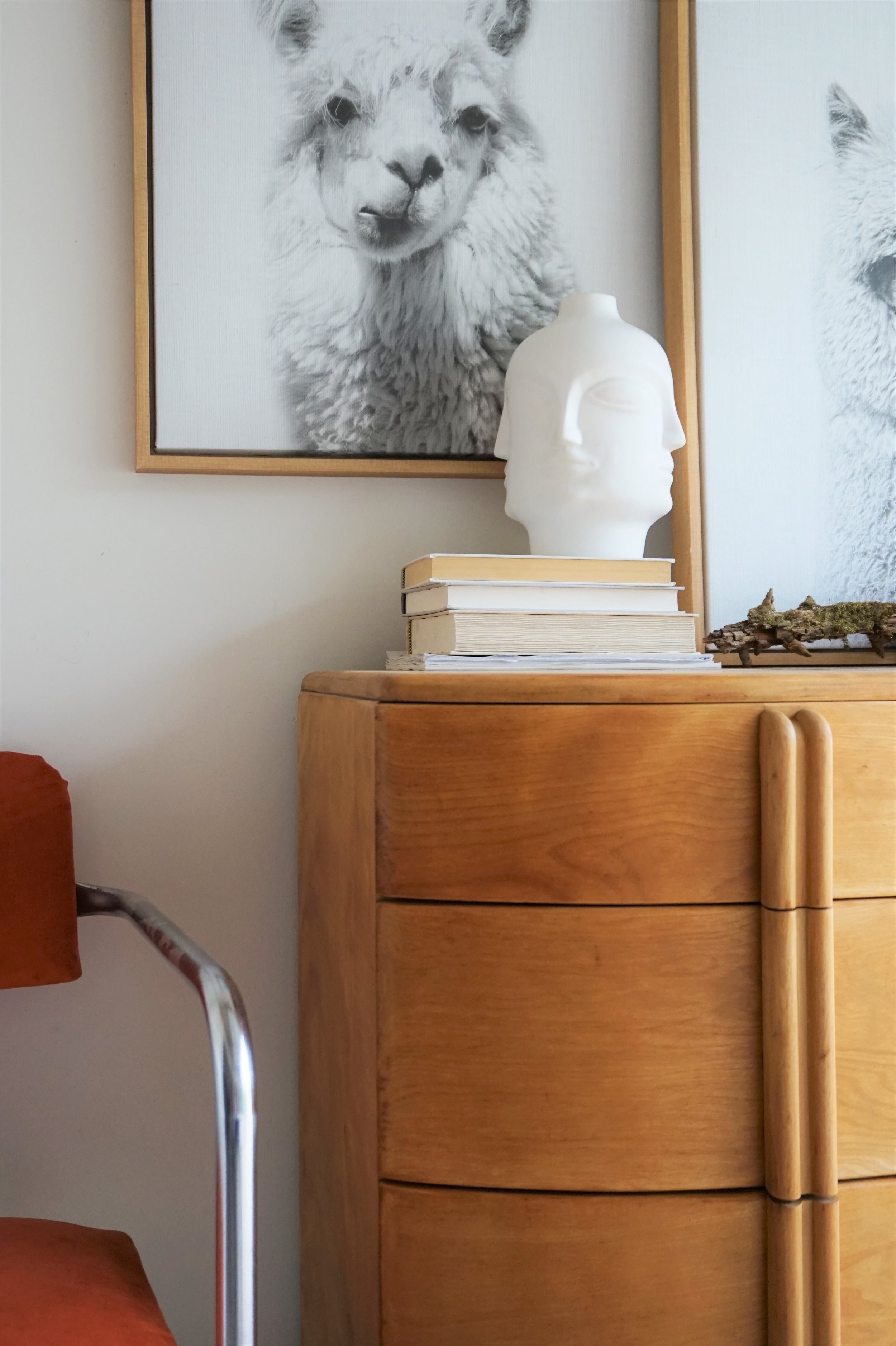
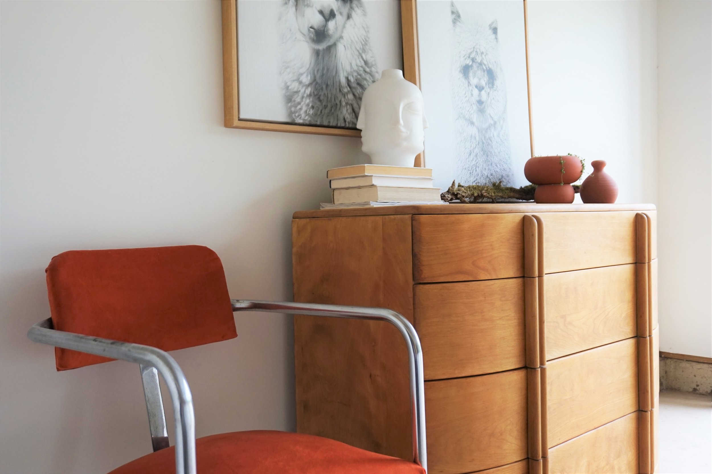
Besides the finish, another trademark feature of a H-W piece is the sculptural lines - like the unique curves in the drawer fronts and the architectural details in the handles.

IMG_0832.JPG

I know Heywood-Wakefields can read a little too George Jetson to some so I wanted the styling to show how it can still have its moment in the modern day. The quirky lines of this vintage dresser play well with the mod lines of my velvet cantilever chair flip and cheeky llama prints.  

IMG_0831.JPG

And I just had to pull out my face vase and add a touch or two of terracotta.

IMG_0830.JPG

This newly restored bad boy is now available for sale if you’re in the market for a piece of American-made history!  Email me for purchasing or shipping options.

FullSizeRender.jpg
 

Heywood-Wakefield Airflow Dresser
Now Available for Sale
42ʺW × 20ʺD × 34ʺH
$795

If you are interested in this piece or a custom order like it, email me at cate@stylemutthome.com

IMG_0224.JPG