Reveal: Industrial Meets Cozy in Beantown

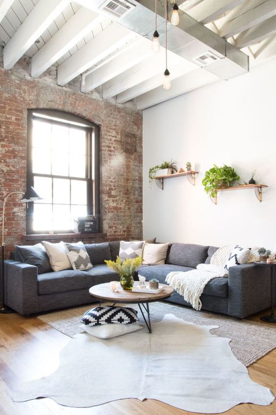
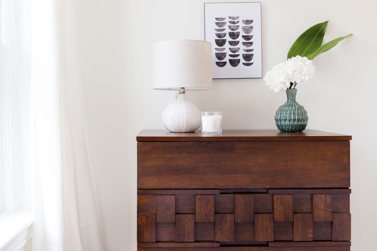
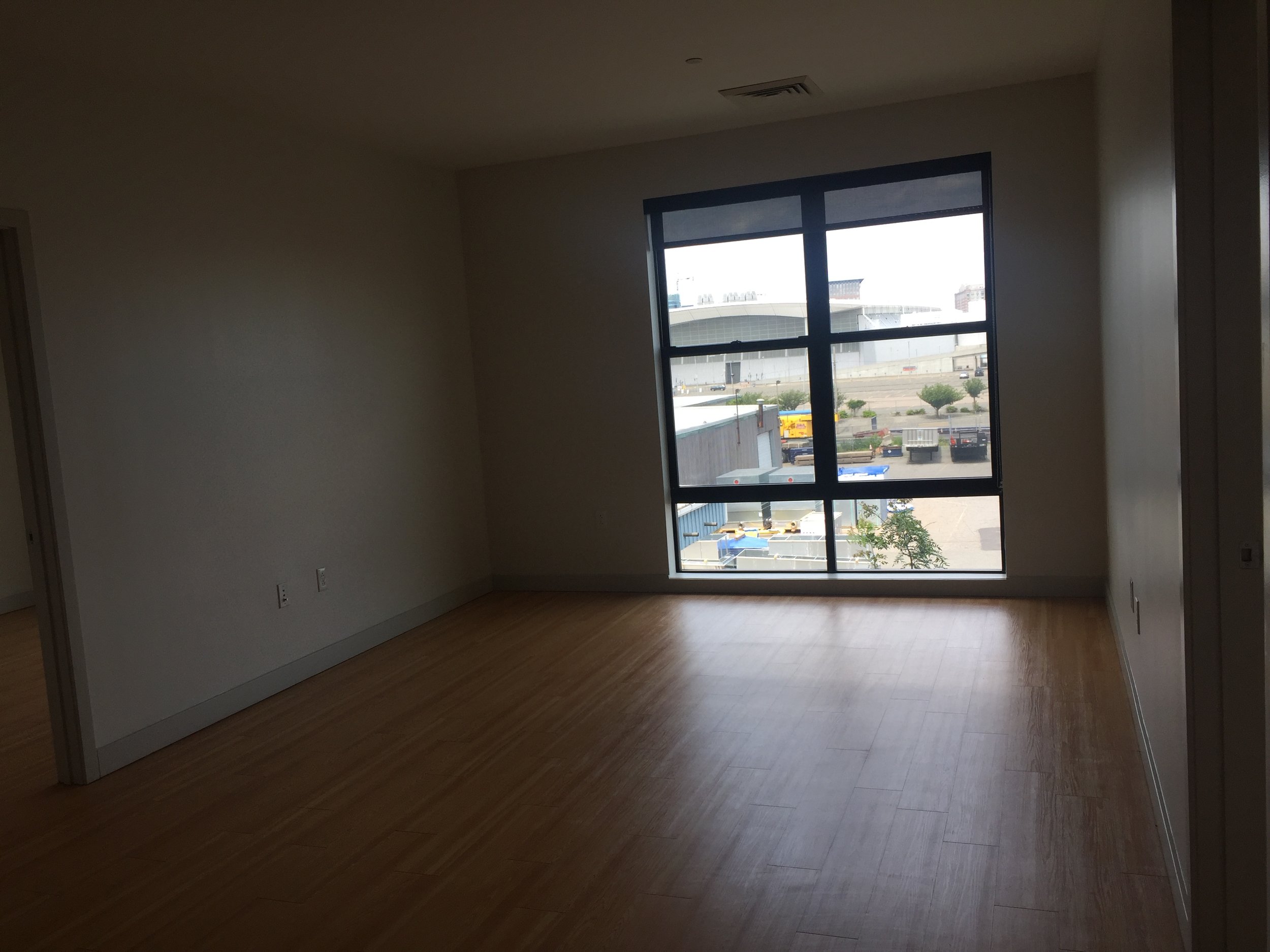
Got another eDesign reveal today! The client started with a very industrial 2 bedroom space - interior brick, city views and large windows; all my favorite things together! I had complete stylistic freedom, but a limited budget and limited time to get it complete, so I started with some design inspiration to help me hone in on the ideas I wanted to prioritize. Some of my favorite inspo images are below and with each one I had made a note of what caught my eye most.

For this project I was given a sketched floorplan and a video tour of the space. Since I didn't have photos to go by, I was meticulous with the floorplan. I had a vision of what I wanted the space to look and feel like, but a vision is just a vision if the pieces don't fit perfectly and the flow is not a hundred percent comfortable. I created a floorplan for each room in the space and several for the living room - it was an oddly shaped room and I wanted to try some different layouts, but the one seen below is what we ultimately followed the closest!

Finding the right pieces for this space was an absolute blast, but not without some particular challenges! The client needed the design completed 2 days from handing me the specs on the space, so I needed pieces that were not only friendly to our budget, but that offered a speedy delivery! Below is one of the final moodboards of the living room. I used several to indicate some specific details, but this one shows the jest of it.

Boston Sonder Living Room 1.jpg

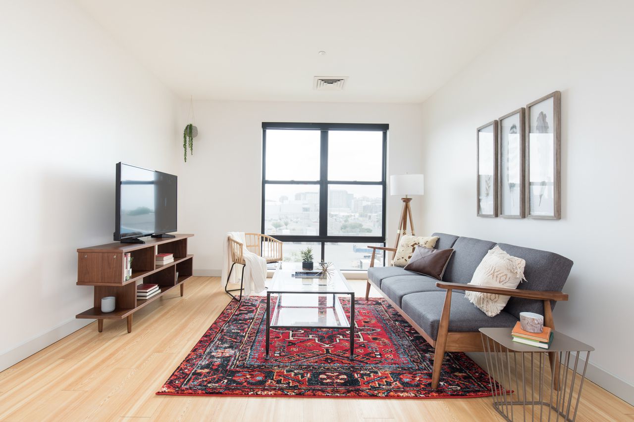
And voila!

1.jpg

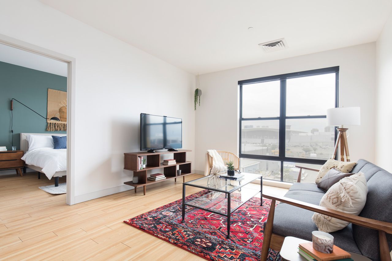
I really trusted the client's measurements of the space as well as the measurements indicated with this sofa - if either had been off it wouldn't have worked. Luckily it was a perfect fit and I got to tuck the sofa cozily inside this brick clad nook.

3.jpg

I'm so grateful to the hardworking installation team that carried out this design to 'T'! eDesign is most successful when the designer can clearly indicate the details of the design and the installation team interprets the instructions properly. The team did a fantastic job carrying this design to fruition; it turned out exactly as I had imagined and hoped!

4.jpg
5.jpg

Although the kitchen was an itty bitty little thing, the client desired a small eating area that could accommodate 4. I used a modest round table and simple chairs on the smaller side, but also shared in the design boards a couple fun alternative options for one of the chairs to be used elsewhere for when space is needed during meal prep. Options are always good!

8.jpg
7.jpg

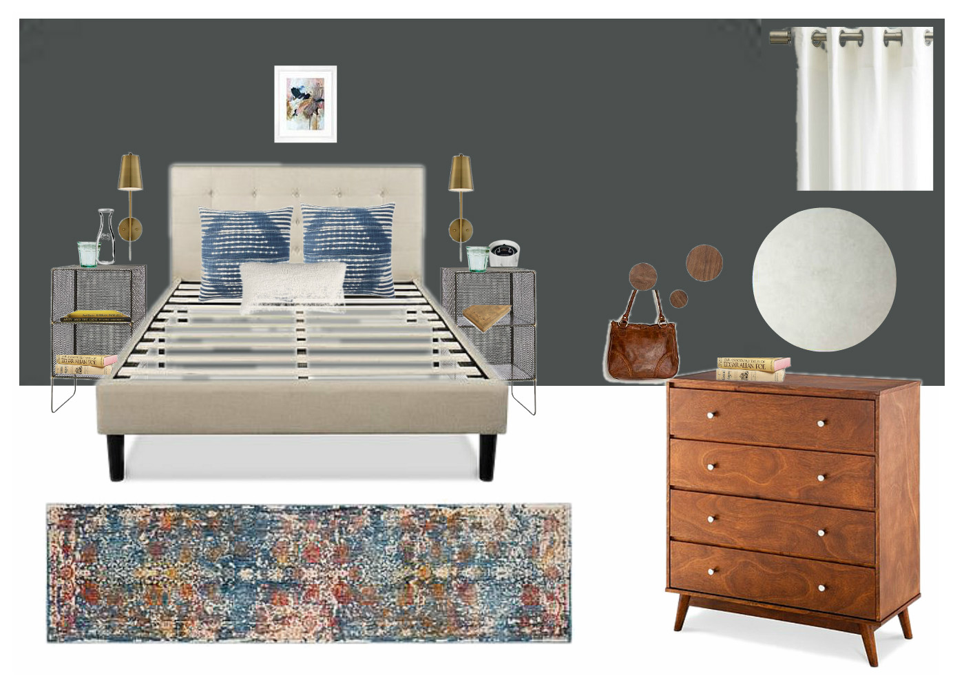
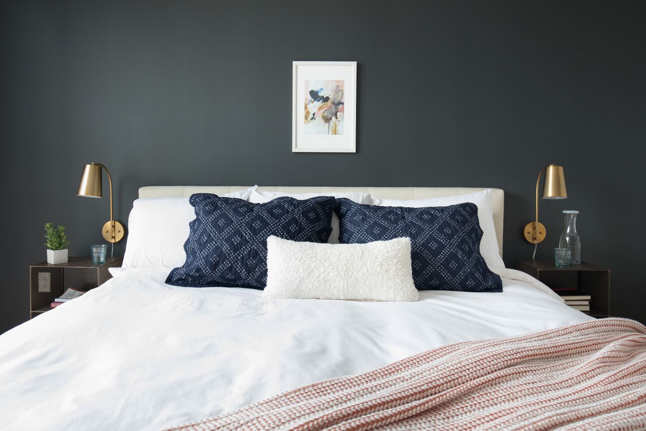
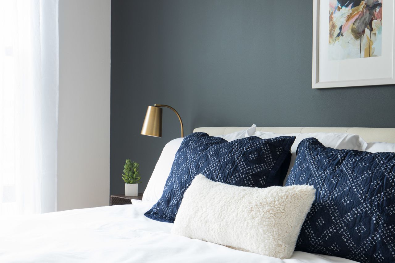
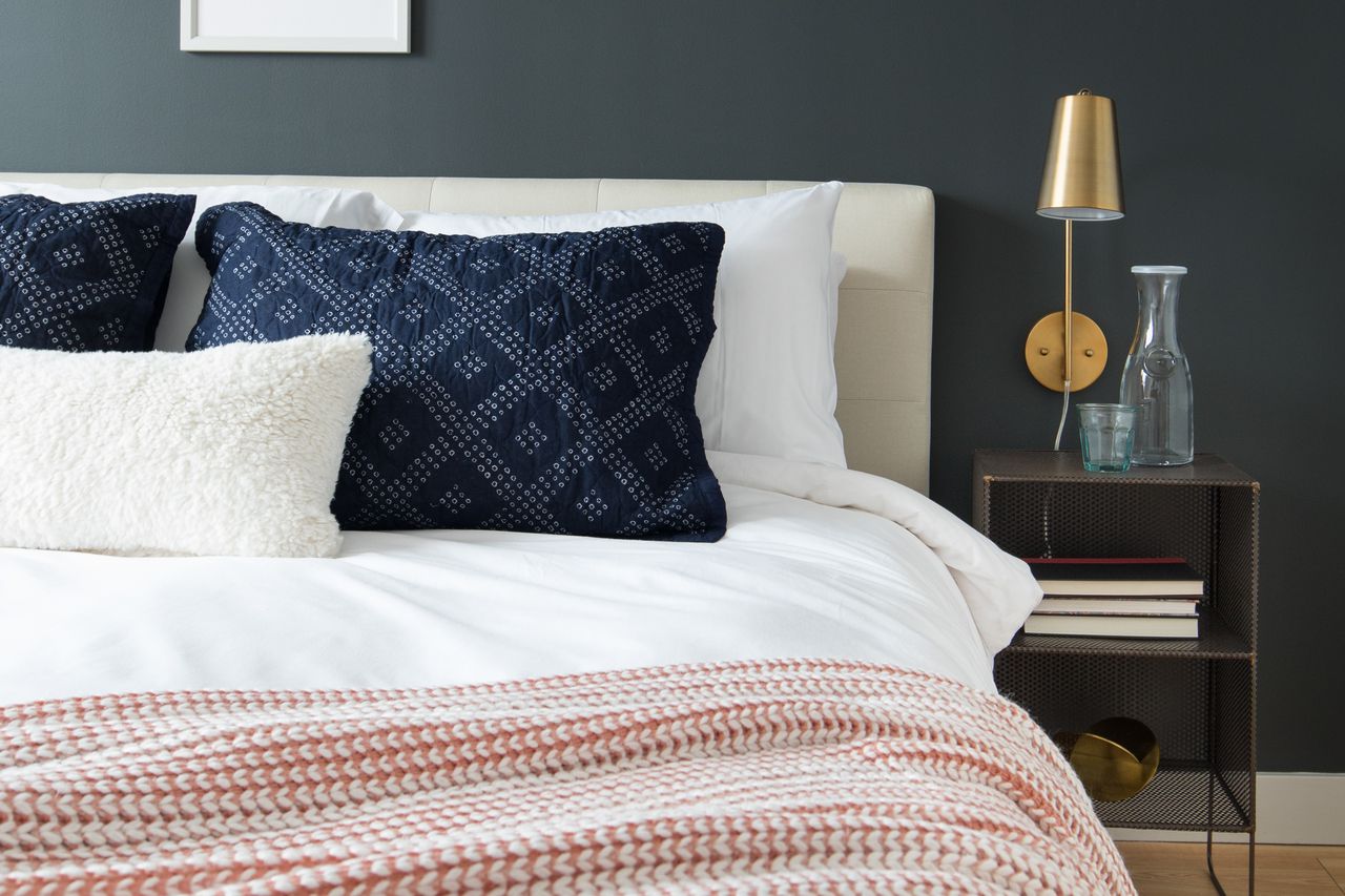
I wanted to give the bedrooms a cozy, sophisticated feel that is so true to Boston. Bostonians are not excessive in their style; nothing too contrived, function over form. Always. It's been a while since I've lived there, but that aspect of the city as a whole has been around for ages. There's an old story of a Boston matriarch bein where she got her hat, to which she responded, "We don't buy our hats, we have our hats."

Bedroom 1:

12.jpg

Nothing too fancy here, just classic, comfortable design.

13.jpg
14.jpg
15.jpg
16.jpg

Bedroom 2 is the slightly less sophisticated younger sibling of Bedroom 1. But they 'speak the same language', as Cate says, and the laid back, comfortable vibe is consistent between the two.

9.jpg
10.jpg
11.jpg

It's such a delight to see this space finished - it was a whirlwind putting it together in a matter of days but I absolutely adore how it came together! Even with such a short timeline to work with, the creative freedom to do just about anything I wanted with this space was an incredible opportunity to be entrusted with. I look forward to sharing more such projects with you soon!

Thank you so much for coming by!

Chelesa.jpg

Boston's 'D Street' Reveal!

Hello again! My last post was ridiculously text heavy so I won't waste time with too many words here, but I just want to say thank you for all of your incredibly kind words of encouragement for Cate and me as we pursue new and exciting challenges with our work here at StyleMutt Home. Your words lift our hearts so.

I'm really excited to dive right into sharing some of the units I've been working on with Sonder, (see this post for details on my new freelance position)! I've completed 7 units since mid-July and am looking forward to seeing more of them photographed and listed! The work is completely digital - they send me a floorplan with measurements of the space, and sometimes, if I'm lucky, pictures of the space as well! A lot of times there are still renters in the units so I don't get listing pictures, but with this unit I did!

I won't even try to hide how much of a nerd I am for factory windows - factory windows, interior brick, and unfinished warehouse ceilings are probably my top three favorite architectural elements in a home, so getting to work on urban condos and apartments is an awesome fit. And doing this unit in my favorite city of Boston was another big perk! I lived there for 6 years and it's one of my favorite places in the world. Go Sox!

So after Sonder sends me the floorplan and any pictures or video tours they may have of the unit, I start a Pinterest board, (just like we do with our clients)! Unlike client boards, however, I keep my Sonder boards public. So if there's anything you see that you're interested in, you can find it all here on my Pinterest! I create a different Pinterest board for each unit and use that to save inspiration and pieces. Sonder always gives me a very strict budget, (right to the cent), a 'turn-in' date of when they need the design completed, (usually around 2 days), and a 'need by' date of when they need every last item to ship by, so I need to make sure every piece can be delivered on time! Below is a sample of the board I used for today's apartment!

IMG_9291-2.PNG

After pinning the main furniture pieces I want to use I then create a floorplan based on the measurements Sonder sent. When doing eDesign it's absolutely imperative that you understand the space you are working with, right down to the inch. I'm getting MUCH better with my floorplans, but have definitely been in a position of asking whoever is on the installation end, (clients, or Sonder operations), to squeeze this way or that or try to explain a new layout. Not fun and totally embarrassing. Floorplans are priority!

Floorplan.jpg

And finally I create the design boards! I typically make one design board per room in the apartment, (unless the layout is wonky and I need to show some super specific styling or layout details). Below is the design board for the living room, and following is the living room in completion!

1.jpg

For some reason they did not use the gorgeous Rose Swiss Cross engineer print I had sourced from our dear friend Vol25, and yes, I am taking it personally. Hah! I had chosen that for my closeted infatuation with red and pink, as well as the lovely contrast between the dusty pink and the cow print. Oh well. I don't love the feathers but I can move past. Shall we?

2.jpg

Other than that Rose Swiss Cross print, it's crazy fun seeing every other last detail implemented exactly as I had presented in the design, (even the books). So cool!

5.jpg
6.jpg
7.jpg

Bedroom 1: We've had the opportunity to work with two clients this year who wanted sage green walls in their home. While the specific direction with style and color scheme was unique to our clients, I had a little fun of my own in this room with sage green. Here is the design board followed by the real deal:

OB-CHI Sonder DSTR320 Bedroom 2.jpg
8.jpg

No, your eyes aren't playing tricks on you, they switched out the black mudcloth pillows for these dusty blue ones....but I'm not sad about it. They picked a really earthy, dusty blue, which I think goes well. Otherwise, the room represents the design to a 'T'!

10.jpg
11.jpg

Bedroom 2: Same feel, different route to get there. Design board followed by the completed space.

OB-CHI Sonder DSTR320 Bedroom 1.jpg

One thing I forgot to mention! All beds get dressed in 'hotel white' bedding, so I don't ever do comforters, duvets or sheets. So I try to pick beds, pillows and throws, (as well as overall room colors), that will go with crisp white.

13.jpg
14.jpg
15.jpg
16.jpg

A huge thank you to the folks I will never meet who worked on installing this space for Sonder! It turned out just as I had imagined. Except for the Rose Swiss Cross. :)

Til' next time! Thank you all so much for coming by today!

Chelesa.jpg