StyleMutt Design: Chelsea's Updated Home Tour

What?! Where is our usual Friday Reader Design home tour, you ask? Our booty kicking intern, McKenna, is taking a much deserved week off, so I'm slipping in to share a little tour of my own! Hope you guys don't mind! We've got a fabulous line up of Reader Design tours that will resume next week, though. Promise!

A LOT has changed in our main living spaces since last fall; a result of HGTV coming to photograph our home and then casually letting me know our home can't be shared on our blog or social media until after it's printed next Fall....unless I change it all. Challenge accepted, HGTV! The day after the shoot I sold rugs, chairs, tables, swapped things from one floor to the other, deconstructed, redesigned and reconstructed our pipe shelves, and redesigned our main living spaces. It's been such a fun process but I sure am glad it's over. It's time to kick back. :)

We're going to go ahead and just call this tour 'moody', as opposed to, 'it started pouring cats and dogs during the 45 minutes I had to prep and shoot this thing before the kids came home from school, so I had no time to manually adjust the light settings on my camera before each shot'. Moody has a better catch, don't you think?

Well, come on in!

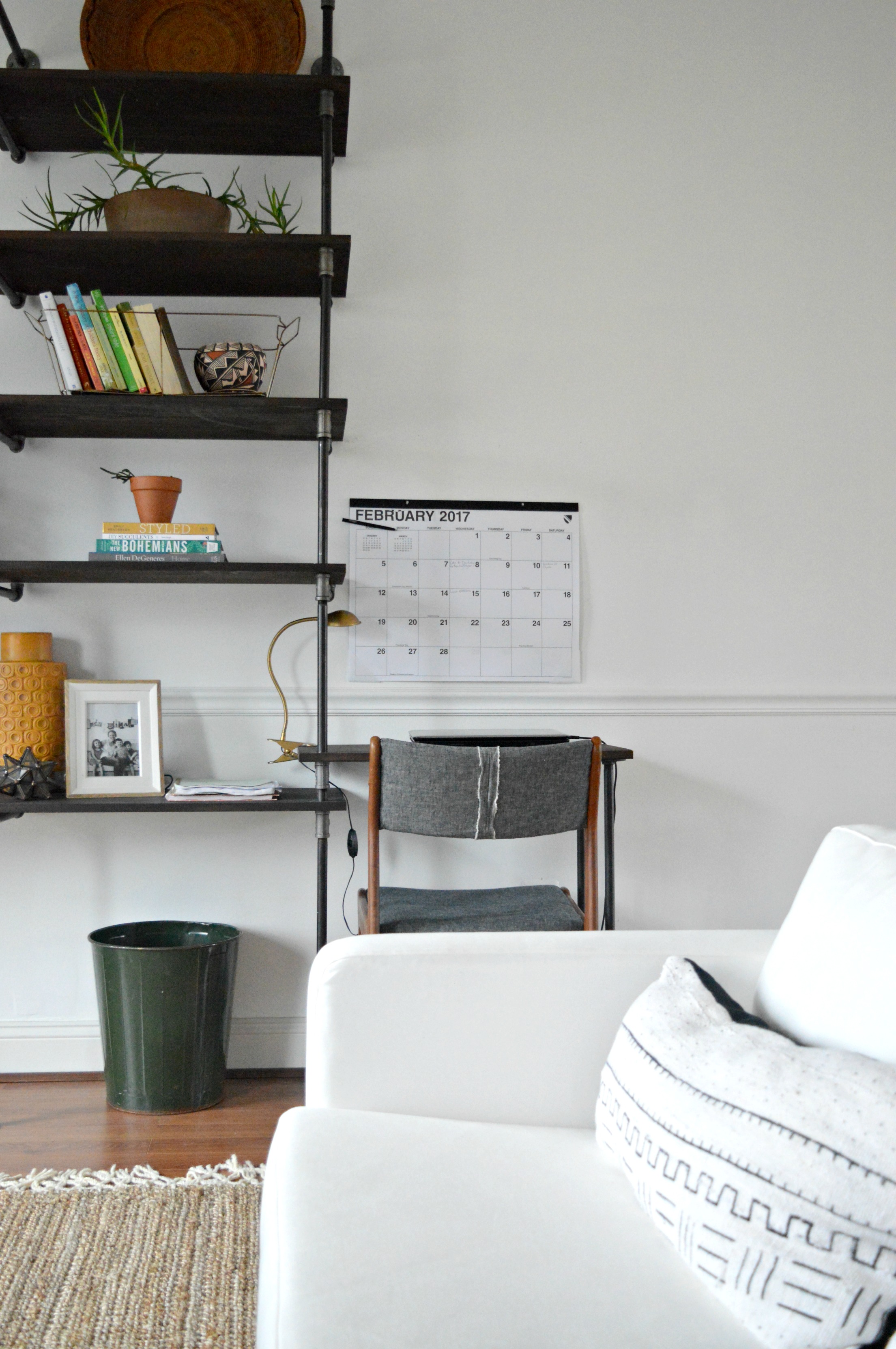
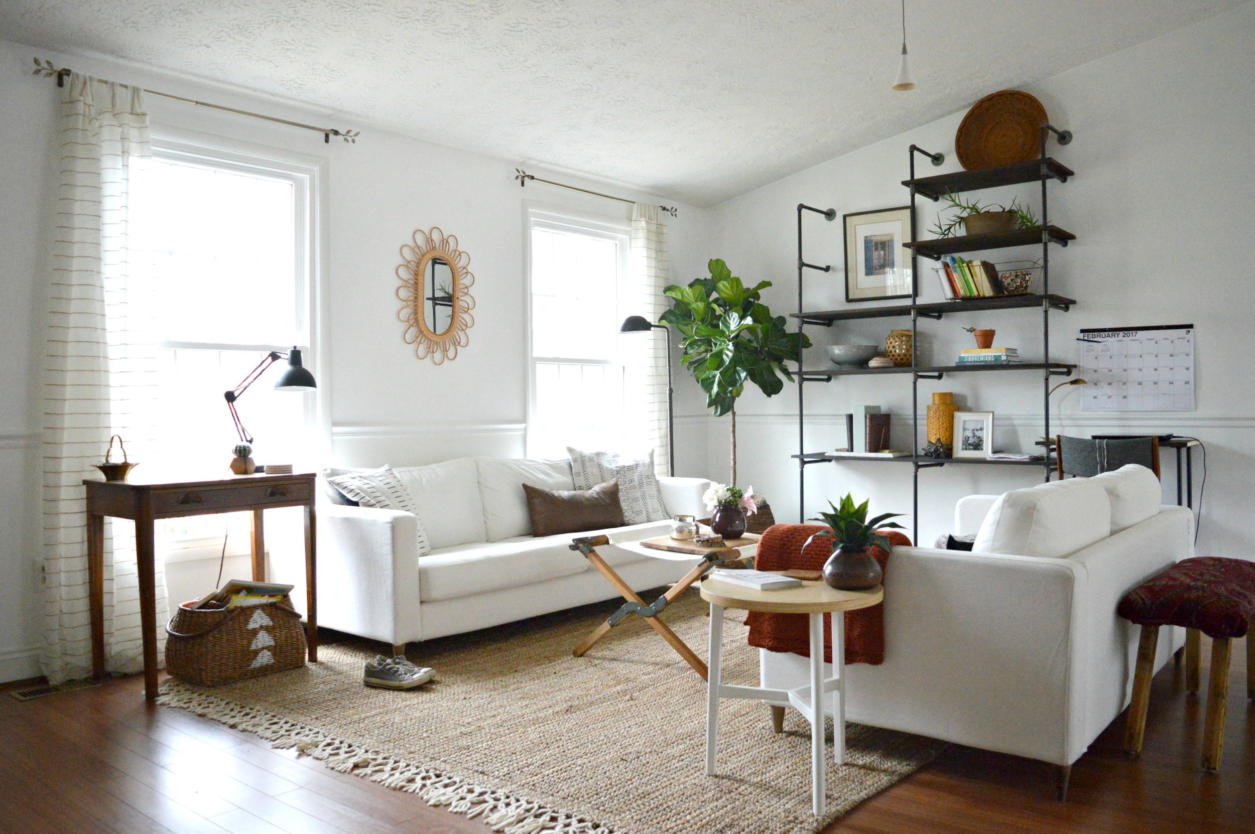
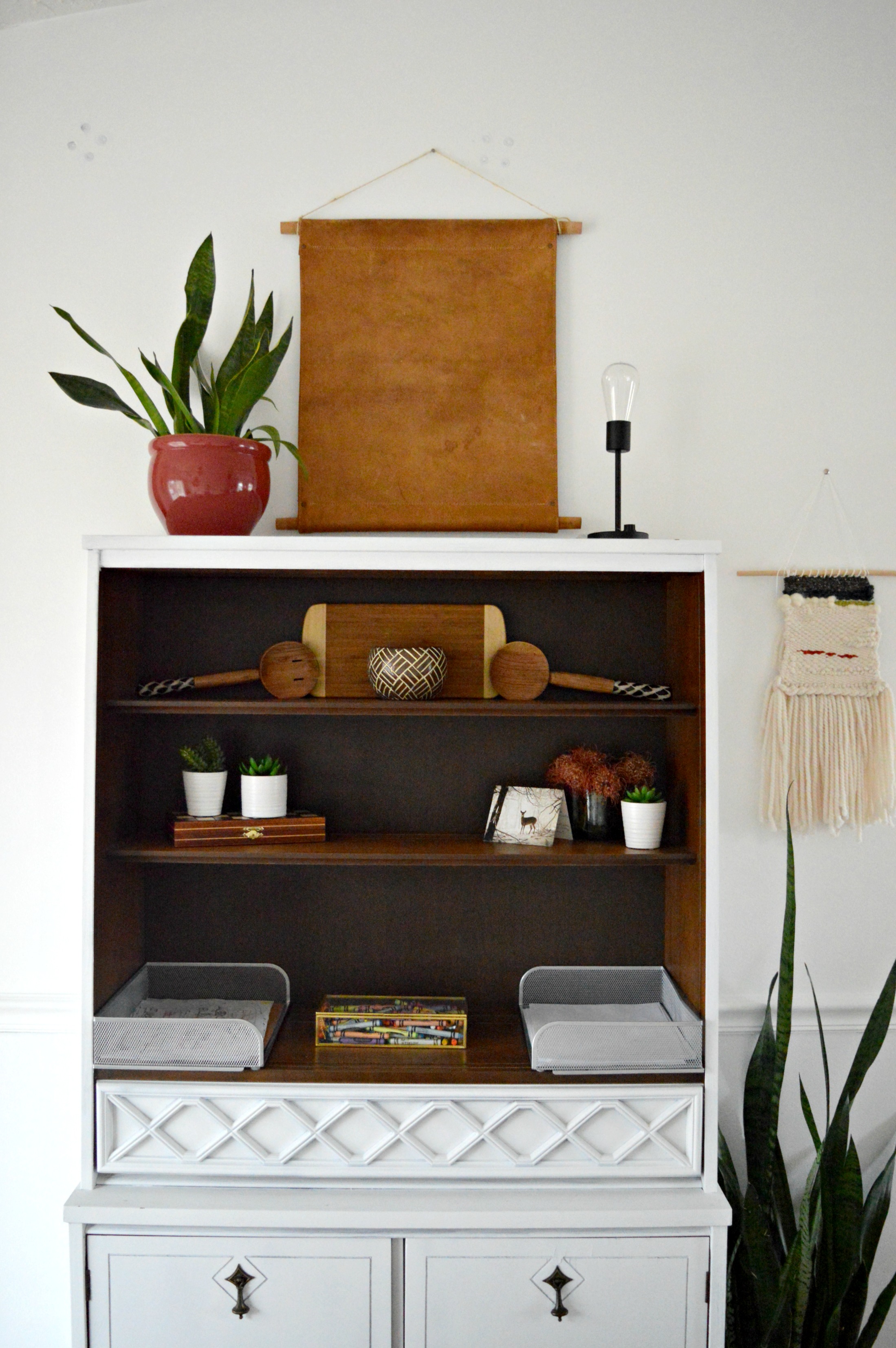
It helped me tremendously to lay the plan for this space out in a 3D rendering, (which I posted about here). Seeing it come to life confirmed that the shelves really belong in the living room, rather than the dining room where we built them originally. Along with moving them to this wall, I also wanted a bit more desk space. Matt cut two boards on the upper left side to make room for a piece of art, and we transplanted one of those cut pieces off to the right hand side as a desk!

10.jpg

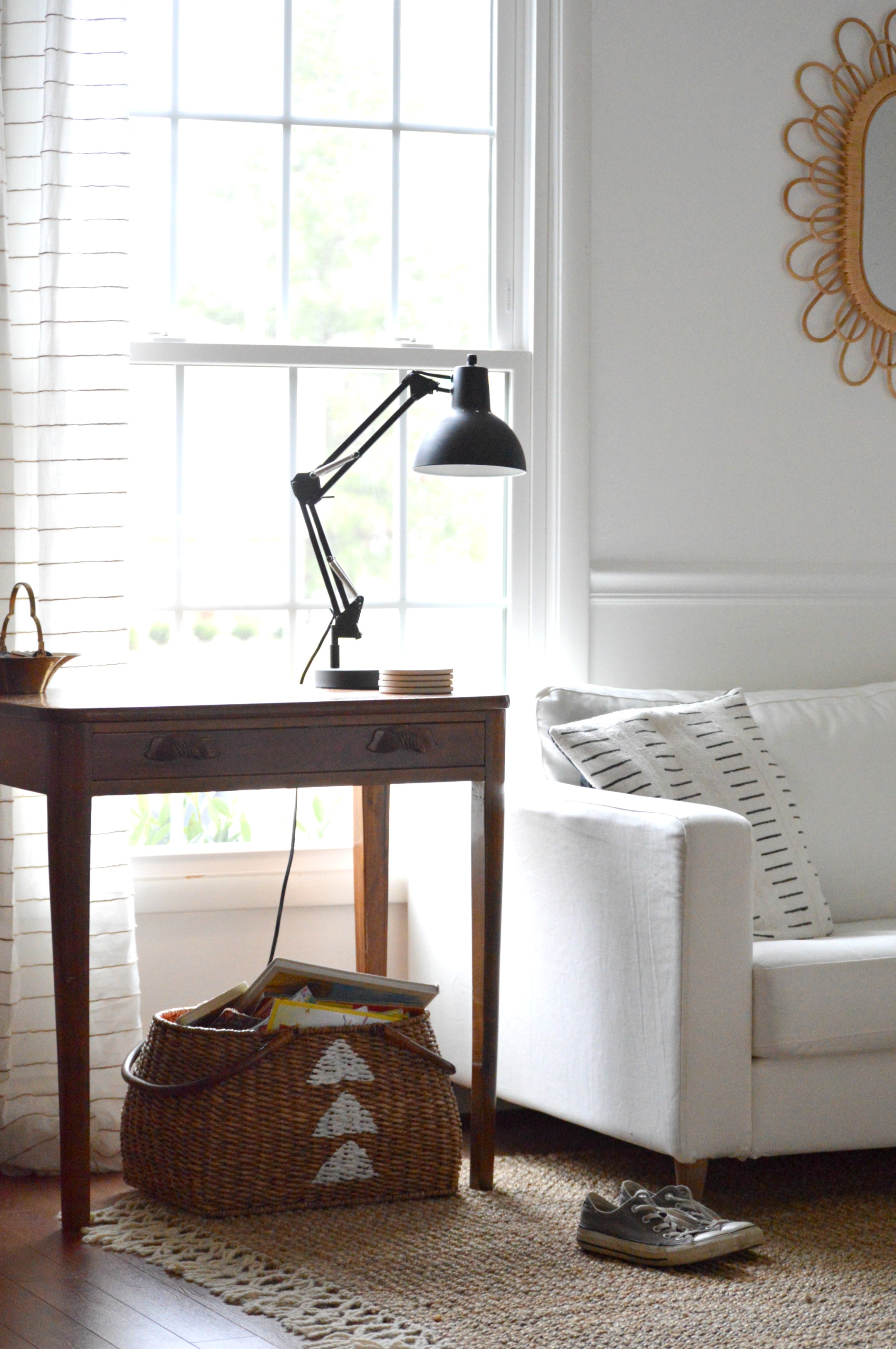
With the pipe shelves busy with books, plants, art, pottery and photos, I really wanted the rest of the room to caaaalm down but still be interesting, you know? This jute rug by Plush Rugs was the perfect unboring plain rug to compliment the space. The soft thick cream braided fringe on the ends adds that character I was hoping for, but the simplicity of the overall rug doesn't beg for attention, (linked here if you want to check it out).

Our coffee table here was previously in the basement - the two rooms agreed to swap coffee tables and they've been the better for it! This piece was a WWI army cot in another life. It made a rickety bench; too wobbly for the babes to use, so I cut it down and turned it into two coffee tables! One table sold, and the other has been serving our home ever since. Once in the service, always in the service!

While finding pieces around your own home is fantastic, it doesn't hurt to keep your eyes peeled out of the home as well. While taking a few bags of old clothes to Goodwill several months ago, I noticed this beautiful old Persian rug rolled up and left by the dump. It was dirty and stinky, but I brought it home figuring I could re-purpose at least some pieces of it, just like the rug I made the tree skirts from. After airing out for nearly two solid months I cut it up, using one piece to cover this, (also found in a neighbor's trash), bench!

It's not an impeccable job; I wrapped that thing like a Christmas present and used a staple gun to attach the fabric underneath, (after stuffing in some batting I had on hand). But you know what? It's a sturdy little piece, my kids use it as a pirate ship, and it's a solid homemade job using totally free supplies. Ahoy, matey!

Let's meander to the dining room, shall we?

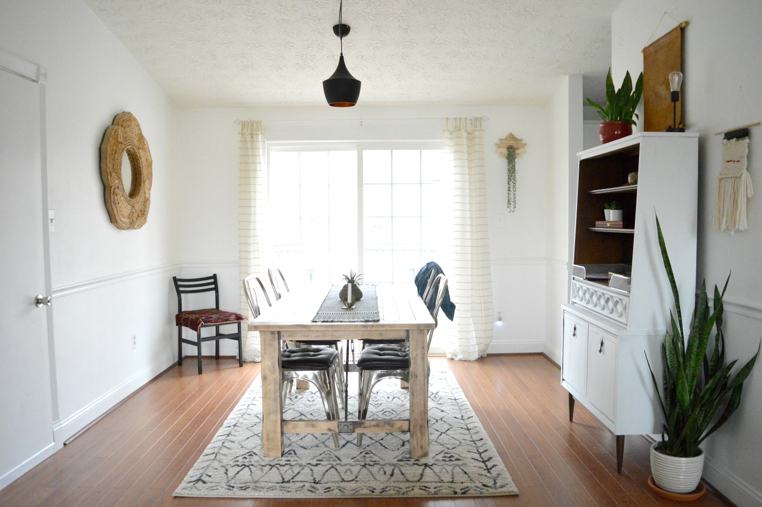
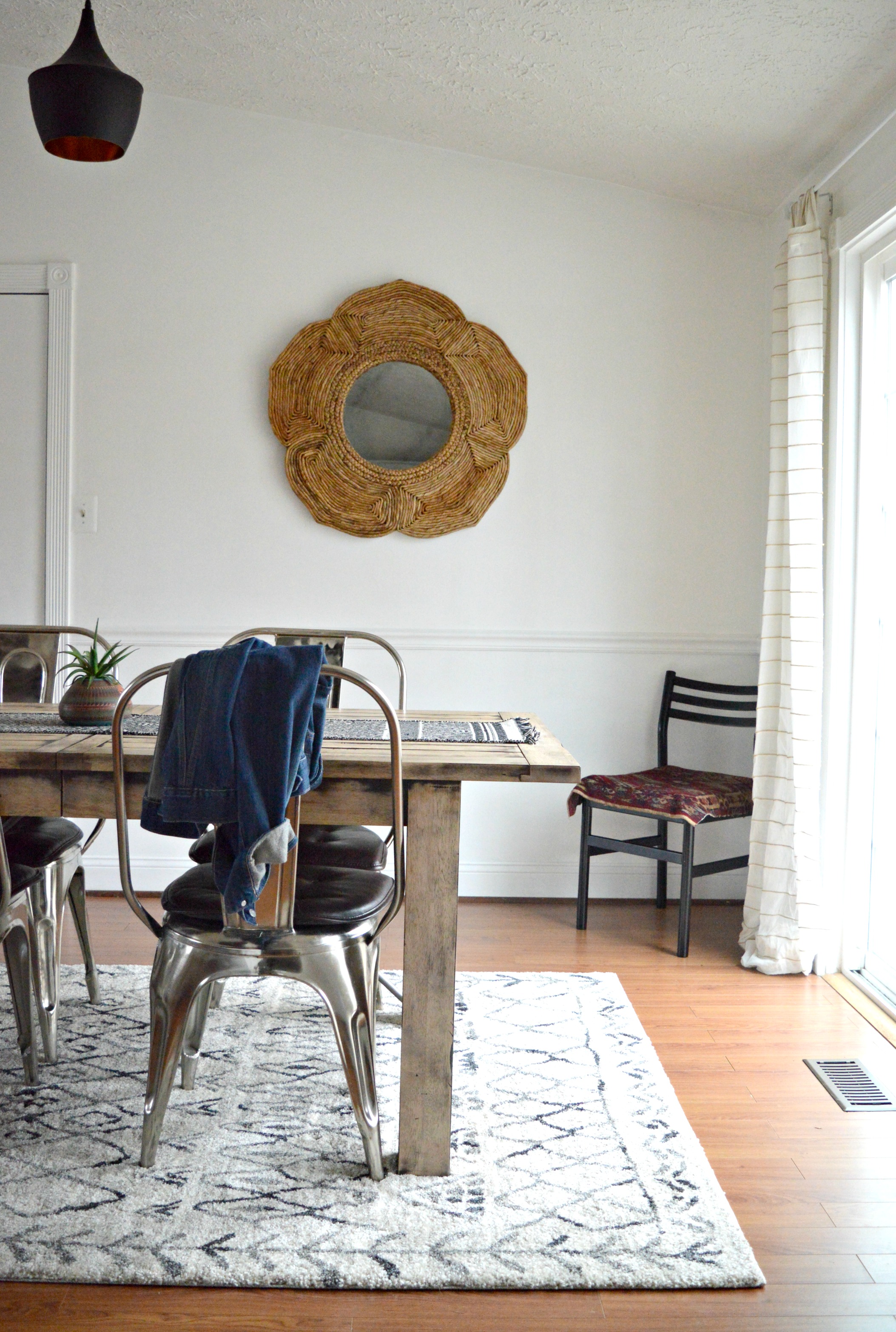
Of all the rooms in this home, our dining room is by far the most temperamental. We just don't get along, period. Every single move I make, it counters with something contrary. Here's a sample of our ongoing dialogue over the years:

Item 1: I replace a very wide table with a narrow table so we can reach across to help our, (then), three toddlers during meal time
Counter: NOW THERES TOO MUCH SPACE.
Item 2: I try a big dark green cabinet to store all our craft supplies; perfect style, perfect color
Counter: OOPS, NOT ENOUGH SPACE FOR THAT.
Item 3: I remove the curtains in favor of a cleaner look
Counter: MY EYES! TOO MUCH SUN! (says all my kids who suddenly have sensitive eyes)
Item 4: Replace the old thrifted chandelier with something more modern
Counter: MY FAVORITES DON'T WORK ON A SLOPED CEILING. (So I settle for this one that's like a baby size of what this room needs)
Item 5: Center the table with the sliding glass doors.
Counter: THE DOORS ARENT CENTERED WITH THE LIGHT FIXTURE. NOW EVERYTHING IS OFF, FOOL! GOTCHA!

Can you believe our dining room talks that way?! The nerve.

But how about that rug! After selling one of our old rugs I purchased this one for the same amount as I sold the old one for - even stevens! It's an Overstock rug I found here, and is THE softest thing under our feet. I don't mind saying, it's borderline luxurious!

I don't do fussy tables, but I like interesting pieces like this pottery from my grandparents' old lakehouse.

Moving on to the kitchen to finish this marathon tour already! Recognize anything?

I cut a long strip of that dumped old Persian rug to use in here! It's just the kind of excitement this space has needed! I love tossing a bit of unexpected into a space and this rug is just the right dose in here.

That's a wrap, folks! If you made it this far, congratulations; you deserve to start your weekend early! Seriously though, thank you so much for coming by today. I just really enjoy this home and the way it has evolved with our family and it's a special thing to get to share it with you, friends.

Have a wonderful weekend!

First Design of 2017: Function + Character in a Century Old Home

Hi Friends! We can't believe we're already rounding the end of February here; it feels like we just celebrated the new year, just sat down and outlined our goals, just put together our new design packages and just said, 'I will put lipstick on every day'. Hah! Hard to believe that after all the work done to prepare for the year ahead, we're ready for the work of the year ahead.
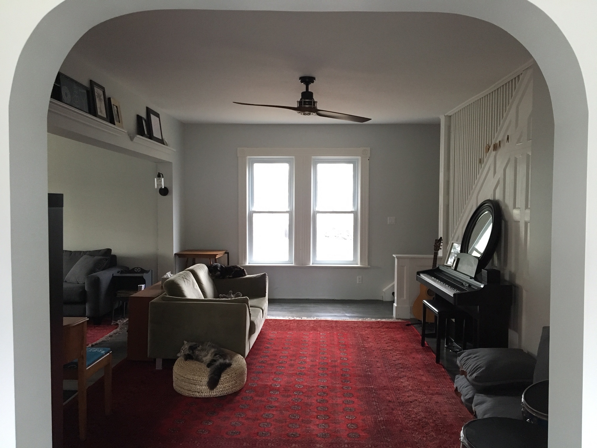
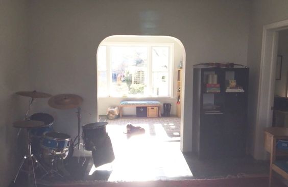
Our first design project of the year wrapped up last week - at least from our end. Now it's up to the sweet Abrosimoff family to take their design concepts and run with them! This sweet couple contacted us from Canada to help them finish off the beautiful 100+ year old home they've been renovating. Let us just say, ANYONE brave enough to take on a century old house always has a spot on our schedule! Here are some snaps they sent over:

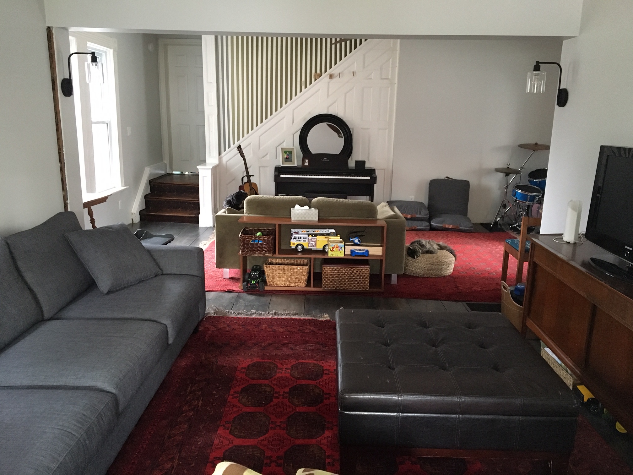
Right off the bat we were excited to get to work with such cool stuff in such an amazing space! They're avid thrifters/yard-salers/Kijiji-ers, (fun fact - Kijijji trumps Craigslist up there!) The two red rugs are actual vintage persians they found on Kijiji, but they both agreed that the two pieces together were too much red for the conjoined space.

The gray sofa and mid-century media cabinet were sure keeprs, while the funky mid-century bookshelf was a maybe, and the greenish loveseat was getting the boot.

These parents of three young kids requested a clean, open space that includes storage for kids' toys, a bohemian sitting area tossed with pillows, and layers of color and pattern. The Abrosimoffs chose our brand new Style Try-On package, which is where we design TWO concepts for a client space after getting to know their style and functional needs. One week after our consultation, during which we collaborated together on Pinterest sharing inspirational ideas, we sent them their two design concepts!

DESIGN ONE

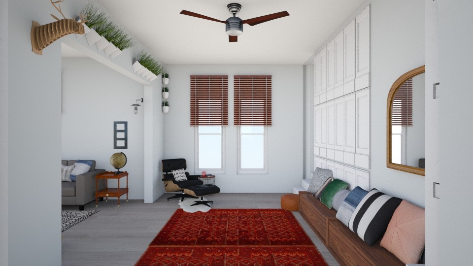
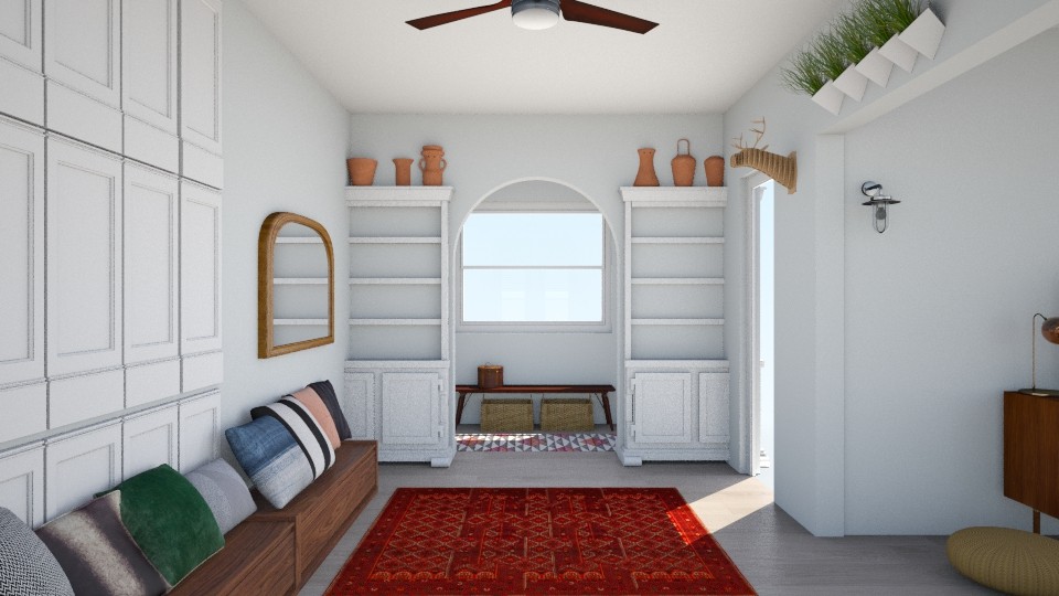
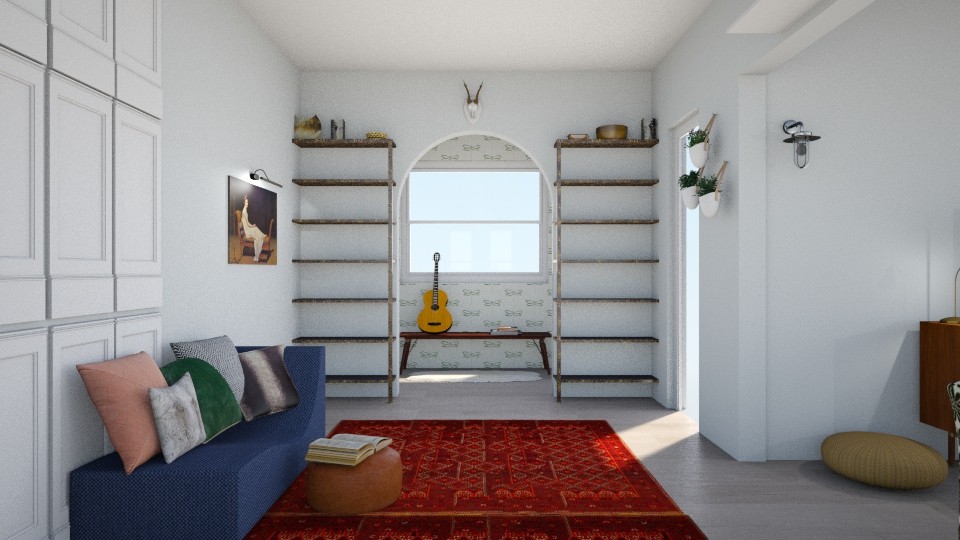
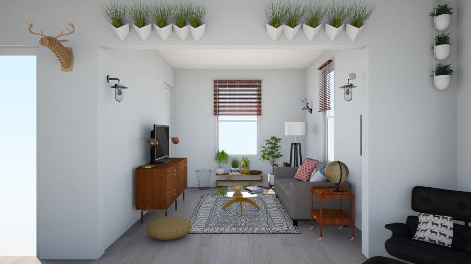
Entering from under the archway we added a long storage bench up against the wall that serves double duty as a toy keeper and pillow clad seating. A sophisticated leather Eames lounge with small side table is the perfect place to kick back and observe the beautiful chaos of kids.

We gave the archway white built ins with room at the top for pottery or other sculptural pieces you wouldn't necessarily want at kid height, and an oversize arched mirror to bounce a bit more light in that darker corner of the room.

The kick-back part of this space was kept clean and open, with the addition of a neutral but bold black and white geometric rug and round glass coffee table. Light fixtures in brass and black are distributed to balance the space, while the funky mid-century bookshelf is placed under the window as a plant sanctuary to anchor the room with a strong focal point.

DESIGN TWO

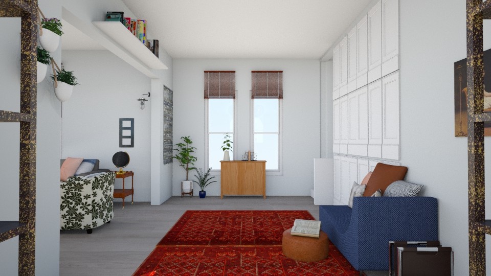
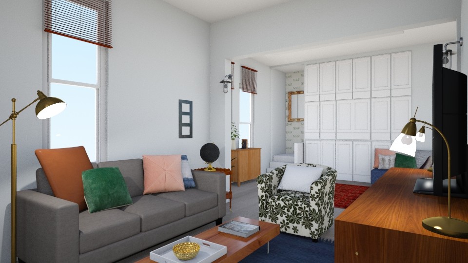
We shook things up a bit with the second design, really tapping into the old character of the home with vintage inspired pieces, including a denim blue chaise lounge! This piece is topped with various leather, fur and patterned pillows and a leather ottoman serves as a scale-appropriate table or child size perch. A storage cabinet under the far windows is home to some happy plants and hides children's toys and games when they aren't being used.

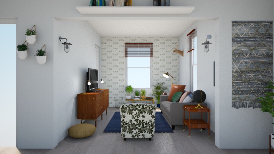
Since the Abrosimoffs clearly aren't afraid of vintage pieces and happen to have a fabulous sense of humor, we included an ironic portrait of a woman on a chaise lounge to represent this spot as a perfect place for an oversized vintage piece of similar colors and proportion. You may also notice we included wallpaper in this design! We wouldn't include wallpaper in just any job, but in a century old home it couldn't be more fitting. We chose a simple, modern paper that is white with an oversize dark green pattern, (it happens to be dragonflies, but this was just to give our clients a visual idea), and we used it throughout the space, so keep your eyes peeled. ;)

See it in the mudroom on the other side of the archway? For this design we swapped the modern white built-in shelves for rustic industrial shelves, again leaving room at the top for various architectural artifacts.

The family kick-back space is anchored by our chosen wallpaper on the facing wall, and grounded with a saturated blue rug, (a fabulous addition our talented intern, McKenna, pulled for this space). The pattern on the chair isn't literal, but we love the idea of giving this room an extra dose of cozy with a floral patterned chair that compliments the surrounding colors and reminds the family of the history of their home.

Two designs for one home - both very different but as Cate would say, they speak the same language. The point of creating two different designs is not for our clients to pick their favorite and follow it verbatum, but rather to show them options - how two different looks and layouts under the same style umbrella would look in their own home. It's literally trying different looks on a home!

So, while we do not pit the two designs against each other, do you happen to have a favorite here? We'd love to hear what you think! And stay tuned, because the Abrosimoffs have hit the ground running and we can't wait to share these shots when all is said and done!

Thank you so much for stopping by today! If you'd like to give our Style Try-On package a try for $165, please don't hesitate to contactus here! We'd love to hear from you.

DIY Planter ||Furniture Flip Bucket List||

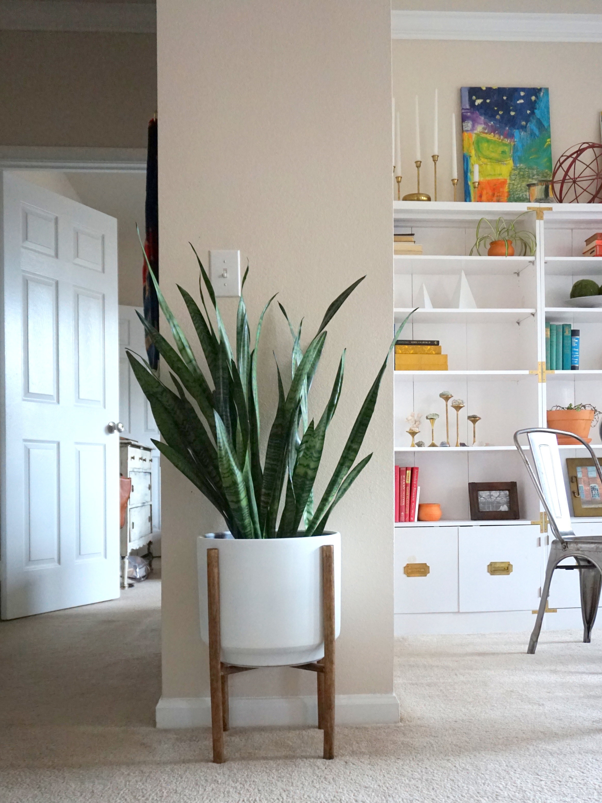
Ok so something magical happened.  I made something I've always wanted to make using only the items I already had lying around.  That's a project with like no risk and all reward.  Hey-Oh!  Even better, this project also fulfills one of the items on my 2017 Furniture Flip Bucket List.  Double Hey-Oh!

So which item is the first I shall be crossing off this year's list?


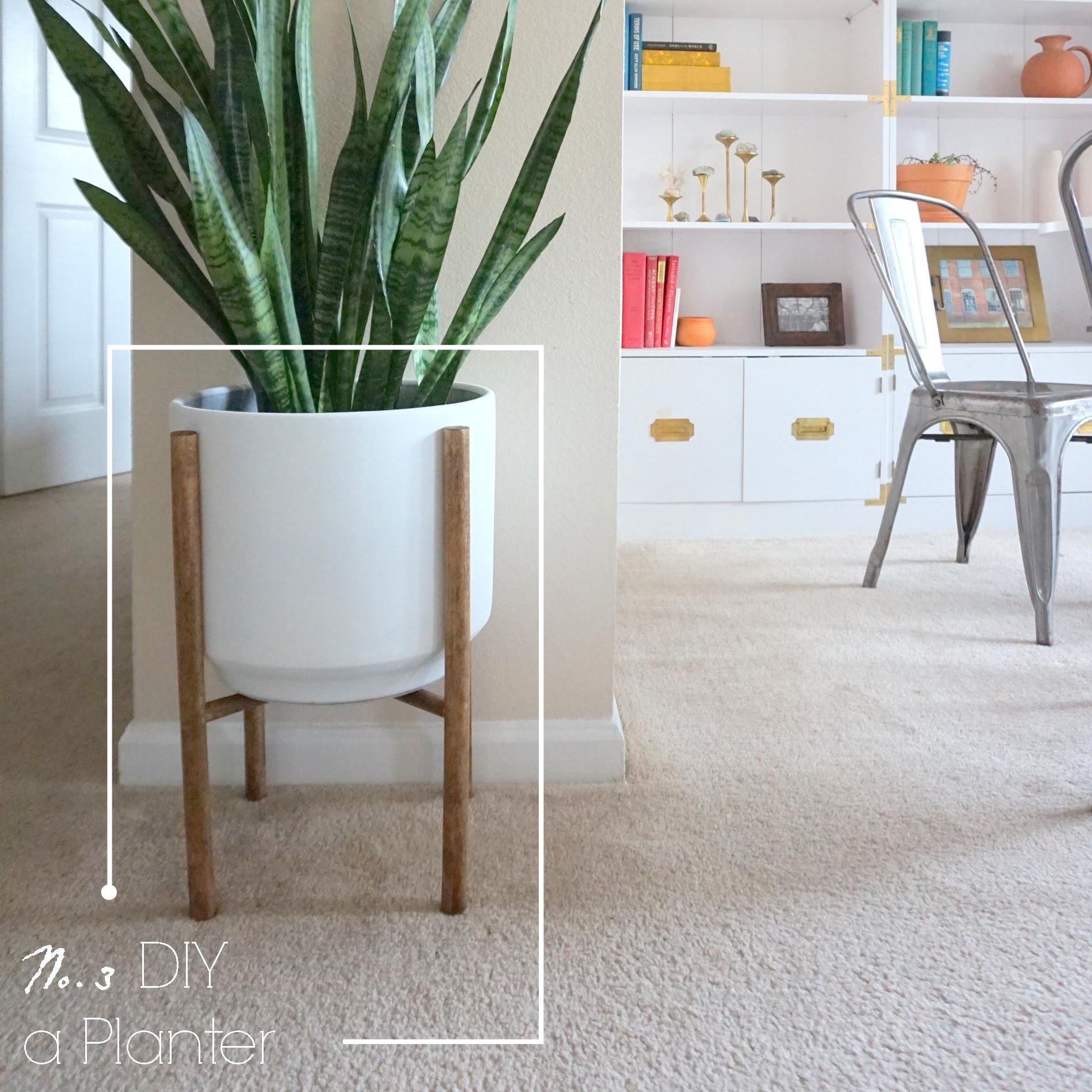
Why No.3 of course.

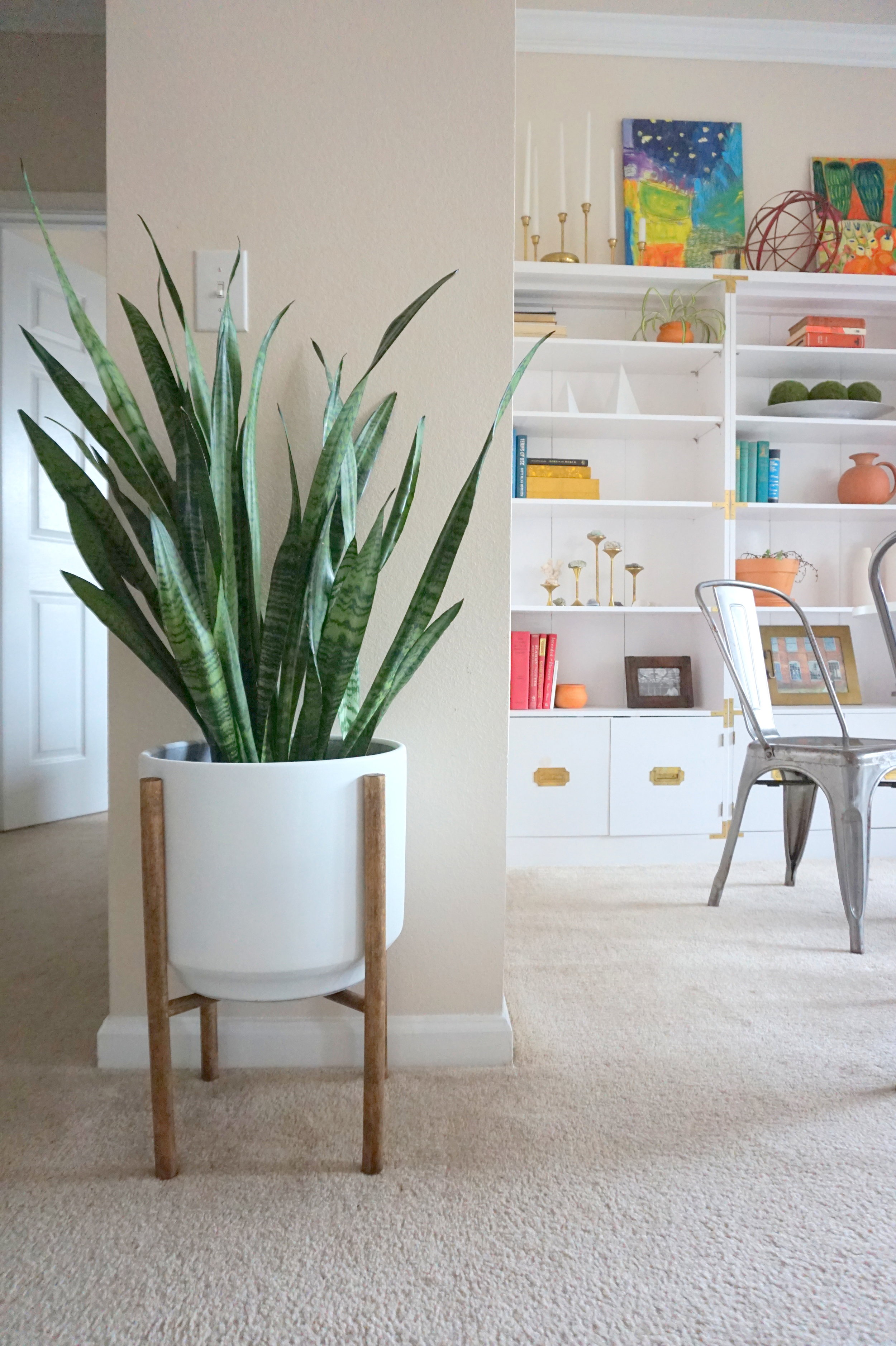
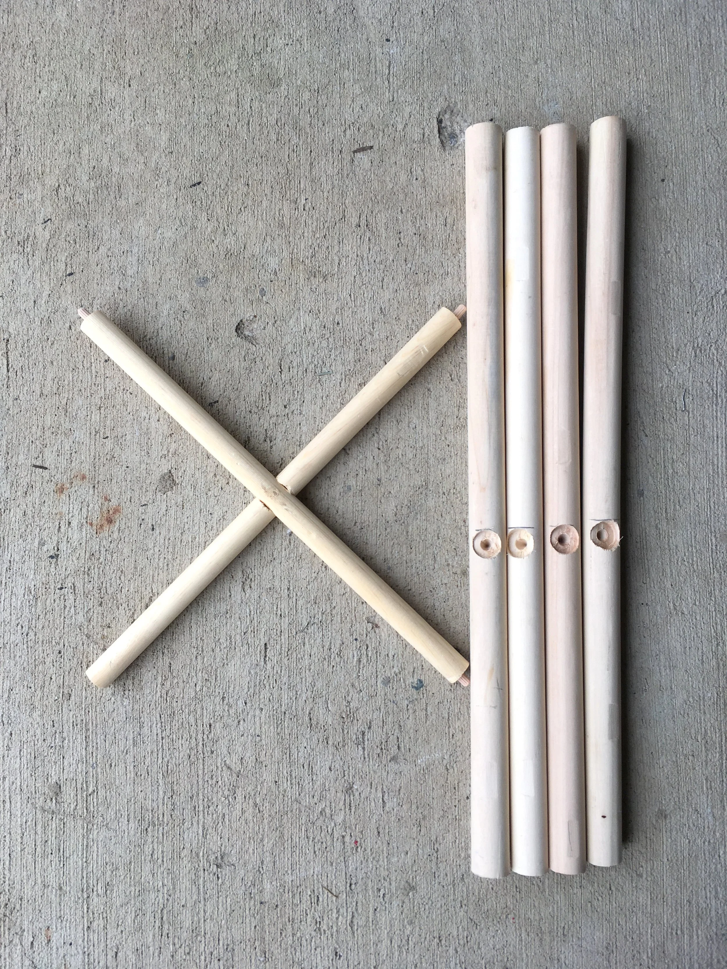
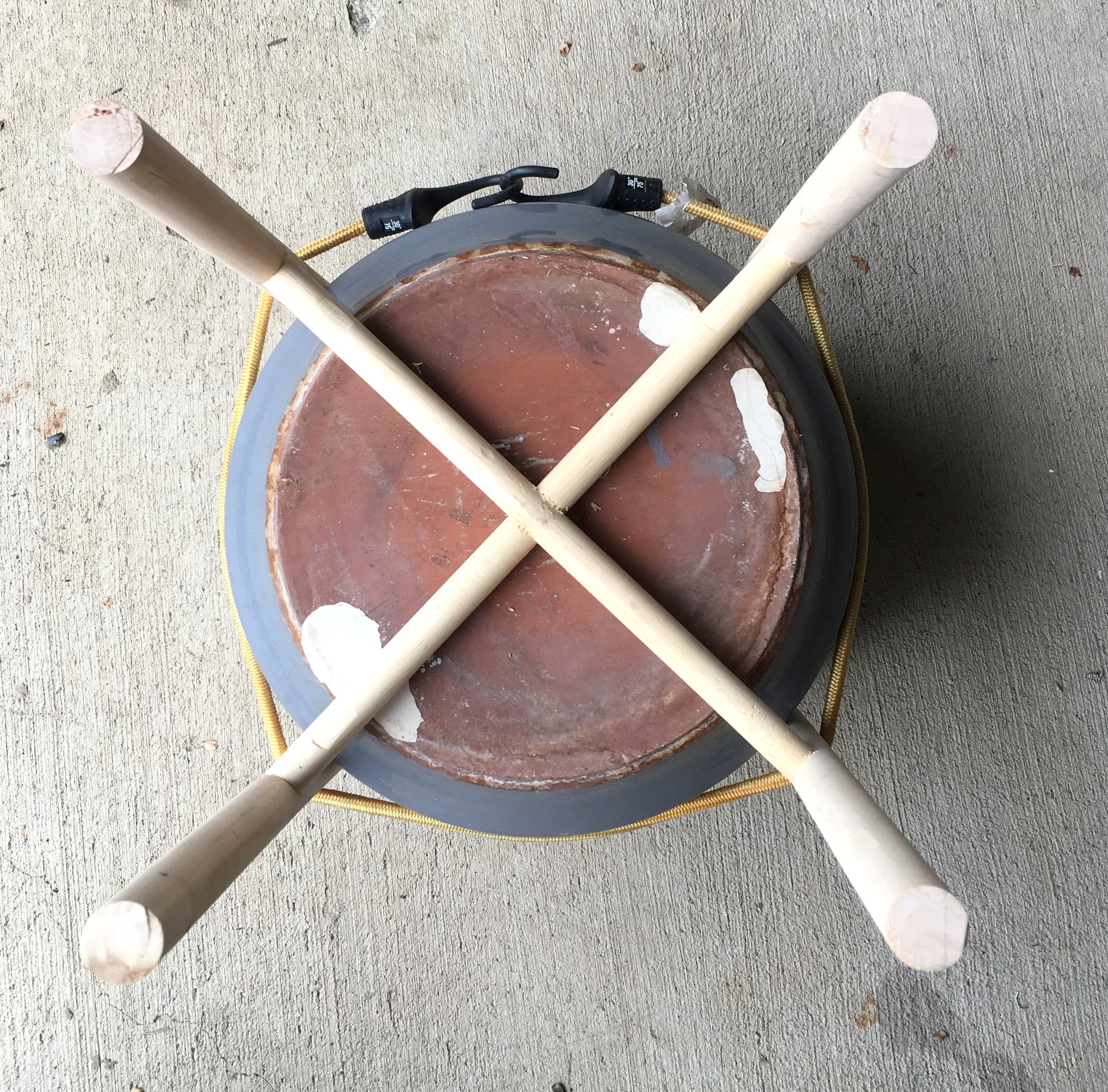
The construction of this little guy was relatively simple.  All I needed was some round wooden dowels, a dowel kit, some wood glue, and a large ceramic planter.  Following along with this handy tutorial, I was able to assemble the four legs and the joining cross section. 

I built the stand to fit a ceramic planter I had lying around (with a dead plant carcass inside).  For extra stability, I secured the joints with wood glue and strapped the base in place to set.

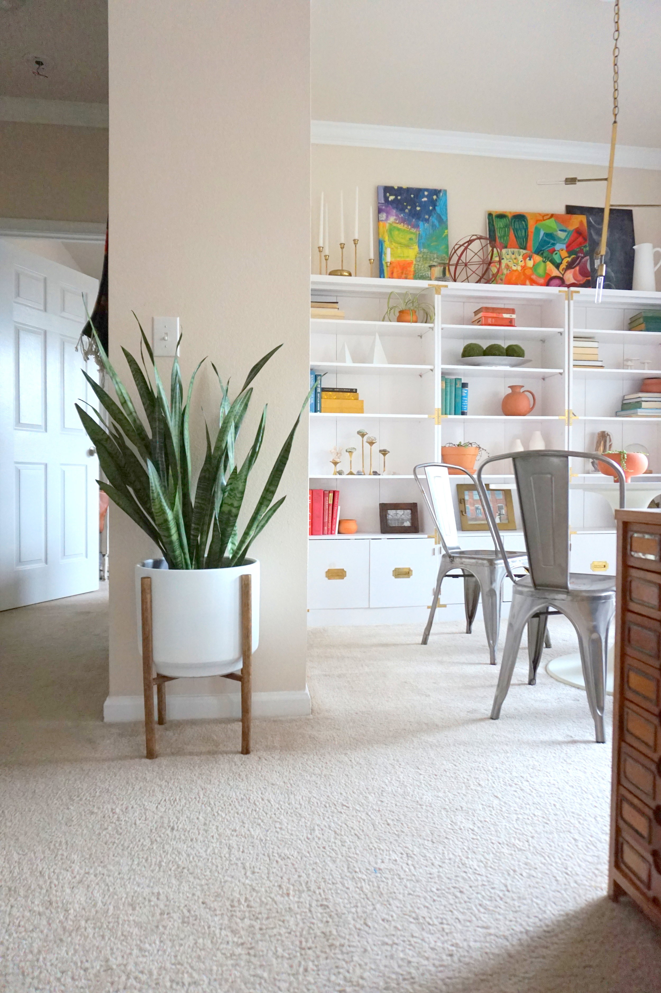
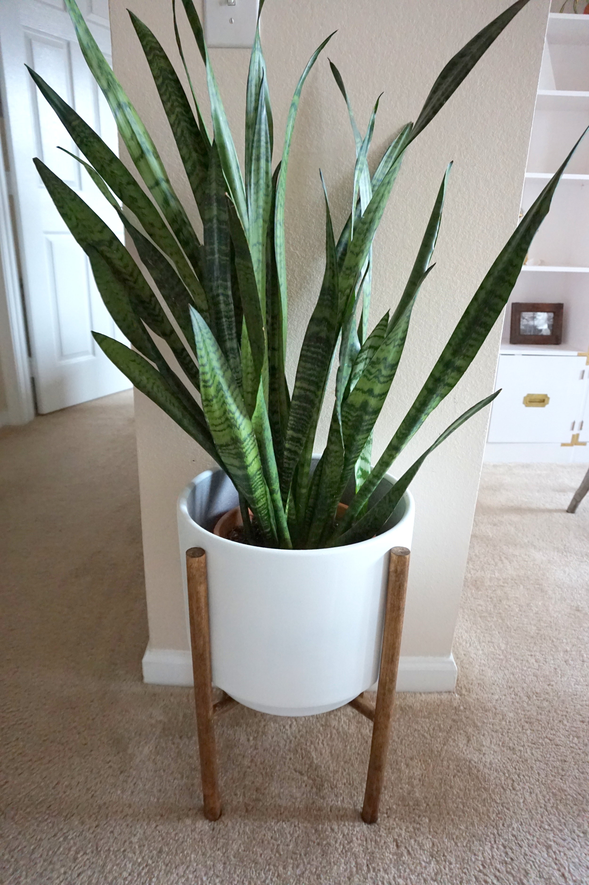
Once the glue dried, I spray-painted the planter white and stained the legs a warm brown to get that iconic MCM planter look.

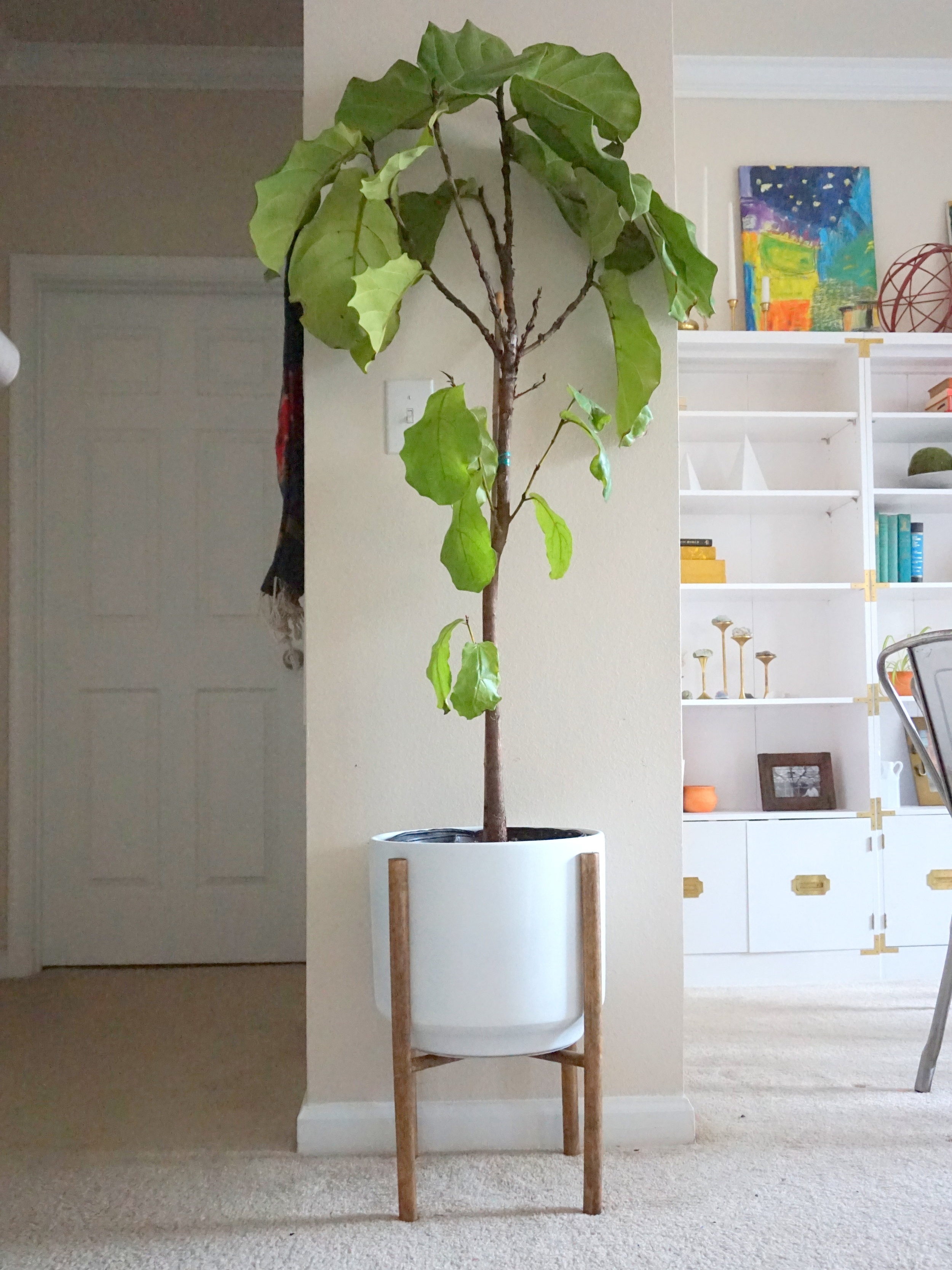
Now my plant children have a place of honor to reside.

Despite the glue, he's still not the sturdiest but I am proud I built him nonetheless.  And I still plan to improve my carpentry skills and build something SUPER solid to fulfill item No.7 this year.

But of course in the spirit of the upcoming Oscar's, let's play a little round of

WHO WORE IT BEST?

Leave your votes in the comments below xoxo.

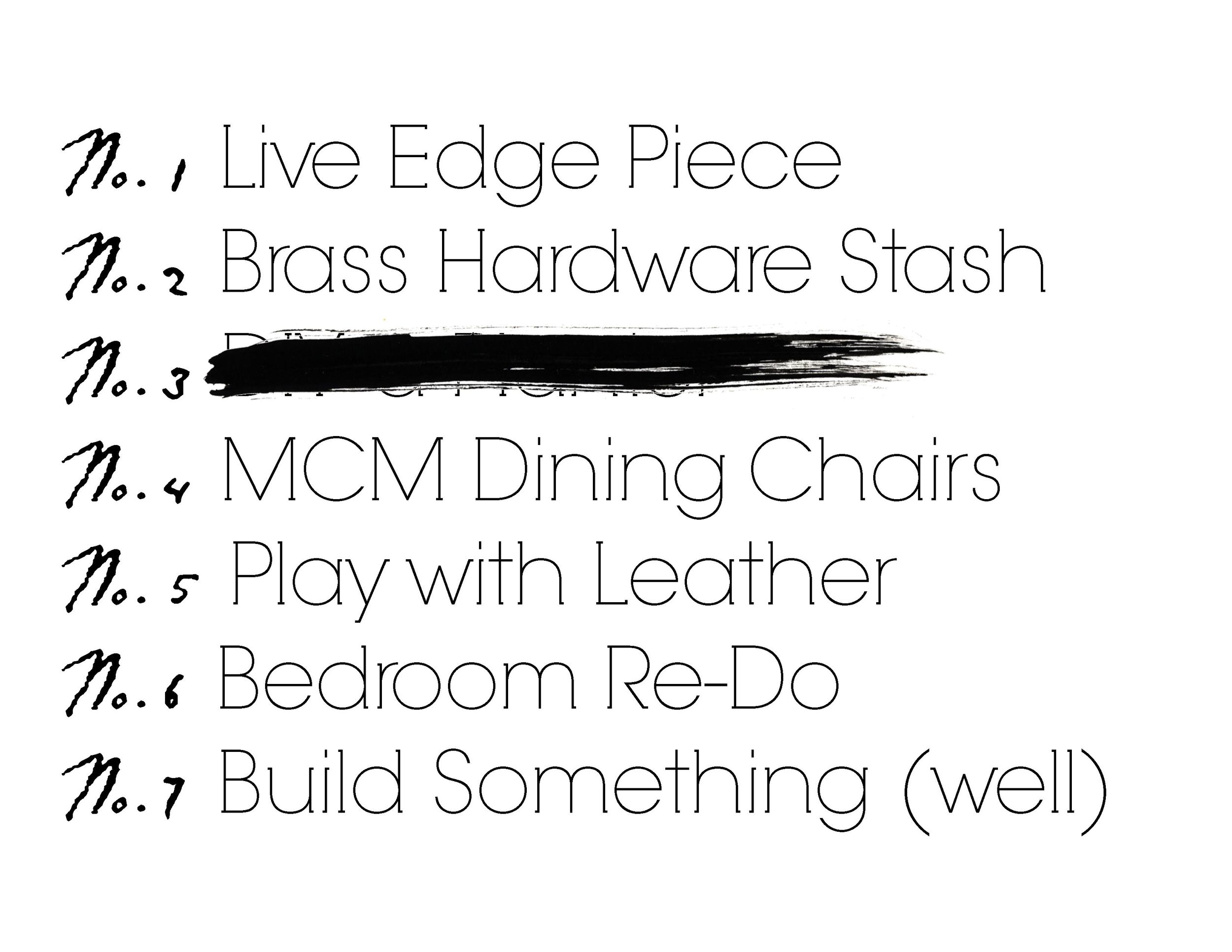
One down, six to go.  Catch up on the 2017 Furniture Flip Bucket List: