eDesign Reveal: Dani Barbe's Great Room

Hi friends! We hope you are all enjoying your Summer, wherever that may be! We've been so ridiculously excited to share one of our favorite eDesign projects so far that we picked up in the early Spring and recently finished. Today we are sharing part 1 of our amazing client, Dani Barbe's, home. This sweet lady contacted us with excitement, motivation and a completely open mind - all the makings for a wonderful eDesign adventure for us all! She is a self-made jewelry designer, (she has a collection in Anthropologie!), and to work with someone who inspires us so much has been such a gift. First up is her Great Room and Breakfast Nook, with more to come from her country side home in Frederick, MD shared with her fiance and their 'Lonny' - the most adorable french bulldog to walk this earth.

If you'd like to look back at our design boards and 3D renderings of this space before you see the entire finished product below, you can check out this post! Otherwise, come on in!

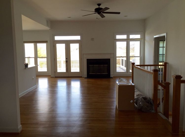
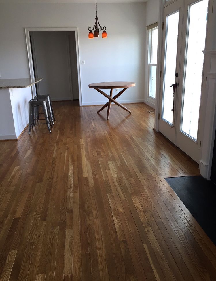
BEFORE

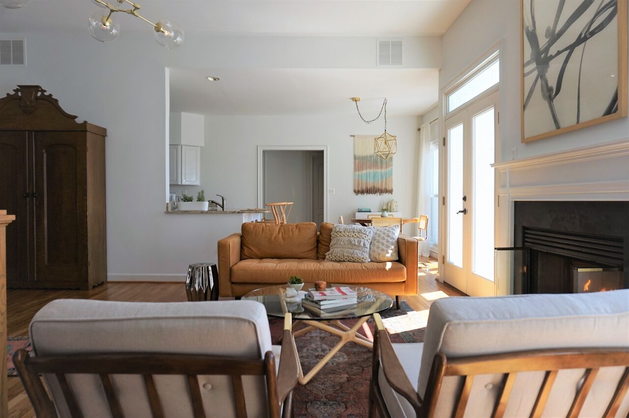
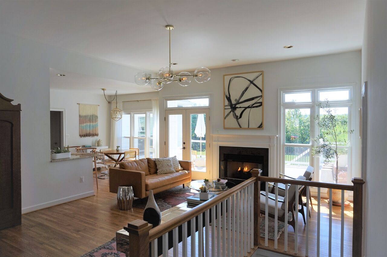
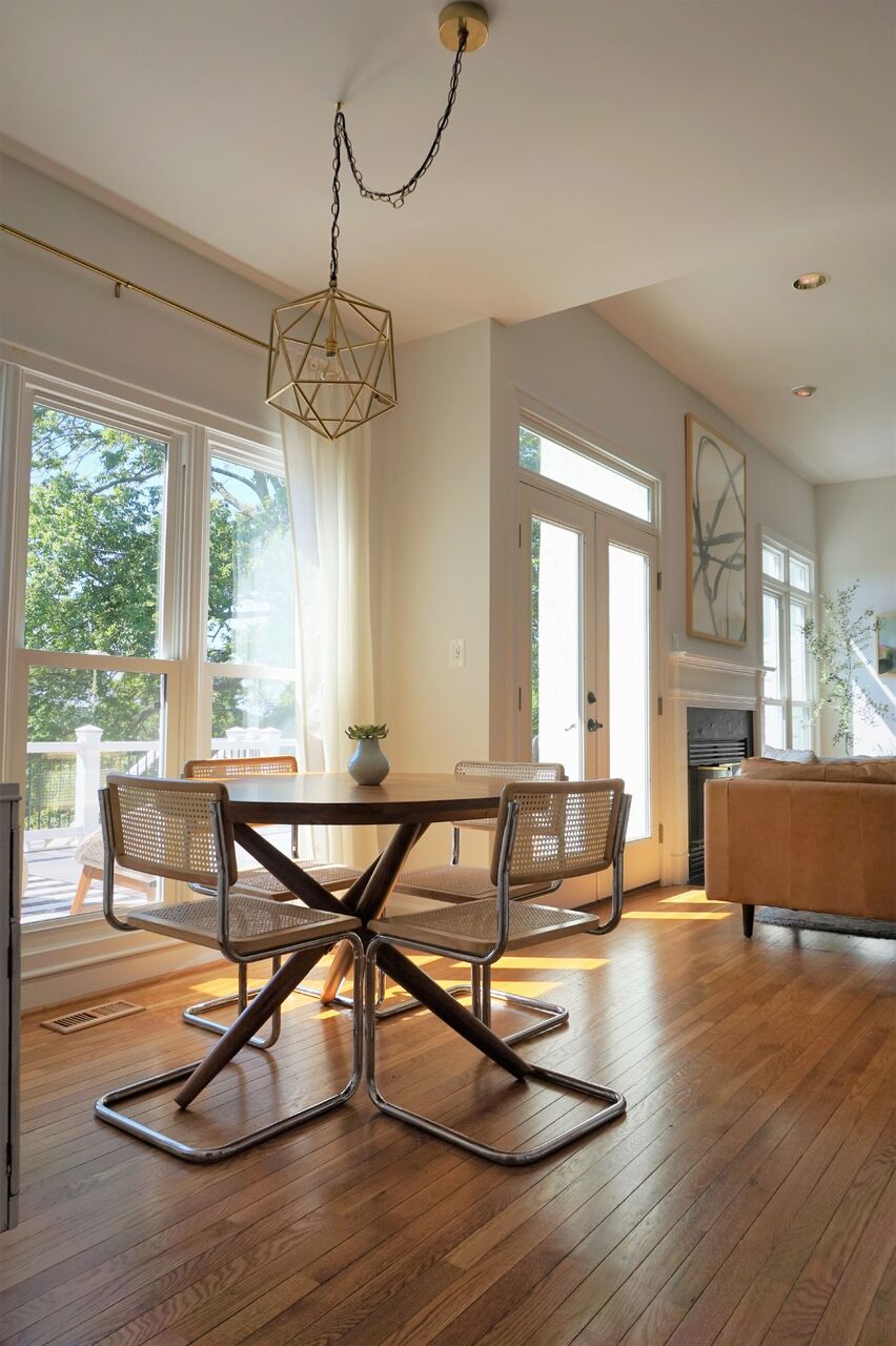
Fairly early on we settled into a less stuff-better stuff mentality all around. It's not overly filled but every piece was selected through thoughtful consideration of the grandeur of the room. Although the space is grand, indeed, Dani and her fiance are quite laid back and desired a space that was comfortable and easy to entertain young and old alike.

The light in this space was really inspirational in the design process and when we were faced with tough decisions, we ultimately focused on the natural glow of the space and what pieces would enhance that! Pastel colors came into play from the beginning, with mixed dark and light wood tones peppered throughout.

Both the area rug and runner for this space were ebay scores that we were definitely throwing virtual fist bumps over. Lol!

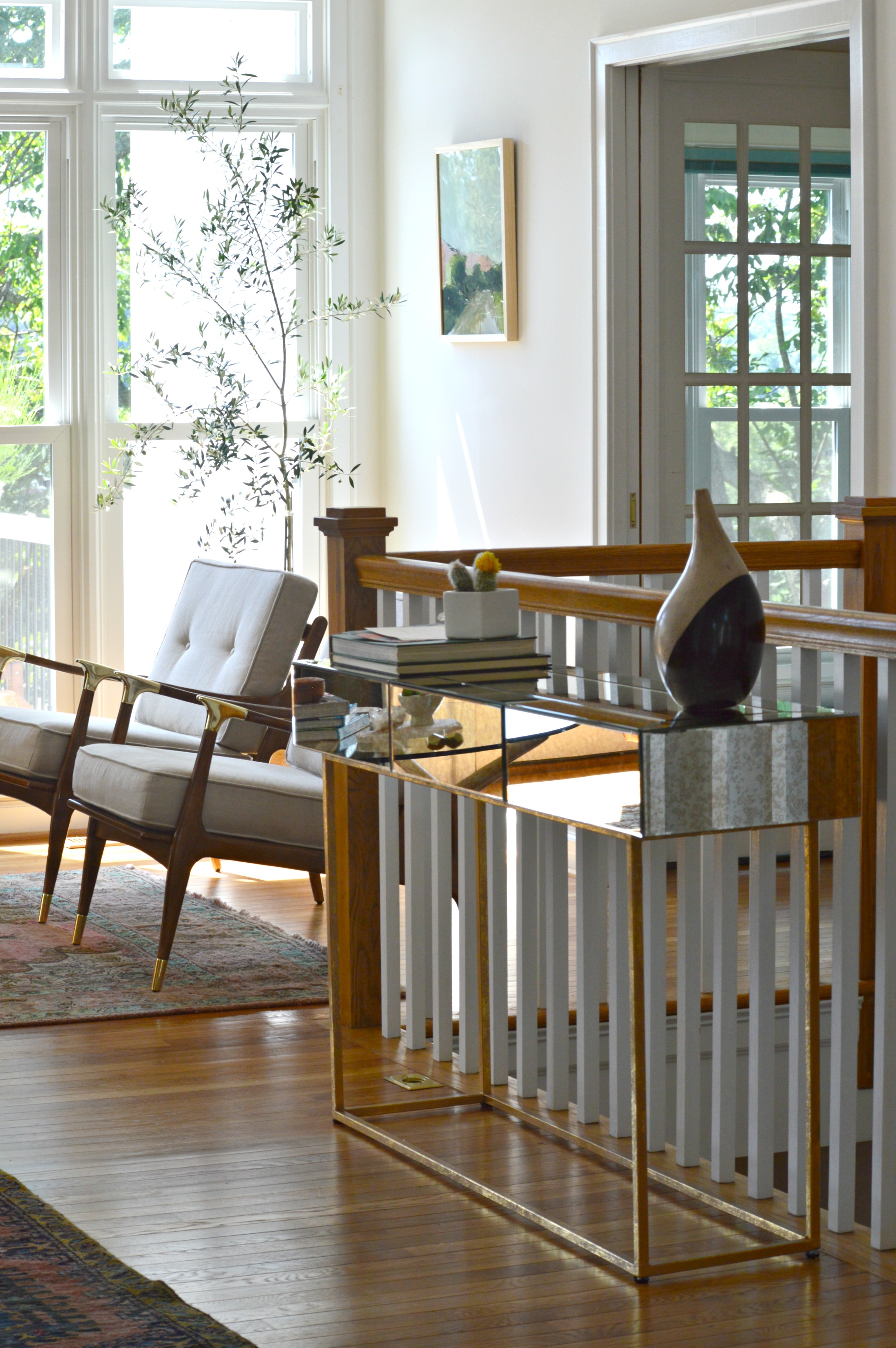
The entry way is balanced by an antiqued mirrored and brass console as well as an epic antique Craigslist find, (keep scrolling). Mixing in these unique old, (or old looking), pieces into the space, along with the vintage rugs, gives the modern bright white space some necessary grounding and storied character.

25.jpg

Ah-ha! Here is our extraordinary Craigslist find. I've truly never seen anything like this and admit I found and saved this piece in my phone before any aspect of the design even begun! I remember quickly creating a hypothetical design around this piece so I could share it with them and they could snatch it up before it was too late!!

As it goes with every design job, there are always a couple hurdles to overcome. The area rug turned out to be a bit smaller than what the seller had listed, so in order to fill a bit of awkward empty space on the side of the sofa where the sofa should have reached, we added an inexpensive mirrored accent table from Urban Outfitters. It balances the mirrored console beautifully and adds a touch of reflection to the darker side of the sofa!

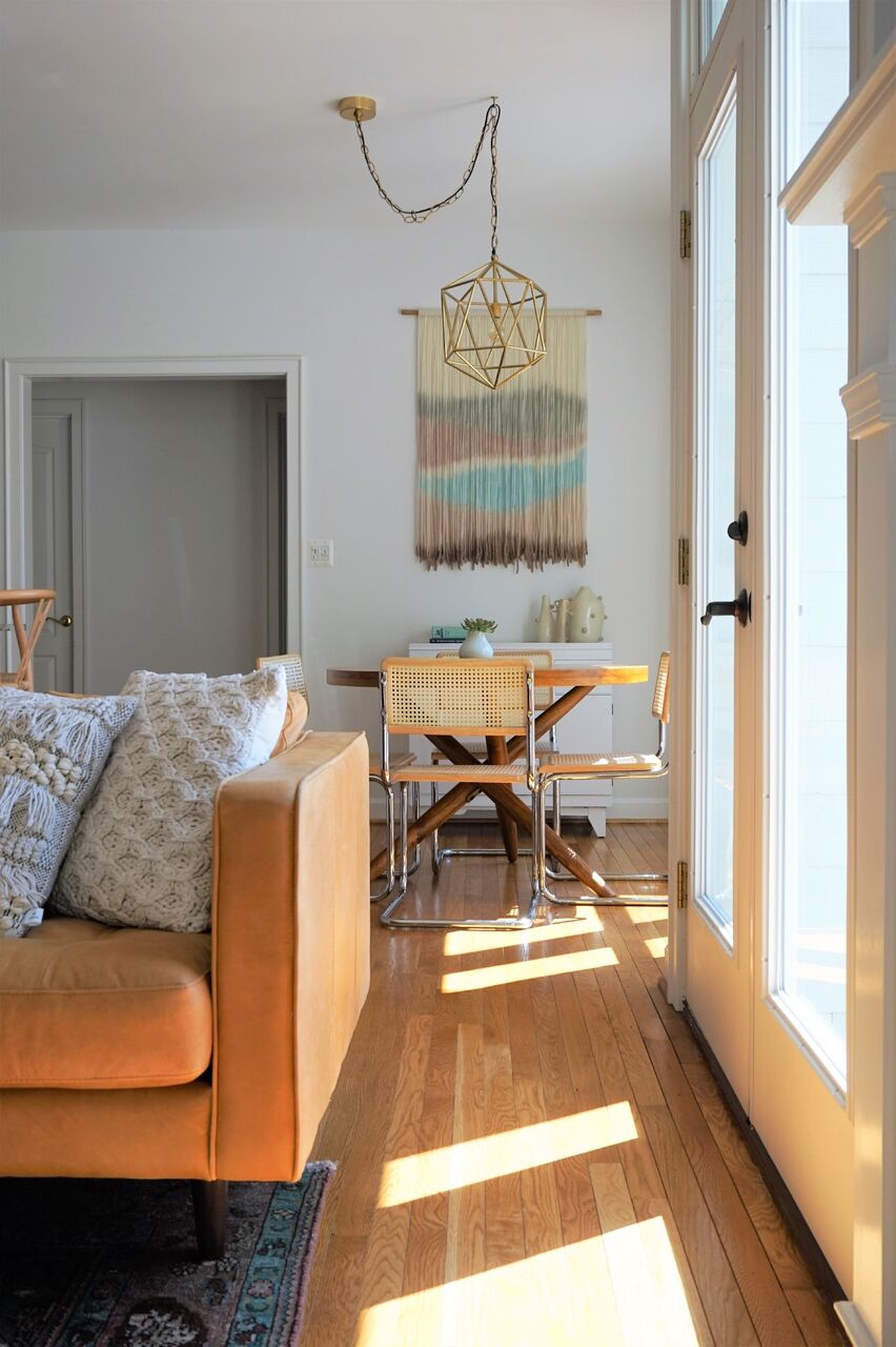
On to the dining nook! Serious confession; I've been waiting for just the right opportunity to use a custom made fiber piece from Designs by Filia, who's work I've been following for a while. I don't know how she does what she does, but she's amazing at doing it! When we selected just the right furniture pieces for this spac and the light fixture, it just needed one final statement. Since we decided to forgo a rug in here, I really wanted to bring a touch of color and texture up the wall - and our opportunity was born! We worked closely with Filia to pick just the right colors for this space and she just knocked it out of the park! As I mentioned earlier, our focus was to maintain the natural glow of this entire space, and this piece does that so well.

When we mentioned that a tree of some sort would be ideal in this far corner, Dani mentioned that she had her eye on an olive tree. Little did we know what a green thumb she had - when we arrived to shoot this space we got to see all the olives on this thriving tree of hers!

Minted art for the win, folks. The black and white watercolor over the mantle is Minted as well!

Two of our most clutch finds were a StyleMutt Home team effort - McKenna nailed the art for over the mantle and Cate hit it out of the park with this light fixture found in Etsy shop, Intermountain Lights.

That's it for now! As you head out you'll notice this gorgeousbrass vortex fixture that gives the entry way all the attention it needs!

Speaking of attention, Lonny would love to say hello before you go.

Thank you all for walking through our latest project with us! This one was pure joy for us to work on and we thoroughly enjoy getting to share it with you friends. Stay tuned for more from this home! Hint: Green velvet, apothecary storage, raw minerals and gemstones, cement coffee table - we've got another doozie of a reveal ahead for you!
First Design of 2017: Function + Character in a Century Old Home

Hi Friends! We can't believe we're already rounding the end of February here; it feels like we just celebrated the new year, just sat down and outlined our goals, just put together our new design packages and just said, 'I will put lipstick on every day'. Hah! Hard to believe that after all the work done to prepare for the year ahead, we're ready for the work of the year ahead.

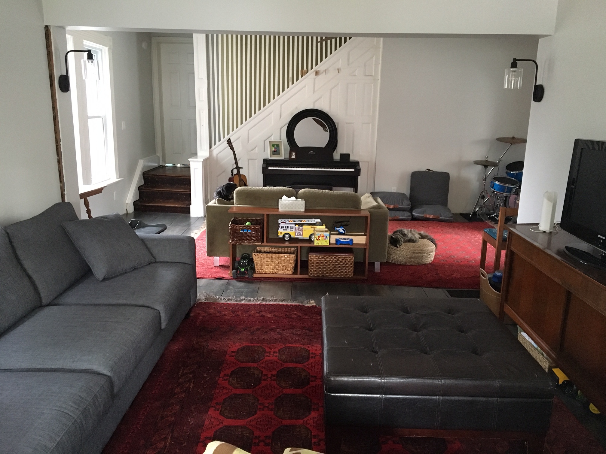
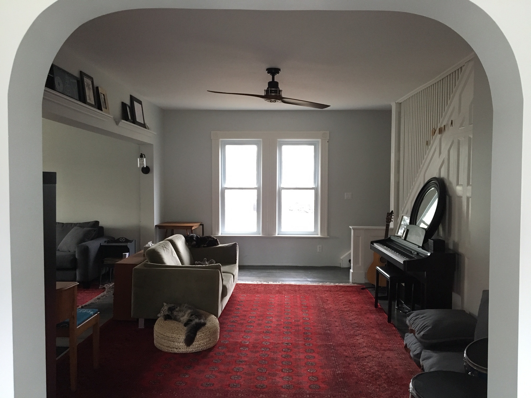
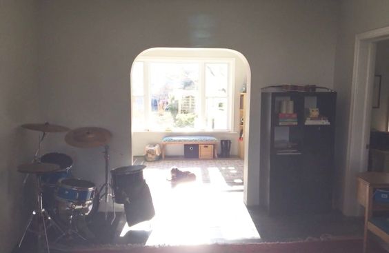
Our first design project of the year wrapped up last week - at least from our end. Now it's up to the sweet Abrosimoff family to take their design concepts and run with them! This sweet couple contacted us from Canada to help them finish off the beautiful 100+ year old home they've been renovating. Let us just say, ANYONE brave enough to take on a century old house always has a spot on our schedule! Here are some snaps they sent over:

Right off the bat we were excited to get to work with such cool stuff in such an amazing space! They're avid thrifters/yard-salers/Kijiji-ers, (fun fact - Kijijji trumps Craigslist up there!) The two red rugs are actual vintage persians they found on Kijiji, but they both agreed that the two pieces together were too much red for the conjoined space.

The gray sofa and mid-century media cabinet were sure keeprs, while the funky mid-century bookshelf was a maybe, and the greenish loveseat was getting the boot.

These parents of three young kids requested a clean, open space that includes storage for kids' toys, a bohemian sitting area tossed with pillows, and layers of color and pattern. The Abrosimoffs chose our brand new Style Try-On package, which is where we design TWO concepts for a client space after getting to know their style and functional needs. One week after our consultation, during which we collaborated together on Pinterest sharing inspirational ideas, we sent them their two design concepts!

DESIGN ONE

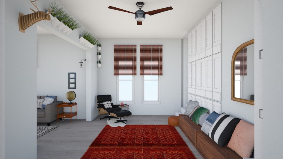
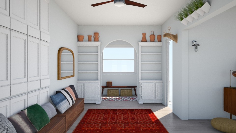
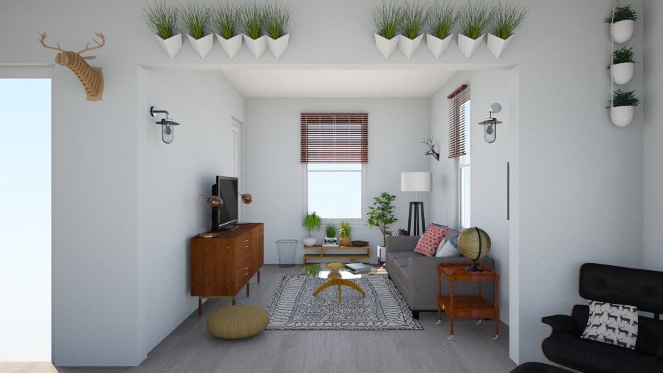
Entering from under the archway we added a long storage bench up against the wall that serves double duty as a toy keeper and pillow clad seating. A sophisticated leather Eames lounge with small side table is the perfect place to kick back and observe the beautiful chaos of kids.

We gave the archway white built ins with room at the top for pottery or other sculptural pieces you wouldn't necessarily want at kid height, and an oversize arched mirror to bounce a bit more light in that darker corner of the room.

The kick-back part of this space was kept clean and open, with the addition of a neutral but bold black and white geometric rug and round glass coffee table. Light fixtures in brass and black are distributed to balance the space, while the funky mid-century bookshelf is placed under the window as a plant sanctuary to anchor the room with a strong focal point.

DESIGN TWO

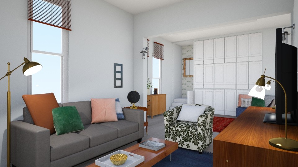
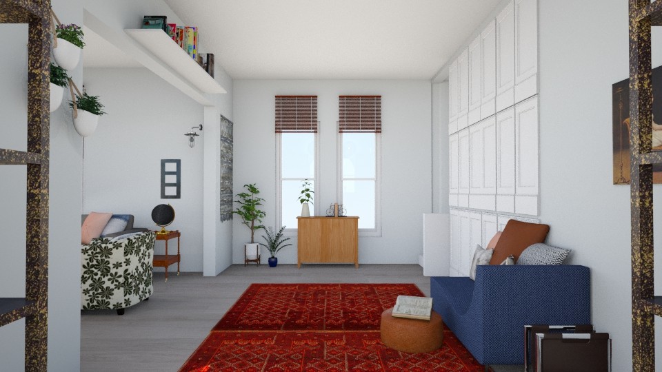
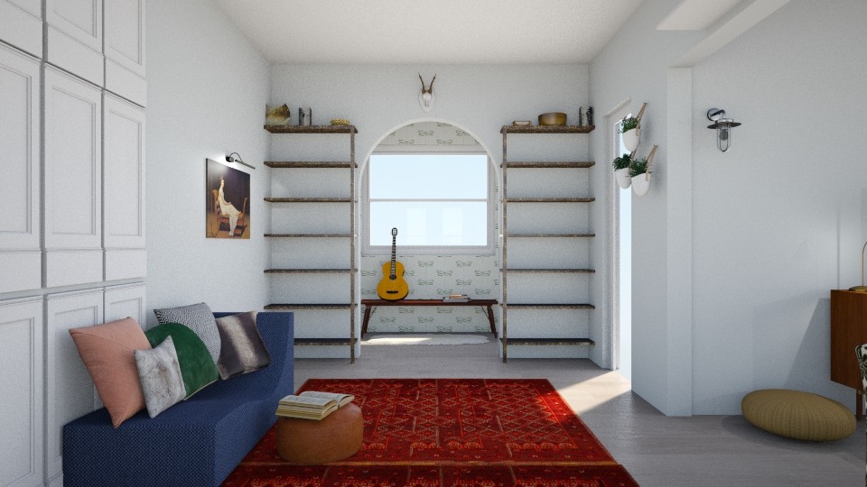
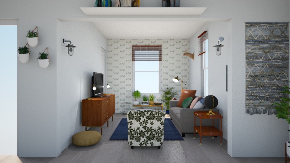
We shook things up a bit with the second design, really tapping into the old character of the home with vintage inspired pieces, including a denim blue chaise lounge! This piece is topped with various leather, fur and patterned pillows and a leather ottoman serves as a scale-appropriate table or child size perch. A storage cabinet under the far windows is home to some happy plants and hides children's toys and games when they aren't being used.

Since the Abrosimoffs clearly aren't afraid of vintage pieces and happen to have a fabulous sense of humor, we included an ironic portrait of a woman on a chaise lounge to represent this spot as a perfect place for an oversized vintage piece of similar colors and proportion. You may also notice we included wallpaper in this design! We wouldn't include wallpaper in just any job, but in a century old home it couldn't be more fitting. We chose a simple, modern paper that is white with an oversize dark green pattern, (it happens to be dragonflies, but this was just to give our clients a visual idea), and we used it throughout the space, so keep your eyes peeled. ;)

See it in the mudroom on the other side of the archway? For this design we swapped the modern white built-in shelves for rustic industrial shelves, again leaving room at the top for various architectural artifacts.

The family kick-back space is anchored by our chosen wallpaper on the facing wall, and grounded with a saturated blue rug, (a fabulous addition our talented intern, McKenna, pulled for this space). The pattern on the chair isn't literal, but we love the idea of giving this room an extra dose of cozy with a floral patterned chair that compliments the surrounding colors and reminds the family of the history of their home.

Two designs for one home - both very different but as Cate would say, they speak the same language. The point of creating two different designs is not for our clients to pick their favorite and follow it verbatum, but rather to show them options - how two different looks and layouts under the same style umbrella would look in their own home. It's literally trying different looks on a home!

So, while we do not pit the two designs against each other, do you happen to have a favorite here? We'd love to hear what you think! And stay tuned, because the Abrosimoffs have hit the ground running and we can't wait to share these shots when all is said and done!

Thank you so much for stopping by today! If you'd like to give our Style Try-On package a try for $165, please don't hesitate to contactus here! We'd love to hear from you.