Reader Design: Hannah's Stunning Home Reno

If there was a home that personified that term "a picture is worth a thousand words," it's Hannah's. This total renovation project in Dallas, Texas isn't the first one for Hannah and her husband Chayce, who recently started a renovation business called Blank Slate Renovations. They got their start early - in fact, Chayce flipped his first home when he was a senior in high school! Life took them from Texas to England and back again, and in the process of moving around, they had a sort of awakening:

More and more, we’re becoming convinced that we were all made with special talents and unique gifts. True joy and lasting fulfillment aren’t far behind when you couple these with your profession—I think some of the best products come from these individuals. It’s almost like you become the truest and most natural version of yourself, and the products you create are just an extensions of who you are. Our goal for Blank Slate Reno is that we wouldn’t even be able to call it work, but that it would be more like play.
Frontwindow.jpg
Living.jpg

The home was completely opened up and updated with mid-century and Scandinavian elements, plenty of interesting architectural elements, and some bright colors to keep things interesting. 

 
Kitchen2.jpg
 
Livingandkitchen.jpg
For this particular project, my favorite piece in the entire house was an original midcentury fireplace (that we bought from our friend Craig off his List…;) that we placed in the living room and paired with a fun pink cement tile. We also experimented with a few new elements such as wallpapering, and wall panelling that turned out fab!
Wholeliving2.jpg
 
Fireplace.jpg
 

The experimentation has certainly paid off, even if it took some time.

Five years ago, I didn’t really have a specific aesthetic style, and when we first got married...I’m too embarrassed to even talk about it. Over the past four years of being more thoughtful and intentional about my look, the more my style has developed and evolved into what it is today. At the moment, Scandinavian minimalism particularly intrigues me. I love how blending neutral palettes, organic materials, natural lighting and live plants blurs the lines between the outdoors and indoors.
Masterbed.jpg
Masterbath4.jpg
Bathroom2.jpg

But even as styles and tastes change, the goal remains the same, whether you're designing for yourself or for a client:

My goal for most spaces is to create something simple and beautiful, while at the same time maintaining functionality and relaxation. Natural lighting, green plants and cozy nooks are key!

Hannah, we can't wait to see where you take Blank Slate Renos next; and thank you for letting us in to your home! 

Follow Hannah along on Instagram at @blankslatereno.

McKenna Sig.jpg

Reader Design: Kristina's New Home Love

You guys, I don't think I've ever looked forward to a Friday more in my life! Our twins started kindergarten this week and I've missed them so very much. It's wild how suddenly we've found ourselves in a completely different stage of life just like that! Happy to be moving forward, and sad for what we leave behind.

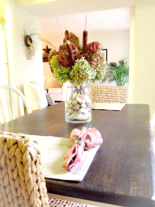
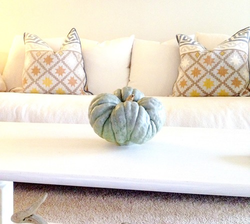
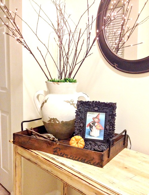
Speaking of moving! This is the FIRST time we are sharing a Reader Design from someone we've already featured before!! Last year we had the pleasure of sharing sweet friend Kristina's beautiful apartment, decked out for Fall! Here's a refresher:

So soft and pretty, right!? Well guess what - Kristina and her man bought a foreclosure in Gaithersburg, MD this past spring and spent a solid 2 months renovating it back to life. I was ecstatic when she agreed to come back and share her new home here! 

From Kristina: 

When I first saw the house I wasn't crazy about the colors of this house, but I must admit the updates have made me fall in love with this very patriotic colonial home. The first thing we did after signing the paperwork for this house was drive straight to Home Depot to replace the hideous brass lighting. We also replaced the brick stoop which was falling apart, added a new front door (a much brighter red) and updated the landscaping. It's amazing what a little TLC can do!

Entryway

The entryway was pretty standard, not terrible, however after some paint, new flooring, and a new front door it is much brighter and welcoming. I also purchased that perfect little rustic shelf that is the perfect size for holding my key bowl.

Family Room

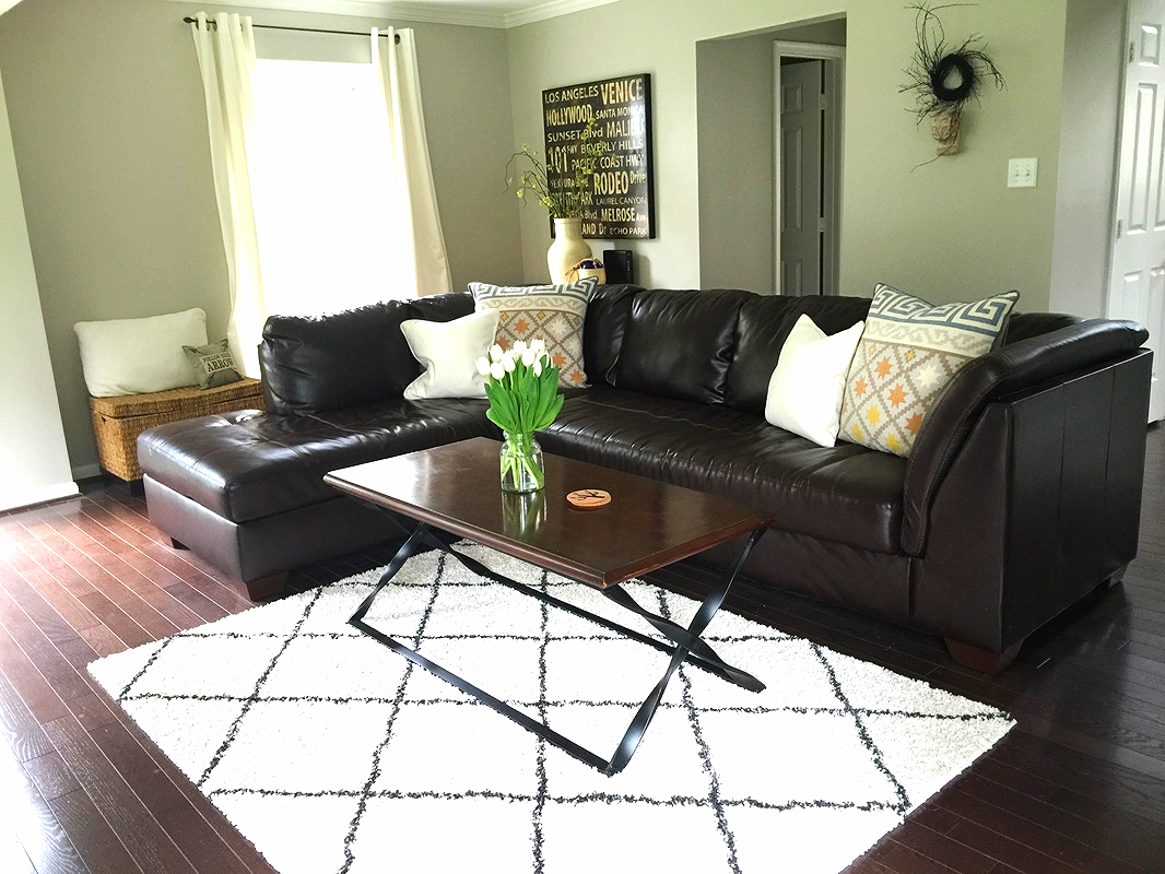
I love how bright this space is! Also, I spy some gorgeous drift wood... :) It's so cool seeing Kristina's personal style translated from an apartment to this new home. Her last Reader Design was highlighted with beautiful coastal elements, and it's fun to see how she's carried that laid back feel over here too!

Living Room

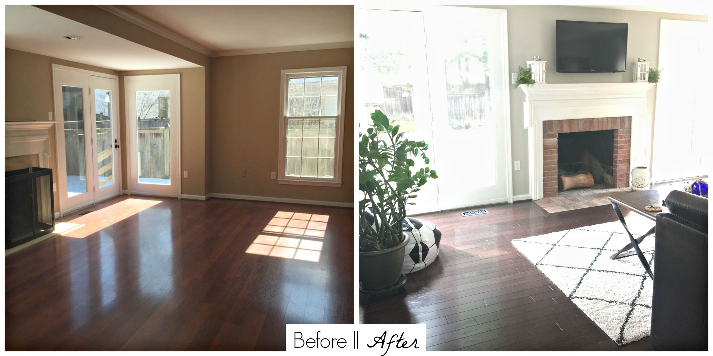
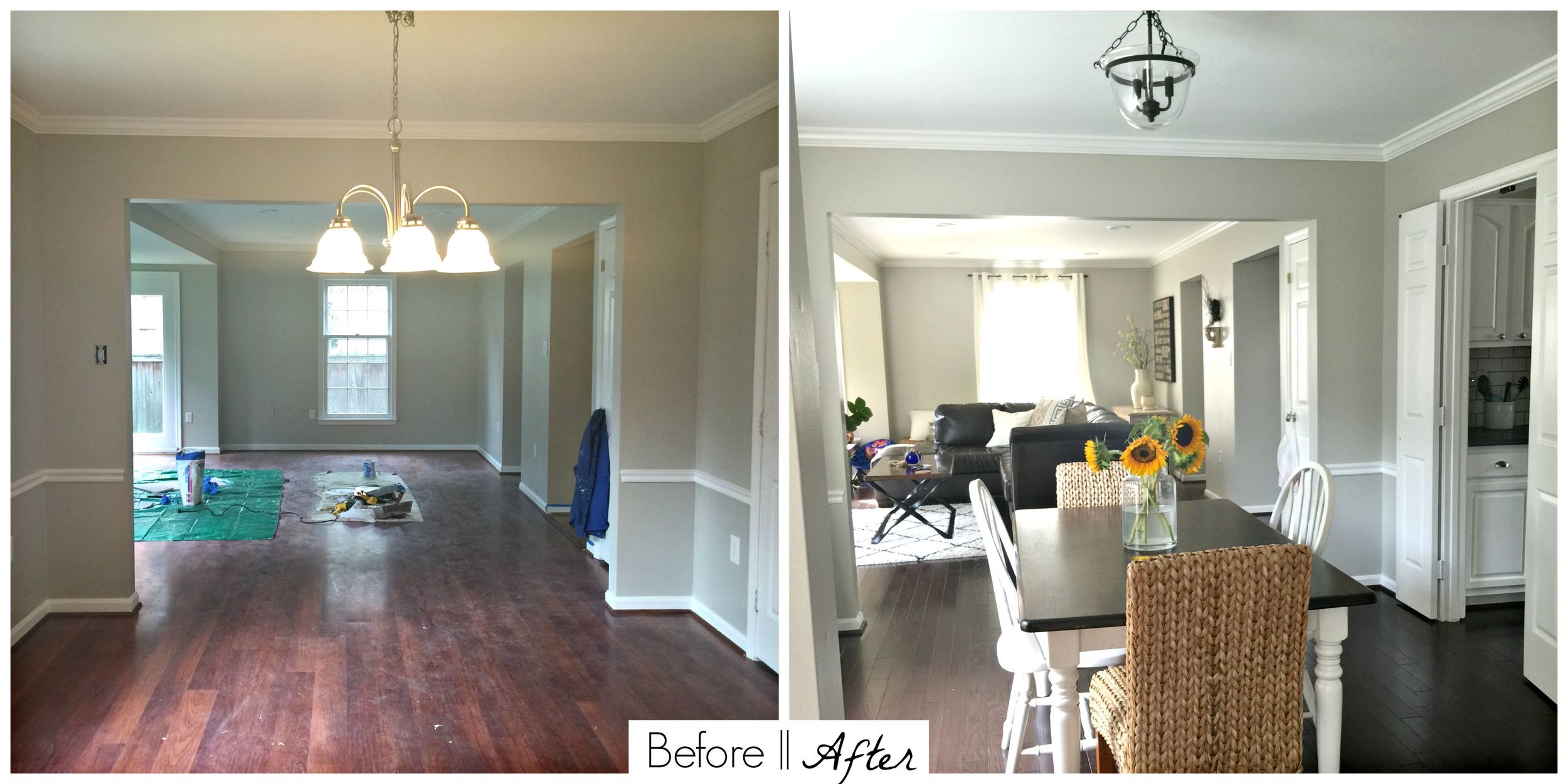
The living room was a blank slate. We added recessed lighting in the ceiling, painted it the same color as the rest of the bottom level (Revere Pewter by Benjamin Moore), and mounted a tv over the fireplace. The original fireplace surround was marble and cracking along the sides so we replaced it with brick to match the casual feel of the house and the fireplace in the family room. Its a great place for entertaining now!

Dining Room

Now this is a room I could linger in long after a meal is over! So fresh and inviting!

Kitchen

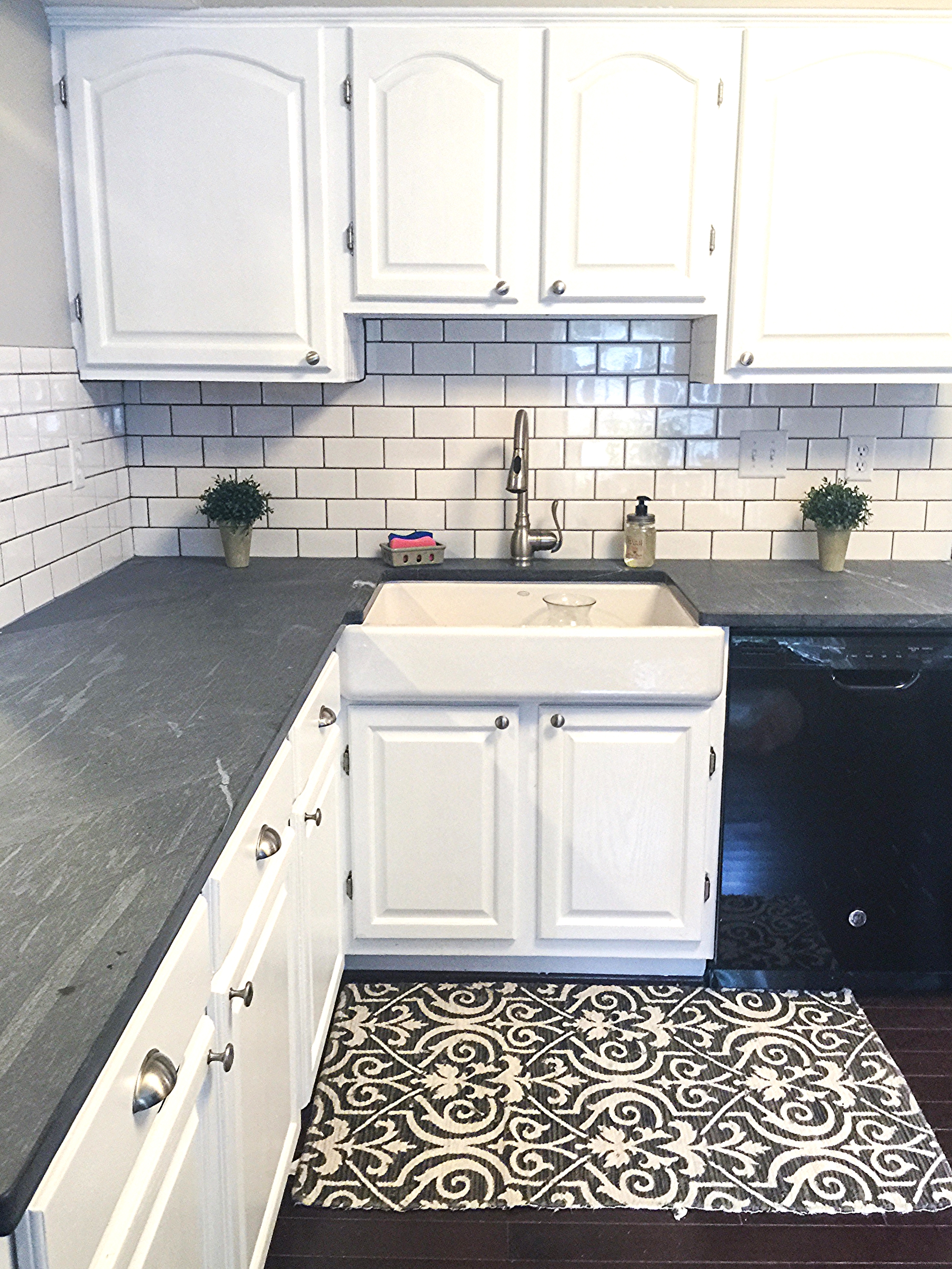
Oh the kitchen, our biggest project yet! The things I loved about this kitchen when I saw it were the size, the new appliances (albeit not stainless but NEW!), and the fact that it was a blank canvas for us to create in our own style. We chose light grey soap stone countertops for a more natural look, classic white subway tile with light grey grout, under cabinet lighting, and my favorite, this huge cast iron farmhouse sink! I stripped, sanded, primed, and painted the cabinets myself and BOY what a chore that was! I have to admit though they turned out better than I had imagined. New hardware ties it all together and it is now our favorite place in the house!

Seriously, Kristina! Way to get er' done, girl! This looks incredible! Your hard work more than paid off!

Thank you so much, Kristina, for showing us around your new home! I'm in complete awe and admiration of what you've done. May your years here be wonderfully blessed, friend!

You can follow more of Kristina's reno-adventures on her informative blog, New Home Love! All our featured home and room tours are on our growing SPACES page and we encourage you to tag your own photos with #stylemuttspaces on Instagram or directly to our Facebook wall! We're hoping to line up our Friday Reader Designs a month in advance so it helps us to see who's interested!

Thank you for stopping by and have a wonderful weekend!!