Reader Design: Oksana's Charming Home

A home is nothing if not a place of love, and love is clear in Oksana's home in Chattanooga, Tennessee. The family home, which Oksana shares with her husband and their baby girl, is full of European charm in the middle of the South.

Oksana fell in love with interior design in July of 2015, when she and her husband bought a 1930 bungalow that was previously abandoned for 20 years. Since then, the couple has worked to bring the house back to life, tackling DIY projects like nobody's business and documenting the fun renovation adventures on their blog, Foxy Oxie

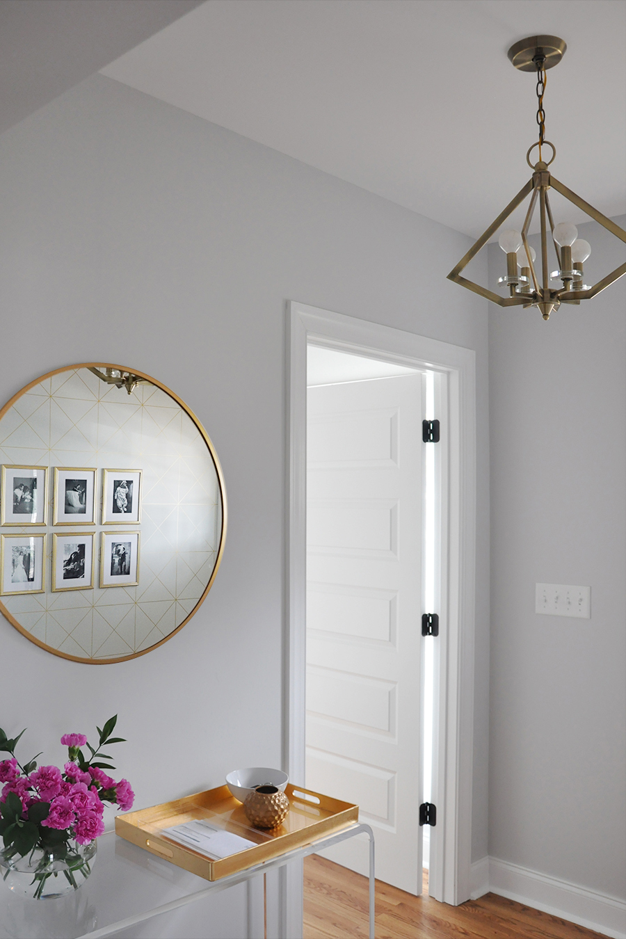
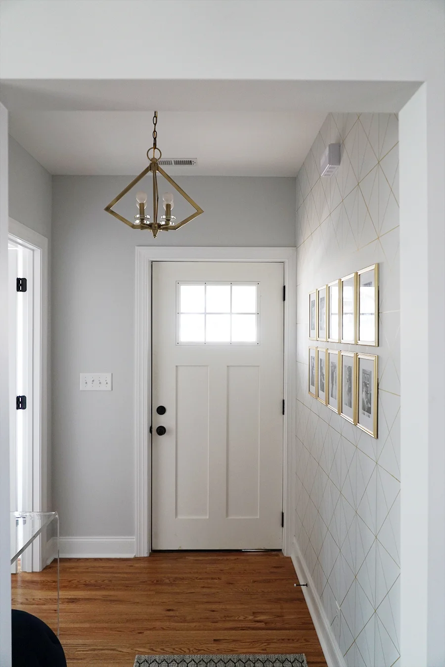
FOXY OXIE - Entryway 2.jpg
FOXY OXIE - Entryway 3.jpg

From Oksana:

I wouldn’t say I have a particular style, but I am drawn to an aesthetic of clean lines and geometric elements juxtaposed against more traditional silhouettes. The key, for me, is balance. I want our home to feel sophisticated but also real and honest and truly reflective of our everyday life, especially now that we have a young daughter and another little one on the way. I find that playing up opposing styles – feminine and masculine, soft and edgy, modern and traditional – is a great way to showcase personality in design.

I am a compulsive redecorator by nature, and my style is ever-evolving. But I always, always gravitate towards a neutral color palette with lots of texture. Every now and then I’ll add in a pop of color – the latest being a moody teal – but it never lasts.

More important to me than a specific style, however, is the overall feel of our home – and that’s something that is based on individual design intuition and varies greatly from person to person.
FOXY OXIE - Kitchen 1.JPG
FOXY OXIE - Dining Room 1.JPG
You’ll find a lot of European design influence in our home – from our Italian cantilever dining chairs to the French-inspired dining table to our Chesterfield-style sofa.
FOXY OXIE - Living Room 4.JPG
FOXY OXIE - Living Room 2.jpg
FOXY OXIE - Living Room 5.JPG
FOXY OXIE - Living Room 6.jpg
I know first-hand the transformation nature of a well-designed room. Our surroundings have the power to instantly lift our spirits, increase productivity and improve our quality of life. Beyond the aesthetics, I strive to make our home feel relaxed – and a big part of that is maintaining a clutter-free environment. You have to give rooms breathing space. For example, I am one of those rare individuals whose countertops are (almost) always empty. Decluttering sprees are a regular occurrence in our home. And as much as I love arranging pretty vignettes, I am not a fan of displaying decorative tchotchkes for the sake of filling a space.
FOXY OXIE - Master Bedroom 1.jpg
FOXY OXIE - Master Bedroom 2.jpg

Instead of knick-knacks, Oksana gravitates toward more permanent fixtures.

I am very particular about our light fixtures and am always willing to splurge for just the right one. Lighting is truly the jewelry of a room, and just like a well-designed piece of jewelry can instantly elevate a rather simple outfit, light fixtures have the same effect on a room.
 
FOXY OXIE - Nursery 1.jpg
 

Every room is full of love, yet simple; graphic and bold, but timeless. Perhaps it's the combination of Oksana's career as a graphic designer and her family life as a wife and mother that brings balance to bear. Regardless of the reason, it sure has created a beautiful home!

Oksana, thank you for the tour today! 

Follow Oksana and her family along on Instagram at @foxyoxie.
McKenna Sig.jpg

Reader Design: Sarah's Urban Reno

This weekend, I'm in New York City for a friend's wedding... and that just so happens to also be the site of today's feature! Now, for many, owning your own place in New York City is an elusive pipe dream. But Sarah found a fixer upper with the right bones and embarked on a gut-job renovation to make her urban apartment a perfect fit. 

Let's take a look!

 
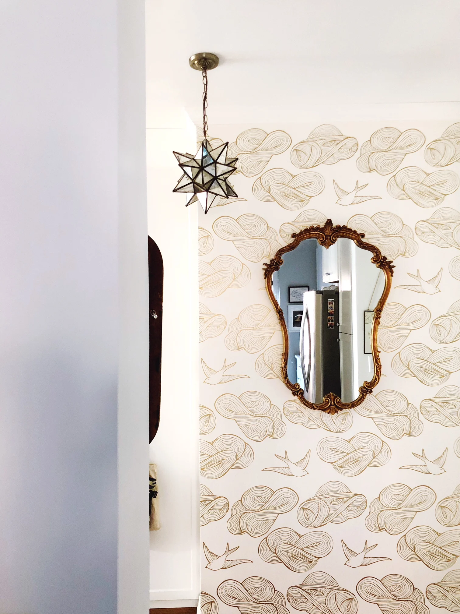
TGA_Entryway.JPG
 
TGA Living Room 2.JPG

From Sarah:

When I first started gathering inspiration photos for my renovation, I found myself bookmarking a mix of simpler, cleaner, more neutral spaces and ones with a bit more eclectic oomph and color to them. See, I want to be a minimalistic, neutral, Marie Kondo-esque type, but in reality, I’m much closer to a bohemian cat lady with a penchant for ALL the tchotchkes.

I balanced those two sides by keeping the bigger parts of my design (wall colors, tile, big furniture pieces) quiet so that my finishing touches (textiles, wallpaper, décor) could get loud. Cue the J. Lo and insert the dancing girl emoji here. That means my walls are a light grey, and my bathroom is all white—but I’ve got more vintage mirrors than anyone could possibly need, an antique Persian runner in my entryway, and gold Hygge & West wallpaper on the wall opposite my kitchen.
TGA Couch Exposed Brick.JPG
TGA Living Room TV Stand.JPG
The great thing about doing a gut renovation? You’re literally starting from scratch, which means your home (and your design!) can be anything you want it to be. The world is your oyster (within reason and budget, of course)! The terrible thing about doing a gut renovation? You’re spending a lot on your choices—so you better hope they’re good ones. I’m happy to say that while there are a few small things I’d do differently if I were to do it again, I’m mostly quite happy with how my little home turned out.
TGA Living and Dining.JPG
TGA Bar Cart 1.JPG

Comfort and ease were two huge considerations as Sarah was designing this space. After all, it's smack dab in the middle of the city that never sleeps, and it needs to operate accordingly!

Above all, I want my home to feel comfortable. Yes, I have nice things, but I don’t ever want anyone to feel like they can’t drink red wine on my white couch (that’s why god made eco-friendly bleach!) or like they can’t make a mess in my kitchen (lord knows I do). Homes are meant to be lived in, and I hope to evoke that sense of warmth and comfort in every aspect of my design.

The exposed brick wall, which was a happy accident during construction, goes a long way in bringing those homey vibes to the space!

TGA Breakfast Bar.JPG

In the kitchen, Sarah maximized every inch she could by adding this extra counter space with the breakfast bar and keeping things light and airy with exposed shelving and natural light. Despite how practical the design was, there is certainly no shortage of personality!

IMG_4292 (1).JPG
Cement tile is big right now (and has been for the past few years), and I put it in my kitchen. When I showed my contractor (who advised me a bit—even when I didn’t ask for it!—throughout the renovation process) the tiles I was planning on purchasing, he shook his head. “You should go for something simpler,” he said. “Something with resale value. This tile—it’s too trendy. It’ll be out in a few years.” And honestly, he may be right. In five years, I may look down at my cement tile and wish I’d done something simpler. Trends come and go, right? But since I renovated for me more than for resale value (my apartment isn’t a flip), I took a risk—and I’m glad I did. My floors make me happy every time I see them, and that feels worth it.
TGA Kitchen Stove.JPG
TGA Kitchen Shelves 2.JPG
TGA Bedroom.JPG
My bedroom is the one space where I’m not quite sure I’ve nailed it (at least, not yet)—but one piece I know I love is my dresser. I found it in the basement of my rental building about a month before I started renovations and lugged it into the elevator and up to the 10th floor one Monday night. The streets (and basements!) of New York City are a veritable treasure trove. If you keep your eyes peeled, you never know what you’ll find—for free!
TGA Bedside Table.JPG
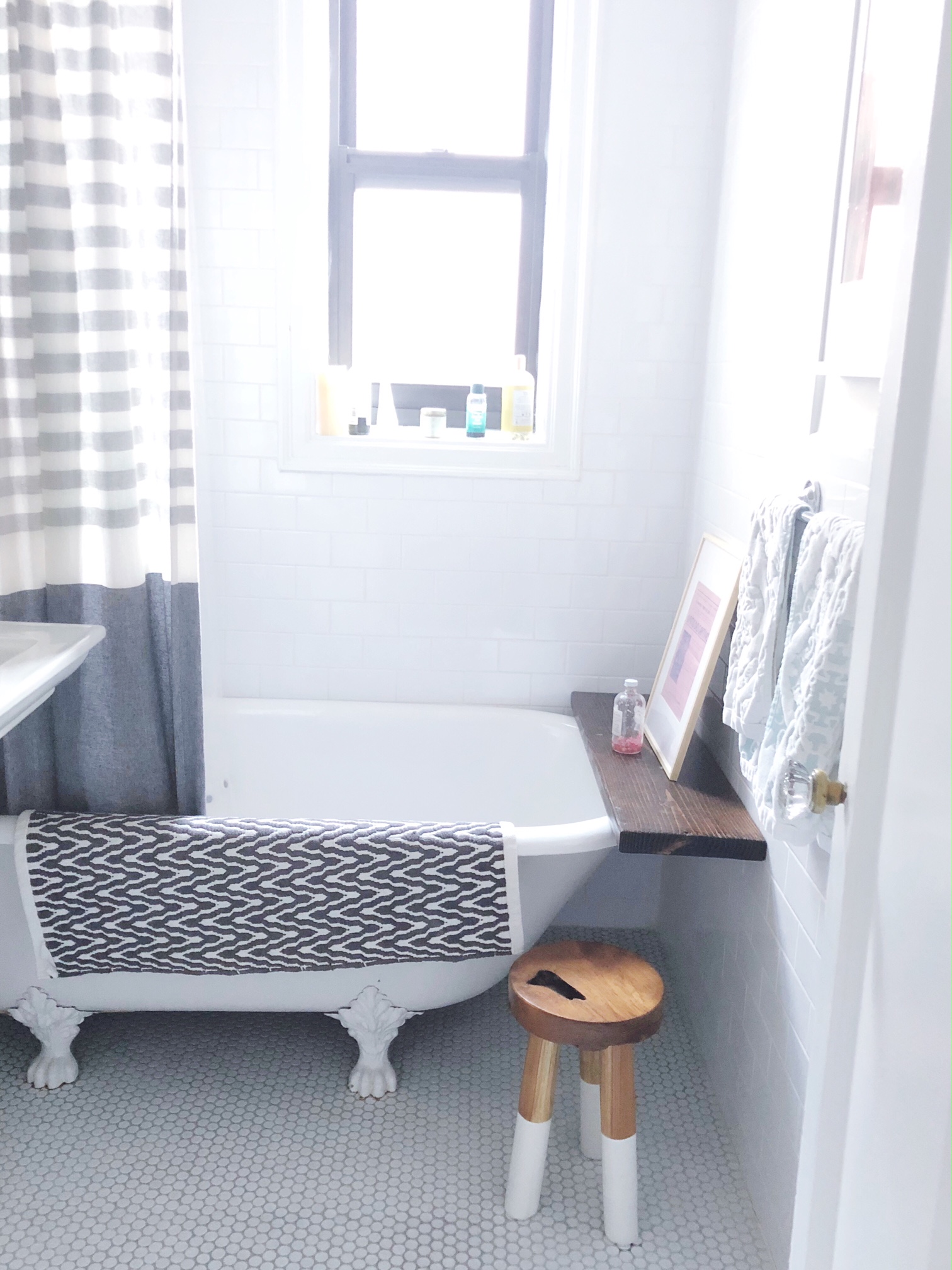
TGA Bathtub.JPG

This whole home feels completely personalized - Sarah, we think you nailed the renovation game! Thank you for showing us around. Follow Sarah along on Instagram at @_thegrandapt for more photos and before and after details! 

McKenna Sig.jpg

Reader Design: Jillian's Glam Getaway

Jillian and I have so much in common: a history in one of the best cities ever, Richmond, VA (school for her, growing up for me); a love for New York City; and a government day job in Washington, D.C. Despite those similarities and the fact that we live 15 minutes away from each other, we have never met (Jillian, we must change that!). 

But those overlaps are why I am so excited to show off the home Jillian and her boyfriend have created in Bethesda, Maryland.

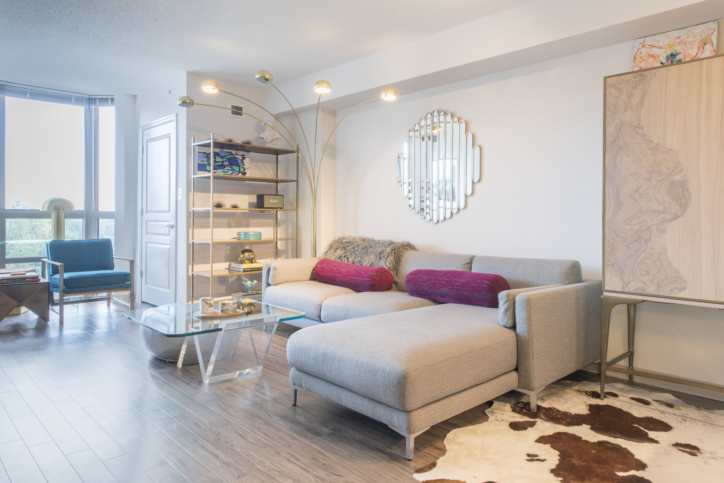
7K8A5600-HDR_1.jpg

This space is just their in-between place - a spot to relax after work and rest their heads until they find a place to buy in the area. But just because it's not part of the long-term plan doesn't mean it can't feel special. 

From Jillian:

I’ve always loved this quote from Bunny Williams: “If you love something, it will work. That is the only real rule.” Through fashion or interior design, I find items that speak to me and I allow them the space and the confidence to coincide together. If I love something, whether it’s art or furniture and it makes me happy to live beside it everyday, that’s more valuable to me than anything. To me your place has to host sentimental value…only collect the pieces that tug at your heartstrings.

Jillian's heartstrings feel the pull when they're around interesting historical details, understated glam elements, Parisian flair, and traditional silhouettes - all of which are seen clearly in this cute one bedroom apartment. 

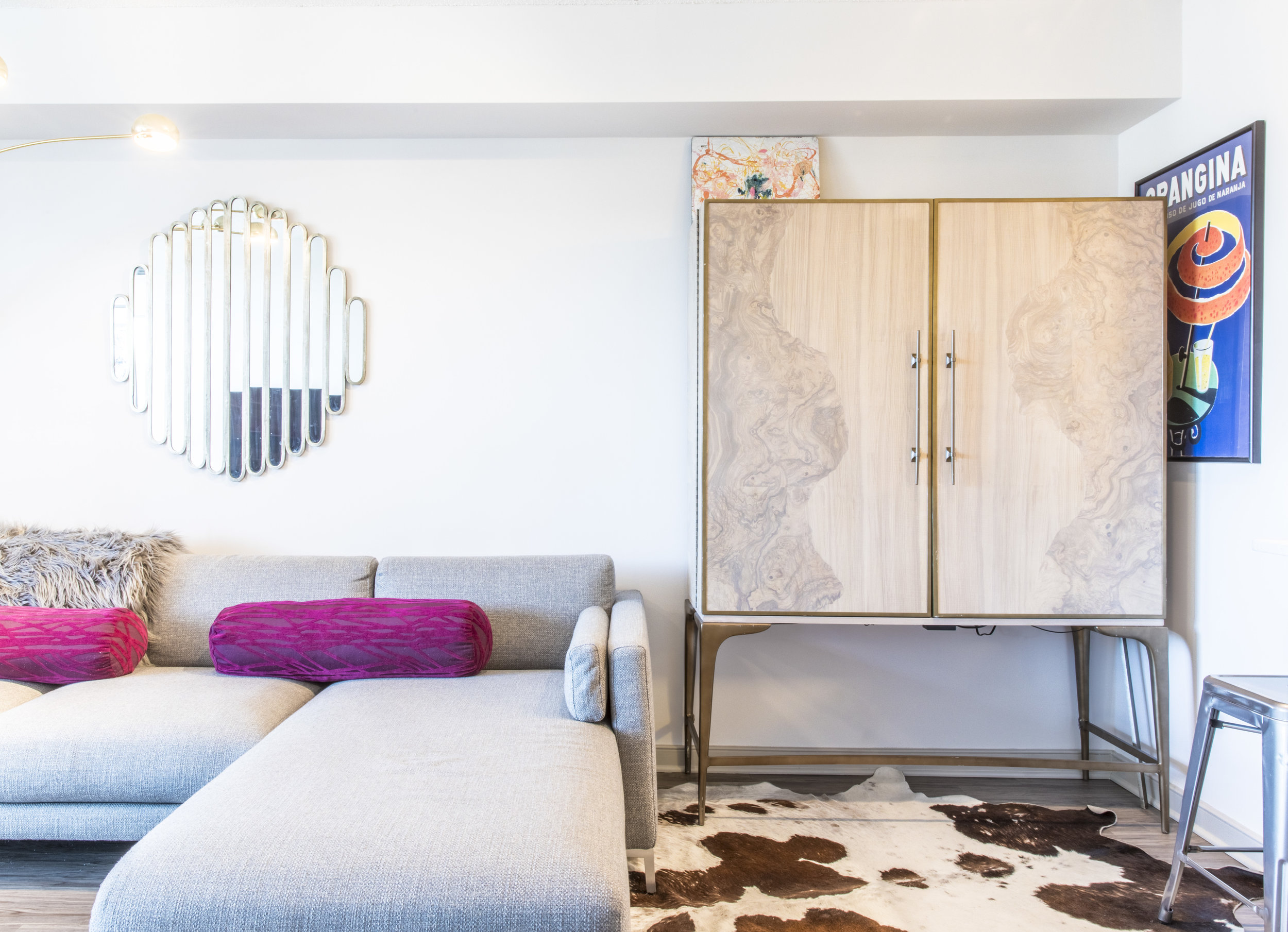
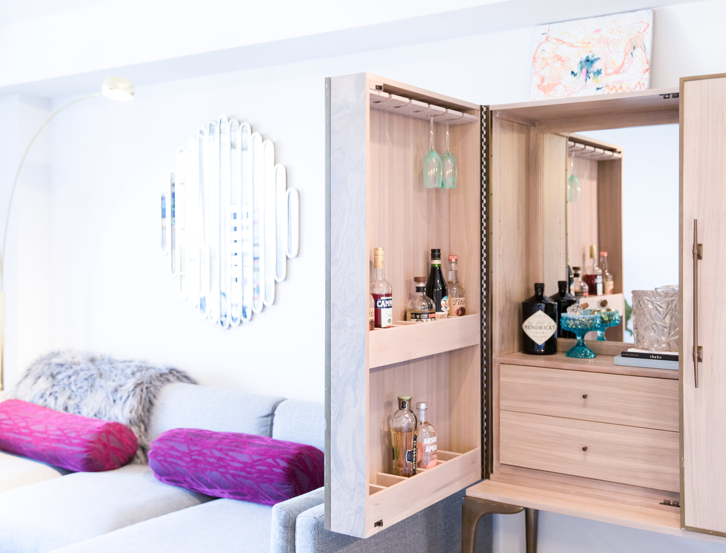
In the living room, one of the best finds is the bar cabinet. 

I scored the bar cabinet in Richmond (my beloved college town) - I spotted it in the far back corner of the store, and I just had that feeling. I have wanted a bar cabinet for years, and this piece is not only incredibly sturdy but the bleached walnut details are so unique. It was a great investment, and I am so glad I decided to buy it.

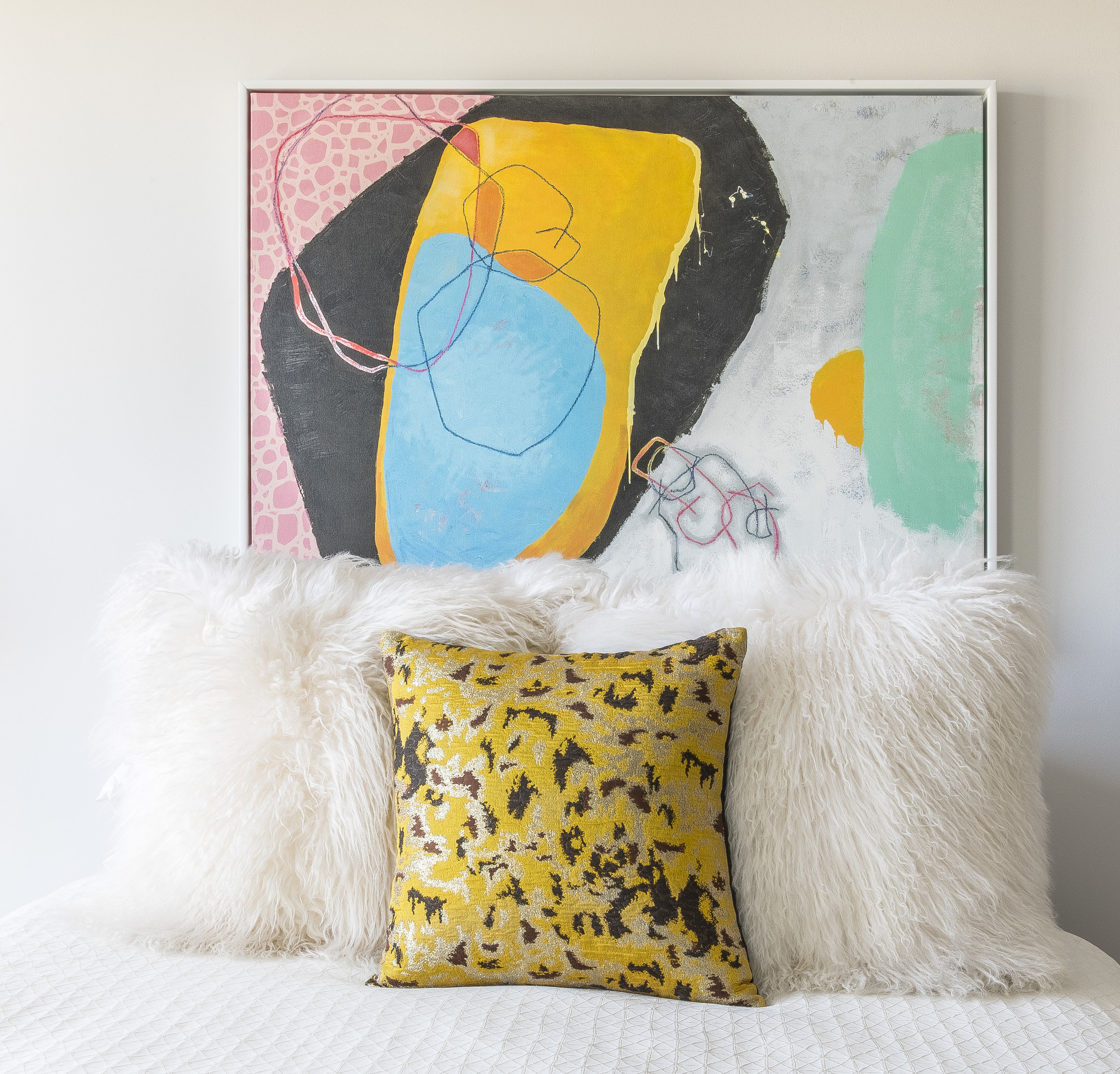
In the bedroom, Jillian opted out of a traditional headboard by replacing it with a bright piece of seriously incredible abstract art. 

I’m so in love with the piece that hangs over our bed. It’s the first original piece we bought together as a couple. It’s vibrant and strong, and it makes me happy everyday to wake up to it.

This place has such a clear personality and is 100% Jillian, 100% of the time. It's authenticity and intrigue shine through in every single corner, and I am loving it.

Jillian, thanks for welcoming us in for a visit. For a place that is allegedly intermediate, it sure does feel like home. Follow Jillian along on Instagram @jqg_ for more.