Cantilever Chairs || Plus a Dining Room Reveal!

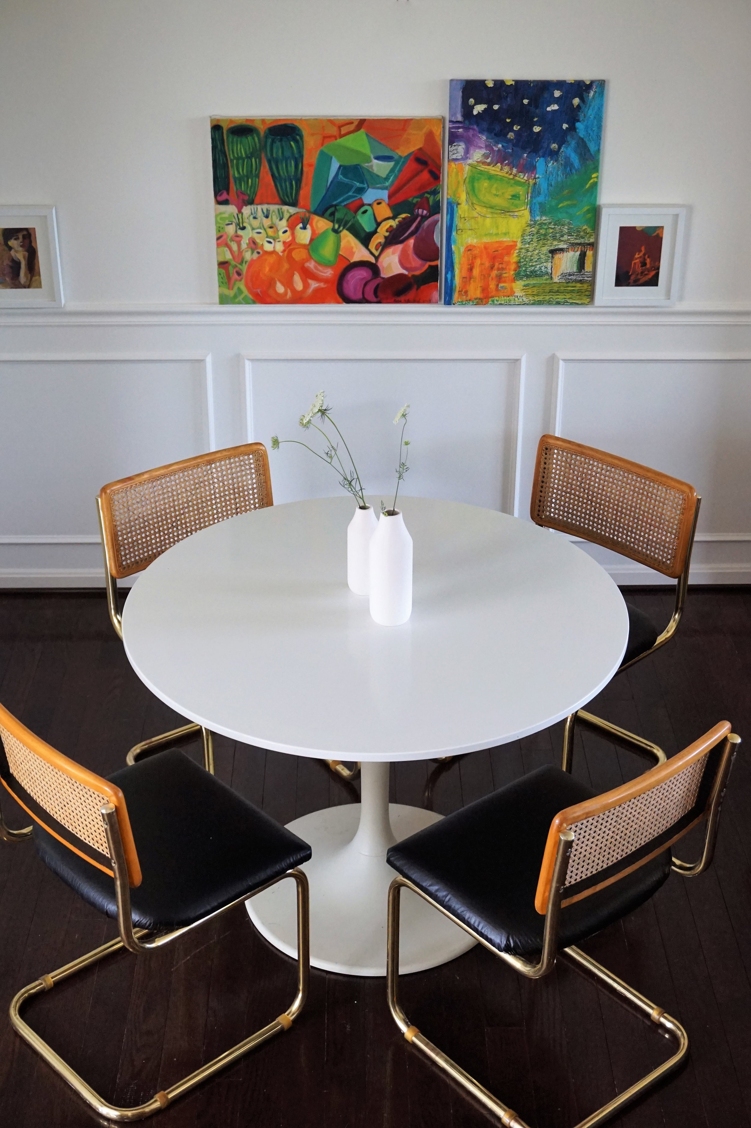
Today is the day.  I finally have a room in our new place to share: our dining room!

3. Dining Before, Tan.jpg

Ok so it didn’t look like much when we moved in.  Basically three things had to happen to get us to this reveal day: 

1) The dining room HAD to be painted something a little less light-sucking
2) We needed to find some chairs - because what is a dining room without chairs amiright? 
3) I needed to decide what art to feature in here!

We (I mean er my familial paint crew - thanks again guys!) knocked out the painting on week one but finding some chairs that could really make a statement was proving more difficult.  But eventually, I found them:

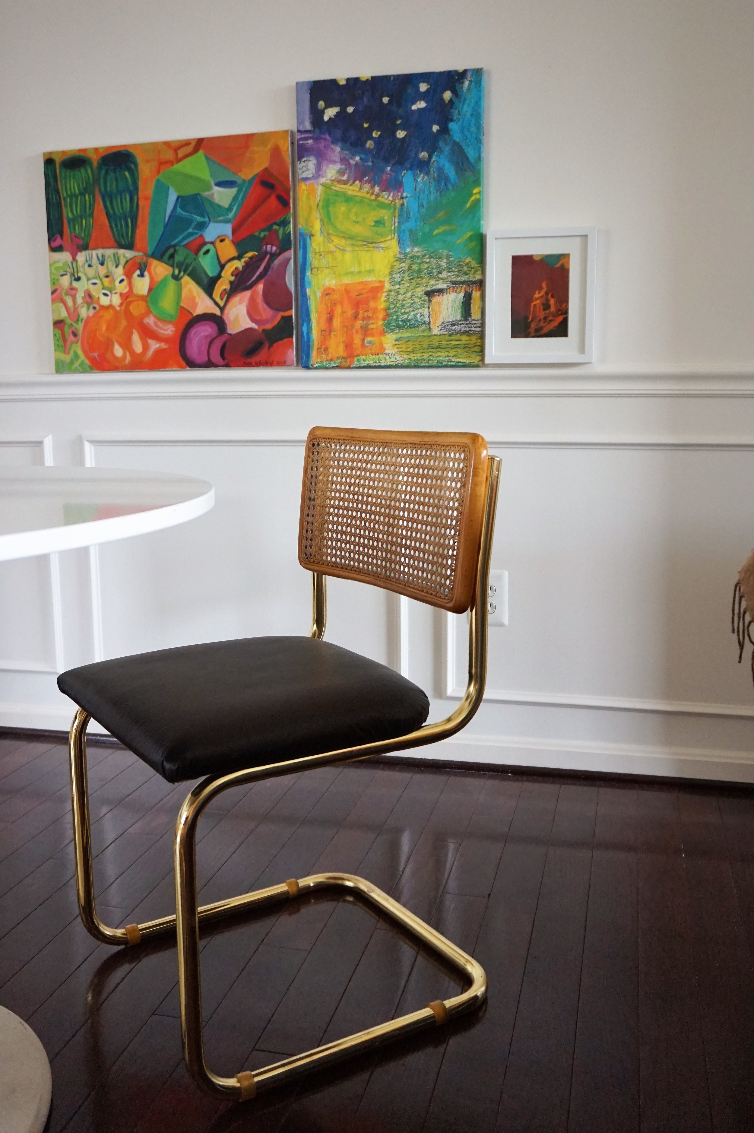
Brass... Breuer... CANE... Cantilever chairs.

Photo Jul 07, 12 15 00 PM.jpg

Up until I found these, I didn't even know Marcel Breuer chairs came in anything but chrome.  But when I saw these glittering gold chairs, I scooped them up - carrying two at a time through the maze of dusty furniture at the thrift store, slightly panicked that the other two wouldn't still be there while the check-out clerk waited for me to navigate them safely out. 

My original plan was to flip and sell them. But I wasn't sure what direction to take them in.  My gut wanted me to recover the seats in leather but I was having some doubts.  Between the warm cane and bright brass, I feared that richly-toned leather would stick out like a sore thumb.  It needed something to tie it all together.

Photo Jul 07, 12 17 05 PM.jpg

I sought council from my favorite sounding board Chelsea.  She actually suggested a soft, light velvet instead - wouldn't that be lovely?!  But after more research at the fabric store, I realized velvet was out of my price range.  Plus, I already had some yardage of leather in black and didn't want that to go to waste - but what could I do to marry the look?  

Photo Jul 14, 2 31 52 PM.jpg

Eventually, I landed on adding an unexpected touch of black on the back of the cane.  Suddenly, this discreet black lip is what I needed to realize I was in love!  Alrighty - let's see it all together shall we?

IMG_1226.JPG

Ah the paint color already makes a WORLD of difference in this space.

IMG_1222.JPG

And these chairs are the stuff my dreams are made of!

IMG_1223.JPG

Can you see the touch of black on the inside lip?

DSC04432.jpg

At certain angles it even peaks through the cane.

IMG_1218.JPG

It’s funny to me that rooms with molding used to always read really "traditional" to me.  But when we toured this rental, it was the idea of making this space a fresh take on traditional is what sold me on this house in the first place - despite the dingy tan walls.

IMG_1224.JPG
IMG_1221.JPG

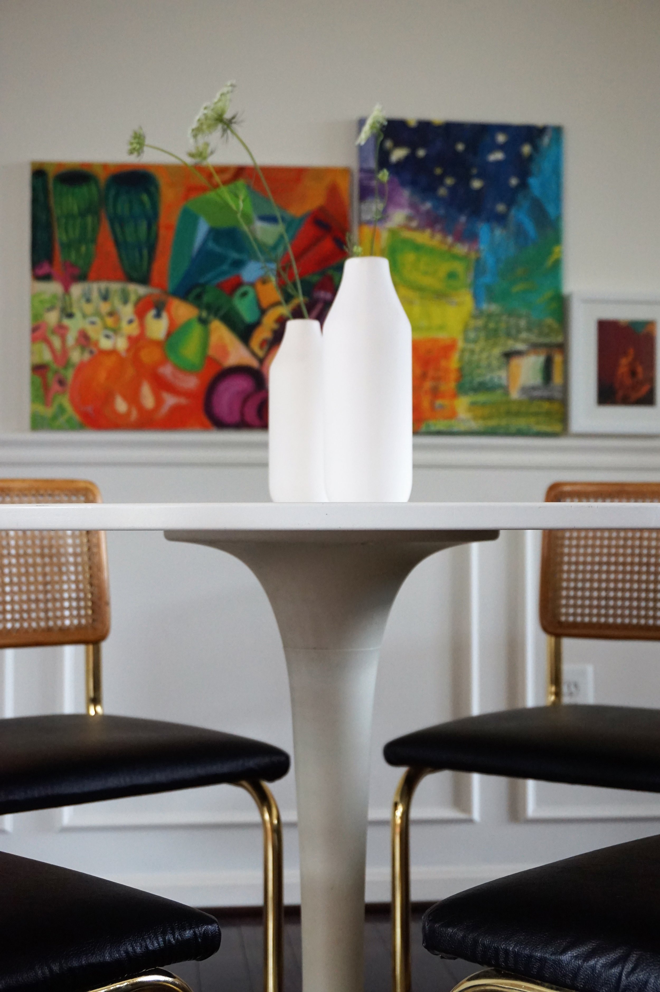
As for the art, I tried hanging all sorts of arrangements in this dining nook and was despondent to all of them.  I had wanted something long and low to lean a cluster of art on but the dining room didn't have space for a buffet or credenza.  But when I hung the art low and along the chair rail I realized it created the same effect that I love without the added furniture footprint!

IMG_1220.JPG
IMG_1228.JPG
IMG_1225.JPG
IMG_1217.JPG

Even though they were originally supposed to be for sale, once I brought them in around our table - I was done.  These babies were mine.  And the perfect crowning jewel to our freshly finished space.  Hoping to have more of our new place to share over the coming months so stay tuned friends!

IMG_4088.JPG

Bedroom Re-Do || 2017 Flip List Item No.6

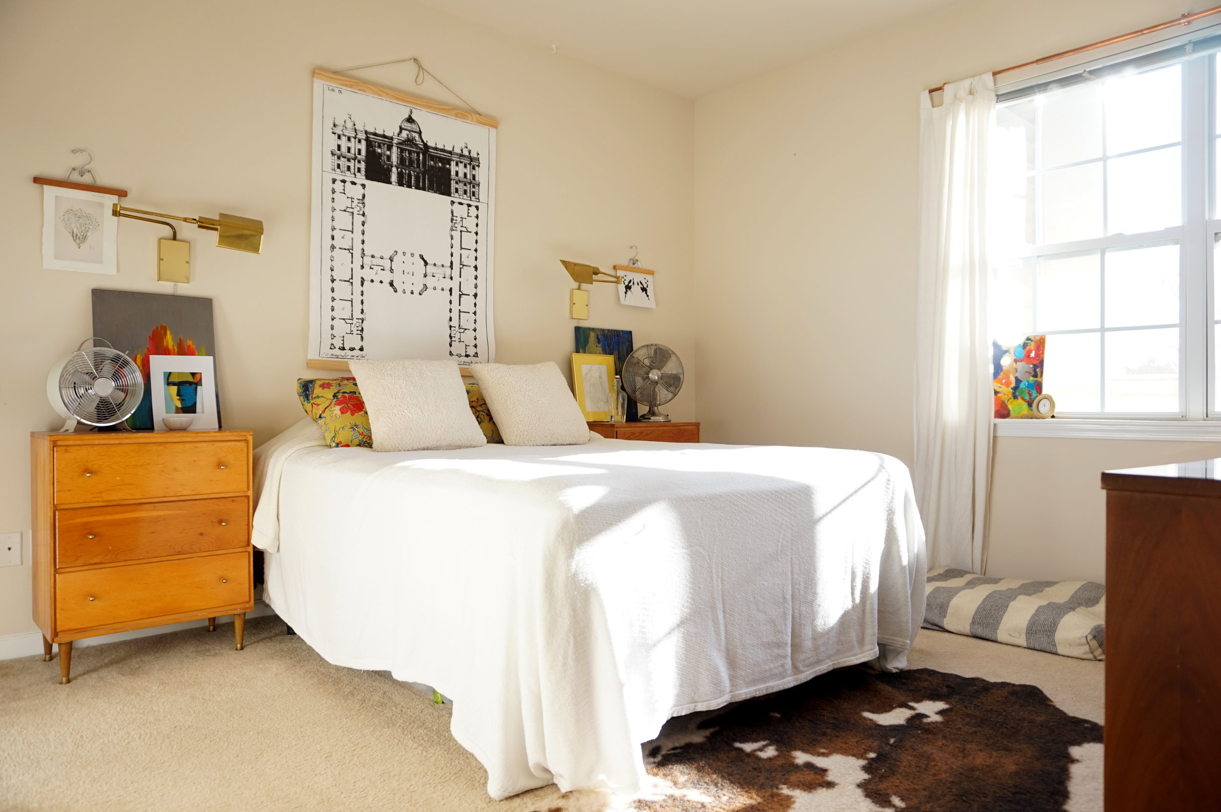
Like Chelsea said yesterday, our bedroom has always been a flat note to me.   We've tried a couple different looks over the past two years (see here and here).  Each time we rearranged, it felt like I inched a little closer to the vibe I wanted but without ever bringing the design to full fruition.

So I added item redoing our bedroom to the 2017 Furniture Flip Bucket List in the hopes of figuring out what was missing from this neglected space.  

DSC02587.jpg
DSC02535.jpg

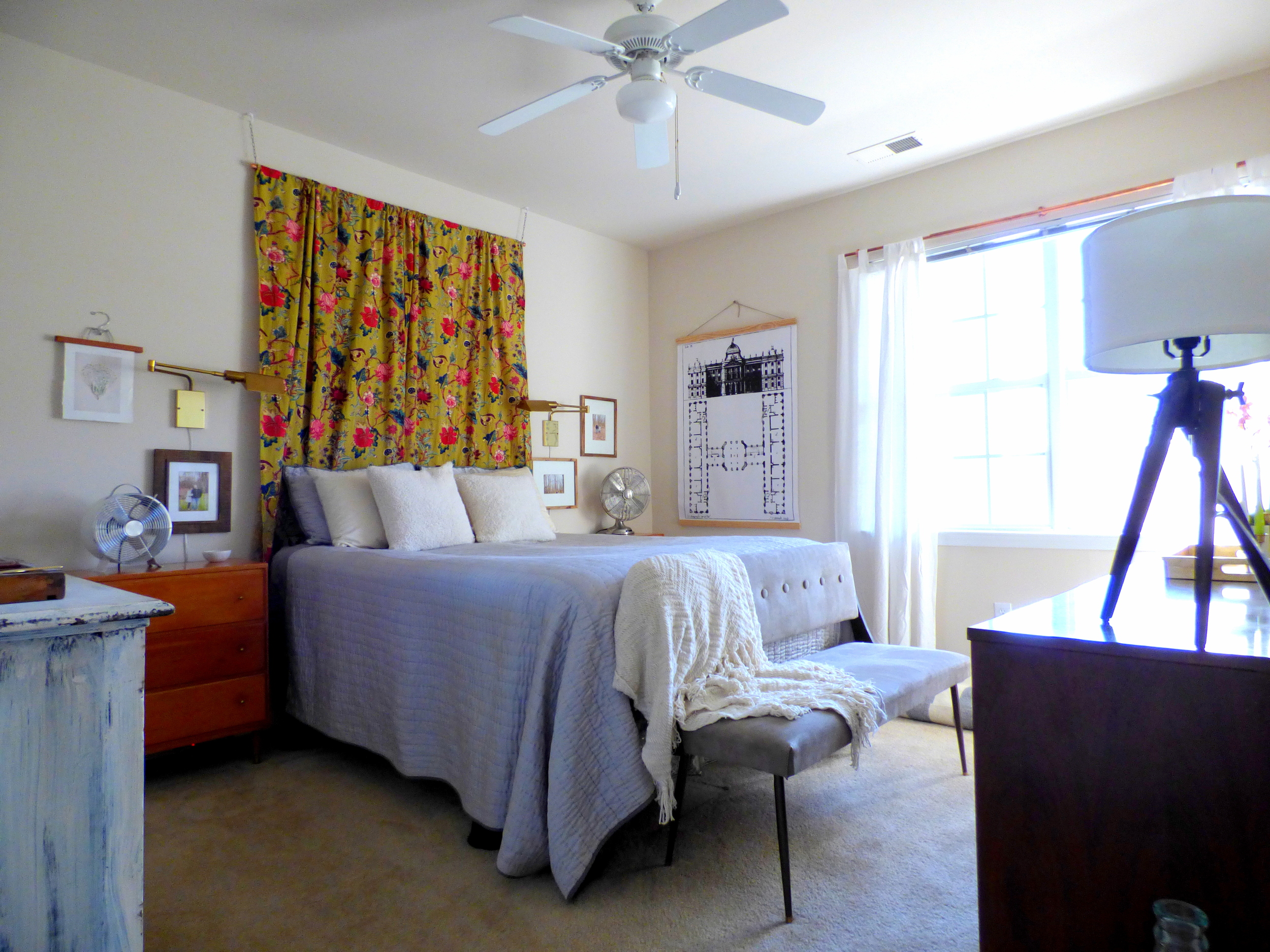
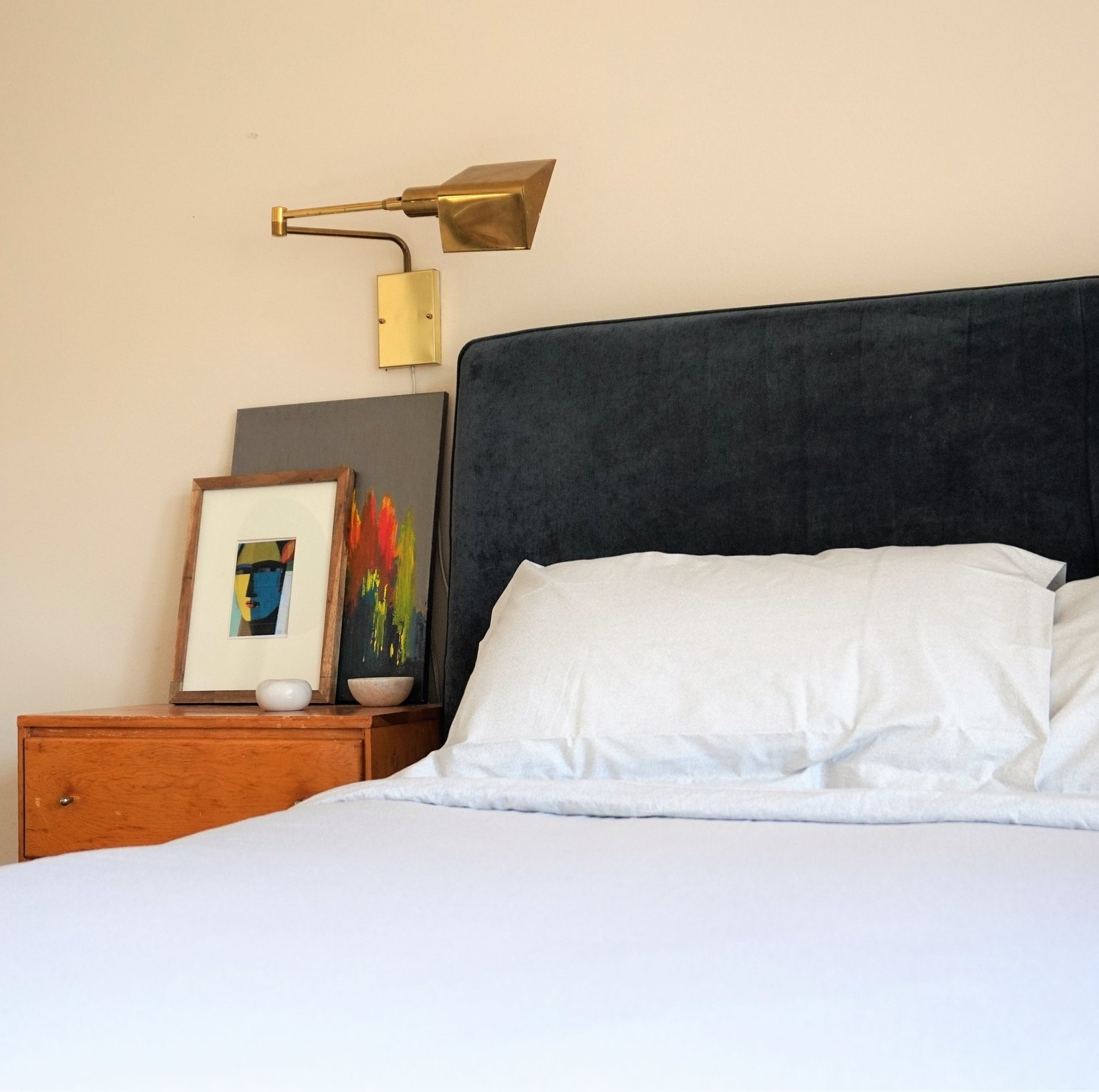
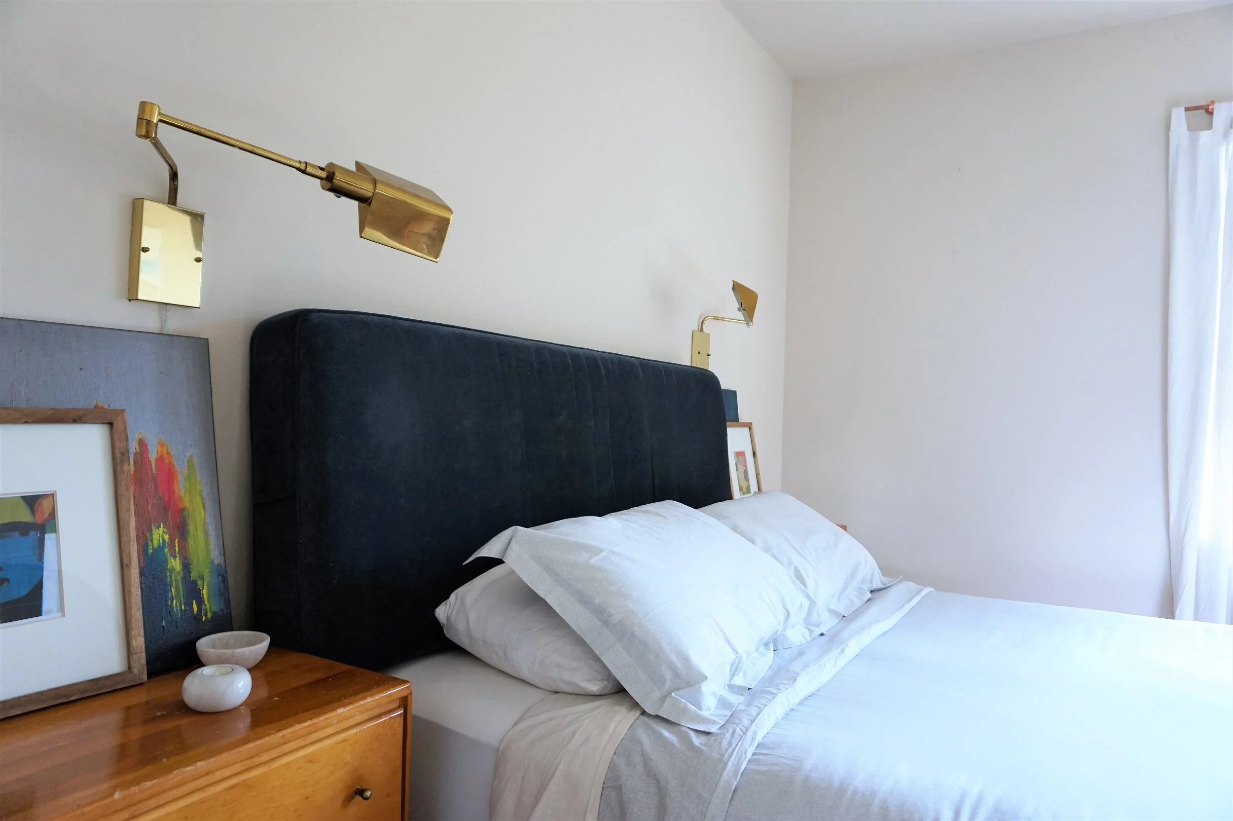
The first thing that greets you when you walk into our bedroom has always been my nightstand.  I fell in love with this vignette ages ago so I used it as inspiration for the rest of the space: warm wood + pops of color + a glint of brass.

DSC02569.jpg
DSC02516.jpg

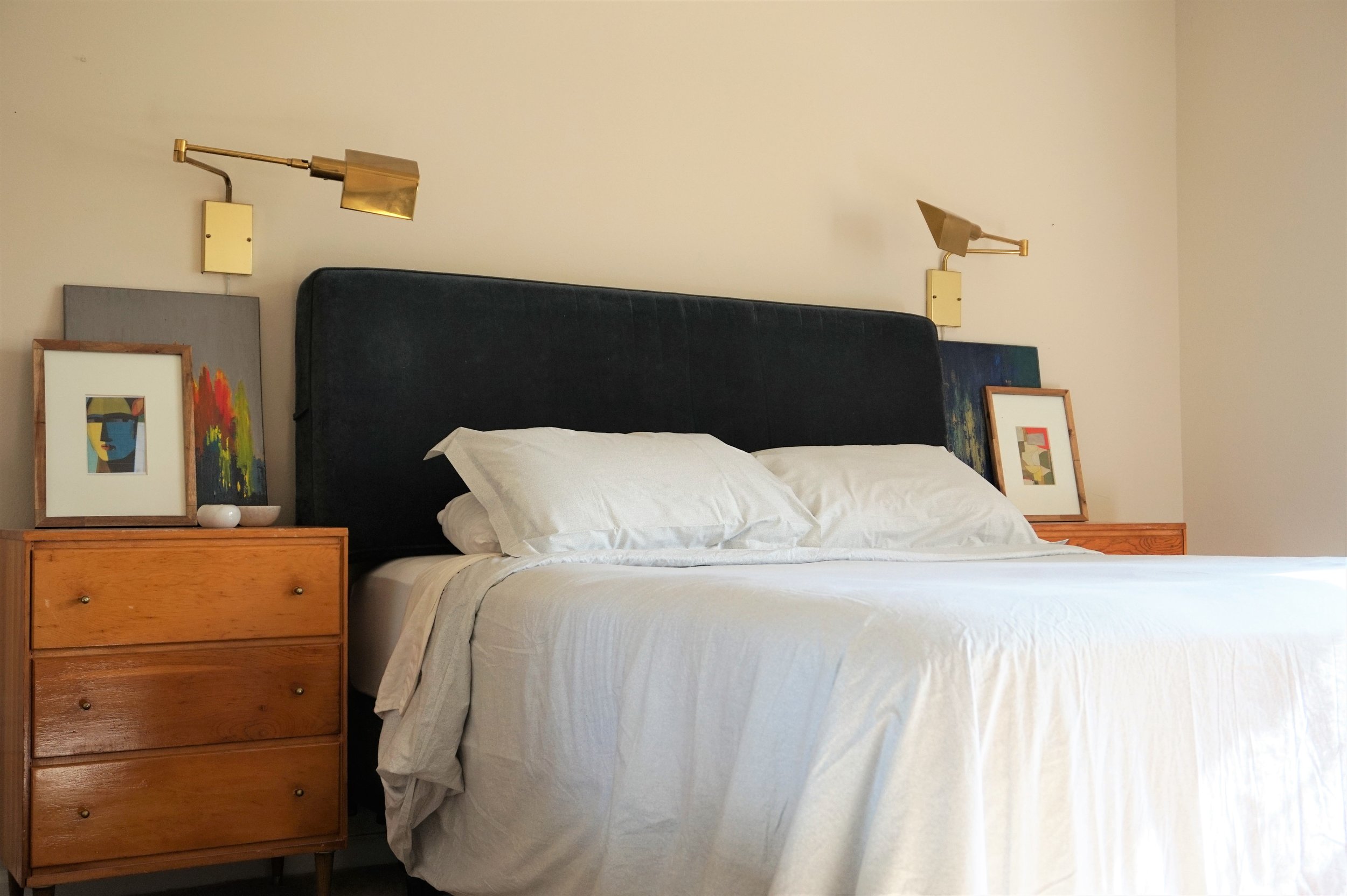
In the past looks I’ve tried, we’ve never had a headboard.  I think that made me feel like there was something juvenile about our space.  So this time around I needed to see if a headboard would help refine our bedroom.  And I gotta say I am loving the anchor of the plush blue velvet!

DSC02566.jpg
DSC02503.jpg

I also kept my beloved leather + brass cantilever chair in the corner by the window.  

DSC02494.jpg

I think one day I’d ideally like to use this chair at a desk, but until then I guess my husband can keep throwing his “clean” underwear on it *insert facepalm emoji.*

DSC02580.jpg

Next to the chair is our thrifted MCM dresser.  I found this bad boy for only $50 and eventually scored the sunset mirror to go with it.

DSC02490.jpg
DSC02484.jpg

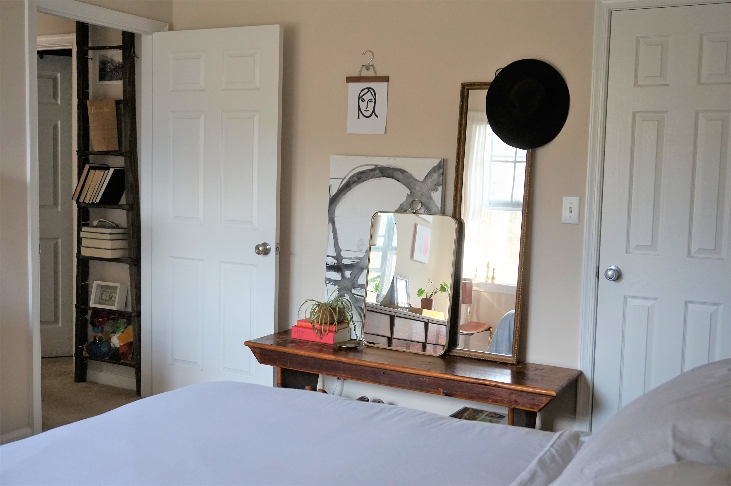
Just outside our door you can peek the roadside rescue ladder I've often used as a lateral storage piece.  Our hallway doesn't have much going on so I added the low-profile vertical piece for some architectural interest.

DSC02487.jpg

In this redecorating process, I did figure out that I’m bothered by the lack of varied furniture height in our room.

DSC02570.jpg

I shopped our apartment to introduce something lower as an alternative storage piece - do you recognize it?  This bench was actually our coffee table but I liked the idea of converting it to a get ready station.

DSC02577.jpg

The pièce de résistance to the makeover however is new bedding... I never realized how grown-up it would feel to have a real duvet cover!  We scored the Marble Percale Duvet Cover and matching shams (guess what - their on sale!) from Cstudio Home and it’s perfect for me and my oven-of-a-husband (ok I’m an oven too).  

 
Don't forget to check out Chelsea's Cstudio Home finds in her bedroom reveal... Gasp!  That shag pillow cover!  *heart eyes heart eyes heart eyes*
DSC02594.jpg

True, most of this makeover is a series of subtle tweaks.  What can I say?  We’re still in a rental after all.  But this modest assortment of new things has me feeling right as rain.  Until I get the itch to change it again that is... ;)

DSC02597.jpg

And on that note, that’s officially a wrap on the 2017 Furniture Flip Bucket List!  After two years of late finishes, it feels good to cross the finish line with a month to spare.  I’ve already begun percolating what I want to tackle in 2018 so stay tuned for next year’s list come January!

 
0 down.jpg
 
Cate.jpg

Seven down, zero to go.  Catch up on the 2017 Furniture Flip Bucket List.

Main Floor Redesign: The Plan!

Hi Friends! We're all in that weird limbo week between the hype of Christmas, the depressing day after, and the mustering of energy to ring in the New Year. I'm 32 and even I don't handle all those emotions well!
Between games of Mousetrap with my kids and reassuring them that life doesn't end when Christmas is over, I've been doing a bit of scheming for a redesign of our main floor! I'm never good at doing progress posts so I thought I'd give it a try and see how it goes!
Here is our main floor as it is now, (Christmas tree and all)!
The plan is really very simple, (well, in theory at least)! Move the thousand pound industrial shelves about 14 feet to the center wall in the living room as the focal point between the sofas. I may be exaggerating about the weight, but you've got to respect a structure made entirely of steel and solid wood! It legit frightens me. Once the shelves are moved we'll bring in a special mid-century cabinet I refinished a while ago and have been saving for our dining room for months. I intended to sell the piece but once it was finished and I took a good look at it, I got attached! This is why I stay away from PetSmart.

I created these 3D renderings of what this little switch-a-roo could look like once all is said and done! Warning, these images were the first I created with this program, (RoomStyler for anyone interested), so I've got a lot of learning still ahead!

I love these shelves as an anchor for the living room - this space has needed a strong statement and I've never been able to figure out how to pull it off! We'll still use the shelves for craft supply storage and my desk, but they'll be a few steps away from the dining room now.

So that's the plan, folks! And as we all know, even the best laid plans can go awry. I'll check back in soon with the progress!

Thank you so much for coming by!