Reader Design: Megan's Eclectic-Boho Retreat

It's Friday, and I'm on a train to Long Island to witness one of my best friends' marriage. It's the happiest of occasions - so let's keep the good vibes going! 

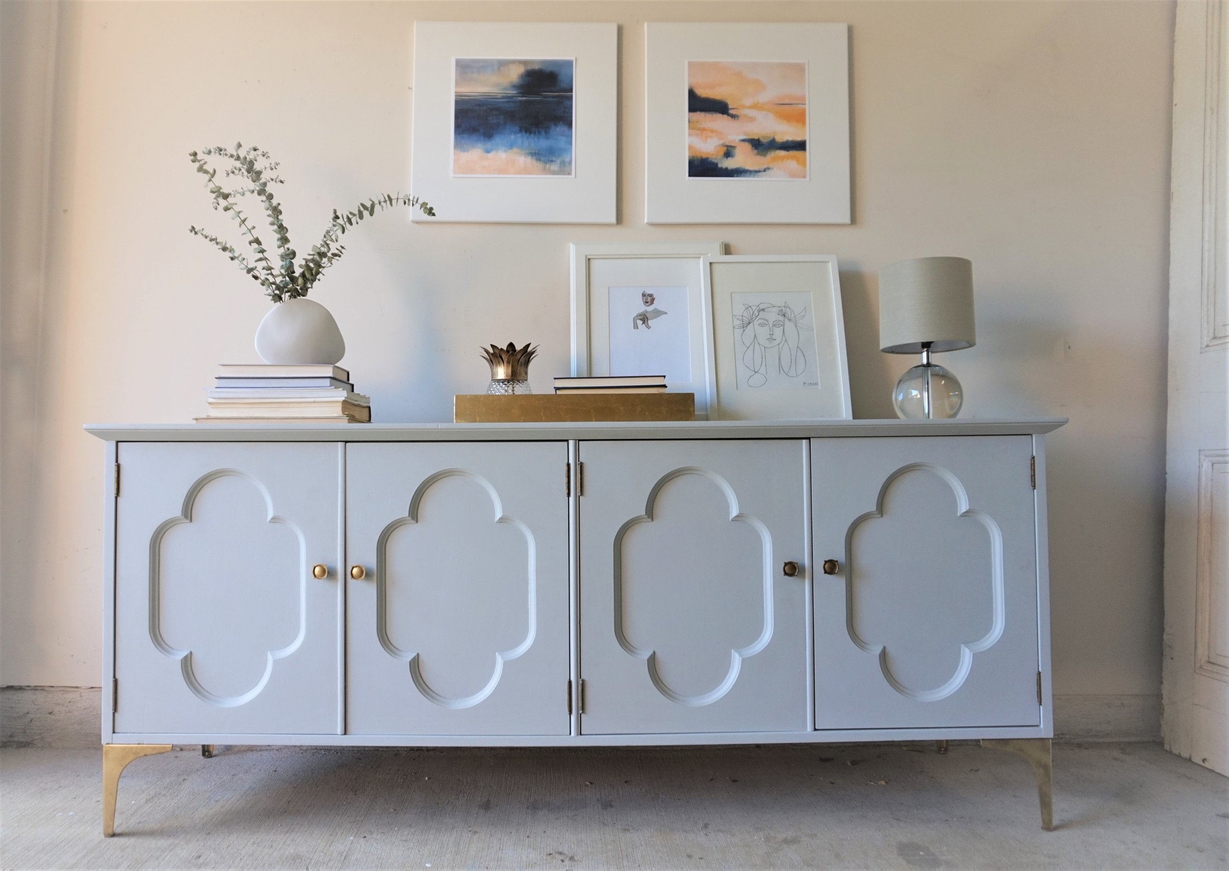
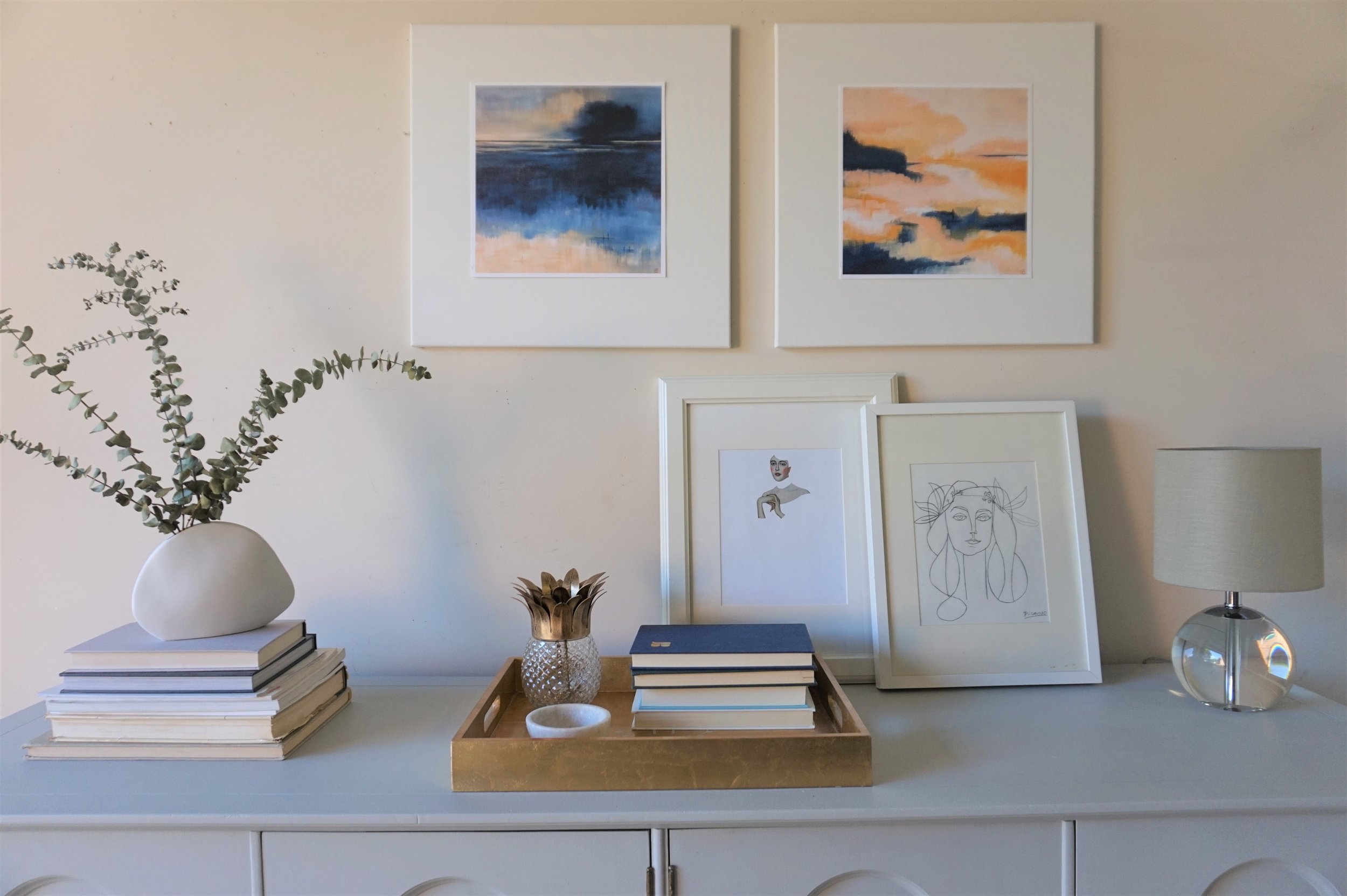
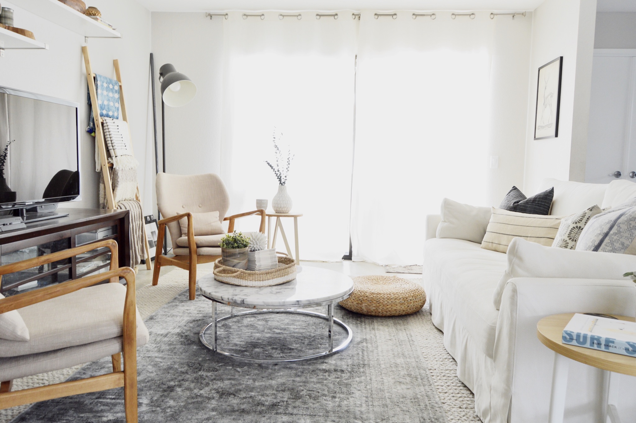
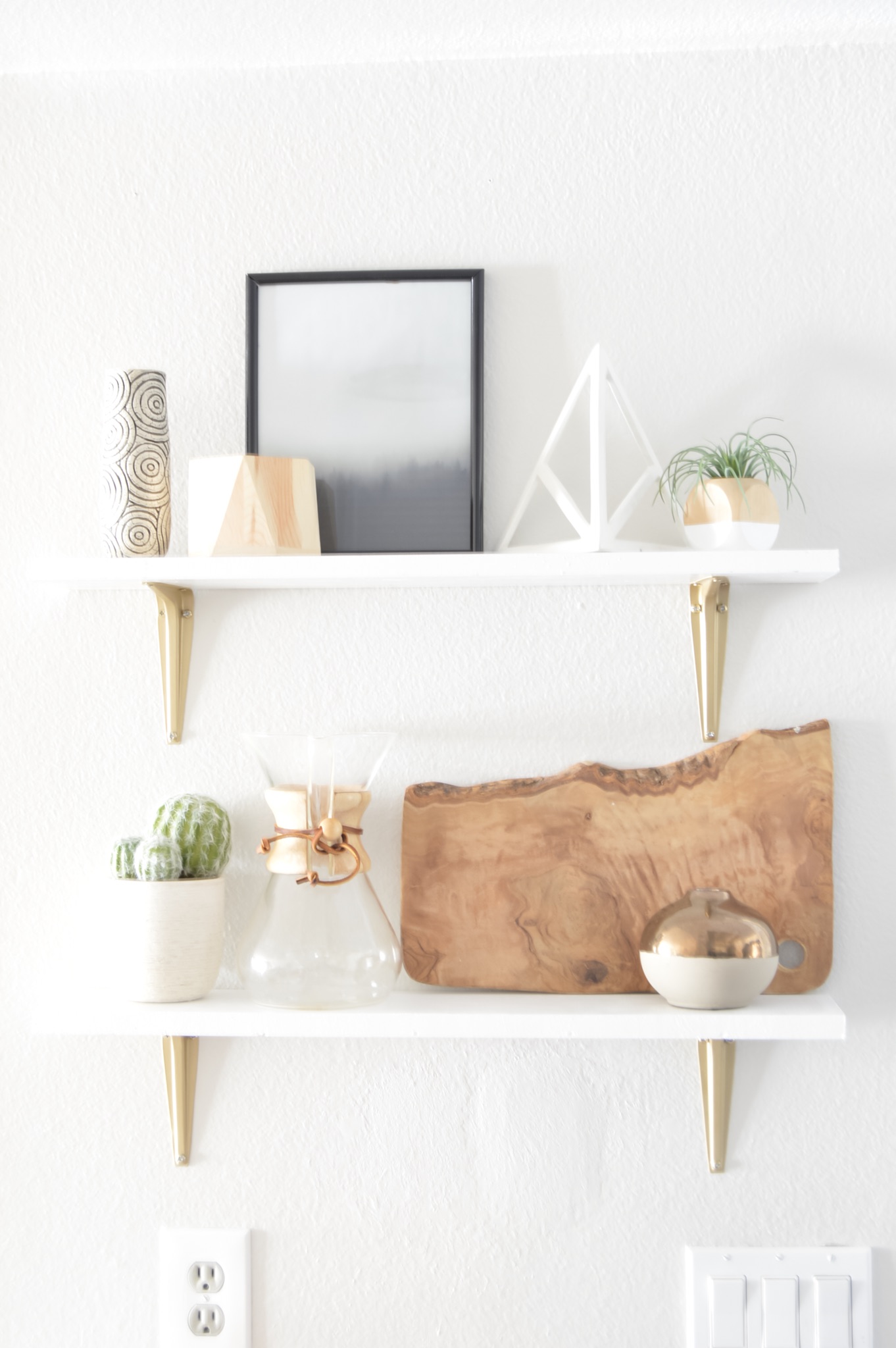
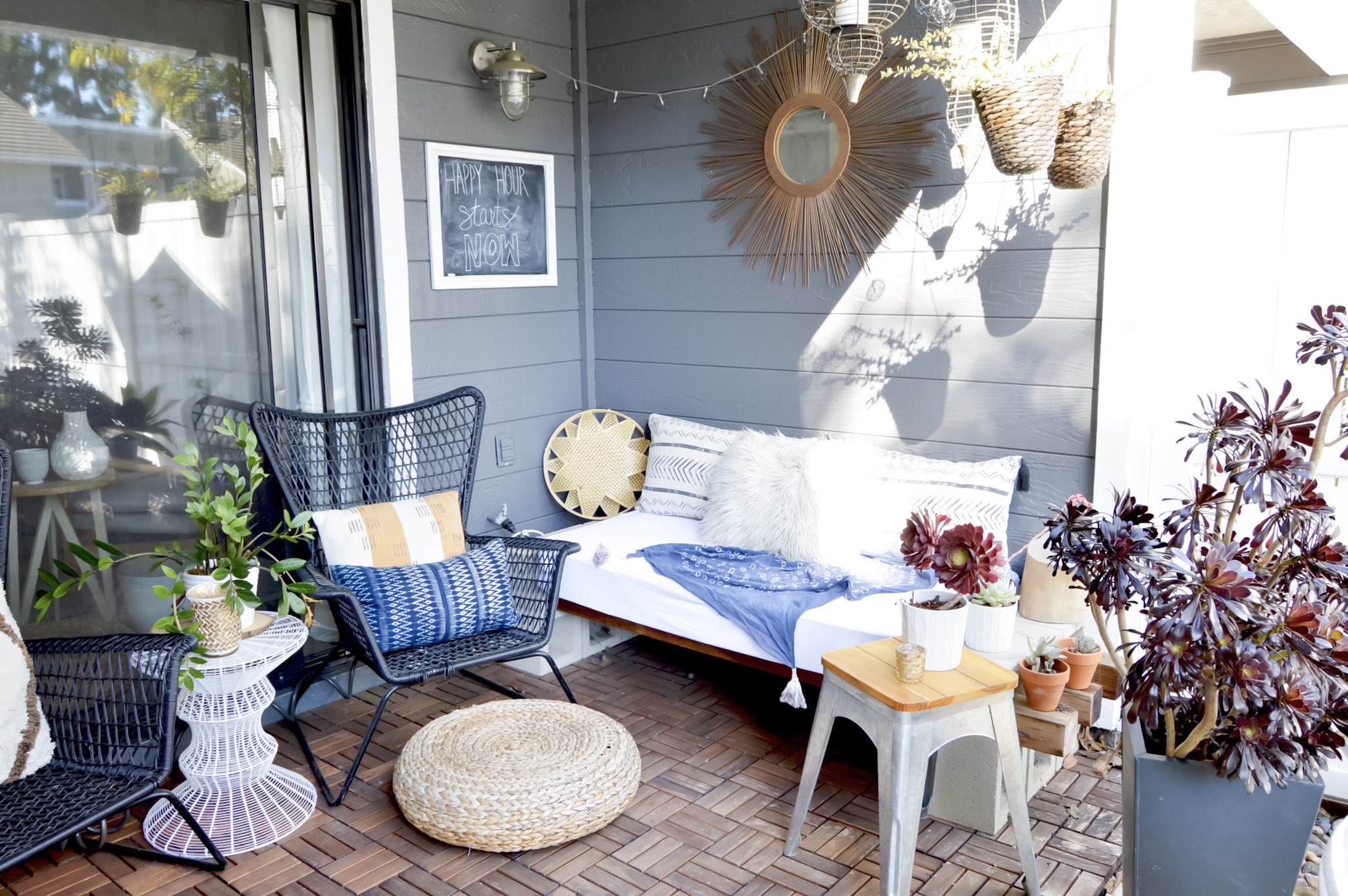
Today, we're touring Megan's California family home, a space which is clearly a sanctuary away from this busy world. Her home is full of neutral bases, like whites, grays, and natural woods, with accents of brass and added texture. 

From Megan:

I like when something in the room is slightly off but just works.

I want our home to feel styled and put together but inviting and lived in. I don’t want things too fussy. I want guests to feel comfortable to grab a drink from our fridge, put their cup down on our table without fussing for a coaster, or even put their feet up on our coffee table.

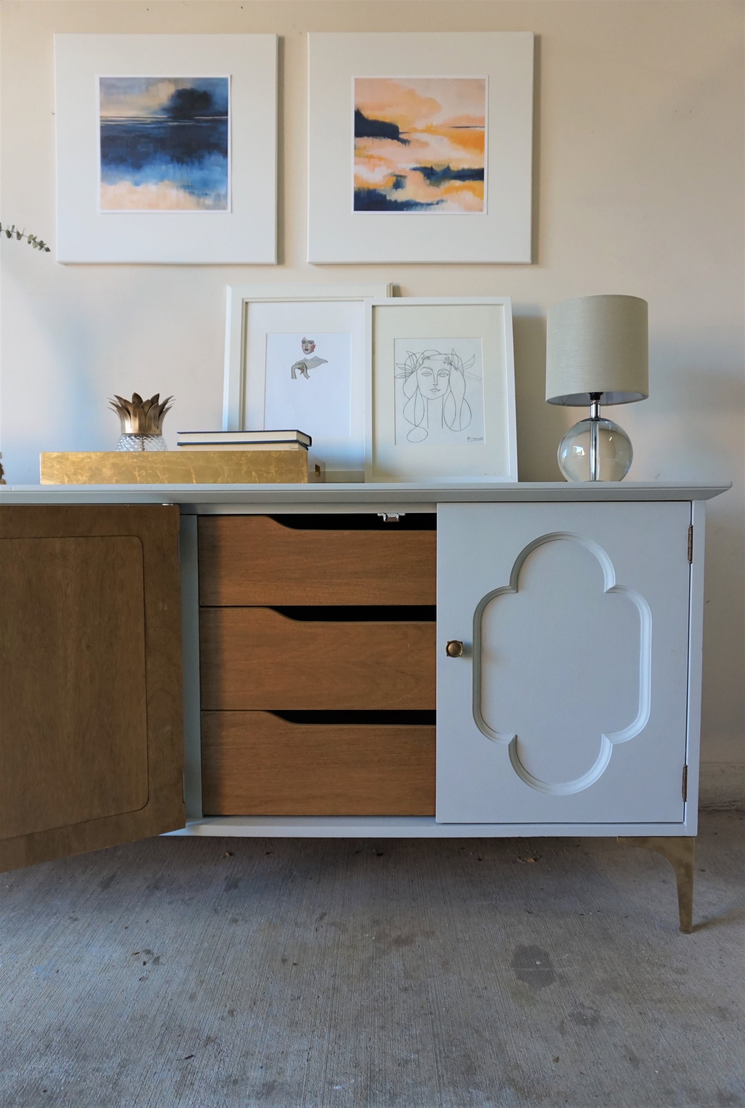
To achieve that feeling, Megan carefully curated this space, keeping in mind the needs of her family and friends and giving a nod to trends without tying herself to them. 

The big thing I wrestled with was picking large furniture pieces that I wouldn’t fall out of love with, quickly. I don’t want the urge to change out my couch, coffee table or dining room table six months from now. I wanted pieces that would grow with our family for years to come. So, we really avoided making impulse buys for the big items.


That same mindfulness with the big purchases extends to decor too. At least a handful of items, items you see on a daily basis, should have a story and bring you a sense of nostalgia and joy when you see them. For Megan, an example is the collection of photos in the dining room, which were taken by her sister-in-law Anna when she and her husband, Megan's brother, were road tripping down Route 66.

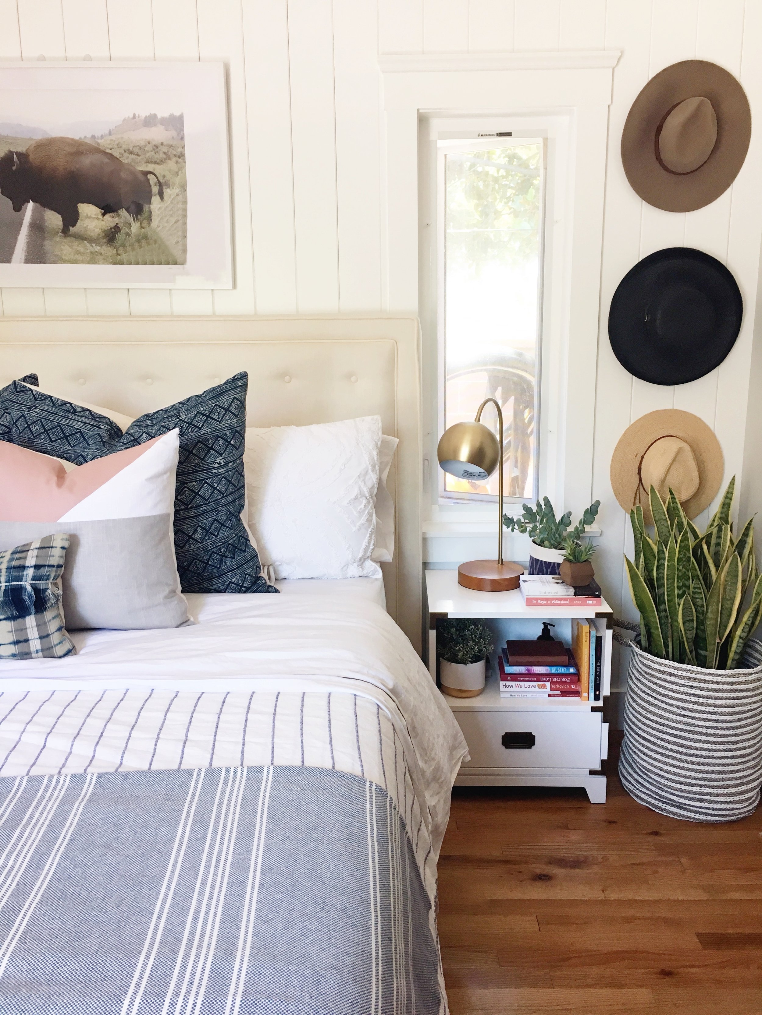
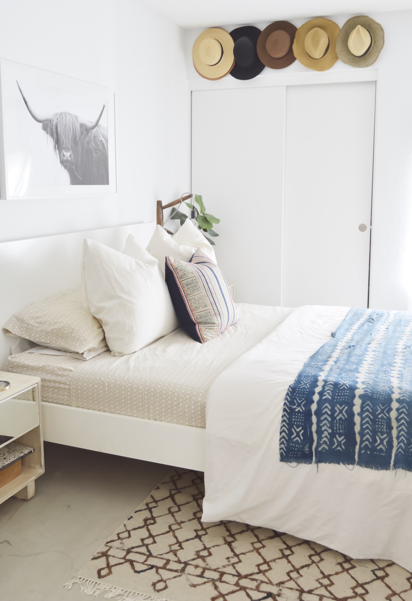
In the master, Megan has two favorites - any guesses? 

The Bison photograph above our bed (though, this piece’s final home is our son’s room) was a photograph I took on a family trip to Yellowstone.

Also, our headboard. It was a purchase we bought right after we got married and had moved to NYC. I love that headboard. I love the clean lines, the subtle tufted detail, and the neutral base. It’s a piece I haven’t tired of in nearly 9 years!

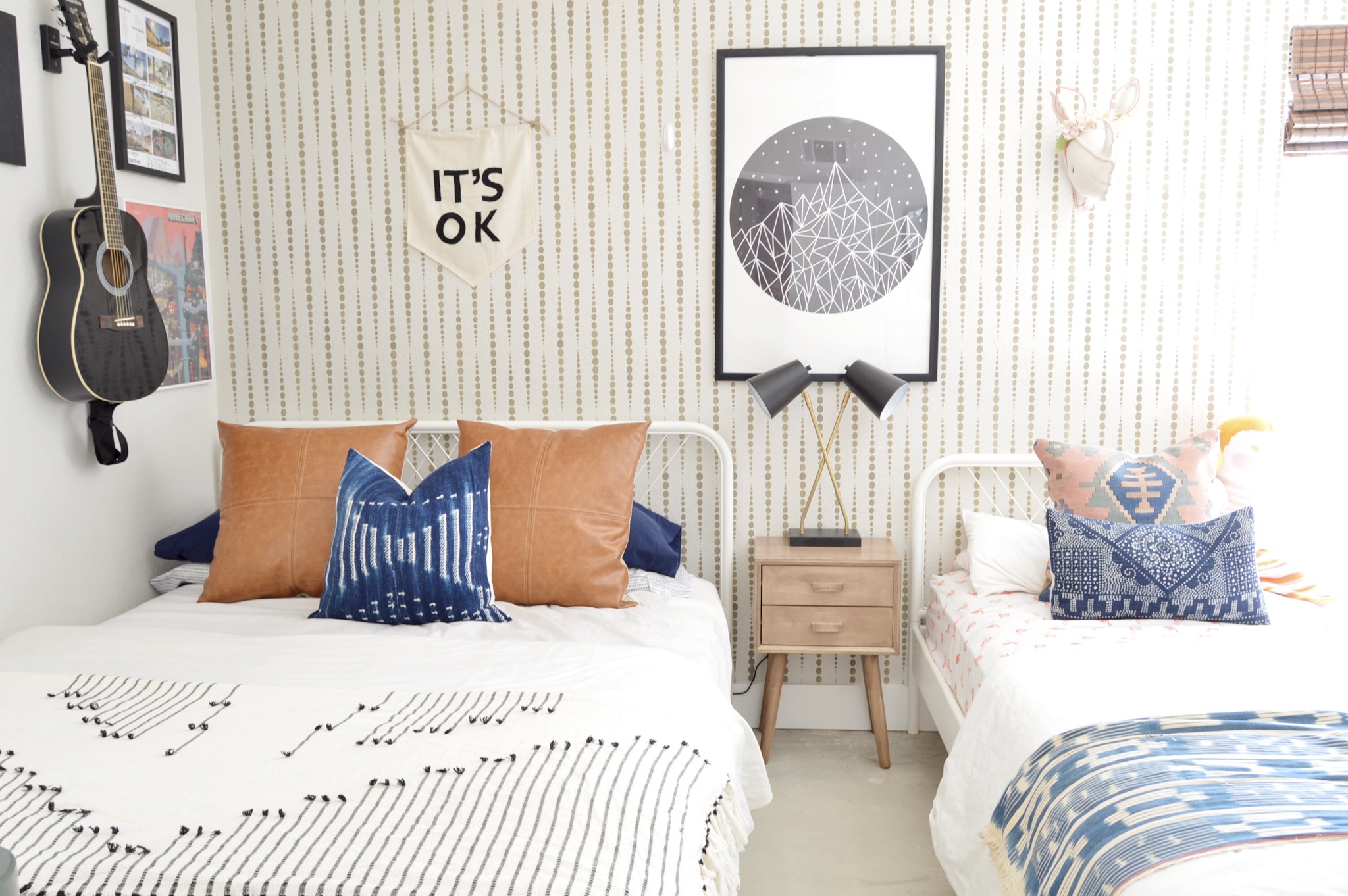
See! There the same photo (not a copy, Megan assures me they just strategically moved it around) is in her son Beckham's room. And the photo in her daughter Waverly's room is another one courtesy of Anna, featuring a carefully organized collection of buttons.

Megan, that's some awesome indoor/outdoor living you have there. What a dream. Thank you for showing us around!

Follow Megan along on Instagram @everydavismoments for more! 

See you next week,

Quatrefoil Credenza ||A Collaboration with Modern South||

Today I have the privileged of debuting not only a fresh piece but also a fellow creative!  Posts like these are some of my favorites - when two creatives join forces to make something together.  I connected with Cory of Modern South via Instagram and jumped at the chance to work with her on a juicy collaboration.

Modern South Studio

Original Artwork by Cory McBee
Charleston, SC

Cory and I share a mutual love of color and abstract art.  When we were looking for an excuse to work together, I had the perfect piece in mind to show off her ethereal landscapes art.  I found this four door credenza without a leg to stand on and the sweet quatrefoil detailing was so endearing that I couldn't pass it up. 

Plus I was jonesing to do something in a buttery gray again.

The classic lines of this piece called for a feminine and glam look - something a little softer than I normally debut in the garage shop.  

The paint color I went with was Hailstorm Gray by Behr Marquee.  In person, it's almost blue, almost purple, almost green and therefore an all-around very mysterious neutral.

It actually did pain me a bit to paint the burled wood inserts on the doors but there were too many areas of damage that needed repair and I just couldn't picture a two-toned look.  I think because the two-tone is more indicative of a modern streamlined piece that wouldn't fit a piece like this with more decorative details.  

For her new gams, I found these metal 7" legs.  Their sleek lines help modernize the credenza so it can appeal to a wider variety of home decor styles. 

The piece's original floret-ed knobs complimented the quatrefoil design on the doors too perfectly to give up so I gave the legs our favorite faux-gold finish to match.

Inside is a cabinet on the left

and a set of drawers on the right.

Any one of her prints would have been the perfect compliment, but Cory's "Blue Fever" and "Dreaming in Orange" make such a lovely couple. 

Blue Fever by Cory McBee, Modern South Studio

Blue Fever by Cory McBee, Modern South Studio

Dreaming in Orange by Cory McBee, Modern South Studio

Dreaming in Orange by Cory McBee, Modern South Studio

The navy and blush paired with the gray and gold of their piece reminds me of a quiet sunrise.  

I kept a relatively neutral color scheme with the rest of my decorative items: dried eucalyptus in a white ceramic vase, a couple stacks of books, white picture frames and touches of glass and gold.

Cory's prints are the precise soft/ feminine accents I was picturing when I finished this piece.  If you want a set of your own, you can shop Modern South Studio or email Cory for customize print sizes.  And if you're local to the DC Metro area, this gray quatrefoil beauty could also be yours.

Gray Quatrefoil Dresser
Now Available for Sale
72"L x 20"D x 30.5"H
$685

If you are interested in this piece or a custom order like it, email me at cate@stylemutthome.com.

Reader Design: Bri's Cali Cool Home

It's Friday!! Finally. After what feels like the longest week. I don't know about you guys, but I am in serious need of a good vacation. 

Thankfully, today we are touring Bri's Cali cool home; right in the middle of Southern California in a little town called Aliso Viejo, every day just has to feel like a vacation for Bri right? Her home is certainly relaxing enough to make you think so! 

What you wouldn't necessarily guess, though, is that this open and airy space is also home to Bri's husband and two children. That means that functionality is right up there with appearance. 

From Bri:

I want our home to be comfortable because we have two children, but I also want it to look rad. Many of my textiles are vintage items that have already withstood many years of use, so I feel pretty confident that they can handle being used in fort building and pillow fights. I’ve recently switched to a lighter color scheme in our main living space because I wanted it to feel light and bright even though our home gets very poor natural light. I love mixing wood tones within my home too because of the warmth and sense of comfort they can exude. Overall, I just really want our home to feel like you can kick your feet up on the furniture, because we are fine with that...maybe take your shoes off at least since we do have a white sofa, but nothing is too precious.

That means that Bri decorates by being, in her words, "a little bit of a lot." She mixes lots of styles together, in small increments so that one aesthetic doesn't overtake the whole space. She also mixes and matches when it comes to price points, pairing pricier mid-century finds or local textiles with flea market steals or Target items. 

In the dining nook, that meant Bri flexed her creative muscles to add doors to Ikea toy benches - a simple change that gets big functionality and style points! 

And the style keeps right on going into the bedrooms. 

In our bedroom, I have to say I love my hat wall. That may sound so silly, but I truly just love the warmth the shades of brown add to the room and that they also serve as wall decor. It’s a simple storage solution that makes a big impact.
In my kid’s shared room I love their accent wall that I stenciled. You can see this wall when standing in our kitchen, looking through the living space so I knew I wanted it to standout.


Bri, thank you for showing us around. I have just one final question for you -

When can I visit? 

Follow Bri on Instagram @brimoysa for more, and I'll see you all next week!