Quatrefoil Credenza ||A Collaboration with Modern South||

Today I have the privileged of debuting not only a fresh piece but also a fellow creative!  Posts like these are some of my favorites - when two creatives join forces to make something together.  I connected with Cory of Modern South via Instagram and jumped at the chance to work with her on a juicy collaboration.

Modern South Studio

Original Artwork by Cory McBee
Charleston, SC

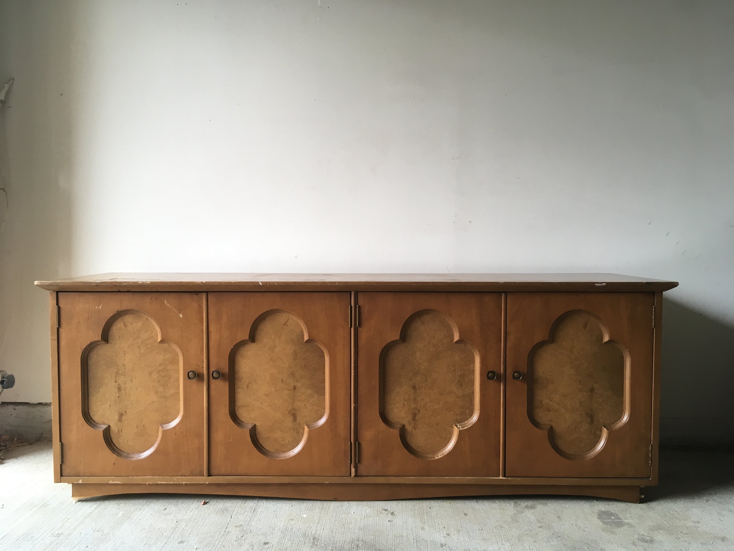
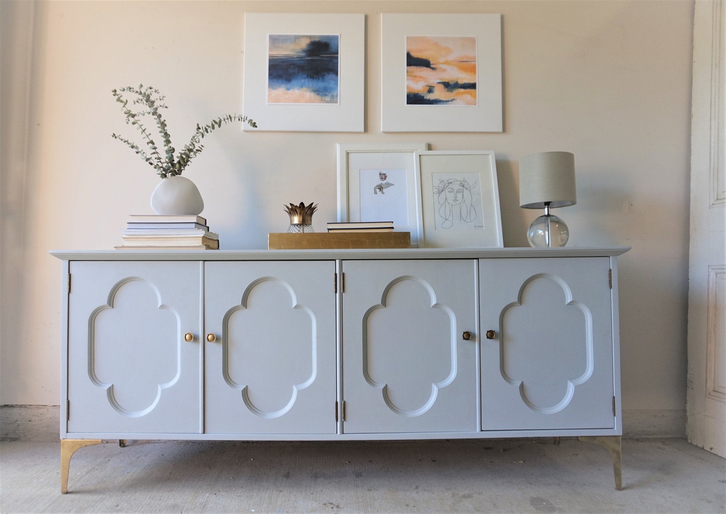
Cory and I share a mutual love of color and abstract art.  When we were looking for an excuse to work together, I had the perfect piece in mind to show off her ethereal landscapes art.  I found this four door credenza without a leg to stand on and the sweet quatrefoil detailing was so endearing that I couldn't pass it up. 

Plus I was jonesing to do something in a buttery gray again.

The classic lines of this piece called for a feminine and glam look - something a little softer than I normally debut in the garage shop.  

The paint color I went with was Hailstorm Gray by Behr Marquee.  In person, it's almost blue, almost purple, almost green and therefore an all-around very mysterious neutral.

It actually did pain me a bit to paint the burled wood inserts on the doors but there were too many areas of damage that needed repair and I just couldn't picture a two-toned look.  I think because the two-tone is more indicative of a modern streamlined piece that wouldn't fit a piece like this with more decorative details.  

For her new gams, I found these metal 7" legs.  Their sleek lines help modernize the credenza so it can appeal to a wider variety of home decor styles. 

The piece's original floret-ed knobs complimented the quatrefoil design on the doors too perfectly to give up so I gave the legs our favorite faux-gold finish to match.

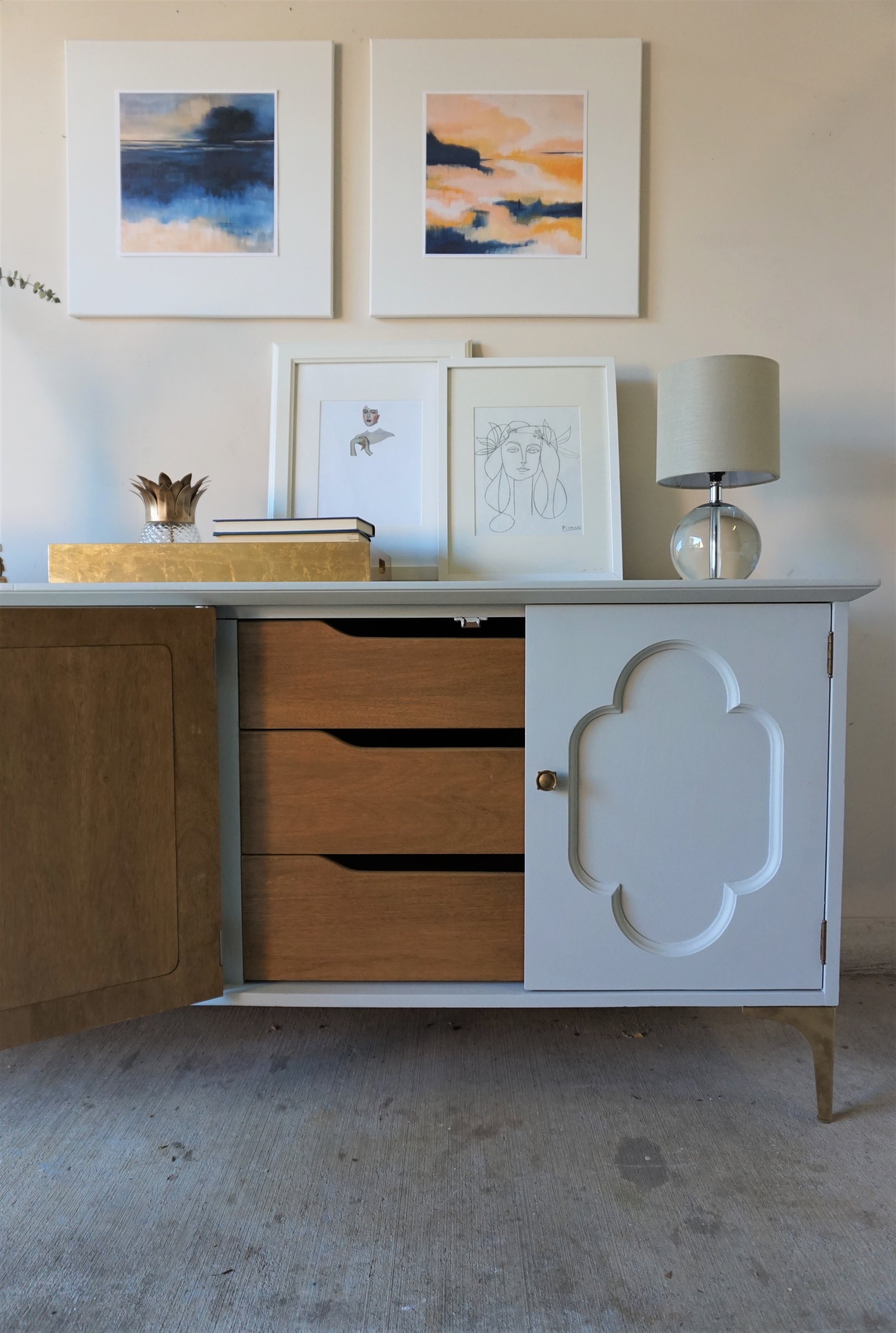
Inside is a cabinet on the left

and a set of drawers on the right.

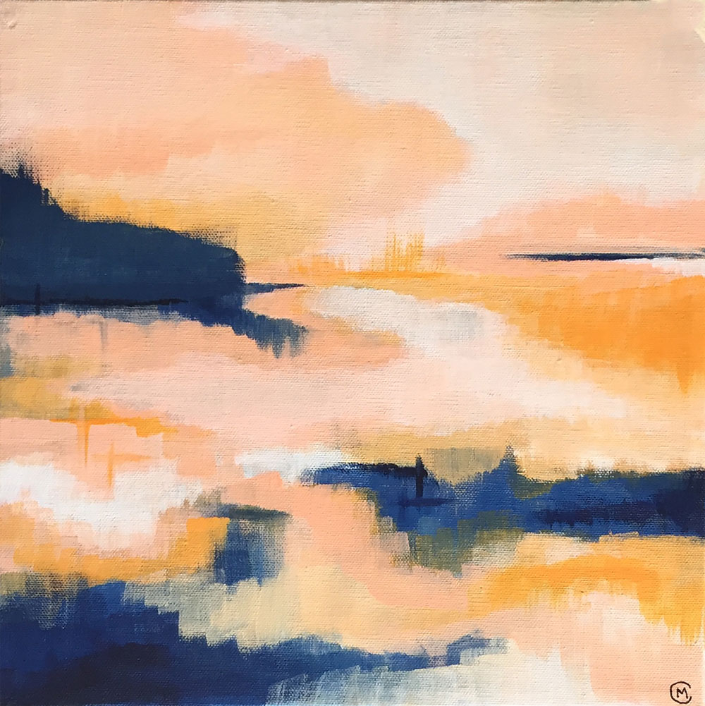
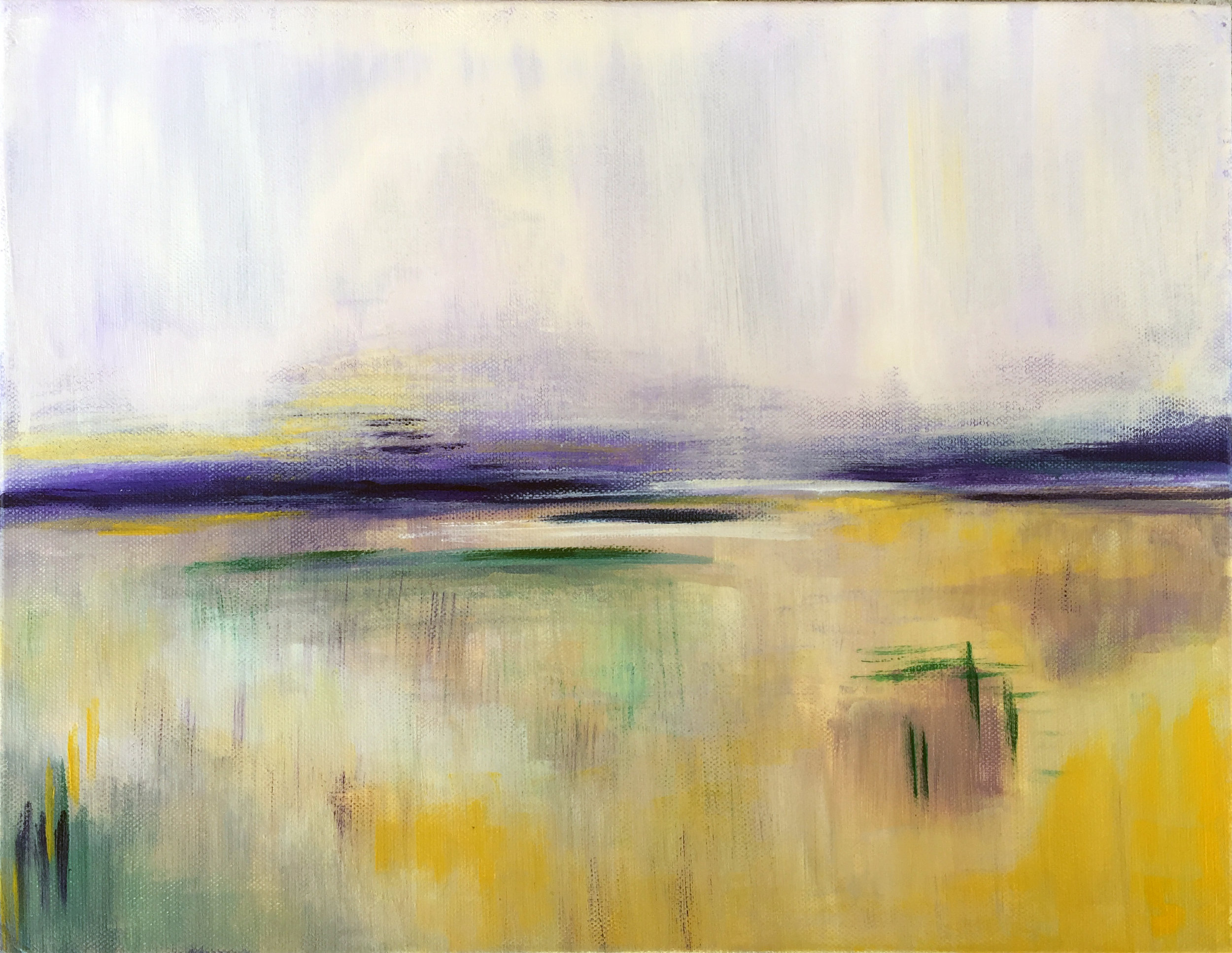
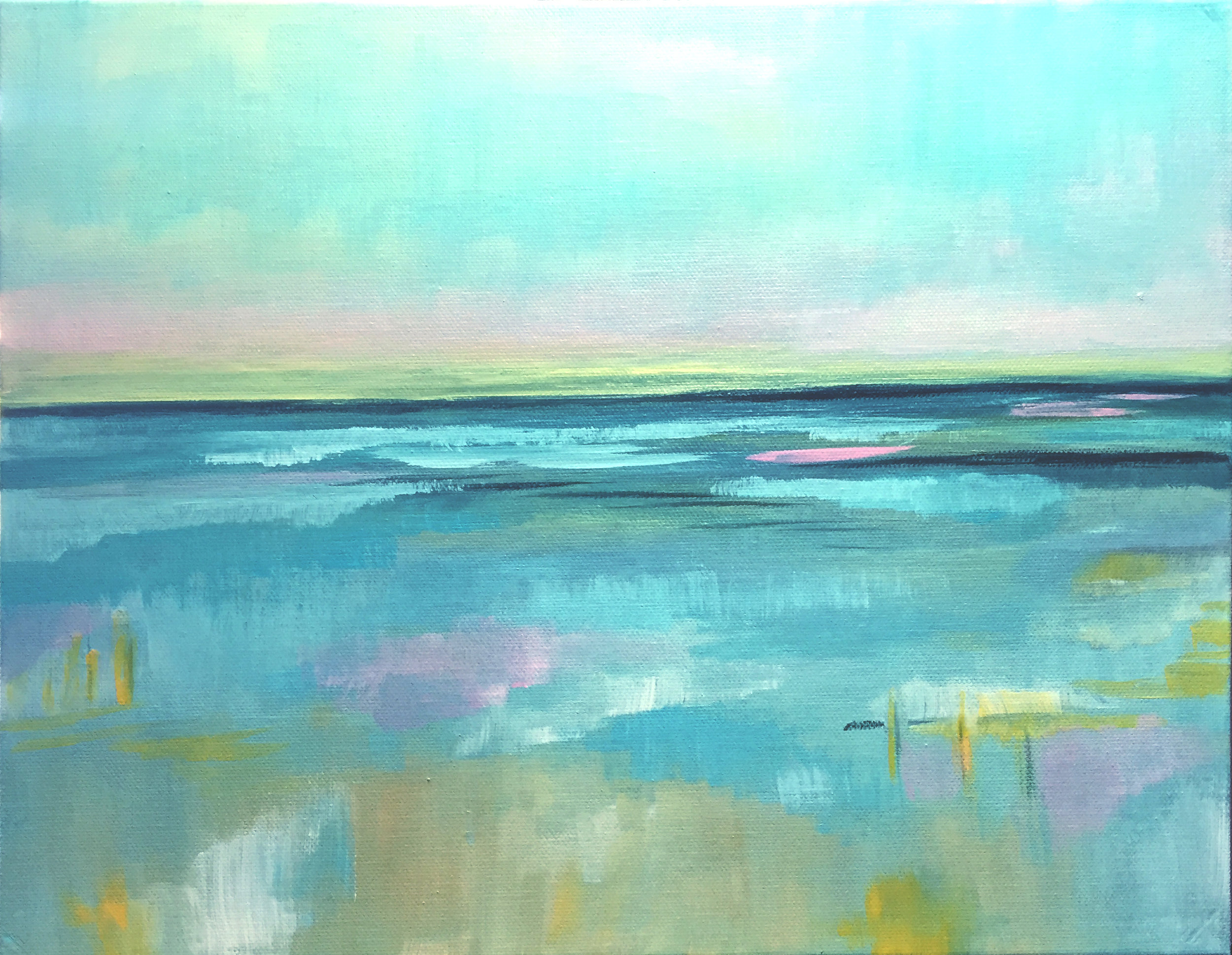
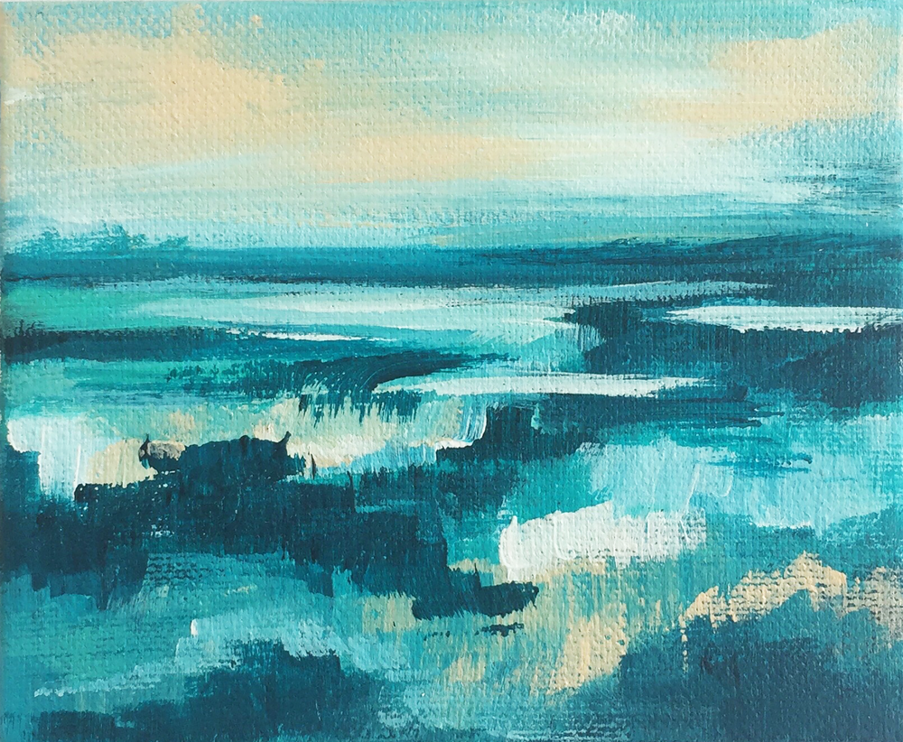
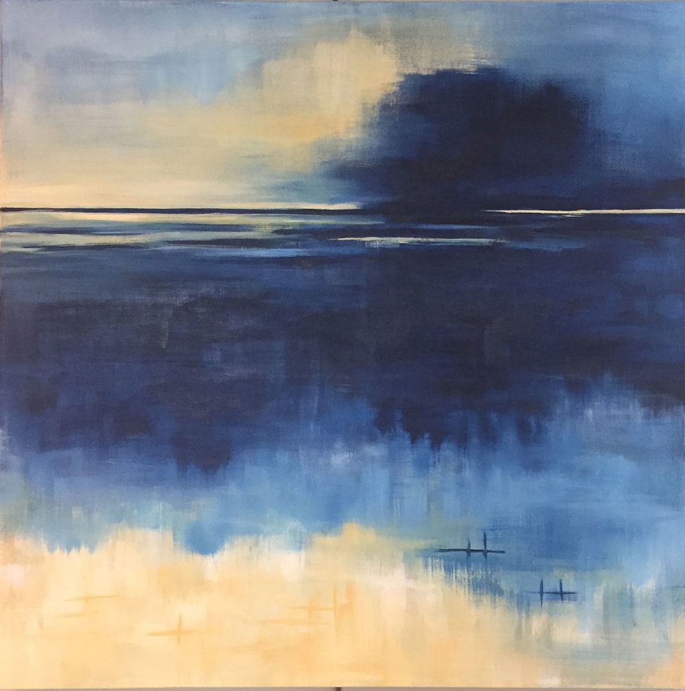
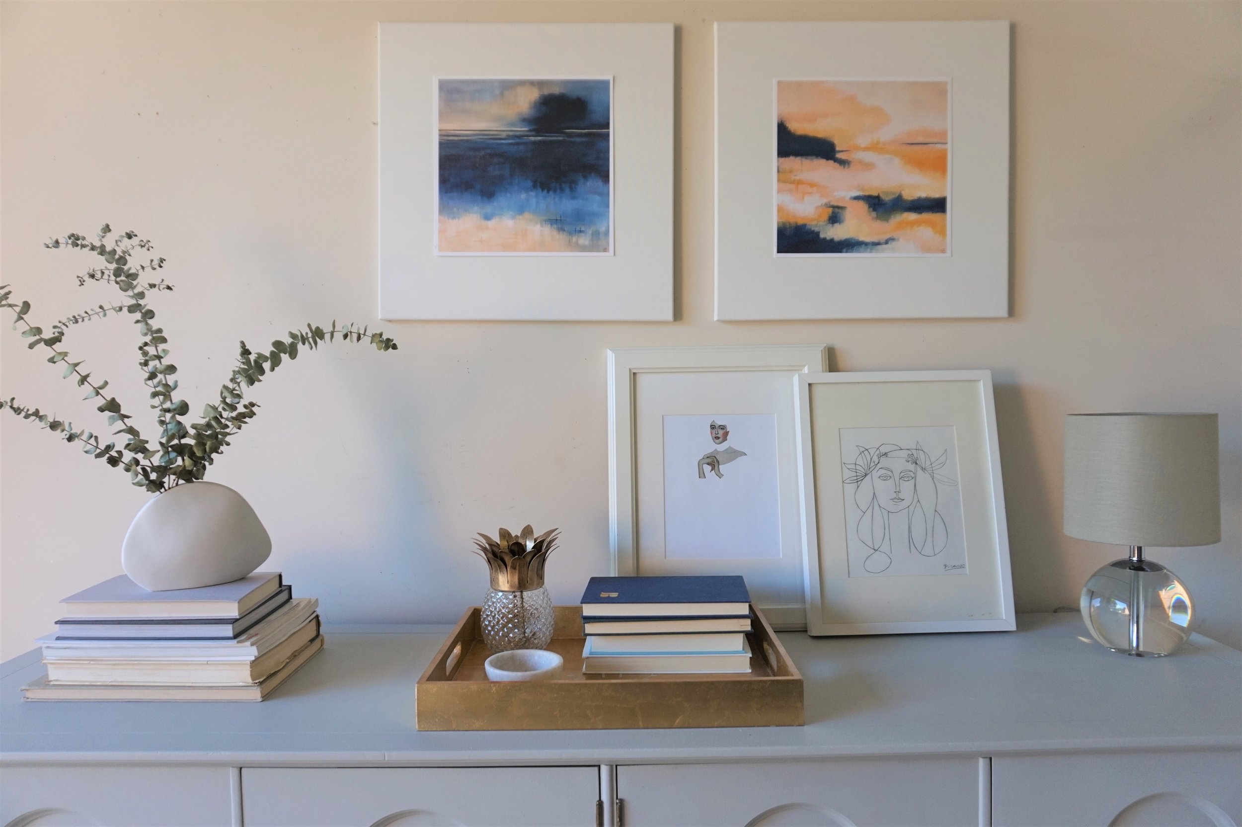
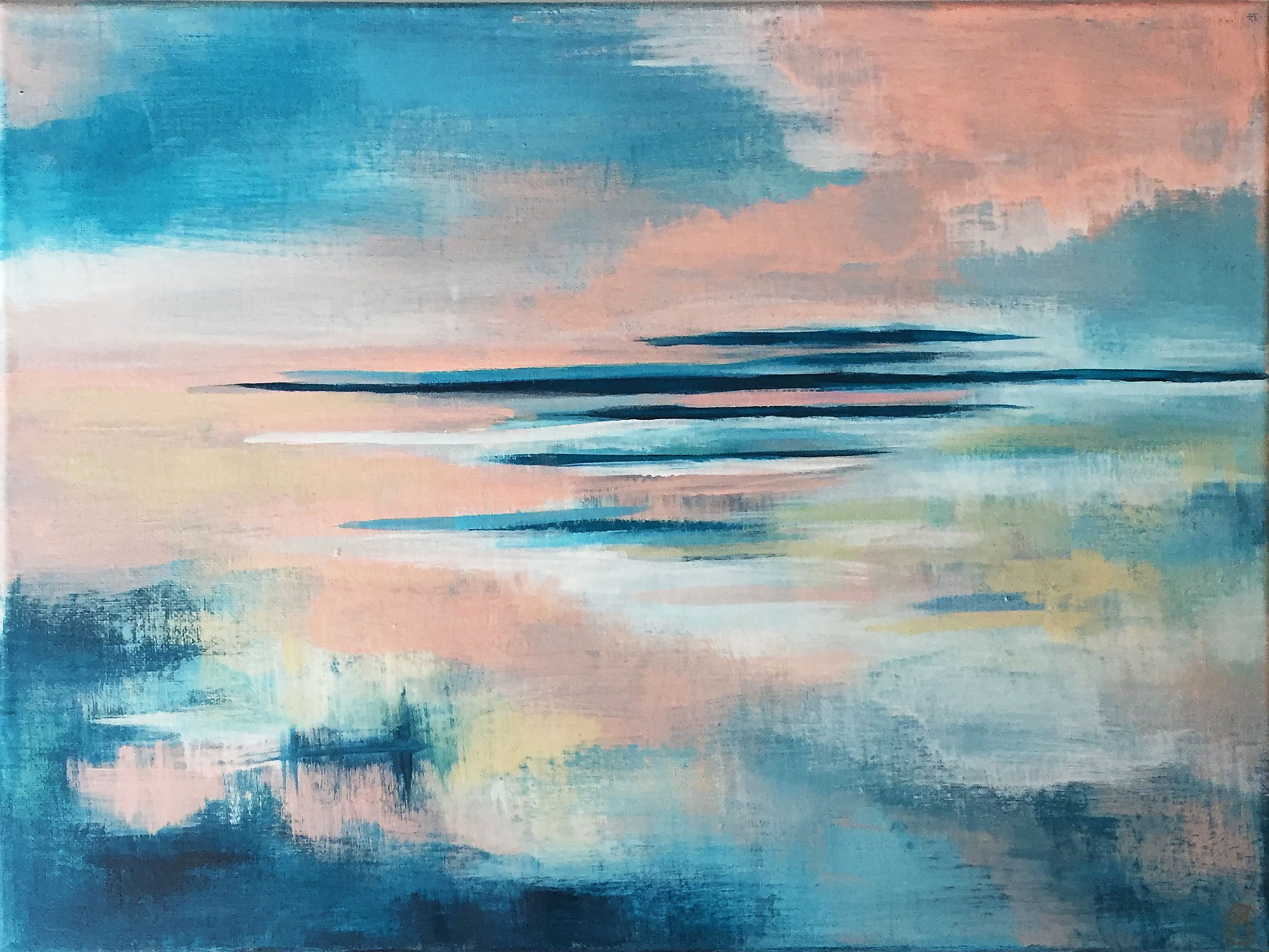
Any one of her prints would have been the perfect compliment, but Cory's "Blue Fever" and "Dreaming in Orange" make such a lovely couple. 

Blue Fever by Cory McBee, Modern South Studio

Blue Fever by Cory McBee, Modern South Studio

Dreaming in Orange by Cory McBee, Modern South Studio

Dreaming in Orange by Cory McBee, Modern South Studio

The navy and blush paired with the gray and gold of their piece reminds me of a quiet sunrise.  

I kept a relatively neutral color scheme with the rest of my decorative items: dried eucalyptus in a white ceramic vase, a couple stacks of books, white picture frames and touches of glass and gold.

Cory's prints are the precise soft/ feminine accents I was picturing when I finished this piece.  If you want a set of your own, you can shop Modern South Studio or email Cory for customize print sizes.  And if you're local to the DC Metro area, this gray quatrefoil beauty could also be yours.

Gray Quatrefoil Dresser
Now Available for Sale
72"L x 20"D x 30.5"H
$685

If you are interested in this piece or a custom order like it, email me at cate@stylemutthome.com.

Reader Design: Lisa's Global Retreat

This one is for the travelers. The ones out there who have insatiable wanderlust like myself. Or even those who just like to dabble in some global cuisine every now and then.

Lisa's Chicago home represents years of travel. Her home tells us where she's been and gets more unique with every trip she takes and item she brings home.

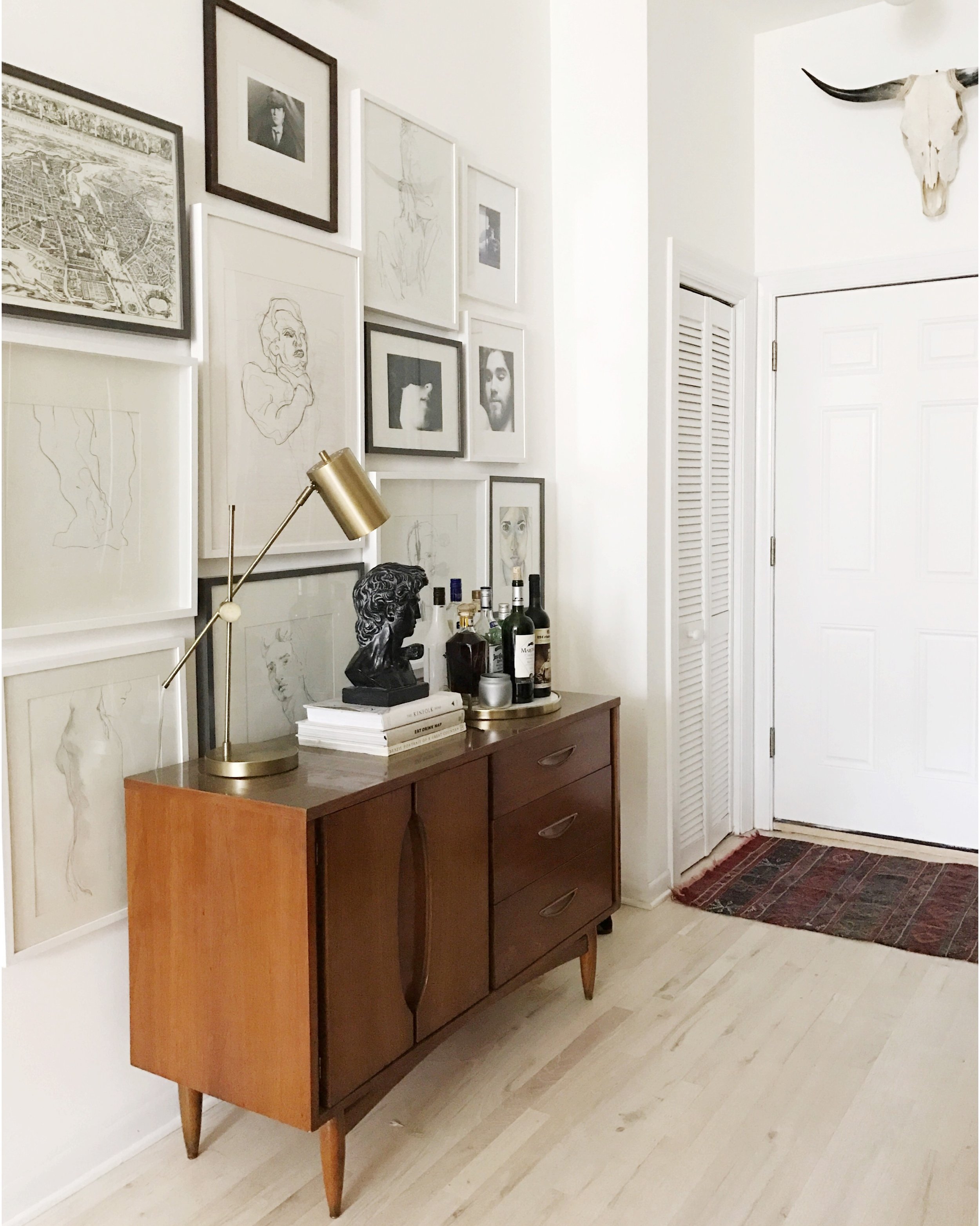
The feeling hits you the second you come through the door. And it's not just one thing. But the thing that jumps out at me is that gallery wall. Now, we all see a lot of gallery walls. But this is something else. 

It's a lovingly curated collection of works from one of Lisa's favorite artists as well as some of her own work and will be something she adds to throughout her life. It perfectly represents her aesthetic philosophy.

From Lisa:

I love spaces that are functional and classic, with meaningful keepsakes, souvenirs, and artwork sprinkled in there. If an object/piece of furniture doesn’t serve any sort of purpose in the space or if a souvenir/piece of artwork doesn’t evoke a feeling, then it shouldn’t be there.

In the living room, you notice the textiles. 

I have a few blankets that I bought in Peru that I LOVE. I came home with a new suitcase full of Peruvian textiles but still felt like it wasn’t enough...


All those global influences make a place feel special but can be difficult to bring together.

I’ve been fortunate enough to do a good amount of traveling in my life , and most places have influenced me in some way. It can actually hinder me a lot of times when I’m trying to put together a space. When I was in my early 20’s, I spent some time living in Italy and Southern France. I love the softness of French style, but I also love the ruggedness of an Argentine estancia. Those cultures influenced me a lot in the way I live and especially in my aesthetic choices. The key is to figure out how to make those contradictory elements work together.

So how do you do it? How do you take influences from literally all over the place and make it feel cohesive, unified, homey? It's a question Lisa has a pretty good answer to. 

When designing a space, my starting point is always going to be Function. What is the point of this room? What are people going to be doing in here? Once you’ve established the function of the room, you can start figuring out what layout and styles will make the most sense.

Well done, Lisa. This home functions beautifully. I know that I for one will stay tuned on Instagram @lisalaurens to see where your travels lead you next! 

Thanks for following along, mutts! 

Lindsey's Neutral Family Home

Happy Friday, Mutts! I don't know about you all, but this four-day week felt like a six-day week. Holy cow, am I glad that's almost over!

Today, we have a serious treat for all of your neutral lovers. If you haven't seen this neutral obsession splattered all over social media, you must have been living under a rock. Some of it goes too neutral, towards cold or impersonal. But Lindsey gets it right, creating a family home that feels casually curated but also actually feels lived in. What a concept! 

You can see right away that we're dealing with a historic home here. There's something about that history that really gets to me - thinking about all the families that have built their lives here. I love that Lindsey's design honors that past while making it her family's own.
From Lindsey:

Our home was built in 1900, and it sits on an acre lot in the country. Because of the original wood work, including beautiful pocket doors, and my old soul, I think the style of our home would equate to the Midwest. When I look around, I think, ‘yeah, this house just belongs here.’

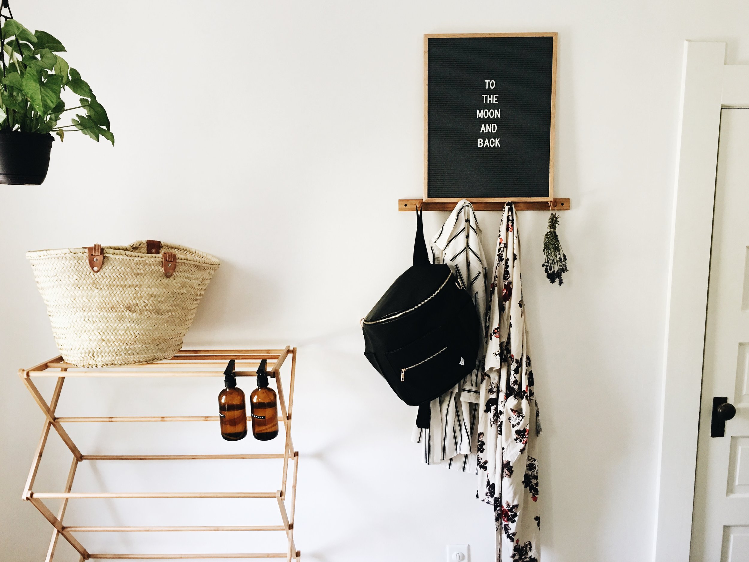
A fun fact for all of you, and a shameless plug for a company I adore: I found Lindsey and her awesome space via the Letterfolk Co Instagram account. Their letterboards are seriously amazing, and I do not blame Lindsey at all for owning more than one! And, they plan right in to Lindsey's style. 

I think I would best describe my style as midcentury meets farmhouse, with a side of simplicity. I love visually clean spaces and have an obsession over antique pieces. At the end of the day, I want our home to house only meaningful items, to be inviting and free of clutter. I love this quote by William Morris: ‘Have nothing in your house that you do not know to be useful, or believe to be beautiful.’

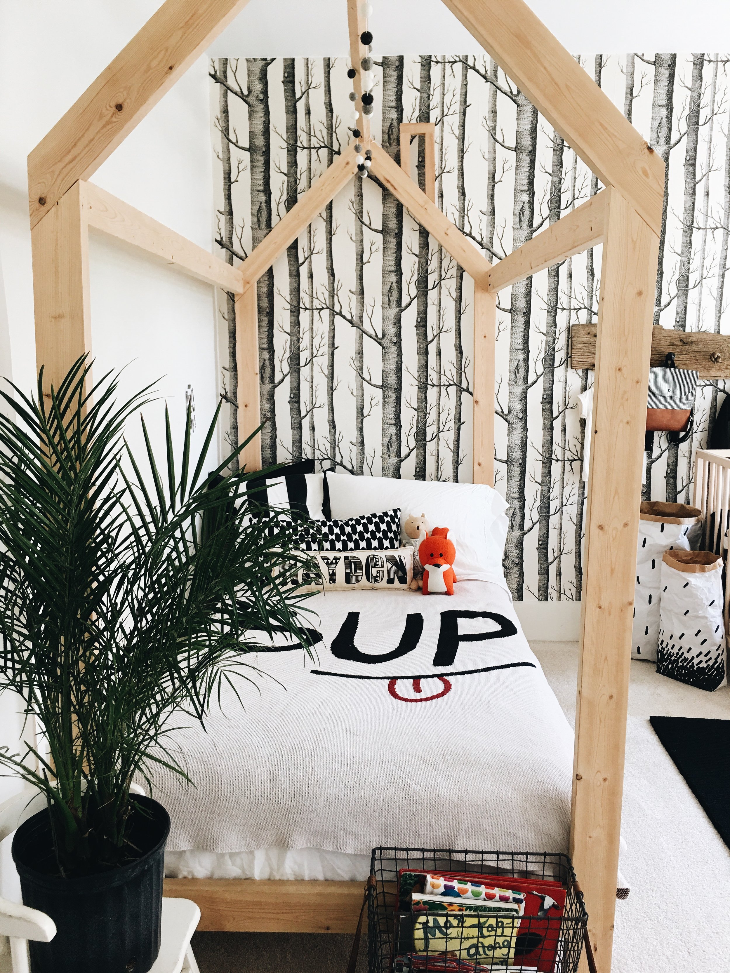
Now, Lindsey is raising two beautiful babies in the Northwestern Ohio country. So next, let's look at the bedroom these kiddos get to grow up in. I wish I could use the written word to adequately describe my envy. Not that my mom didn't do a great job decorating my childhood bedroom (in case you're reading this, Rosemary...) BUT this room screams 'Be a kid! Explore! Play!' Color me jealous... 

In the boys’ (Hayden’s) room, my favorite piece, hands down, is his bed. My husband and my father built it together with their own hands, just for our sweet Hayden. There’s actually many hand made pieces in his room and I think that’s why it’s my favorite room in our house.
I think our styles are always evolving. Since having our two boys, I have had the biggest urge to purge and to simplify. I found myself thinking, why spend time cleaning up after all of these ‘things’ when I could be soaking up this precious time that I won’t get back with our children. It’s played a huge part in finding my style.

I think you'll all agree with me that Lindsey has found her style and is sticking to it. Finally, let's take a look at her master bedroom. 
Now, everyone has their own opinions of color. I almost think about it in the same way that I consider extroverts vs. introverts. People just recharge in different ways - by being alone or with others OR, in this case, by being surrounded with colors or calm neutrals. 

I really wrestled with the decision of leaving the walls white, or giving them a pop of color. Something about the white walls gives me a sense of calm, and as a stay at home mama, this is something that is so important for my overall mentality. The extra sunlight shining through our home and reflecting off the walls is sure to give us all something to smile about throughout our day. Finding what makes you happy is key.

Lindsey, I applaud you. You're an awesome mama, and you've made a home to serve some seriously important purposes - inspiring your babies, encouraging your family's peace, and giving yourself a place to recharge. We tip our hats! 

Follow Lindsey along on her blog, Being Badenhop, or on Instagram for more decor and life inspo. And Mutts, remember, you too can have your home featured - just drop me a line at mckenna@stylemutthome.com