Reader Design: Bri's Cali Cool Home

It's Friday!! Finally. After what feels like the longest week. I don't know about you guys, but I am in serious need of a good vacation. 

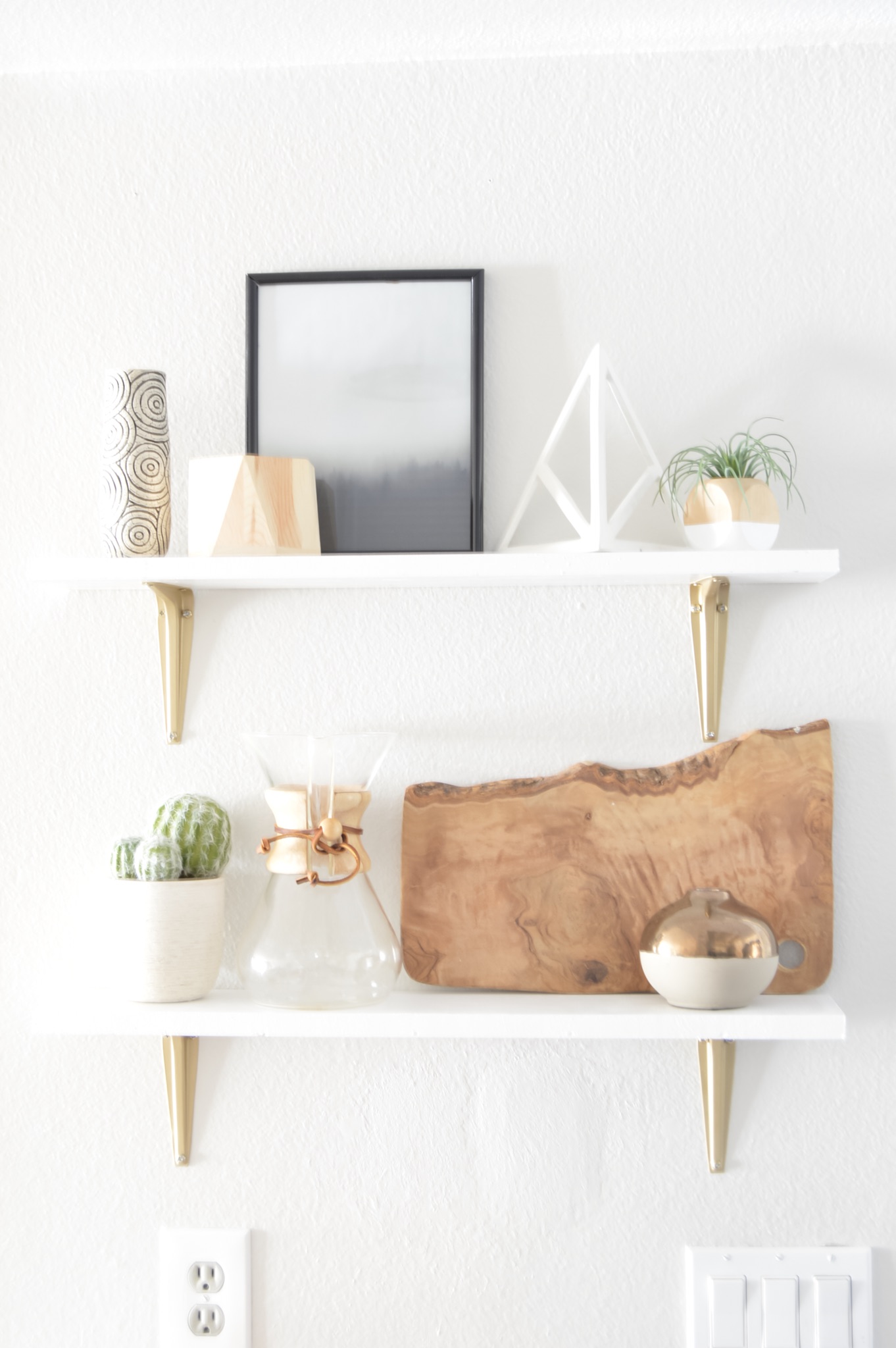
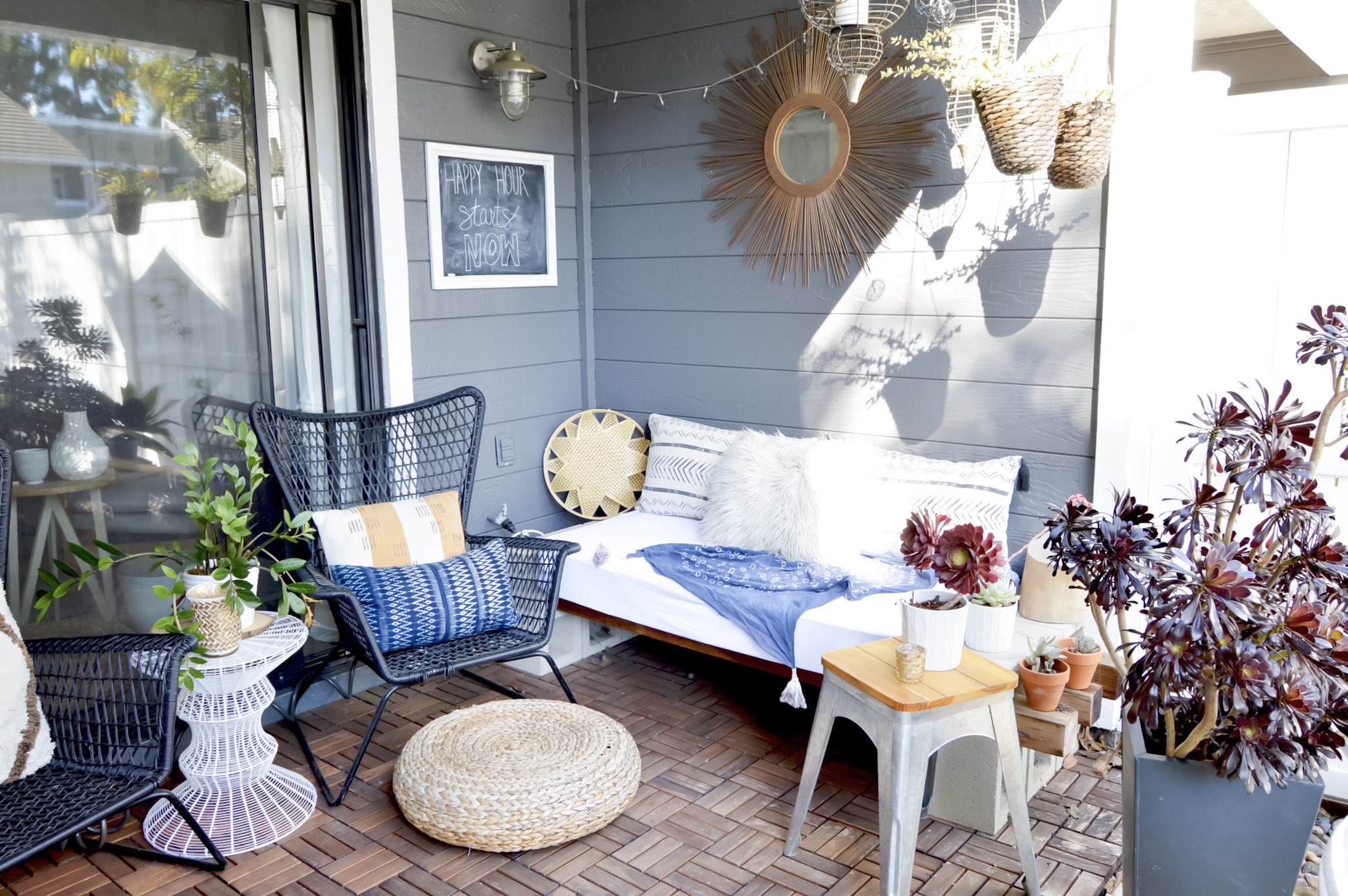
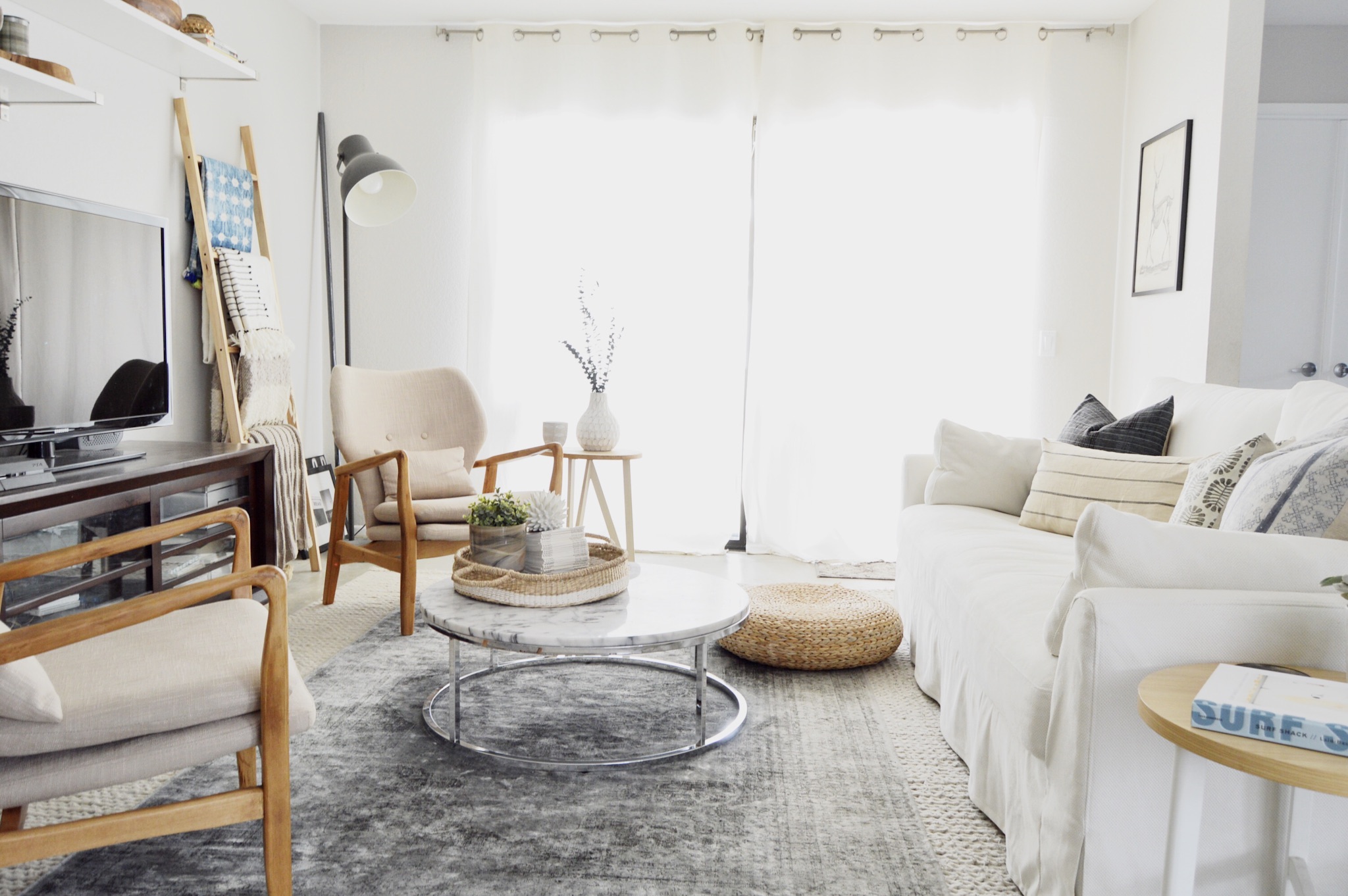
Thankfully, today we are touring Bri's Cali cool home; right in the middle of Southern California in a little town called Aliso Viejo, every day just has to feel like a vacation for Bri right? Her home is certainly relaxing enough to make you think so! 

What you wouldn't necessarily guess, though, is that this open and airy space is also home to Bri's husband and two children. That means that functionality is right up there with appearance. 

From Bri:

I want our home to be comfortable because we have two children, but I also want it to look rad. Many of my textiles are vintage items that have already withstood many years of use, so I feel pretty confident that they can handle being used in fort building and pillow fights. I’ve recently switched to a lighter color scheme in our main living space because I wanted it to feel light and bright even though our home gets very poor natural light. I love mixing wood tones within my home too because of the warmth and sense of comfort they can exude. Overall, I just really want our home to feel like you can kick your feet up on the furniture, because we are fine with that...maybe take your shoes off at least since we do have a white sofa, but nothing is too precious.

That means that Bri decorates by being, in her words, "a little bit of a lot." She mixes lots of styles together, in small increments so that one aesthetic doesn't overtake the whole space. She also mixes and matches when it comes to price points, pairing pricier mid-century finds or local textiles with flea market steals or Target items. 

In the dining nook, that meant Bri flexed her creative muscles to add doors to Ikea toy benches - a simple change that gets big functionality and style points! 

And the style keeps right on going into the bedrooms. 

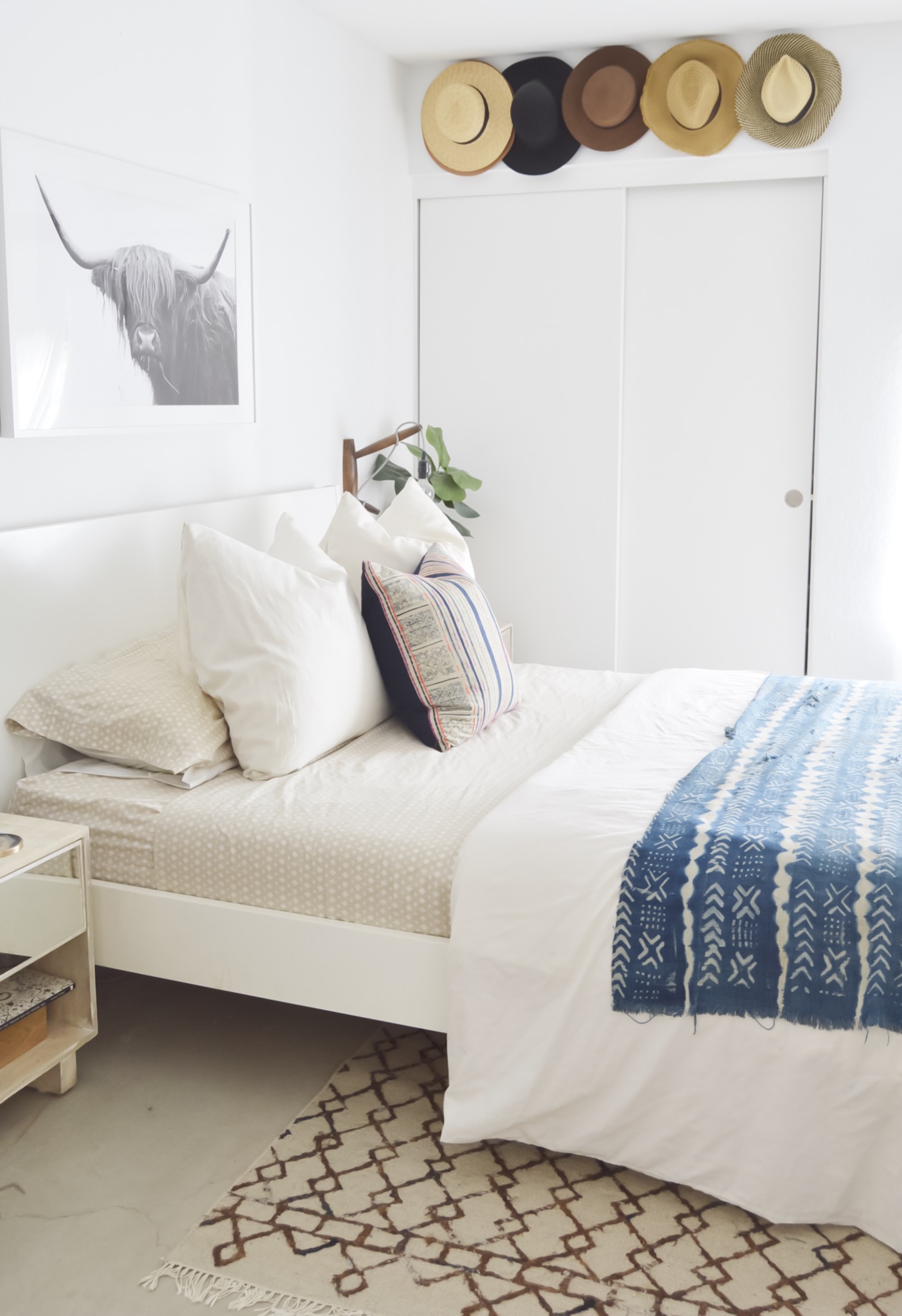
In our bedroom, I have to say I love my hat wall. That may sound so silly, but I truly just love the warmth the shades of brown add to the room and that they also serve as wall decor. It’s a simple storage solution that makes a big impact.
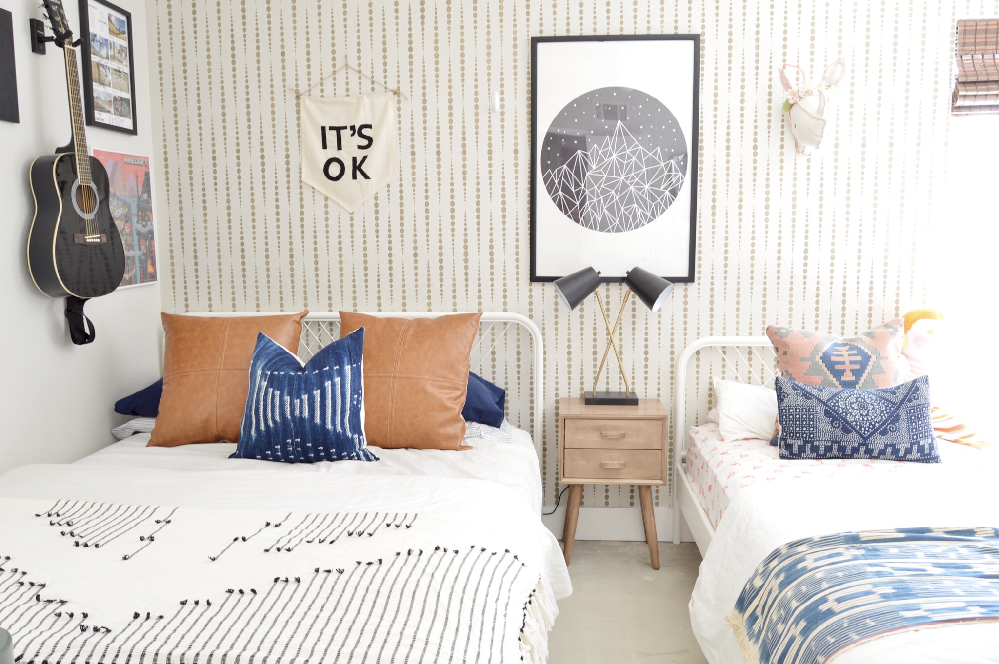
In my kid’s shared room I love their accent wall that I stenciled. You can see this wall when standing in our kitchen, looking through the living space so I knew I wanted it to standout.


Bri, thank you for showing us around. I have just one final question for you -

When can I visit? 

Follow Bri on Instagram @brimoysa for more, and I'll see you all next week!
Reader Design: Kathleen's Impeccable Emerald Accents

I have a question for you.  What's better than a Friday?  How about a fall Friday?  Nay - how about a...  

Fall Friday RD.jpg

As Chelsea posted about here and here, we are keen on green this season. Well not only do we have a stunning home tour courtesy of Kathleen from Lindsay Hill Interiors for you today, we have more of our favorite trending fall color: emerald.

From Kathleen:

I would describe my style as crisp, clean, and cozy. I love in a small and cozy much more than big and ornate! I love using white backgrounds and adding interest with pops of color and with wood and texture. I always add something vintage, or antique, or a family heirloom to every room. I think old things have such charm and character, and they help keep us connected to our past and to those we love.
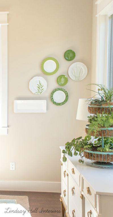
[This is my] dining area with plate wall and old buffet that I painted. I don't love my table, but I'm making it work for now! Also, I removed the inner drum shade lining from the chandelier so the crystals could sparkle.
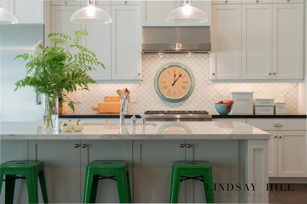
The Kitchen is my favorite room in the house! I have a thing for white kitchens, and I love adding pops of color to them.

Would you look at those excellent green accents people!?

I snagged this vintage tin canister set at a local antique shop. It's become my favorite kitchen accessory!
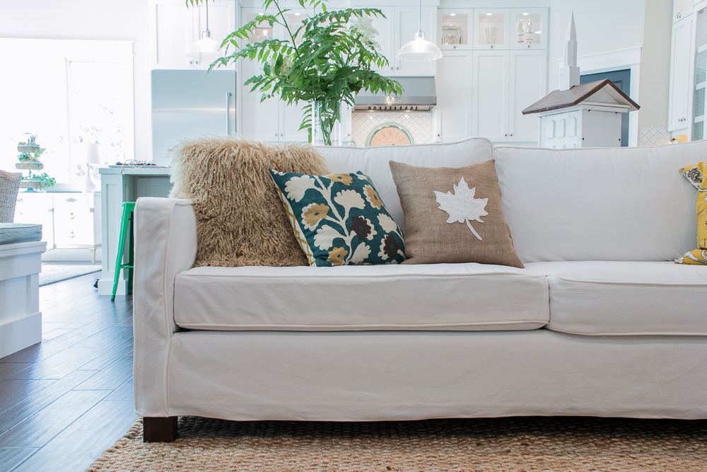
My kitchen, living room, and dining area are all open to each other. This sofa, though a nice quality, was a boring brown tweed. I decided to sew slipcovers for my living room furniture (crazy idea, since I had never sewn a slipcover in my life!), but I love how they turned out and how they tie all those open areas together now.
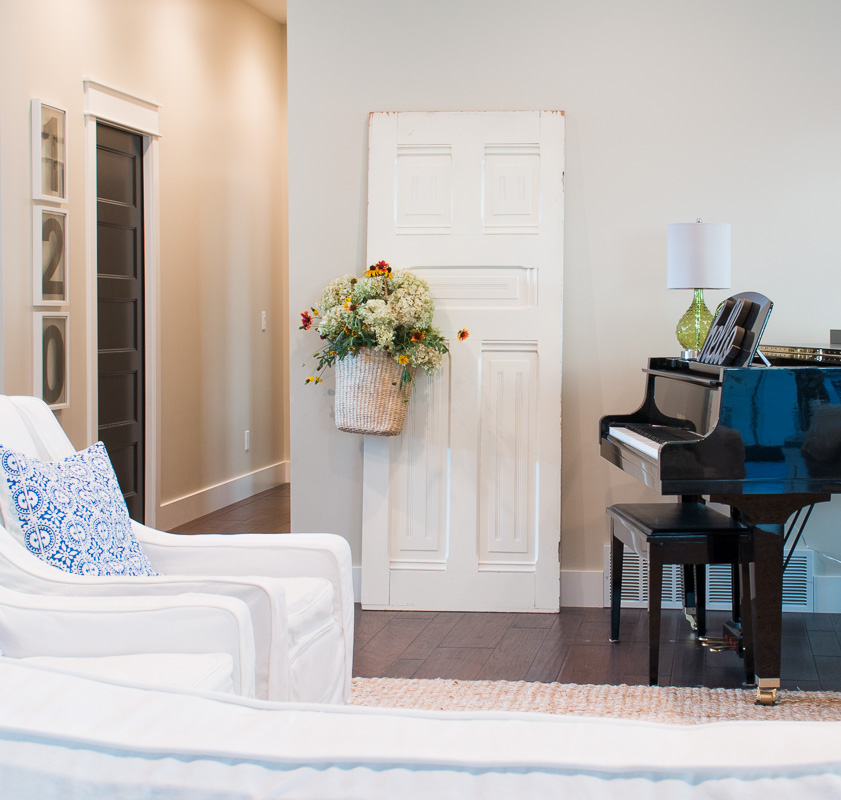
My husband thought I was crazy when I dragged this old door into the house (he still thinks I'm crazy!), but I love using it for seasonal decorating.

I have one of those myself Kathleen [both the decorative door and the less-than-thrilled husband].  Decorative doors unite!

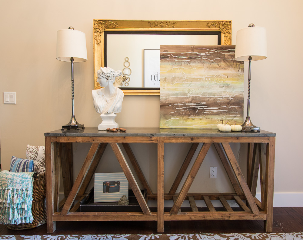
This slate topped entry table is perfect for little vignettes, and to hold my white-headed lady.
This little settee [in the entry] also got covered in a white slipcover. In fact, I started my slipcovering experience with this settee, which was probably a mistake since it was the curviest of the pieces I covered!

Ok well you can't tell this was your inaugural slipcover Kathleen.  And how chic and fun is that typographic wall art and those touches of brass?!

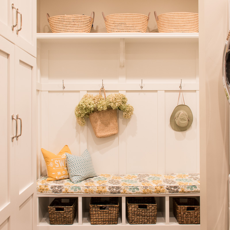
I love the built-ins [in the mudroom] for hiding all those not-so-pretty necessities.
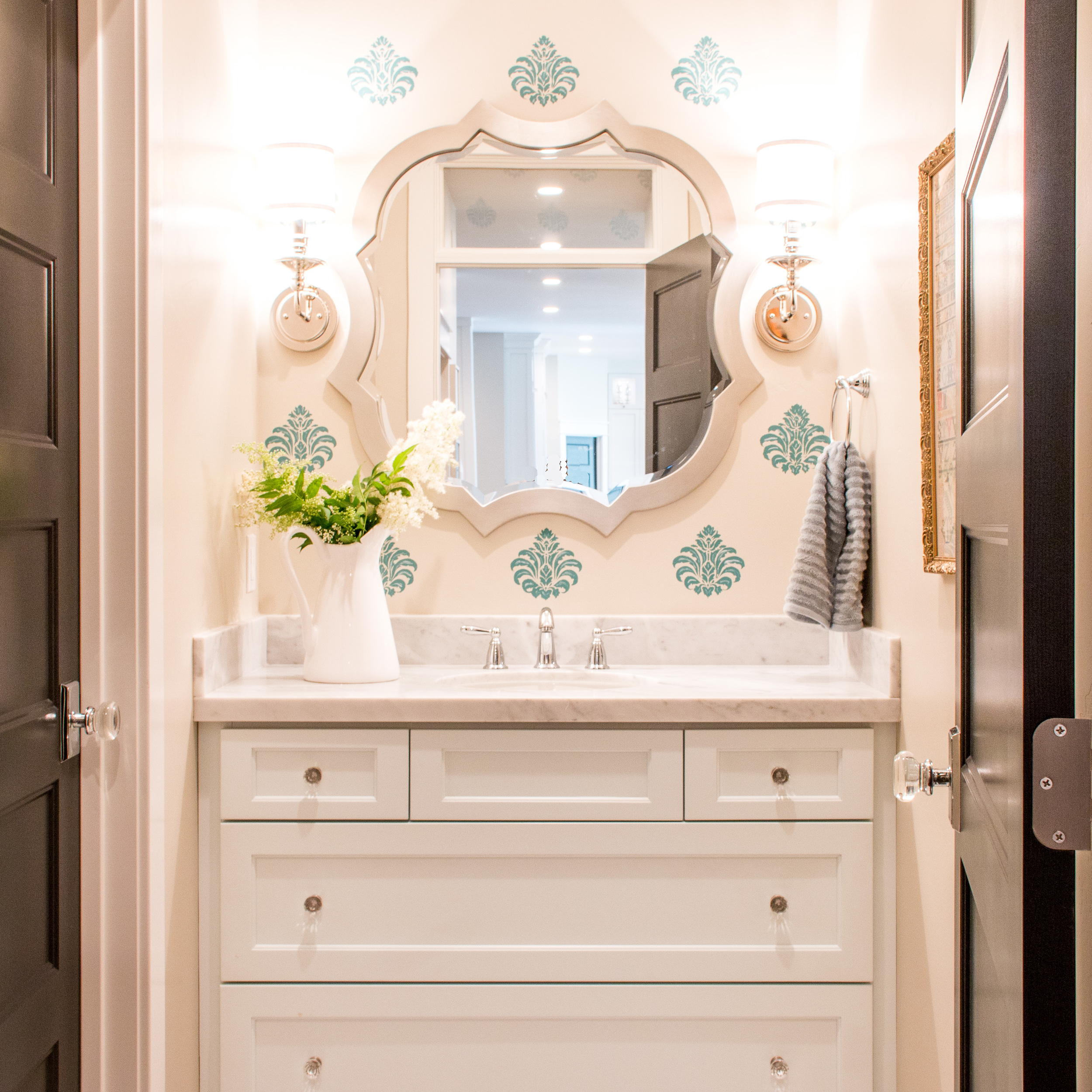
I originally wanted wallpaper [in the hall bath], but when I priced out the one I wanted, I just couldn't bring myself to spend the money. So I went to my local dollar store, bought a cheap stencil, and this is the end result. I love how it perks up this space.
My office is my happy room where I do my creating.
This [master bedroom sitting area] is where I retire to before bed to read, browse IG, and relax.
I love the feature wall behind the bed [in the master bedroom] - it adds a lovely tailored touch.

Thank you so much Kathleen for this incredible gem of a home tour!  And if you are not in on this already, be sure to follow Kathleen @lindsay_hill_interiors for more STUNNING home decor and design.

Want to see your own fall tour on our SPACES page?  We do too!  Tag your your home pics with #stylemuttspaces on instagram or post directly to our Facebook wall.  

Reader Design: Lindsey's Paint-Perfect Updates

I am particularly tickled over today’s #stylemuttspaces feature.  A while back, fellow CNU alum Lindsey asked me over for a re-upholstery consult by sending me this photo:

Obviously I knew I just HAD to share her home with you and boy-oh-boy are you all in for a retro treat!

From Lindsey:

Andrew and I bought our first home in June 2014. We got a great deal on a lovely 1970s townhouse because, well, it didn't look dramatically updated past then. Carpeted stairs, carpeted bathrooms, gold glitter seashell sinks--oh my! We have lots of down-the-road dreams for our new home, but for the time being, paint is the upgrade we can afford. And paint alone brought things a few decades into the future :)

The Before

The After

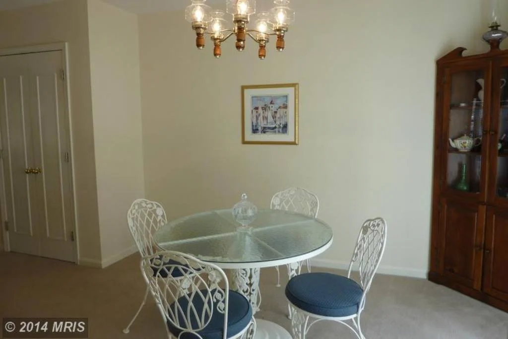
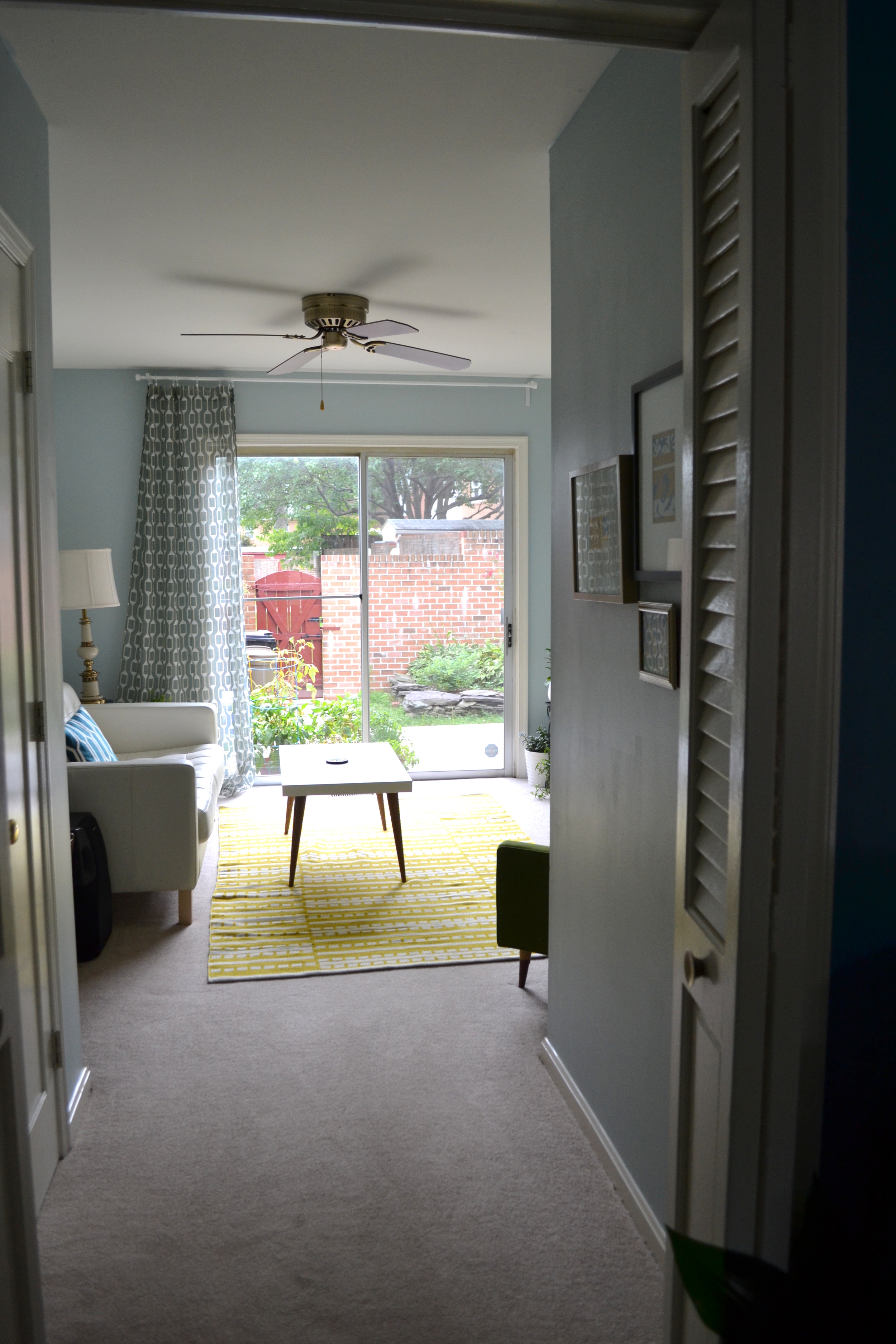
The Lounge [is] the small room adjacent to the kitchen is the dining room. The living room at the front of the house is spacious and sunny, and was a much better size our grandparents' dining table. We swapped out the wooden chandelier in the original dining room for the ceiling fan from the living room to better suit our sitting room. But as we compiled our hand-me-down lamps, chairs, and turntable, the room became an undeniable retro lounge. 

Before & After


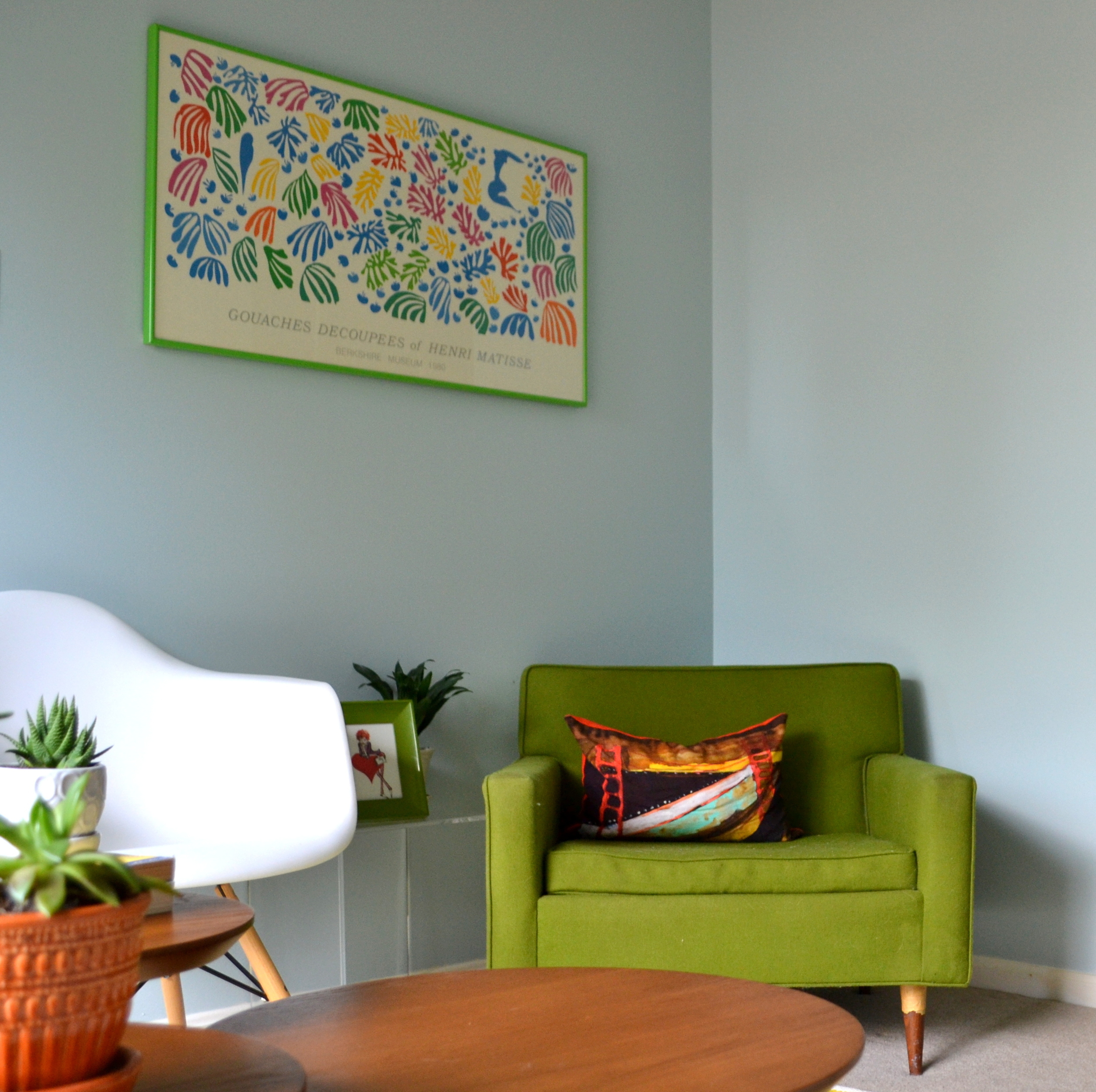
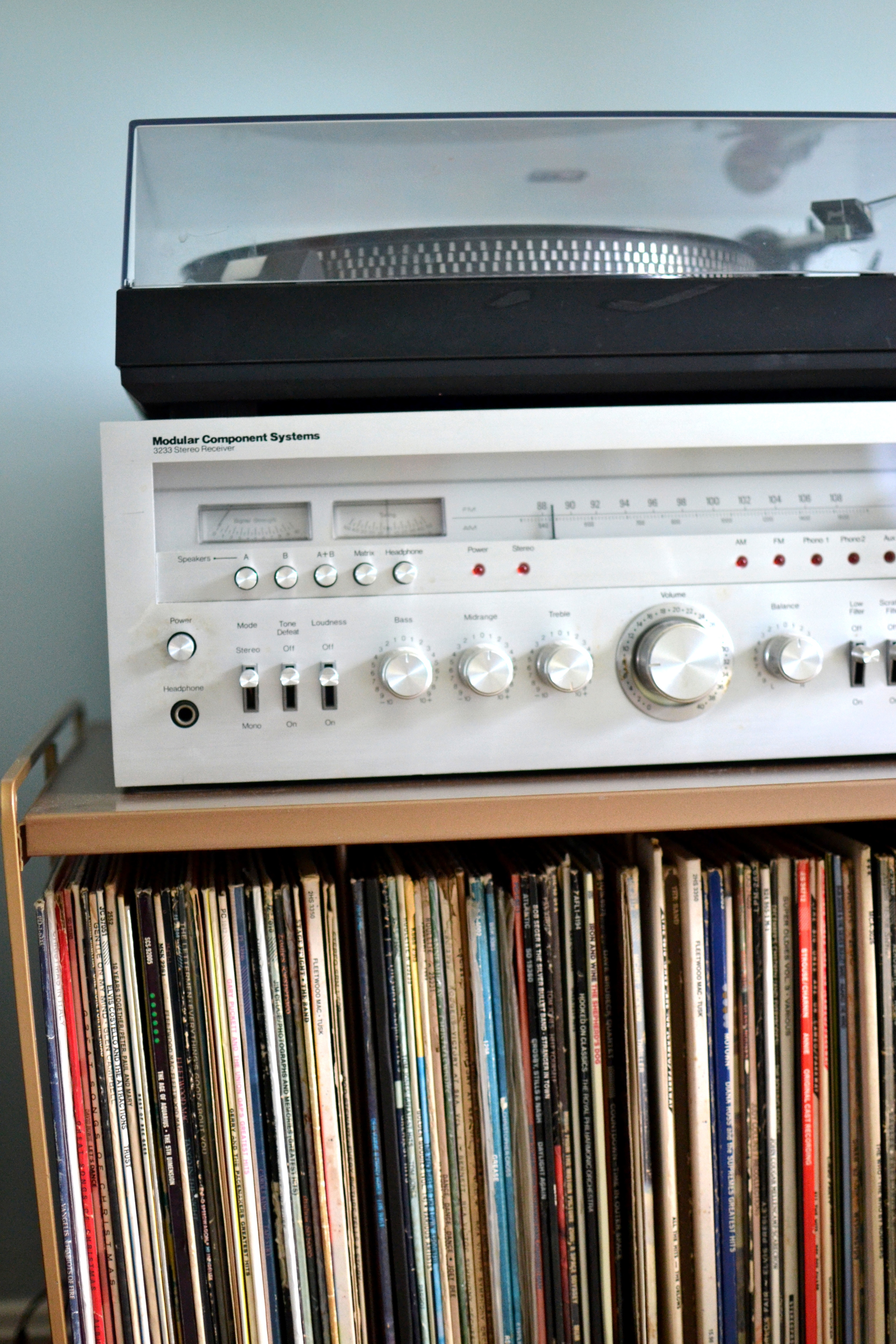
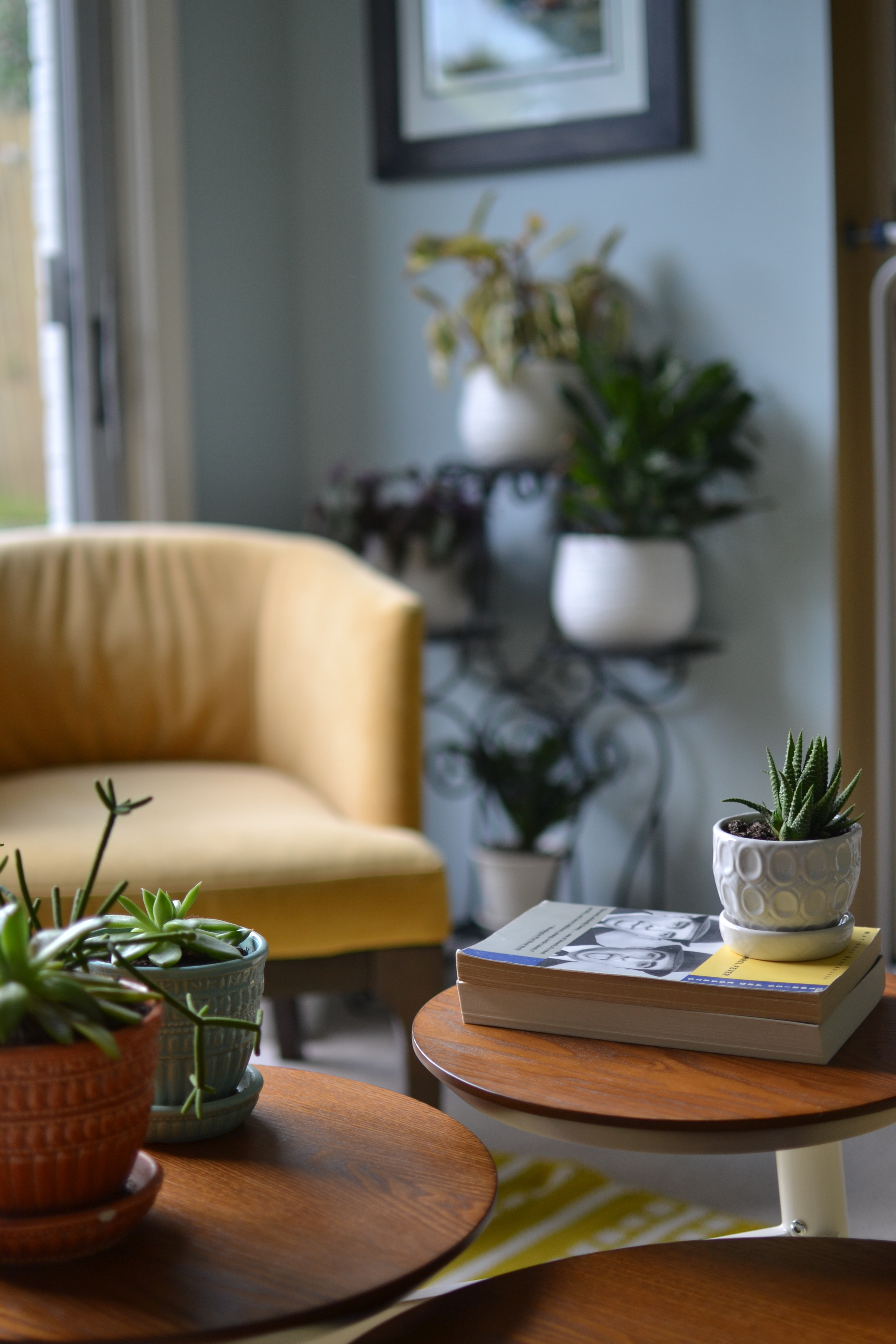
Lindsey’s house is full of authentic-retro personality and she is constantly evolving it’s retro-liciousness.  Since setting up when the family (Lindsey, husband, and dog Hannah) moved in, she has cleverly swapped out her lack-hack coffee table for this awesome West Elm clover one and updated her IKEA end table and couch with custom tapered legs from tablelegs.com.  Brilliant!  She’s completed the room with unique family pieces: a brass record stand (Lindsey’s mom’s from childhood), her parent’s original Stiffel lamps (circa 1970s), Grandma Peggy’s mod green lounge chair, and Grammy’s orange and aqua succulent planters.

I love the high end look of the white eames-inspired chair and acrylic side table juxtaposed with the mod green lounge chair.

Both Lindsey and her husband Andrew are fans of Henri Matisse, so when they found “The big Parakeet and the Mermaid” Matisse print in antique store in Delaware it was a no brainer.  Plus it was framed in Belvedere Square, Towson, Maryland (just near where Lindsey and Andrew got hitched!) and it was only $20.  BOOM.

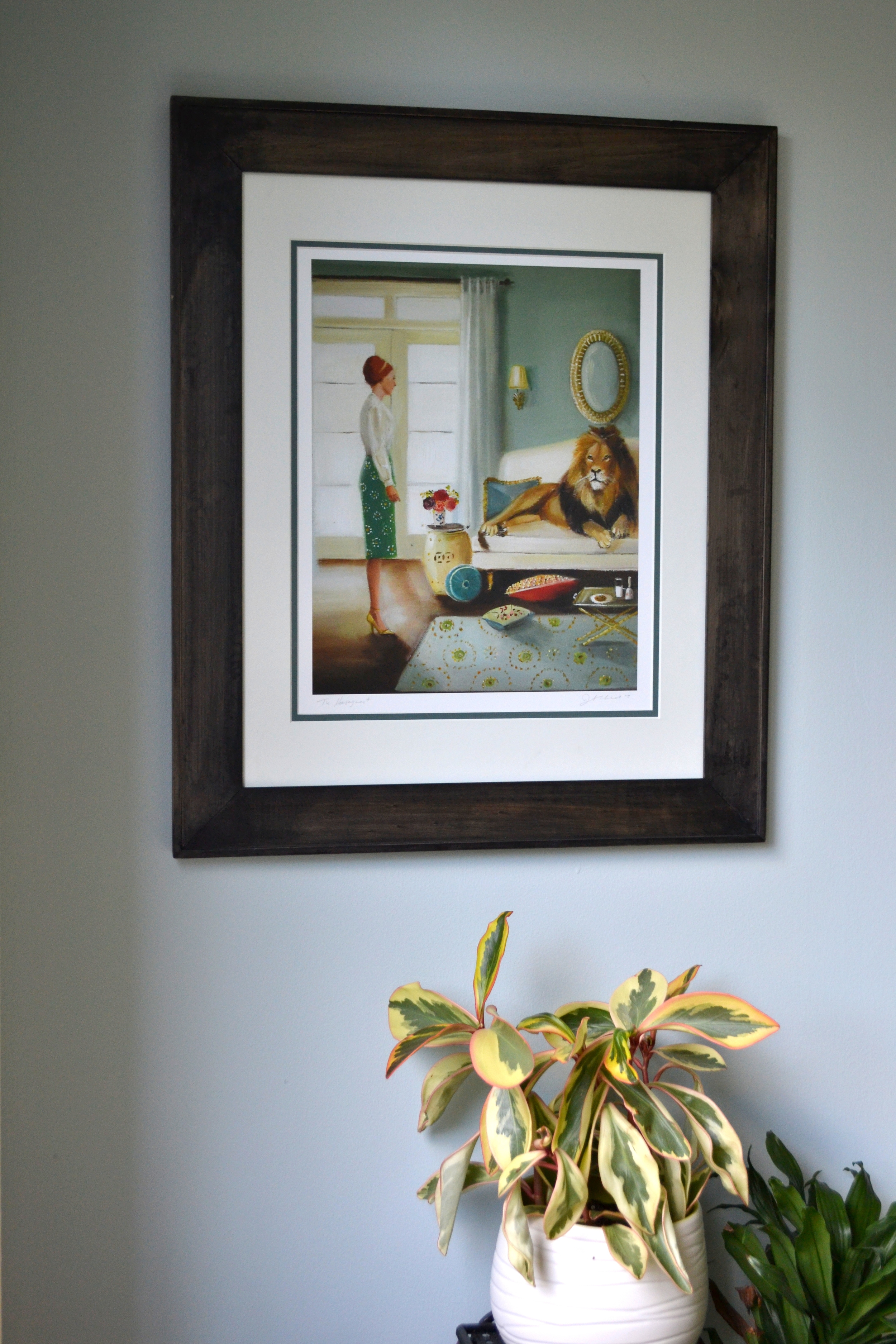
Lindsey’s other art is a combination of other Matisse prints from the Moma exhibit, prints from used art books, postcards from vacation and quirky prints that make her smile like this Etsy find, “The Houseguest” by Janet Hill.

A record collection to swoon for wouldn't you say?

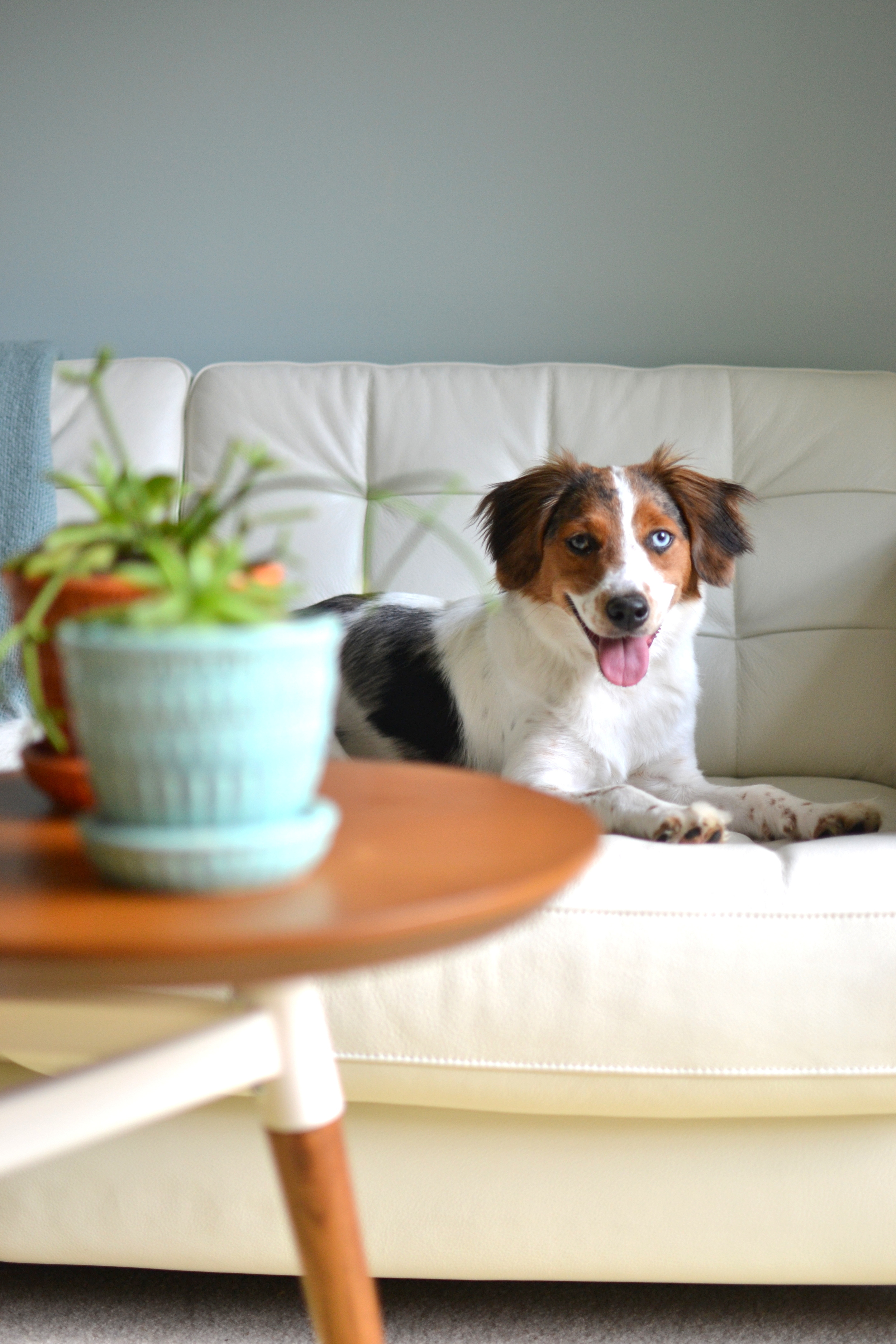
That slate blue wall color really plays up the sunlight (and Hannah Girl’s intelligent icy blue eyes).

I love the combination of the Crate&Barrel Bucato Yellow Rug, warm wood tones, olive upholstered chair, and little pops of redsy oranges!

Every corner has a story: Lindsey bought this “Wild Thing Your Make My Heart Sing” wooden clock from a whimsical clockmaker in Kalispell, Montana when she was 15.  

I asked my parents to hang onto it for me for when I got married and had a house one day. Grateful my taste has not changed too much! Sure enough, they held onto it for me and Andrew and I adore it. It's such a fun pop of red in the lounge.

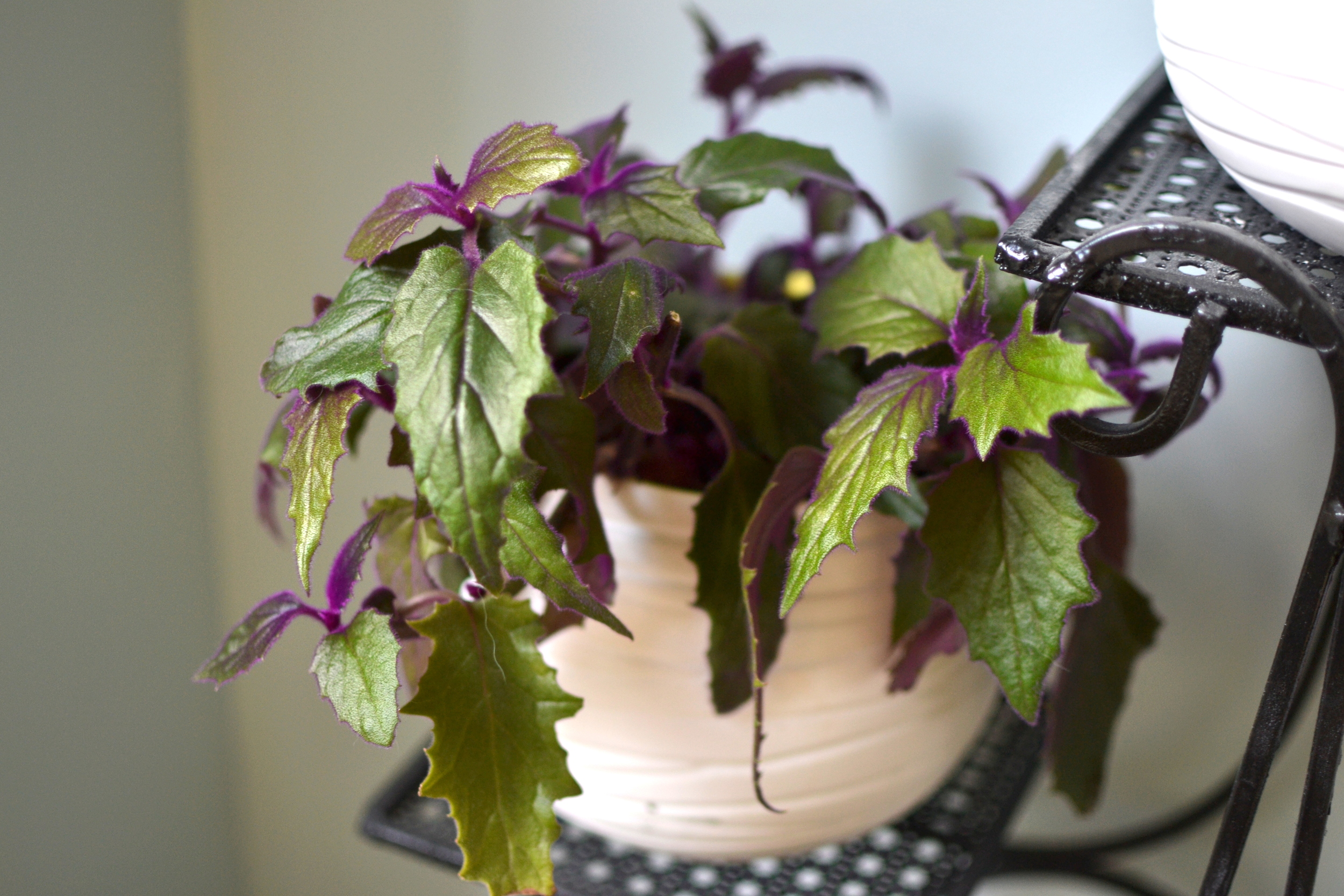
The iron plant stand in the corner is an antique find which Lindsey updated from a white worthy of “Grandma’s porch” to a sleek black.

And the transformation doesn’t stop there.  Lindsey deploys her secret weapon (a coat of paint) in the basement powder room for amazing impact.

The Before


You can see the before, carpeting on the floor, medicine cabinet protruding far into the room, full length towel bar (why??) and porcelain toilet paper holder. We pulled up the carpet (Which, it turns out, had not been glued down) to find simple tile in decent shape. 

The After

A little paint plus some Andy Warhol art of my childhood boyfriend (Elvis, I'm an old soul, what can I say?). The bathroom has a very low ceiling, which stumped me, since I dreamed of a bright red bathroom next to our basement movie room. I found a creative compromise by painting the low ceiling a soft white. Though we still have the same sparkly sink, the fun pop art is a nice distraction in the meantime ;)

 Paint Colors: Behr's  Ballet White & Allure || Andy Warhol's Double Elvis Poster || Double Han Solo Print || Poster Frames: Michaels

Rug: Target  ||  Freestanding Toilet Paper Holder: Target

Guys this doesn’t even cover half how awesome the rest of Lindsey’s house is.  Give her some extra love and maybe, just maybe, she’ll let us share some more ;)  Thank you Lindsey for opening up your home to us and showing us the amazing wonders a little paint can do! 

Don't forget we are always looking for more readers to feature on Fridays.  You don’t have to be a world renowned designer to get some real estate on our SPACES page – you just have to love your home and want to show if off.  Post your proud pics to our Facebook wall or tag #stylemuttspaces on Instagram.