Boston's 'D Street' Reveal!

Hello again! My last post was ridiculously text heavy so I won't waste time with too many words here, but I just want to say thank you for all of your incredibly kind words of encouragement for Cate and me as we pursue new and exciting challenges with our work here at StyleMutt Home. Your words lift our hearts so.

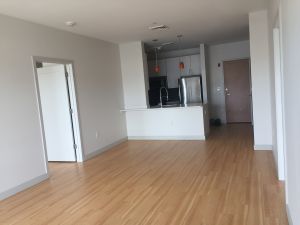
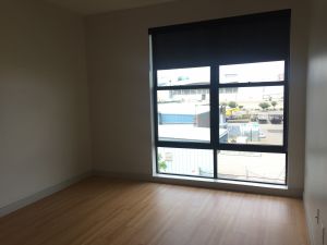
I'm really excited to dive right into sharing some of the units I've been working on with Sonder, (see this post for details on my new freelance position)! I've completed 7 units since mid-July and am looking forward to seeing more of them photographed and listed! The work is completely digital - they send me a floorplan with measurements of the space, and sometimes, if I'm lucky, pictures of the space as well! A lot of times there are still renters in the units so I don't get listing pictures, but with this unit I did!

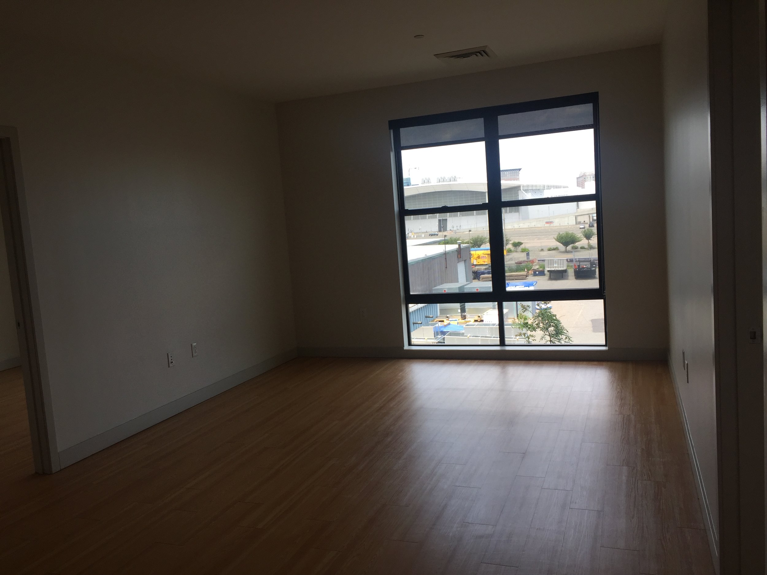
I won't even try to hide how much of a nerd I am for factory windows - factory windows, interior brick, and unfinished warehouse ceilings are probably my top three favorite architectural elements in a home, so getting to work on urban condos and apartments is an awesome fit. And doing this unit in my favorite city of Boston was another big perk! I lived there for 6 years and it's one of my favorite places in the world. Go Sox!

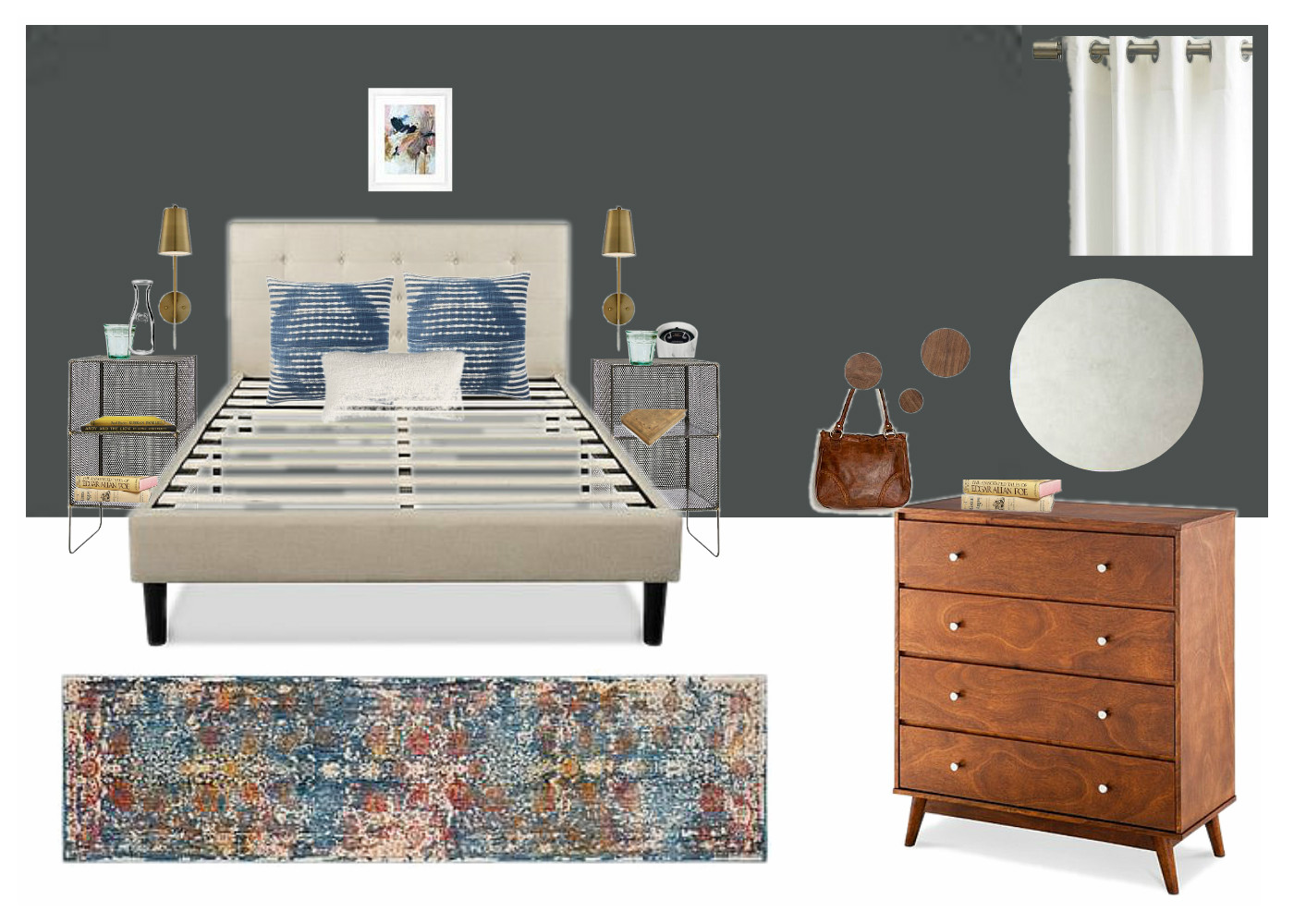
So after Sonder sends me the floorplan and any pictures or video tours they may have of the unit, I start a Pinterest board, (just like we do with our clients)! Unlike client boards, however, I keep my Sonder boards public. So if there's anything you see that you're interested in, you can find it all here on my Pinterest! I create a different Pinterest board for each unit and use that to save inspiration and pieces. Sonder always gives me a very strict budget, (right to the cent), a 'turn-in' date of when they need the design completed, (usually around 2 days), and a 'need by' date of when they need every last item to ship by, so I need to make sure every piece can be delivered on time! Below is a sample of the board I used for today's apartment!

IMG_9291-2.PNG

After pinning the main furniture pieces I want to use I then create a floorplan based on the measurements Sonder sent. When doing eDesign it's absolutely imperative that you understand the space you are working with, right down to the inch. I'm getting MUCH better with my floorplans, but have definitely been in a position of asking whoever is on the installation end, (clients, or Sonder operations), to squeeze this way or that or try to explain a new layout. Not fun and totally embarrassing. Floorplans are priority!

Floorplan.jpg

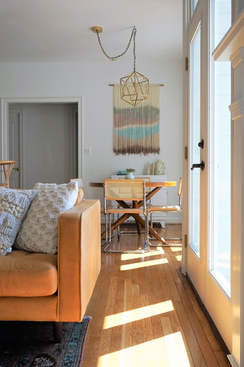
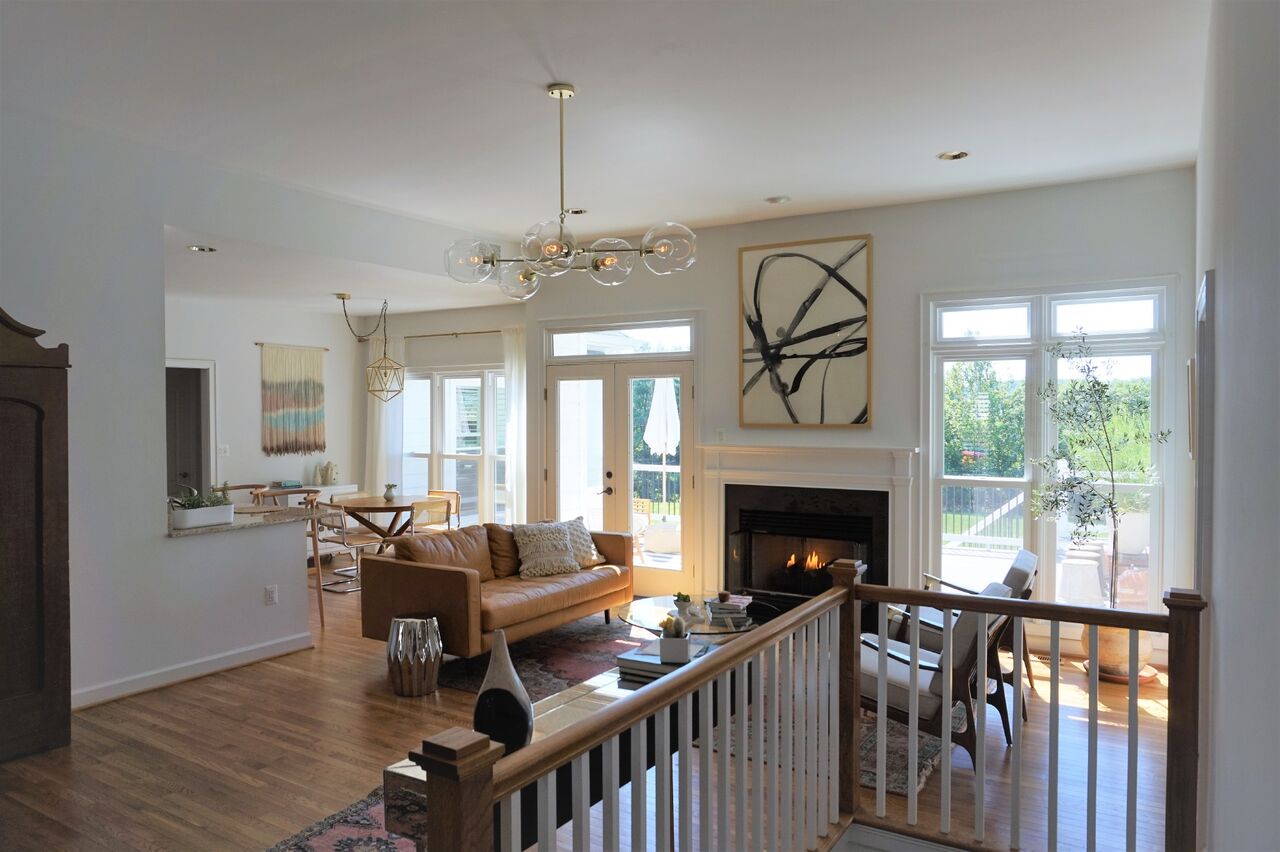
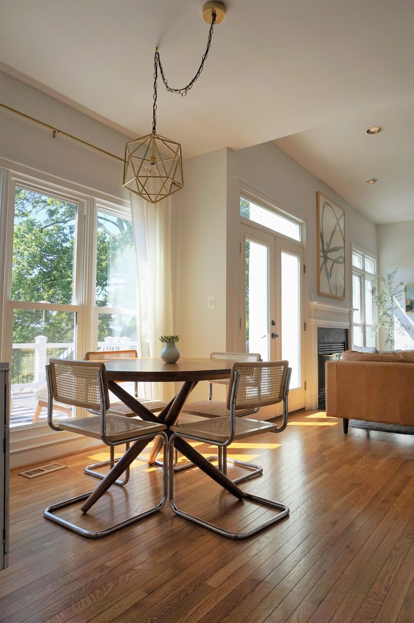
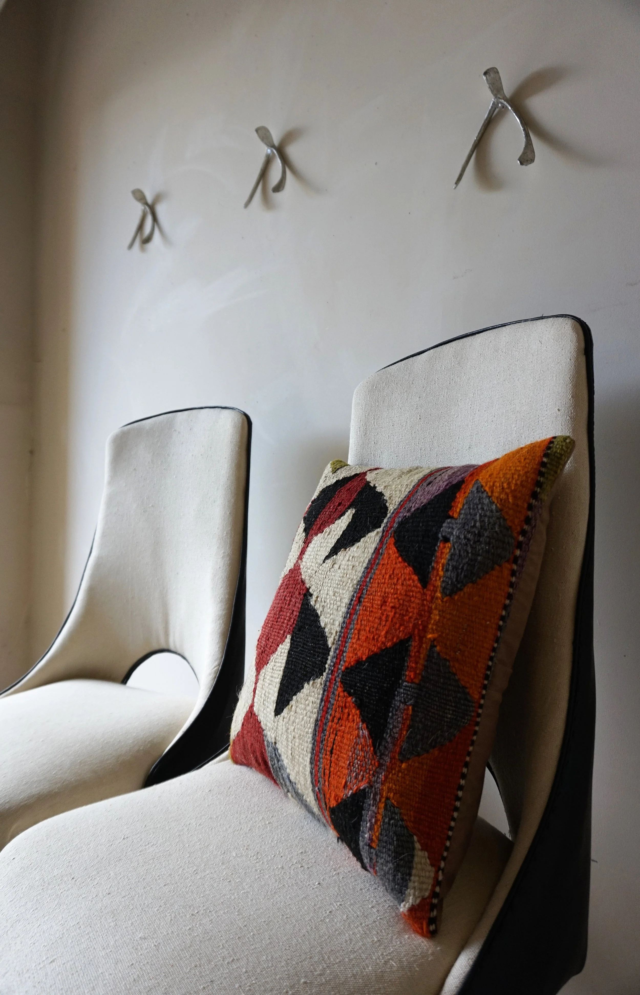
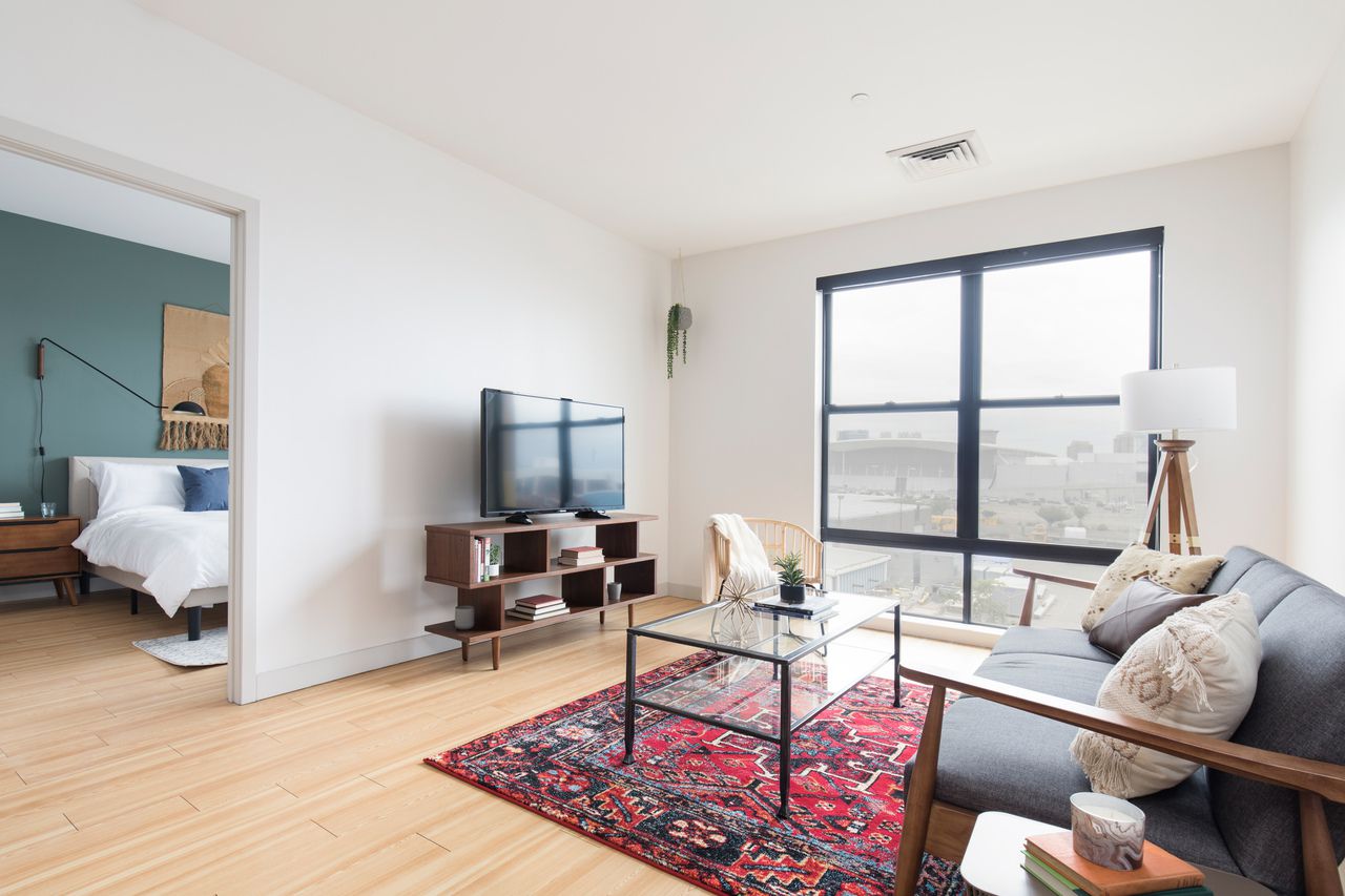
And finally I create the design boards! I typically make one design board per room in the apartment, (unless the layout is wonky and I need to show some super specific styling or layout details). Below is the design board for the living room, and following is the living room in completion!

1.jpg

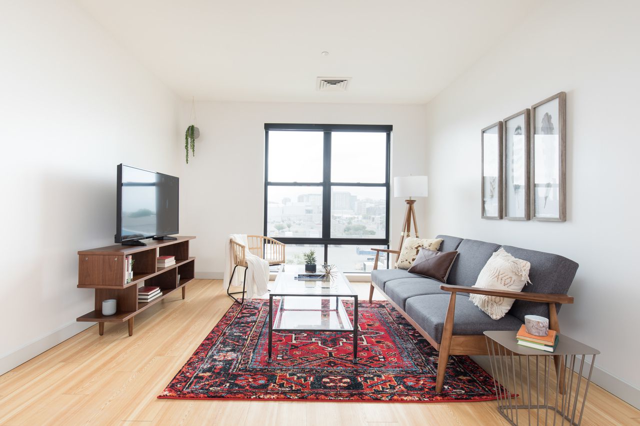
For some reason they did not use the gorgeous Rose Swiss Cross engineer print I had sourced from our dear friend Vol25, and yes, I am taking it personally. Hah! I had chosen that for my closeted infatuation with red and pink, as well as the lovely contrast between the dusty pink and the cow print. Oh well. I don't love the feathers but I can move past. Shall we?

2.jpg

Other than that Rose Swiss Cross print, it's crazy fun seeing every other last detail implemented exactly as I had presented in the design, (even the books). So cool!

5.jpg
6.jpg
7.jpg

Bedroom 1: We've had the opportunity to work with two clients this year who wanted sage green walls in their home. While the specific direction with style and color scheme was unique to our clients, I had a little fun of my own in this room with sage green. Here is the design board followed by the real deal:

OB-CHI Sonder DSTR320 Bedroom 2.jpg
8.jpg

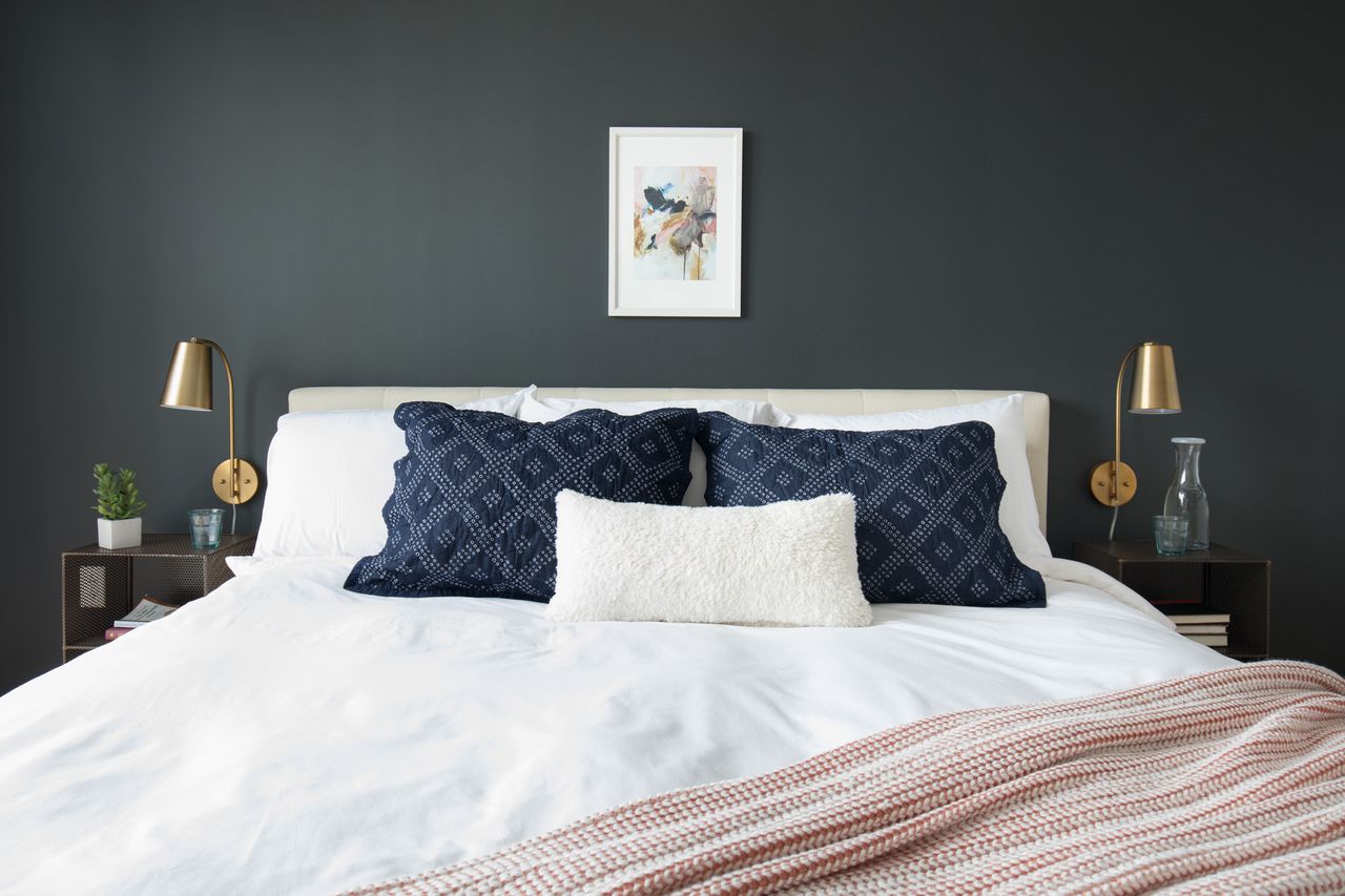
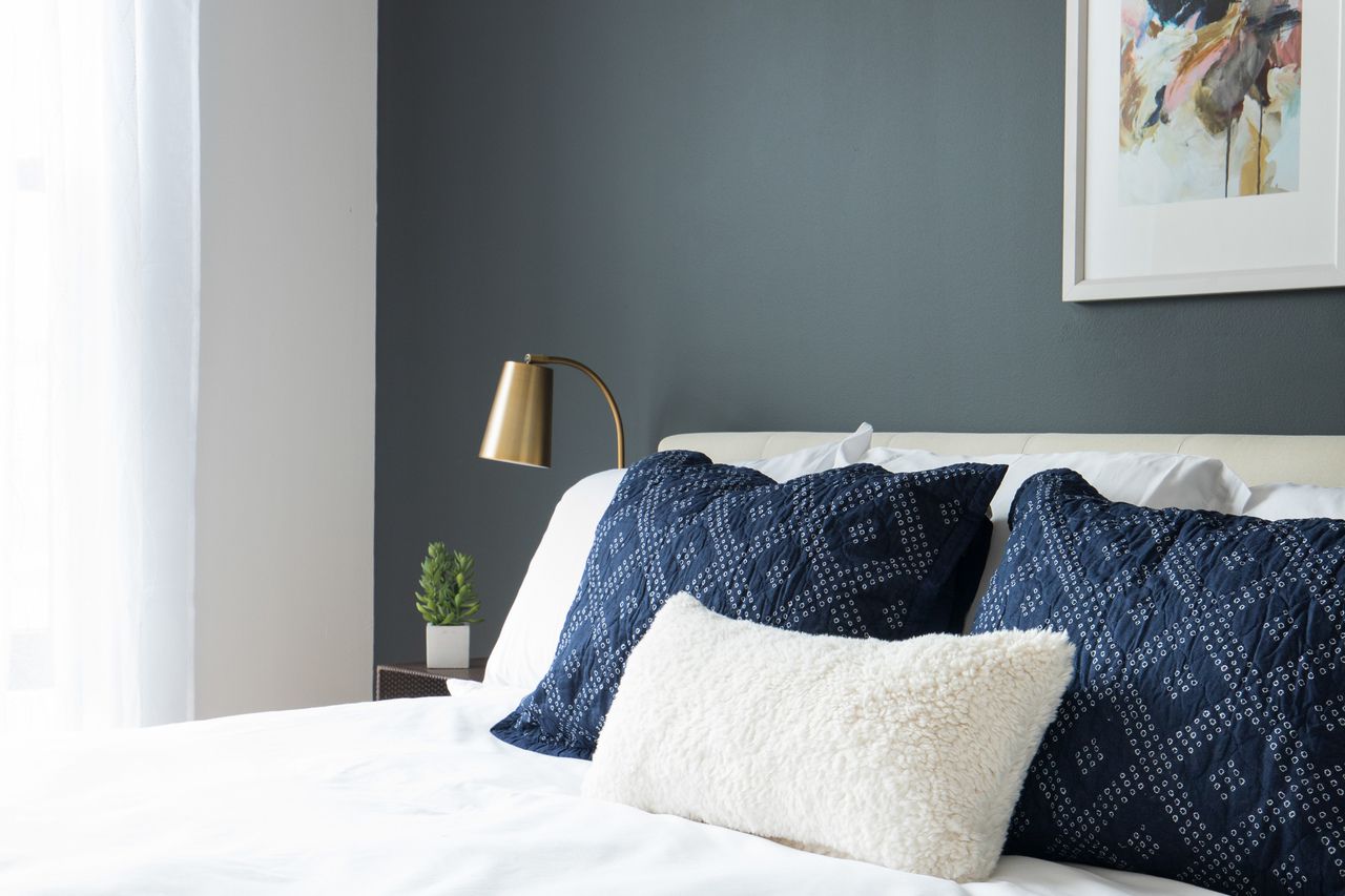
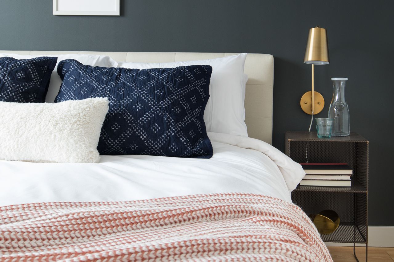
No, your eyes aren't playing tricks on you, they switched out the black mudcloth pillows for these dusty blue ones....but I'm not sad about it. They picked a really earthy, dusty blue, which I think goes well. Otherwise, the room represents the design to a 'T'!

10.jpg
11.jpg

Bedroom 2: Same feel, different route to get there. Design board followed by the completed space.

OB-CHI Sonder DSTR320 Bedroom 1.jpg

One thing I forgot to mention! All beds get dressed in 'hotel white' bedding, so I don't ever do comforters, duvets or sheets. So I try to pick beds, pillows and throws, (as well as overall room colors), that will go with crisp white.

13.jpg
14.jpg
15.jpg
16.jpg

A huge thank you to the folks I will never meet who worked on installing this space for Sonder! It turned out just as I had imagined. Except for the Rose Swiss Cross. :)

Til' next time! Thank you all so much for coming by today!

Chelesa.jpg

eDesign Reveal: Dani Barbe's Great Room

Hi friends! We hope you are all enjoying your Summer, wherever that may be! We've been so ridiculously excited to share one of our favorite eDesign projects so far that we picked up in the early Spring and recently finished. Today we are sharing part 1 of our amazing client, Dani Barbe's, home. This sweet lady contacted us with excitement, motivation and a completely open mind - all the makings for a wonderful eDesign adventure for us all! She is a self-made jewelry designer, (she has a collection in Anthropologie!), and to work with someone who inspires us so much has been such a gift. First up is her Great Room and Breakfast Nook, with more to come from her country side home in Frederick, MD shared with her fiance and their 'Lonny' - the most adorable french bulldog to walk this earth.

If you'd like to look back at our design boards and 3D renderings of this space before you see the entire finished product below, you can check out this post! Otherwise, come on in!

BEFORE

Fairly early on we settled into a less stuff-better stuff mentality all around. It's not overly filled but every piece was selected through thoughtful consideration of the grandeur of the room. Although the space is grand, indeed, Dani and her fiance are quite laid back and desired a space that was comfortable and easy to entertain young and old alike.

The light in this space was really inspirational in the design process and when we were faced with tough decisions, we ultimately focused on the natural glow of the space and what pieces would enhance that! Pastel colors came into play from the beginning, with mixed dark and light wood tones peppered throughout.

Both the area rug and runner for this space were ebay scores that we were definitely throwing virtual fist bumps over. Lol!

The entry way is balanced by an antiqued mirrored and brass console as well as an epic antique Craigslist find, (keep scrolling). Mixing in these unique old, (or old looking), pieces into the space, along with the vintage rugs, gives the modern bright white space some necessary grounding and storied character.

25.jpg

Ah-ha! Here is our extraordinary Craigslist find. I've truly never seen anything like this and admit I found and saved this piece in my phone before any aspect of the design even begun! I remember quickly creating a hypothetical design around this piece so I could share it with them and they could snatch it up before it was too late!!

As it goes with every design job, there are always a couple hurdles to overcome. The area rug turned out to be a bit smaller than what the seller had listed, so in order to fill a bit of awkward empty space on the side of the sofa where the sofa should have reached, we added an inexpensive mirrored accent table from Urban Outfitters. It balances the mirrored console beautifully and adds a touch of reflection to the darker side of the sofa!

On to the dining nook! Serious confession; I've been waiting for just the right opportunity to use a custom made fiber piece from Designs by Filia, who's work I've been following for a while. I don't know how she does what she does, but she's amazing at doing it! When we selected just the right furniture pieces for this spac and the light fixture, it just needed one final statement. Since we decided to forgo a rug in here, I really wanted to bring a touch of color and texture up the wall - and our opportunity was born! We worked closely with Filia to pick just the right colors for this space and she just knocked it out of the park! As I mentioned earlier, our focus was to maintain the natural glow of this entire space, and this piece does that so well.

When we mentioned that a tree of some sort would be ideal in this far corner, Dani mentioned that she had her eye on an olive tree. Little did we know what a green thumb she had - when we arrived to shoot this space we got to see all the olives on this thriving tree of hers!

Minted art for the win, folks. The black and white watercolor over the mantle is Minted as well!

Two of our most clutch finds were a StyleMutt Home team effort - McKenna nailed the art for over the mantle and Cate hit it out of the park with this light fixture found in Etsy shop, Intermountain Lights.

That's it for now! As you head out you'll notice this gorgeousbrass vortex fixture that gives the entry way all the attention it needs!

Speaking of attention, Lonny would love to say hello before you go.

Thank you all for walking through our latest project with us! This one was pure joy for us to work on and we thoroughly enjoy getting to share it with you friends. Stay tuned for more from this home! Hint: Green velvet, apothecary storage, raw minerals and gemstones, cement coffee table - we've got another doozie of a reveal ahead for you!

Mid-Mod Dining Chairs

Not even two weeks into the summer and somehow I managed to get my hands on some Brody mid-century modern dining chairs!  Can I get a holla?!?!  Except there was only one problem...

 They looked like this:

See that splitting vinyl??  Tres tragique!  What's worse was even the underside of the chairs had instructions on how to care for the upholstery.  Someone had seriously neglected these puppies in a past life...

I motion that they add to the *DON'TS column: "Do not give to frat house or wreckless bachelor" (which is how I got my hands on them).

Since the original vinyl was so SHOT, I  had no choice but to replace the fabric.  New upholstery challenge accepted! 

As is my usual reupholstery MO, I went with a cream linen that really lightened up their silohuettes.

In a perfect world, I would've restored the original fabric.  But the seats and the backrests were truly unsalvagable.  The back panels, however, where in mint condition so after some jerry-rigging, I found a way to keep them for a two-toned contrast.

The chairs' original swivel chrome bases were in excellent shape as well. 

The backrests had some cute keyhole detailing - which I'm not gonna lie, was one of the trickiest parts of the reupholstery project.

But those wishbone keyholes, coincidentally, inspired the unconventional staging wall-art.

And (of course), I couldn't style a chair without my favorite Kilim pillow kid (shhh don't tell the others).

Is it just me or do they look like a chorus line?  

Let's practice that high kick ladies.

If you're in the D.C. Metro area and are looking for a set of dining chairs (or even some occasional or desk chairs if that's what you're in to) - hit me up.

DSC01411.jpg

Mid-Mod Dining Chairs
Now Available for Sale
$175 each/ $600 for the set

If you are interested in this set or a custom order like it, email me at cate@stylemutthome.com.