Outdoor Living (+ ditch the mosquitoes)

Welcome to Spring in Virginia! Specifically, our backyard. Spring around here is lush and fragrant as the foliage surrounding our home fills in, and the aromatic perennials come back to life. With temps lingering in the mid 60s-70s, it’s truly a beautiful time to bring every day living outside.

When our twins were around 1 year and we were pregnant with our third, we build our deck with great hopes of spending those long days with young kids outside. We bought a cheap outdoor table and chairs at IKEA and I did indeed spend quite a bit of time with my littles out there! We played, crafted and ate our way through all the pretty days outside together. Fast forward to the kids starting school, and we just stopped using it like we used to. Partly the natural course of children growing up and starting to have their own activities and schedules, and partly, the mosquitos got TERRIBLE! At the advise of a friend we got a canopy structure with zip-up netted curtains so we could enjoy at least dining outside without the buggers. But, if you have spent any time in Northern Virginia in the last 5 years, you may have noticed how windy it’s become. Our home has survived several tornadoes despite repairable damage to our home. A semi-permanent canopy is just asking for trouble! So, now you’re all caught up on the evolution of our deck, and up until two weeks ago, this is what it had become:

Blank 2000 x 2000-1.png

It’s been a sad, unwelcoming extension of our house that we had every intention of enjoying. It was time to reclaim this space and breath some fresh life into it!

B9338949-847A-466F-8724-B0084E2BC3B2-DDC2C1DA-B483-4D7D-A05C-9F57A80C7A18.jpg

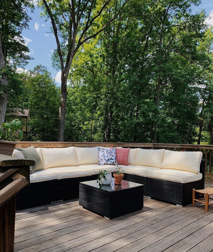
We swapped the dining furniture for lounge furniture as that just fits our family better. We have already enjoyed dining out here as a family, entertaining friends, and Albus and I hang out here when I’m getting work done during the week. The versatility of this space now is just what we need!

6B73150F-4964-4FCF-8C35-511A81B3EABF-915DA23C-D0BF-4F17-8F23-B7A55F6BAFD5.jpg

I found a few outdoor pillows at Society6 to add a little color…since I wouldn’t let Matt get the sofa in Caribbean Blue ;)

7FA555A4-5D60-45DB-B04A-BB73847B9B73-A0838BA7-2087-475B-95C7-CB9DD7D185AF.jpg
AAC9DCF0-5953-475B-A9B5-C7D55C21440B-0C457C32-3103-4EA7-991C-6DD0409254A7.jpg
B0529B31-AE9F-47F9-AED1-EDE798E83E11-6D51631B-976D-4C19-A47F-23F8243B439B.jpg

To address our mosquito issue (we are nestled into the woods and have a creek on the opposite side of our property), I went to the web in search of naturally repelling plants. I found some great recommendations, took a trip to my favorite Merrifield Garden Center, and put together a planter that would be visually striking AND go to work for us!

0C133CE8-BAC9-4396-9253-8773CB5F9FB5-230D9738-B401-4587-BA46-53CBD5E5226E.jpg

Whenever we go out here we rub a few leaves between our fingers and then wipe our necks, arms and legs. So far this is working amazingly well! I can tell a significant difference between the mosquito quantity in our front yard to our deck. Listen, I have that blood type that attracts those suckers, so if I notice a difference there’s a difference!

Here’s what I planted:

7A93C379-D16D-4A23-98F5-8ABDE64D6D65.jpg

And a big pot of mint! Mint is very invasive but effective. Highly recommend it, just in its own pot!

C6B5BD01-6F72-4F6C-9992-F5BFBC6AF073-7B68C425-7941-48AA-BFA5-8CD5323A84E7.jpg
CEA30A0E-88C3-42DC-A24D-2F72DA161987-462B7074-1E72-4279-976A-47C03D213D77.jpg

The wood is for Albus. He’s a real chewer and loves wood. You can tell when he’s been out here as there are wood chips covering 94% of the surface.

On a whim I decided to paint the frame around our sliding door. First I painted it a pale blue-green color (Shire Green, in fact), but Matt thought it blended into the siding too much and once he stated his opinion I couldn’t get him out of my head. (Love you!) So I went over with some leftover exterior black paint I had used on our shutters and garage door because I know it will hold up and I really can’t resist a strong black+white+wood moment.

14D57306-DE48-4B1B-B5ED-913175148001-BEA50A01-7537-40EA-899D-FC5B017285AB.jpg

Now available: Albus’ homemade mulch!

C9BBCBF1-B120-4E21-AC6F-732AC0758392-C115B774-F177-470E-AF61-C1E890B8F6E4.jpg
751693E6-3978-40E5-8271-969BE4E87502-B6DEA2F0-039D-4284-9590-463AECEA2224.jpg

There you have it! This space feels like a retreat once again, just as we intended it to be 10 years ago. Let me know if you try your own mosquito repelling planter! The true test will be in the Summer when they get really bad, but I’m feeling optimistic!

Thank you so much for coming by!

Chelesa.jpg

A Picture's Worth a Thousand... Bucks? ||Part 2||

Welcome back!  I am so happy that you returned to hear how my staging adventure turned out from yesterday's post...  Bet you couldn't sleep last night because you were wondering how my design conundrum was going to turn out.  But really, I hope you actually slept like a log.  Ok so quick recap.  

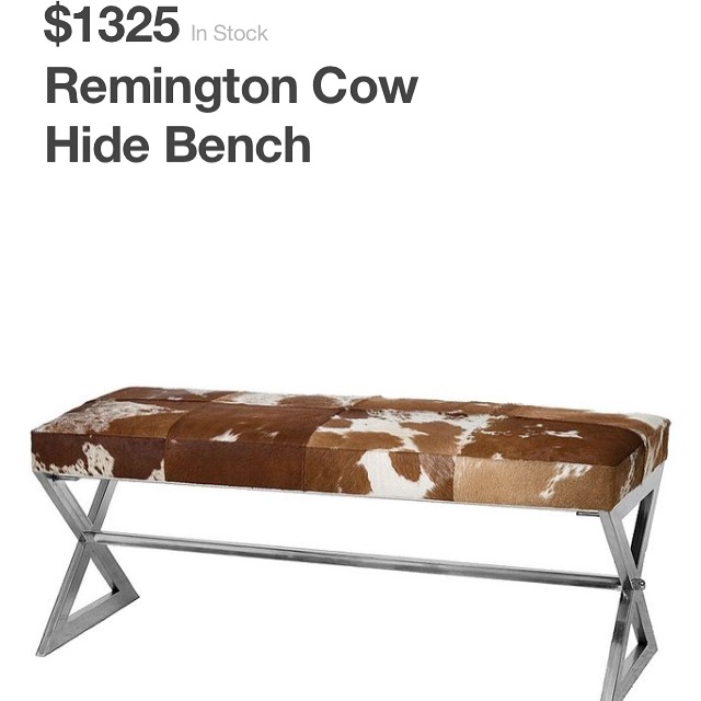
 Fell in love with this bench:


Source: Zen Home

Cried a little when I saw the price... decided to make one of my own:

Got excited to sell it at Sweet Clover Barn [You're Invited!]

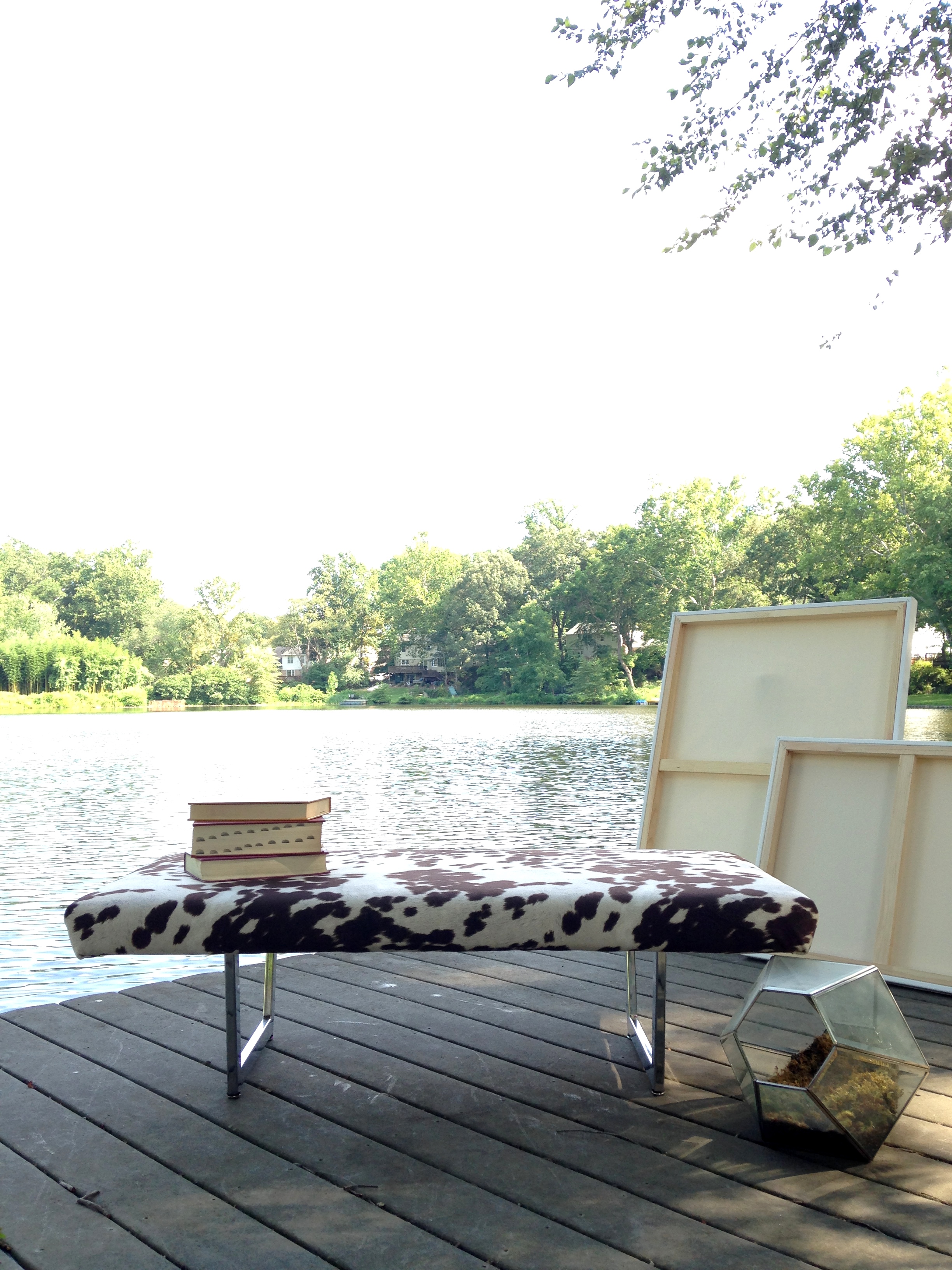
Tried staging outside:

Photos or editing weren't selling the bench... gave up on photoshoot al fresco.

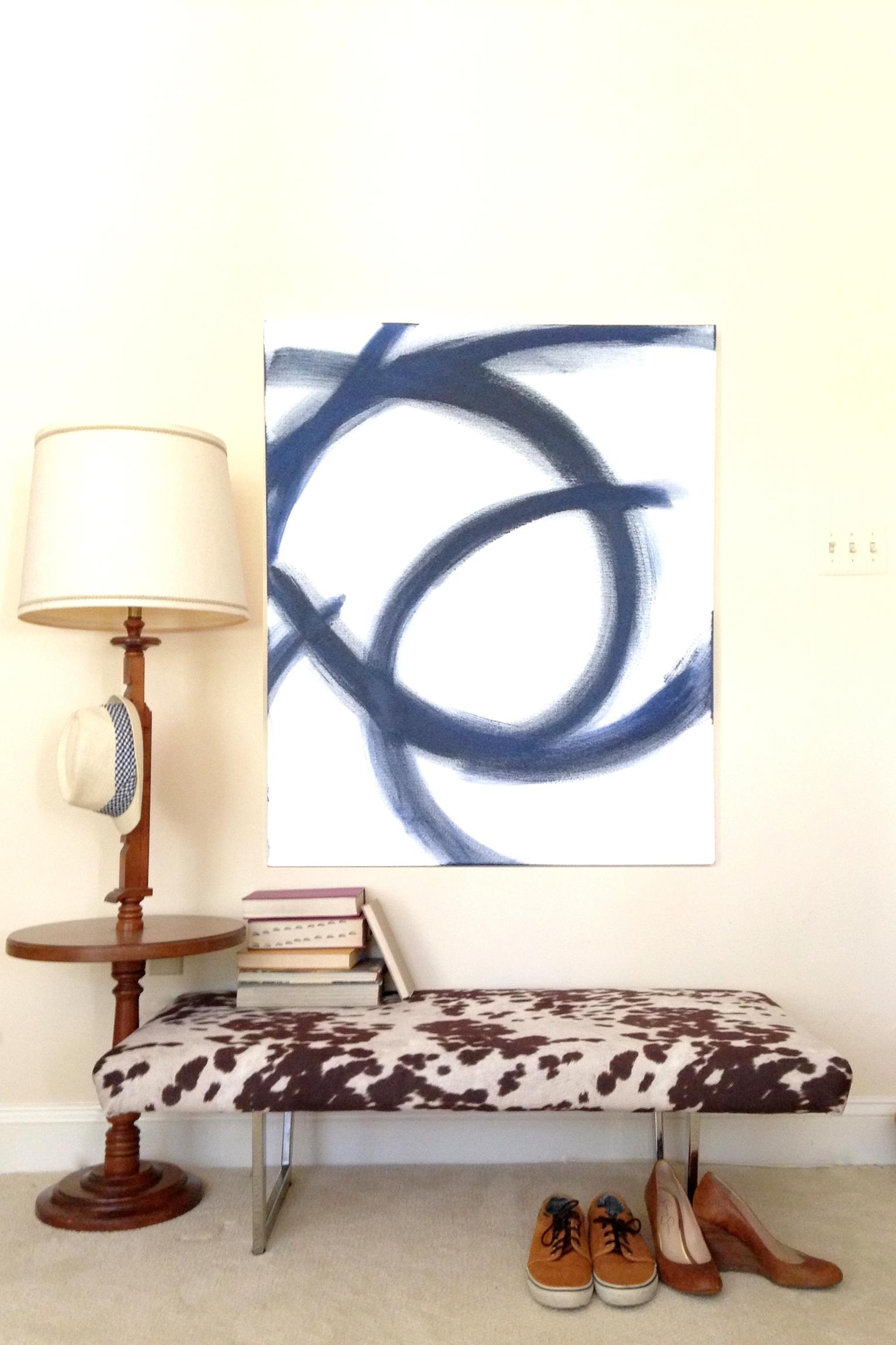
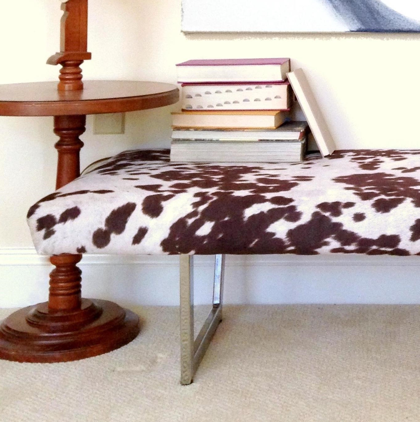
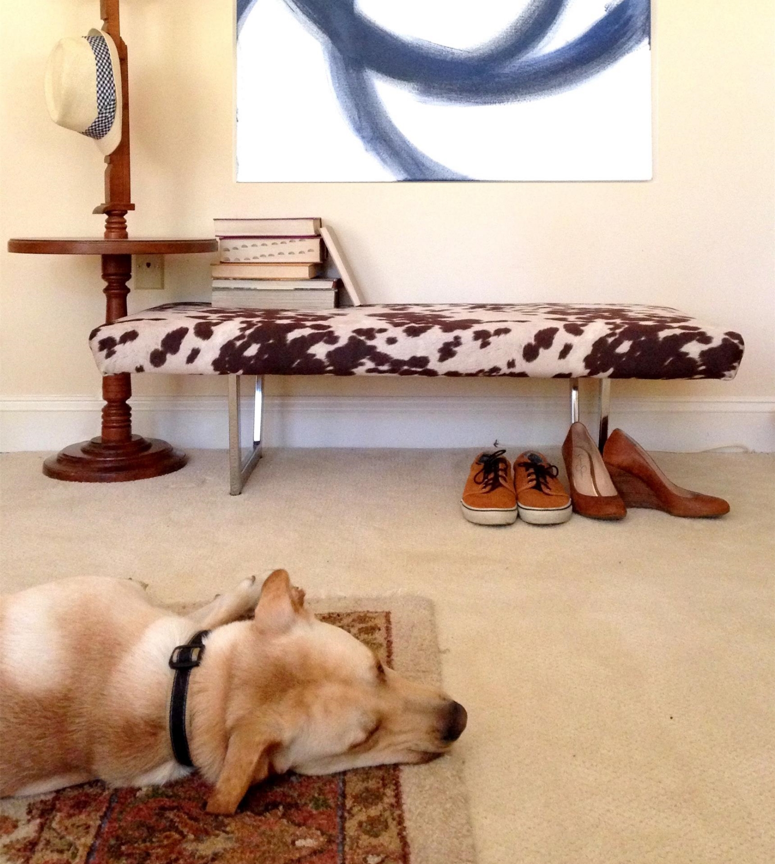
Ok you caught up?  So in all that hullabaloo I'll admit I threw myself a pity party.  I was so frustrated that I didn't have any of my things to create a vignette for the mid-century/modern/rustic/eclectic customer!  But after reading all the great advice on Instagram and Facebook, I was resolved to creatively use some of my surrounding traditional décor to make a modern bench shine.  I did some digging around in the basement that Caleb and I are squatting in and found a quirky lamp table that could pass as mid-century.  It was like a light bulb went off [pun absolutely intended].  I grabbed some hardcover books, some shoes, and a hat, slapped some paint on one of my blank canvases, and got this:


BOOM!  This is exactly what I was going for!  That lamp table and easy DIY art piece completed the vignette I just couldn't get outside.


Even though the lighting in the basement isn't all that great and made the pictures a little grainy, the walls came off as more cream than butter yellow [how does paint do that?!?] which I count as a win!


The modern chrome makes for a beautiful contrast against the rustic Guernsey print don't you think?  [Guernsey meaning a brown-and-white-spotted cow.]  And the quirky lamp table and art help sell the eclectic story of a fun entryway bench or upholstered table.


Thank you so much for all your support and encouragement while I tried to work through this one.   This was an incredible lesson in stretching my style mutt muscles and working with limiting factors.  If any of you are also living outside of your usual decor element or trying to take photos to help sell your pieces, I hope my struggle encourages you to not feel trapped by your circumstances.  Keep pushing until you are happy with what you see.  

This bench will be for sale at Sweet Clover Barn in Frederick, MD this weekend Aug 21-23 10am to 5pm!  If you are a savvy local mid-century/modern/rustic/eclectic shopper in the market for a bench that looks $1,000 bucks but won't cost you that much... then I hope to see you there!


A Picture's Worth a Thousand... Bucks? ||Part 1||

T-Minus 2 days until the Sweet Clover Barn Sale!  Chelsea and I have been wishin' and hoping' and thinkin' and prayin' that we'll get to meet some new faces, sell a few pieces, and not shop too much ourselves over the weekend ;)

So a few of you may remember that back in April, Caleb and I put all our stuff in storage (including my go-to tools, DIY supplies, and staging accessories) and moved into a friend's basement AKA our "summer home."  Wanting to respect the space of our host, I haven't taken on many furniture flips.  But with the sale coming up, I found a few low-impact projects I couldn't resist - like copycatting this stunner of a bench:

 
Source: Zin Home

Source: Zin Home


But YIKES that price!  Who would have an extra grand lying around to spend on a bench?  I wanted to make a bench that would look like $1,000 bucks but not one that would actually cost someone that much!  I had scored a set of [free] chrome legs from another bench so that was a step in the right direction by keeping my expenses low.  After curating the perfect faux cowhide fabric I had this:


Not too shabby eh? 

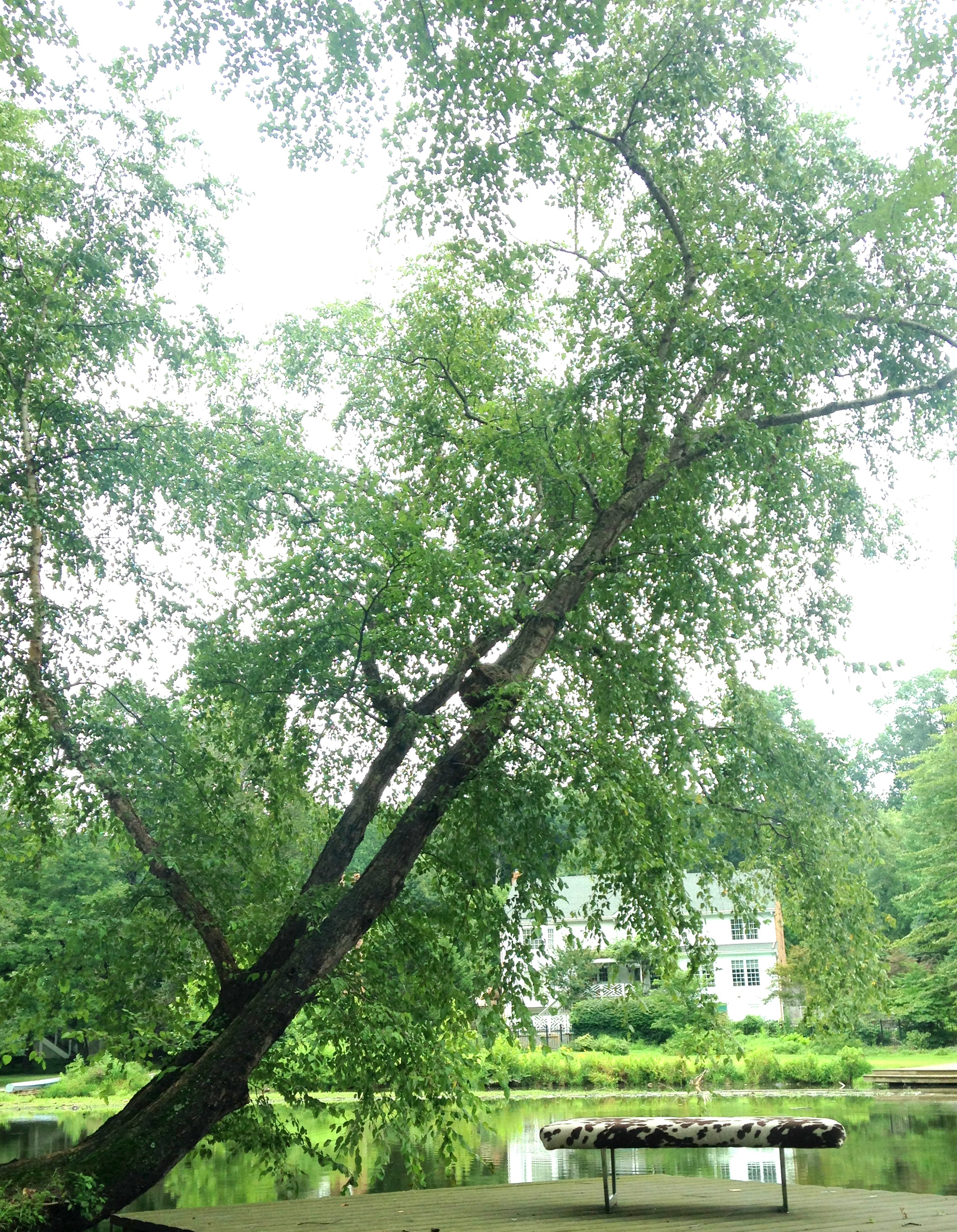
So now I had this epic mid-century modern meets rustic meets eclectic bench to sell [a style mutt of it's own if you ask me] and I started thinking about the kind of customer I hoped it would attract.  In our line of work, pictures often make the sale so it was critical that I get some captivating shots.  The problem was we're living in a basement with butter yellow walls and mostly traditional decor.  It just didn't seem like the best set-up to sell a mid-century/modern/rustic/eclectic bench.  Fortunately, our summer home has a GLORIOUS view so I thought I'd try something I've always wanted to: do a furniture photoshoot al fresco.  Here's my best shot from the shoot:

So after I took this shot I couldn't help but feel like it wasn't really "selling" the bench.  Was it too artsy or the background too busy?  Stumped, I turned to Instagram for some help from the DIY community and got the following feedback:

  • "Needs something... not sure what.. hopefully you'll get some ideas today.."
  • "Really like the idea of outside staging but I think the background is a bit overwhelming."
  • "I love this piece and this shot! What if the bench wasn't facing the side with that house behind it, but rather where the view is a bit deeper and you see the lake in the background. Might be more monochromatic."
  • "Leave it! It lets the piece shine!"
  • "Ok right now I'm staring because the shot is so beautiful. But I think you need more focus on the bench. Maybe move the bench a little more in front of the tree and shoot with your focus on the bench"
  • "Absolutely love the pic, but I almost missed the bench at first glance, maybe if the background was blurred a little?"
  • "Stunning just how it is!"
  • "The bench caught my eye first thing"
  • "Stand along and let it speak for itself!!!"
  • "Stunning with nature's green as a backdrop"

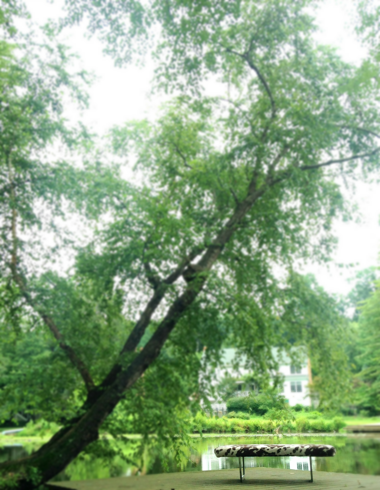
Although it seems like I was getting mixed poll results, it totally helped me realize what was bugging me about this shot.  I realized that what I loved about this picture wasn't the bench, it was the tree.  I wasn't even looking at the bench for that sweeping tree - leaning out over the water like it just wants to go for a refreshing dip.  So I tried blurring the background to help focus on the bench [literally]. 

Better but would that really help a buyer put it in the context of their home?  I decided to try introducing a few of my decor pieces [that weren't in storage] in hopes that it would help:

Here's some of the feedback I got with this new shot:

  • "Wish I had an answer for you! Since I only sell my stuff online, I always have a white background. It is a pretty shot though! Maybe if you just cropped it with less background?"
  • "I love the props together, but personally I think a blank wall backdrop would work better with the look you have going on"
  • "I'll be completely honest with my opinion. Until I read that it was a styled shot I thought it was a behind the scenes of what you did before. I lost the fact that the bench was what I needed to be looking at. I appreciate the picture alone, but for me it didn't work to capture my attention as an ad for the bench."
  • "I think the bench and the books, by themselves against the backdrop would have been really cool!!
  • "Love the book idea..but maybe just one book laying open.... And a small very small tray with a tall glass of lemonade with a tall tall straw and lemon garnish! I would kill for your view! Love being near water...  the bench is marvelous!"
  • "This looks like a magazine ad! Love it"

Again, mixed poll results.  I liked the color scheme but the odds and ends made for a confusing vignette.  I mean who is this photo geared towards?  Someone who spends the day by the lake reading books with their upholstered coffee table bench, a terrarium, and blank canvases?  That's a pretty narrow market.  

I tried blurring the background again in hopes they wouldn't stand out as much.  Maybe it could be mistaken as a magazine ad, but not every buyer has editorial taste.  It was still missing that "$1,000 feeling" so what else could I do to help it sell?  It was at this point I was ready to throw in the towel but the encouraging IG community got me thinking again.  Maybe, with a little imagination and the help of our host's traditional decor, this style mutt could find a way to get the feel I was going for after all...  

I hope you'll come back tomorrow to find out how!

And don't forget!  You're invited to the Sweet Clover Barn Sale this weekend Aug 21-23 from 10am to 5pm at Sweet Clover 4051 Stanford Ct, Frederick, Maryland 21703.