T-Minus 2 days until the Sweet Clover Barn Sale! Chelsea and I have been wishin' and hoping' and thinkin' and prayin' that we'll get to meet some new faces, sell a few pieces, and not shop too much ourselves over the weekend ;)
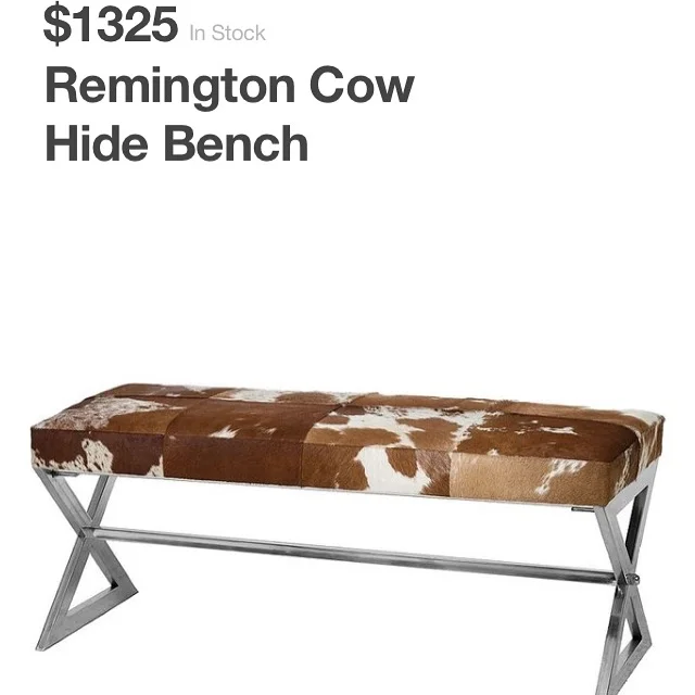
So a few of you may remember that back in April, Caleb and I put all our stuff in storage (including my go-to tools, DIY supplies, and staging accessories) and moved into a friend's basement AKA our "summer home." Wanting to respect the space of our host, I haven't taken on many furniture flips. But with the sale coming up, I found a few low-impact projects I couldn't resist - like copycatting this stunner of a bench:
But YIKES that price! Who would have an extra grand lying around to spend on a bench? I wanted to make a bench that would look like $1,000 bucks but not one that would actually cost someone that much! I had scored a set of [free] chrome legs from another bench so that was a step in the right direction by keeping my expenses low. After curating the perfect faux cowhide fabric I had this:
Not too shabby eh?
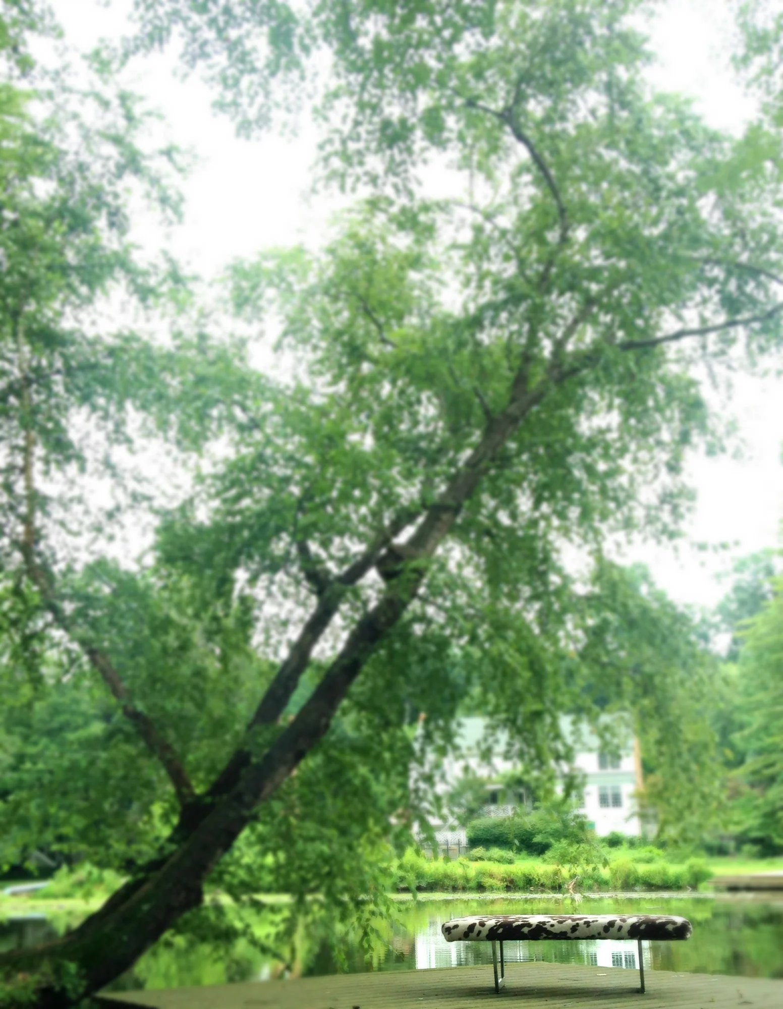
So now I had this epic mid-century modern meets rustic meets eclectic bench to sell [a style mutt of it's own if you ask me] and I started thinking about the kind of customer I hoped it would attract. In our line of work, pictures often make the sale so it was critical that I get some captivating shots. The problem was we're living in a basement with butter yellow walls and mostly traditional decor. It just didn't seem like the best set-up to sell a mid-century/modern/rustic/eclectic bench. Fortunately, our summer home has a GLORIOUS view so I thought I'd try something I've always wanted to: do a furniture photoshoot al fresco. Here's my best shot from the shoot:
So after I took this shot I couldn't help but feel like it wasn't really "selling" the bench. Was it too artsy or the background too busy? Stumped, I turned to Instagram for some help from the DIY community and got the following feedback:
- "Needs something... not sure what.. hopefully you'll get some ideas today.."
- "Really like the idea of outside staging but I think the background is a bit overwhelming."
- "I love this piece and this shot! What if the bench wasn't facing the side with that house behind it, but rather where the view is a bit deeper and you see the lake in the background. Might be more monochromatic."
- "Leave it! It lets the piece shine!"
- "Ok right now I'm staring because the shot is so beautiful. But I think you need more focus on the bench. Maybe move the bench a little more in front of the tree and shoot with your focus on the bench"
- "Absolutely love the pic, but I almost missed the bench at first glance, maybe if the background was blurred a little?"
- "Stunning just how it is!"
- "The bench caught my eye first thing"
- "Stand along and let it speak for itself!!!"
- "Stunning with nature's green as a backdrop"
Although it seems like I was getting mixed poll results, it totally helped me realize what was bugging me about this shot. I realized that what I loved about this picture wasn't the bench, it was the tree. I wasn't even looking at the bench for that sweeping tree - leaning out over the water like it just wants to go for a refreshing dip. So I tried blurring the background to help focus on the bench [literally].
Better but would that really help a buyer put it in the context of their home? I decided to try introducing a few of my decor pieces [that weren't in storage] in hopes that it would help:
Here's some of the feedback I got with this new shot:
- "Wish I had an answer for you! Since I only sell my stuff online, I always have a white background. It is a pretty shot though! Maybe if you just cropped it with less background?"
- "I love the props together, but personally I think a blank wall backdrop would work better with the look you have going on"
- "I'll be completely honest with my opinion. Until I read that it was a styled shot I thought it was a behind the scenes of what you did before. I lost the fact that the bench was what I needed to be looking at. I appreciate the picture alone, but for me it didn't work to capture my attention as an ad for the bench."
- "I think the bench and the books, by themselves against the backdrop would have been really cool!!
- "Love the book idea..but maybe just one book laying open.... And a small very small tray with a tall glass of lemonade with a tall tall straw and lemon garnish! I would kill for your view! Love being near water... the bench is marvelous!"
- "This looks like a magazine ad! Love it"
Again, mixed poll results. I liked the color scheme but the odds and ends made for a confusing vignette. I mean who is this photo geared towards? Someone who spends the day by the lake reading books with their upholstered coffee table bench, a terrarium, and blank canvases? That's a pretty narrow market.
I tried blurring the background again in hopes they wouldn't stand out as much. Maybe it could be mistaken as a magazine ad, but not every buyer has editorial taste. It was still missing that "$1,000 feeling" so what else could I do to help it sell? It was at this point I was ready to throw in the towel but the encouraging IG community got me thinking again. Maybe, with a little imagination and the help of our host's traditional decor, this style mutt could find a way to get the feel I was going for after all...
I hope you'll come back tomorrow to find out how!
And don't forget! You're invited to the Sweet Clover Barn Sale this weekend Aug 21-23 from 10am to 5pm at Sweet Clover 4051 Stanford Ct, Frederick, Maryland 21703.


