Hunter Green Campaign Chest ||And the Craigslist Experiment Results||

Back in August, I decided to conduct a little Craigslist experiment in order to test a theory.  Basically, my hypothesis was that a reserved and sophisticated muted teal piece would sell faster than my usual edgier and bolder color choices.  

1 month in, and I had a few nibbles but no solid bites.  I re-baited by lowering the price  and still hadn't "hooked" anyone.  Then I stumbled on a unique opportunity to test my theory even better.

No I didn't repaint the muted teal dresser.  I actually found an almost identical 7 drawer dresser.


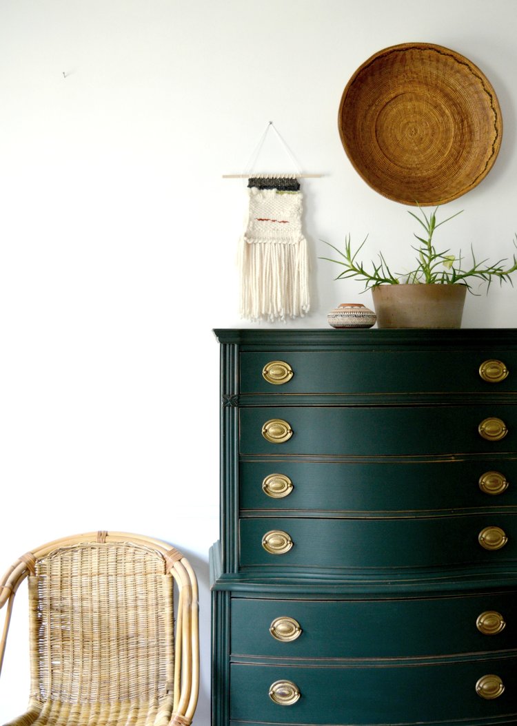
Chelsea and have been crushing on hunter greens lately.  If we had our way, we'd write it in on the color-of-the-year ballot.  Scratch that, we'd probably write it in for President.  After Chelsea rolled out this piece in "Scholar Green" by Ralph Lauren, I think I started salivating at the thought of doing a piece of my own in such a moody shade.  When I found myself with another long-and-low campaign piece, it was a no brainer. 

Since the brass campaign chest was the same in size and scale, it was the perfect opportunity to pit a newer trendier color against the "safer" muted teal piece,

P1020495-001.JPG

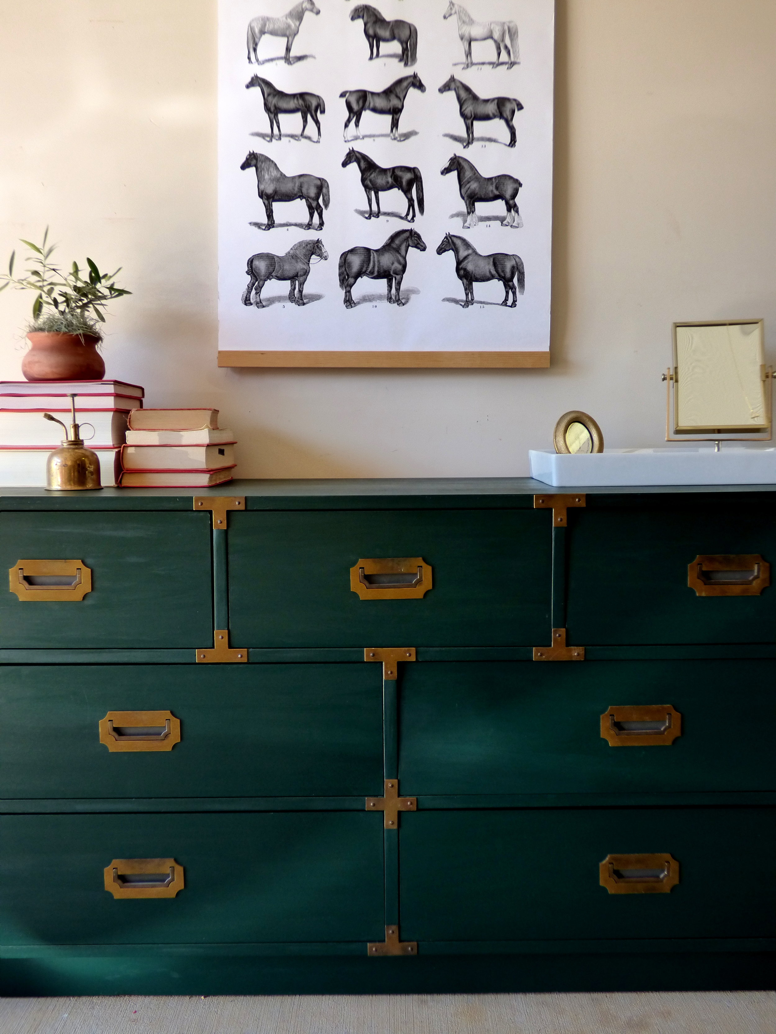
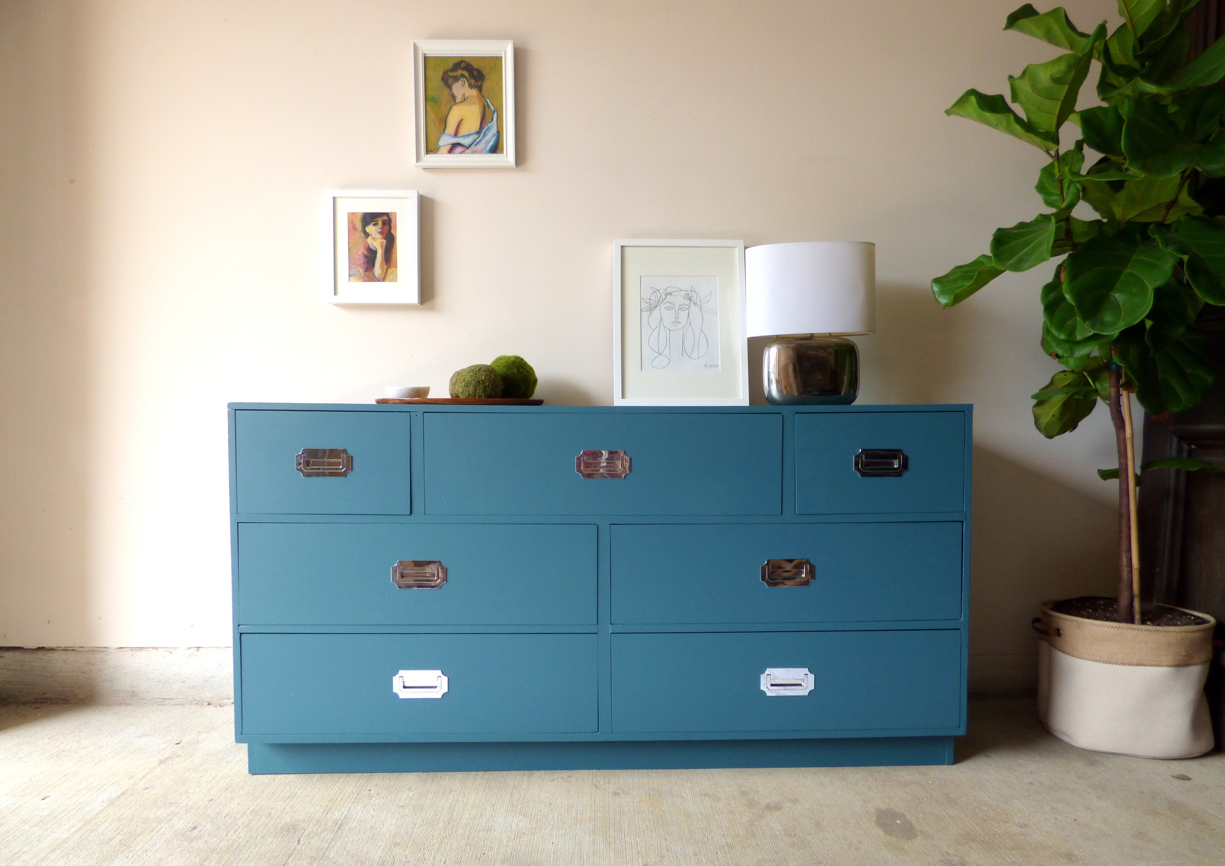
The second chest had brass recessed pulls and decorative T-braces indicative of a true campaign piece.

The hue is dark and moody and could be a little risky for a potential buyer.  In person, it has a velvety, buttery texture.

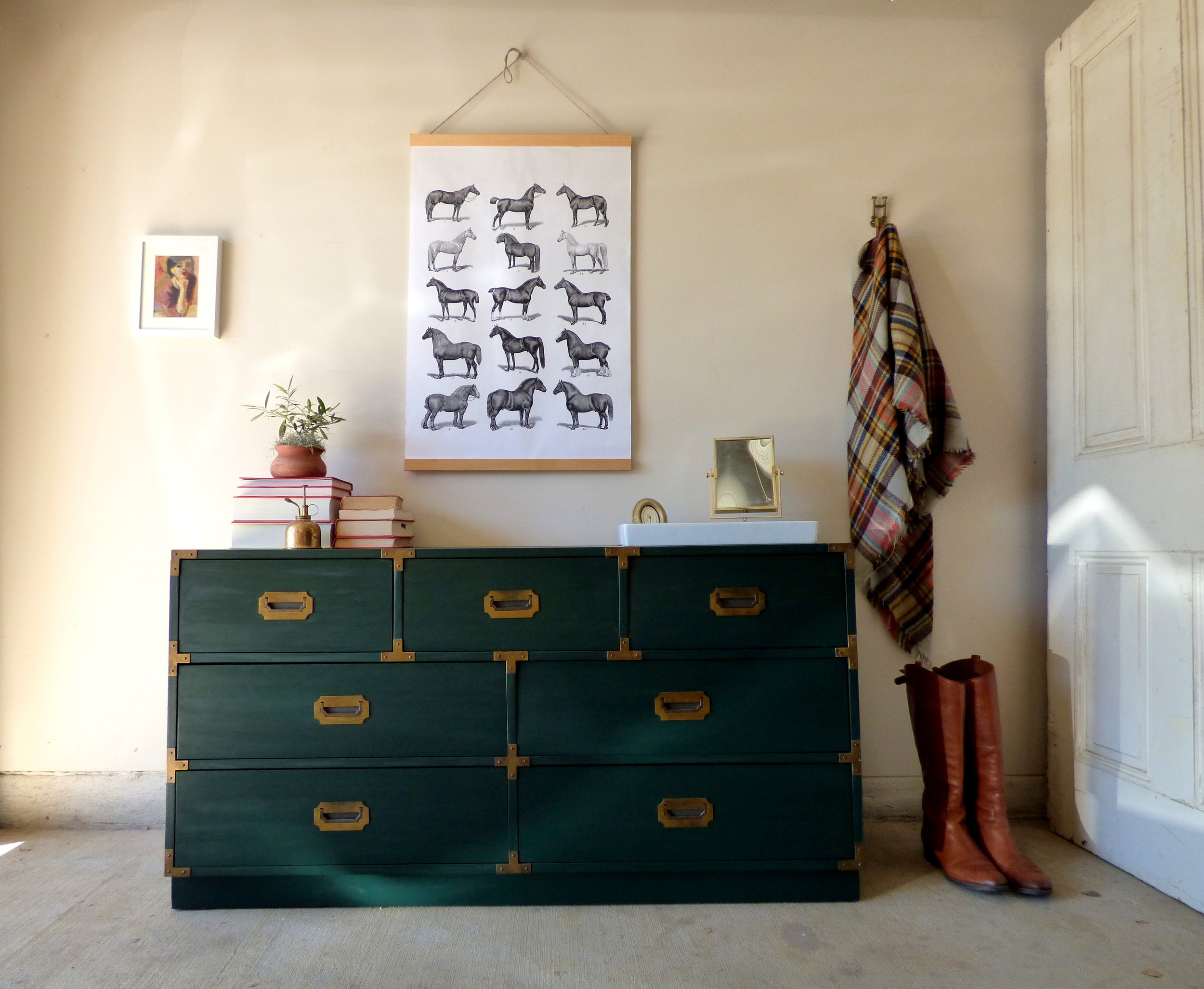
Taking a cue from the hue, I went all equestrian with my styling.  

The wall hanging was an easy vintage-inspired DIY that cost less than $10.

IMG_5203.JPG

The camel leather "riding" boots and plaid blanket scarf were also inspired by my favorite fall weather (and hey, I'm really just looking for any occasion to break them out).

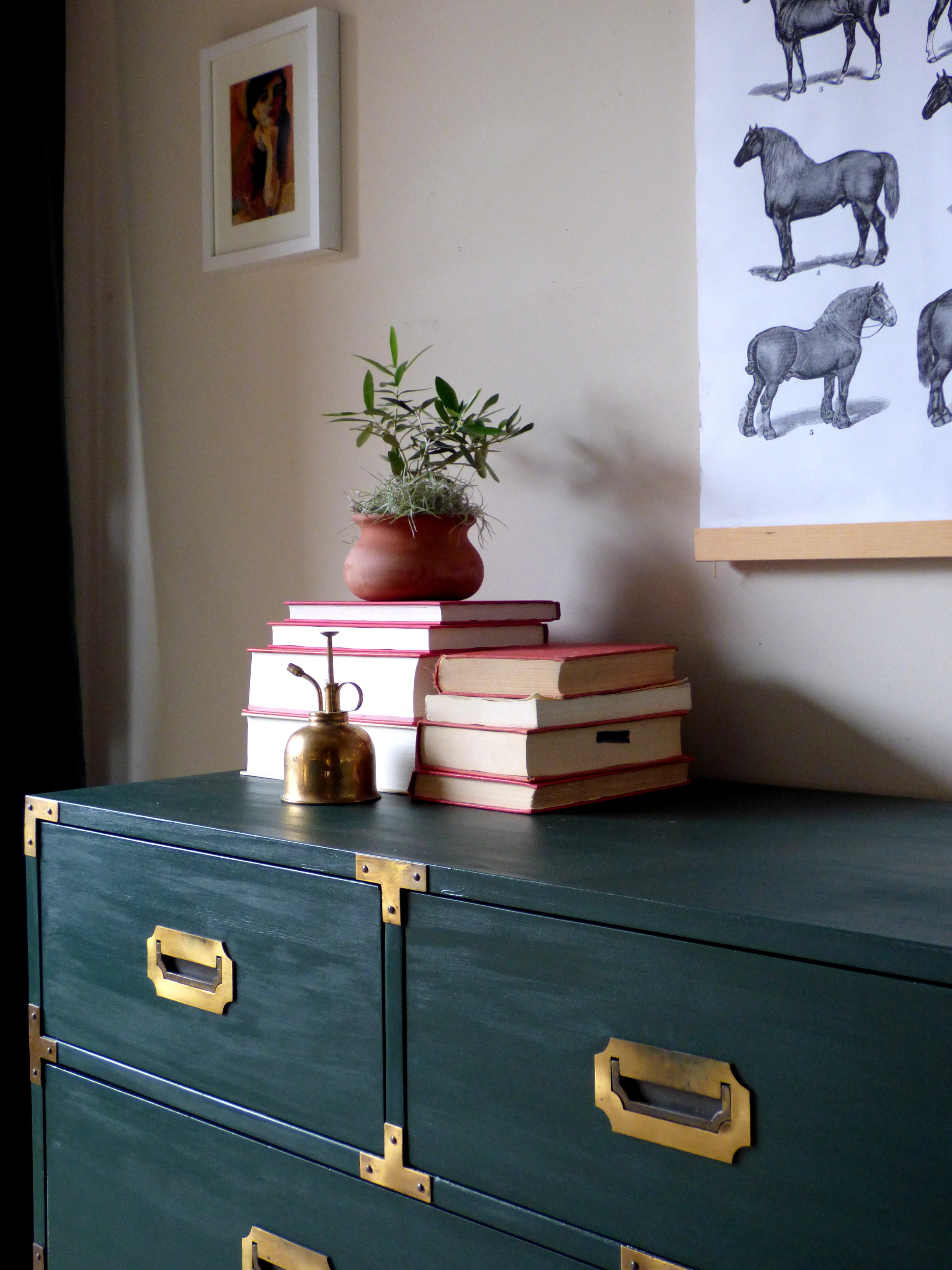
Although Chelsea and I are firm believers that dark green is the new neutral, not everyone can be so easily committed to such a strong look.  For that reason, I decided to style as both a living room credenza and a bedroom dresser in hopes that it would show its versatility.

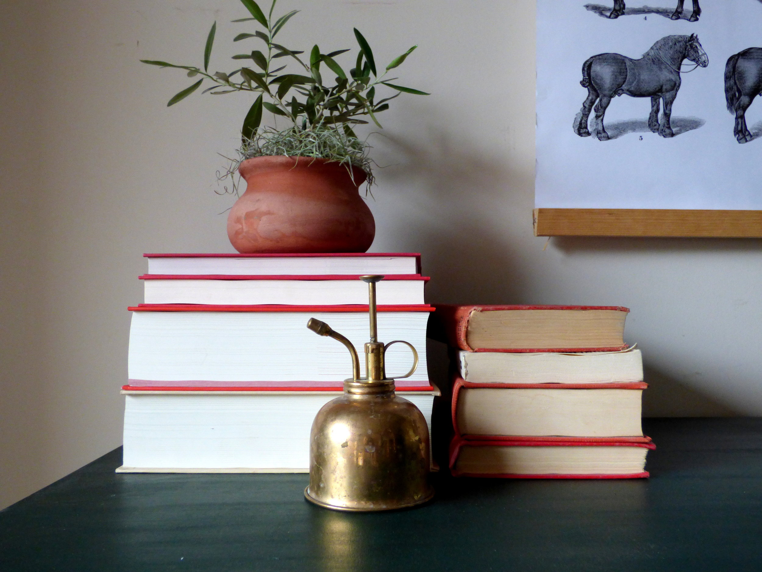
On the left, the  living room credenza has a stack of books and decorative plant.

IMG_5204.JPG

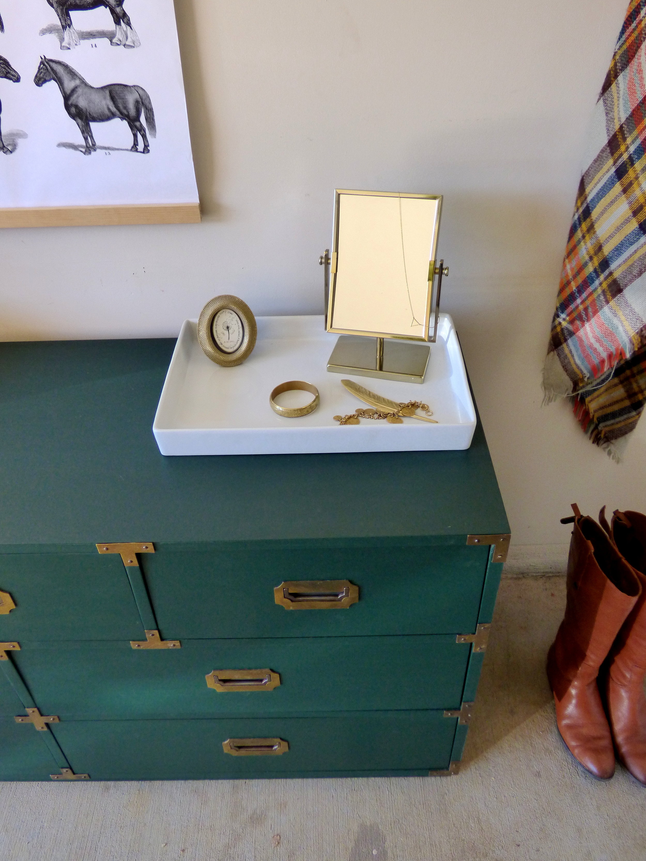
While on the right, the bedroom dresser has a makeshift vanity station on a simple tray.

So let's get to the results of my expanded experiment: last month, a potential buyer set up an appointment set up an appointment because the green piece had caught her eye, but when she arrived she realized the muted teal piece was more suited for her new home in the suburbs and purchased it instead!

The green chest sold to a fabulous inner-city couple a little over a week later.  Interestingly enough, both pieces went for about the same price.  Even though the muted teal sold first, it had been listed for nearly 2 months and only "accidentally" got a buyer.  The hunter green was only listed for a grand total of 2 weeks.  Ergo, my results are a tad inconclusive.  But hey, I didn't go to school for scientific research now, did I? LOL.

Dark Green Campaign Chest
56"W x 18"D x 29.25"H
SOLD

Even though this handsome gent already sold, you can always contact me about a custom order!  
Reader Design: Amy's Perfect Imperfection

It'sssssssssssssssssssssssss Friday!  And I'm particularly excited about sharing today's reader design because of the heart behind this home in Minneapolis, MN: Amy from Modern Chemistry at Home.  While emailing back and forth with Amy about sharing her style mutt space on the blog, it became very apparent she's a kindred spirit.  Much like us, her desire is to see people encouraged and empowered in their own home decorating.  She too believes that creating is a form of worship.  But like many forms of worship it can be too easy to get caught up in the beauty of what you're creating instead of why you're creating it.  We just love how Amy has made it her mission to embrace her home's imperfections and create a real, raw, and inviting space.
image.jpg

From Amy:

Hello, everybody! My name is Amy, and I really am a style mutt. In fact, my blog (Modern Chemistry at Home) got its name partly because my husband and I have very different tastes and my decorating is something like a chemistry experiment as we merge our styles.
image.jpg
image.jpg
My style perspective has definitely changed over the years. My point of view has developed through having children and learning to think about function just as much as how a space looks. 
image.jpg
I’m definitely drawn to spaces that have a mixture of styles. Some of my favorites include Midcentury and Scandinavian Modern, but I also really enjoy children’s spaces and would seriously put pretty much anything from Land of Nod in my living room or bedroom. 
image.jpg
I love a cheerful room. Natural light, lots of white, fun patterns, and bright colors speak to me. Clearly, my decorating isn’t too serious!
image.jpg
And a big part of my story as we renovated and decorated our fixer-upper is how God worked in my heart to help me be content and understand that my identity is not in how my home looks. Our home is a place to raise our littles, live life together, and bless others through hospitality. It can be beautiful, but perfection isn’t my goal. 
image.jpg
There are quite a few things in our home that I inherited from my grandparents. There is a special joy in decorating with these furnishings. 

GASP!  I must have this entire vignette - especially those bookends!!!!

image.jpg
One of my favorites is the big dresser in our bedroom. My sister-in-law discovered that it is probably an Empire style dresser. The shape is so lovely!
image.jpg
My favorite DIY might be the white bookshelves a friend helped me build. They flank the fireplace in our living room and I just love them so much. It’s satisfying to make something with your own two hands!

Well done Amy - those bookshelves look like they should've come with the house!

image.jpg
And my favorite room is probably the nursery. Again, I enjoy children’s spaces because they are often so bright and cheerful.
image.jpg
image.jpg
image.jpg
Decorating this room helped me develop my style and gain some confidence. So with this room as a sort of guide for how I wanted the rest of our home to feel, I reworked other spaces in my home that didn’t feel right to me. I made a lot of mistakes the first time around! But the process of trial and error can be really enjoyable—in hindsight, after we get it right. ;)
image.jpg
I just love decorating creatively and it is my heart to help and encourage others to do the same.
image.jpg

Thank you Amy for so sweetly inviting us into your perfectly imperfect home.  Follow Amy  @modernchemistryathome for more decor goodies and check out her full home tour on her fabulous website!

image.jpg

You want in on this? Submit to #stylemuttspaces for your chance to be featured in a Friday Reader Design.  No design experience necessarily you just got to love your space and what to share it ;)  

Reader Design: Celeste's Home Away From Home

Well, well, well, what do we have here? It's Friday, so that only means one thing around these parts; it's Reader Design day! I don't know about you all, but I look forward to the week's Reader Design like a Christmas Day countdown. It's absolutely one of my favorite things here at StyleMutt Home!!! Know why? Because it's a fun opportunity to share YOUR unique style! With no requirements to be a professional decorator or even a fellow blogger, all are encouraged to share their style here! The purpose of Reader Designs is simply to share beautiful rooms with fresh ideas and document these features in our SPACES page as a source of inspiration! 

Coming all the way from Australia is a very inspirational Reader Design, indeed. Be warned, though; this one may cause the sudden urge to pick up the phone and give a far away loved one a call...

Celestes's living room4 DONE2.jpg

Celeste is a sweet friend via the great land of Instagram - you can check out her adventures @littlefrenchdiary!

From Celeste: 

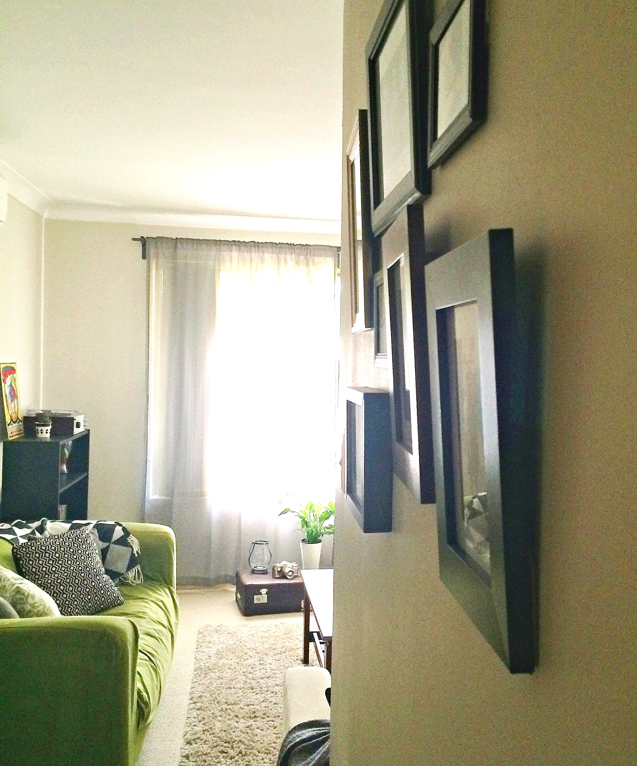
" My husband and I are renting a little house in East Perth and I had a very hard time trying to get the look and atmosphere I wanted for the living room. But after one year of wondering, I finally got the feeling I wanted for that space. This space is full of photos. Being French, I am away from my homeland and I need to see the faces of my family and friends still around me."

"I didn't want to obstruct the space with too many photo frames. That's why I hung a string across two walls in the living room, where I can hang Polaroids. I love that little corner. I think it gives a certain fantasy to the room. "

A string of Polaroids, folks. Be still my heart!

Well hello there! 

"I also love having unique and vintage pieces around. For example, I found my old suitcase on the street, quite far away from our place. Someone wanted to get rid of it and I couldn't let that happen! It's now sitting proudly on my living room floor. I have "modern" objects on top of it, to break the look and create kind of a "old vs new" style."

What a cool tip! Tucking that one away, for sure!

"I would resume my style by... No style! I don't like sticking to one particular decoration style. I love to play around with objects, old and new. My living room represents the most of my house: full of little fun and cute objects, but in a very cozy and warm atmosphere. The bookshelf is one of my favourite pieces. I absolutely love it's look and the warm feeling it gives to the space. It has our parents wedding photos and ours on it, and a few of our wedding decorations."

This is just precious. 
Can we take one more look at those Polaroids?

This is just all kinds of good. Swooning...

Thank you so much, Celeste, for sharing your warm and cozy living room with us! Love all your sweet details that come together to create this one of a kind, and truly special space.

You guys know what to do now! Share your own room photos directly to our Facebook page or tag #stylemuttspaces on Instagram!

Have an awesome weekend, friends! Thank you so much for stopping by!