Reader Design: Lisa's Global Retreat

This one is for the travelers. The ones out there who have insatiable wanderlust like myself. Or even those who just like to dabble in some global cuisine every now and then.

Lisa's Chicago home represents years of travel. Her home tells us where she's been and gets more unique with every trip she takes and item she brings home.

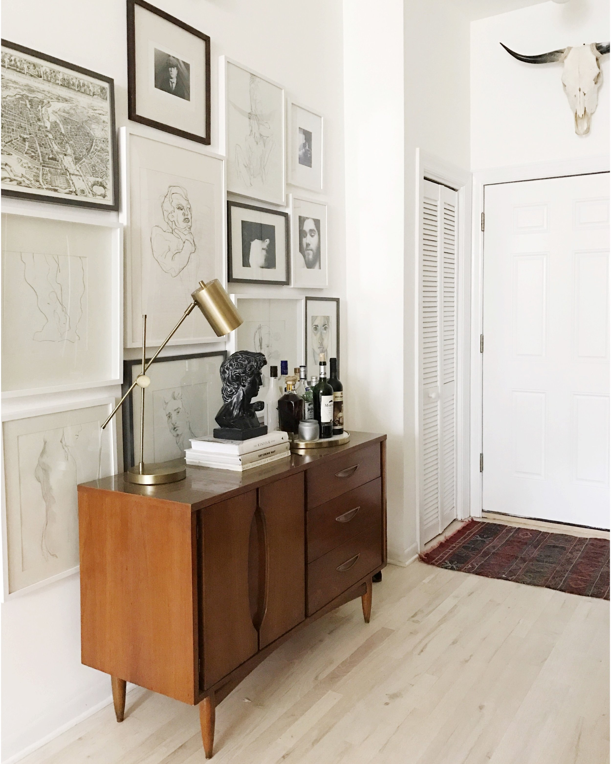
The feeling hits you the second you come through the door. And it's not just one thing. But the thing that jumps out at me is that gallery wall. Now, we all see a lot of gallery walls. But this is something else. 

It's a lovingly curated collection of works from one of Lisa's favorite artists as well as some of her own work and will be something she adds to throughout her life. It perfectly represents her aesthetic philosophy.

From Lisa:

I love spaces that are functional and classic, with meaningful keepsakes, souvenirs, and artwork sprinkled in there. If an object/piece of furniture doesn’t serve any sort of purpose in the space or if a souvenir/piece of artwork doesn’t evoke a feeling, then it shouldn’t be there.

In the living room, you notice the textiles. 

I have a few blankets that I bought in Peru that I LOVE. I came home with a new suitcase full of Peruvian textiles but still felt like it wasn’t enough...


All those global influences make a place feel special but can be difficult to bring together.

I’ve been fortunate enough to do a good amount of traveling in my life , and most places have influenced me in some way. It can actually hinder me a lot of times when I’m trying to put together a space. When I was in my early 20’s, I spent some time living in Italy and Southern France. I love the softness of French style, but I also love the ruggedness of an Argentine estancia. Those cultures influenced me a lot in the way I live and especially in my aesthetic choices. The key is to figure out how to make those contradictory elements work together.

So how do you do it? How do you take influences from literally all over the place and make it feel cohesive, unified, homey? It's a question Lisa has a pretty good answer to. 

When designing a space, my starting point is always going to be Function. What is the point of this room? What are people going to be doing in here? Once you’ve established the function of the room, you can start figuring out what layout and styles will make the most sense.

Well done, Lisa. This home functions beautifully. I know that I for one will stay tuned on Instagram @lisalaurens to see where your travels lead you next! 

Thanks for following along, mutts! 
Reader Design: Celeste's Home Away From Home

Well, well, well, what do we have here? It's Friday, so that only means one thing around these parts; it's Reader Design day! I don't know about you all, but I look forward to the week's Reader Design like a Christmas Day countdown. It's absolutely one of my favorite things here at StyleMutt Home!!! Know why? Because it's a fun opportunity to share YOUR unique style! With no requirements to be a professional decorator or even a fellow blogger, all are encouraged to share their style here! The purpose of Reader Designs is simply to share beautiful rooms with fresh ideas and document these features in our SPACES page as a source of inspiration! 

Coming all the way from Australia is a very inspirational Reader Design, indeed. Be warned, though; this one may cause the sudden urge to pick up the phone and give a far away loved one a call...

Celestes's living room4 DONE2.jpg

Celeste is a sweet friend via the great land of Instagram - you can check out her adventures @littlefrenchdiary!

From Celeste: 

" My husband and I are renting a little house in East Perth and I had a very hard time trying to get the look and atmosphere I wanted for the living room. But after one year of wondering, I finally got the feeling I wanted for that space. This space is full of photos. Being French, I am away from my homeland and I need to see the faces of my family and friends still around me."

"I didn't want to obstruct the space with too many photo frames. That's why I hung a string across two walls in the living room, where I can hang Polaroids. I love that little corner. I think it gives a certain fantasy to the room. "

A string of Polaroids, folks. Be still my heart!

Well hello there! 

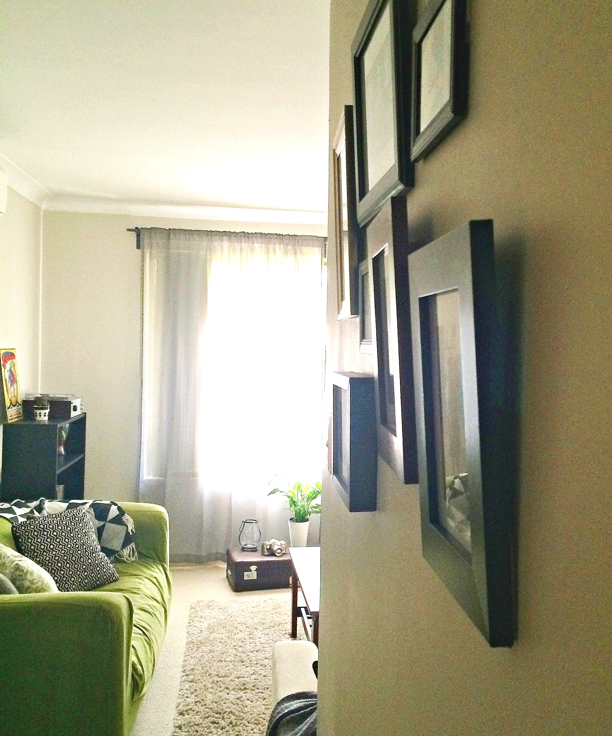
"I also love having unique and vintage pieces around. For example, I found my old suitcase on the street, quite far away from our place. Someone wanted to get rid of it and I couldn't let that happen! It's now sitting proudly on my living room floor. I have "modern" objects on top of it, to break the look and create kind of a "old vs new" style."

What a cool tip! Tucking that one away, for sure!

"I would resume my style by... No style! I don't like sticking to one particular decoration style. I love to play around with objects, old and new. My living room represents the most of my house: full of little fun and cute objects, but in a very cozy and warm atmosphere. The bookshelf is one of my favourite pieces. I absolutely love it's look and the warm feeling it gives to the space. It has our parents wedding photos and ours on it, and a few of our wedding decorations."

This is just precious. 
Can we take one more look at those Polaroids?

This is just all kinds of good. Swooning...

Thank you so much, Celeste, for sharing your warm and cozy living room with us! Love all your sweet details that come together to create this one of a kind, and truly special space.

You guys know what to do now! Share your own room photos directly to our Facebook page or tag #stylemuttspaces on Instagram!

Have an awesome weekend, friends! Thank you so much for stopping by!