Reader Design: Ashley's Farmhouse Boho Home

Ok, y'all (side note: now that I'm a Seattleite I never say that word outloud, but boy does it feel good to type it!). 

Daylight savings has happened. The days are officially darker, and Fall - and perhaps even Winter - are already here. Today, we're taking off to Montana and fully embracing all there is to love about this season with a tour of Ashley's home. 

DSCF9470.jpg
DSCF9577.jpg
DSCF9485.jpg
DSCF9489.jpg

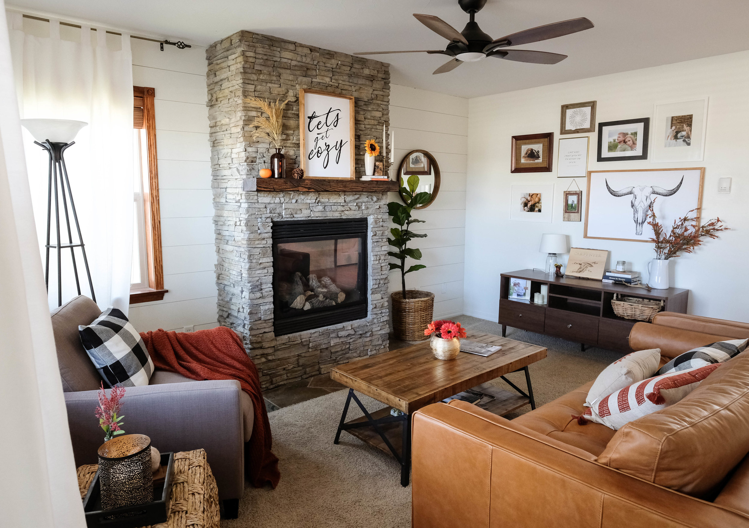
It's some mutt-ish mix of boho, mid-century, and rustic and replete with all the Fall vibes. This is a perfect opportunity for an edition of "I Spy: StyleMutt Home Reader Design." Count the Fall references in this home - all things layered, cozy, and Thanksgiving-inspired - and we'll see if we come away with the same number. Deal? 

From Ashley:

I strive for functionality that also looks good. I strive to promote a sense of coziness and cleanliness in my home. A space that is clutter-free but also has a ‘lived-in’ feel (because, yes, real people live here!) I take pride in creating an oasis for my husband to come home to after a long day of work.
DSCF9487.jpg
DSCF9526.jpg
DSCF9521.jpg

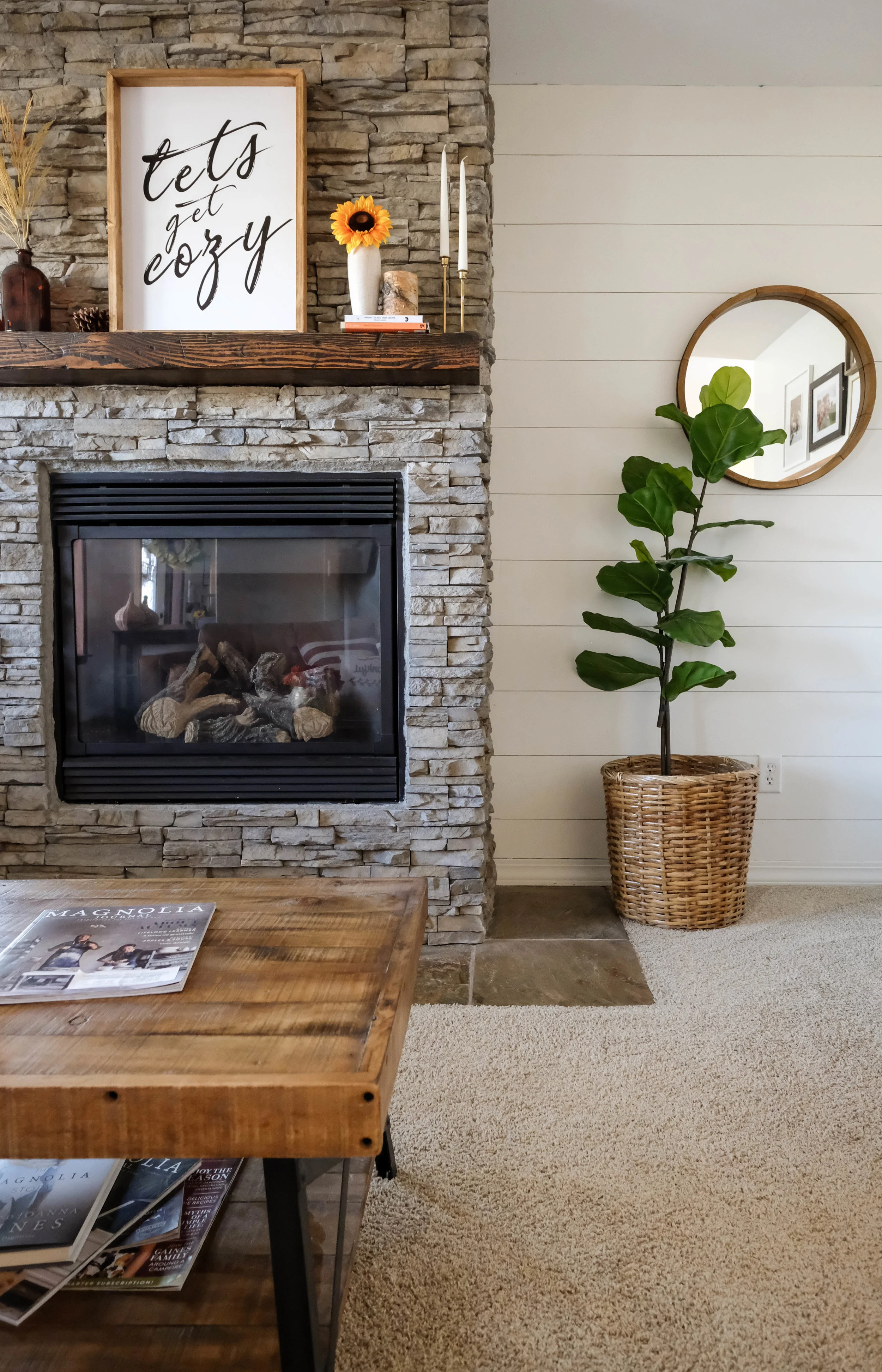
This oasis was created with a lot of DIYing, bargain hunting, and creativity. In the living room, Ashley and her husband transformed the cookie cutter box fireplace into the stunning stone masterpiece you see. All it took was a lot of sweat and, per Ashley, maybe a few tears!

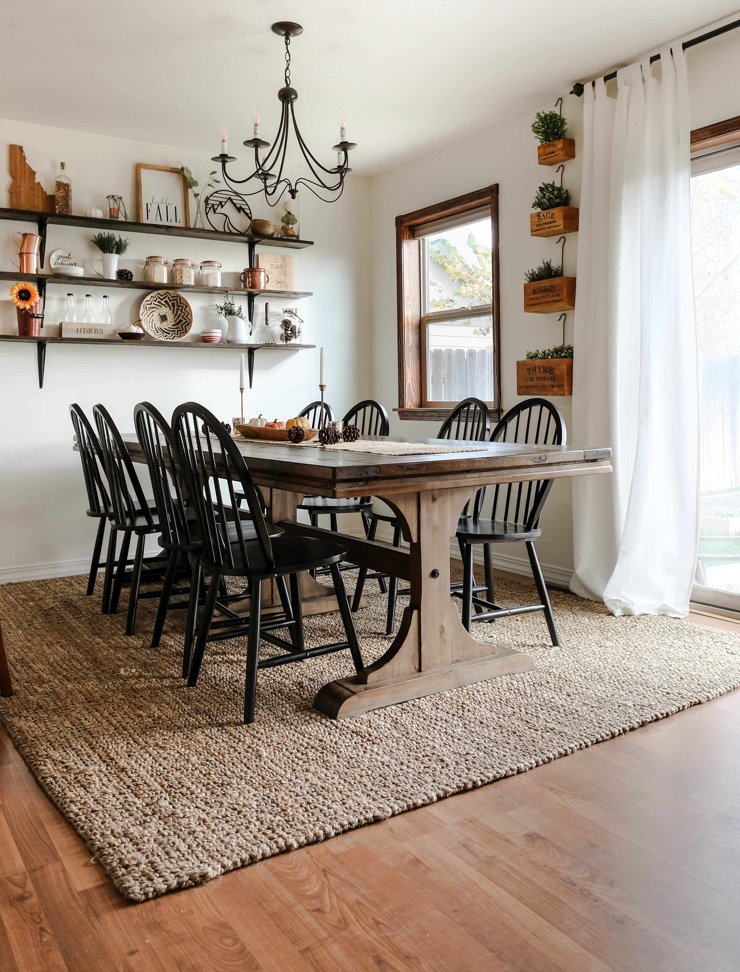
In the living room, they negotiated and landed a "dinged" floor model version of the farmhouse table they were eyeing; those display scratches didn't detract at all from the table - in fact, they added character! 

DSCF9497.jpg
DSCF9501.jpg
DSCF9517.jpg
DSCF9552.jpg

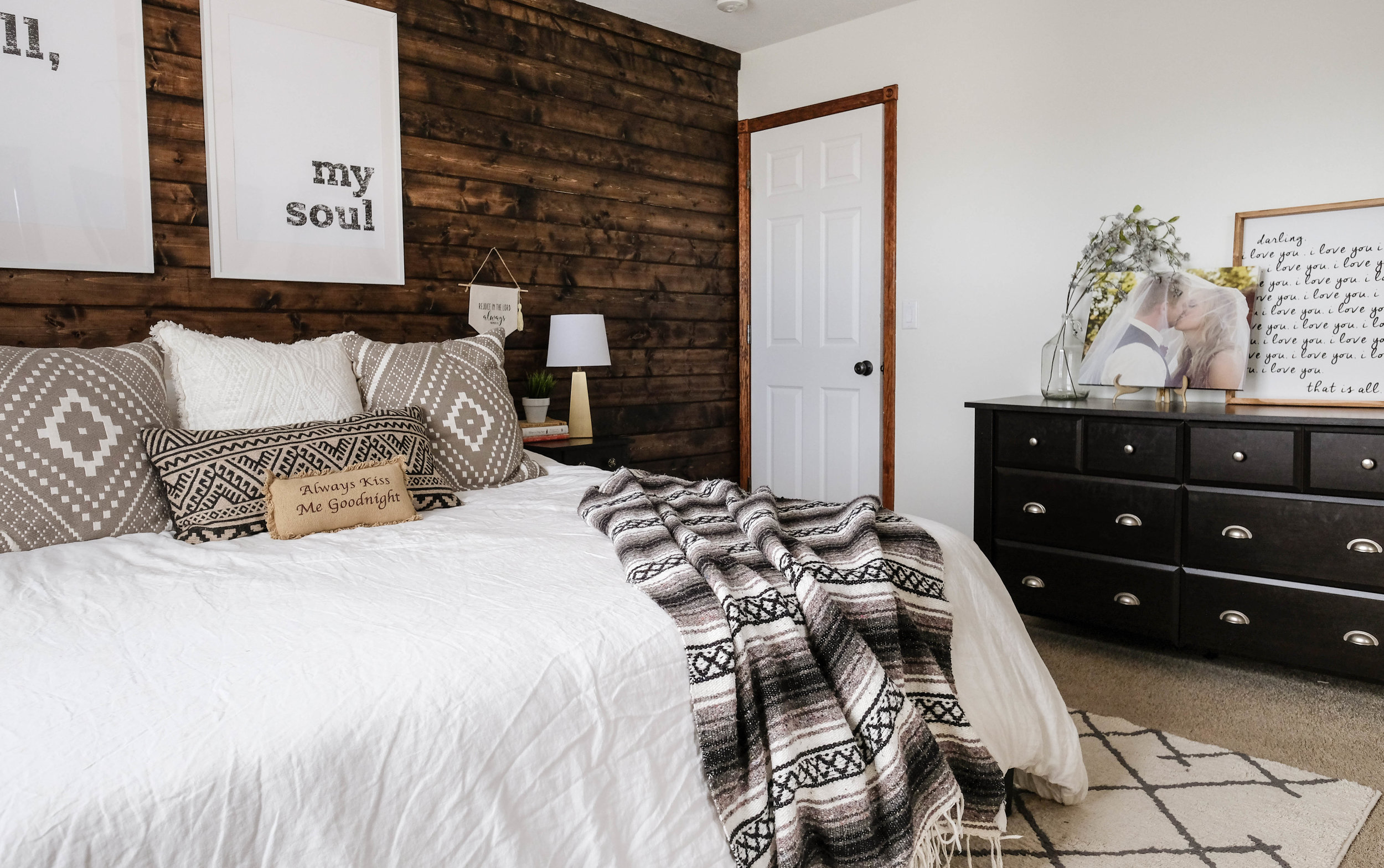
In the master bedroom, they added some character again with a DIY shiplap wall. Now... I know what you're thinking. Thank you, Joanna Gaines, for the shiplap obsession that's rocking the nation. But Ashley knows that despite its current trendiness, the feature is still completely her. 

I don’t pay too much attention to trends, but instead gravitate towards classic and timeless pieces. I don’t want to feel like my décor is dated only months after designing a space. With that said, I do have shiplap in my home which is very “trendy” right now. But shiplap isn’t new, and I love the interest it adds to a space – so that is why I have it in multiple rooms, not because it is “in”. There is already talk about people regretting their decision to shiplap their walls, but I love it and have no regrets! At the end of the day, as long as your space brings you joy, that is all that matters!
DSCF9446.jpg
DSCF9450.jpg

At the end of the day, all that money and time is well spent if the results makes you feel content, happy, and home. 

[I’ll always invest in] anything that is well built and serves as functional décor! I love finding pieces that are made with quality materials and will stand the test of time. With that said, I also love finding functional useful items and displaying them as décor in my home. This dual purpose makes it worth a splurge!

Thank you for the tour, Ashley! Your home is so full of love and built to withstand any season. 

Follow Ashley along on Instagram @ashley.joyfullygrowing for more. See you all next week! 
McKenna Sig.jpg

Reader Design: Kristina's New Home Love

You guys, I don't think I've ever looked forward to a Friday more in my life! Our twins started kindergarten this week and I've missed them so very much. It's wild how suddenly we've found ourselves in a completely different stage of life just like that! Happy to be moving forward, and sad for what we leave behind.

Speaking of moving! This is the FIRST time we are sharing a Reader Design from someone we've already featured before!! Last year we had the pleasure of sharing sweet friend Kristina's beautiful apartment, decked out for Fall! Here's a refresher:

So soft and pretty, right!? Well guess what - Kristina and her man bought a foreclosure in Gaithersburg, MD this past spring and spent a solid 2 months renovating it back to life. I was ecstatic when she agreed to come back and share her new home here! 

From Kristina: 

When I first saw the house I wasn't crazy about the colors of this house, but I must admit the updates have made me fall in love with this very patriotic colonial home. The first thing we did after signing the paperwork for this house was drive straight to Home Depot to replace the hideous brass lighting. We also replaced the brick stoop which was falling apart, added a new front door (a much brighter red) and updated the landscaping. It's amazing what a little TLC can do!

Entryway

The entryway was pretty standard, not terrible, however after some paint, new flooring, and a new front door it is much brighter and welcoming. I also purchased that perfect little rustic shelf that is the perfect size for holding my key bowl.

Family Room

I love how bright this space is! Also, I spy some gorgeous drift wood... :) It's so cool seeing Kristina's personal style translated from an apartment to this new home. Her last Reader Design was highlighted with beautiful coastal elements, and it's fun to see how she's carried that laid back feel over here too!

Living Room

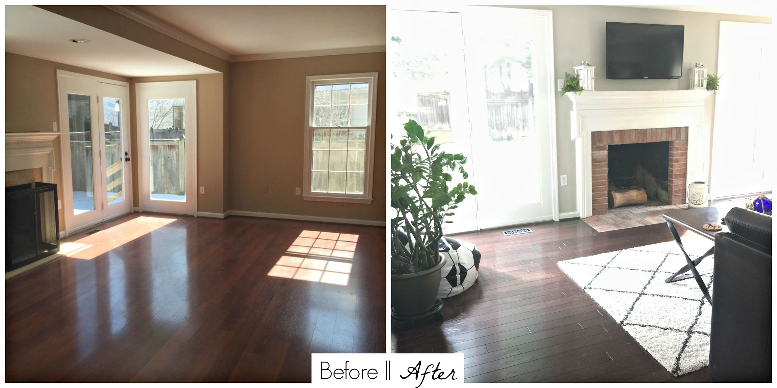
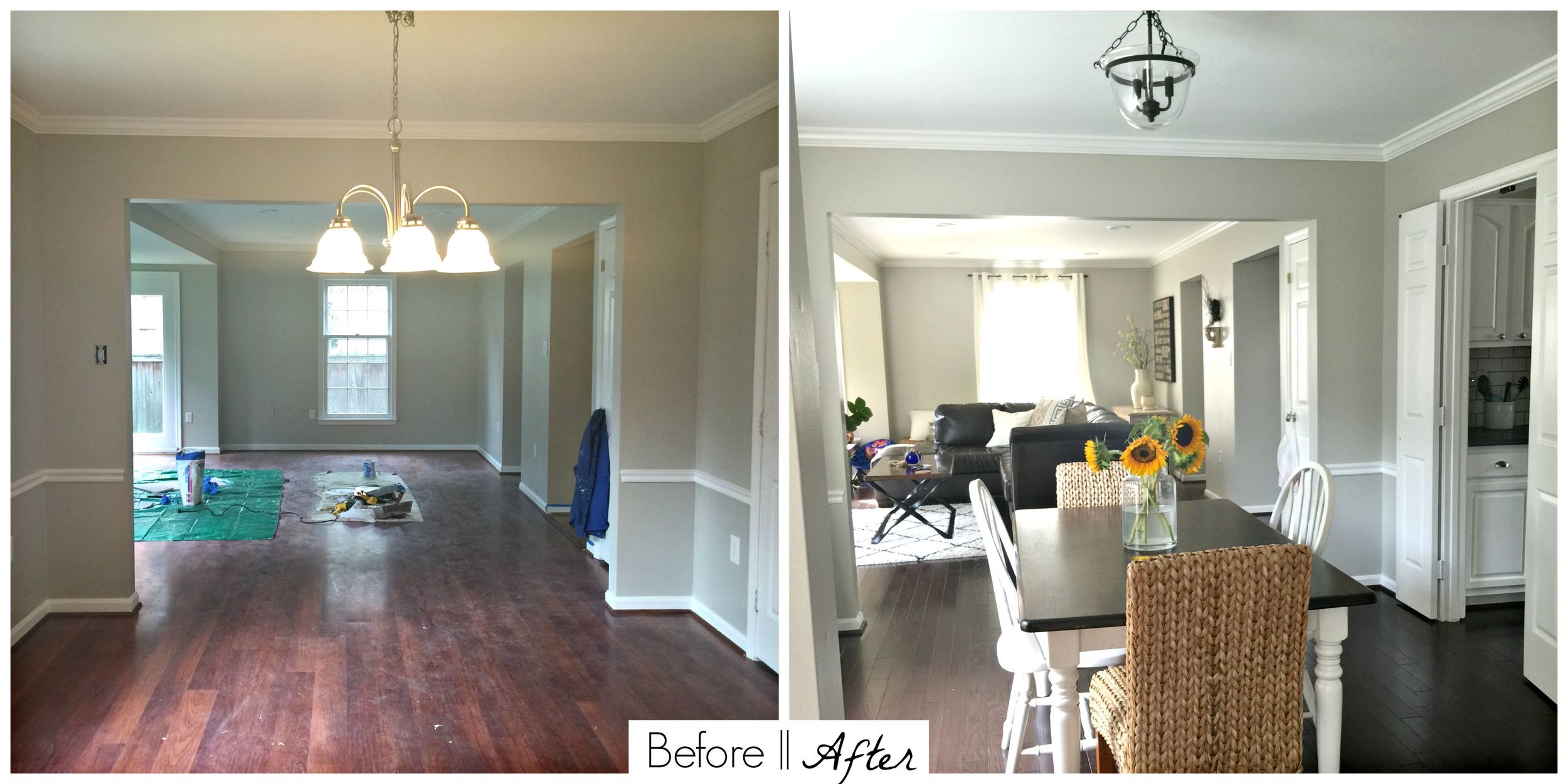
The living room was a blank slate. We added recessed lighting in the ceiling, painted it the same color as the rest of the bottom level (Revere Pewter by Benjamin Moore), and mounted a tv over the fireplace. The original fireplace surround was marble and cracking along the sides so we replaced it with brick to match the casual feel of the house and the fireplace in the family room. Its a great place for entertaining now!

Dining Room

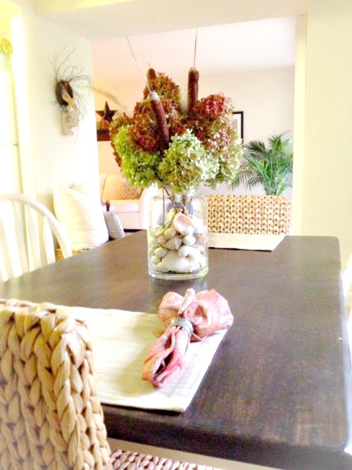
Now this is a room I could linger in long after a meal is over! So fresh and inviting!

Kitchen

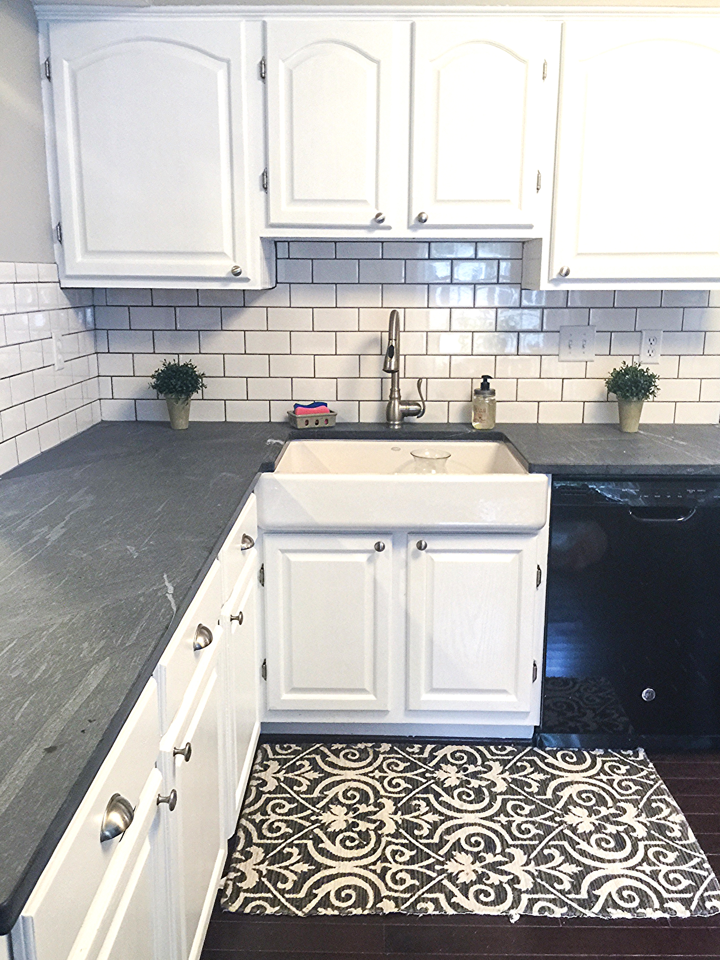
Oh the kitchen, our biggest project yet! The things I loved about this kitchen when I saw it were the size, the new appliances (albeit not stainless but NEW!), and the fact that it was a blank canvas for us to create in our own style. We chose light grey soap stone countertops for a more natural look, classic white subway tile with light grey grout, under cabinet lighting, and my favorite, this huge cast iron farmhouse sink! I stripped, sanded, primed, and painted the cabinets myself and BOY what a chore that was! I have to admit though they turned out better than I had imagined. New hardware ties it all together and it is now our favorite place in the house!

Seriously, Kristina! Way to get er' done, girl! This looks incredible! Your hard work more than paid off!

Thank you so much, Kristina, for showing us around your new home! I'm in complete awe and admiration of what you've done. May your years here be wonderfully blessed, friend!

You can follow more of Kristina's reno-adventures on her informative blog, New Home Love! All our featured home and room tours are on our growing SPACES page and we encourage you to tag your own photos with #stylemuttspaces on Instagram or directly to our Facebook wall! We're hoping to line up our Friday Reader Designs a month in advance so it helps us to see who's interested!

Thank you for stopping by and have a wonderful weekend!!