Bedroom Re-Do || 2017 Flip List Item No.6

Like Chelsea said yesterday, our bedroom has always been a flat note to me.   We've tried a couple different looks over the past two years (see here and here).  Each time we rearranged, it felt like I inched a little closer to the vibe I wanted but without ever bringing the design to full fruition.

So I added item redoing our bedroom to the 2017 Furniture Flip Bucket List in the hopes of figuring out what was missing from this neglected space.  

DSC02587.jpg
DSC02535.jpg

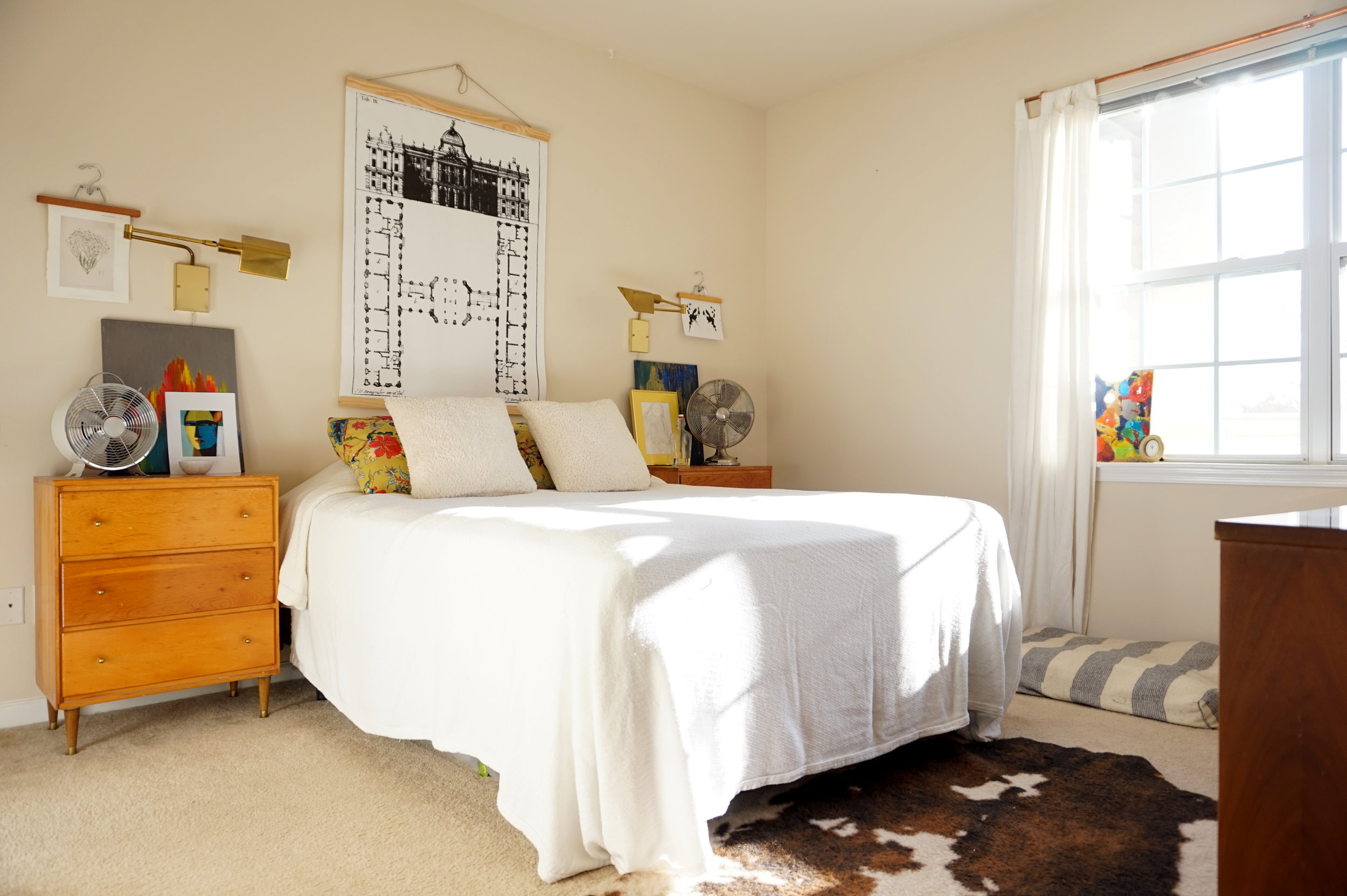
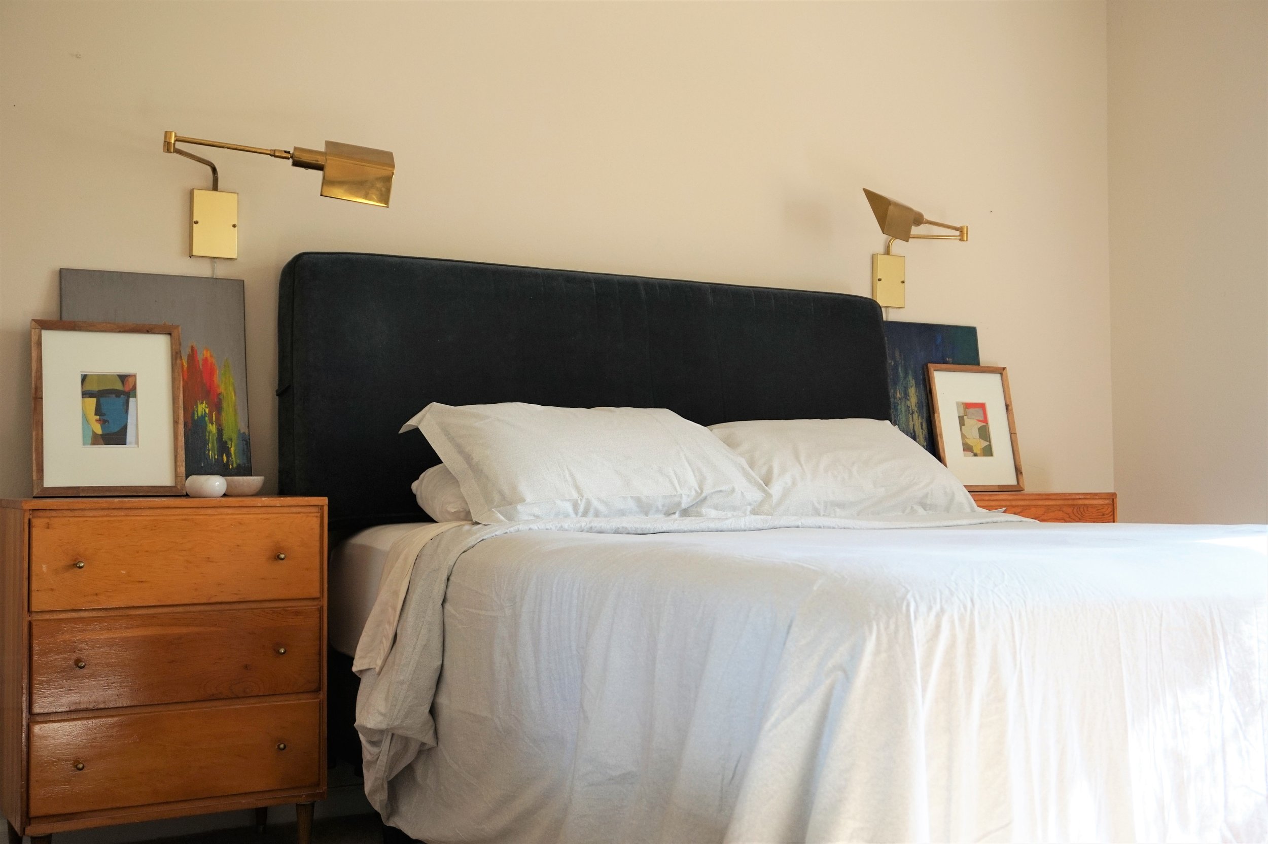
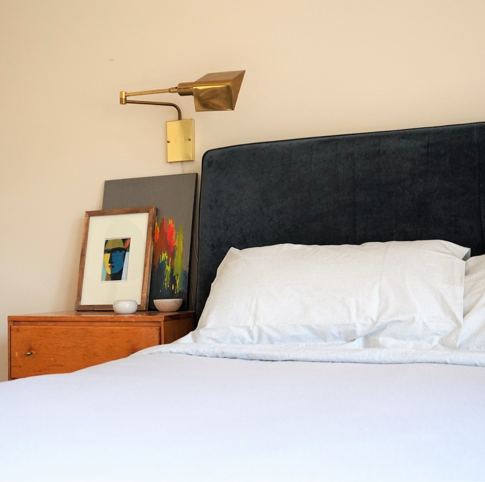
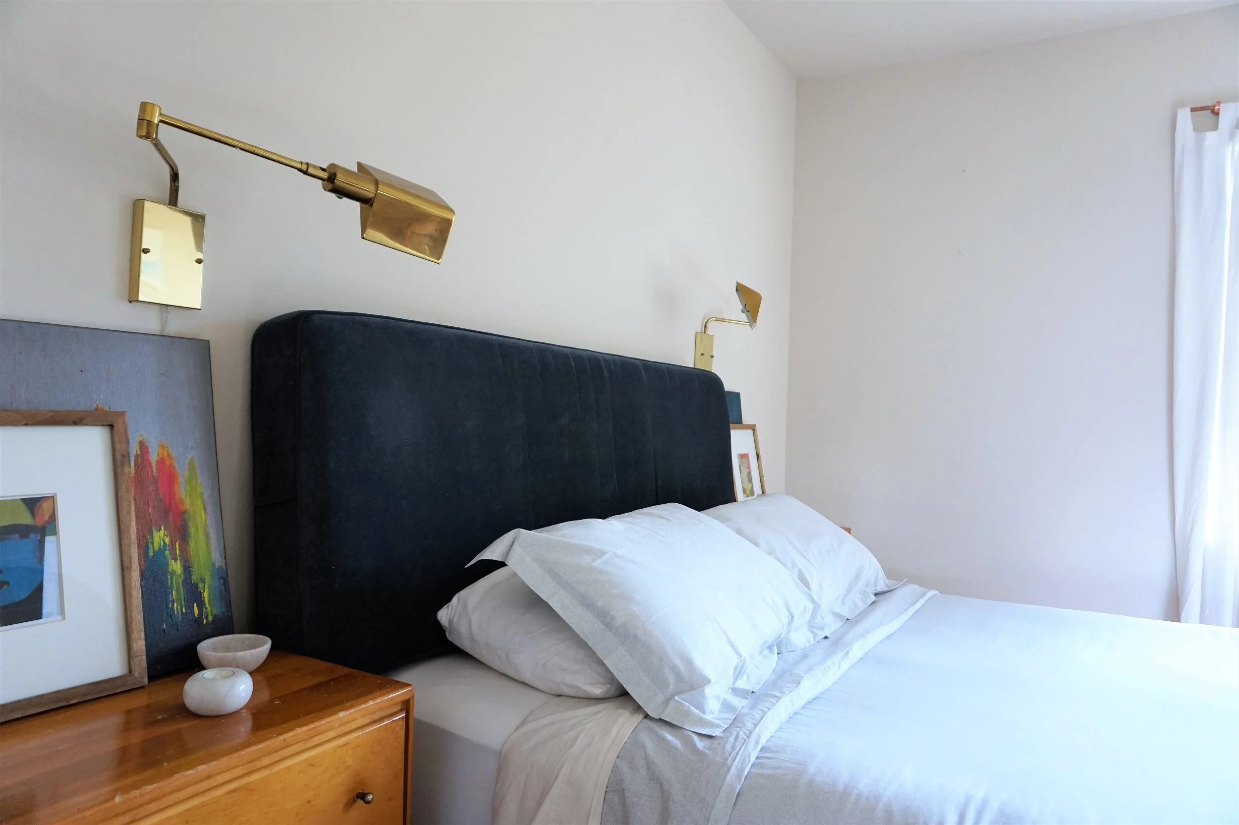
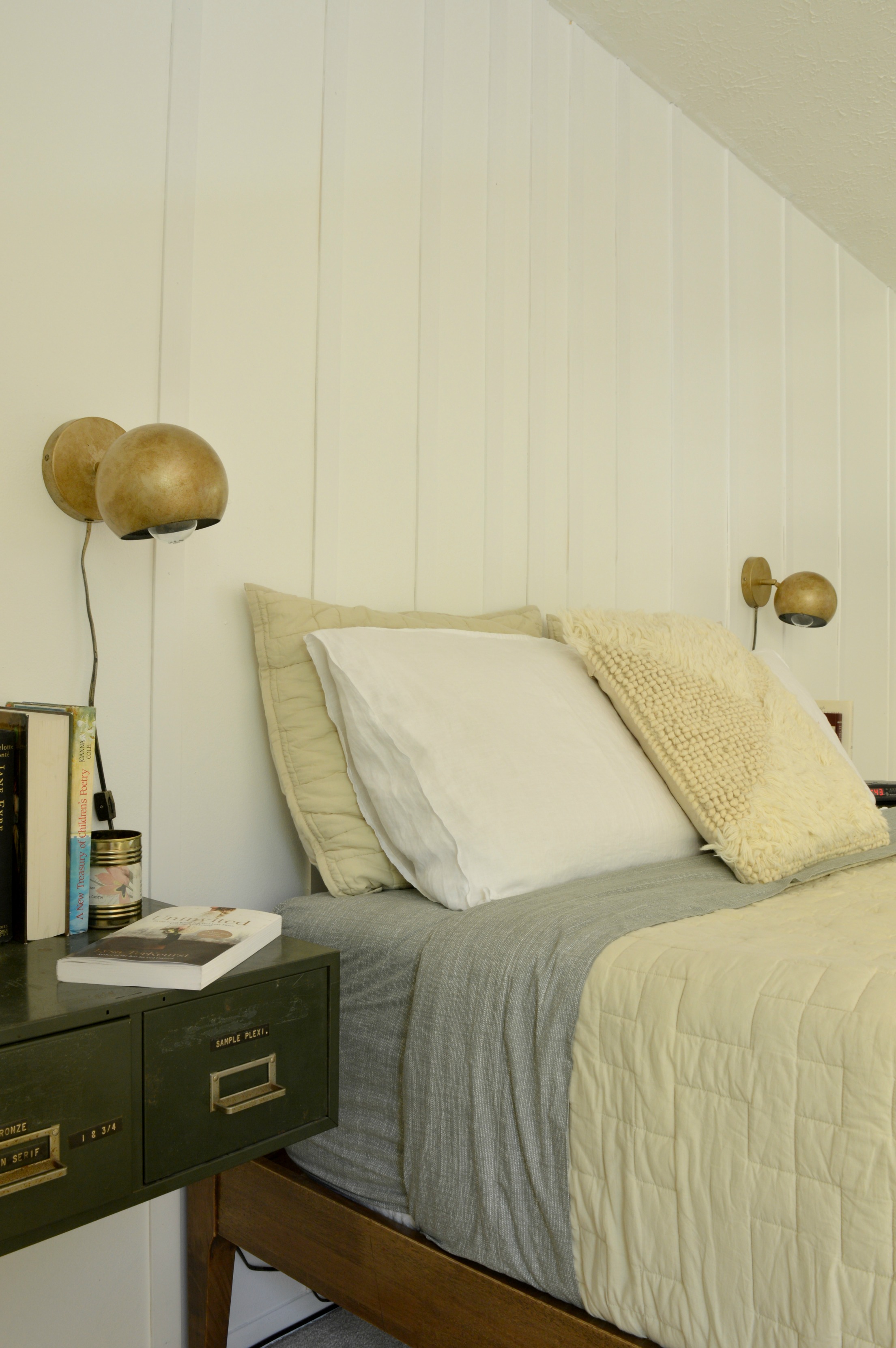
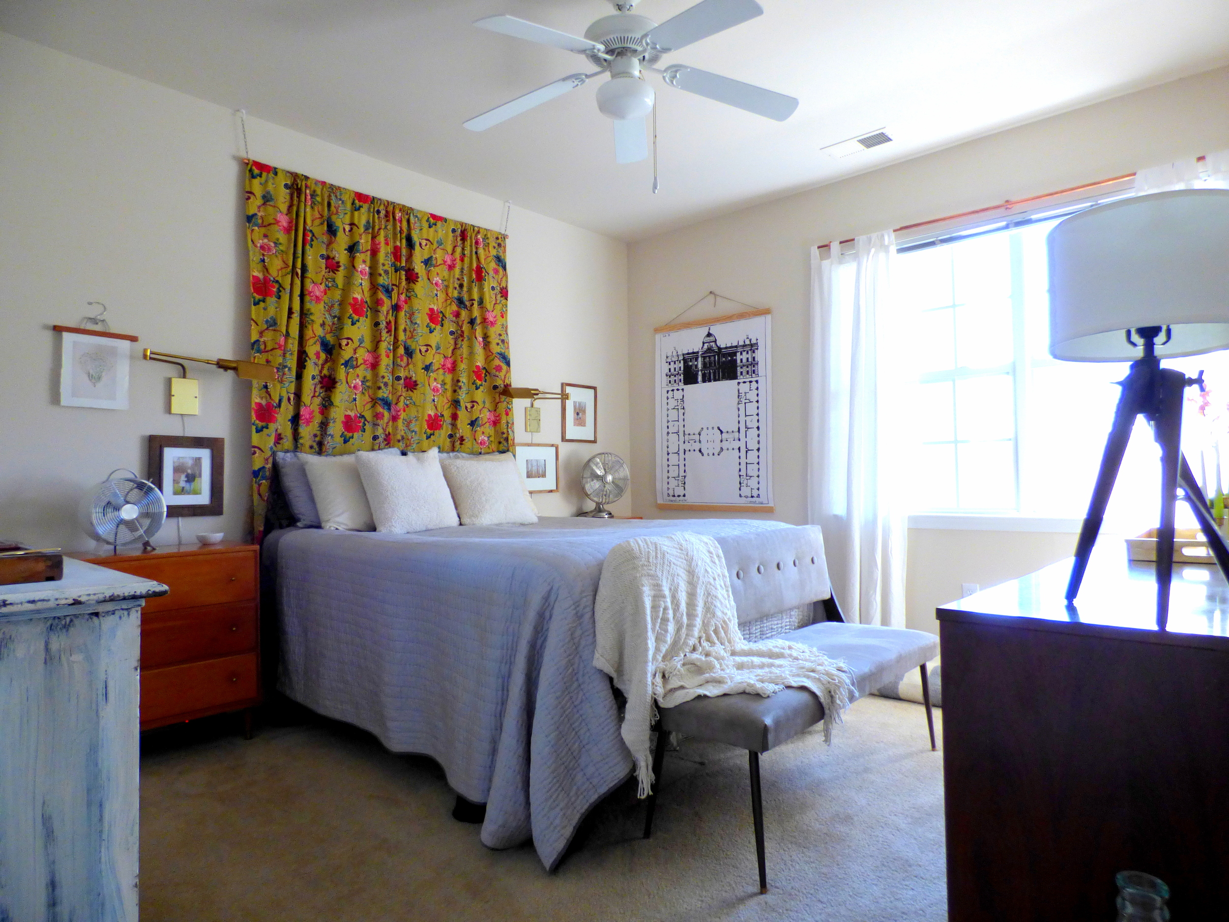
The first thing that greets you when you walk into our bedroom has always been my nightstand.  I fell in love with this vignette ages ago so I used it as inspiration for the rest of the space: warm wood + pops of color + a glint of brass.

DSC02569.jpg
DSC02516.jpg

In the past looks I’ve tried, we’ve never had a headboard.  I think that made me feel like there was something juvenile about our space.  So this time around I needed to see if a headboard would help refine our bedroom.  And I gotta say I am loving the anchor of the plush blue velvet!

DSC02566.jpg
DSC02503.jpg

I also kept my beloved leather + brass cantilever chair in the corner by the window.  

DSC02494.jpg

I think one day I’d ideally like to use this chair at a desk, but until then I guess my husband can keep throwing his “clean” underwear on it *insert facepalm emoji.*

DSC02580.jpg

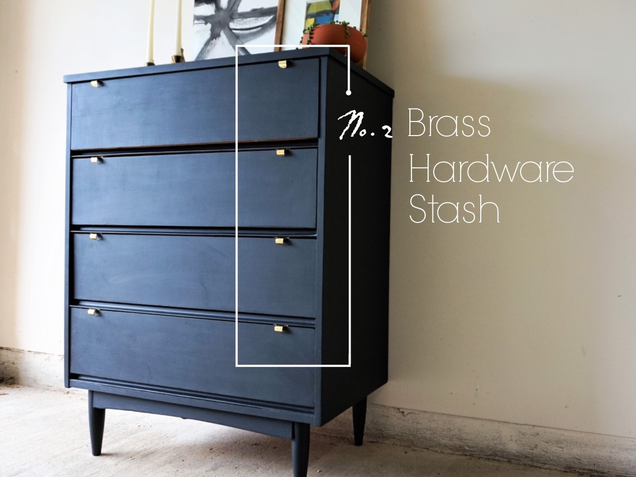
Next to the chair is our thrifted MCM dresser.  I found this bad boy for only $50 and eventually scored the sunset mirror to go with it.

DSC02490.jpg
DSC02484.jpg

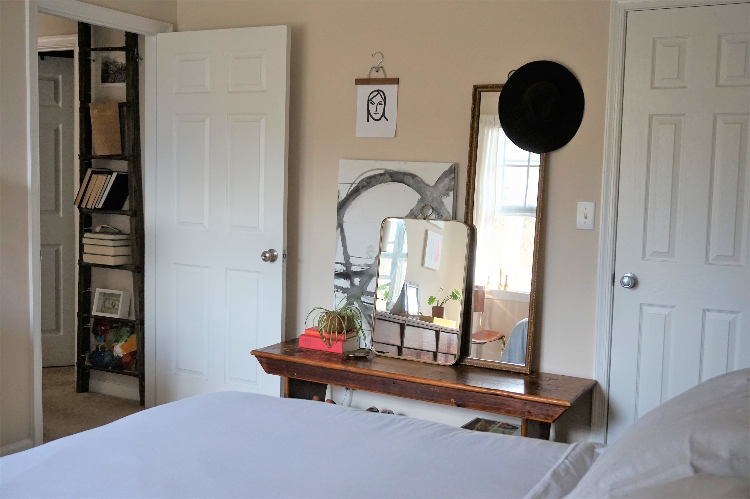
Just outside our door you can peek the roadside rescue ladder I've often used as a lateral storage piece.  Our hallway doesn't have much going on so I added the low-profile vertical piece for some architectural interest.

DSC02487.jpg

In this redecorating process, I did figure out that I’m bothered by the lack of varied furniture height in our room.

DSC02570.jpg

I shopped our apartment to introduce something lower as an alternative storage piece - do you recognize it?  This bench was actually our coffee table but I liked the idea of converting it to a get ready station.

DSC02577.jpg

The pièce de résistance to the makeover however is new bedding... I never realized how grown-up it would feel to have a real duvet cover!  We scored the Marble Percale Duvet Cover and matching shams (guess what - their on sale!) from Cstudio Home and it’s perfect for me and my oven-of-a-husband (ok I’m an oven too).  

 
Don't forget to check out Chelsea's Cstudio Home finds in her bedroom reveal... Gasp!  That shag pillow cover!  *heart eyes heart eyes heart eyes*
DSC02594.jpg

True, most of this makeover is a series of subtle tweaks.  What can I say?  We’re still in a rental after all.  But this modest assortment of new things has me feeling right as rain.  Until I get the itch to change it again that is... ;)

DSC02597.jpg

And on that note, that’s officially a wrap on the 2017 Furniture Flip Bucket List!  After two years of late finishes, it feels good to cross the finish line with a month to spare.  I’ve already begun percolating what I want to tackle in 2018 so stay tuned for next year’s list come January!

 
0 down.jpg
 
Cate.jpg

Seven down, zero to go.  Catch up on the 2017 Furniture Flip Bucket List.
Chelsea's Bedroom Makeover

Hi, friends! We've had a lot of fun furniture and eDesign reveals to share around here lately, but it's been quite some time since we've shared anything new from our own home fronts! As our plates have been filled up with these various projects, the ones we've desired for our own homes have been set aside for quite some time.

But I can only partially blame the busy schedule.

I've always felt like our bedroom was the black sheep of our home. It's not that I never felt satisfied with it, but it's always stuck out as an entirely different style and feel from the rest of the house. Our home has evolved to this cozy minimal bohemian look that's very laid back, understyled and layered for function. Since before we were married I've had the pleasure of using a family heirloom bedroom set that was anything but laid back! The carved antique wood was completely unique, remarkable and unlike anything I've ever seen.Still, I couldn't figure out how to make the large and ornate pieces work in this house. Here's a shot from last Christmas:

40.jpg

Like I said, this was beautiful to me! I loved our bedroom, truly. But as I really started to embrace a style that felt a lot more 'us' as a whole, I needed a clean break with the fancier bedroom set so our home could be consistent the whole way through. I found inspiration from a very simple shot I took last year of a chair, a plant and a wall hanging:

13.jpg

Don't worry, you're not missing anything here; it's really about as dull an inspiration pic as one could strum up. But here's what I liked and why I thought it worth setting as my guide - it's both simple and interesting. It's monochromatic yet cozy. It's fresh. These are the things I wanted for my bedroom and I did revert back to this photo to keep myself in check when I was tempted by evil things like color and pattern. HAHA! I'm totally kidding. I love color and pattern, just in very particular execution for my own home. So let's take a look around at our brand new bedroom!

6.jpg
17.jpg

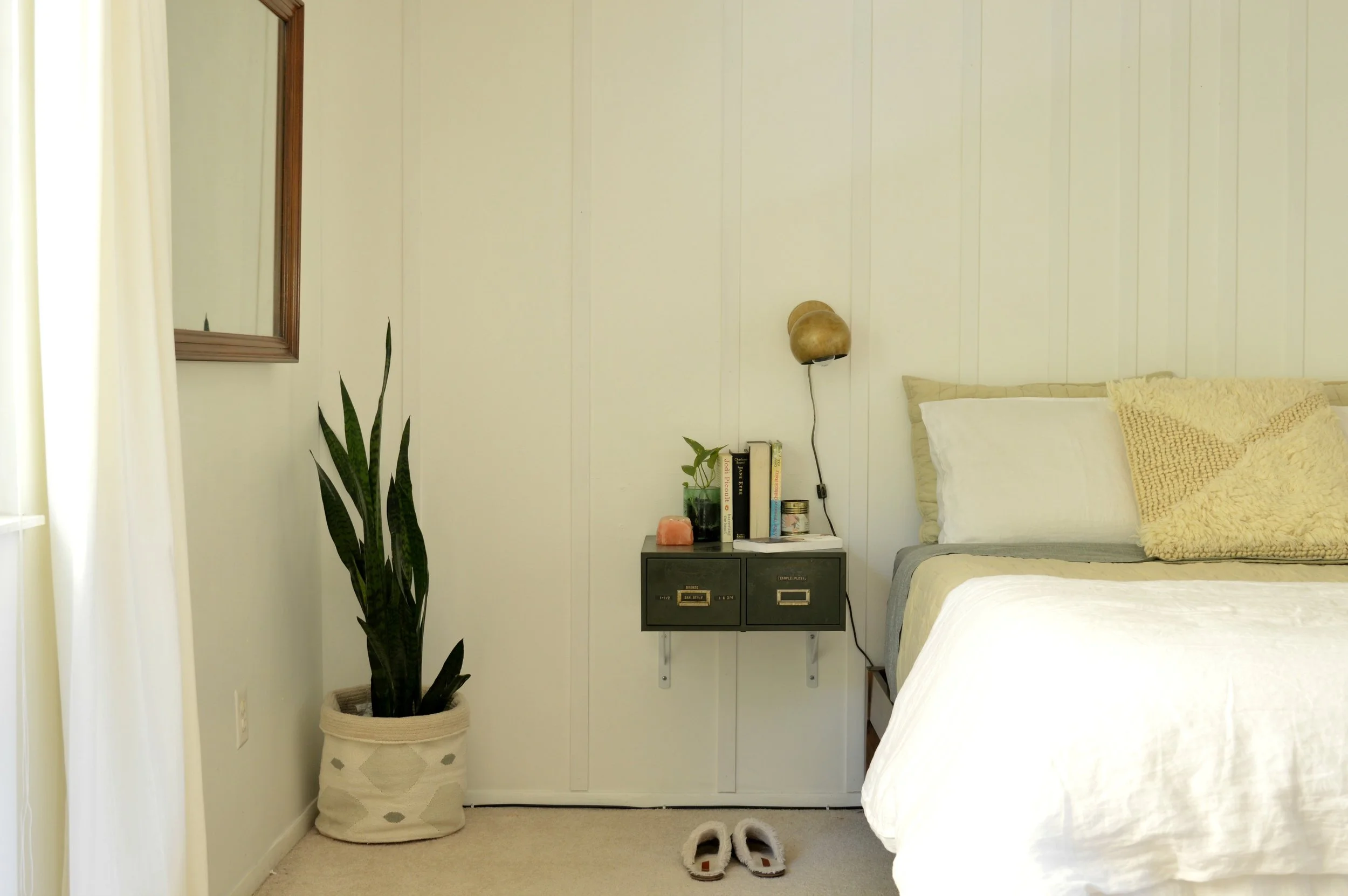
My main objective was a quiet and calm space that still had that interest and unique appeal that I so love. I knew I didnt' want another headboard, but also that I didn't want nothing. After using the idea for horizontal trim in this clients bedroom, I loved that touch of something on the wall that didn't scream for attention. I strummed up this idea to install vertical trim pieces that start close together at the center of the bed, and then fan out, getting wider and wider. The pieces that are close together anchor the bed just as a headboard would! Don't you just love visual tricks?! I think I get those kicks from my Mama. Looking around, I kept my white dresser that I had refinished a couple years ago, but the bed and Matt's dresser were lucky Craigslist finds. After many years of a matching bedroom set, I've welcomed some inconsistencies and mixed pieces.

7.jpg

The idea to use floating dark green two-drawer file cabinets as nightstands came a while before I actually found a pair of dark green two drawer file cabinets. These guys were tucked in the corner of a local antique shop for $35/ea. Not a bad deal! (Of course, Matt was the one who handled the installation logistics) Fun fact: My kids have been writing each other a lot of notes lately.. They write apologies when they've been unkind, thank you notes when they've been helped, and don't even get me started on all their correspondence to the tooth fairy. Now I have a 'Small Letters' drawer for these precious small letters.

13.jpg

Another major component to pulling off an interesting beige and white room is choosing the right bedding. When you go monochromatic, texture and pattern can make a huge difference! When Cstudio Home reached out to introduce themselves, I was smitten with their use of texture and tone-on-tone pattern! The way their blankets are stitched, the subtle weave of the sheets - it's all a minimalists dream come true! We've got the Studio Quilt in Sandstone, the Canvas Sheet Set in Moss, and the Woven Shag Pillow Cover. I've made our bed and am more than willing to sleep in it!

12.jpg
3.jpg
4.jpg
8.jpg
5.jpg
9.jpg

I love the subtle pattern on the sheets - I've never had sheets worth looking at so I've never turned them down like this before! But the subtle mossy green is just so lovely with the white and beige pieces. Fresh, just like the plan.

11.jpg

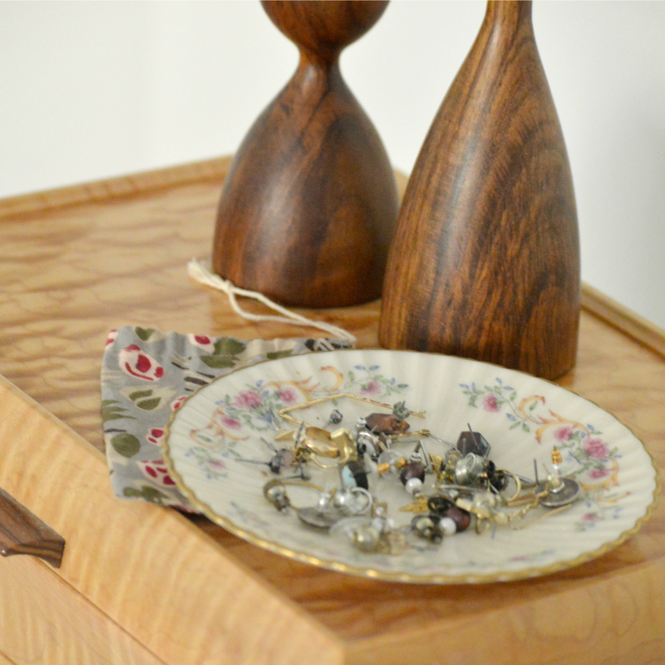
Of course the only true way to make your space truly unique and one hundred percent you, is with your own personal pieces. I may not be able to look at this photo of my grandpa yet without a lump forming in my throat, but I absolutely want to see this every day. I miss him so. The dish to the left is a saucer from my grandma's china collection, and it's where I keep all my studs. I haven't found another way to keep them organized until now! (Well, they're still not so much organized as I can just see them all better)

14.jpg

This vanity mirror hung horizontally was an estate sale find last Spring. I loved the wood pieces of the frame fit together like a puzzle, and it's such a lovely shade of wood; couldn't turn it down.

16.jpg

That's a wrap! Thank you, friends, for coming by. I realize it's a pretty underwhelming room reveal compared to what's out there, but I really believe simple can be interesting, too, and wanted to share my own experience with this room's evolution. Onward and upward, I say! Grateful to finally be at this end of the transformation. :) We would love for you to come back tomorrow to see what Cate has whipped up in her room!  It's so beautiful, completely 'her' and I'm just smitten...oh, I can't wait for you to see!

Chelesa.jpg

Reveal: Eclectic Equine Condo

Hello, hello! It's good to be back here with you for another eDesign reveal! If you're newer around these parts of the great World Wide Web, first off, welcome! So glad you're here! I'm Chelsea and peeled off from doing furniture refinishing about 2 years ago to focus on the design branch of StyleMutt Home. It's been a really exciting challenge to learn how to do design work, (primarily eDesign), and navigate where the specific skills can be used. Although we have been blessed with a full load of individual clients this year,  I accepted and began a freelance design job over the summer with a corporate company who is similar to Airbnb. They're purchasing condos in major cities around the US and Canada and making them available to travelers as home-away-from-home stay places. But between their purchase and that first lease, there is a lot of work to do on these condos! My job is the design, (i.e. the fun part)! The work is very fast paced and often unpredictable. I design these spaces from the comfort of my own home, never stepping foot inside the physical space.  I never know what information they'll be able to supply me with on a unit before I get started on the design. Many times they give me a floorplan with measurements and that's it. If I'm lucky I get pictures, and maybe even a video tour! Regardless of what info I'm given for a space, they require all the details that make up a complete eDesign in a day or two. It's a lot of fast research, drawing, note taking and, <gulp> math, but the exciting part is having the creative freedom to design the spaces how I wish. The company always gives me a style direction, (industrial, old world, California cool, etc), but from there I can run with it.

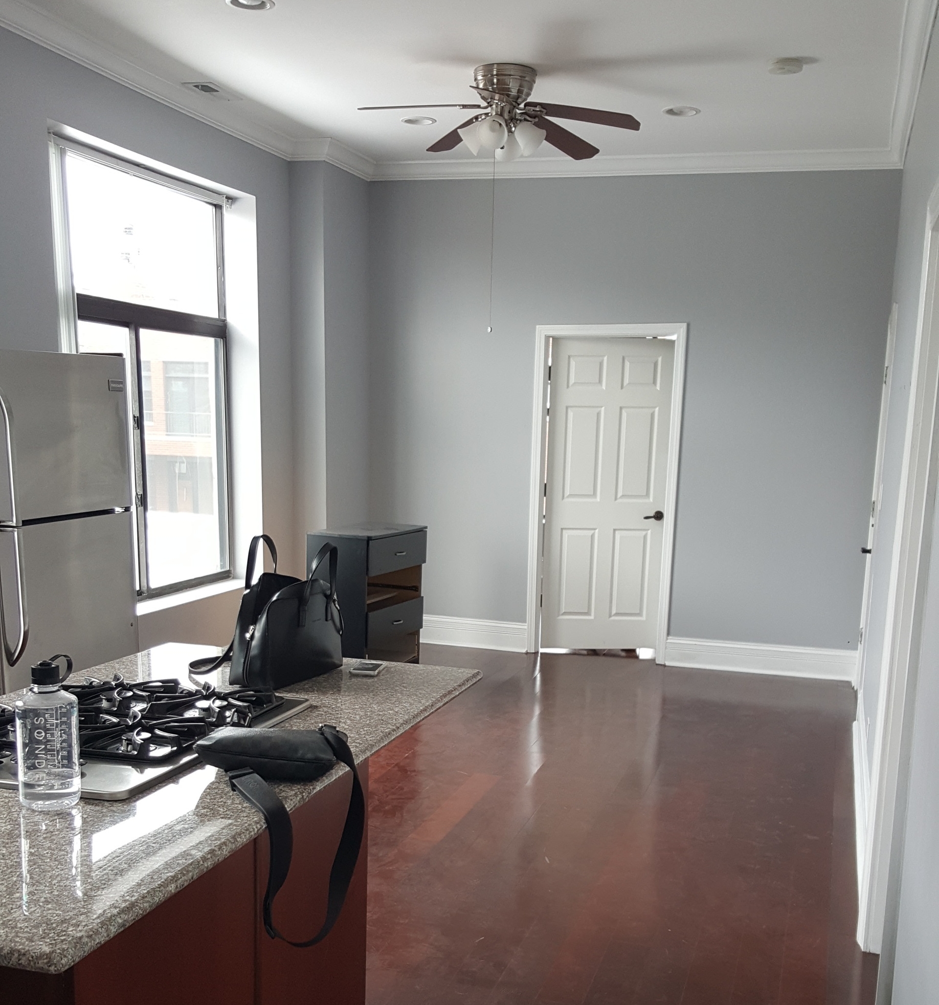
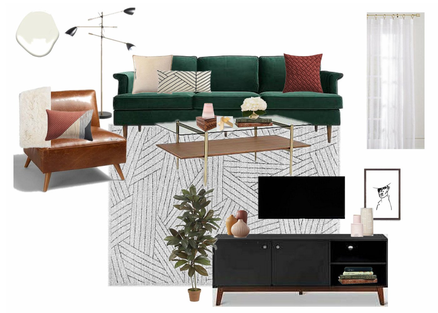
The space I'm sharing today is in Chicago and came with all the lovely before photos a girl could ask for. It is a 2 bedroom condo with a comfortable living space complete with a full kitchen. When I saw the before photos the space just looked tired. The blue-gray walls just made the it all look kind of 'blah'; especially the kitchen. There is absolutely nothing modern or industrial about the architecture here like in many of the other spaces I have designed for this company, so my desire was simply to freshen it up and make it cozy. In my short experience with design thus far I have learned that the most successful designs are a natural extension of the space. Since this space is already very traditional, I stuck to fairly classic pieces that read traditional with a modern twist. When I first showed Cate her remark was how very equestrian it felt with the dark moody colors, rich velvets and warm leather. So I'm calling this the Equine Condo! Lol!

Let's take a look!

LIVING ROOM

Below is a before picture of the living room paired with my design plan:

BEDROOM 1

I'm telling you, it's so hard to design rooms without the current season on your brain. I worked on this space right as the days were turning crisp and pumpkins were being displayed on doorsteps. Can you tell?! I went all out cozy. It's a rather large bedroom and I just wanted to make it feel inviting, quiet, and relaxing. It's like a big green cave and I just love it.
finished 26.png

BEDROOM 2

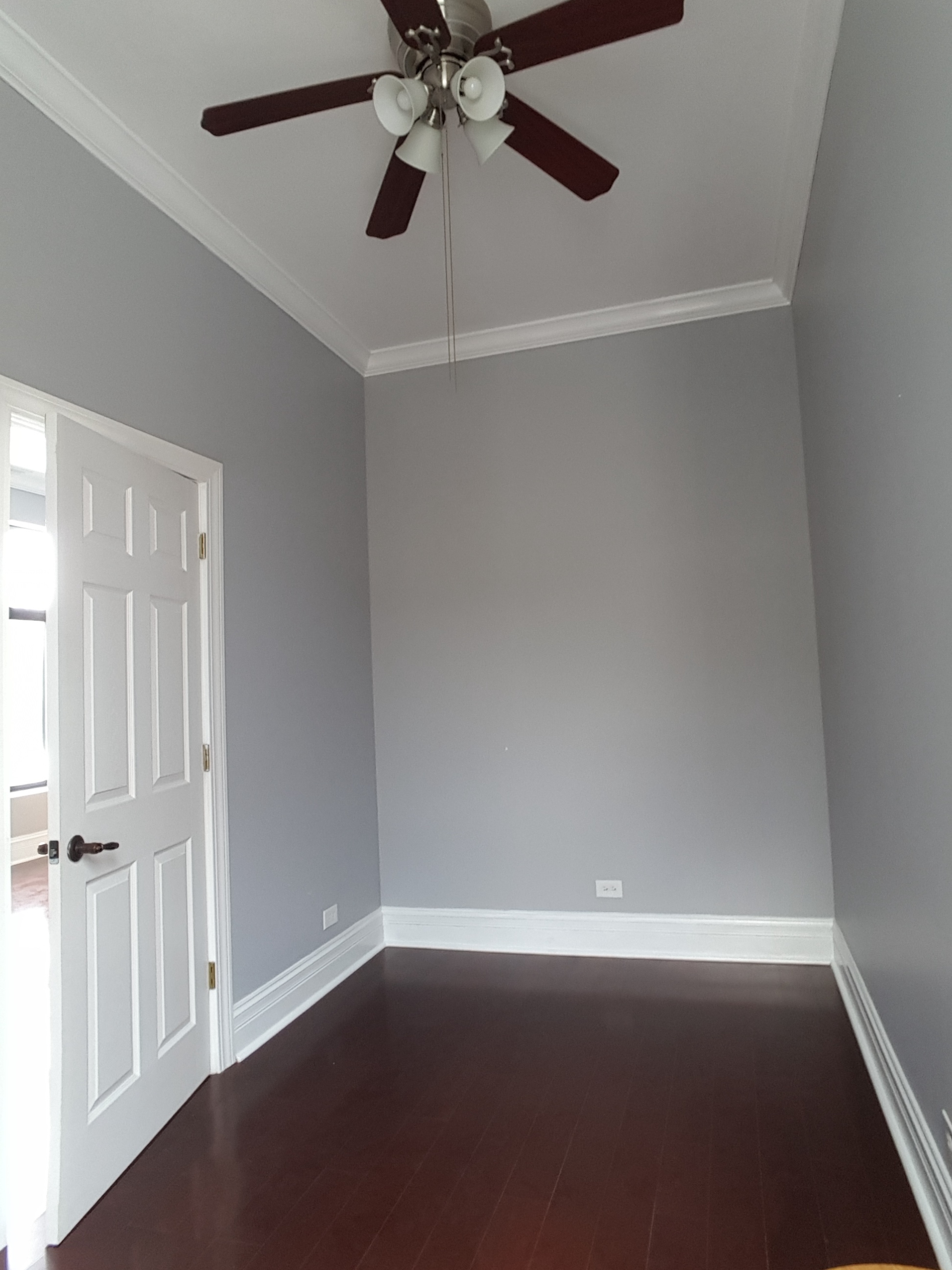
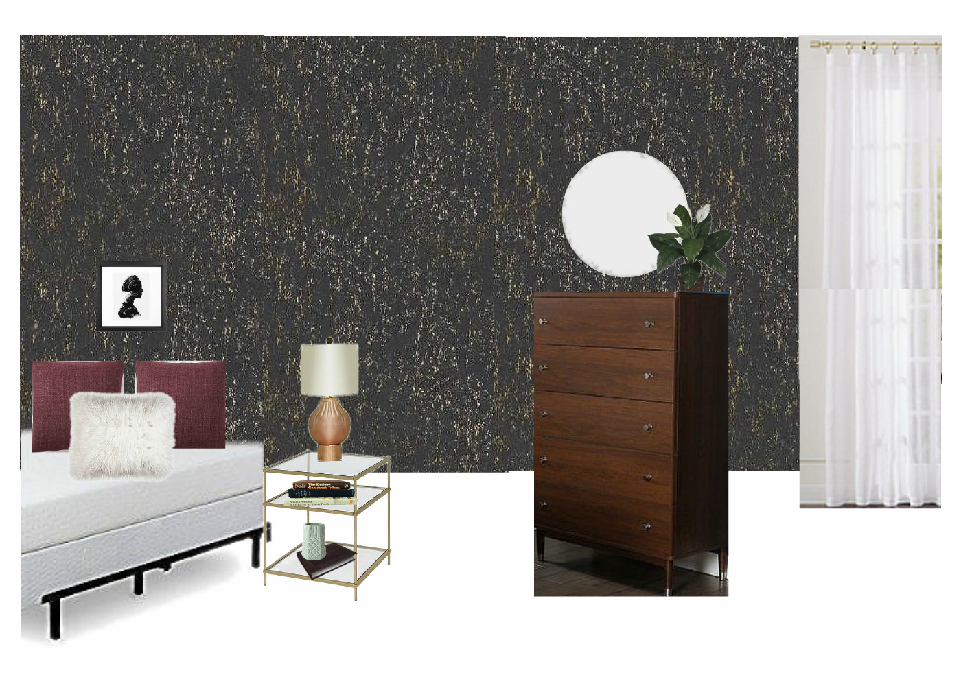
They said a bed couldn't be done. They said a dresser could never fit. Literally - I actually (accidentally) stumbled onto other designers' notes on this room. The client deeply desired this space to be a second bedroom, and with an en-suite bathroom it surely made sense.  I studied that floorplan and researched beds. I knew if the measurements were right that a full bed mattress would absolutely be doable. A bedframe, maybe not. So I found an adjustable bedframe that could be pulled inward a few inches if need be but still support the full size mattress. And with the bed nestled cozy in the corner there was more than enough space for a modest tallboy dresser with a small footprint. I'm not usually one to sit and work on puzzles, but I thoroughly enjoyed figuring out how to fit the pieces together comfortably in this room!

And how about that wallpaper?! Target has a gorgeous line of peel-and-stick that is ~$30 for 27.5 sq ft! That's a lot of impact for a tiny bit of $! I'm still fairly weary of using wallpaper, but I'm so pleased with how it turned out in this space. It's the perfect tiny room for it.

KITCHEN

I admit I wasn't thrilled with these cherry cabinets and cherry floor - it was a lot of red wood, hurt my eyes. Hah! But once again I am floored by the magic of a fresh coat of paint. My design for this space included painting the entire main living space in Swiss Coffee by Benjamin Moore and it absolutely wakes this space up. With all the red wood, the stools may seem an odd choice. I totally get it; why add even more red toned wood? Well, for one thing I didn't want any statements in the kitchen. I was adding a lot of contrast to the living room right next to it and wanted the kitchen to just be easy on the eyes, nothing sticking out. Secondly, although the red toned wood itself is not my favorite, keeping it all the same gives this space a slight modern feel. It's monochromatic which I love.

That's a wrap! I hope you enjoyed looking around - I sure am grateful to you for coming by!

Chelesa.jpg