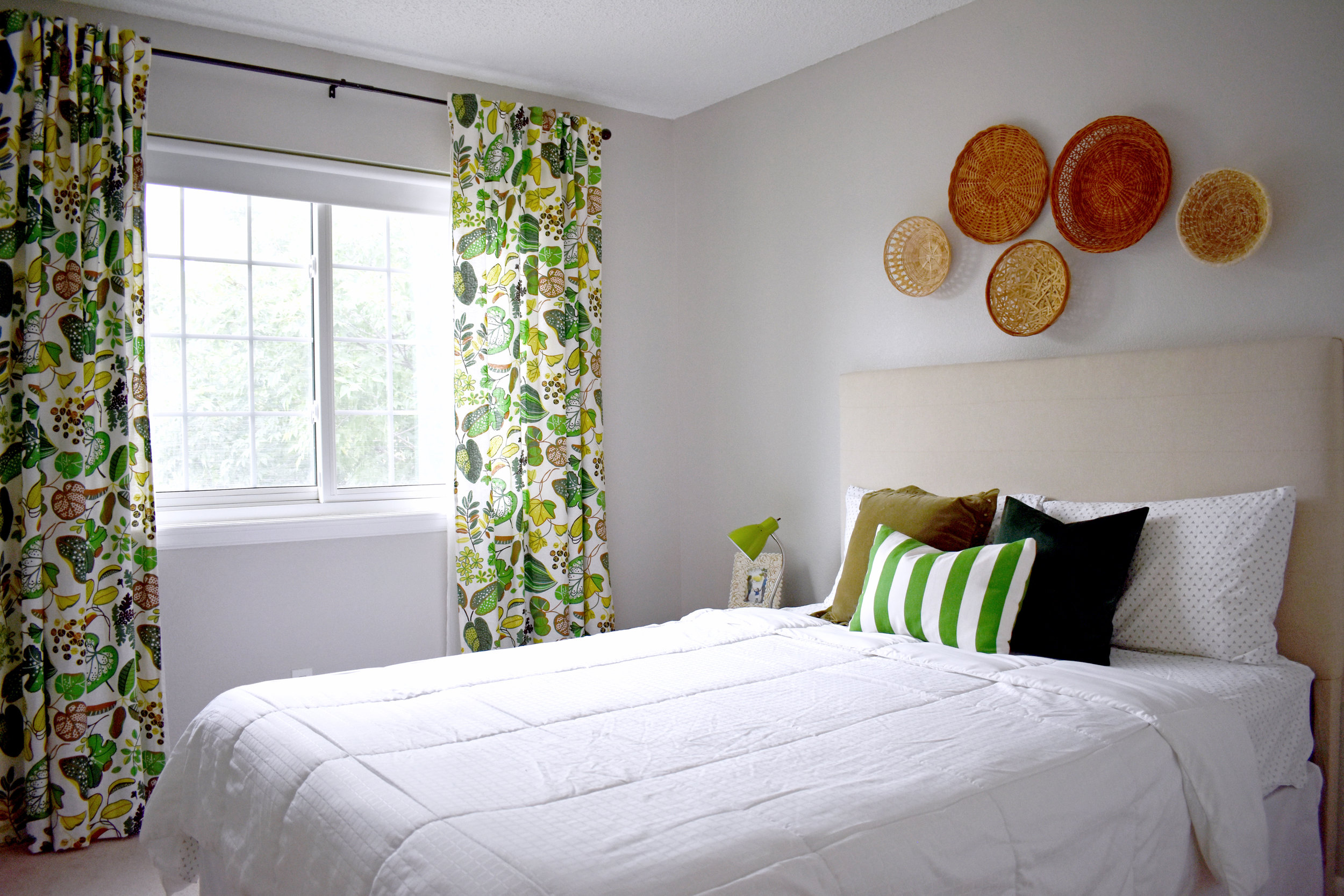
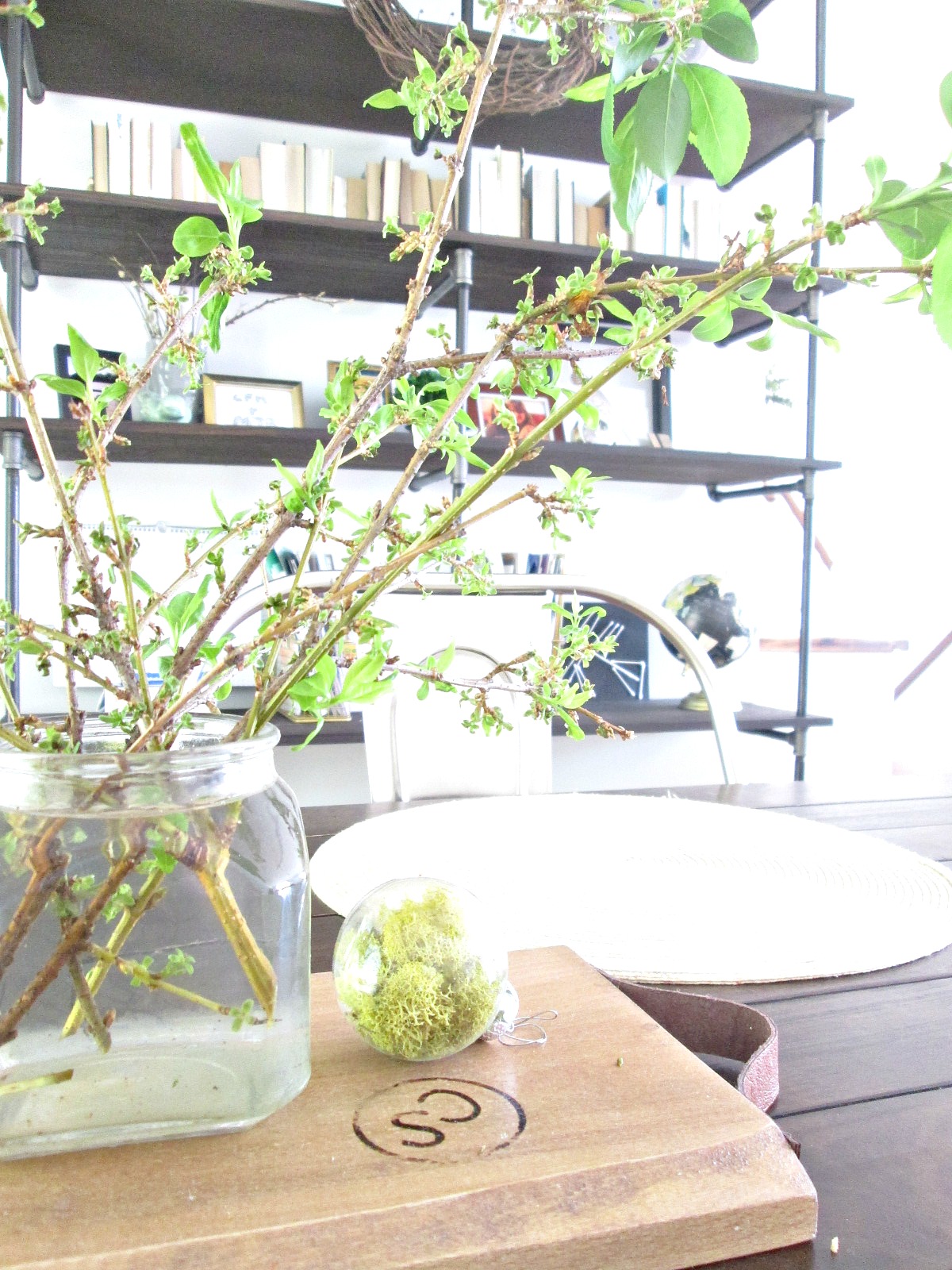
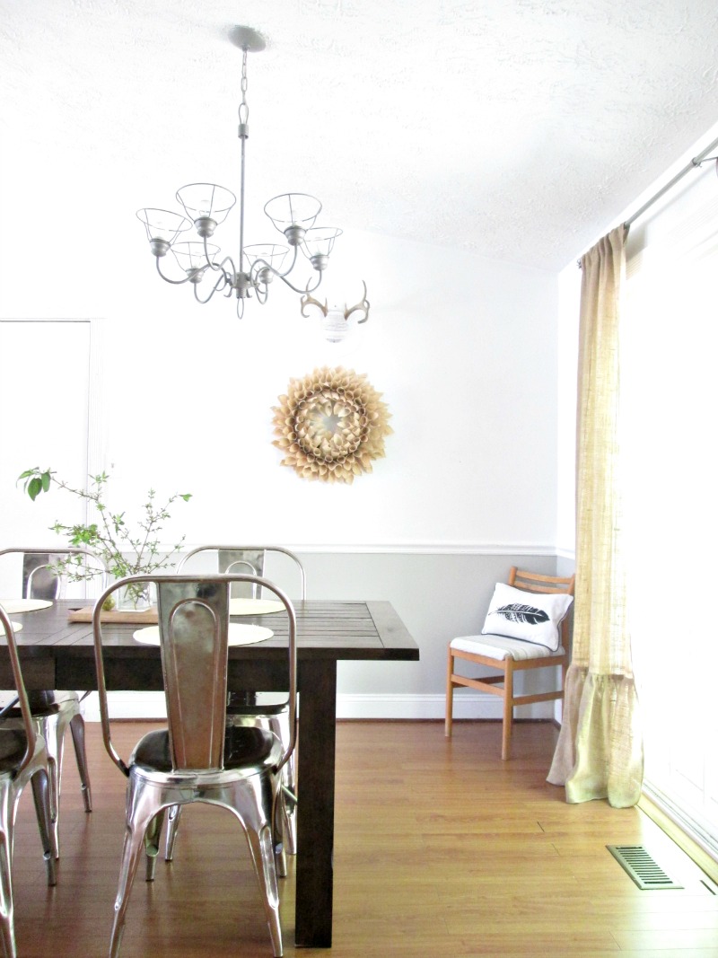
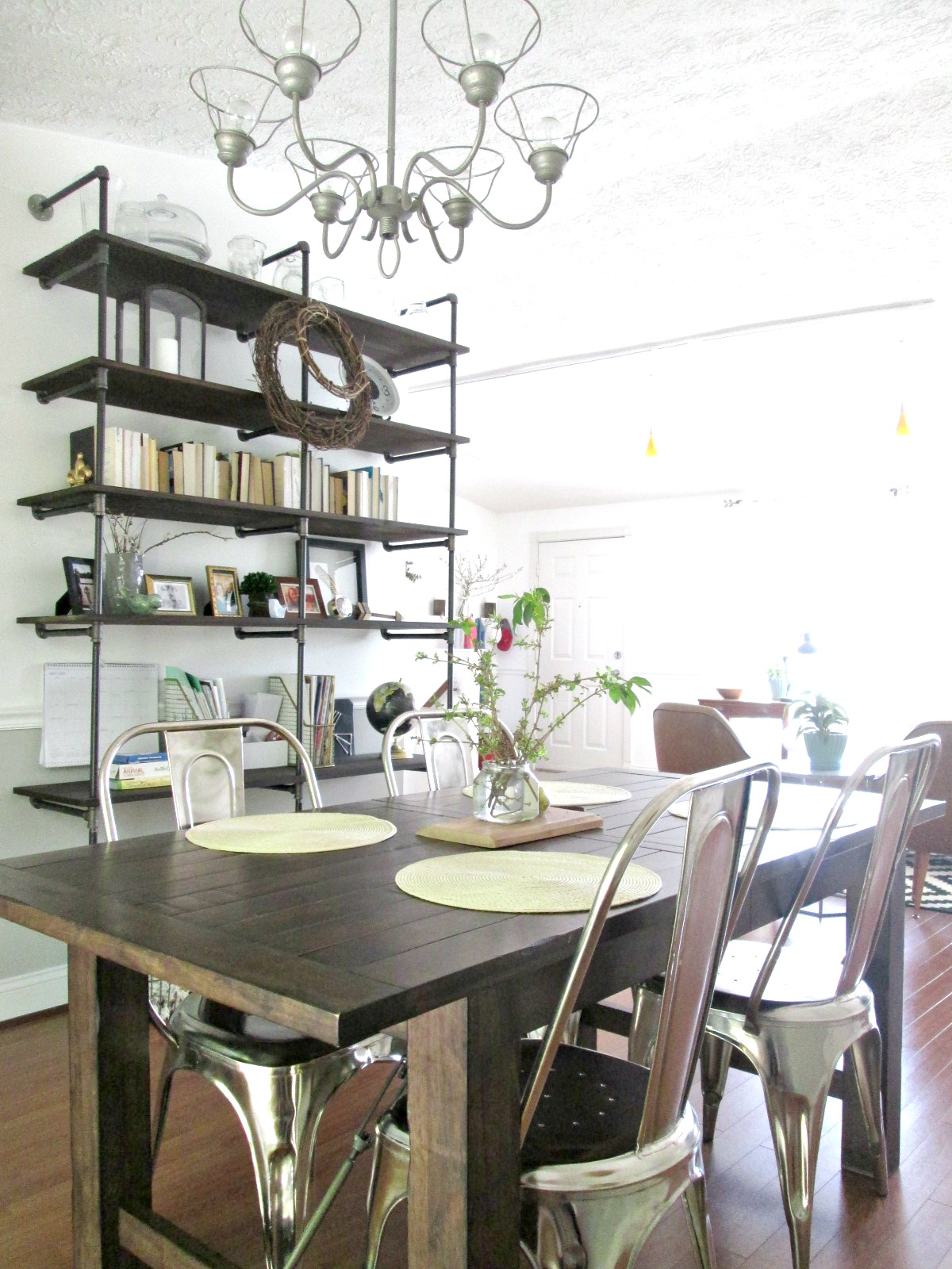
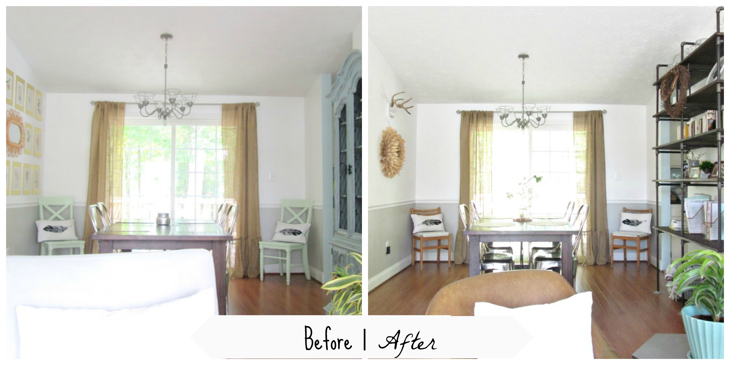
It seems like the whole country is experiencing some crazy sunshine this week! But no place gets more sunshine than the location of today's reader design location: Denver, Colorado. Allegedly, this city gets a whopping 300 days of sunshine, and you can tell by the lightness and brightness of Meredith's home.
“When we bought this home, it was filled to the brim with bold paint colors, glossy finishes, and bright accent walls. My first goal was to lighten everything up and make the rooms feel more cohesive. We used the same light gray paint color (Silver Drop by Behr) in almost every room, and it’s done wonders for making our home feel light and bright and so much bigger! From there I tried to arrange furniture and decorate so our home feels welcoming and cozy but still simplified and clean.”
“My style and DIY skills have definitely evolved over the past 10 years of home-ownership. Our first house was an 80s ranch in Arkansas, where we learned to scrape popcorn ceilings, add recessed lighting, and paint lots and lots of wood trim. I started collecting mid-century modern furniture pieces there because they fit the style of the house, but over time, mid-century furnishings became part of our style, too. Now those same pieces seem to fit our very non-ranch second home in Colorado because they are a reflection of us.”
“Our family room is full of more favorite pieces. The credenza was a $40 Craigslist find that I spent hours sanding down to bare wood and refinishing. That thing will probably outlive me! The gold arc lamp was an estate sale find that took three adults to load into my car (with two carseats installed). And of course, our West Elm leather sofa is the most durable, comfortable thing ever. It was our only brand-new furniture purchase after moving to Colorado and it was worth every penny.”
“One design element I will always be willing to splurge on is good lighting. In both of our homes, we replaced horrible wood-framed fluorescent lighting in the kitchens with recessed lights. We’ve also updated almost every single light fixture throughout our home. I don’t necessarily need something high-end if it’s a good design. I tend to prefer simple globe pendants and sconces, except for in our girls’ shared bedroom where I added the most girly floral chandelier ever!”
“Over the past year, my husband and I have strived to simplify the way we live. We’ve emptied out our unfinished basement, decluttered our kids’ toy collection and our closets, reduced the number of decor items out at any given time, and even put half our dishes and flatware into storage so our kitchen stays cleaner. Our home feels lighter and bigger and we spend much less time cleaning and tidying! I’d love to be a true minimalist, but I have to balance a love of adding interesting textures and pops of color, too. Lately I’ve learned that keeping the pieces you feel most passionate about and letting go of the rest is a pretty great recipe for a home you love.”
Meredith, thank you so much for giving us a tour! Follow Meredith along on Instagram @welcometoheardmont for more!


