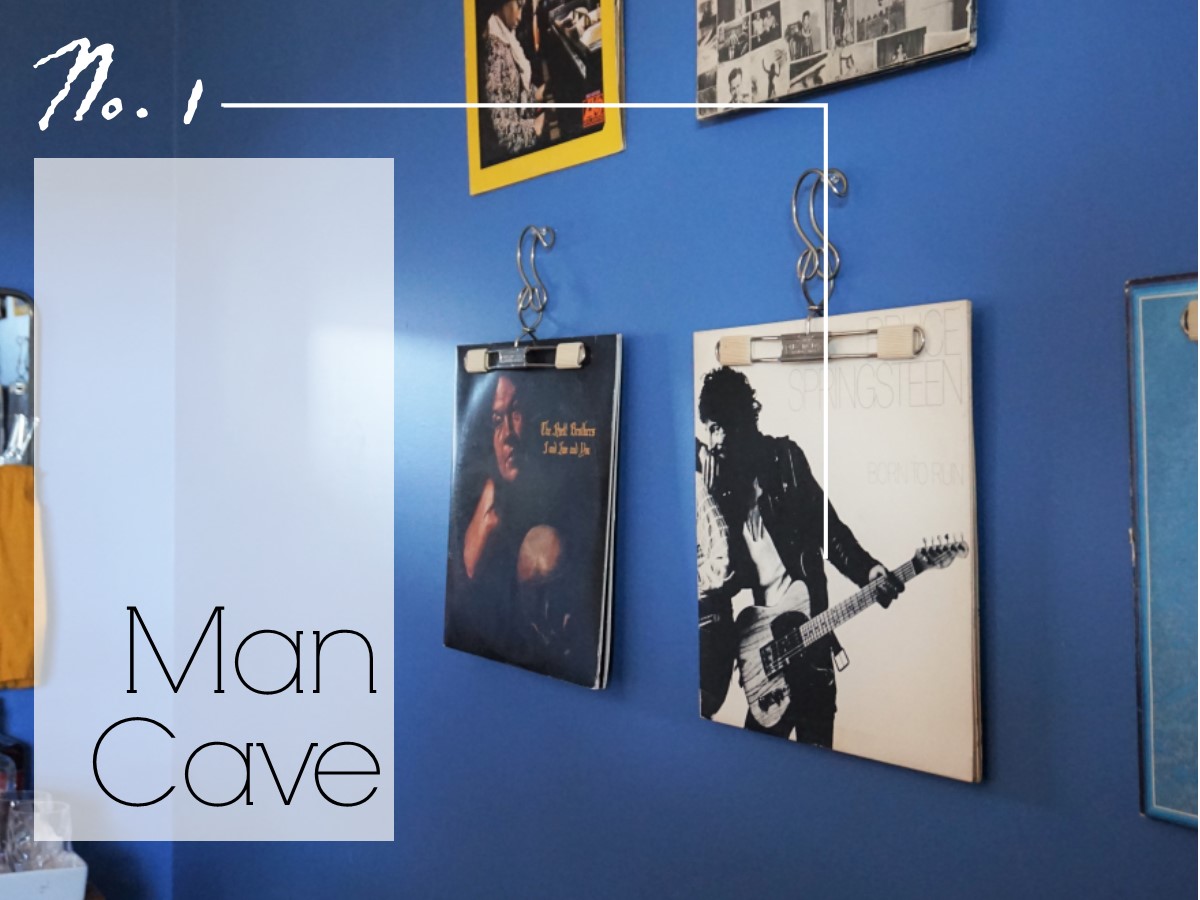
Man Cave || 2019 Flip List Item No.1

So last Spring, my husband and I were on the hunt for our next lease with a very specific list of must-haves in mind:

  • End unit townhouse (less walls to share with noisy neighbors)

  • Green space (for Thor and also so Caleb could exercise his supreme lawn skills)

  • At least 3 bedrooms (little did we know one of them would become a nursery)

  • A garage (a girl’s gotta have her in-home workshop, you feel me?)

  • And a MAN CAVE (Caleb’s non-negotiable)

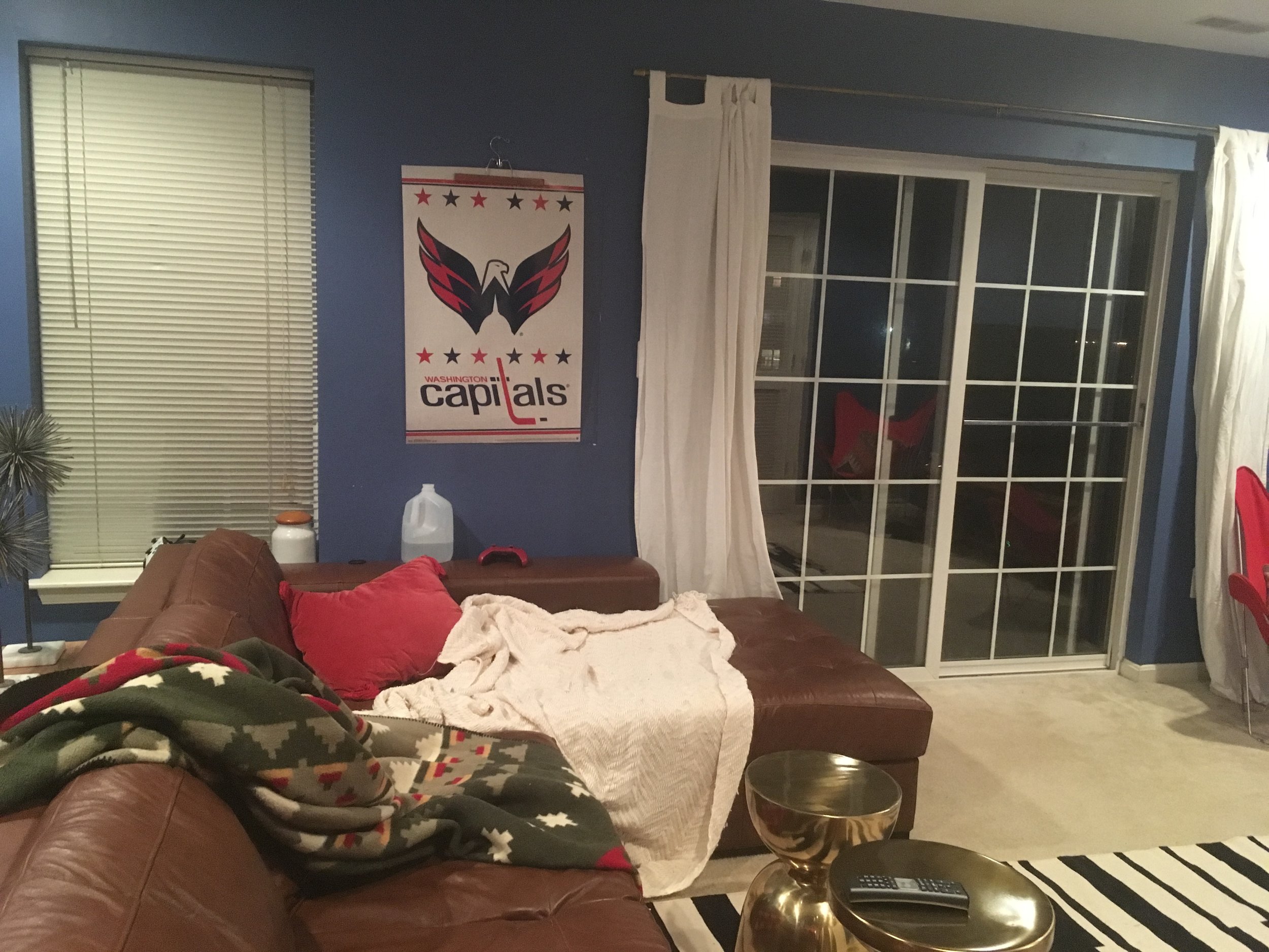
By some miracle, we managed to find something that checked everything off our list - complete with a dungeon-like ground-level media room worthy of Caleb’s video-game playing and sports-game watching needs. The only thing was it was a already painted a very distinctive shade of blue:

“Thalos Blue” to be exact

 
Photo Jan 12, 8 25 30 PM.jpg
 

It’s not that the blue was all that bad. In fact our landlord would have let us paint it if we really wanted, but after giving a fresh coat of paint to the other 80% of the house, we kind of ran out of steam. We decided that the color was workable even though I would have chosen a more masculine navy than a cornflower blue for a media room.

11D9C964-EA76-4BF0-AA73-4DB079251EBE.JPG

Caleb immediately took up residence down here and I set to work on the rest of the house (you can see our progress here and here). In exchange for giving me practically 100% design control of the upper 2 floors of the townhouse, Caleb asked that I limit my… interference… in his sacred basement space. I admit, this was very hard for me to do and I definitely snuck a few decorative items in there every once in a while. He did allow my expertise however to source a comfy sectional. I scoured Craigslist until I found an affordable leather one that was perfect for lengthy lounging and felt manly but still stylish enough for me to tolerate (I mean I have to watch movies down here too ya know ;).

AA1C1619-A13E-4403-9B38-730D5FC62181.JPG

But after a couple months, Caleb came to me with a surprising request to… interfere… with this space after all. See Caleb and I have often disagreed on form vs function when it comes to a space - meaning I like things “pretty” and he likes things “comfortable.” We’ve found little ways to compromise throughout the house but he was very resistant to my initial input on his man space. Me thinks he just wanted a place to set up shop without making any concessions for once. Hence my surprise when he actually approached me about making it feel a little more homey and how this item ended up on the 2019 Furniture Flip Bucket List.

Challenge Accepted

Man Cave 1.jpg

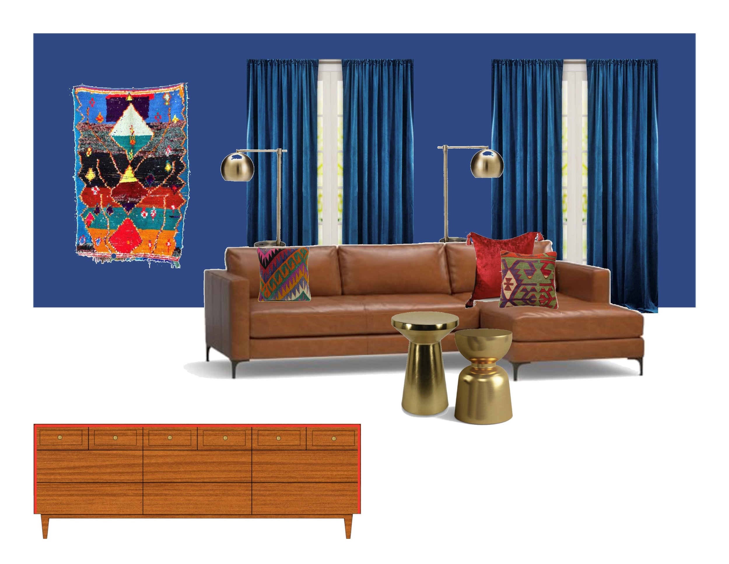
The plan was to use the blue to our advantage and make it as a backdrop for some rich colorful accents coupled with some touches brass to mature the space a bit.

IMG_0331.JPG

The sectional was working out well, but I switched out the boxy man legs for some sexier gams to give the couch a more high-end look.

blob

Legs Before

Low profile + a little frumpy

blob

Legs After

Glam gams = soooo classy

Next we had to figure out what curtains to hang in a true blue room? I tried white for a bit but the contrast was too stark.  I could do red but I didn’t want to take away from all the pops of red I was adding elsewhere.  Eventually I landed on a blue to match the walls.  In a velvet no less to add texture and black-out any light on movie nights.

IMG_0330.JPG

Finding the right TV stand was another fun project.  First we had to source one large enough for our monster TV (almost kept this guy for that very reason).  But we found a deal on this MCM credenza with minimal wear and tear.  I waterfalled the outer edges in a persimmon paint color for another fun by subtle pop.

IMG_0332.JPG
IMG_0333.JPG

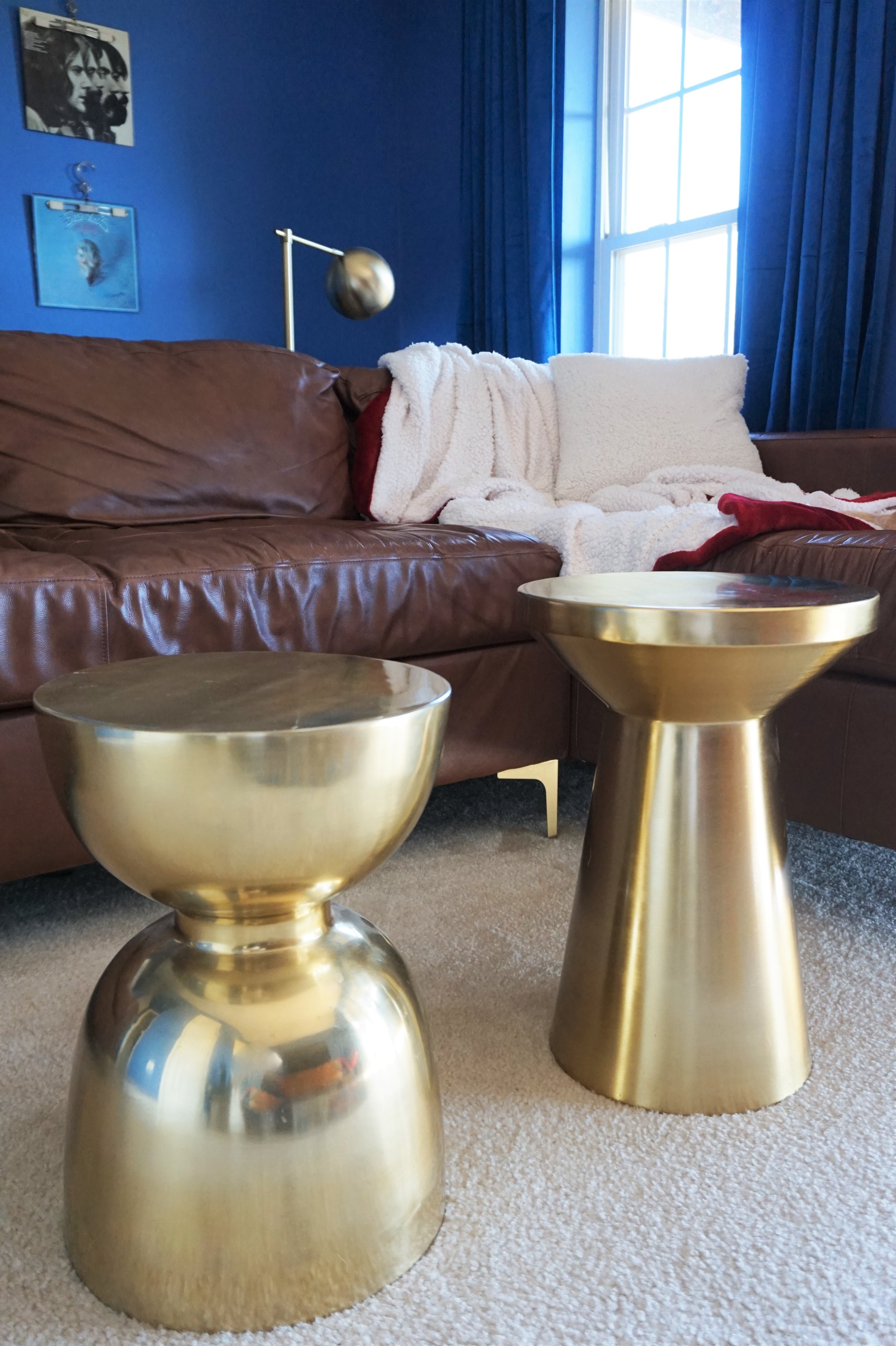
My alternative coffee tables did get a little push-back from Caleb the Client. Instead of doing one large table, I found two brass martini side tables a varied heights. It’s not his favorite design concept (a coffee table should be more of a foot rest according to Caleb), but it allows us a classy take on TV trays when we are eating down there (which is basically on every movie night). 

IMG_0337.JPG

Behind the couch is a small-space bar area when we want to get our Mad Men on.

IMG_0335.JPG

Extra lighting sits on a narrow storage piece that flanks the back of the couch. We keep our small LP collection and record player on the shelves underneath.

IMG_0334.JPG

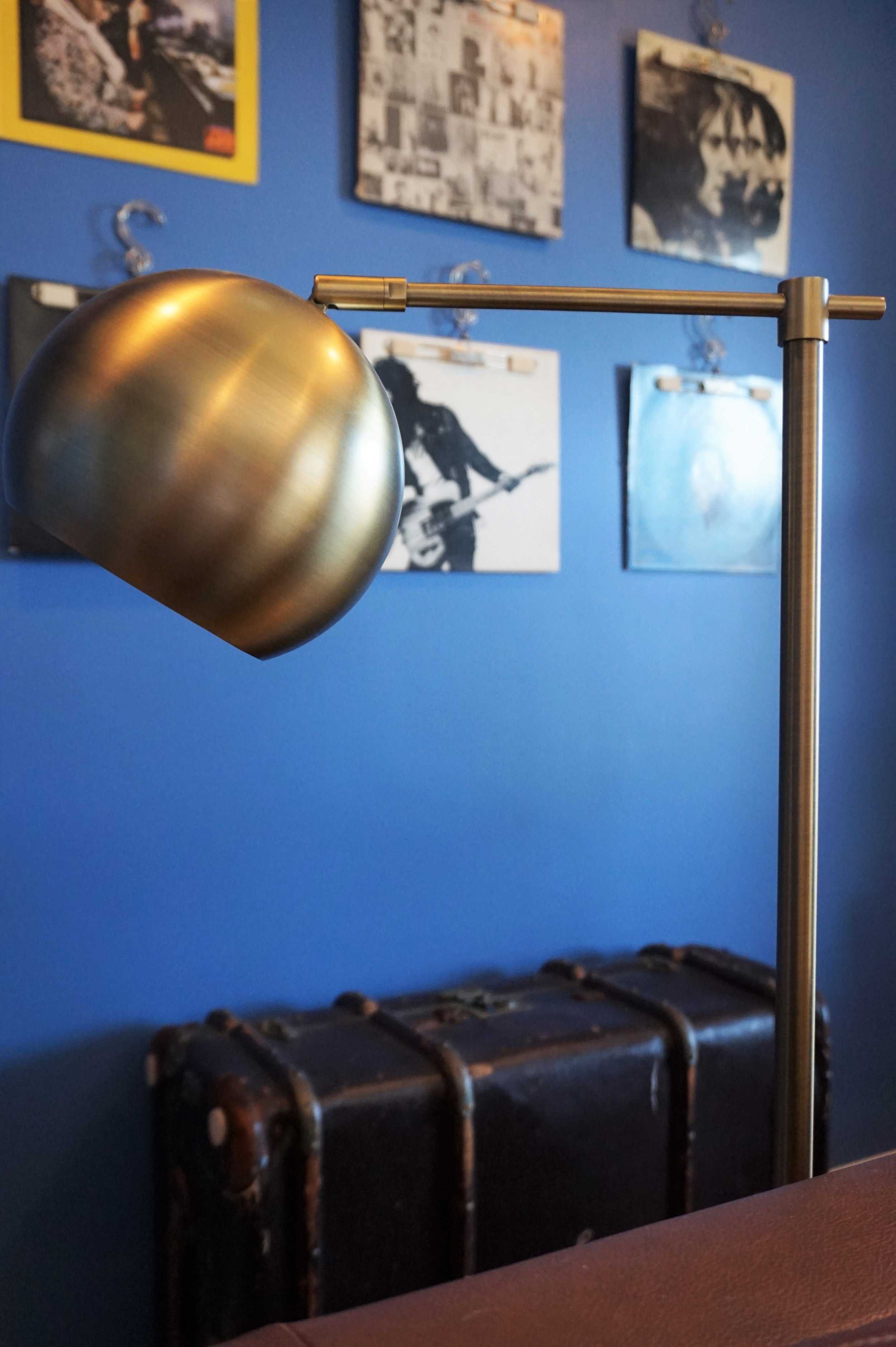
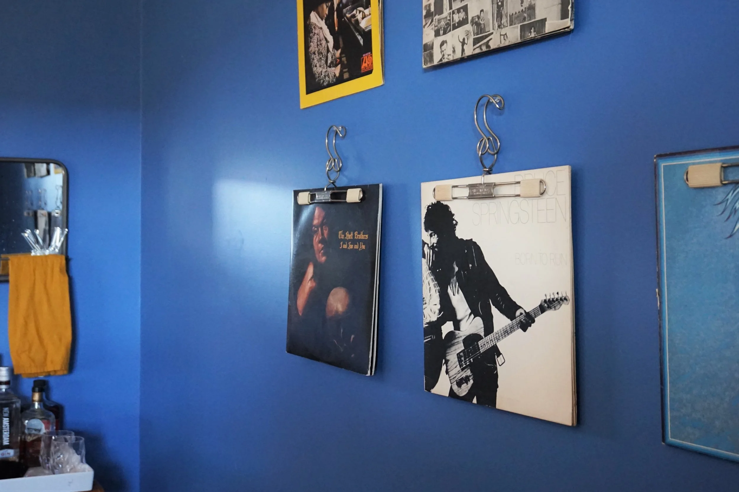
A few of our records hang on the wall to make a “man art” moment. They can easily be switched out for a sports poster or two if the mood strikes.

DSC05156.jpg

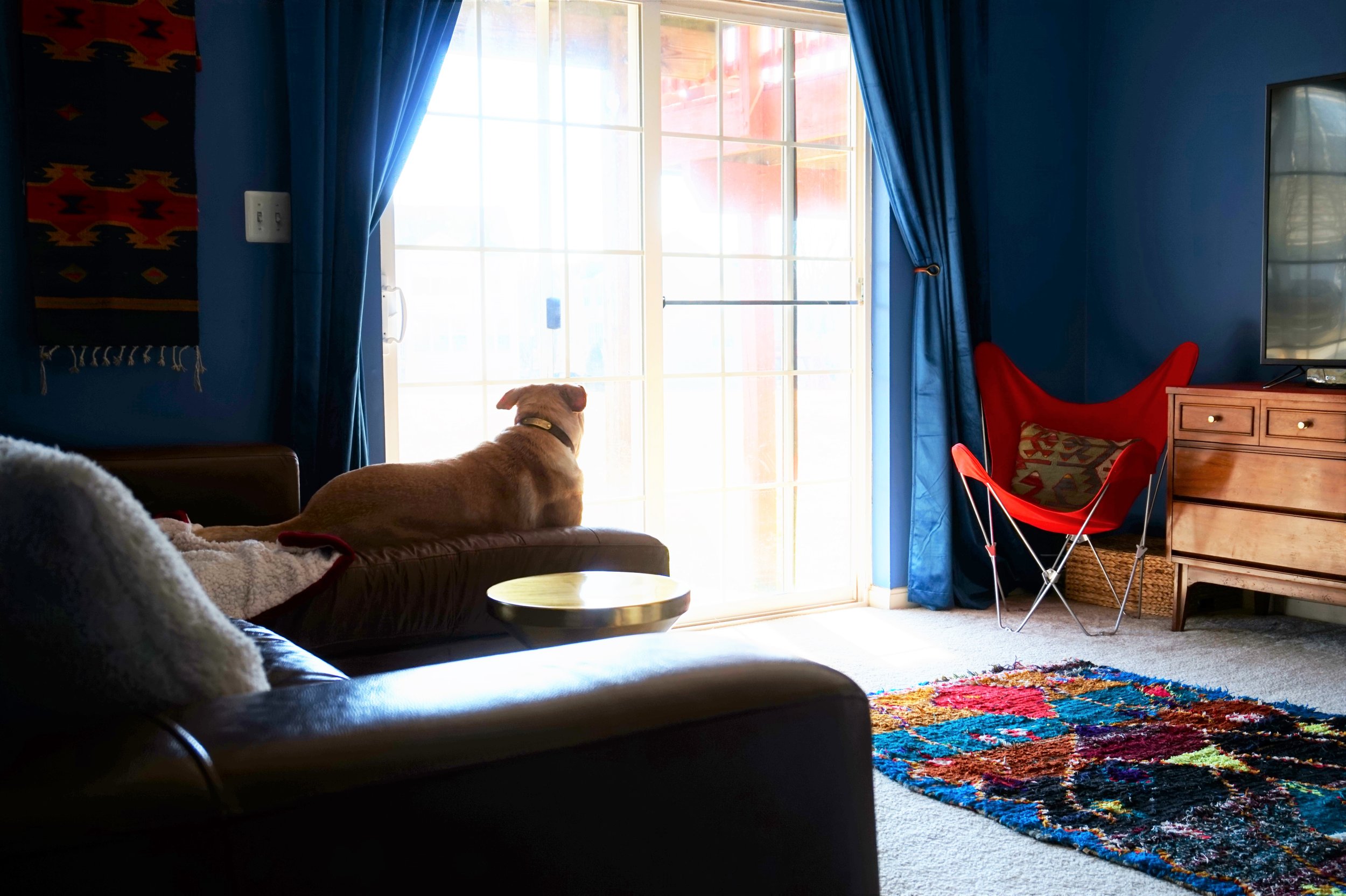
Now this space has the family’s full stamp of approval - Thor included. 

IMG_0338.JPG

And I’m crossing this project off this year’s list!

IMG_0224.JPG

Two down, three to go. Catch up on the 2019 Furniture Flip Bucket List.

Room Tour (Finally): McKenna's Bedroom

You guys know how it is... 

It is next to IMPOSSIBLE to decide when to shoot a space. I take one picture, and all I see are the five things I want to change about the room. I keep telling myself that I'll have our new Seattle rental (we moved here in July 2017... is it still new?!) photographed when it's "done." But let's be honest, that day will never come.

I'm lucky, then, that a breakthrough of sunlight - a welcome arrival during this gray and drizzly winter - made my decision for me. I finished work, snuck in a workout, and came home to the most breathtaking sunshine seeping through our windows. So today, Mutts, you can thank the anomaly that is the winter Seattle sunshine for this peek of our bedroom.

Exhibit A:

DSC_0126.jpg
DSC_0115.jpg
DSC_0137.jpg
DSC_0131.jpg

No, I did not add those light bubbles to these photos. That just HAPPENED. And I know they're not perfect, professional photos, but holy cow, I had to capture it. 

When we moved across the country from DC last summer, we literally brought clothing and kitchen supplies with us. The only pieces of furniture were a coffee table in our living room, and the two bedside tables you see above. Oh, and the painting - which is a Framebridge print of a photo I took in my soul city, Palm Springs, CA. The side table on the left is a table that my parents purchased and refinished at the start of their marriage in the 80s; the table on the right belonged to my fiance's grandmother. Both are precious to us and, luckily enough, majorly back in style. We saw exact lookalikes at a trendy vintage store in Seattle a few months ago. 

 
DSC_0134.jpg
 
DSC_0123.jpg
DSC_0119.jpg

So that means that we had to purchase everything else. As someone who moved every 11 months for 5 years, this didn't phase me, but we took our time to make good decisions and find great deals. 

My proudest purchase is actually our bed. Even though it's a mass-produced item from Wayfair, we spent only $73 on it, and the quality has really surprised us! 

DSC_0114.jpg
DSC_0139.jpg

I hunted down this midcentury Tallboy on Craigslist. It's a tight squeeze in what is already a small room, but it gives me the storage I need. Now that I've accented it with some dried flowers from our local farmers market and a copy of our favorite engagement photo, I seriously love this little corner. 

And then we splurged on a few things: our Parachute Home bedding; our plug-in West Elm sconces; and our stunning and soft West Elm rug. I waited for sales and have no regrets about these purchases. In fact, we've registered for many more Parachute Home items for our upcoming wedding. They're worth it!

DSC_0141.jpg

I love the way the small but sufficient bedroom has come together. Of course, there are things I'd change if I had a limitless budget, but it's a space that I genuinely love at the end of the day. There is no better feeling than lighting a candle, diffusing some essential oils, and nestling into bed with a good book. 

I am so excited to share the rest of our home with you all soon; in the meantime, have a great weekend, Mutts!

McKenna Sig.jpg

Reader Design: Sara's Approachable Rental

It's December 1. Where has 2017 gone?! 

While I sit here and reminisce, let's take a trip to DC, where I lived at the start of this year. We're off to explore Sara's rental in our nation's capitol. Sara's one-bedroom spot is a step-up spatially from the studio she once had - the same spot that inspired her to start sharing her design tips in the first place.

nov 10-012.jpg
nov 10-025 (1).jpg
nov 10-031.jpg
I started my blog because I didn’t find enough resources for studio apartment decorating and living when I first moved into my own studio apartment in DC a 4 years ago. I’ve since upgraded to a one bedroom, but after living in studios and apartments under 800 square feet, I really enjoy the process of designing a space on a budget and that’s entirely renter-friendly. It will probably be awhile before I own a place, so the challenges of making a rental your own are really fun. If your home or apartment is a rental and a place where you spend a lot of time, it should make you happy and reflect your style. Whether it’s new paint, changing out the hardware, adding art or anything else- I believe every home can be beautiful- rental or not!

Sara has pulled together the perfect home base escape, with mid-century, Parisian, and Cali cool vibes throughout. 

nov 10-027.jpg
171110_SSB_3537.jpg
I strive for my home to be inviting, stylish, yet approachable. I want people to admire the space, but also feel comfortable to sit anywhere and put their feet up. I don’t believe any space should be too ‘stuffy’ or so ‘perfect’ that guests are afraid to touch anything. I also have a dog (who is allowed on the furniture) so everything must be pet-friendly, too!
nov 10-049-Edit.jpg
171110_SSB_3518-2.jpg
nov 10-060.jpg

In her home, Sara keeps things simple and calm with neutral tones and subtle pops of visual interest, using color, patterns, and texture. 

The images all over pinterest and instagram constantly give me the urge to paint every inch white and go very scandanavian and remove all color from my place. However... I don’t think I would realistically like that long-term. My apartment is fairly neutral but I do like a pop of color here and there. My bedroom is all white and muted pink accent of the rug and metallic elements keep the space calm and neutral and it’s really relaxing to come home to each night.
171110_SSB_3506.jpg

Since the room is rental, Sara still keeps her design budget-conscious and smart.

I’m always willing to splurge on bigger staple pieces that I know I’ll use for 5-10 years or more. My bed frame and my sofa were both on the higher end of the price scale but I know they are quality investment pieces that I’ll use for years to come. I try to save on accessories and other elements in the apartment- scouring thrift stores and craigslist for great vintage finds.

Sara, thank you for showing us around your home! And thank you, Laura, for the stunning eye candy.

Follow Sara along on Instagram @studiostyleblog for more! Follow the talented @laurametzlerphoto for photos like these and more!

McKenna Sig.jpg