Hi friends! As promised, we're serving up another hot Reader Design on this long-awaited Friday! Last week Cate mentioned we'd be cutting Reader Designs down to one a week - a fun Friday Special to kick off the weekend! This gives these special posts some breathing room and allows readers, (and us), to thoroughly enjoy and be jealous of each one. :)
You can find all our Reader Designs on our SPACES page - as you can tell, we've got quite a range of styles already! Thinkin about sharing your own? Mull no more! Reader Designs are an open invitation to share your unique design and creativity. There are no requirements to be a professional decorator or even a fellow blogger. The purpose of Reader Designs is simply to share incredible rooms with fresh ideas and document these features in our SPACES section to use as a reference of inspiration.
This Reader Design is certainly near to our hearts as Shima is from our neck of the woods! She's an interior designer serving the DC/MD/VA metropolitan area, and worked her magic on this gorgeous living room update!
From Shima:
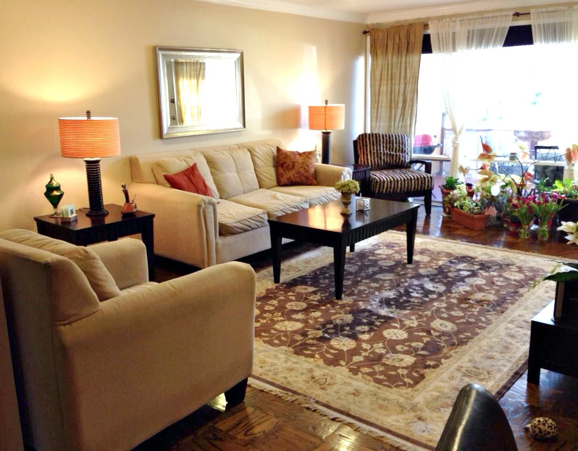
"My client wanted to update her living room as her existing furniture was not comfortable. She desired new sofas and chairs (especially a grey colored sofa), and wanted to keep her existing mirror, side tables, coffee table, and beautiful rug."
What a fantastic Before shot! Usually Befores are so utterly detestable that you imagine even the slightest bit of work would be a huge improvement! This room has great bones already! But we can't stop here. :)
Before: 0 After: 923,497,190
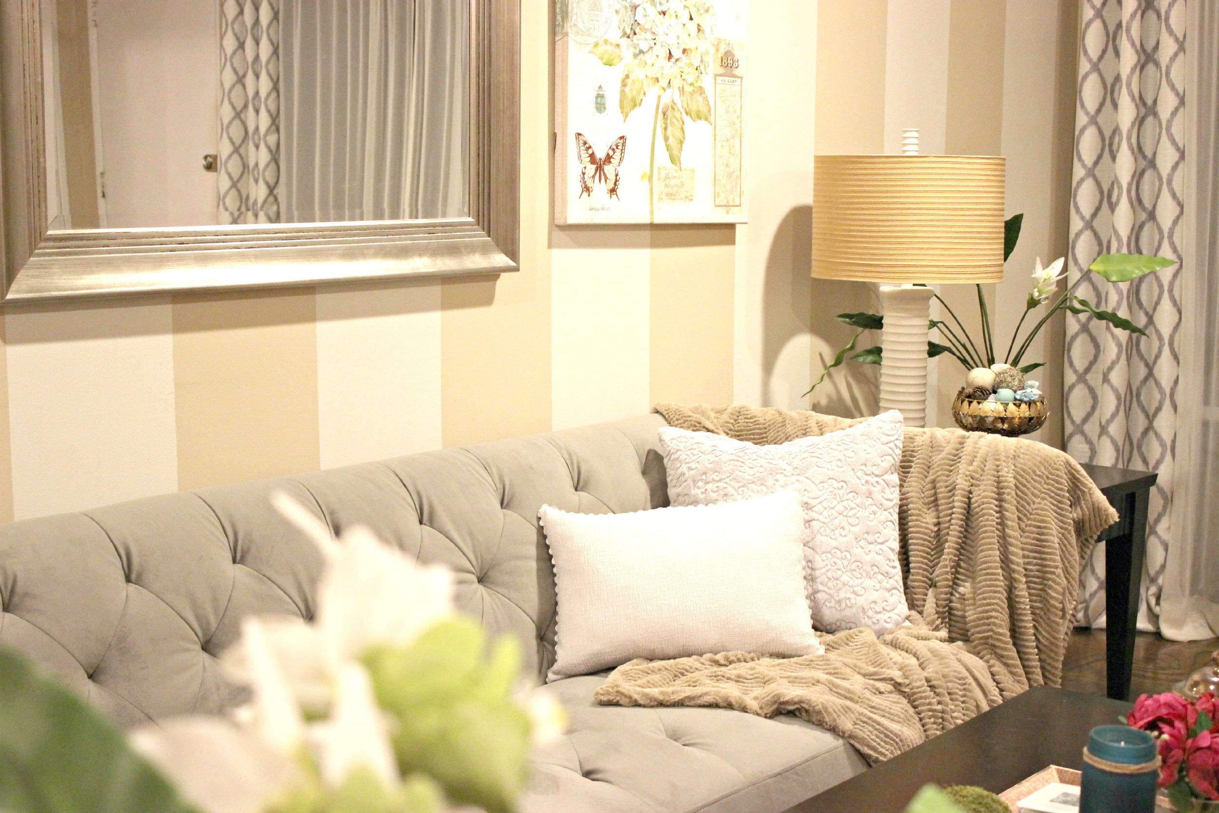
"The first thing we did was find a sofa that she liked, and we found this great sofa from Macy's that was comfortable and firm to sit on. Then we had a fun shopping trip to Home Goods where we picked out the arm chair, 2 high back chairs, and other decor items. She liked the color turquoise so I made that the accent color."
"The entire house was painted in this beige color, so what I did next was simply add vertical stripes. Since the wall was very long and bare, this helped to dress it up. I used Behr Paint, Marquee line, and the color is "varnished ivory" . Once the walls were painted, we had used the leftover paint for the lamp bases, bowl, and plant vases. These were also coated with a sealer. The main reason for painting these items was that they were dark brown and I thought the room had too much brown in it; I really wanted to lighten the look of the room. "
A personal favorite here at StyleMutt Home, too!
"Even though the main accent color is turquoise, I think it's nice to have the pops of fuchsia in there so that the eye does not get tired with the colors. I found this perfect artwork from Home Goods that had turquoise in it, along with a cute candle and fuchsia flowers. I found vase fillers that had turqoise in them. I used the vase fillers to decorate the coffee tray (3 green moss colored balls) as well as fill a bowl for the side table."
"Since we had a grey sofa with a very strong shape to it, I wanted to soften it up with a chenille faux fur throw over one of the arms-- this also provided a nice texture and tied in the brown color of the throw with other browns (such as in the rug) so it tied it all together. "
That spot. Right there.
"Lastly, we bought the patterned curtains from Home Goods and worked on the ottomans. My client already had two unused ottomans (also dark brown!). I went to the fabric store and found left over fabric marked down 75% and used that to reupholster the ottomans. I used only scissors and a staple gun. It was a fun project! The ottomans can be stowed under the coffee table when not used and they add a fun pattern that coordinates with the other grey colors in the room.
All of these DIY updates to the existing items saved my client a lot of money (which was one of her objectives!) and gave these items new life and purpose."
Talk about upgrade! This makeover is nothing short of impressive, but it's especially inspiring given the number of items that were kept and reused! We often talk about working within budget here and it's amazing to see how others creatively stretch theirs.
What a blessing this was to your client, Shima! Way to work it out, girl! You can follow Shima's brilliant work @house_of_shima on Instagram!
Have a wonderful weekend friends and thank you for stopping by!


